Vrij in Vorm

Mitchell Leber


Overview
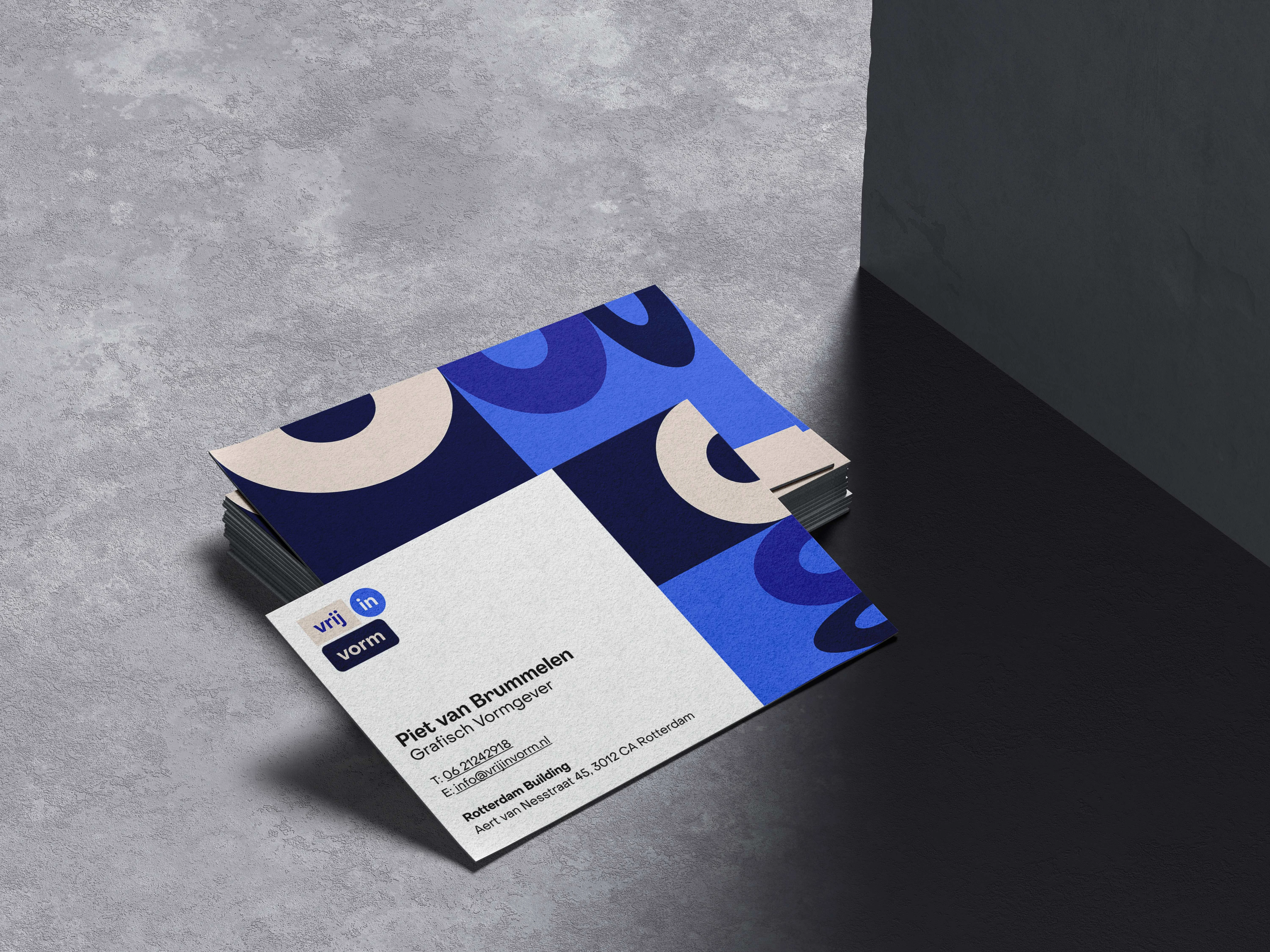
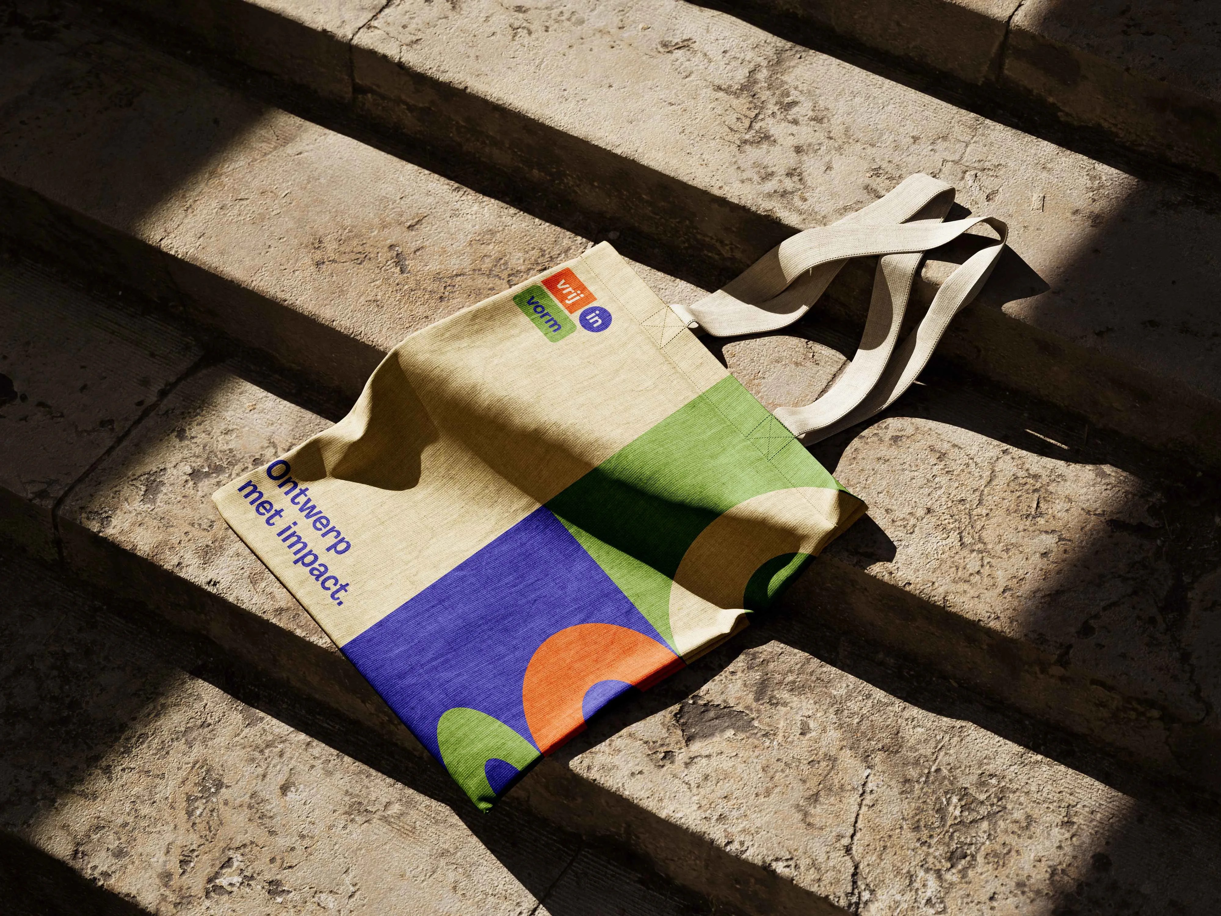
Dynamic Logo
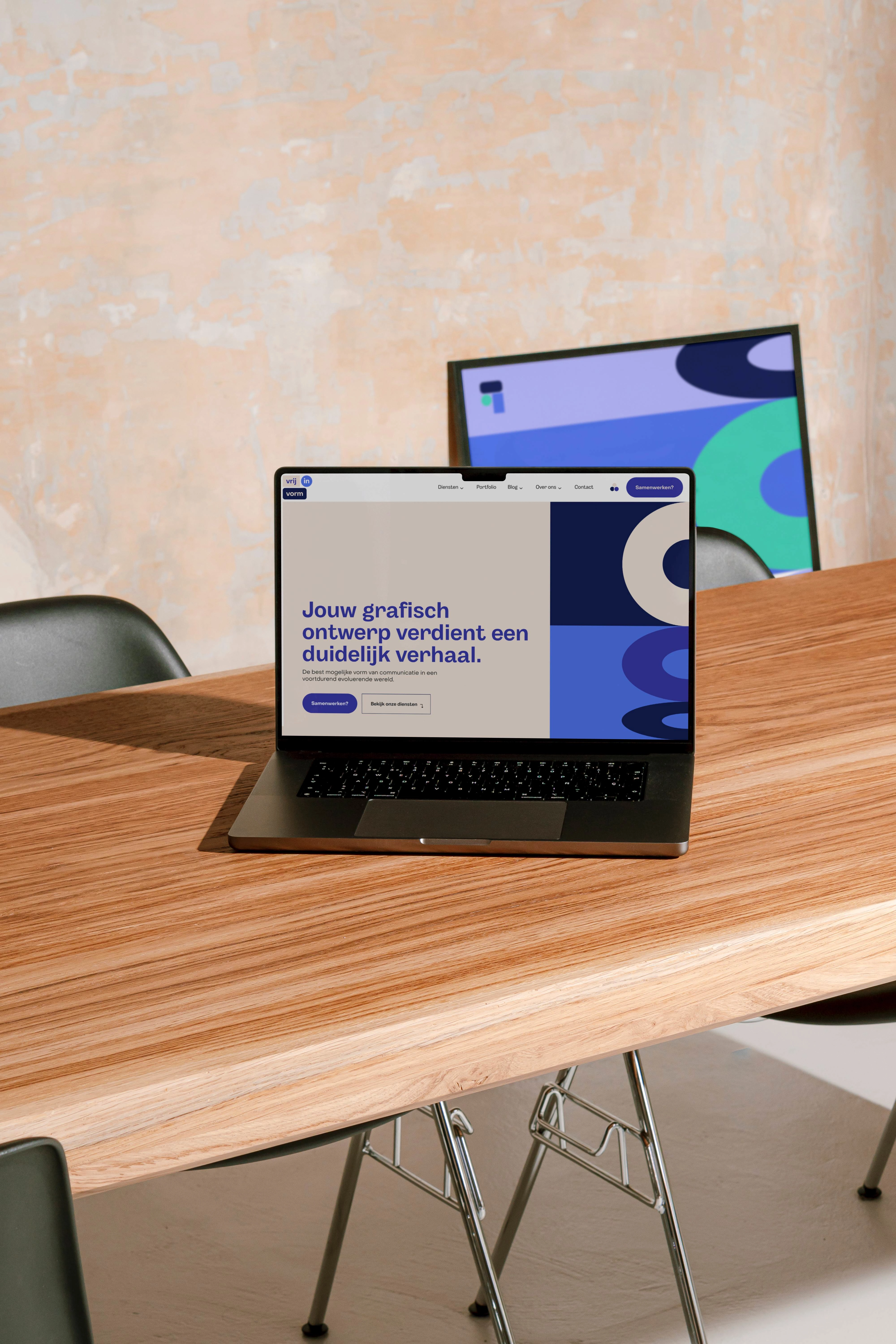
After 7.5 years of continuous growth and professional development, Vrij in Vorm, a Rotterdam-based graphic design agency, came to me for and asked for a new website. After talking we concluded that they were in need of not just a new website, but a complete brand refresh. So we embarked on a major brand refresh to better align with its evolved vision and identity. This rebranding included a new logo, complete new visual style, dynamic patterns, changeable colour themes, a completely redesigned website, and a refined approach to visual storytelling. The objective was to create an identity that reflected the agency's creativity, flexibility, and impactful design philosophy while providing an engaging online experience for visitors.

Challenge
The key challenge was to translate Vrij in Vorm's core values—flexibility, creativity within boundaries, and the power of simplicity—into a visual identity that felt fresh, professional, and representative of the agency's journey. Additionally, the website needed to provide an intuitive and immersive experience that allowed visitors to explore the agency's work, services, and creative philosophy effortlessly.
Approach
The new logo was designed to encapsulate the essence of Vrij in Vorm—flexibility, simplicity, and energy. The logo's minimalistic shapes and vibrant color palette symbolize freedom within form, aligning perfectly with the agency's name and mission. The updated visual identity conveys the creativity and professionalism that define Vrij in Vorm's approach to design.
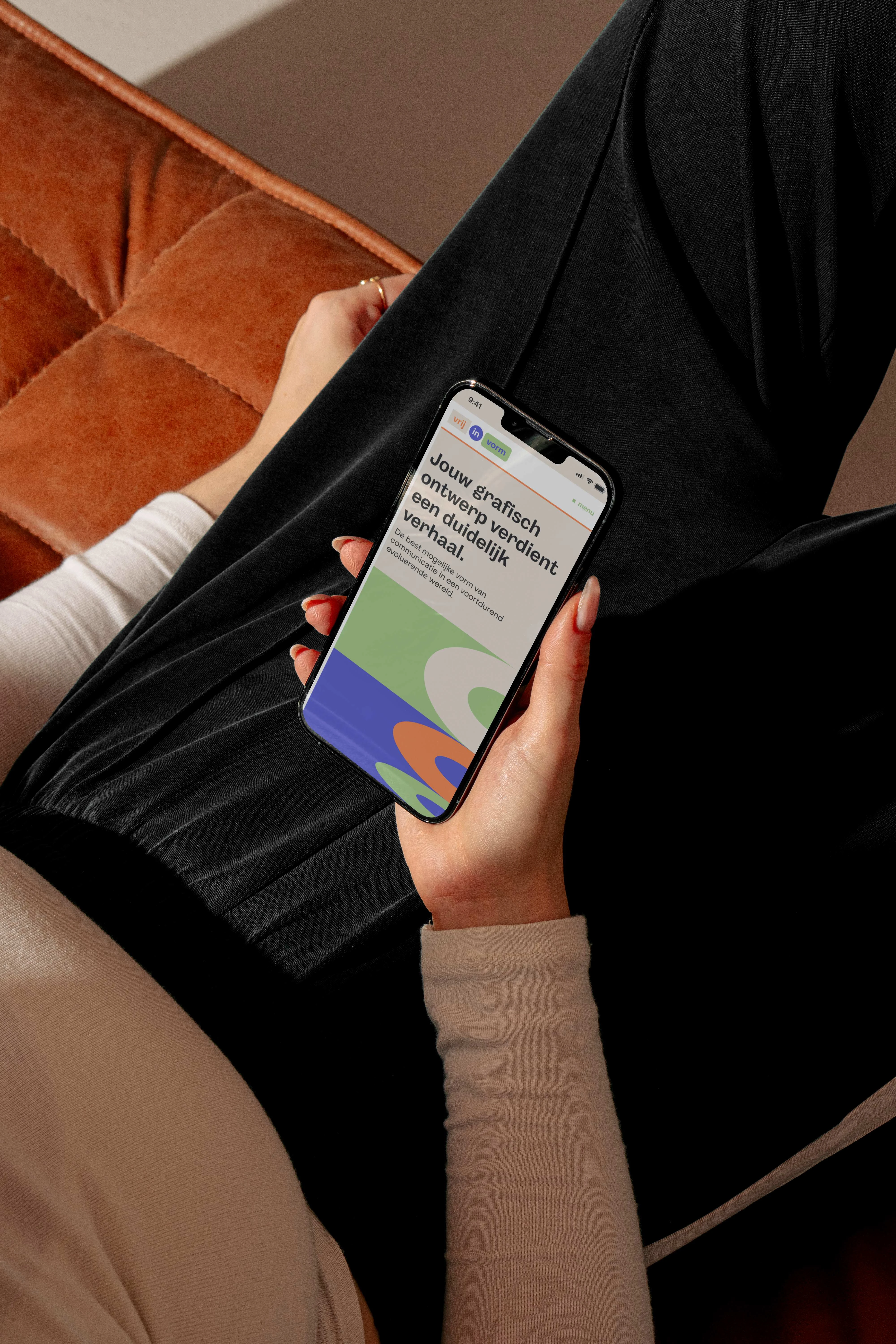
The website was redesigned with a focus on usability and interactivity. The introduction of a "Color Switch" feature allows visitors to personalize their experience by choosing the atmosphere that suits them—whether it's a fresh, vibrant look or a warm, calm vibe. This feature embodies the agency's emphasis on flexibility and user empowerment. The site's content was crafted to showcase the agency's work while highlighting their creative philosophy in a clear and engaging manner. Responsive design elements ensure that the website provides an optimal experience across all devices.
Outcome
The brand refresh and new website successfully reinvigorated Vrij in Vorm's identity, presenting a confident and mature image that aligns with its growth over the years. The new logo and visual identity effectively communicate the agency's core values, while the updated website provides a dynamic platform for engaging with clients and showcasing work.
Feedback from clients and the community has been overwhelmingly positive, praising the modern, professional look and the innovative features like the Color Switch. This rebranding effort has helped position Vrij in Vorm as a forward-thinking design agency that remains committed to delivering impactful and meaningful visual communication.
Key Results
Enhanced brand perception through a new logo and cohesive visual identity.
Improved website engagement due to the interactive Color Switch feature.
Positive feedback on the modern and creative rebranding.
Conclusion
The rebranding and website redesign for Vrij in Vorm mark an important milestone in the agency's journey. By embracing flexibility, creativity, and impactful design, Vrij in Vorm now has a refreshed brand identity that speaks to its values and aspirations, providing an engaging experience for both existing and potential clients.
Like this project
Posted Dec 2, 2024
Brand refresh and website redesign for Vrij in Vorm, highlighting creativity, flexibility, and impactful design, with a focus on user engagement.


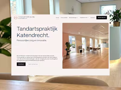
Tandartspraktijk Katendrecht