Brand Identity for Health Communication Consultancy

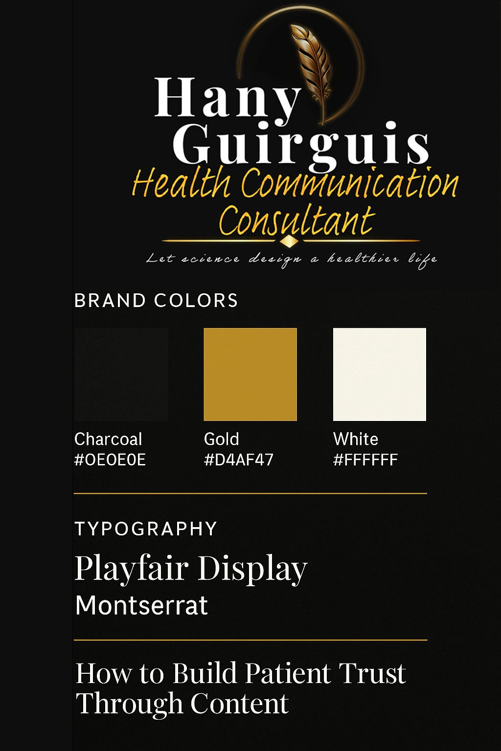
Hany Guirguis

Brand Identity for Health Communication Consultancy
Description
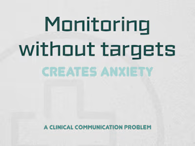
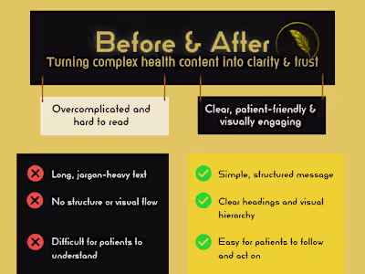
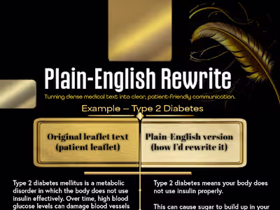
Brand identity system designed to communicate trust, clarity, and clinical credibility for a health communication consultancy.
What I Did
Defined brand values and tone
Selected colour palette and typography
Designed logo and visual system
Applied brand across health content examples
Outcome
A professional, calm identity suitable for patient communication and healthcare teams.
Like this project
Posted Dec 6, 2025
Brand identity system designed to communicate trust, clarity, and clinical credibility for a health communication consultancy.
Likes
0
Views
0