Le Chic Branding
Matt Losapio
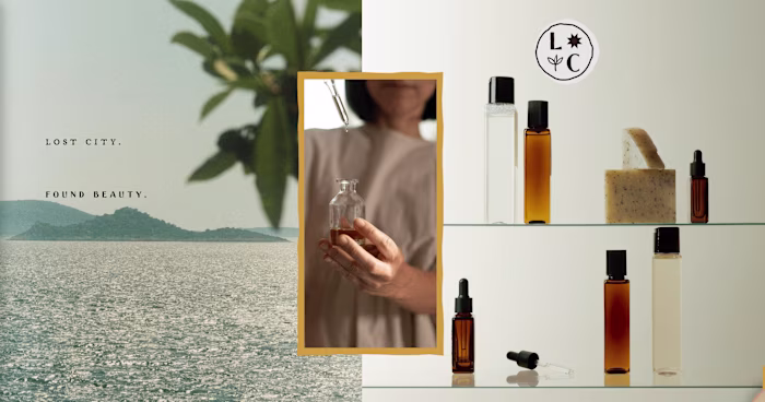
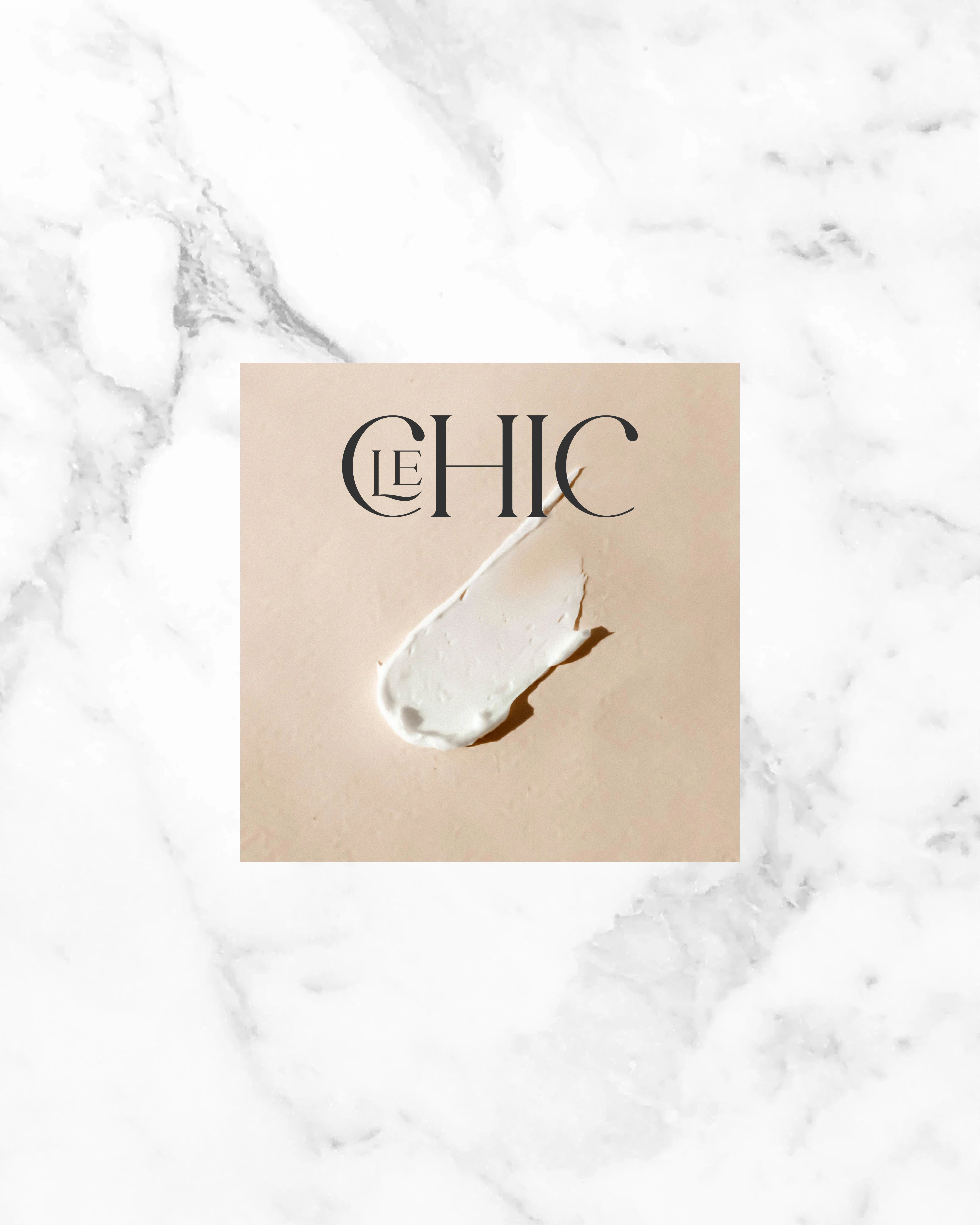
Brand Identity for Le Chic Cosmetics
Logo Design, Art Direction, Packaging, Typography, Color Palette and Photography Style.
An Identity for Luxury Cosmetics 💅
The founder of Le Chic envisioned a brand that felt luxurious and exclusive. My role was to translate that vision into a visual language that invites and lingers in the mind.
Drawing inspiration from high fashion editorials and timeless elegance, I curated a palette of textures, tones, and typography that speak to a premium experience. From the refined packaging details to the classic serif fonts, every element was chosen to feel intentional and elevated.
The photographic style is softly desaturated and cinematic, evokes the glamour of old Hollywood, an echo of vintage beauty reimagined for the modern moment. This delicate balance between nostalgia and sophistication gives the brand its distinct sense of allure.
What emerged is an identity that feels both rare and resonant, a quiet kind of luxury that leaves a lasting impression.
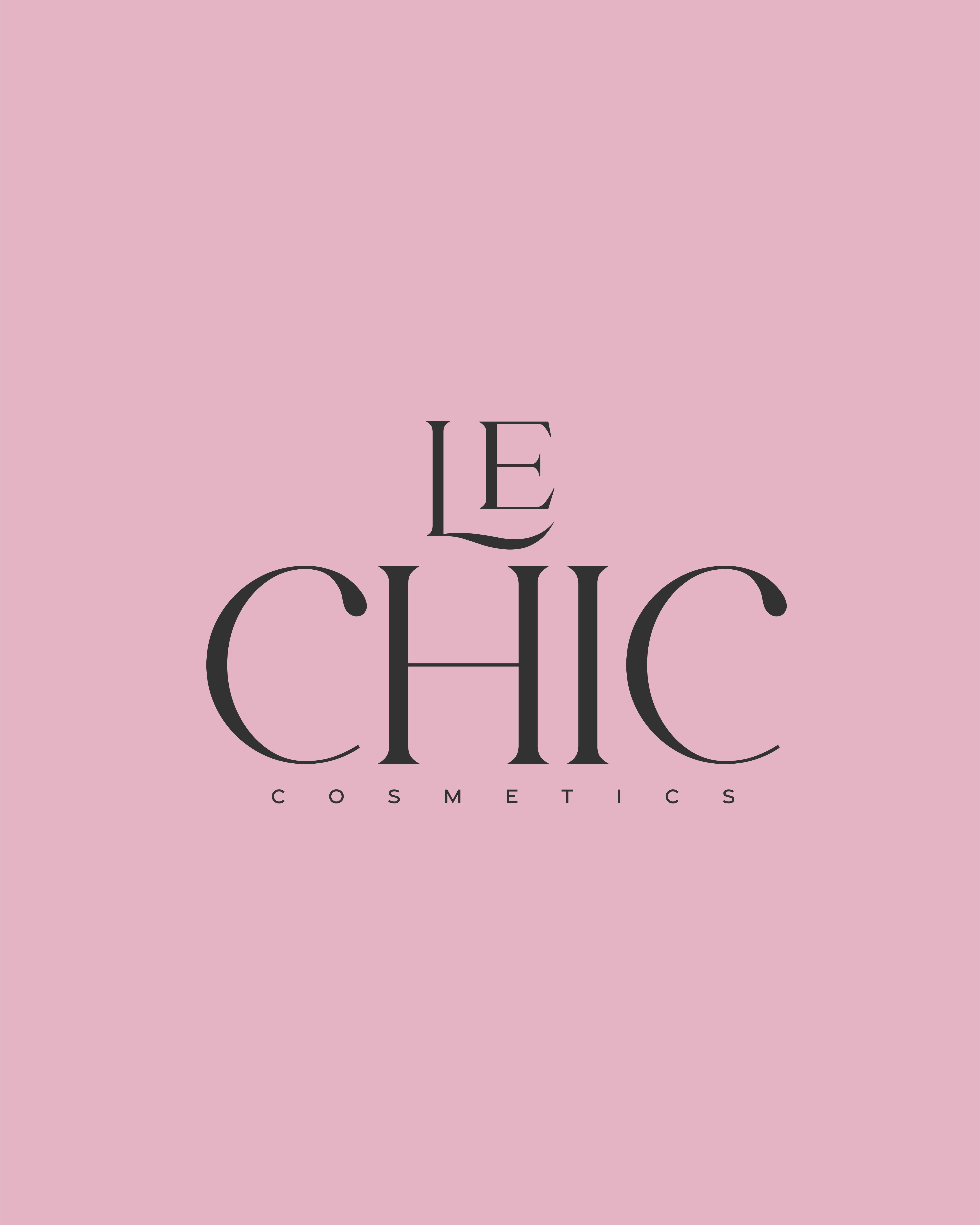
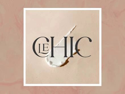
The main logo is simple, striking, and clear. The unique typography gives us opportunities to use the letters as individual sub marks.
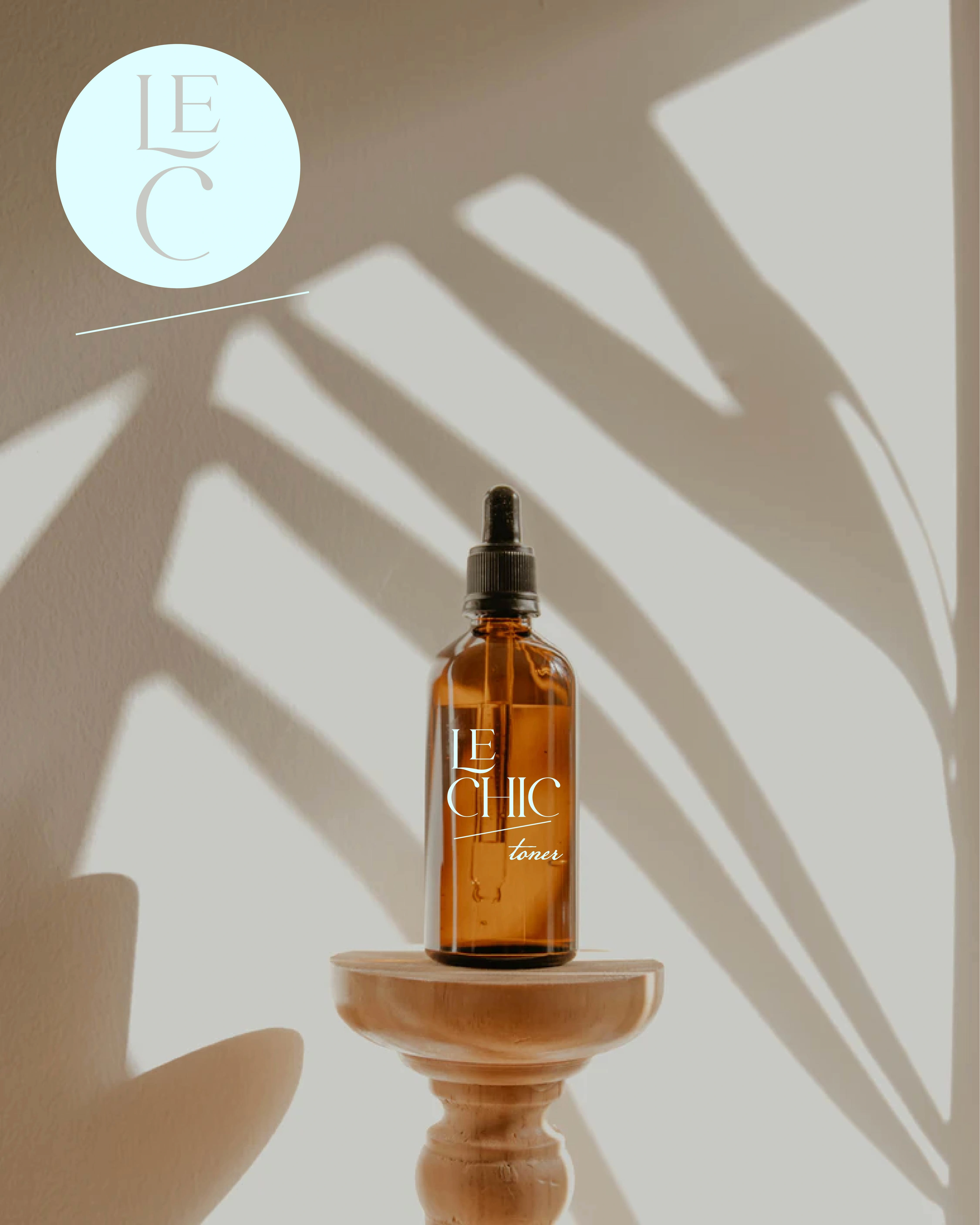
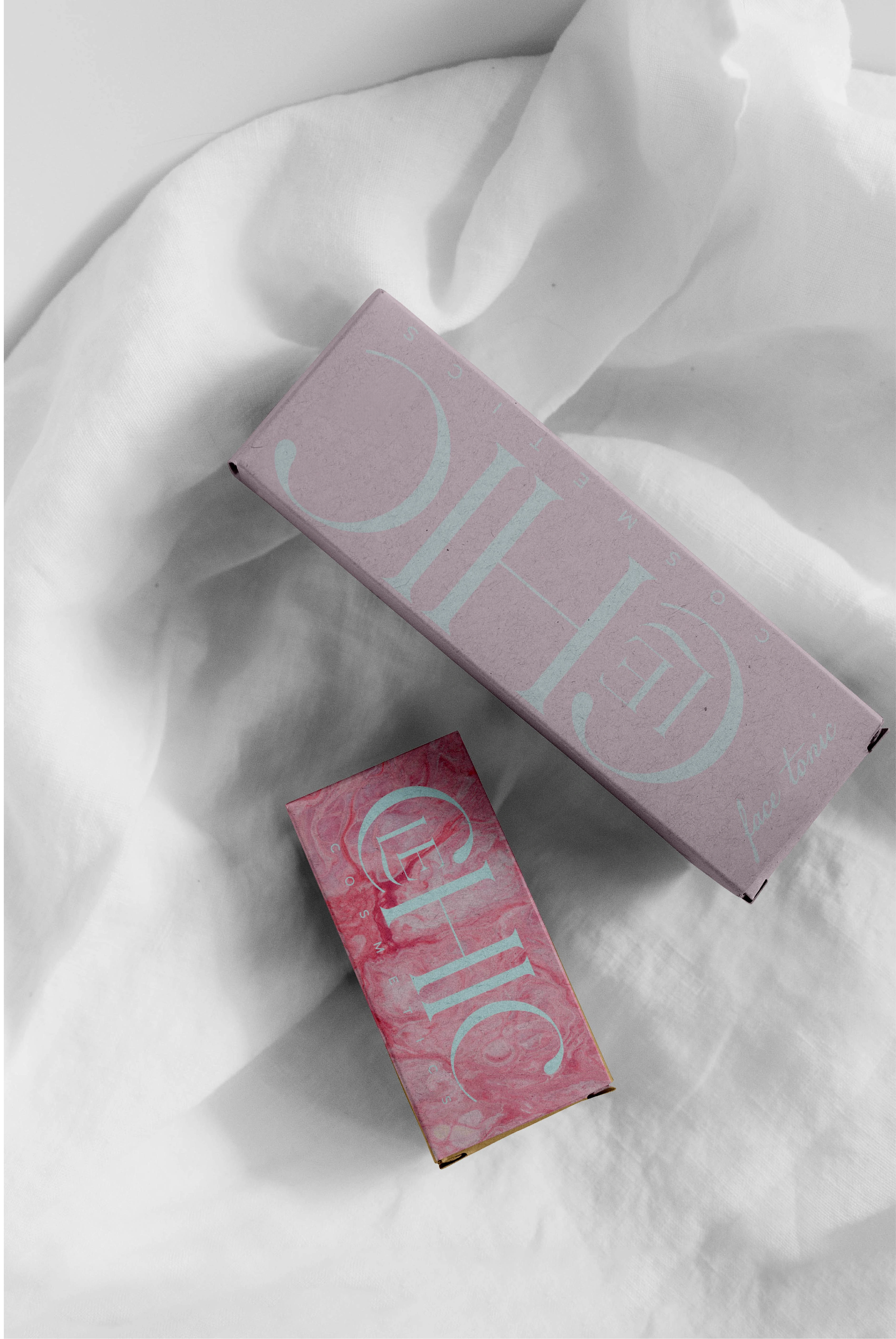
An example of Toner packaging. Simple and beautiful.
Feel.🖐️
For the bottle above, I envisioned a label that felt as tactile as it looks. Something you don’t just see, but sense.
Instead of a traditional printed paper label, I opted for a raised vinyl transfer applied directly to the glass. This subtle elevation invites touch, adding a layer of texture. Paired with the soft, delicate fragrance and the warm clarity of amber glass, the result is a fully immersive sensory experience.
An example of an Ad template.
Making use of the marble texture for packaging concepts.
Le Chic focuses heavily on natural sources for their products, and the packaging is a good opportunity to reflect that. Using recycled materials, the Kraft cardboard boxes have a roughened and raised texture, adding another layer to the design.
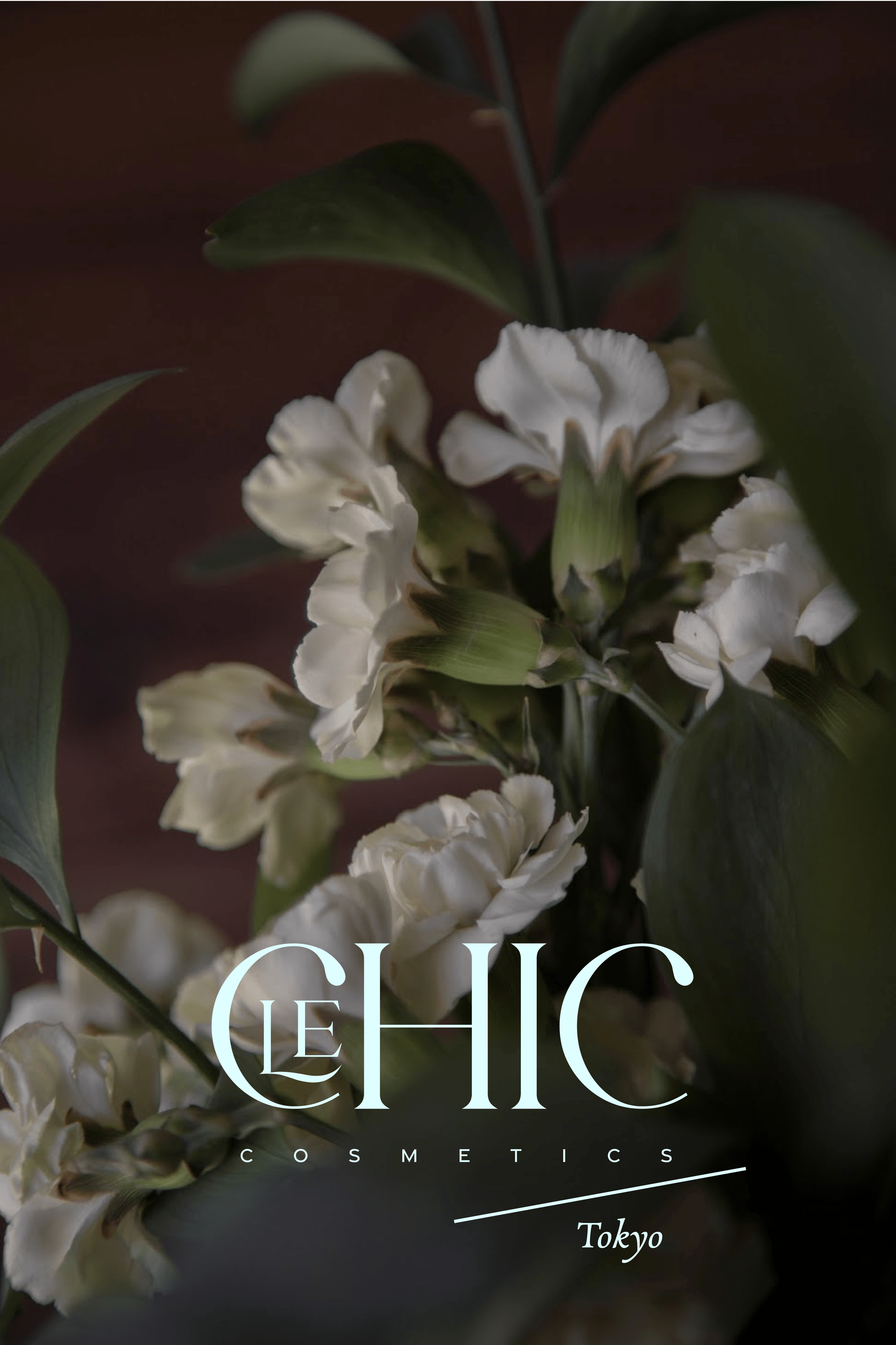
Natural, floral elements are a prominent part of the branding.
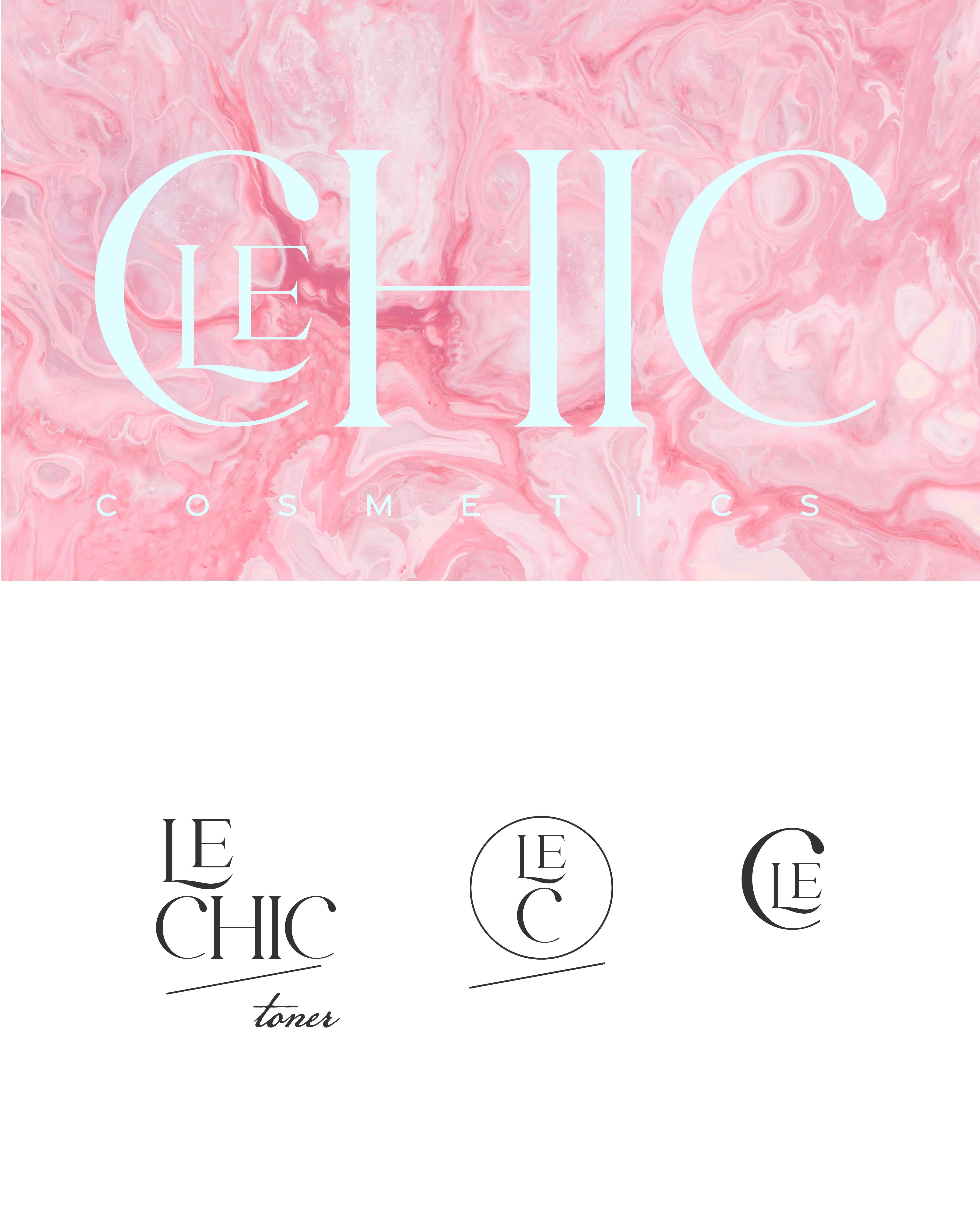
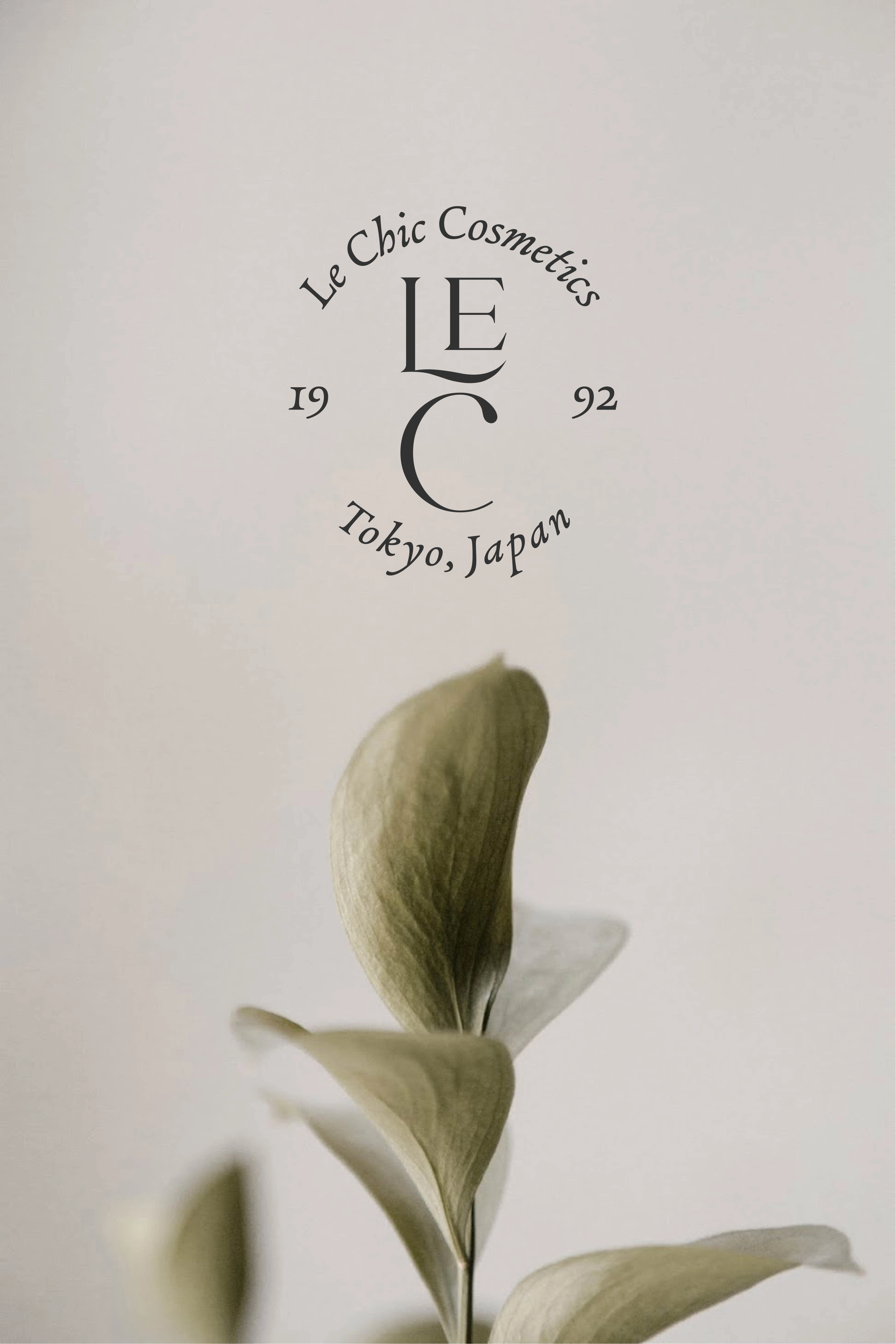
Variations of the logo along with Sub Marks. One variation shows how a product type would be displayed with the logo by including the "toner" text.
Inspired by minimalist Japanese design, this is an example of an ad for Le Chic.
Like this project
Posted May 12, 2022
Brand Exploration for Le Chic Cosmetics
Likes
1
Views
195
Clients
1110design