Car Rental Service Landing Page Design
Sagar Donda
🧾 Project Overview
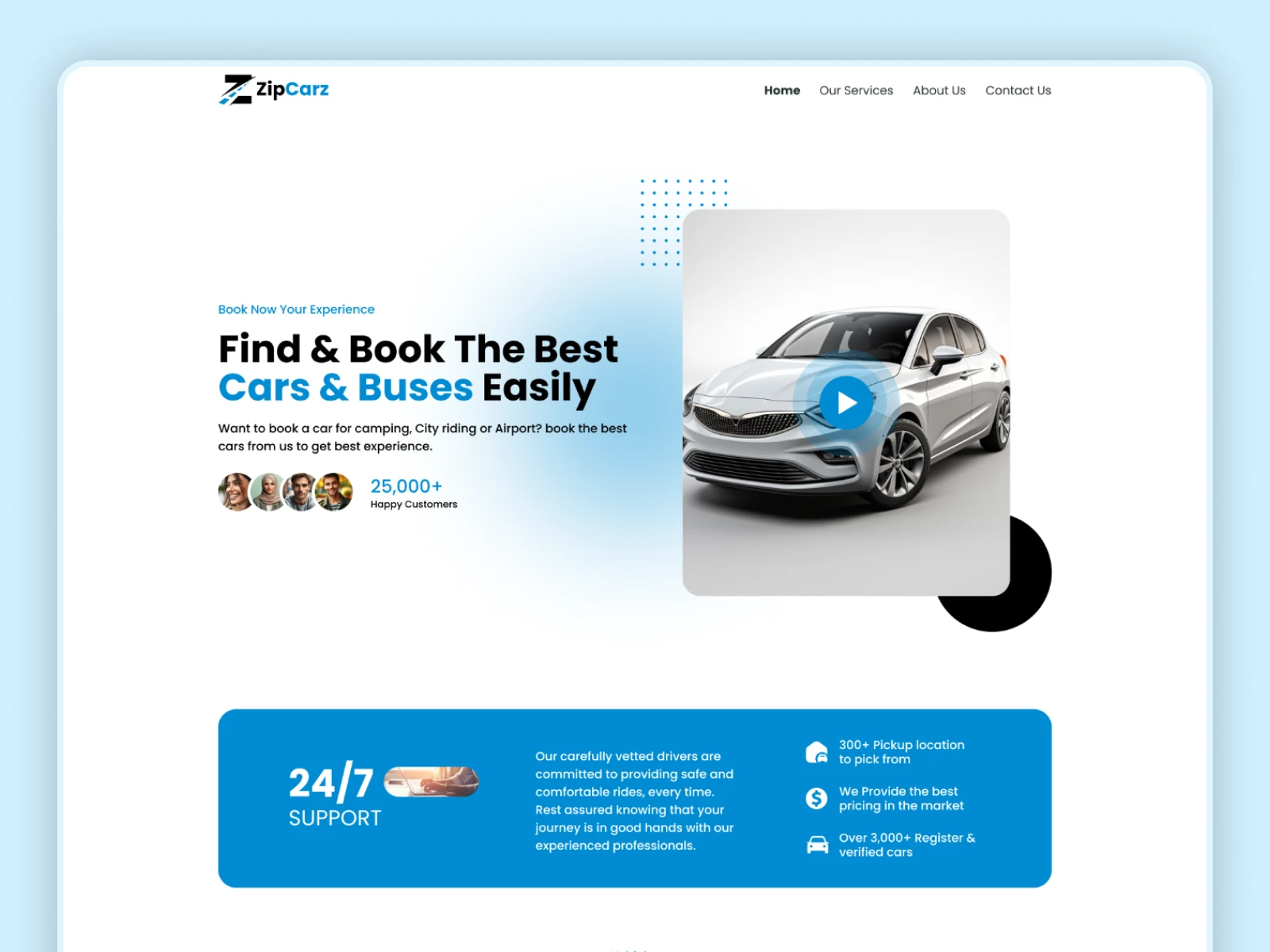
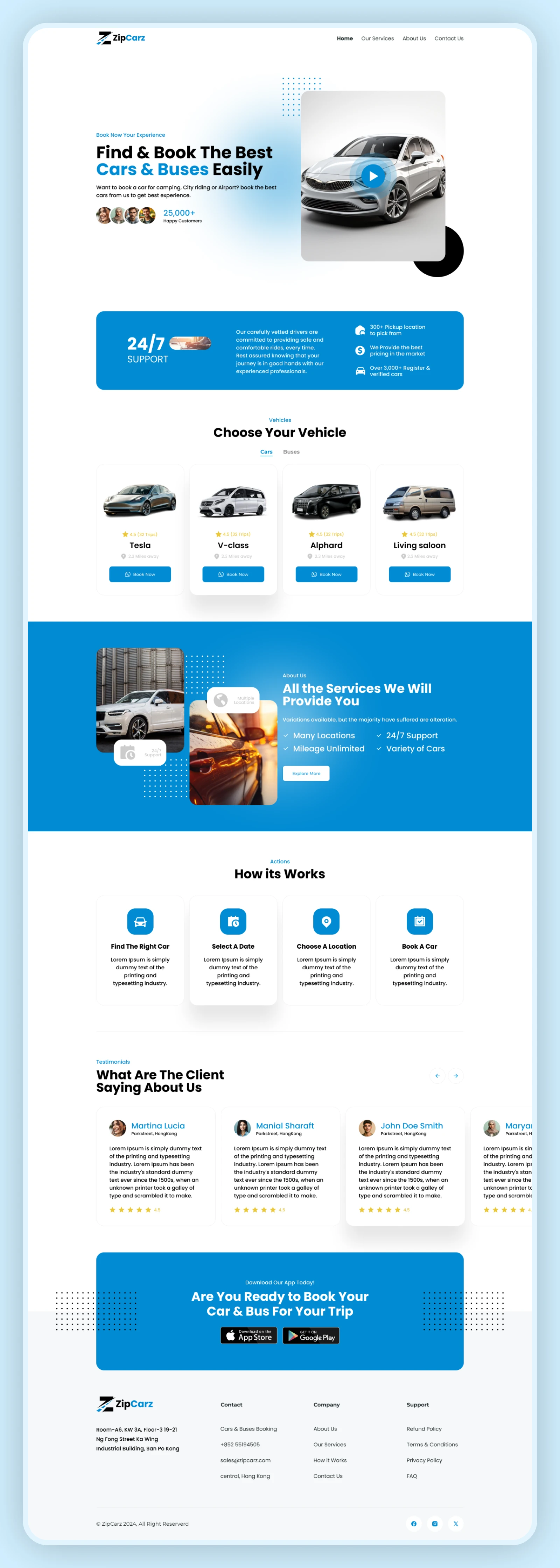
This project focuses on designing a landing page for a car rental service, inspired by platforms like Zipcar. The goal was to create a clean and user-friendly experience that allows users to quickly understand the service and take action.
The design emphasizes easy navigation, strong visuals, and clear call-to-actions to guide users toward booking or exploring available cars.
🎯 Challenges
• Communicating the service clearly in a short time
• Designing a simple and intuitive booking flow
• Making the page visually engaging
• Structuring content for better conversion
• Highlighting key benefits effectively
⚠️ Problems
• Users may not understand the service quickly
• Poor layout can reduce conversions
• Weak CTAs can affect user action
• Too much content can overwhelm users
💡 Solution
• Designed a clear hero section with strong value proposition
• Structured the page into easy-to-scan sections
• Used clear and visible CTA buttons (book now, explore)
• Added visual hierarchy for better readability
• Focused on a clean and modern layout
⭐ Key Features
• Hero section with strong messaging
• Car listing/service overview
• Simple booking-focused layout
• Clear call-to-action buttons
• Clean and modern UI
• Responsive design
👨💻 My Role
• UI/UX Design
• Landing page structure and layout
• High-fidelity UI design in Figma
• Conversion-focused design
🛠 Tools
Figma
📊 Outcome
The final design provides a smooth and engaging landing page experience, helping users understand the service quickly and take action easily.
Like this project
Posted Mar 23, 2026
Designed a modern landing page for a car rental platform, focused on usability, clear messaging, and conversion.
Likes
0
Views
3