Pixoul
About
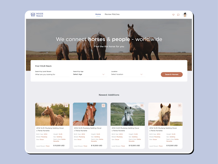
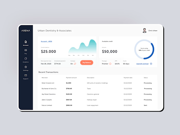
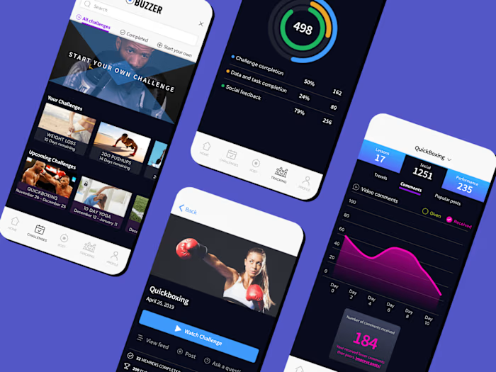
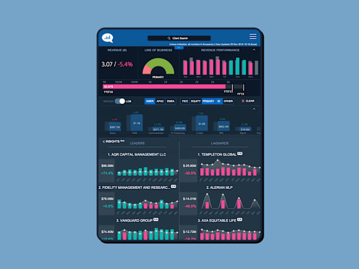
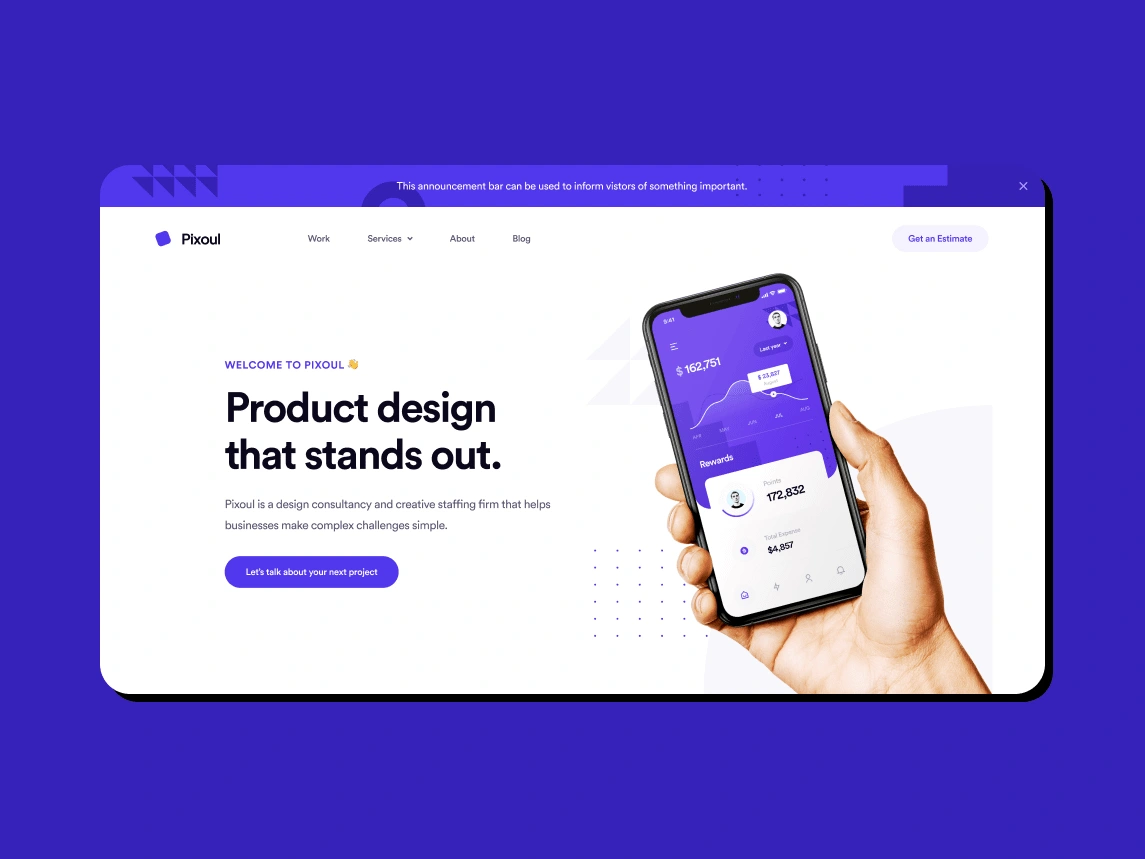
Pixoul is an agency specializing in product design and staff augmentation services. They were looking to update their website to improve UI/UX user conversion optimization.
Our Solution
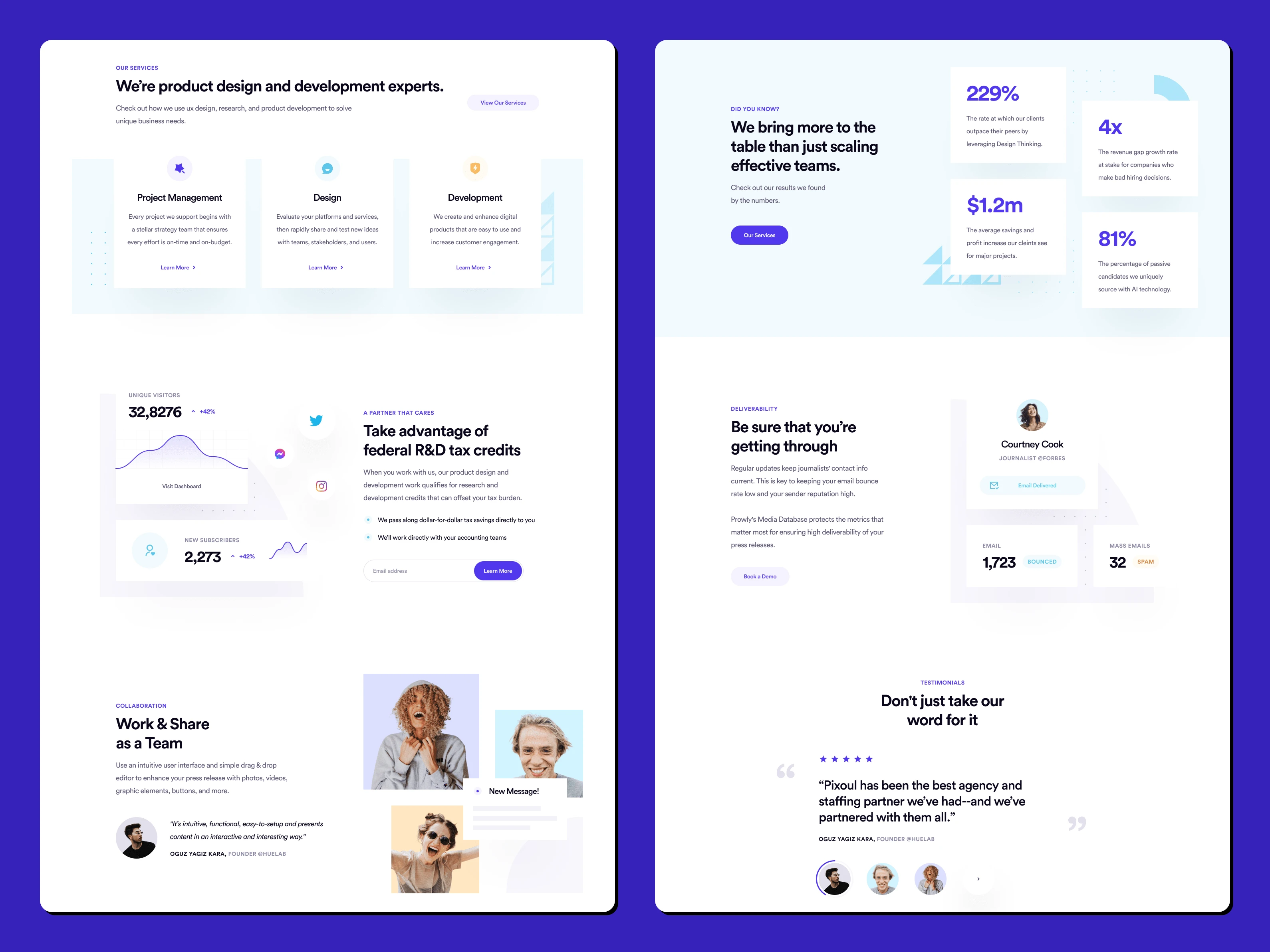
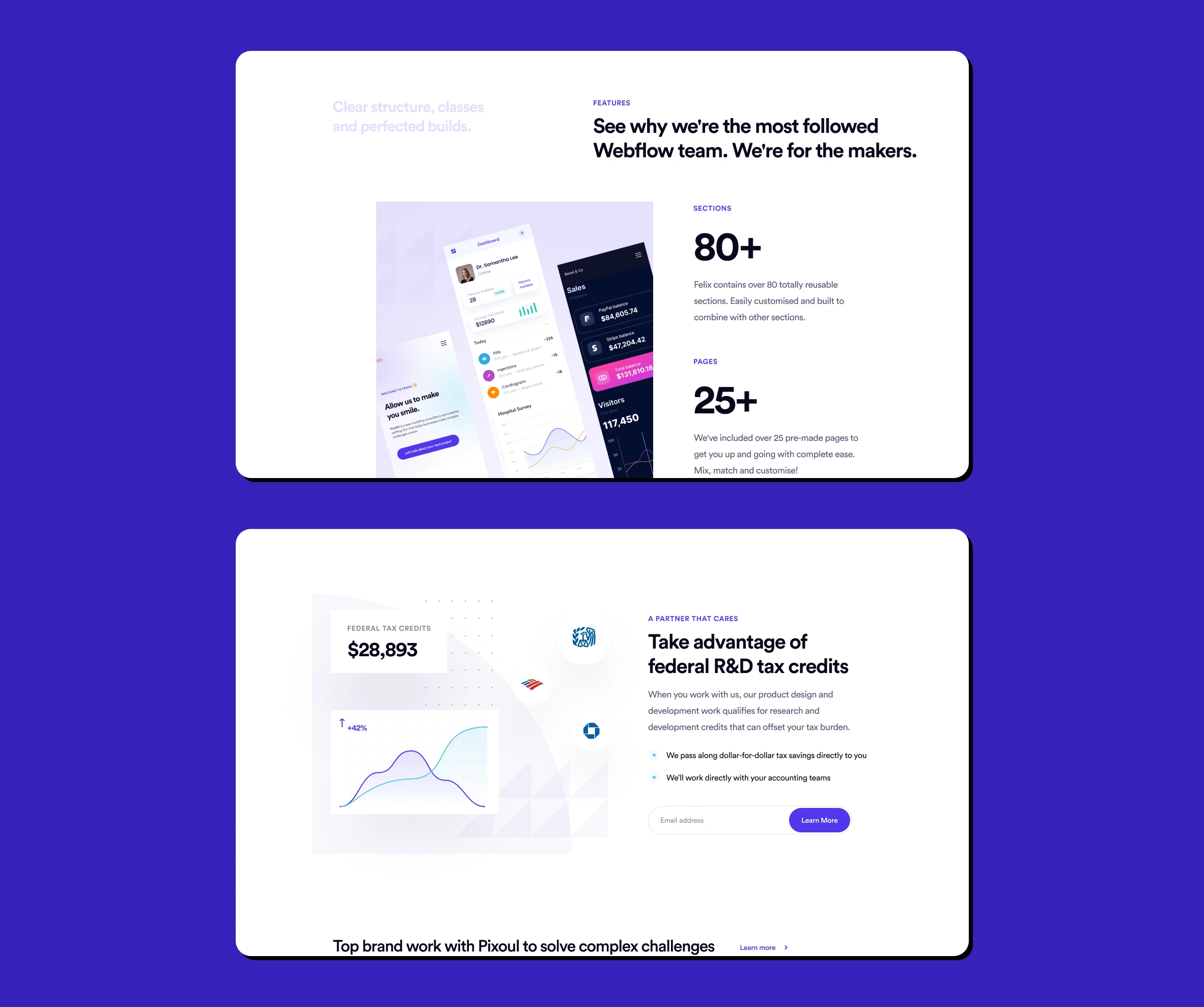
In order to increase user conversion, we started by identifying the main value propositions of the agency, those that they want users to stop and look at. We then started creating the visual language (graphical elements, photos, icons and text) and a user-centric layout that would catch the user's attention and entice them to click the CTA to learn more about the services.All-in-all, we delivered a minimalistic and modern design with specific visual cues that shape the user's experience in a way that would draw their focus to the agencies value props and services.
Like this project
Posted Sep 18, 2023
Website redesign for a product design and staffing agency.

