Marcom.co: Brand Identity Design
Siya Nzimande
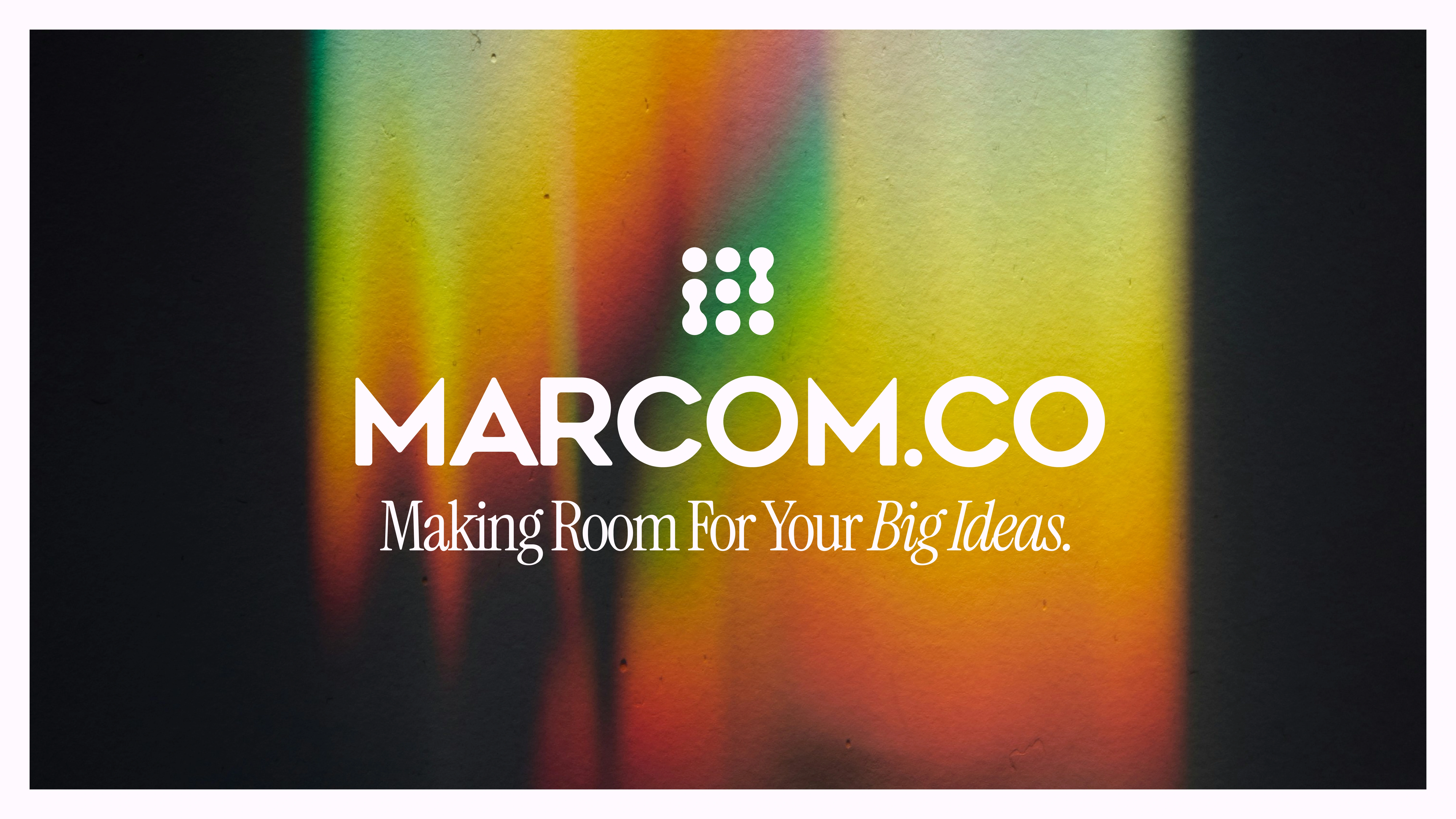
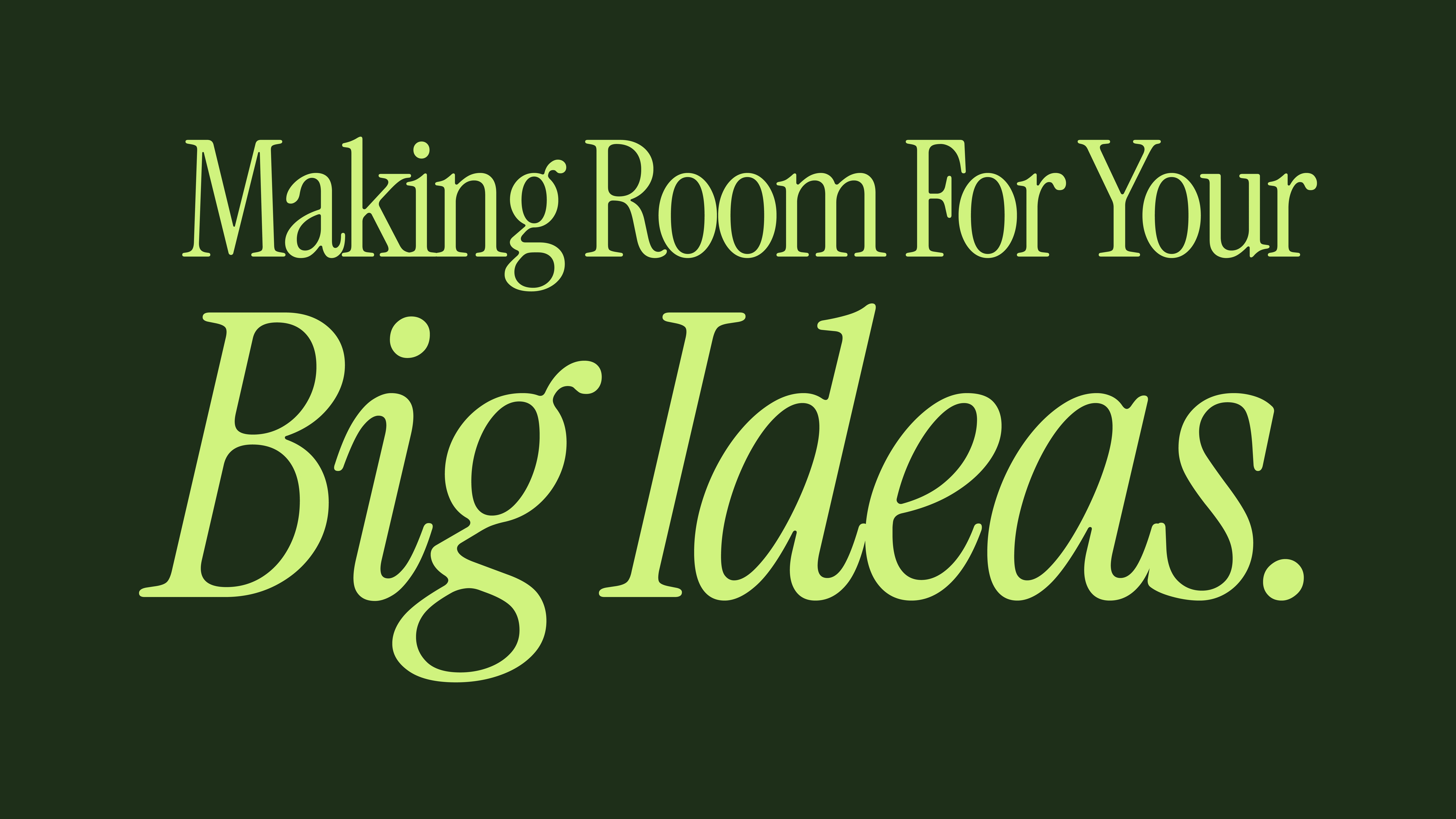
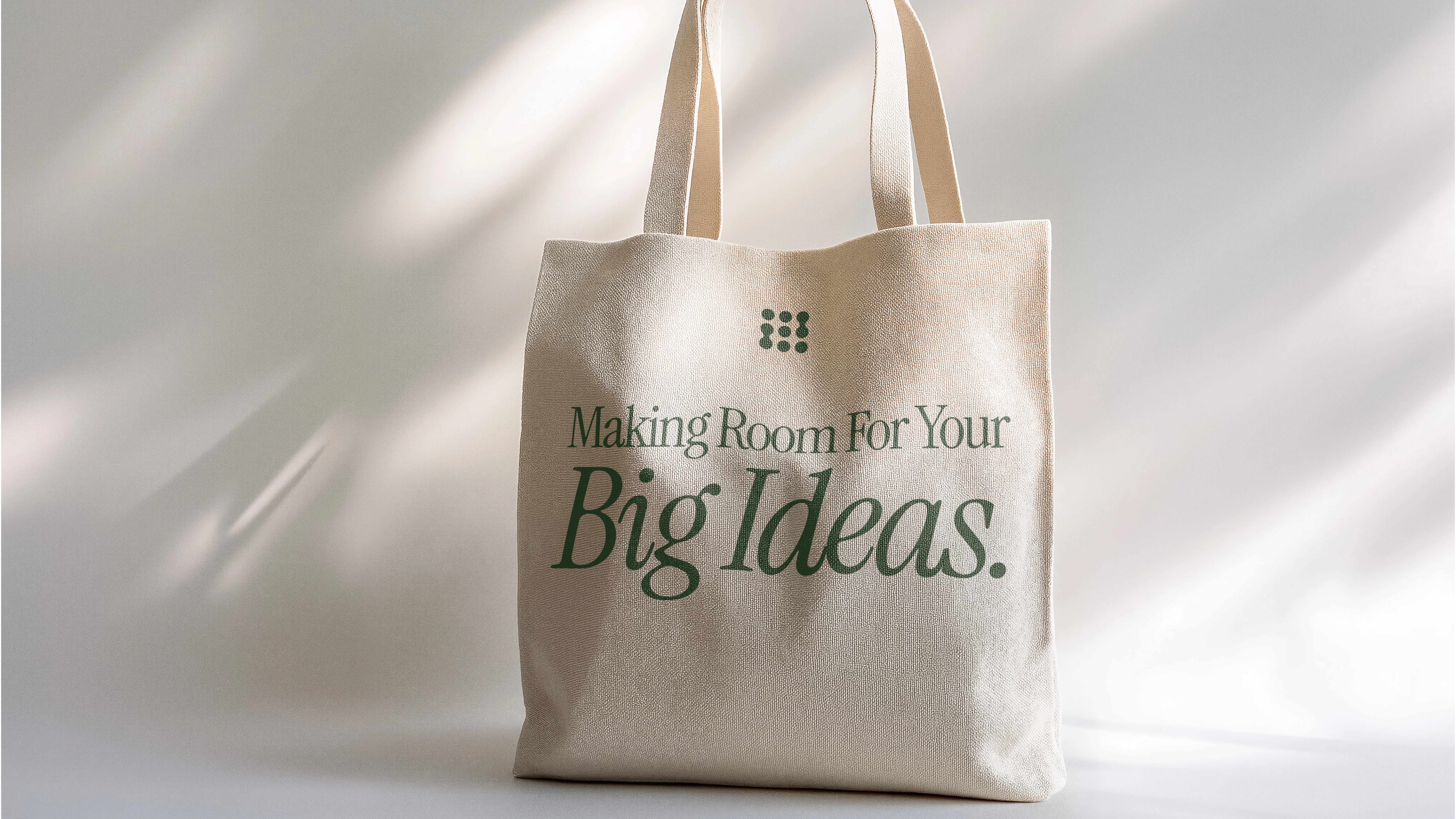
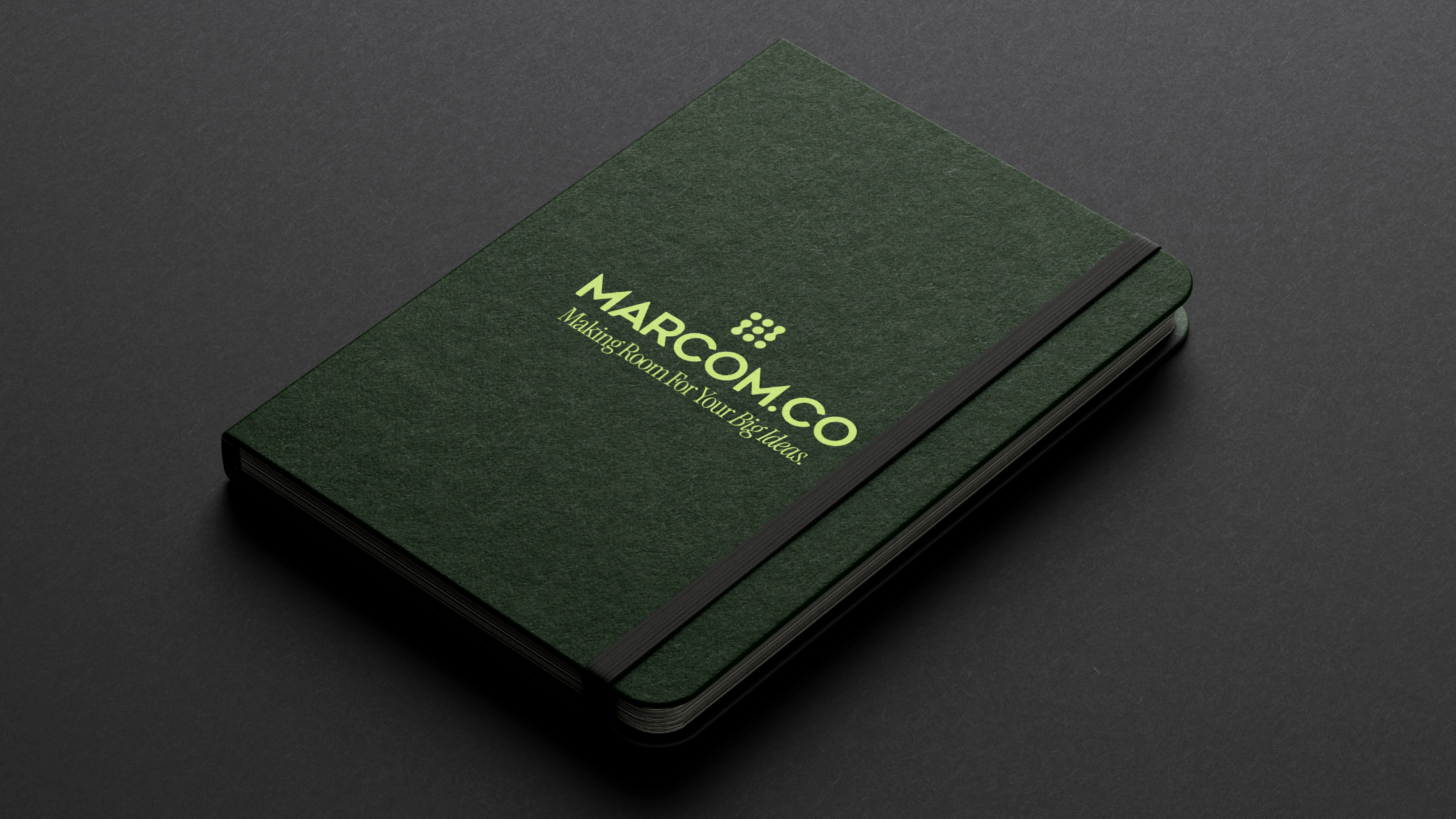
Making room for your big ideas.
Marcom.co is a fresh marketing consultancy designed to give entrepreneurs, startups, and dreamers the structure they need to grow—with none of the fluff. Built on clarity, trust, and support, this brand system is designed to feel like a deep breath in a cluttered industry.
This identity leans into two core archetypes: The Innocent and The Everyman. Together, they shape a tone that’s clear, approachable, and quietly confident. Everything—from the typeface to the color story to the voice—is meant to feel like a hand on your shoulder that says, “We’ve got this.”
Marcom.co is a fresh marketing consultancy designed to help entrepreneurs, startups, and dreamers navigate the complexities of growth with clarity and support—without the fluff. The brand identity was crafted to communicate a sense of calm and confidence in an often overwhelming industry, making room for big ideas.
At the heart of this design is a brand system that’s approachable yet authoritative, built on trust, clarity, and support. The identity leans into two core archetypes: The Innocent and The Everyman. These archetypes together shape a tone that feels clear, reassuring, and quietly confident.
From the choice of typeface to the color palette and the voice of the brand, every design element was chosen to evoke a sense of comfort and confidence—like a hand on your shoulder saying, “We’ve got this.” This brand system is designed to offer entrepreneurs the support they need to thrive.
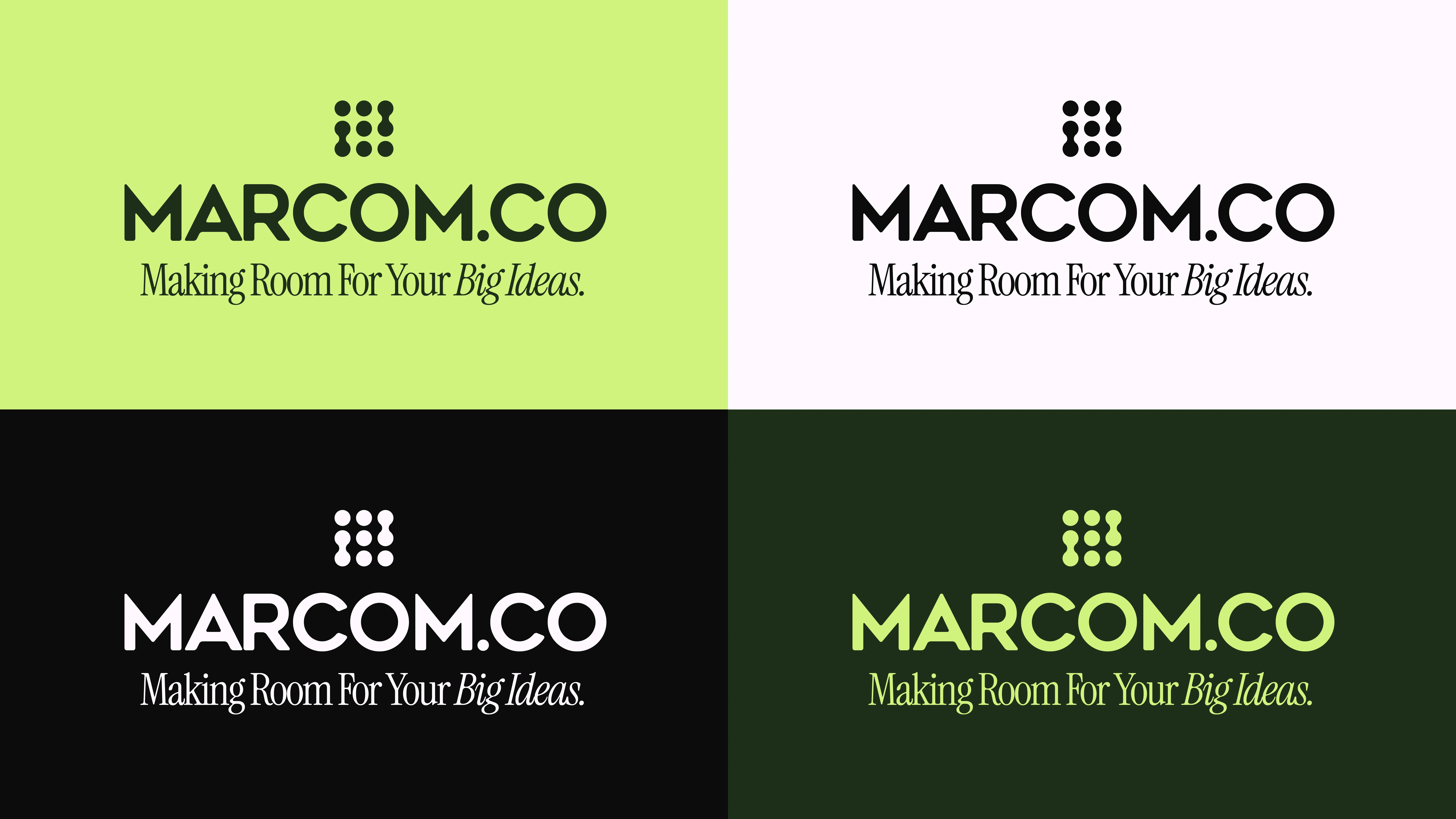
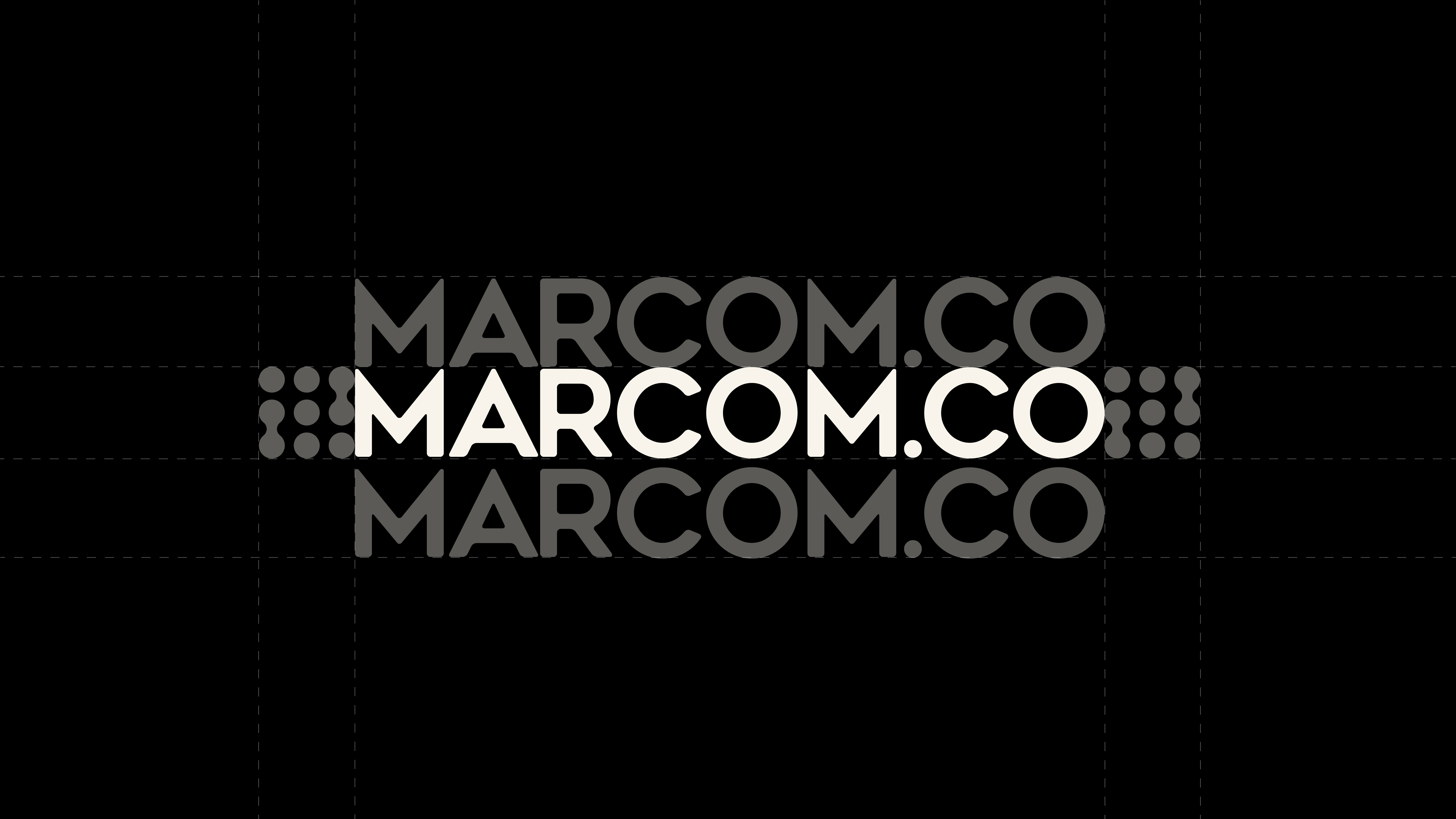
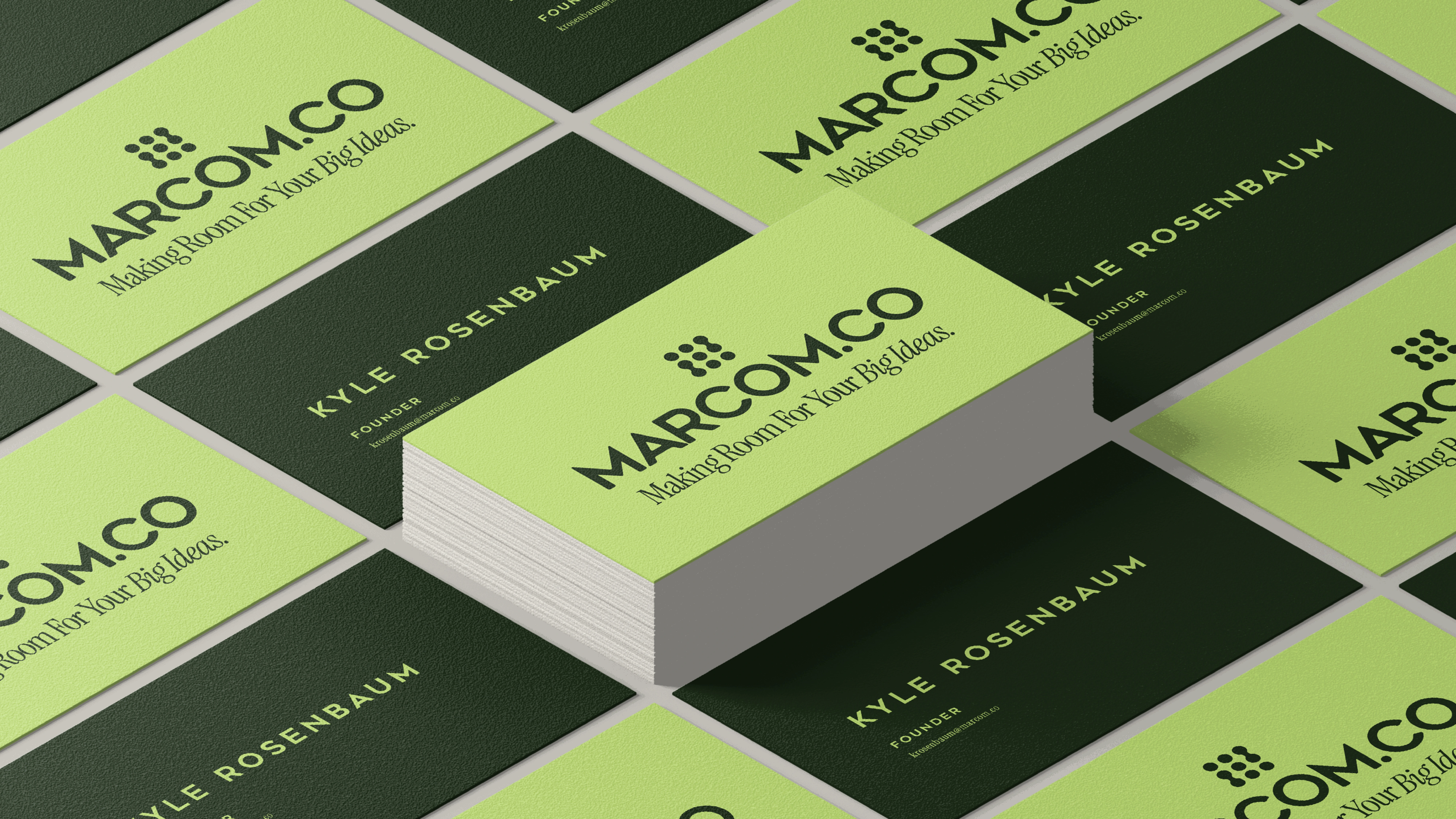
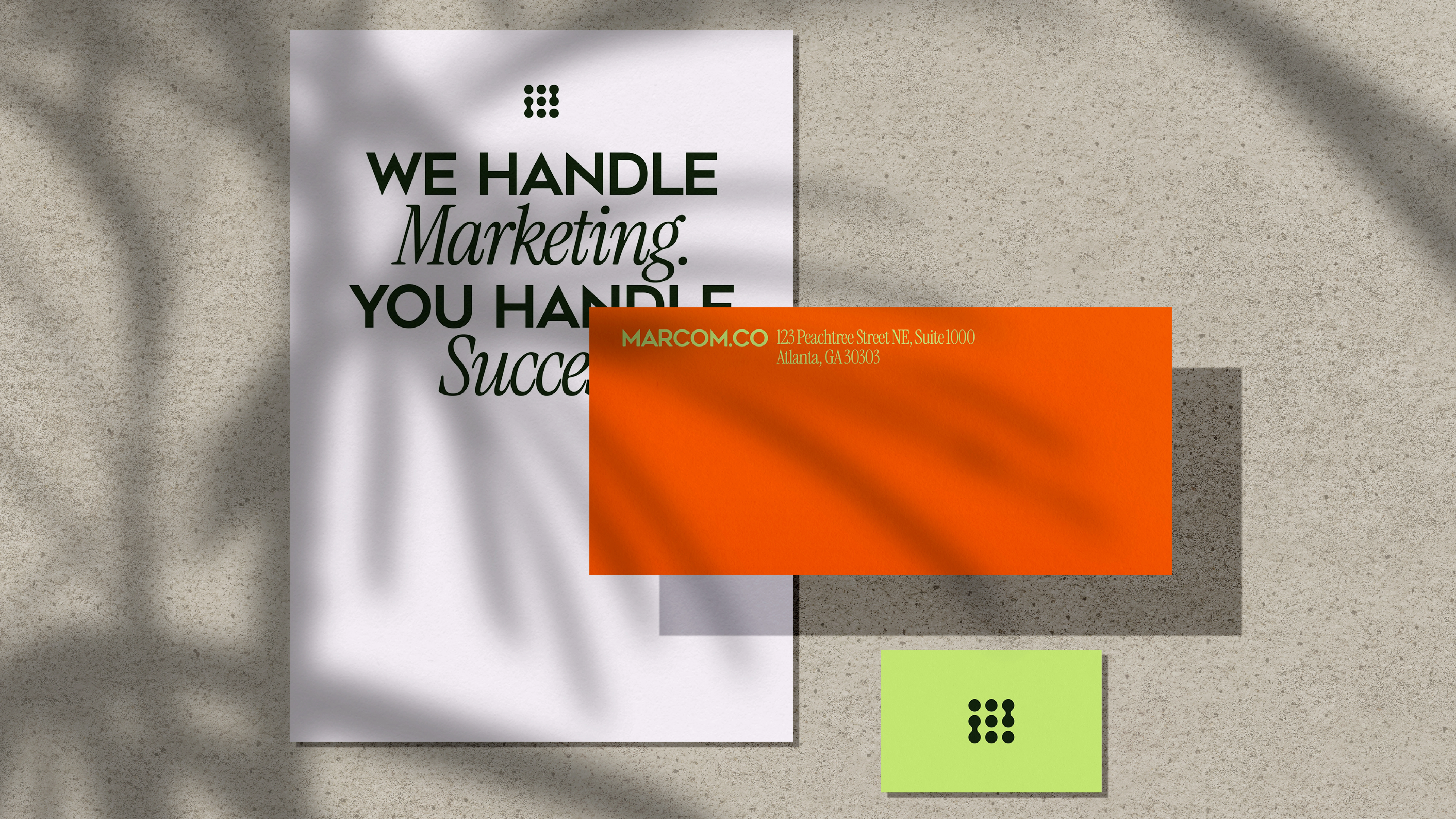
The Marcom.co wordmark is simple and bold. Its geometric construction creates balance and presence, without shouting. Designed to showcase confidence, professionalism while still being open and inviting - it also is crafted to scale across platforms, it’s equally at home on a business card, website landing page or a billboard.
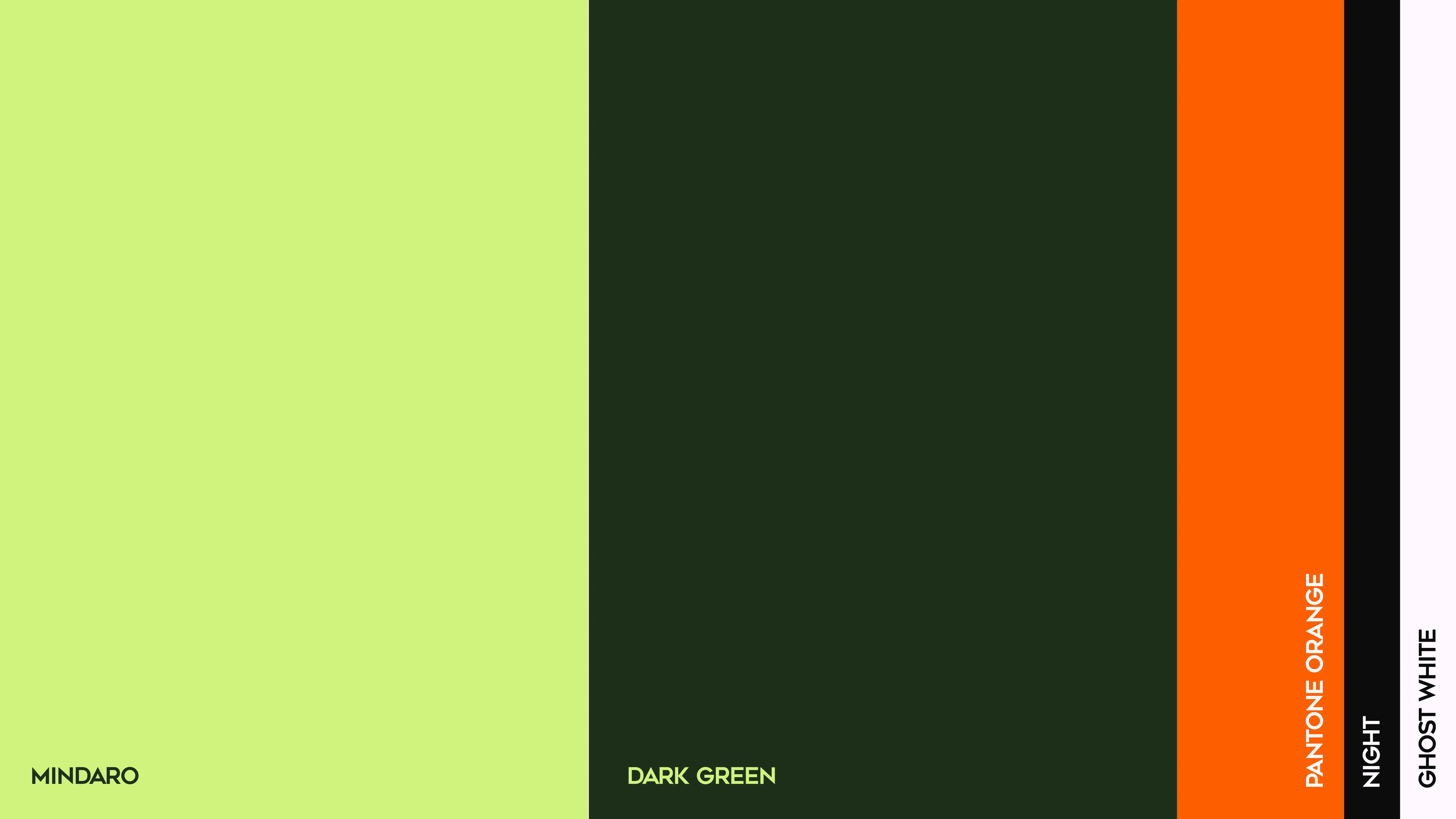
The color palette is intentionally minimal, but full of personality.
1) Deep Greens form the foundation—trustworthy, natural, and grounded. They hold space without overwhelming it.
2) Punchy Orange delivers energy in just the right dose. It’s a moment of momentum, used to highlight calls to action and spark attention.
3) Black and White do the quiet work of contrast, clarity, and structure—essentials in a system built around simplicity.
Each shade plays a role, and together they create a visual rhythm that’s both vibrant and composed.
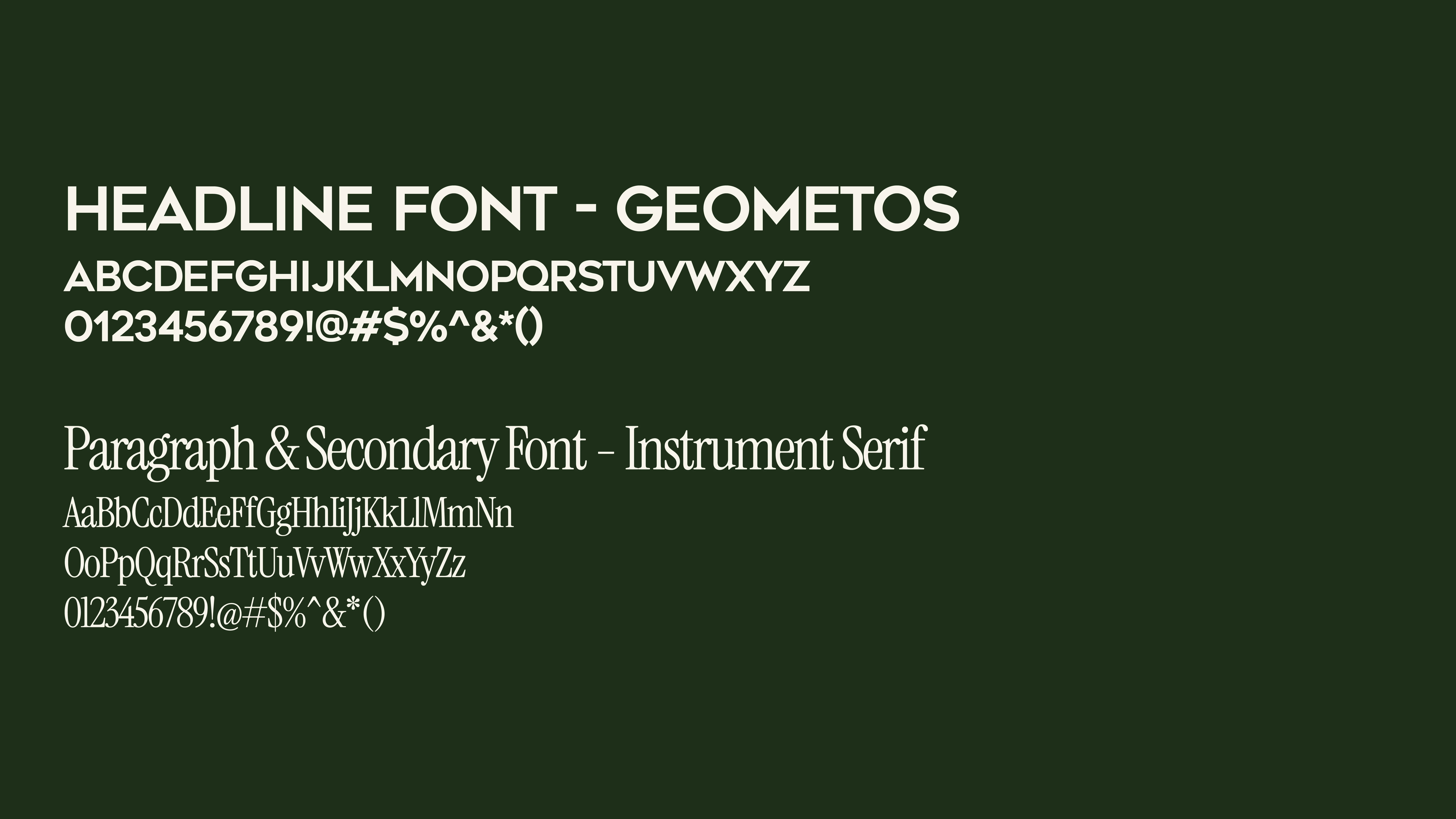
The Typography for the Marcom.co visual identity is about balance.
Geometos, the headline font, brings structure and modernity. It’s used in all caps—clean, bold, and no-nonsense without encroaching into the space of a technology brand or more formal corporate.
Instrument Serif, the body font, softens the system. It’s warm, elegant, and legible, giving longer-form copy a human touch.
Together, the fonts reflect the dual energy of the brand: professional but never cold, smart but never distant.


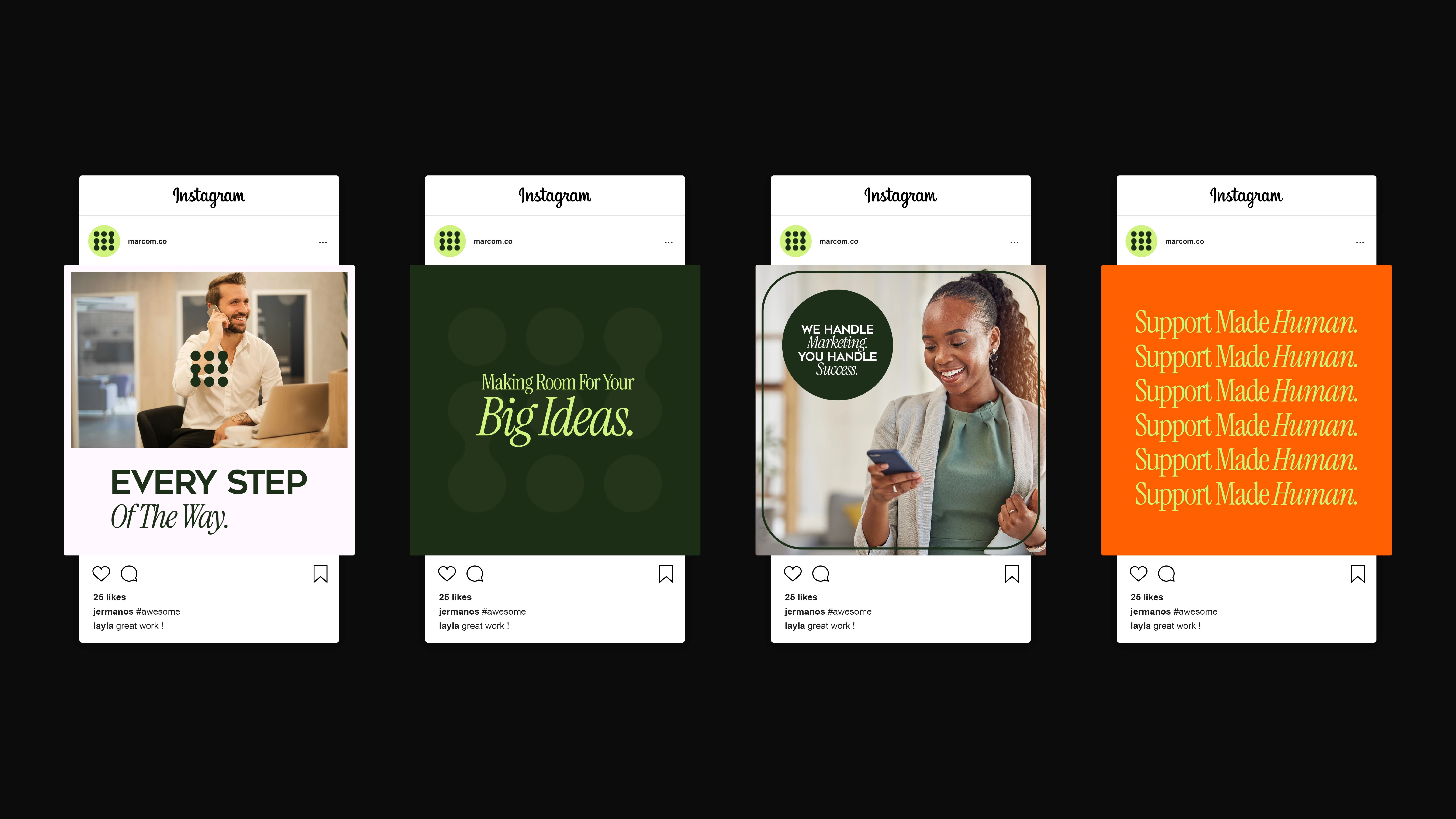

The voice of Marcom.co is clear, encouraging, and practical.
It doesn’t oversell. It doesn’t overwhelm. It communicates with the same ease it promises clients.
Think:
1) Light touch, heavy impact.
2) Human over hype.
3) Simple, honest, and quietly motivating.
Lines like “We handle marketing. You handle success.” are more than just copy—they’re promises. The tone is always approachable, always warm, and always in service of making room for what matters most:
The client’s big ideas.
Like this project
Posted Apr 26, 2025
Crafted the brand identity for Marcom.co, a consultancy for entrepreneurs, blending clarity and support to create a calm, confident, and approachable feel.
Likes
2
Views
24
Timeline
Feb 24, 2025 - Apr 11, 2025