Fitness Membership Kajabi Website Design and Development

Ademola Oladunjoye

Fitness Membership Website: Turning Browsers into Members
Industry: Gym and fitness
Platform: Kajabi
Scope: Full website design and build
The Brief
[One sentence on what the client asked for, in their words if you can, e.g. “needed a site that moved visitors from curiosity to booking a class.”]
A gym website has one job: get someone from “just looking” to “booked.” Most fitness sites bury that path under generic stock photos and a wall of text. My goal was a site with real attitude that still keeps the path to joining short.
Design Direction
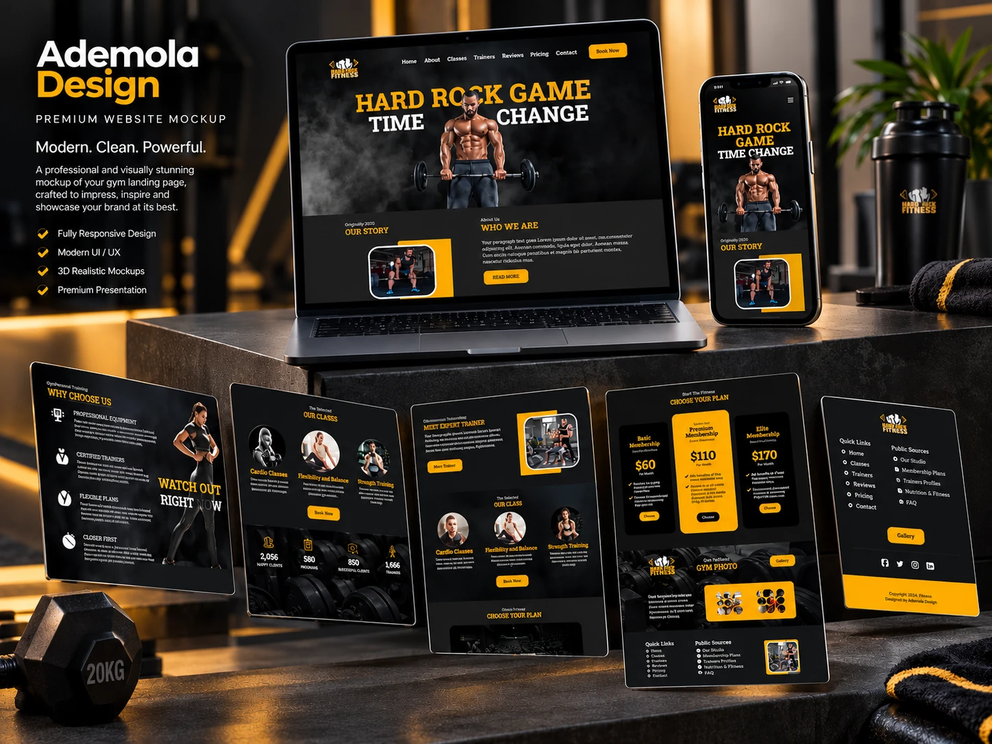
I built the look on a gold accent against charcoal and black. The contrast feels strong and energetic, matching the gym environment, and it keeps the page readable. Gold is used only for headings, buttons and key numbers, so a visitor always knows where to look next.
The recurring design move is athlete cut-outs overlapping oversized headline type, in the hero and again in the “Watch It Right Now” and “Hard Work Pays Off” bands. The type and the photography work together as one image, which gives the page movement without adding clutter.
How the Page Is Structured
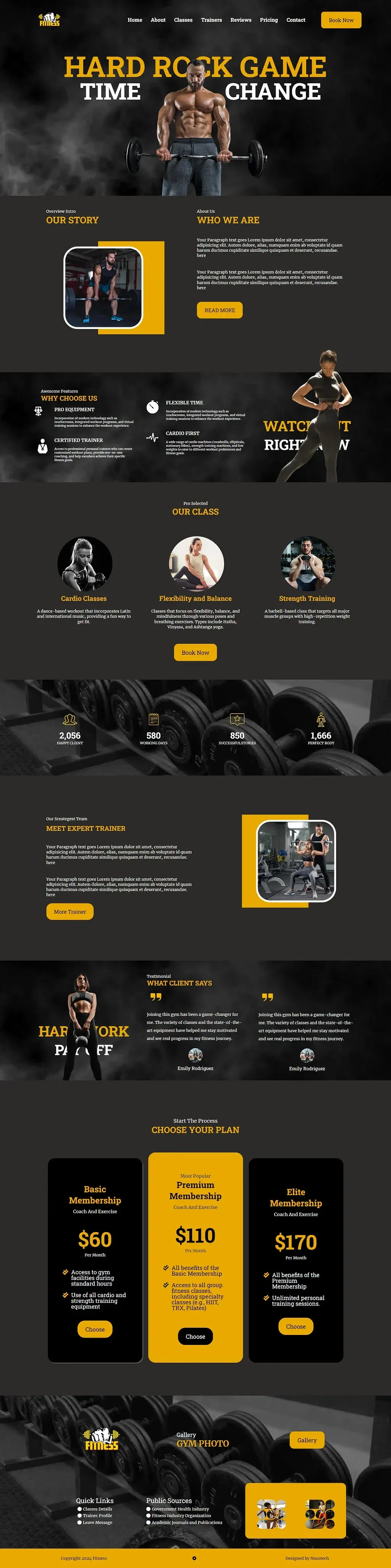
Hero: a bold headline over the athlete image, with “Book Now” fixed in the navigation so the main action is always visible.
Our Story and Who We Are: the gym’s background, paired with a framed training photo for a human, personal feel.
Why Choose Us: four short feature callouts (equipment, certified trainers, flexible hours, cardio-first) with icons, so visitors can scan the value in seconds.
Classes: three offerings in circular image cards, each with its own booking button.
Stats band: a four-counter strip over a dumbbell photo that gives the page a credibility beat before the ask.
Meet the Trainer and testimonials: a face and social proof right before pricing.
Pricing: three tiers, Basic, Premium and Elite. The middle “Most Popular” plan is solid gold while the other two stay dark, so the eye goes to the recommended option first.
Gallery and footer: a photo showcase and quick links to close the page.
Key Design Decisions
One accent colour, used sparingly: limiting gold to action points keeps the page from becoming noisy despite the heavy imagery.
Pricing as the visual climax: the highlighted middle tier uses a standard pricing technique to steer visitors toward the plan the gym most wants to sell.
Booking available everywhere: the nav button, class cards and pricing all lead to the same action.
RESULT
The full website was designed and built and delivered to the client.
Like this project
Posted Oct 10, 2026
Designed and developed a fitness membership website using Kajabi to convert visitors to members.
Likes
0
Views
1