Blume* Brand Identity and Packaging
ABOUT Blume*
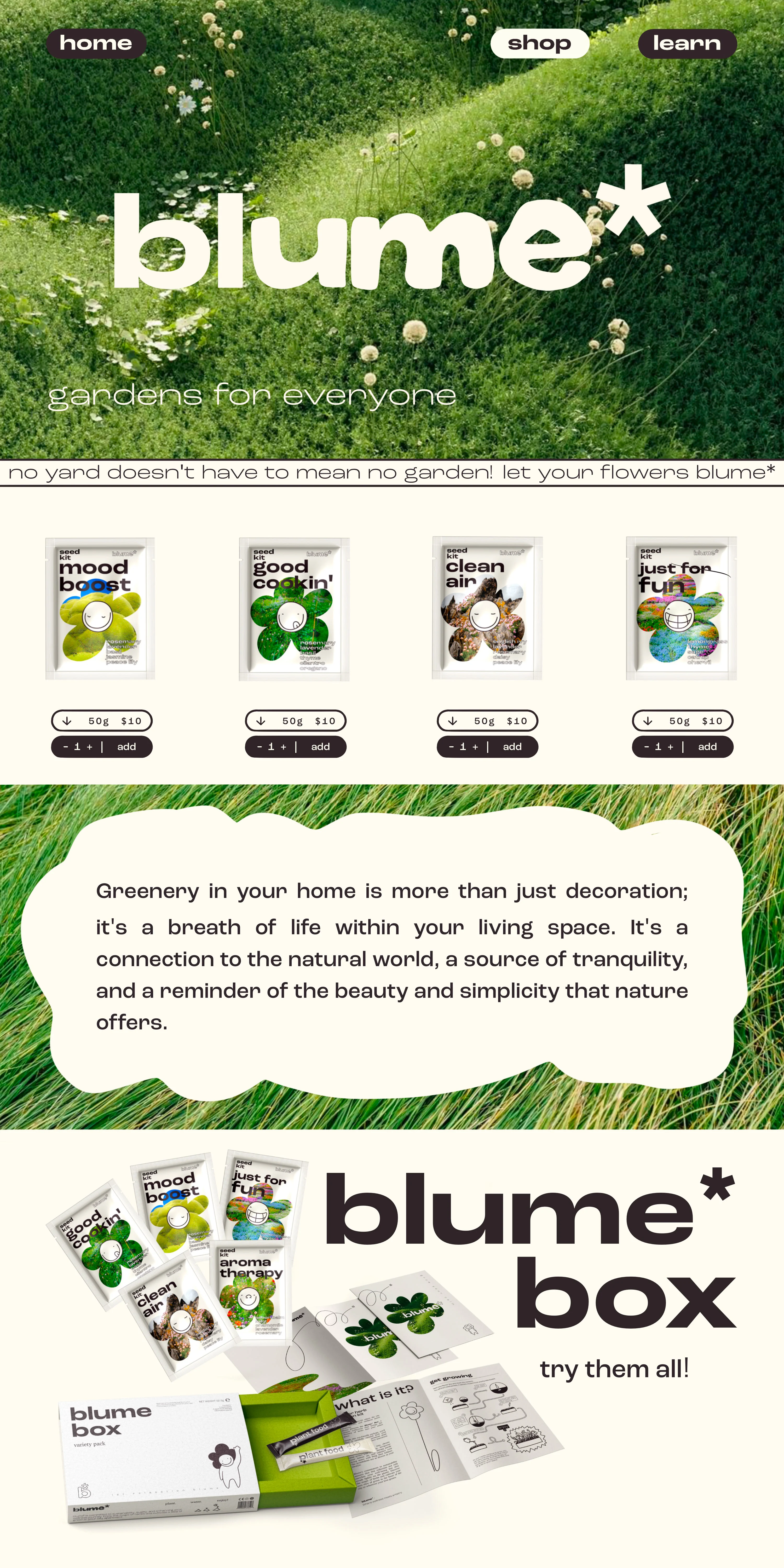
Blume* is a lifestyle brand that reimagines urban living, infusing sustainability, wellness, and creativity into this life in a fast paced and (for some) concrete world. They deliver the magic of herbs to your doorstep, offering an array of curated products that empower you to cultivate herbs for a variety of both physical and mental wellness purposes, transforming your city apartment into a thriving oasis of well-being and artistic expression.
LOGO
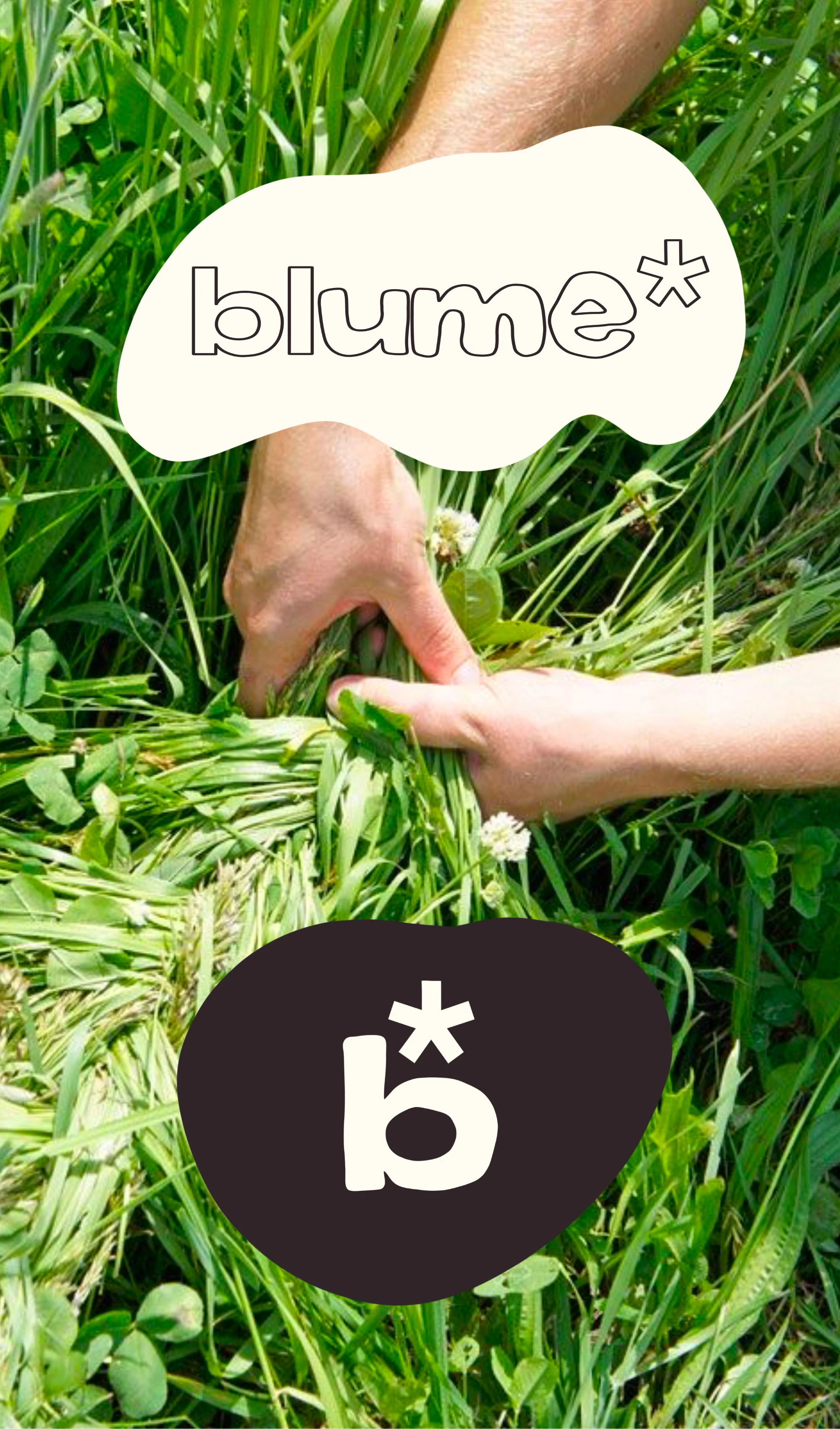
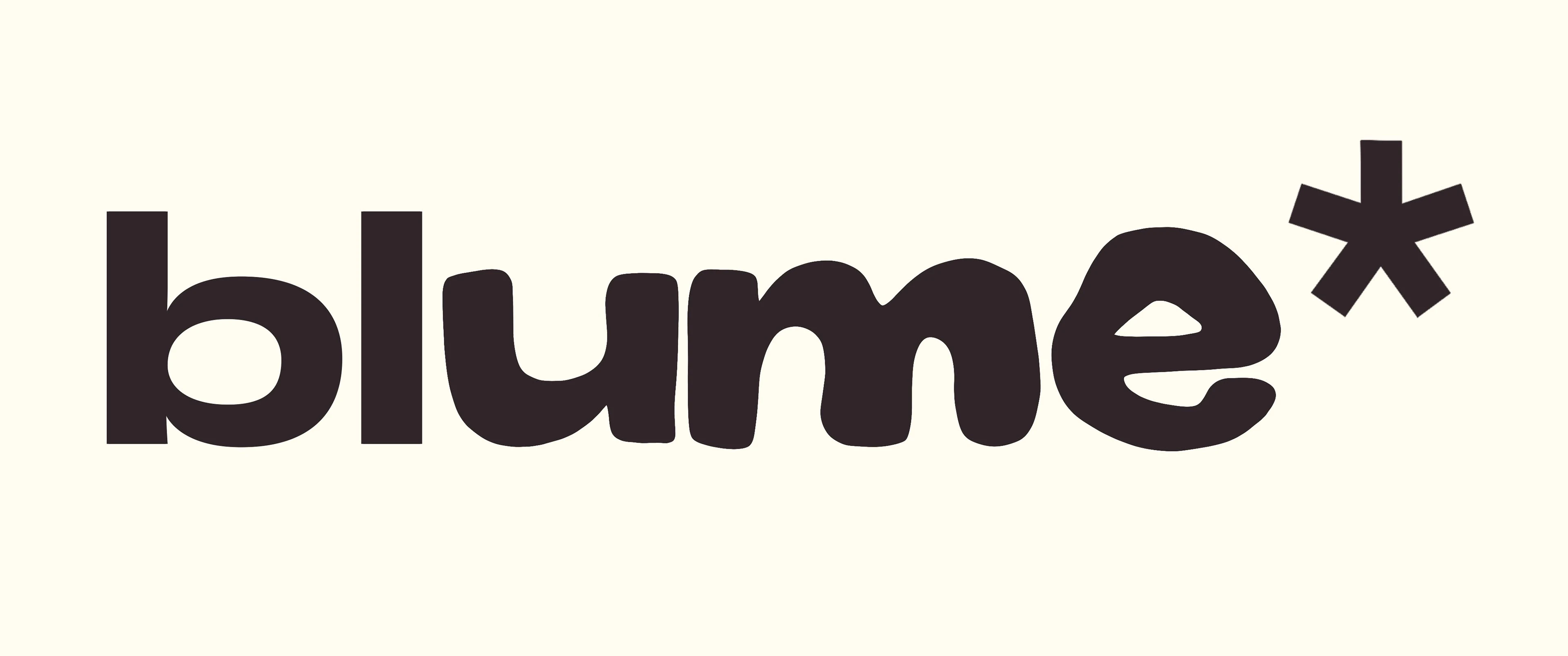
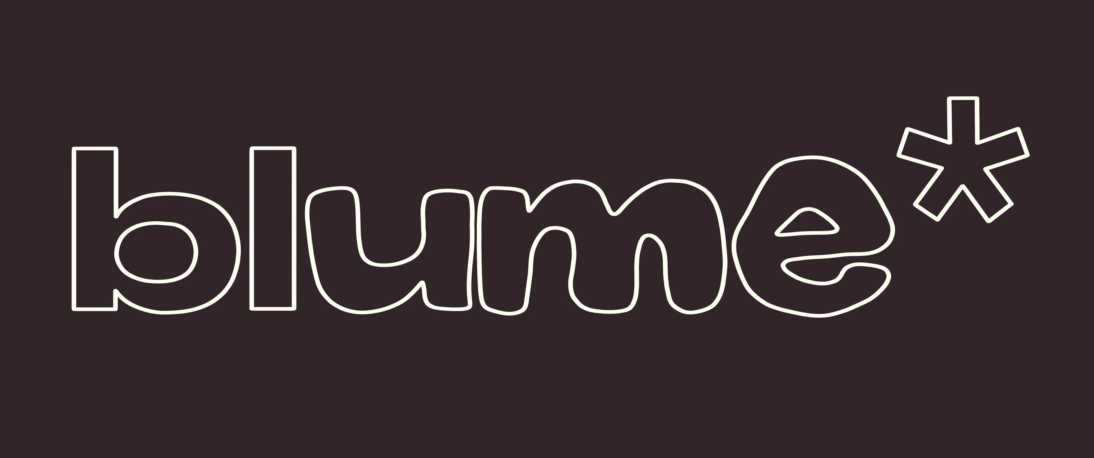
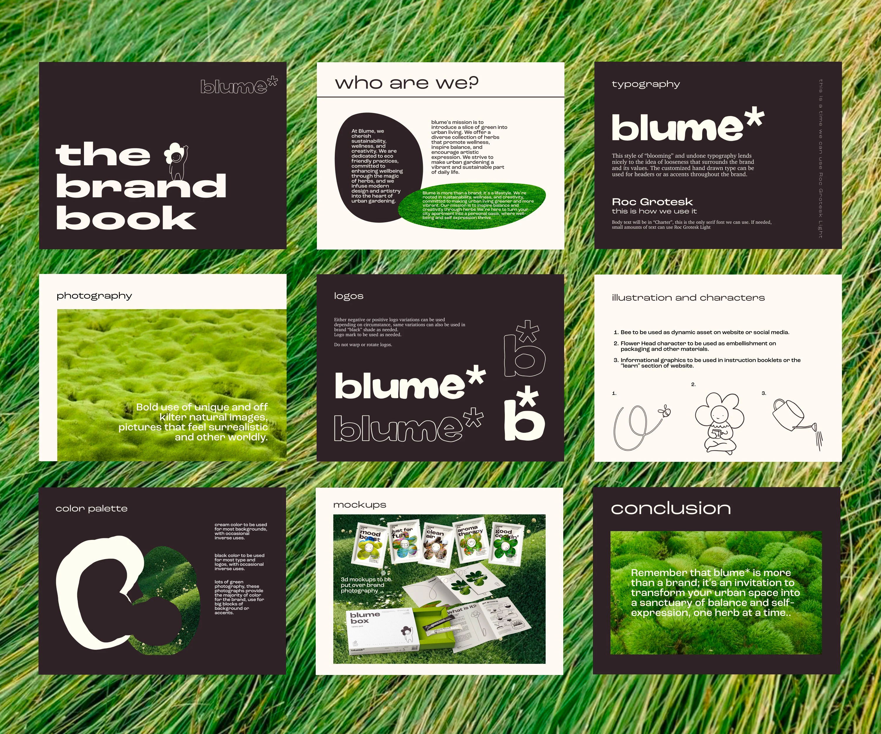
For the Blume* logo the goal was to create something modern, clean, and clever, while still maintaining that same element of play and creativity steeped into the brand ideals.
I created this growing (or blooming) effect on the text to embody growth, both physical and personal.
The asterisk symbolizes a flower, a nod to nature in the age of concrete and tech.
This also makes it so the logo can be typed out in any font and still maintain its brand.
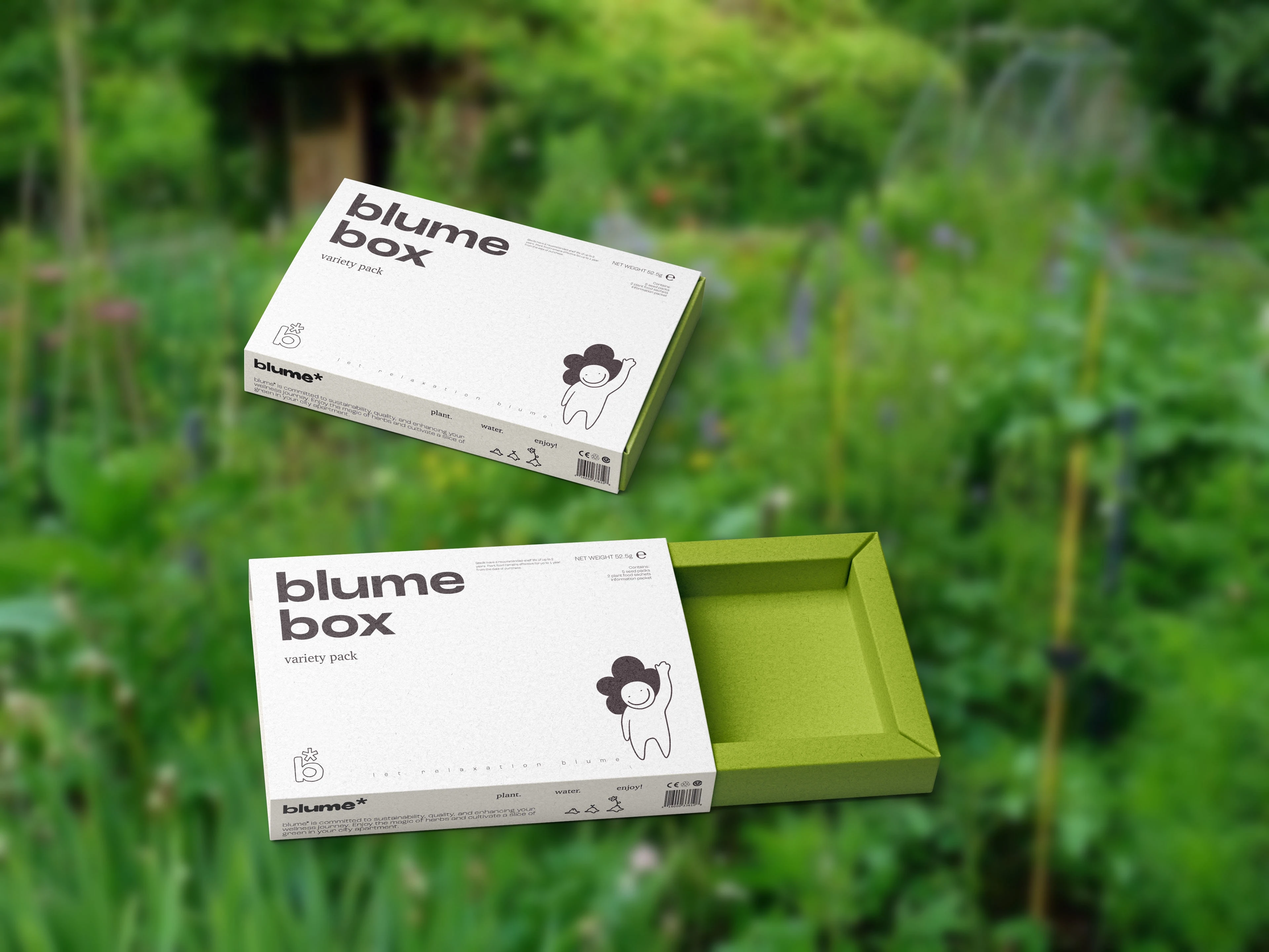
PACKAGING
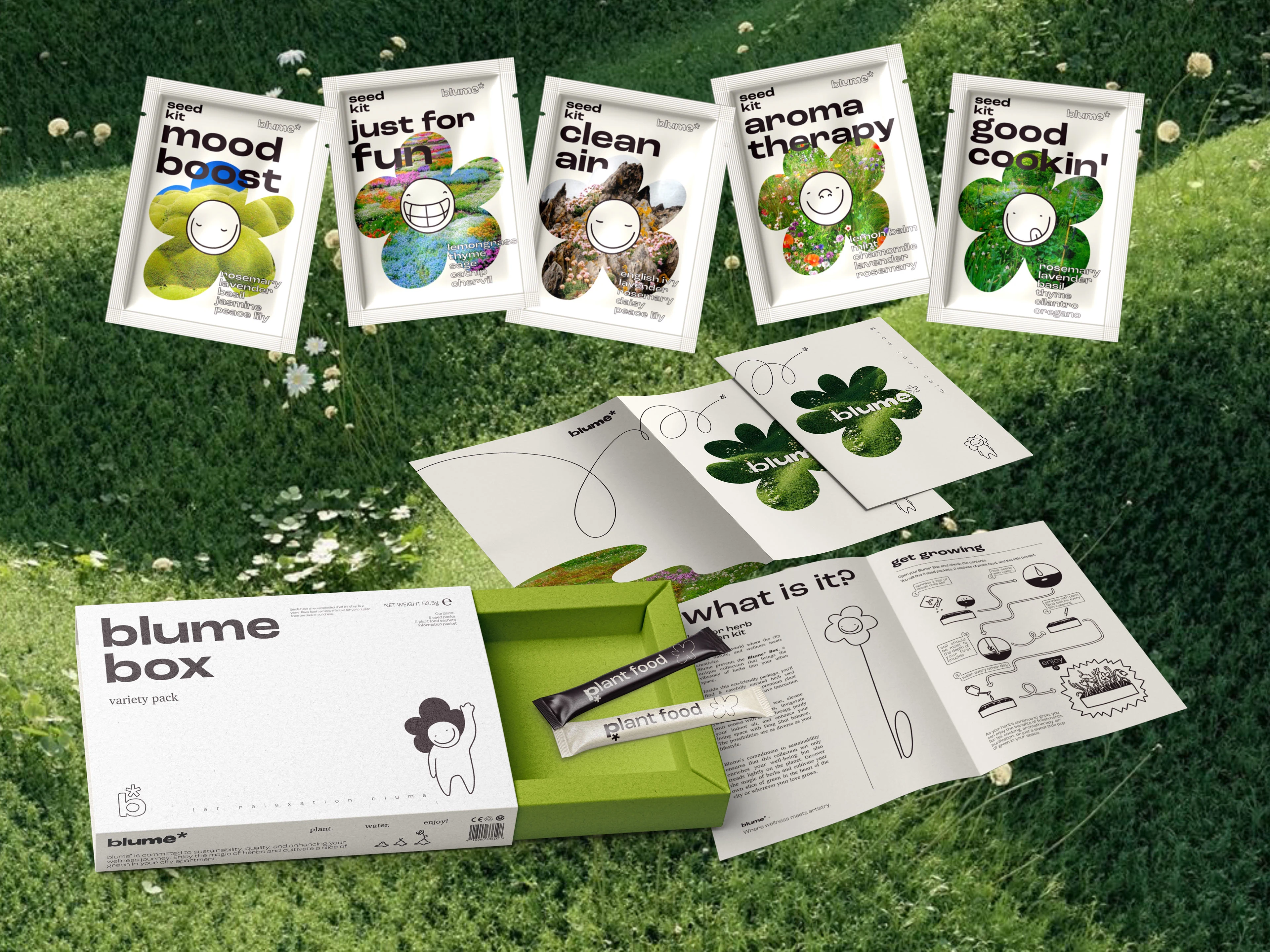
For the Blume* Box packaging encountered was the issue of the necessity of a box at all, the seed kits could simply be sent in a mailer, but that can look a bit tacky.
In the name of sustainability I aimed to create something that could serve a purpose if the customer kept it. This design is sleek and friendly, the colors quiet but striking, with minimal but eye catching graphics to make it usable outside of its original shipping purposes.
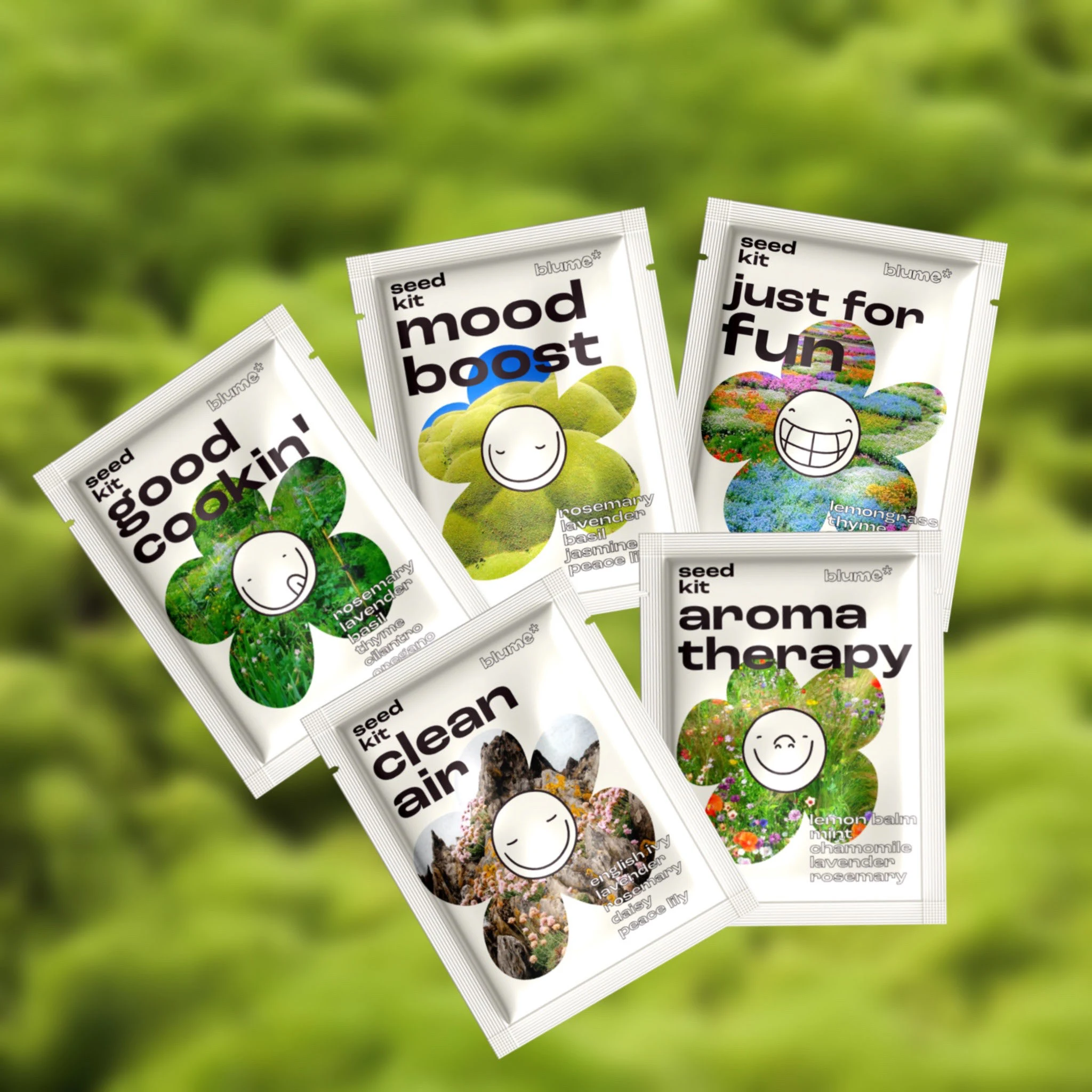
The seed kits are loud and playful to capture the essence of the experience awaiting beneath the tear off top.
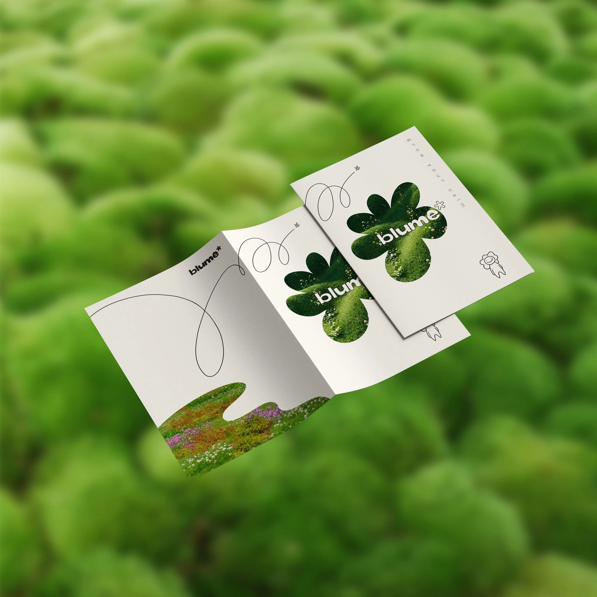
INFO BOOKLET
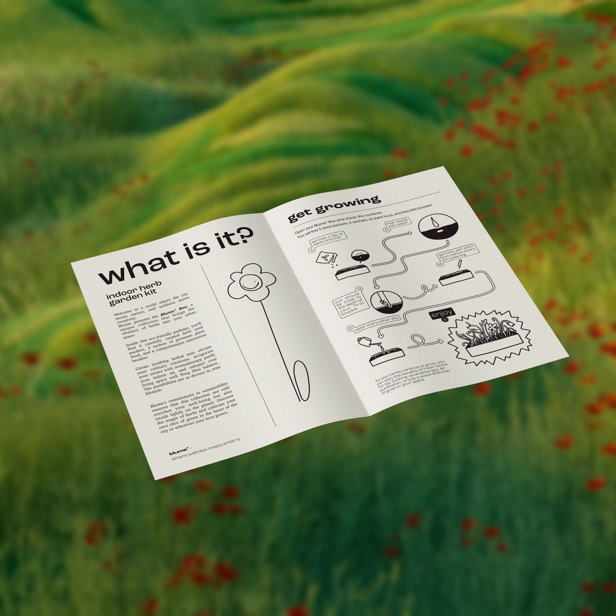
The Blume* booklet posed a fun challenge, the aim was to display information in an organized and digestible way while still maintaining an element of playfulness.
This was achieved through intentional use of clean but cartoonish illustrations coupled with minimal and clean typography, creating the perfect balance between function and play.

MY THOUGHTS AND STEPS
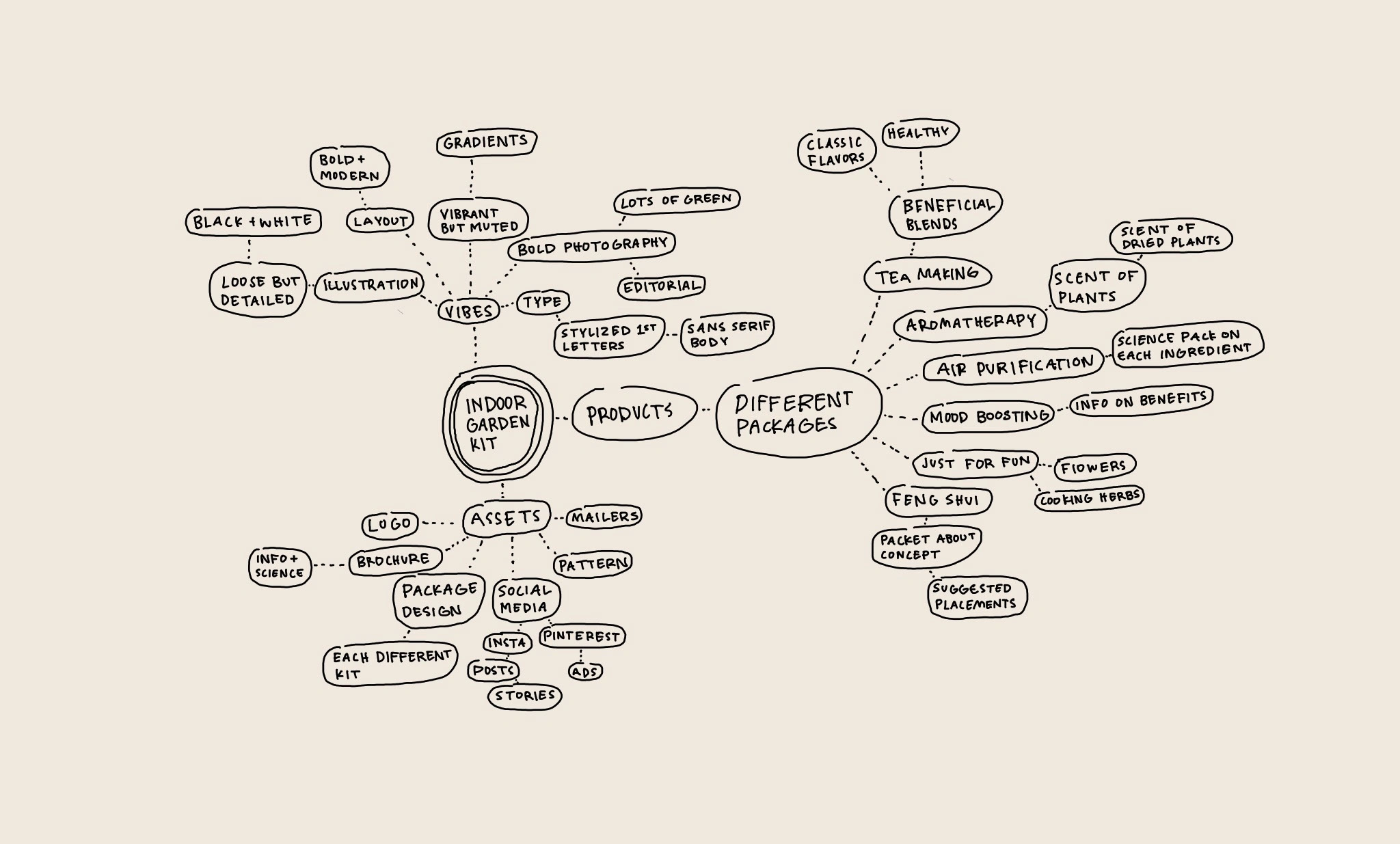
I've found the most effective first step for me after finishing the dredging mood-boarding stage is to move into completely custom style scapes.
I think of the scapes almost as a poster to design, seeing how assets work together, finding blank spots and filling them-- seeing the synergy of the brand come together in the very first stage is a wonderful feeling. This is the original style scape.
For this project the mark was easy to miss, I had to juggle bold photography, illustration, and a minimal color palette without making the work feel flat. I think the first steps are crucial in avoiding excessive reinvention, deciding on direction, and getting into the nitty gritty right away.
In the end a welcoming, plush, and memorable brand was born.
Cheers!
Like this project
Posted Aug 20, 2024
Visual identity, packaging, and illustration for am at-home gardening brand

