
Zap.
Zap is a (currently) mobile note-taking app that encourages people to staying organized throughout their everyday life
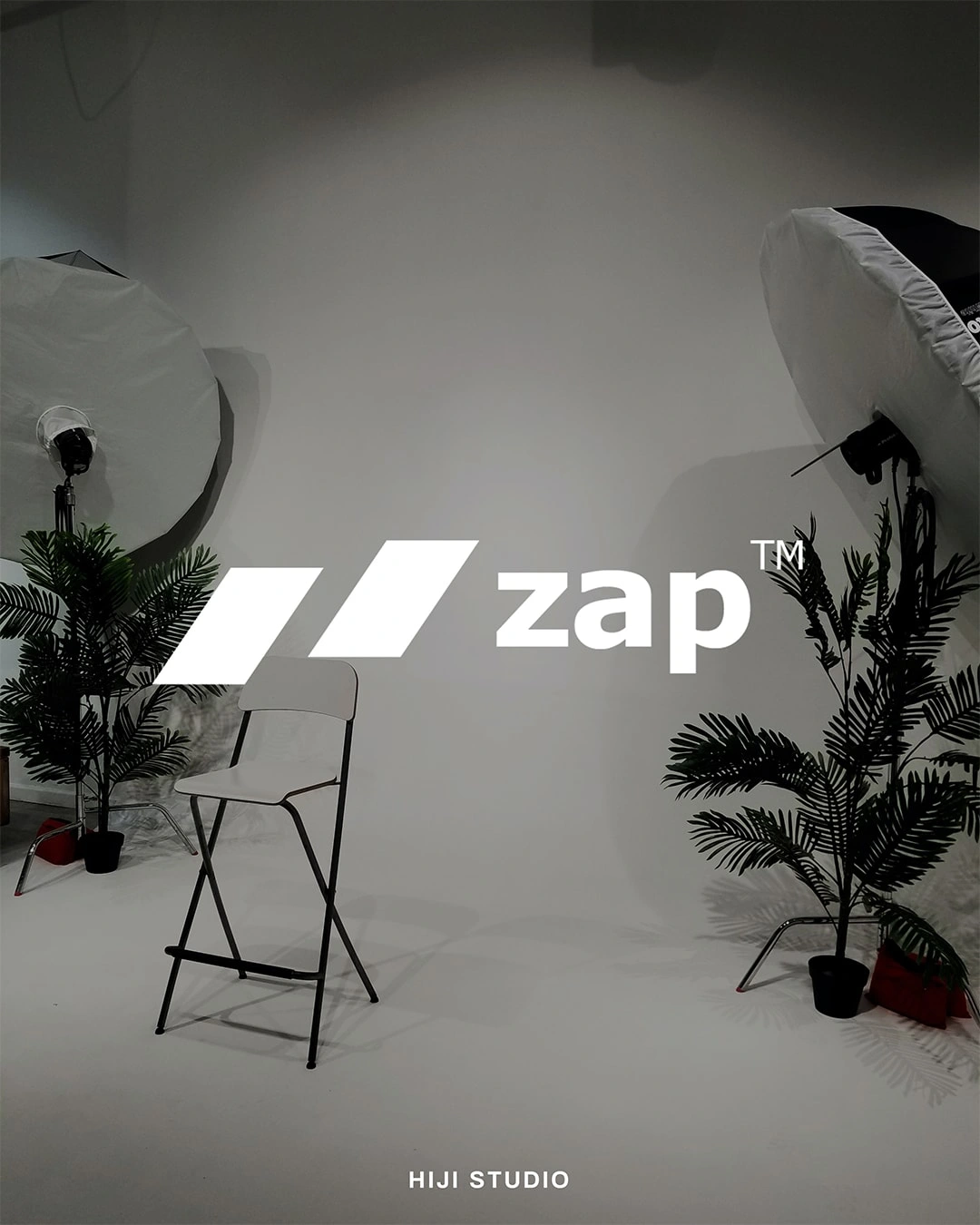
Zap Full Logo Mark
The Brief is to make something that is simple, elegant, sleek, and modern logo that can be used in various media, from the biggest to the smallest as in their app icon.

Zap Logo Structure
The Z in the white space is formed by the two slanted rectangle representing book pages in an abstract way. The slanting it self is meant to depicts something that is moving, active, and progressive.
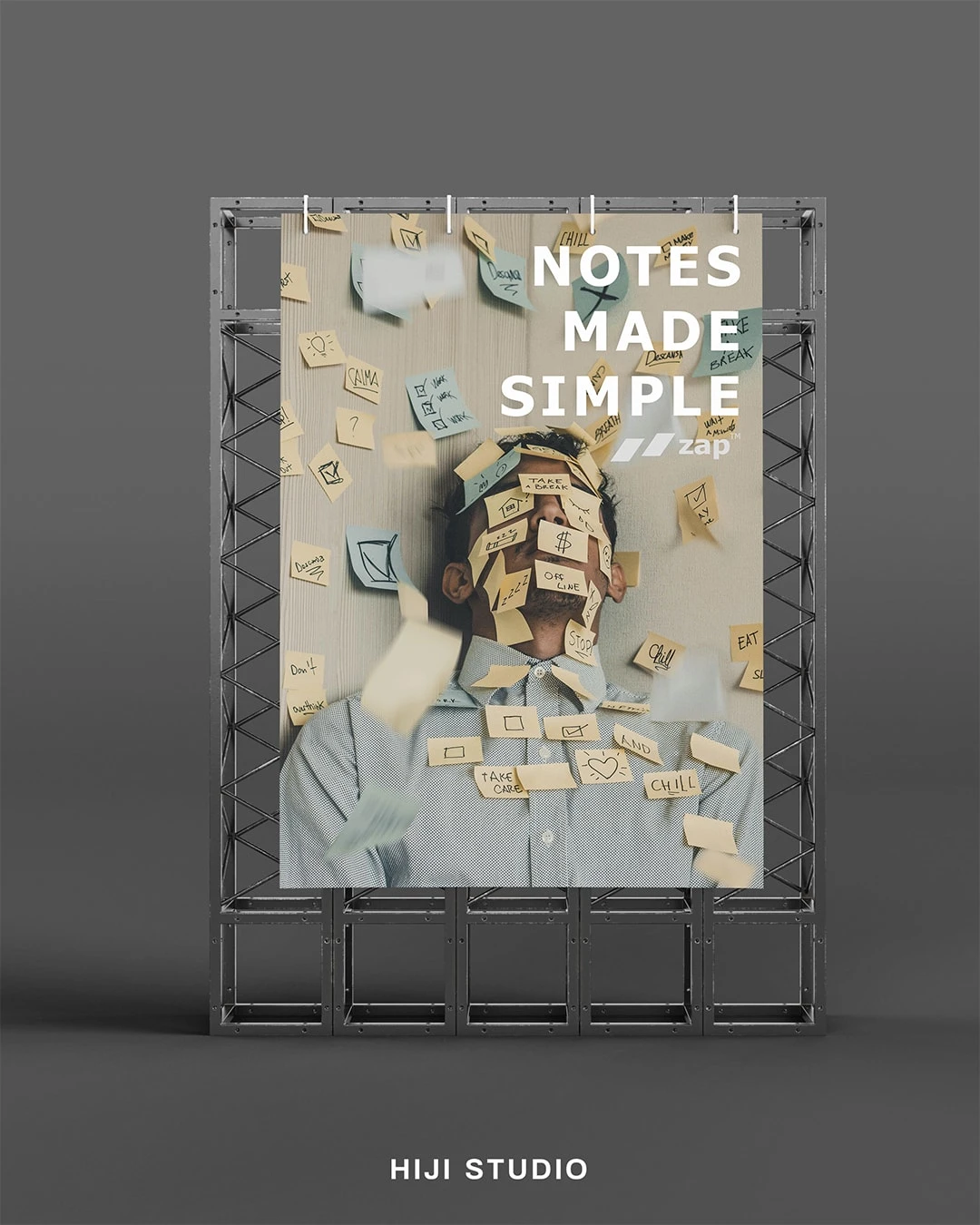
Representation of a possible ads
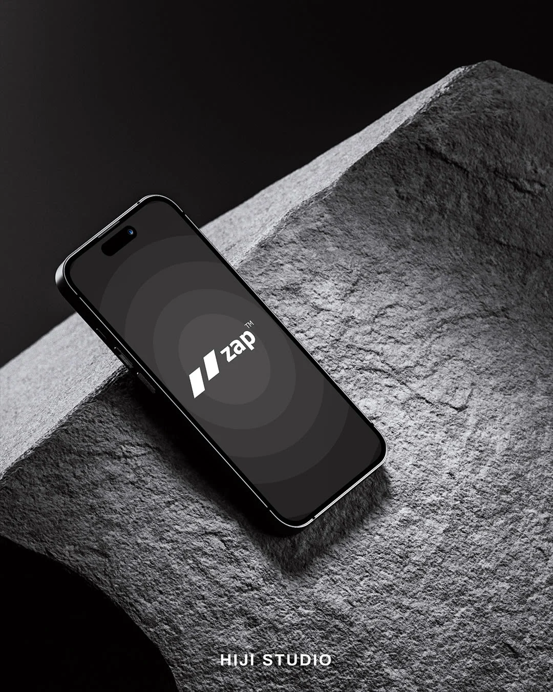
Possible Loading Screen for The App
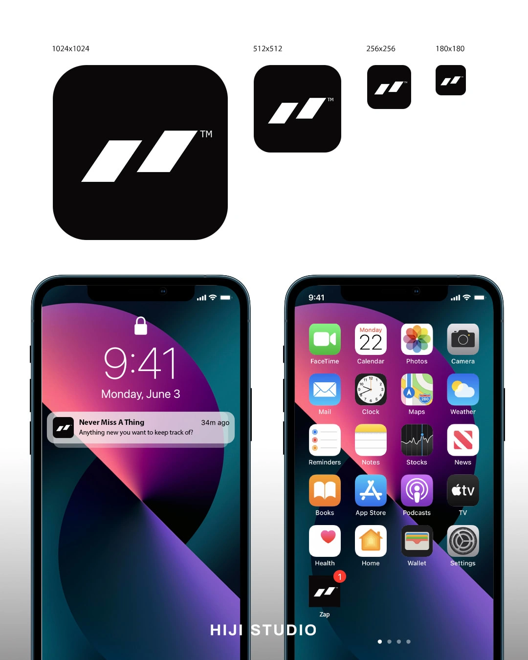
Zap Icon in App Icon Format
The icon is meant to be visible and recognizable in even the smallest scale.
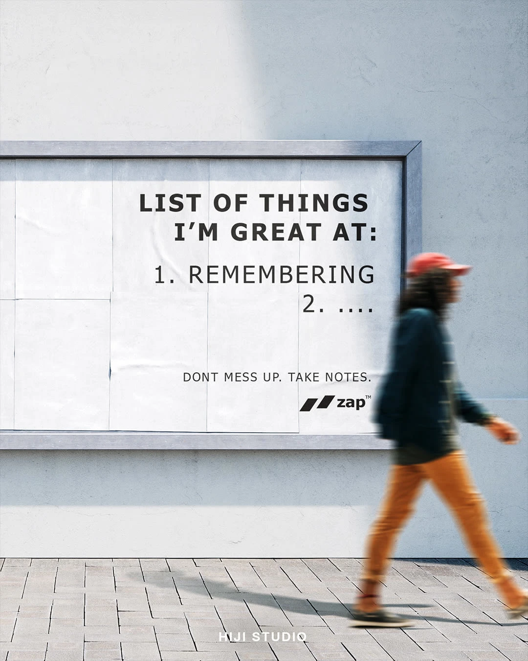
An example of an ad for Zap
It's important for Zap to be somewhat serious, but in the same time being cool enough to resonate with both the millenials and gen-z as they are the group of people that's currently transitioning into the organized adult life.
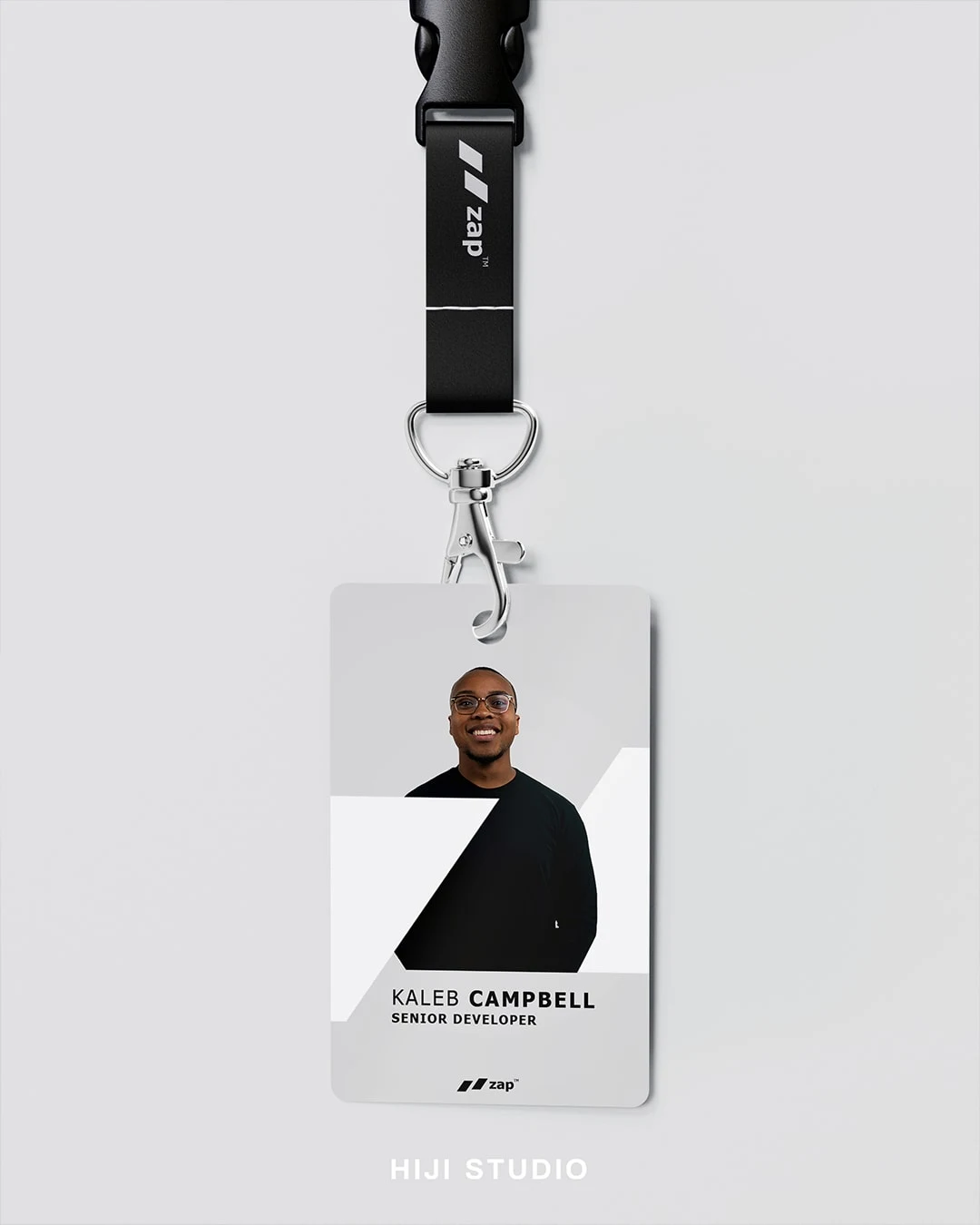
Zap icon as a frame for employee card
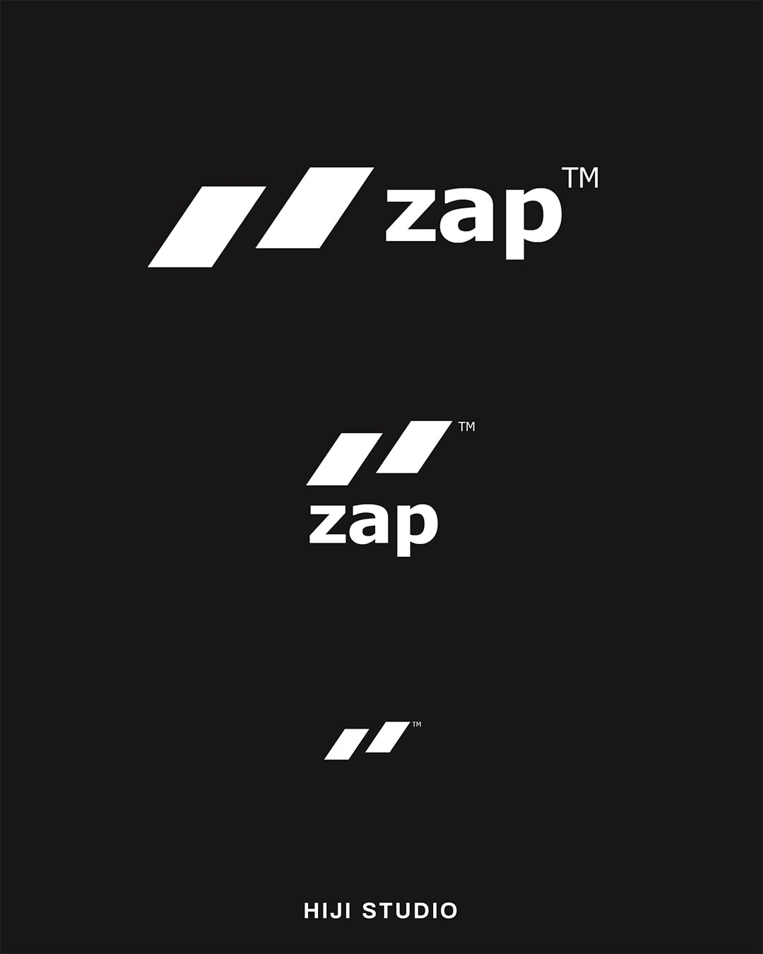
Zap Logo in Three Forms to Support Various Placement Needs.
That's all guys!
At Hiji Studio, we strive to make small business
go big. We are open for commission for a ground-up brand identity creation to a
rebranding project to freshen up yours! Hit us up through DM or email us at:
pun10.hijistudio@gmail.com
0 likes · 6 views · Apr 23, 2023
We created a logo design for a mobile note-taking app called Zap. The brief is to make something sleek and modern to resonate with their adult target audience

