Workybe | Rebrand
Rabbithole Studio
The Project
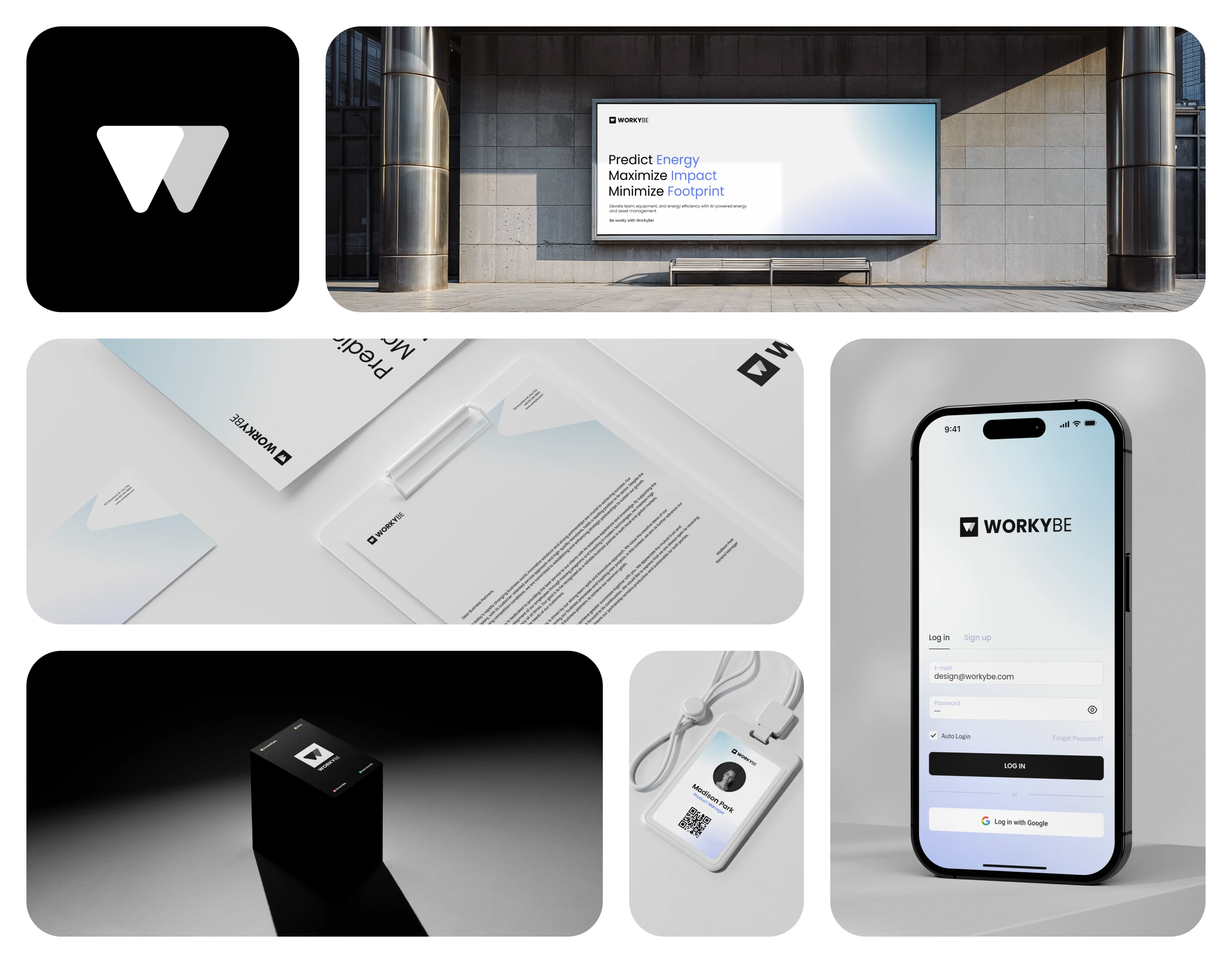
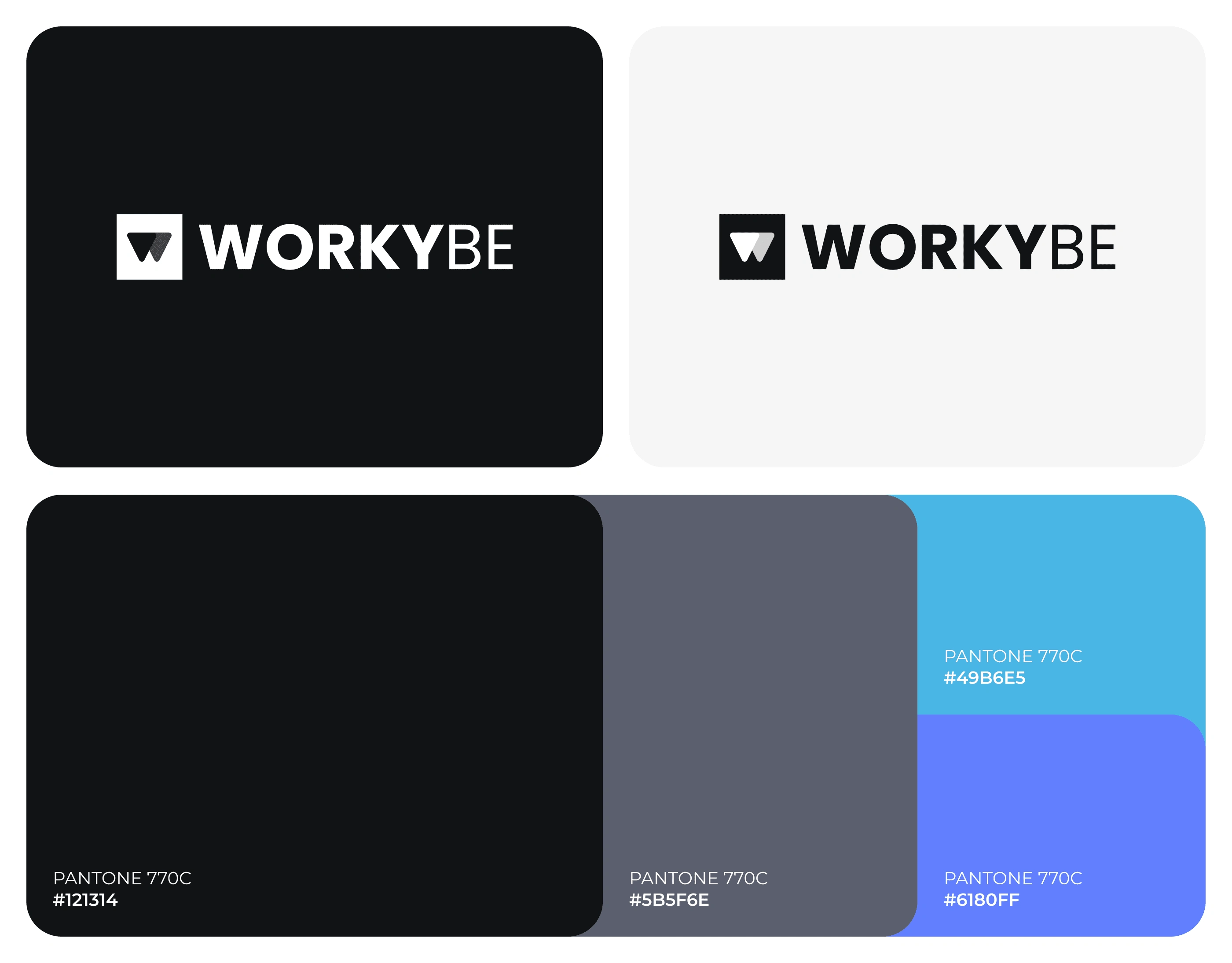
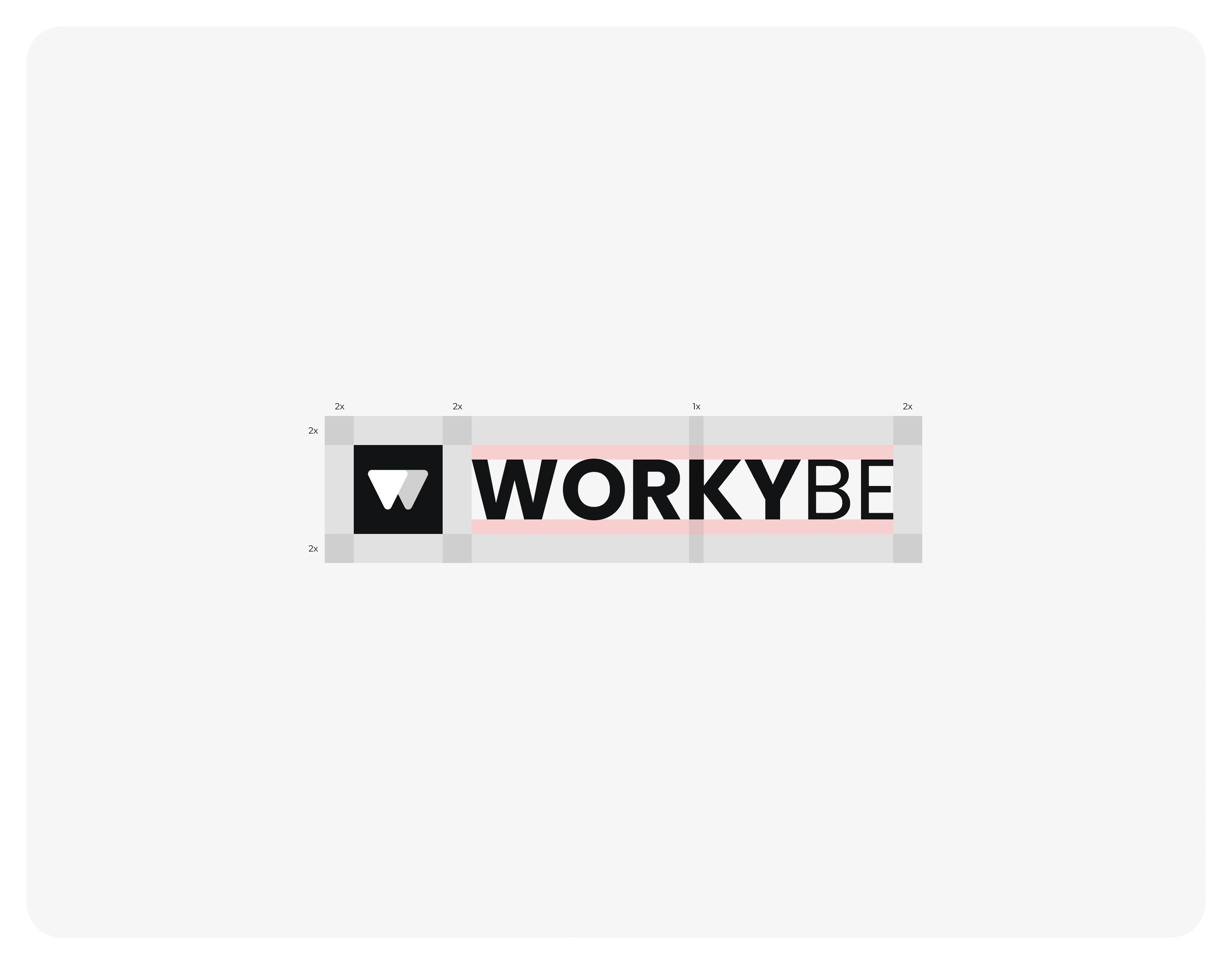
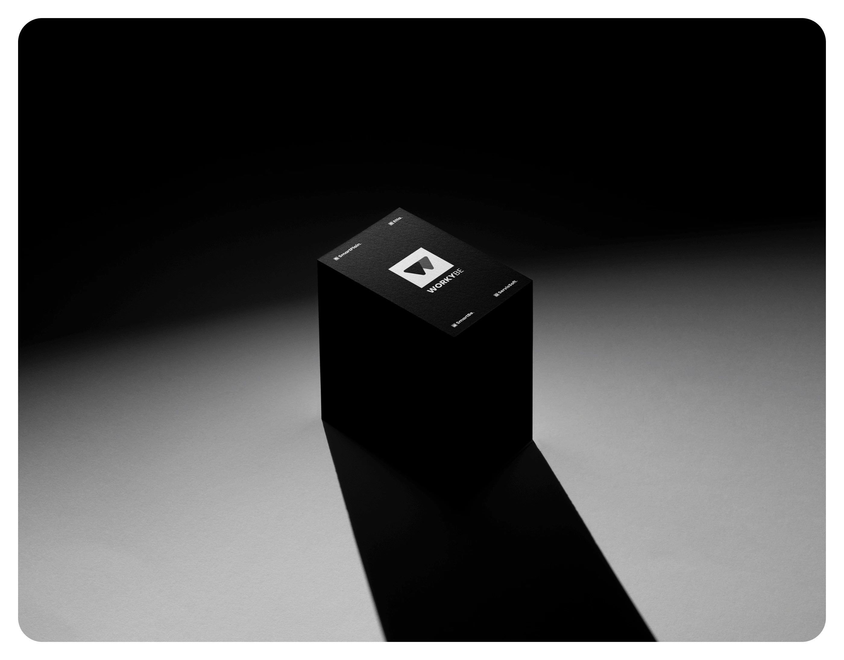
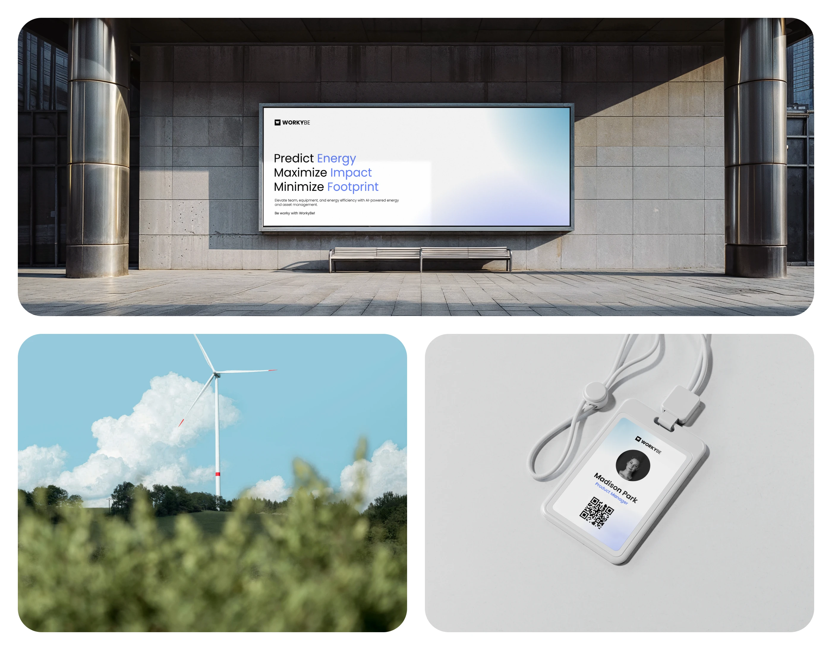
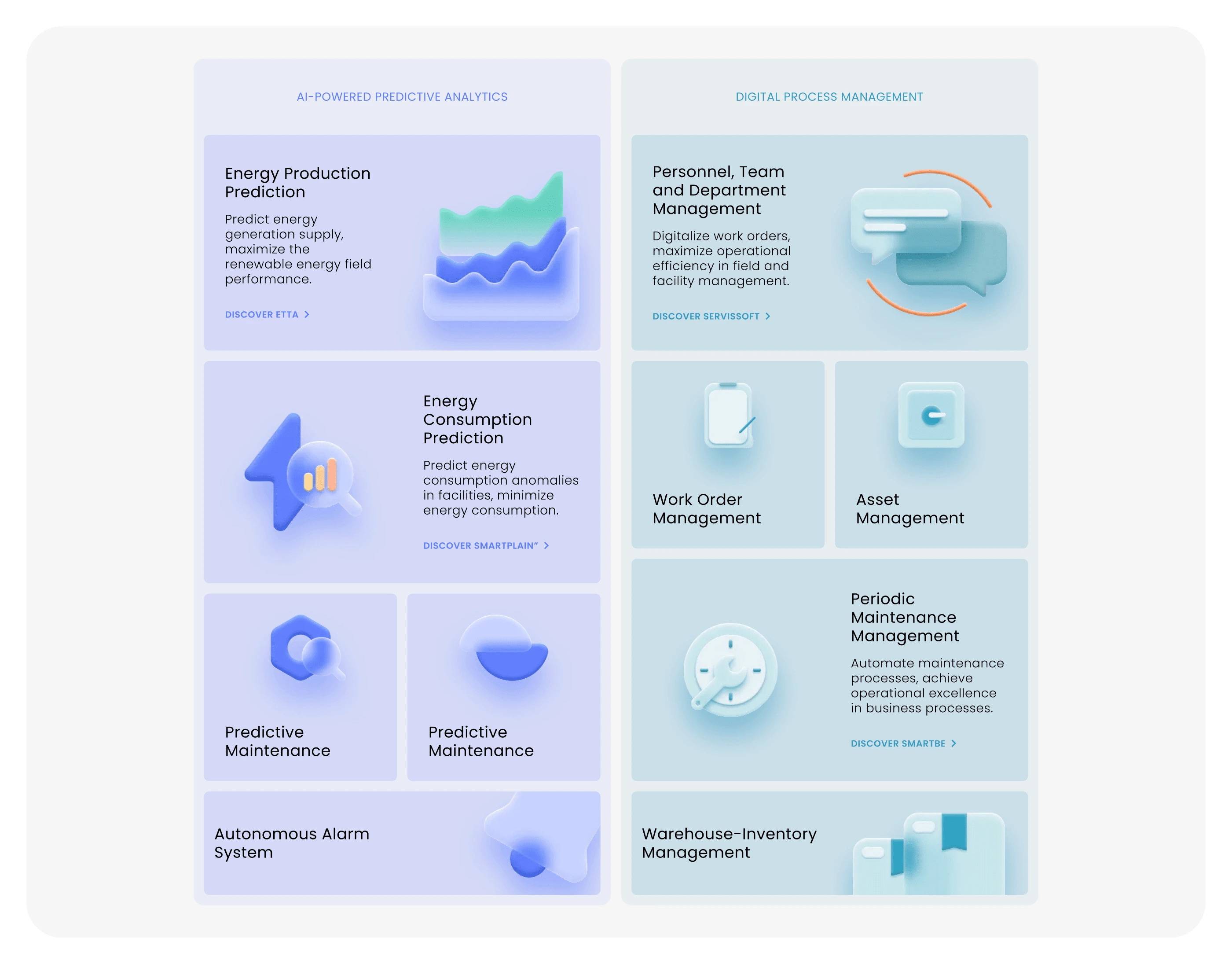
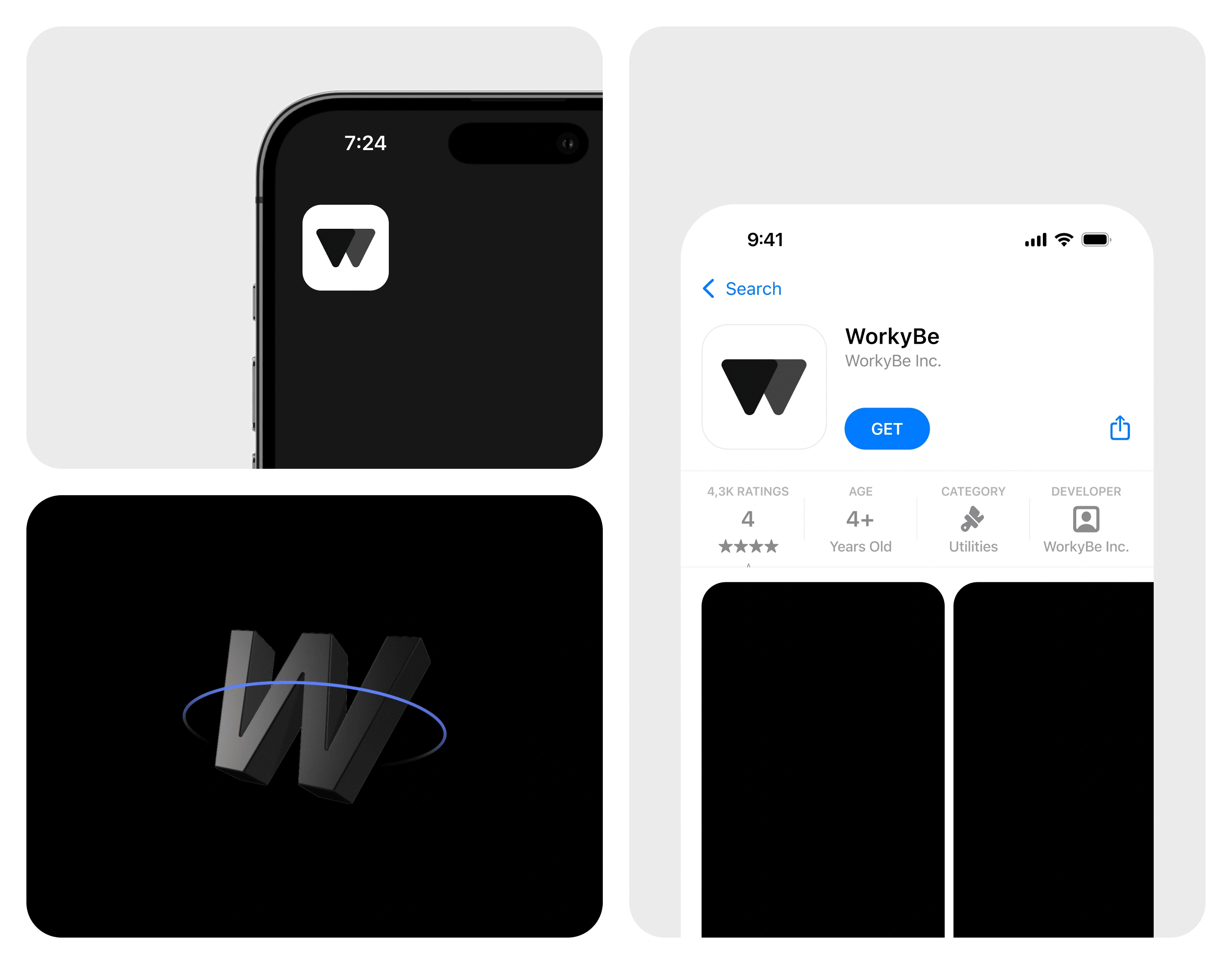
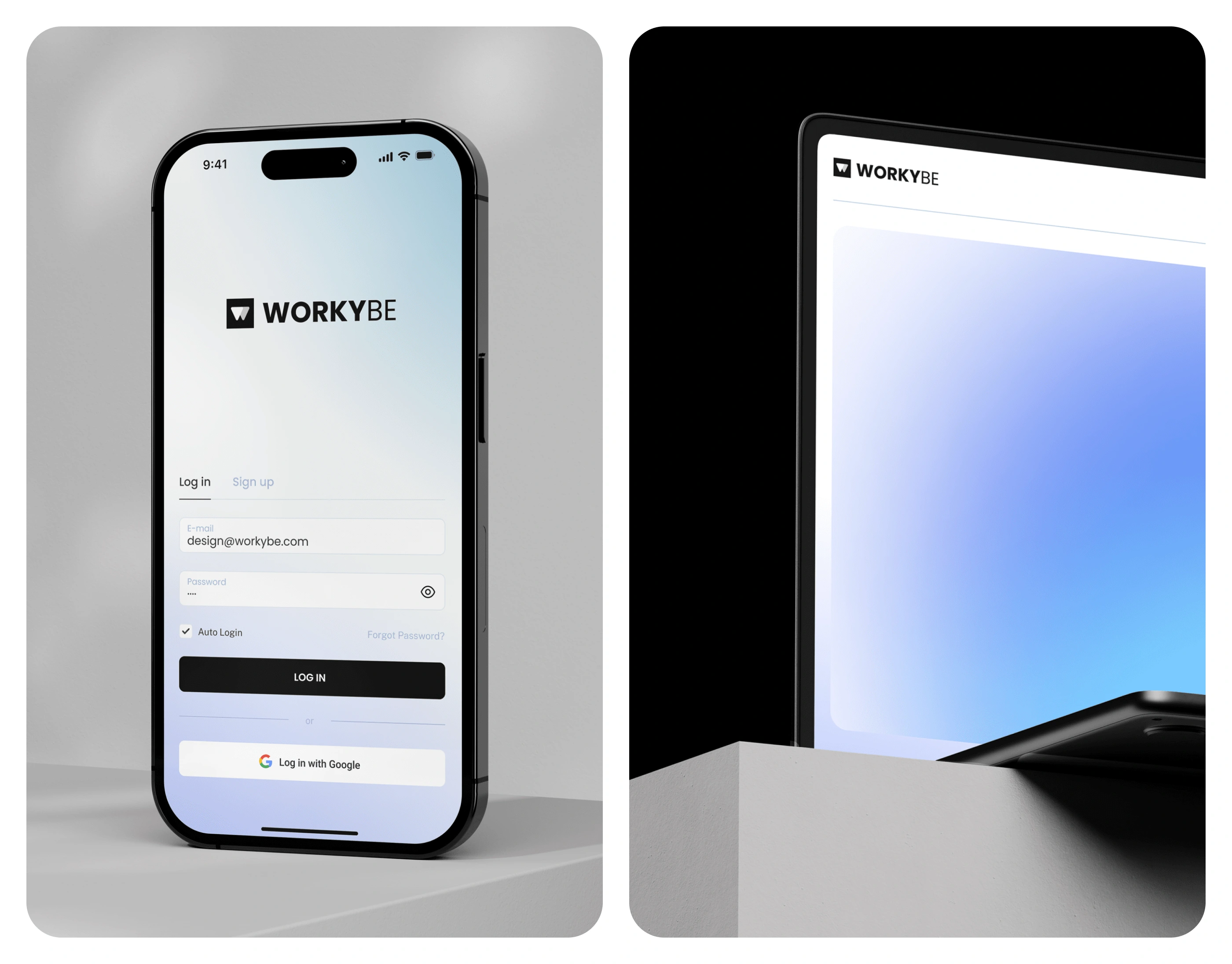
Workybe, a parent brand focused on optimizing energy and environmental solutions through AI-driven technology, was designed to be flexible, modern, and sustainable. The black and white color scheme of the main brand symbolizes its role as an umbrella that encompasses multiple sub-brands, each represented by distinct, vibrant colors. The geometric logo, featuring overlapping triangles, reflects the balance between technology and sustainability. Triangles were specifically chosen as they represent stability and harmony. Geometrically, triangles are one of the strongest shapes, with each side supporting the other. This inherent stability mirrors Workybe’s mission to bridge innovation and environmental responsibility. The minimalist approach ensures clarity and adaptability, allowing the sub-brands to coexist under a unified vision.
Overview
Workybe’s visual identity tells the story of innovation and adaptability. As a company that analyzes natural energy and enhances its distribution, Workybe represents an intersection of technology and environmental care. The black and white color palette is a metaphor for inclusivity—representing all colors—while the sub-brands, each defined by unique colors, operate under this cohesive framework. The logo, with its sleek and geometric design, signifies balance. The triangle, known for its strength and stability in both geometry and engineering, represents the brand’s focus on precise energy management, environmental impact reduction, and forward-thinking solutions. The monochromatic scheme underscores the brand’s comprehensive role, encompassing all aspects of energy management.
Like this project
Posted Mar 22, 2025
Workybe is an AI-driven parent brand for energy and environmental solutions, symbolizing balance and stability through its triangle-based, minimalist logo.
Likes
0
Views
9