HP Engineering Brand Redesign
Josh Wise
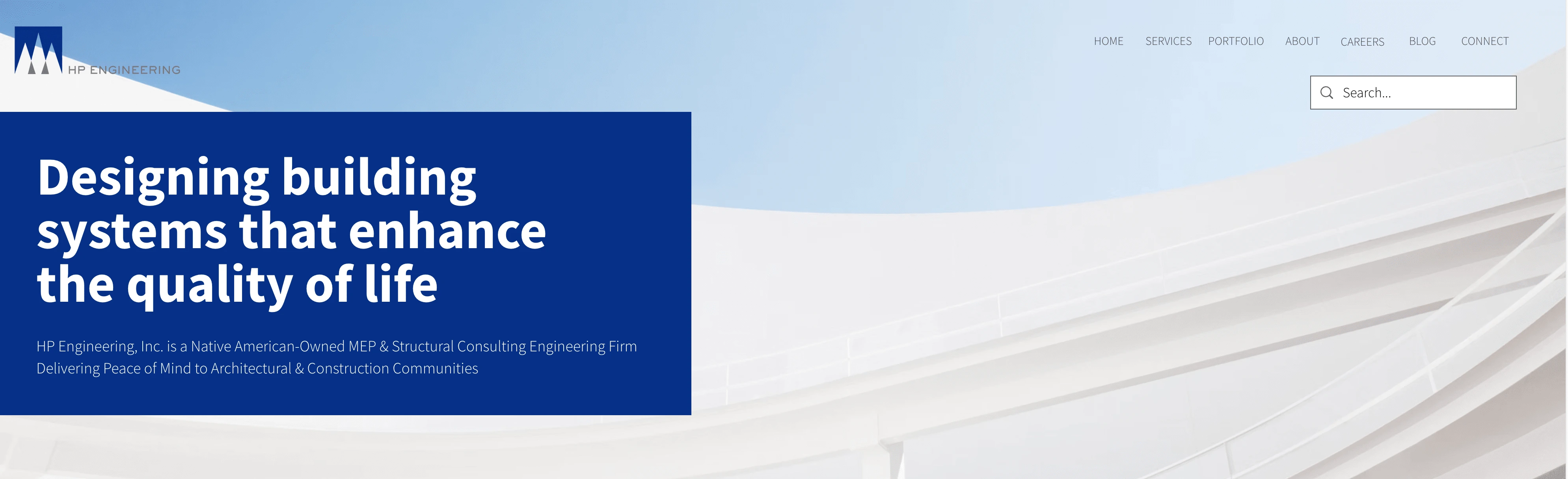
HP Engineering
My friend Michele called me and said: I hope you don’t mind but I gave your name to a friend of mine. Her company is looking for someone to design a logo for them.
That following week, I spoke with Joan. She was relatively new at the company and indicated that she had recognized the need for updated branding. And then I thought, Oh! More than just a logo then. Which was refreshing. Joan wasn’t looking for a flash-in-the-pan logo for the company. Instead, she wanted a thoughtful, meaningful, and lasting identity that would be just a part of an overall rebrand that would be anchored to the new identity itself.
I met with Joan for the first time on a seasonable fall day at the company’s office. The first thing she showed me was the company’s current logo painted boldly on a large canvas.
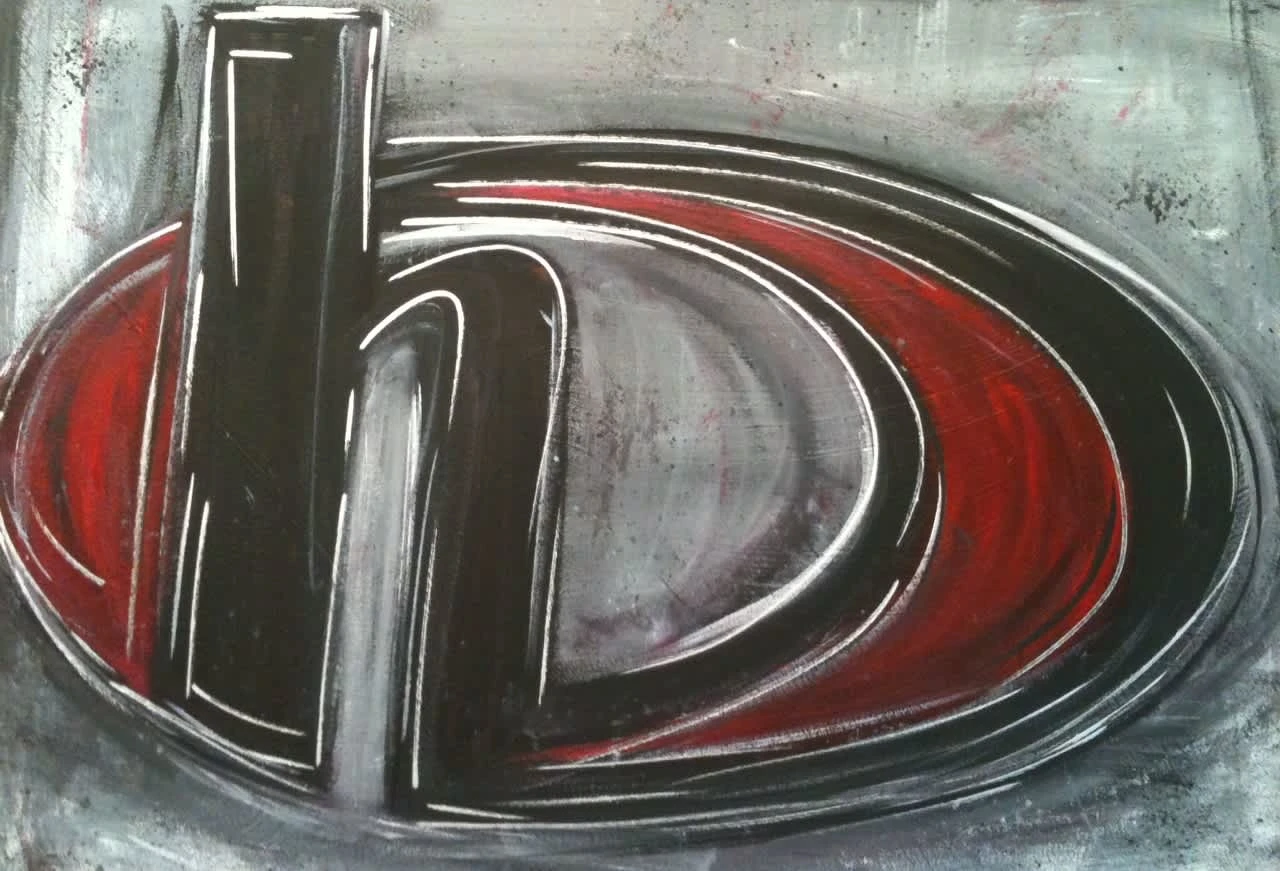
Former HP Engineering logo
That was their current identity: artwork with an H and an implicit P. Not at all decrying the artwork, I knew the problems with the current logo were numerous before we even began to talk.
After iterating with Joan and the owners, presenting various preliminary black and white concepts, we landed on a direction to pursue.
Structure
What I proposed for the structure of the logo was largely square, grounded, and established. In addition, I included the implication of the teepee because of their unique positioning as an Indigenous-owned business. The triangles inherent in the logo structure also serve to aim for upward momentum, stability, and structure, once again tying into the overall anchoring identity that would best convey their service offerings to their target market.
In addition, a versatile logo with horizontal orientation would be critical to its flexibility and adapation across various media.
Color
I began to test color and offer options but encouraged them to consider a blue and gray combination. I felt this would represent more professionalism with blue itself inspiring trust and confidence.
It wasn’t just the identity, the logo, that would achieve HP Engineering’s goals for its brand.
HP Engineering also wanted a brand guide to articulate how to use the logo, what typefaces would work best, how to use the chosen colors, and a cohesive set of marketing collateral.
The point of the entire rebrand was not to simply provide a logo but to provide the groundwork of a system that could be carried forward into a website, trade show materials, and more.
Before it was a fairly popular saying, The brand is more than just a logo, I was busy educating this client that the logo itself and the color and the typography were mere components of their brand. Anchors, sure.

HP Engineering new logo design
Ultimately, it would be their unique and accurate services, their knowledgeable engineers, and the relationships they formed based on trust and loyalty that would become the hallmark characteristics of their brand.
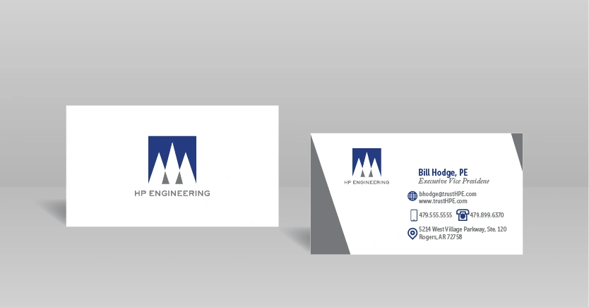
HP Engineering Business Cards
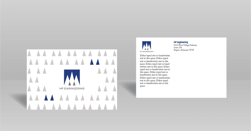
HP Engineering postcard
Designed by Josh Wise | Courtesy of Elegant Themes | Powered by WordPress
Like this project
Posted Mar 13, 2025
This is a brand redesign that provided HP Engineering with a scalable, professional logo with brand guidance to use across all their marketing channels.