NuxtLabs: Branding & UI Design
NuxtLabs is the company behind the NuxtJS framework and also the publisher of SaaS products like Volta and Studio. Leveraging its expertise, the company will be introducing a web agency offering in 2023. The web agency is the result of accumulated expertise in the areas of SaaS, web development, and design, enabling the provision of top-quality digital solutions.
Branding
Since NuxtLabs creation it was decided to keep the brand black and white but also minimalistic. The idea behind this was to emphasize more what we do instead of what we are. The color will come from other products. When we opened the agency side, we believed that this concept could also fit with the idea of color brought by our creations. But we also wanted the agency and head company of Nuxt to be memorable and cool to make potential clients contact us for what they saw.
To add some character to this black and white branding, we added textures, lights, and noises, and used them creatively this opens infinite possibilities for declinations. For the typography, we kept Roobert Pro to fit with the rest of our ecosystem.
Branding
As the first goal of NuxtLabs with this rebranding was to open an agency section, we took the company as our first client to deliver a solid brand book. You can download it below (In french only, sorry)
User interfaces
I designed the UI of the pages on nuxtlabs.com, taking into consideration the minimal and black-and-white branding, while also incorporating textures and noise to add identity to different sections of the website. The purpose of this design was to showcase our capabilities. This choice not only maintains visual consistency but also creates a sleek and sophisticated aesthetic.
To enhance the visual appeal and differentiate various sections of the site, we used textures and noise. By strategically applying these elements, I added depth and character to different components, making them visually distinct and engaging for users.
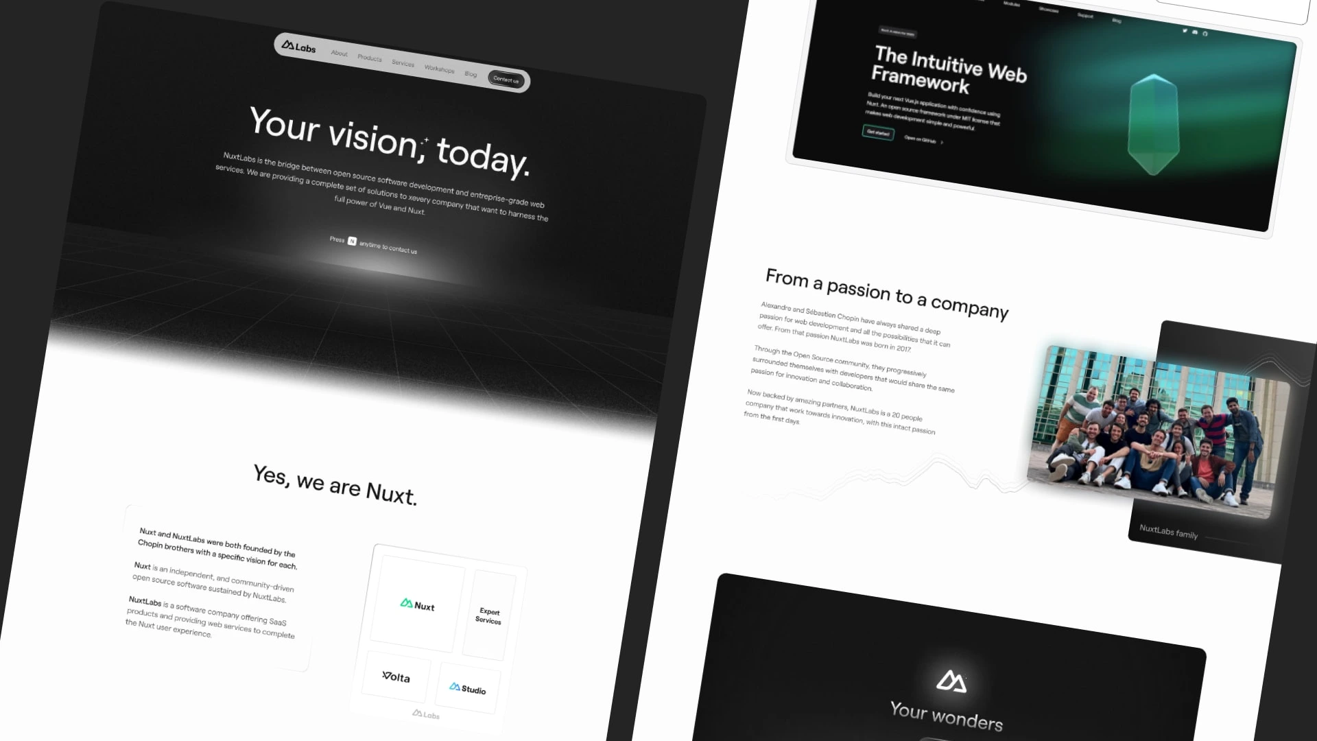
Landing page preview
The design approach aimed to demonstrate our creativity and expertise while ensuring a cohesive and professional appearance. By incorporating textures and noise, we aimed to create an identity for each section, making the browsing experience more dynamic and memorable.
Overall, the design of nuxtlabs.com goal was to reflect our commitment to delivering high-quality digital experiences. It showcases our capabilities in UI design and highlights our ability to create visually appealing websites that effectively communicate our brand's message.
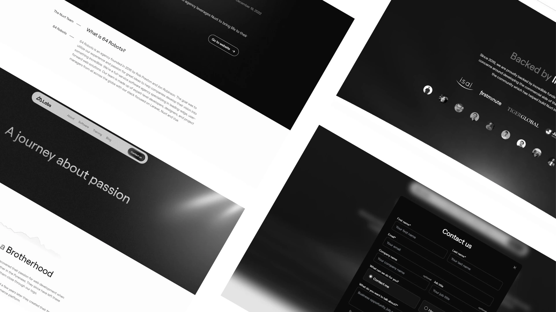
Page About preview
Like this project
Posted Jul 19, 2023
NuxtLabs is the company behind the NuxtJS framework and also the publisher of SaaS products like Volta and Studio.
Likes
0
Views
36


