Hot Topic Rebranding Project
Bailey Drummond
This was a group project where we had to choose a brand that was in desperate need of a rebrand and the one we chose was Hot Topic due to its outdated and out-of-touch brand identity. In collaboration with Madelyn Arnold, Emily Payer, Madison Powell, and Maia Wilms.
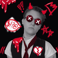
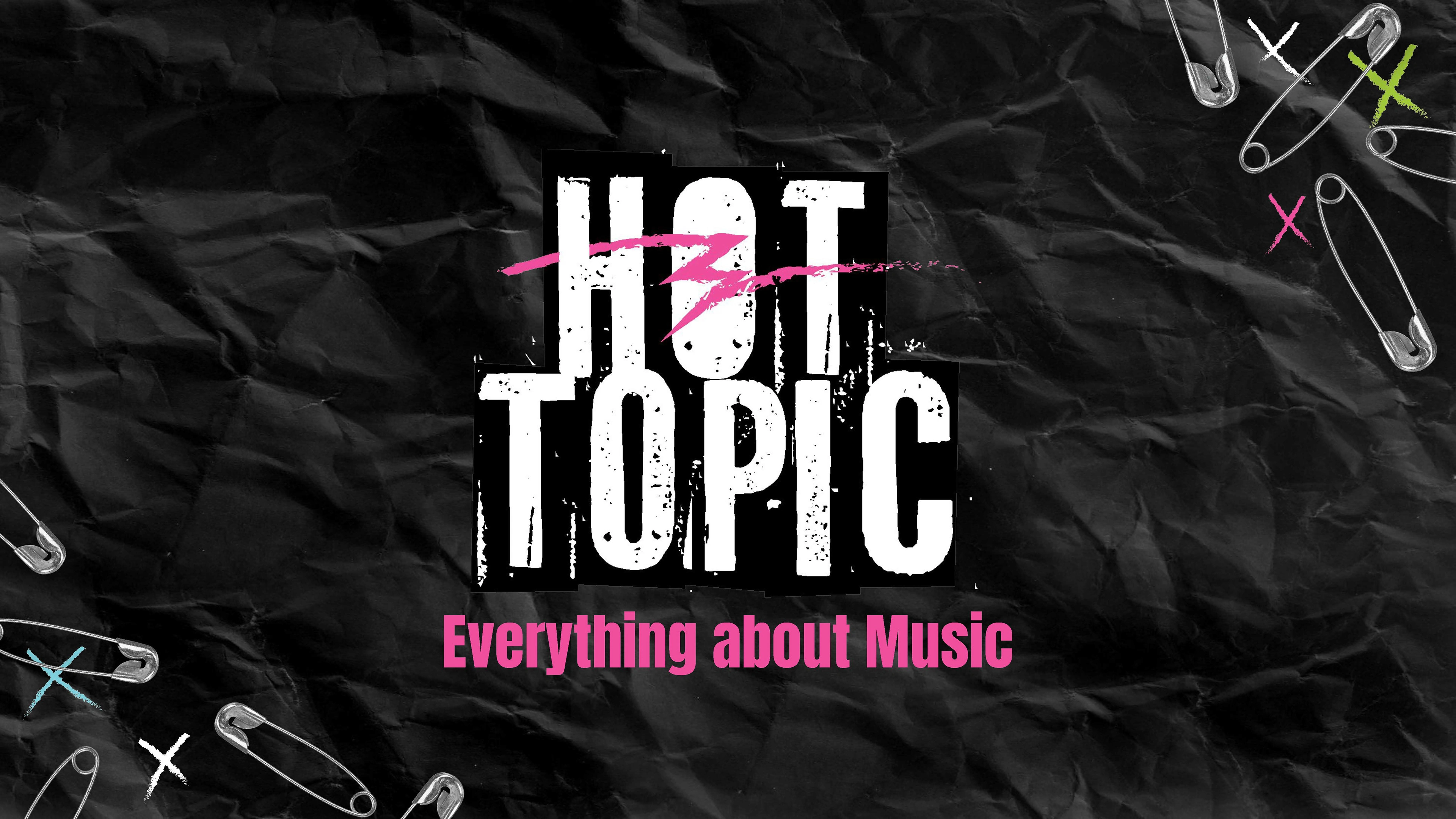
Our group wanted to take Hot Topic back to its music-centric branding and its youth subculture appeal, so we made the logo a more punk rock aesthetic, with the logo, especially the slash, being reminiscent of the brand's 1980s logo, when the punk scene was taking off, especially in America.
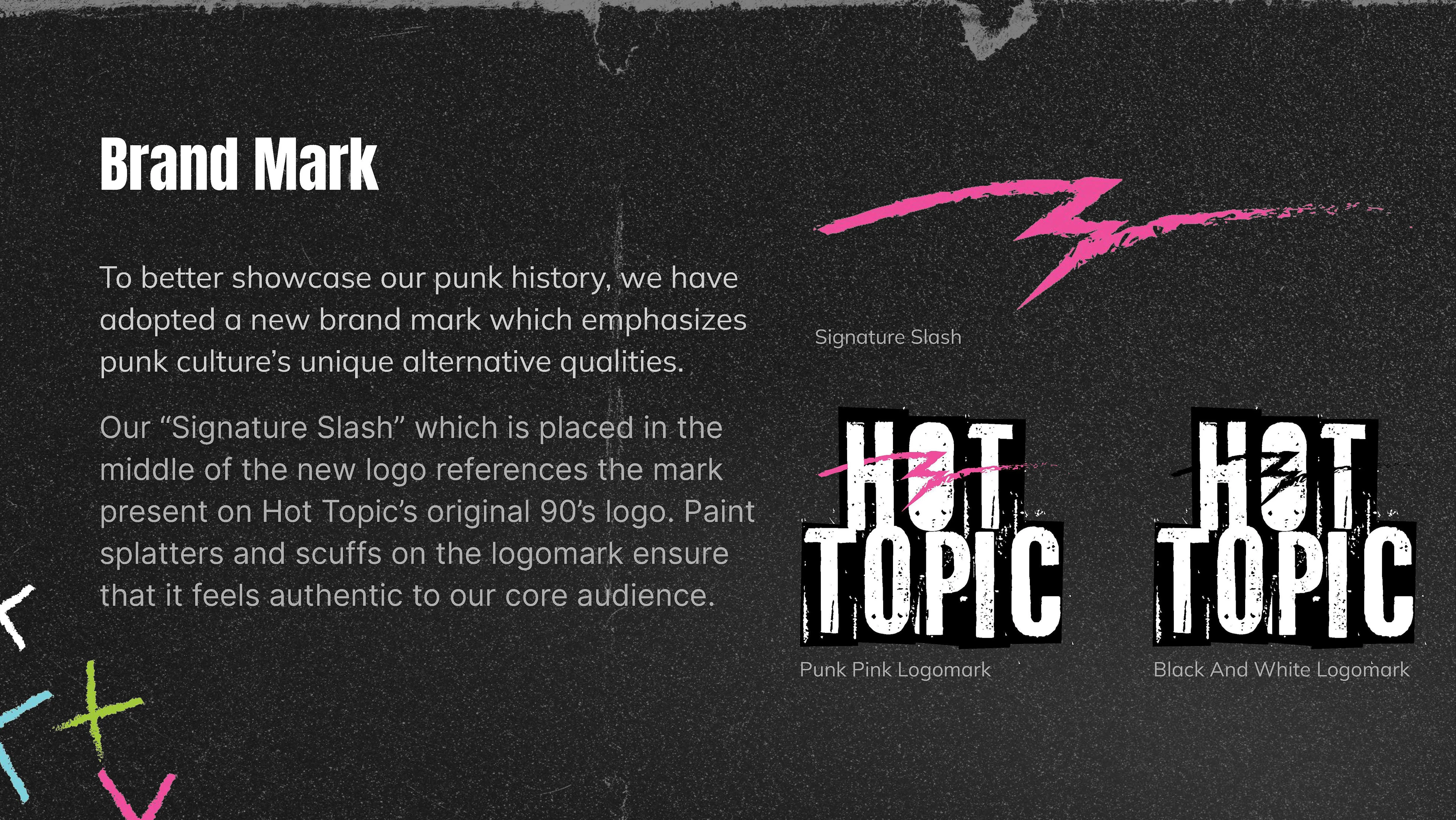
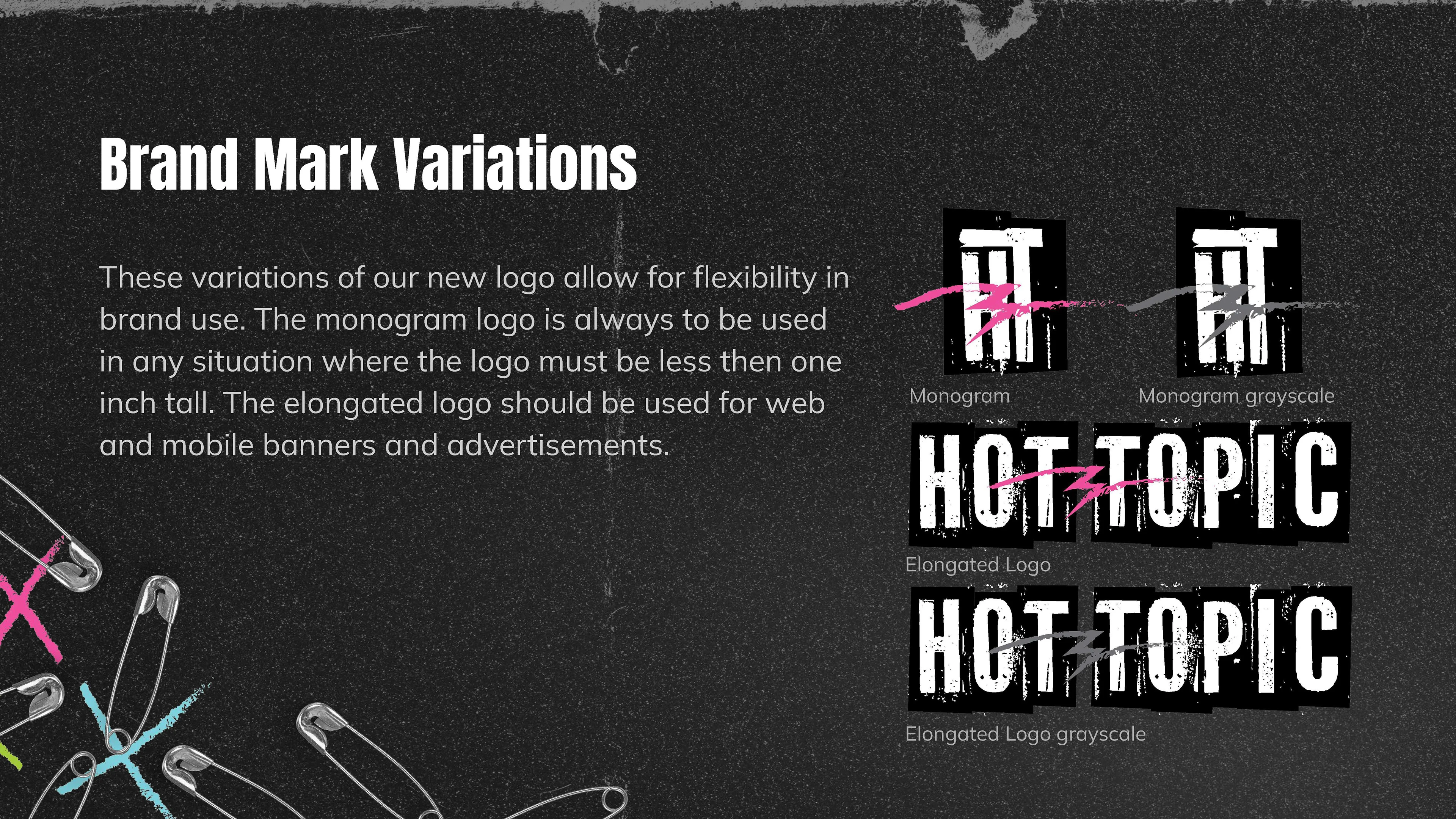
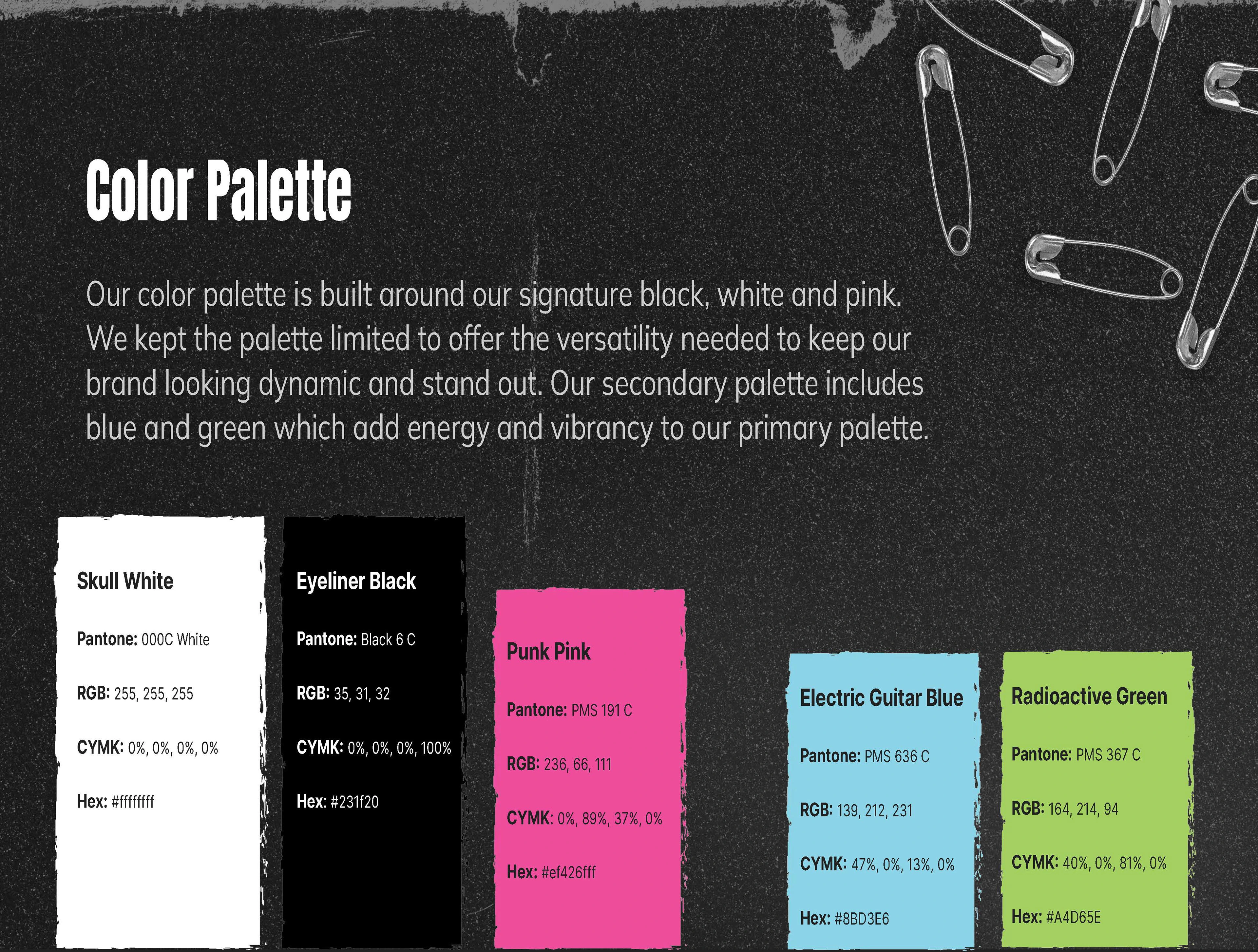
The color pallet also hits on these punk ideals with neon colors contrasting a black and white color scheme, very common in the punk and alt aesthetic. The names of the colors were custom-made for us to strengthen our brand identity and further connect the brand back to niche subcultures.
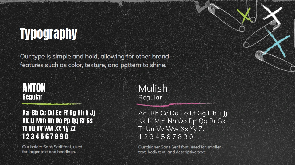
The type we chose was a thick and complementary thin sans serif font to keep it very simple in contrast to the very busy logo, imagery, and graphic elements utilized in our branding. We also wanted it to look a little more professional when utilized in our stationery and promotional materials.
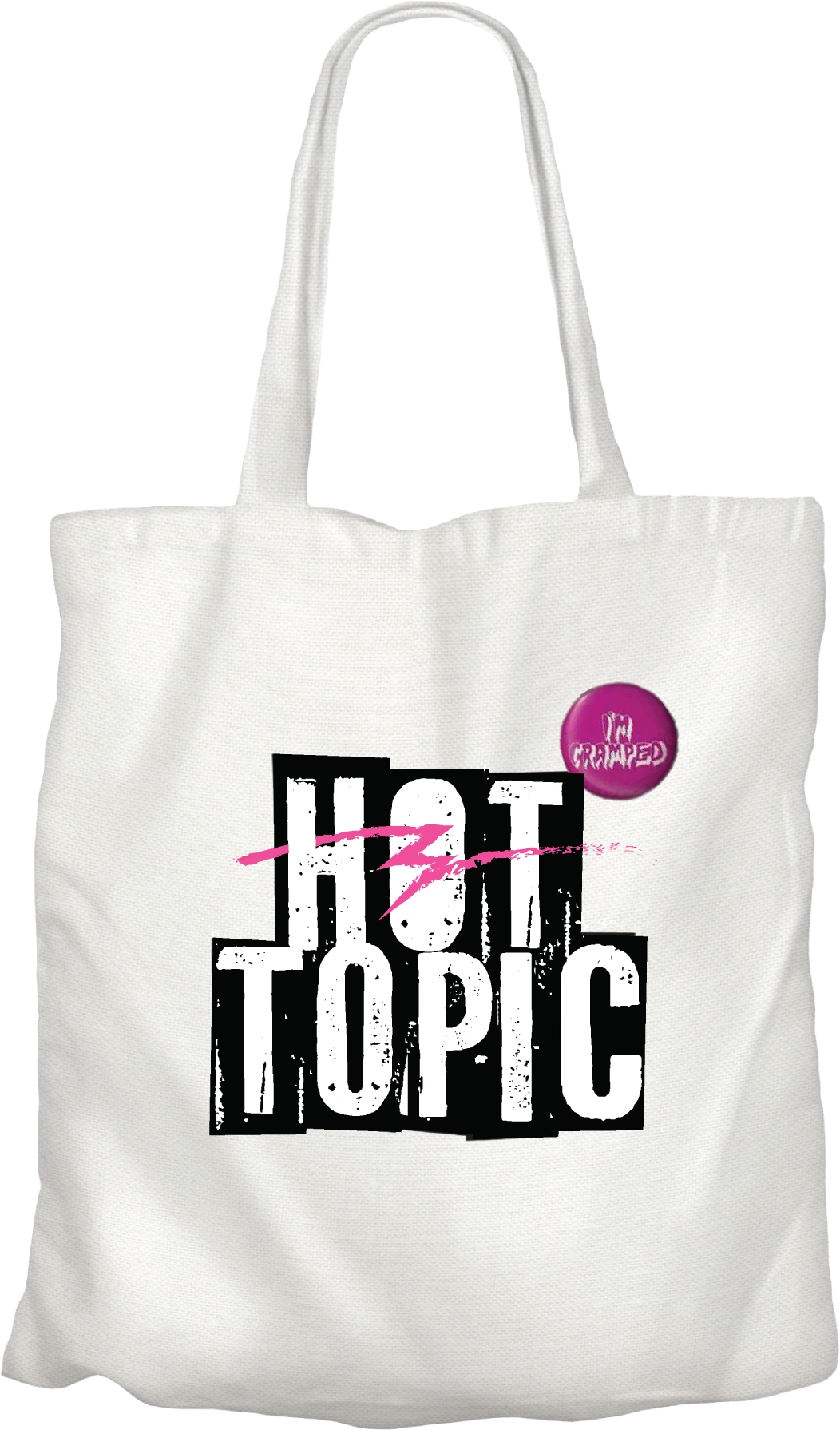
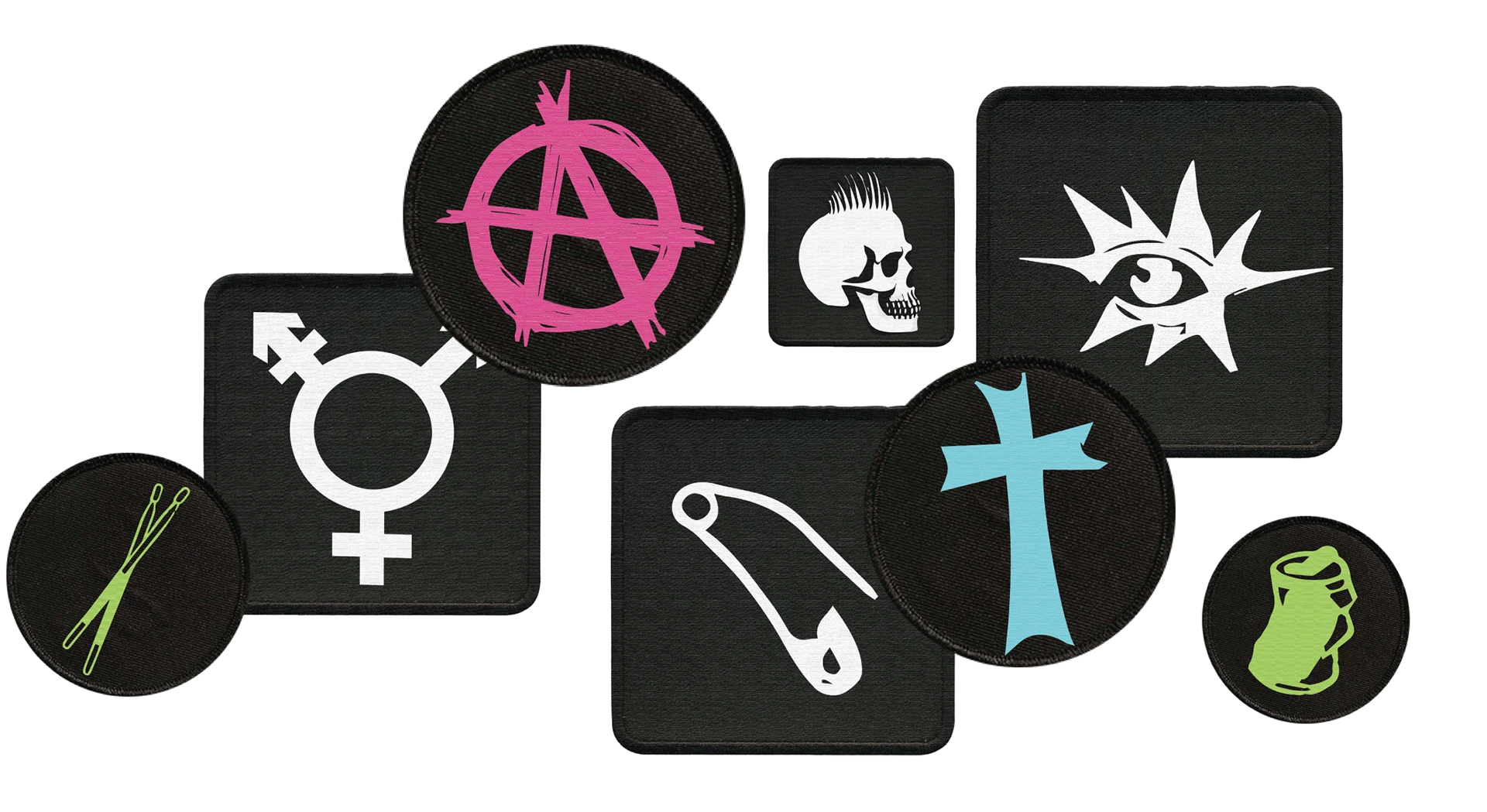
For this project, we had to create innovations within the brand to set it apart from its competition and to refresh it. The innovation we came up with was the idea of reusable tote bags for shopping that were fully customizable with the patches and buttons Hot Topic sells. This customization is a big part of punk culture and we wanted to bring that into the store. The other innovation was bringing in the thrift, upcycle, and handmade culture within the punk scene by bringing in independent sellers and creatives to sell their merchandise in-store, gaining profit for them and Hot Topic, increasing the customer base for these punk artists and allowing Hot Topic to gain trust within the space by separating their brand from the fast fashion model they had been following.
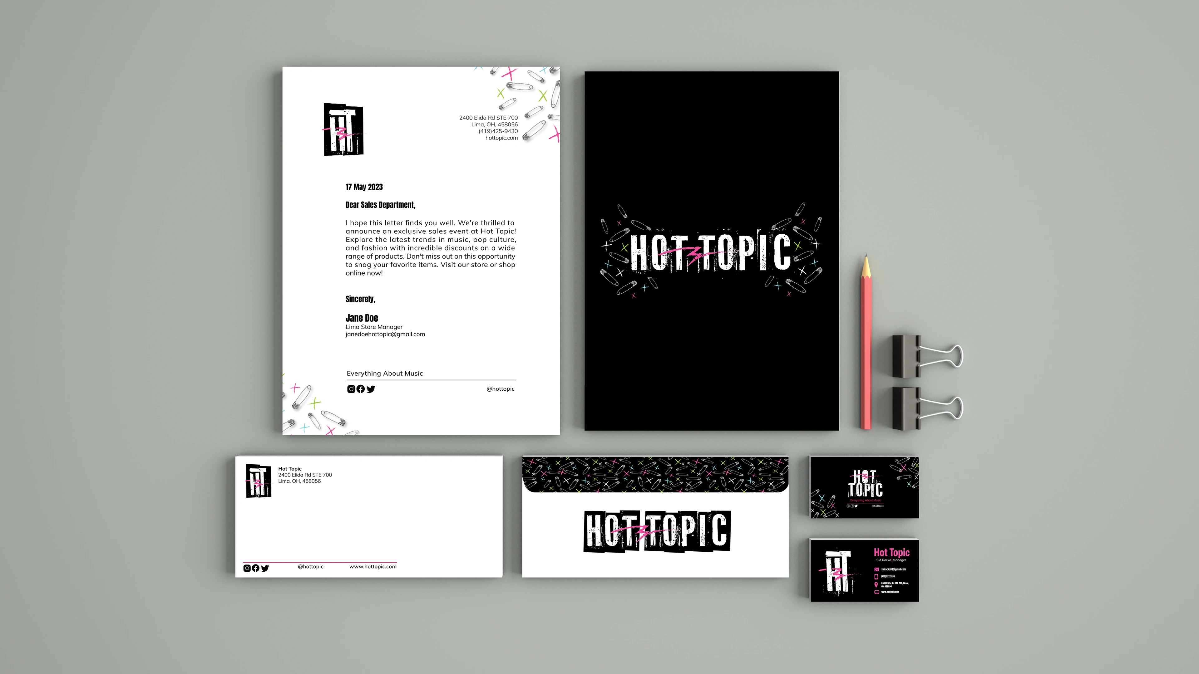
The stationery was a harder undertaking with it needing to look professional in a corporate setting while not sacrificing the brand identity as a whole. How we got around this was a mixture of utilizing our simplistic typefaces and making sure our hierarchy was neat and clean while allowing our logo and graphic elements to shine in some way across all of our stationery items, even if a bit neater than they would usually be seen.
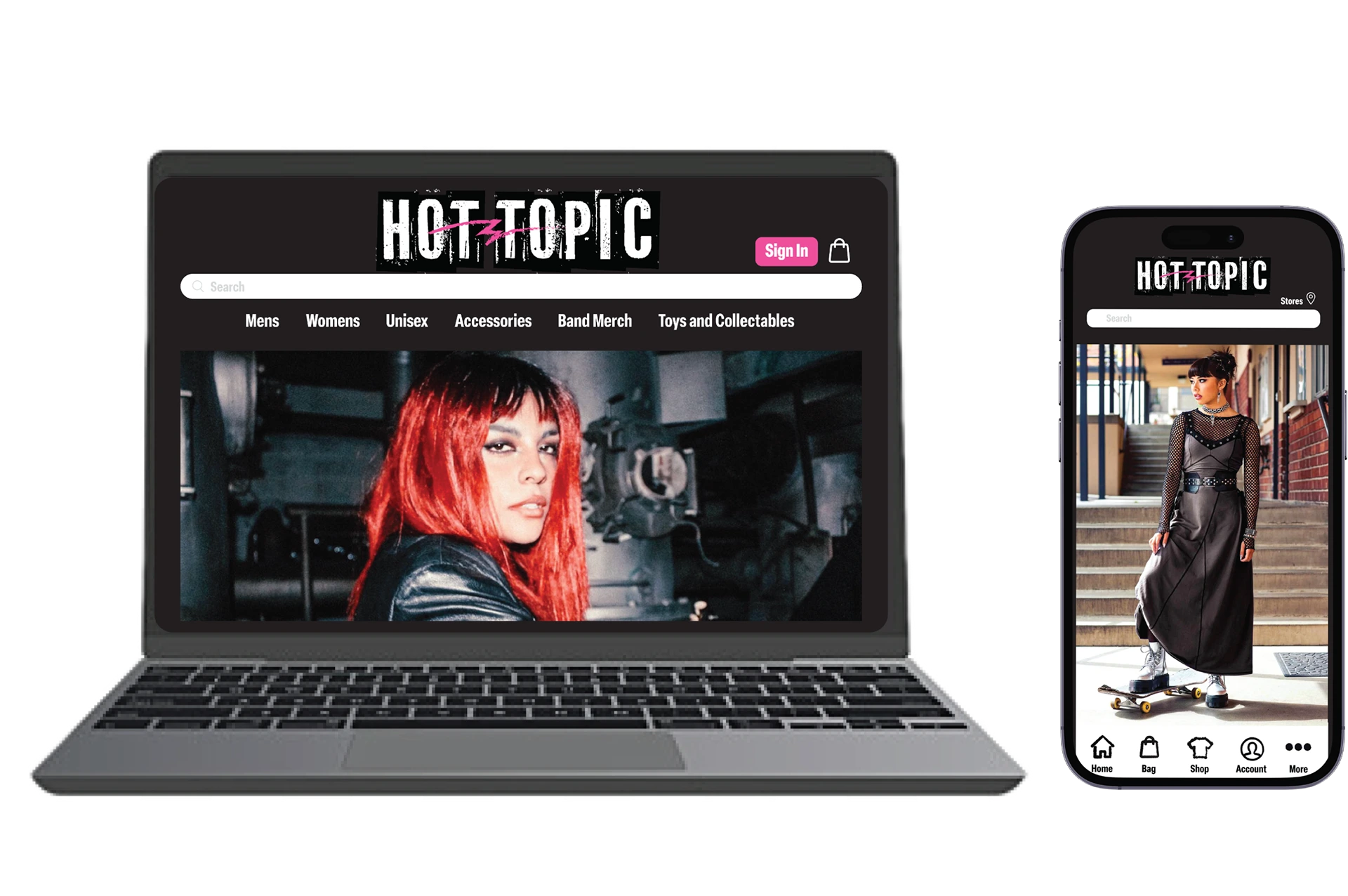
The last major undertaking was completely redoing the website and app for the store. Before, the two were not user-friendly, with too many categories to sift through and a typical fast-fashion brand look with too many pop-ups and web banners that added to the busy and unorganized look. We scaled these back, allowing for a clean and easy-to-navigate interface while still keeping the feel of the brand as a whole.
Like this project
Posted May 11, 2025
Rebranded Hot Topic with punk rock aesthetic and revamped website and app.
Likes
0
Views
15
Clients
Hot Topic