Search Results Redesign
Overview 🔎
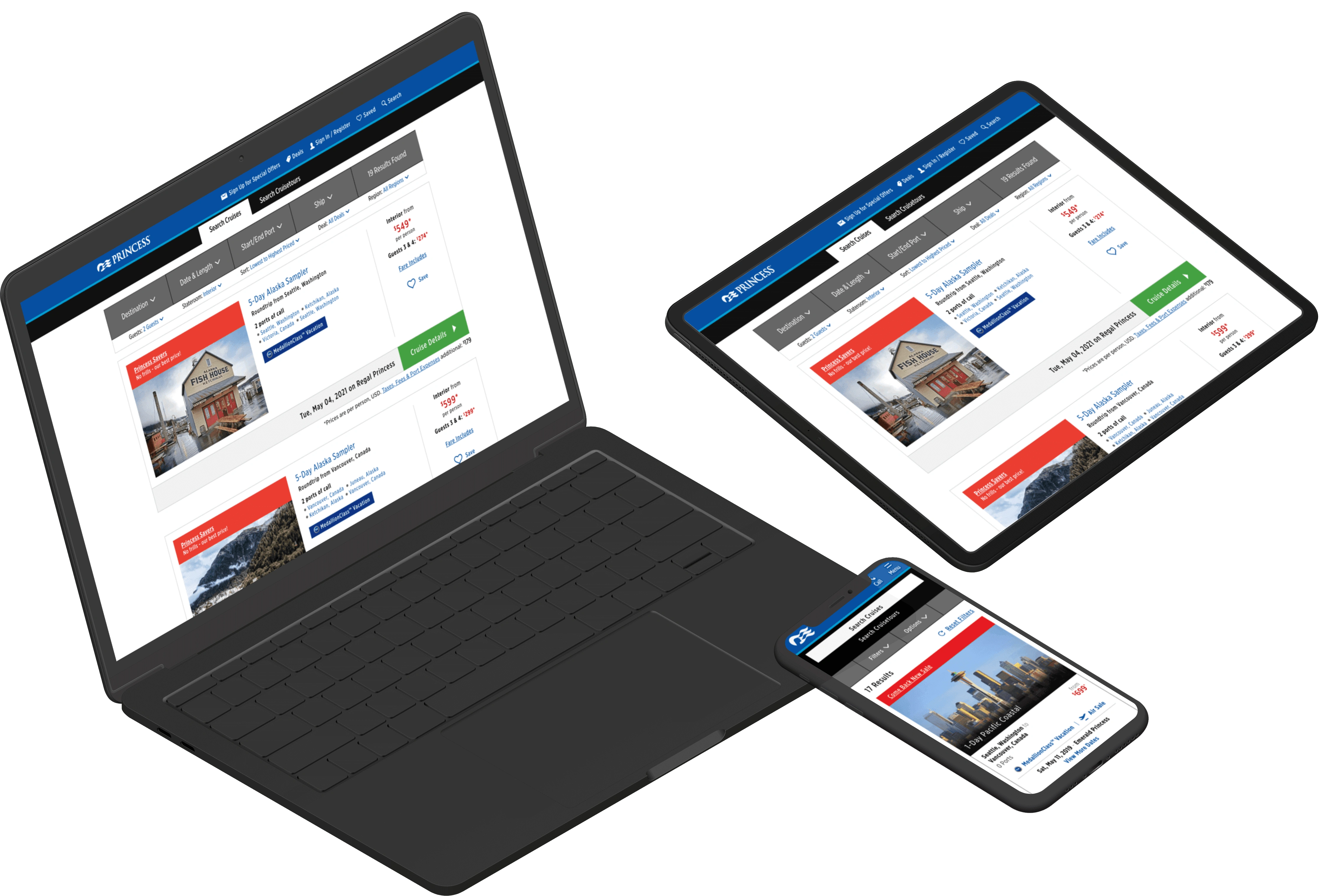
Without having done a substantial redesign in some time, the Search Results page was facing multiple issues from content and features being continually added over time. The page also faced an outdated look and mounting usability problems.
Our scrum team consisted of a front-developer, two back-end developers, a QA analyst, product manager, and business analyst.
Problem & solution 🤝
The problem
How might we redesign search results to make it more user-friendly, streamline the search process, and reduce cognitive overload for the user?
The solution
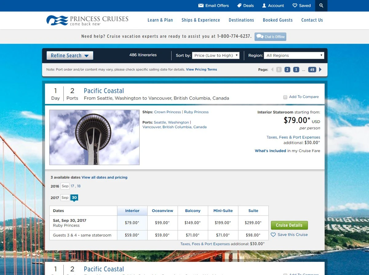
We decided to implement a redesign of the Search Results page that eliminated any unnecessary steps, exposed search refinements, and removed elements not relevant to the user's main goal; finding their cruise vacation.
Usability tests 👀
Our user research involved 8 participants who used princess.com for 45-60 minutes to research possible cruise trips for their upcoming vacation.
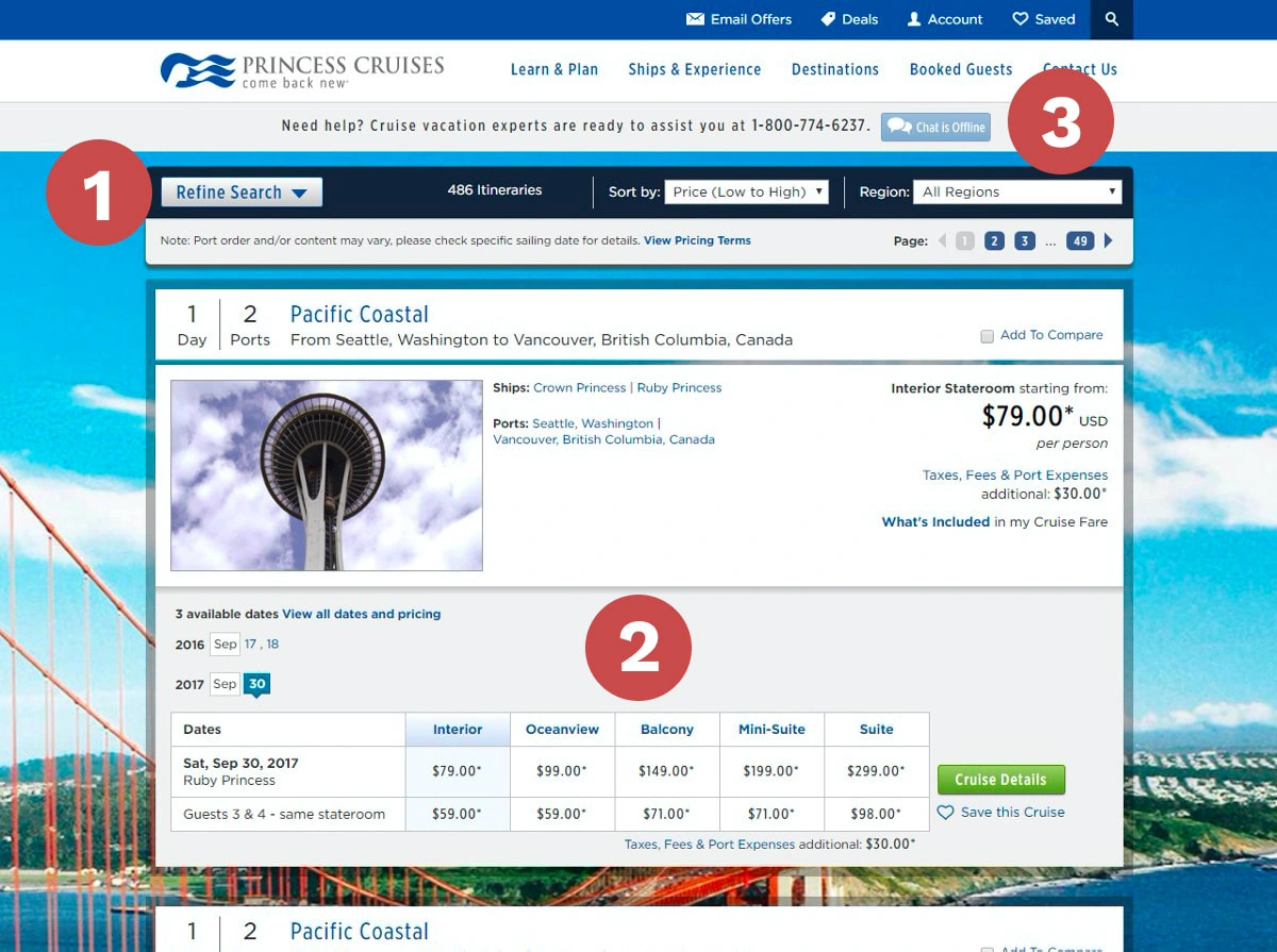
Method to refine your search not easily found
Users overwhelmed by the amount of content
Features like Click to Chat went unnoticed
Sketches ✏️
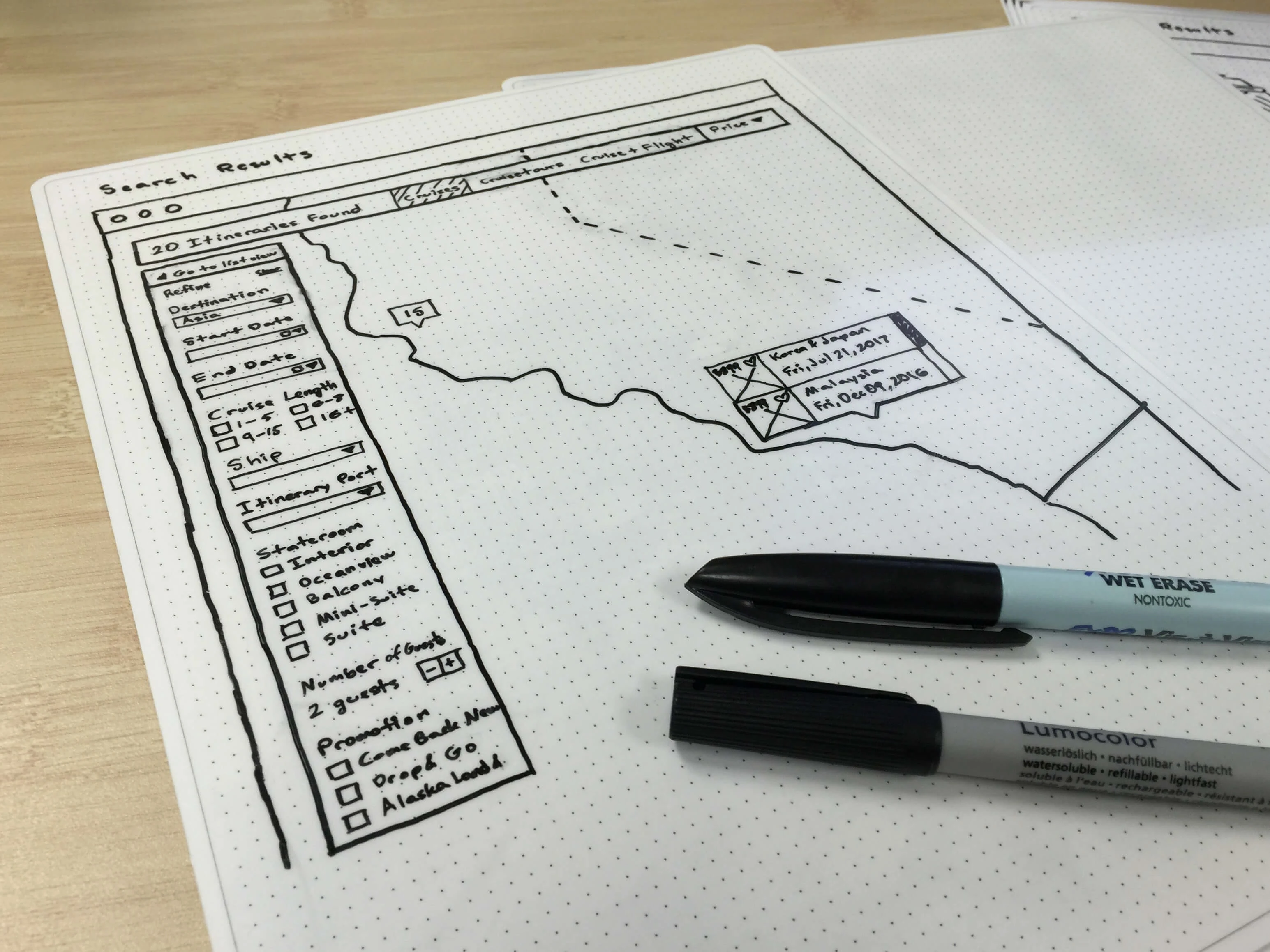
Here are some of the sketches I made during my research and low-fi design phase. I explored many different ways we could meet our goals; interactive maps, personalized promotions, many filters to almost no filters.
We met with our user researcher, design manager, product manager, and sometimes our developers as well depending on how complex our solutions. Sketches were narrowed down and revised based on our conversations.
Wireframes 🎨
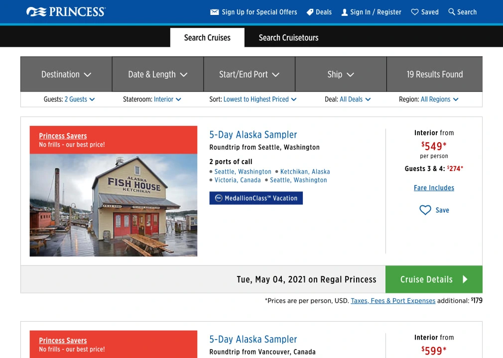
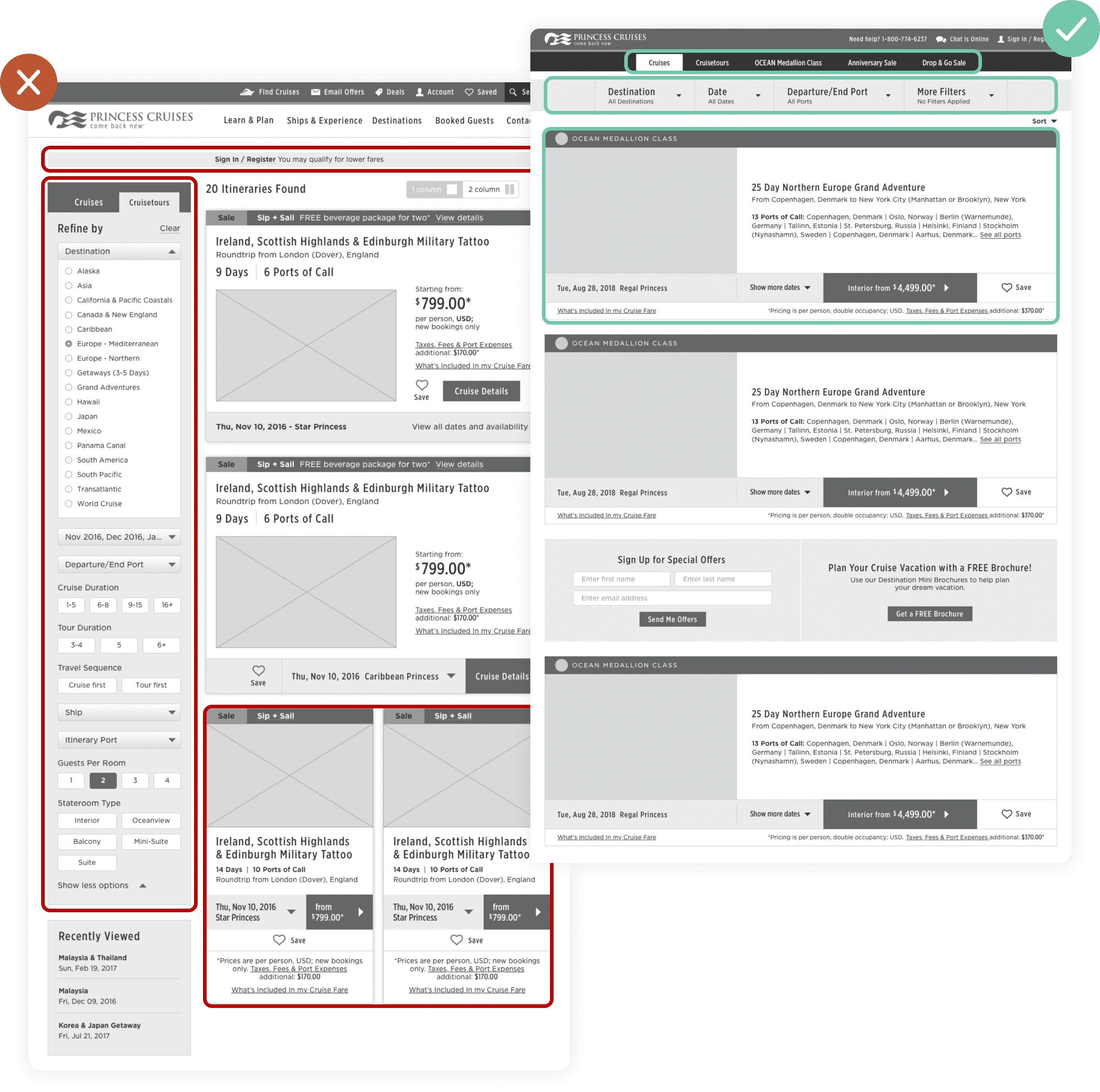
We found that users were less overwhelmed by tucking away the search filters. Users were still able to notice the filters as a horizontal bar on top of the page.
This also gave us the added benefit of having more space for the cruise results below. We utilized this to create a wide 1 column layout for each card. Deals & promotions were also prioritized through the tabbed navigation on top.
Results ✨
Once we added color, we found that users were starting to miss the search filter bar on top. We darkened the color in order to add visibility and meet color contrast standards.
Some filters were brought out such as Guest, Stateroom, and Sort by Price as we found that our more experienced users favored these.
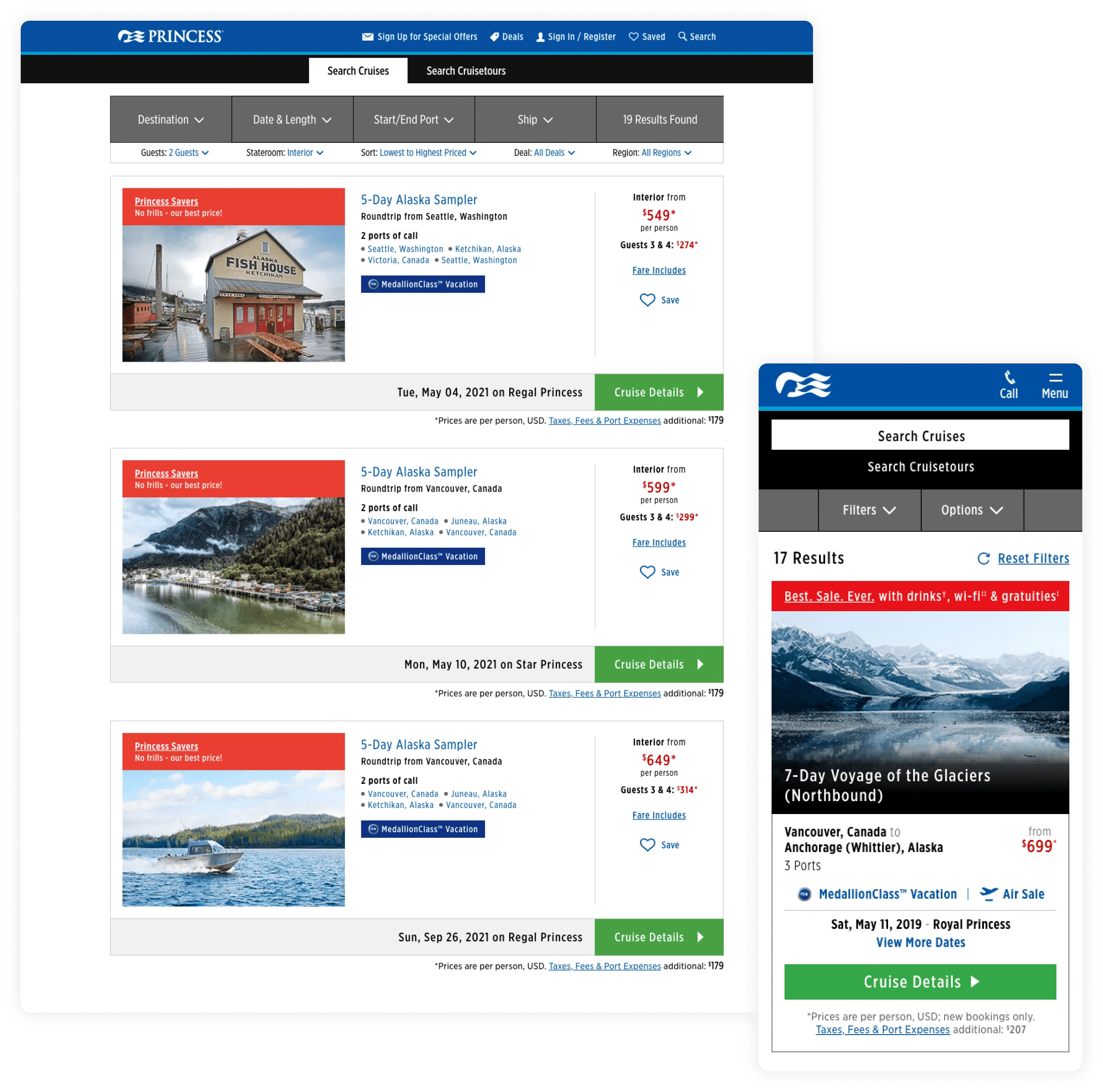
We got our redesign to launch and used Adobe Target to measure our new redesign with the old design. We were ecstatic to get an 11% lift on cruise bookings within the first week.

Conclusion 💥
I learned what it is like to work on such a large project. The scope of this from the beginning of our user research to the launch lasted almost an entire year (Feb 2019 to Jan 2020). With so many decisions being made in meetings, I found how important it can be to lean on documentation. It is so easy to forget what and why something was decided that happened 4 months ago.
If I had more time to work on this, I would find ways to prioritize only the most relevant content for the user’s main goal; find & book a cruise. I would research with more users to help discover what content is not particularly on their minds at this point.
You can find the redesigned search results on Princess Cruises' website.
Like this project
Posted Jul 11, 2023
Making it easier for our guests to find and book their favorite cruise vacation.
