Brand Identity for To’Relle Chocolate Co.
Sinha Graphics
Project Overview
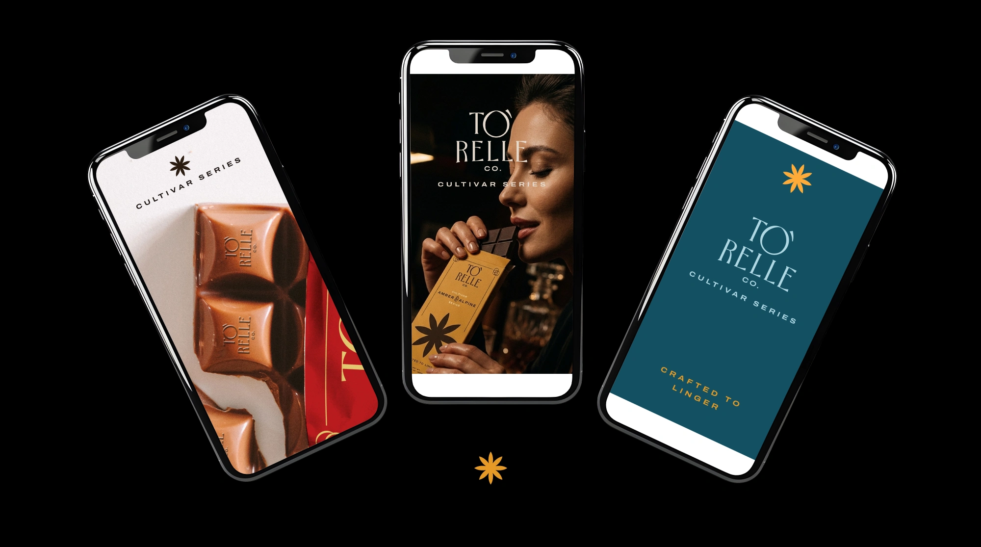
“To’Relle Chocolate Co. is a new premium chocolatier born in Ecuador. They make single-origin bars. Their goal is to make people stop and savor a moment. This project focuses on building a premium chocolate brand that feels rich, vibrant, and personal. The goal was to create a brand and packaging that stands out with its rich and energetic personality—something that feels expensive. The design needed to reflect quality, care, and a premium, enjoyable chocolate experience.”
The Challenge
“The main challenge was balancing bold, expressive colors with a premium feel. Strong tones can quickly come across as loud or overly commercial if not handled with restraint. At the same time, the design needed to stay simple while still being distinctive and memorable on the shelf. It had to clearly signal that the product is high-end and gift-worthy, while also conveying a sense of craft, origin, and a slower, more thoughtful chocolate experience.”
The Solution
“The approach was to keep the layout minimal and allow color to carry the visual impact. Each bar uses a rich, earthy base paired with a contrasting accent, creating a bold yet controlled presence. The wordmark is set in a refined serif, complemented by a custom cocoa shape letter 'O' with a hand-drawn loop apostrophe symbol that adds a subtle human touch and raw handcrafted feel. Charcoal, Olive, and Ivory are the primary identifiers of the brand, while other notable colours will mostly be used in packaging & campaign purposes.”
Like this project
Posted Apr 1, 2026
Developed a premium brand identity and packaging for To’Relle Chocolate Co using a minimal, elegant layout and rich, expressive color palette.