Chaos Tourist™ Branding - Survival Gear Brand
Sinha Graphics
Brand: Chaos Tourist
About: Chaos Tourist is an outdoor survival product brand focusing on eco-tourism.
Service: Brand Identity
Project Overview
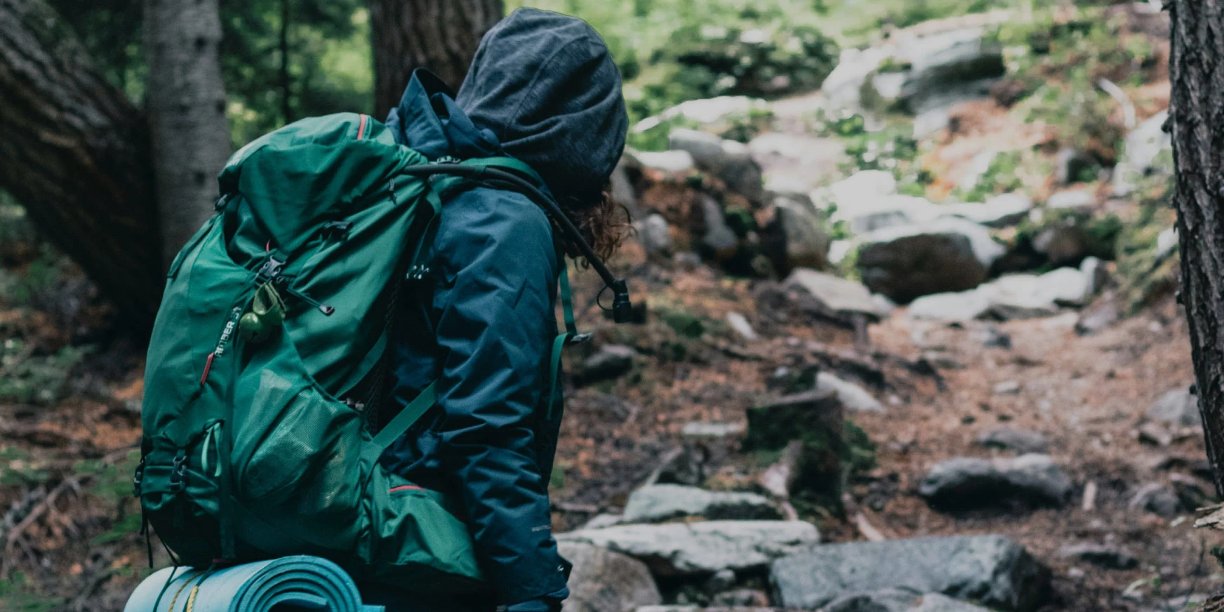
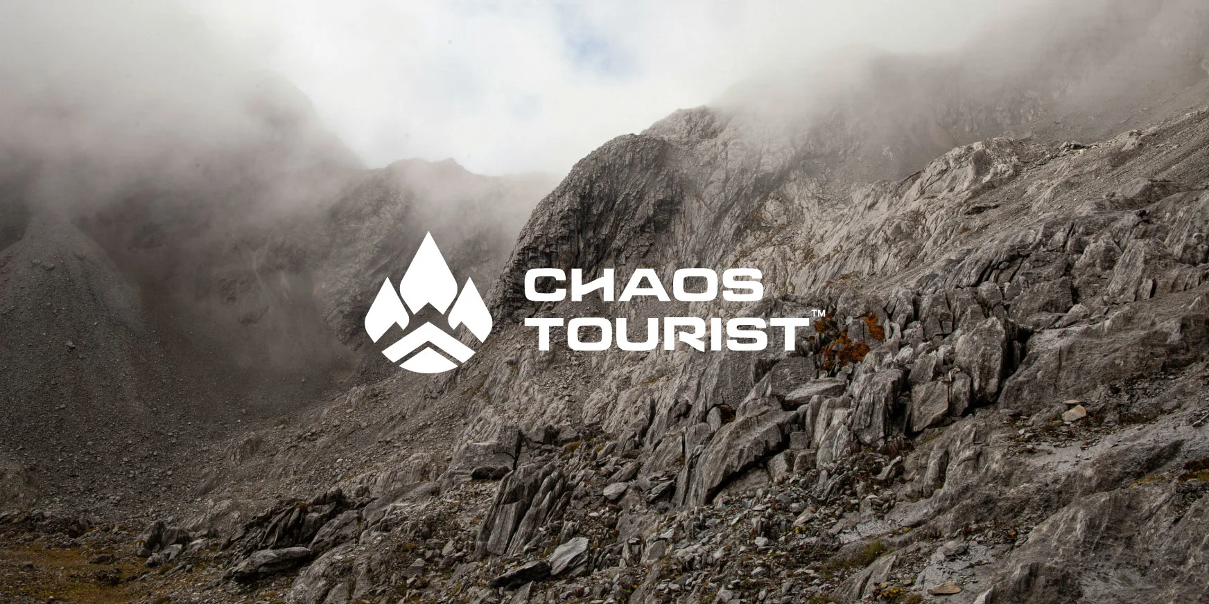
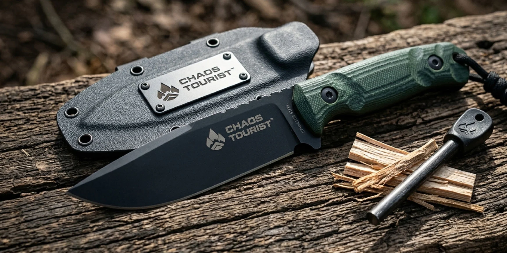
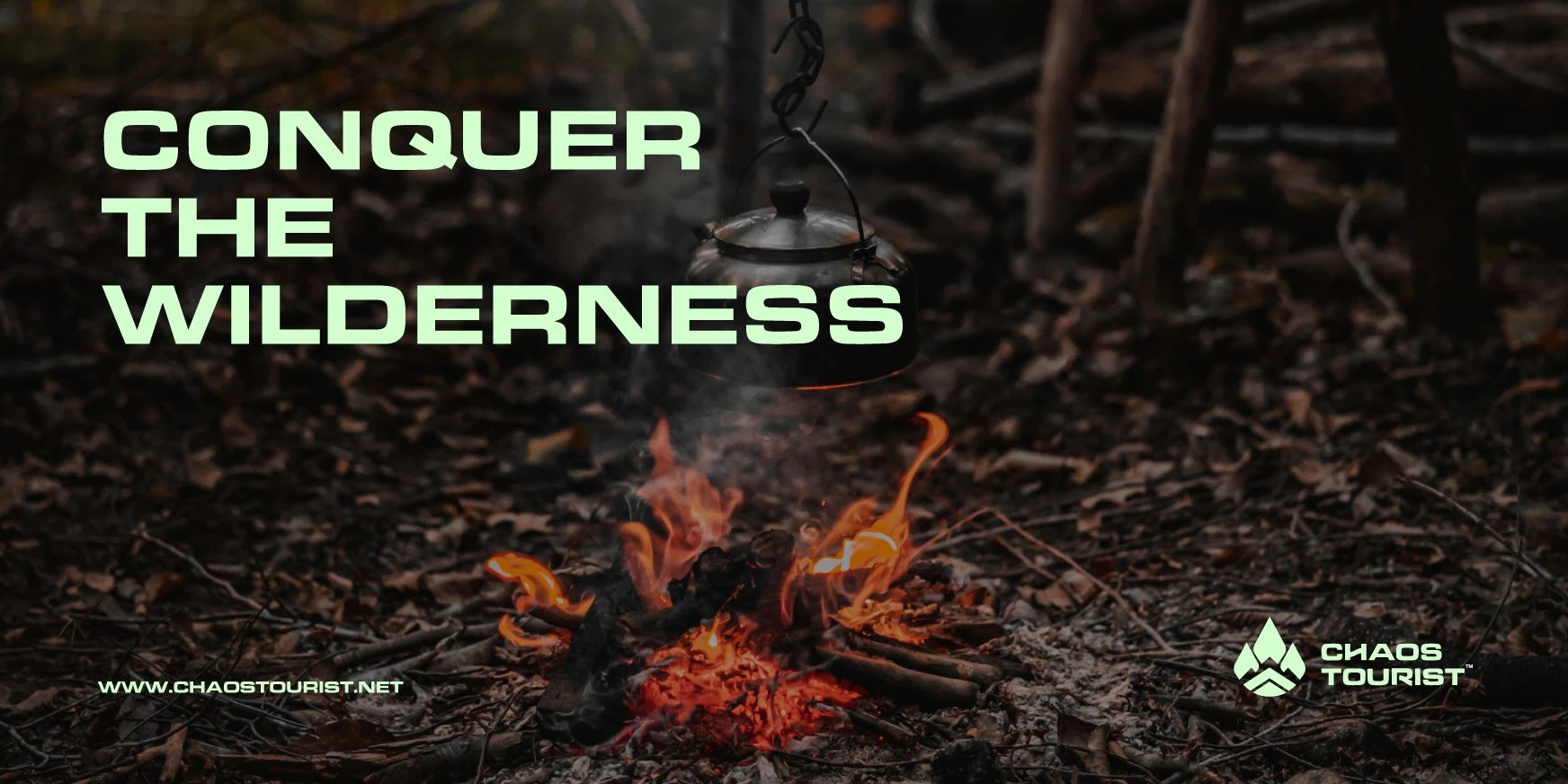
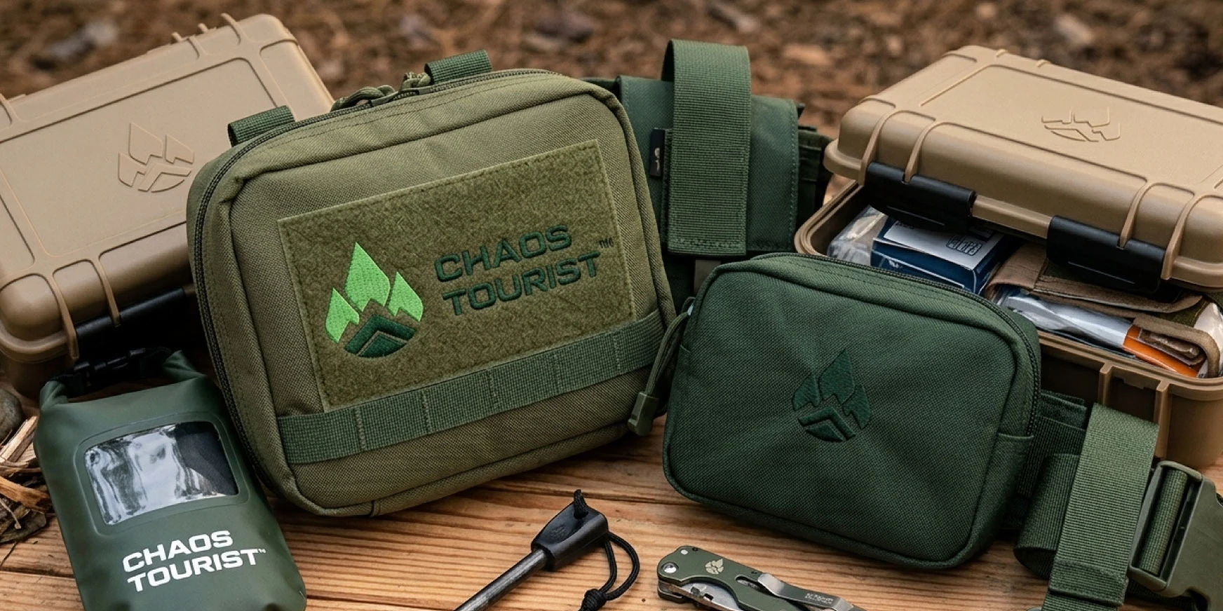
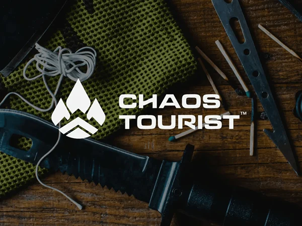
Chaos Tourist is an outdoor survival product brand providing adventurers with reliable, eco-friendly gears focusing on the outdoorsmen, hikers, survivalist, eco-conscious adventurers and military type men. Provides durable survival products that balance toughness with sustainability, helping people feel prepared, safe, and connected to the outdoors.
The Challenge
The challenge was to create a visual identity that balances rugged outdoor survival with eco-consciousness. Chaos Tourist needed to feel strong and reliable, yet approachable and connected to nature, appealing to both adventurers and eco-conscious explorers.
The Solution
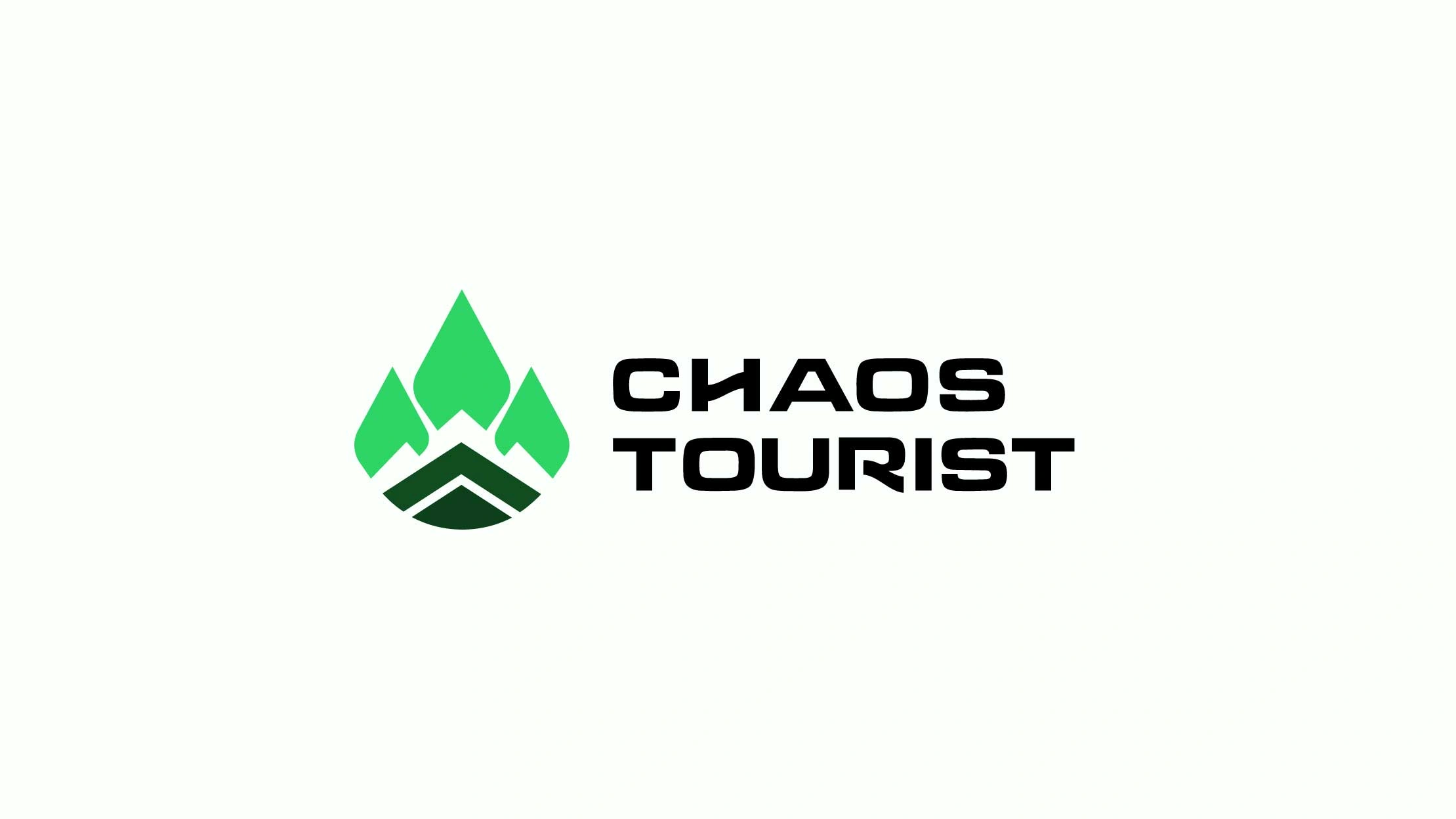
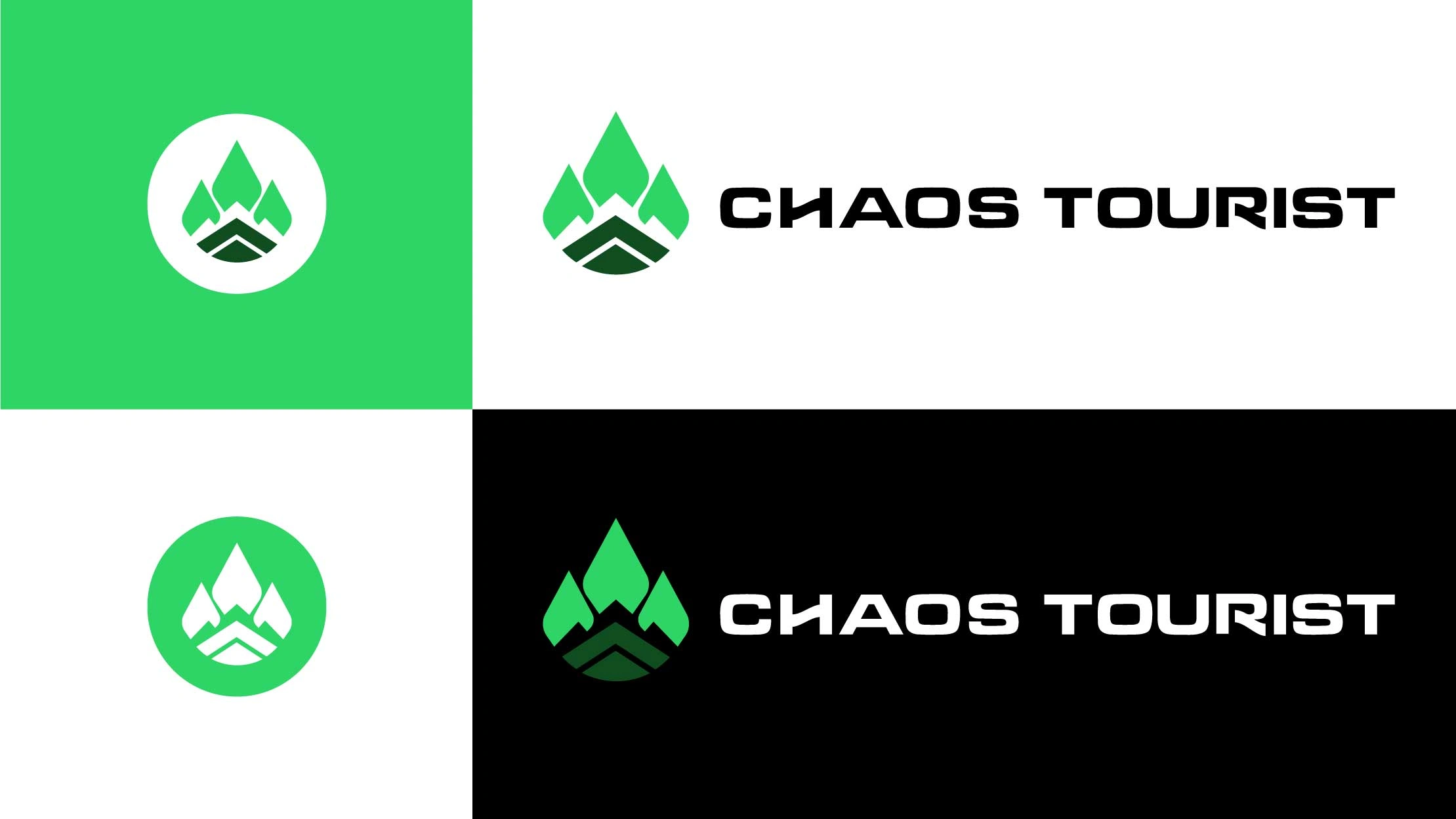
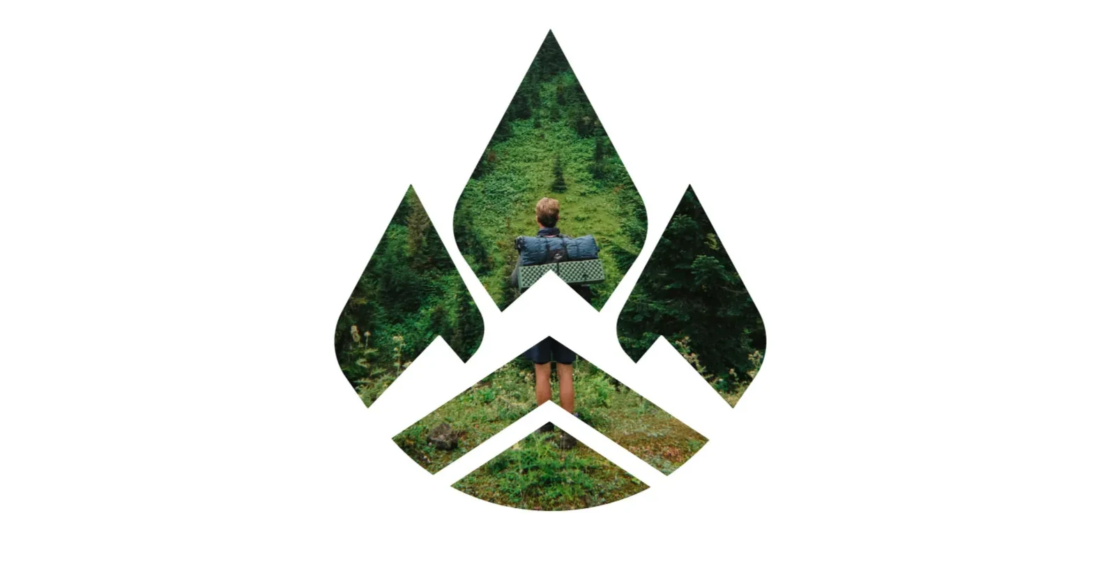
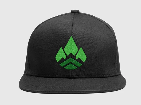
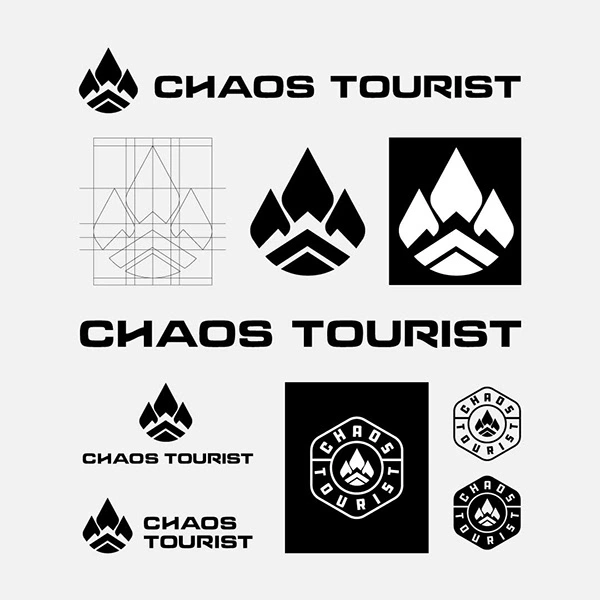
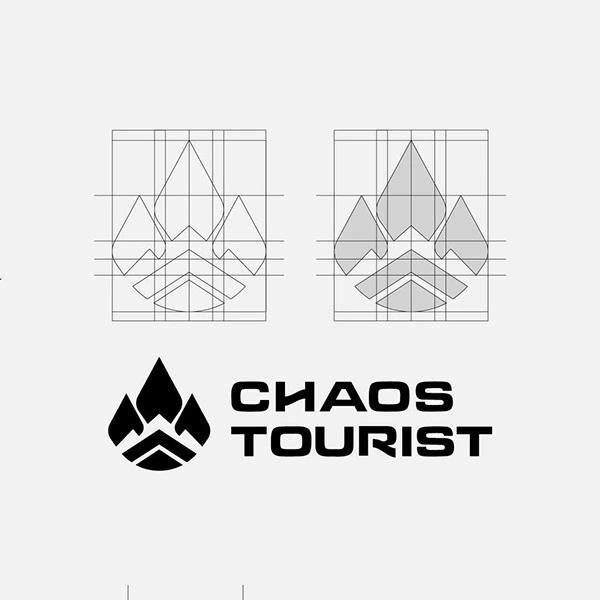
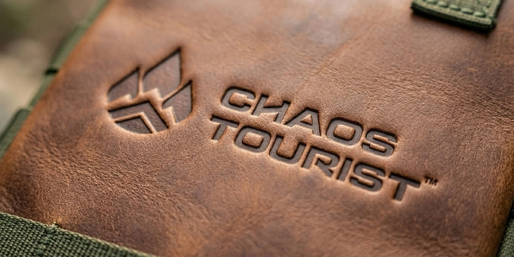
The brand identity uses bold, slightly unbalanced typography and abstract icon to convey balance between nature, ruggedness and unpredictability. The icon symbolizes fire and mountain, the arrow shape underneath represents pathway, direction & adventure. A dark, adventurous nature inspired color palette charcoal, dark green, and medium green adds eco-friendliness and excitement. Clean, strong fonts with playful accents keep it approachable and masculine at the same time.
Like this project
Posted Apr 1, 2026