VAMA - Brand Identity
Developing The Strategy
Derived from its Sanskrit origins, "Vama" translates to “Beautiful.” My task was to develop a brand identity that encapsulates this meaning by blending Indian heritage with modern visuals.

Logo Design
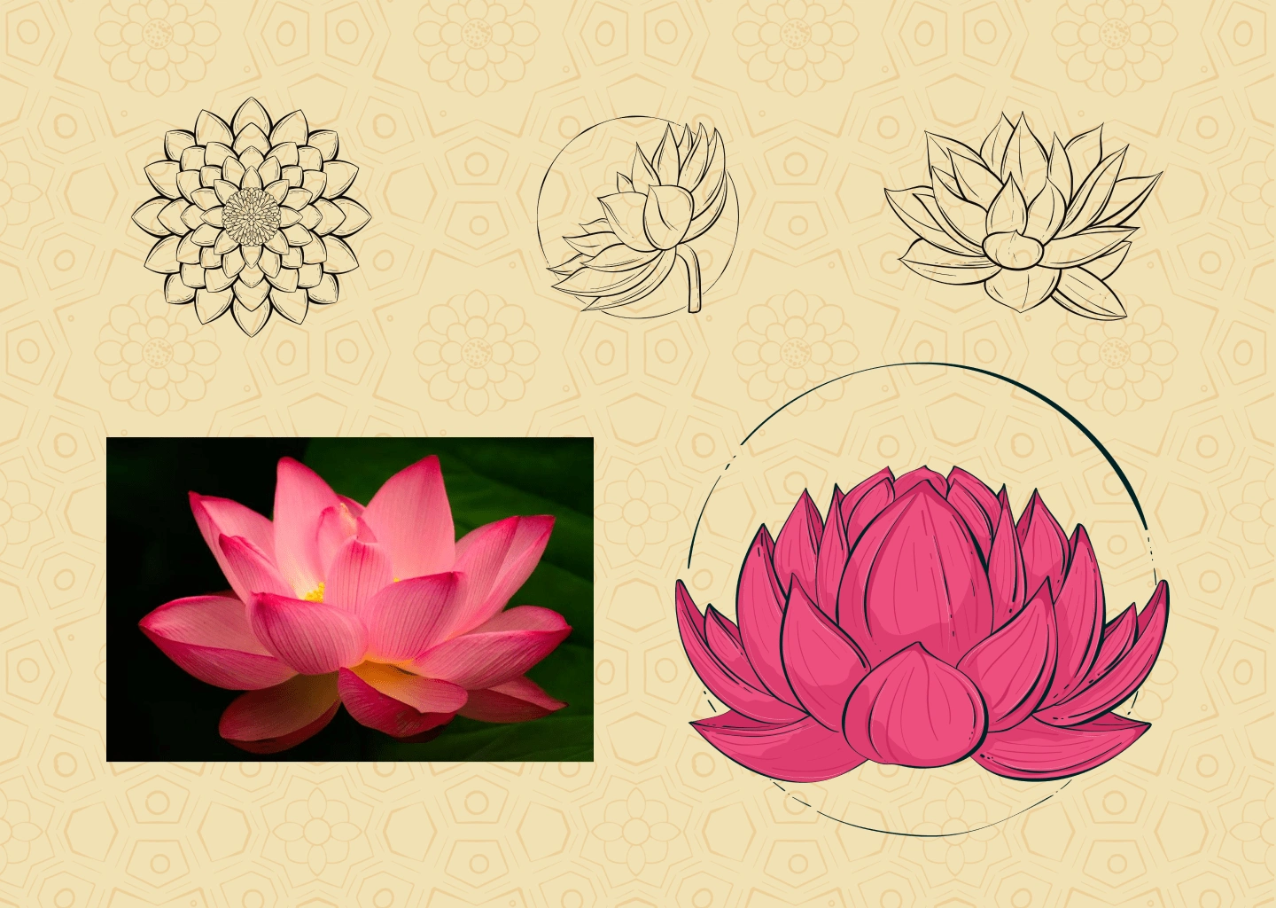
The lotus, symbolizing strength, resilience, and rebirth, was chosen as the perfect representation of the brand. The goal was to create a detailed logo that conveys strength with elegance.
Brand Identity
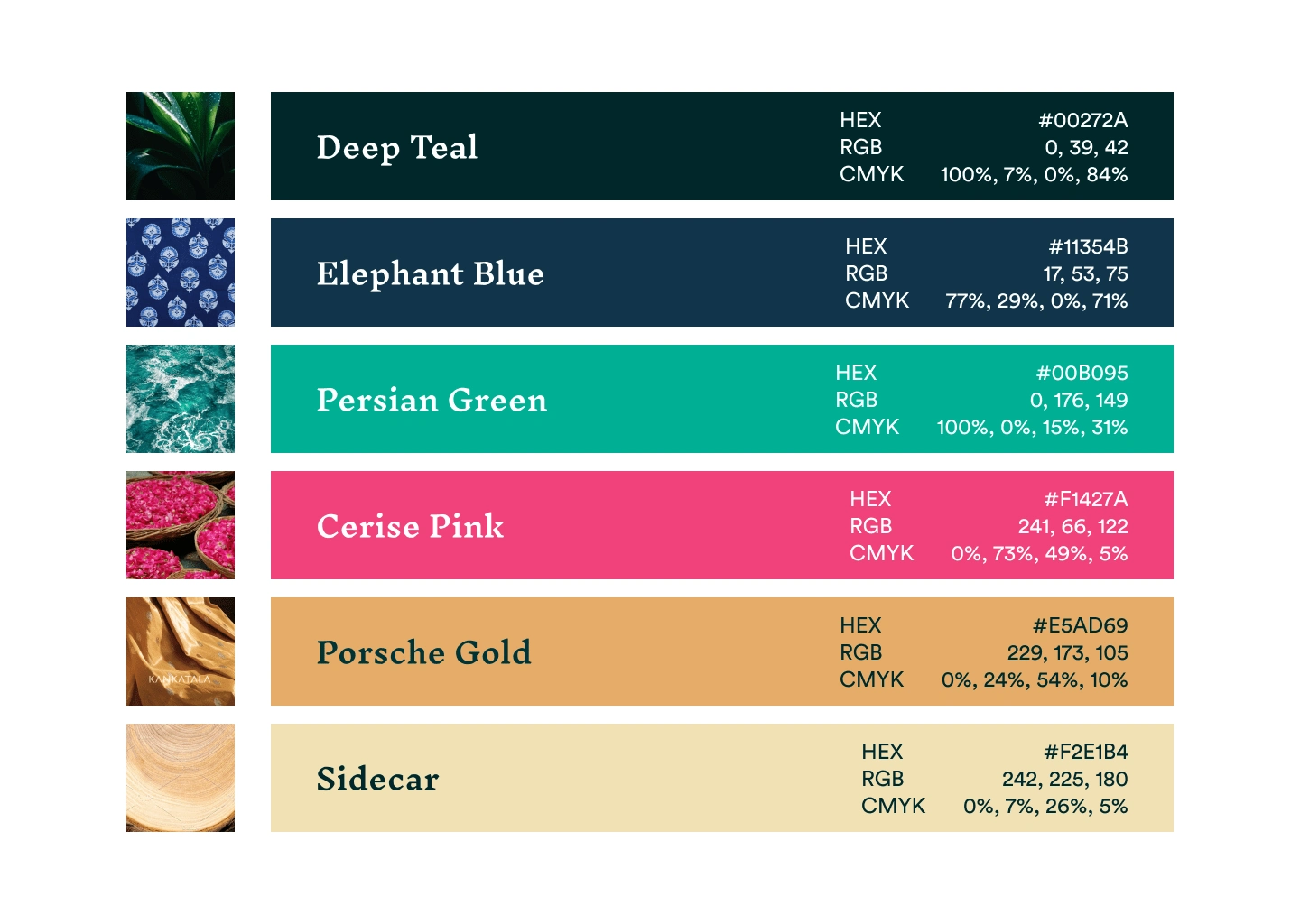
To highlight the brand’s Indian roots, I selected colors inspired by Indian nature and culture. The combination of green, pink, and yellow not only reflects this heritage but also keeps the brand identity vibrant and fresh.
Visual Elements
Traditional Indian flowers, paired with homely leaf motifs, were chosen to best represent the brand. Additionally, a couple of traditional Indian patterns were incorporated to complement the illustrated elements. These visual components can be mixed and matched across various platforms, including packaging, promotional materials, and social media.
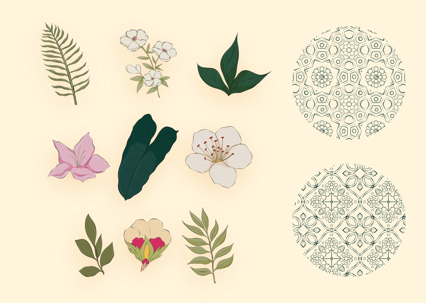
By utilizing symbols of strength and cultural motifs, we created a visually appealing and meaningful brand presence that resonates with its target audience. This project not only celebrates tradition but also embraces modernity, ensuring that Vama stands out in a competitive market.

Like this project
Posted Jul 3, 2024
I crafted Vama's brand identity, merging Indian heritage with modern design for a vibrant and meaningful brand presence across various platforms.

