Brand Creation & Web Design/Development
Overview
Wings veterinary health is a South African based brand, solely committed to integrative and evidence based holistic solutions for animal health.
The brand is family run, and developed as a result of the founding members’ dedication and love for positive reinforcement training and equine behaviour, as well as a deep love for their own family animals and the science of complementary health.
With 25 years of experience in the industry beginning with their parent brand Wings Herbal; specialising in integrative treatments for clinical human health conditions, they are well respected as a leader in this specialist field.
Challenge
Having specialised in the treatment of clinical human health conditions for many years, Wings Herbal was wanting to branch out into integrative solutions for animal health and infiltrate the holistic veterinary field.
The brief was to develop a sub-brand for integrative animal health under the parent brand Wings Herbal. This brand would share the intrinsic value and effectiveness of integrative solutions for animals, and position them as trusted leaders in the field of integrative veterinary treatments and the science of complementary animal healthcare.
The challenge entailed a full brand identity design and marketing strategy.
Approach
The brand name Wings Veterinary health was created as a result of bridging the brand’s core principles; holistic, integrative solutions, rooted in scientific backing and evidence-based clinical trialing. We wanted the brand to convey their holistic foundation while still being positioned as complementary treatment that can be used alongside treatment of clinical health conditions within the traditional veterinary field.
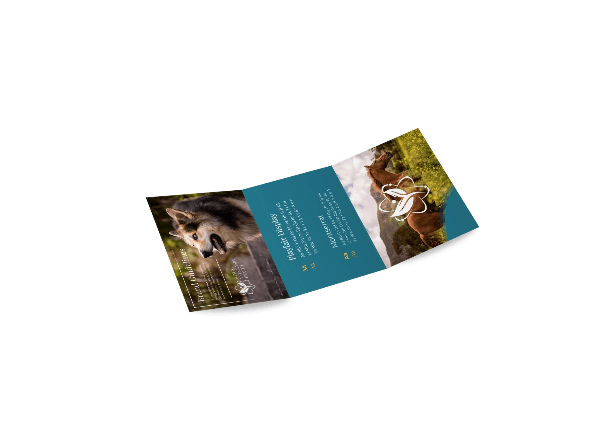
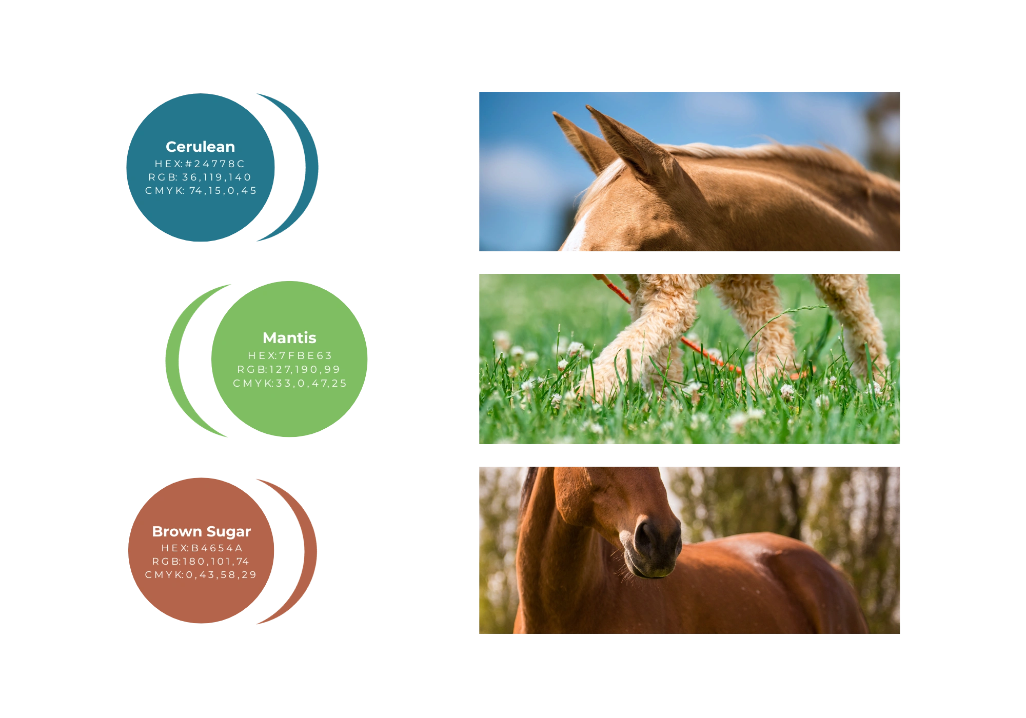
The purpose of Wings Veterinary Health is to use herbal based solutions for the healing of animals. Thus the simple and definitive tagline emerged: Healing Animals, Naturally. The primary colour palette is inspired by the parent brand’s original blue and green, however since the logo was requested to stay the same, we decided to alter the colours in a softer and friendlier way - resulting in the cerulean and mantis combination. The altered hues serve as a modern elevation of the brand from its original colour palette.
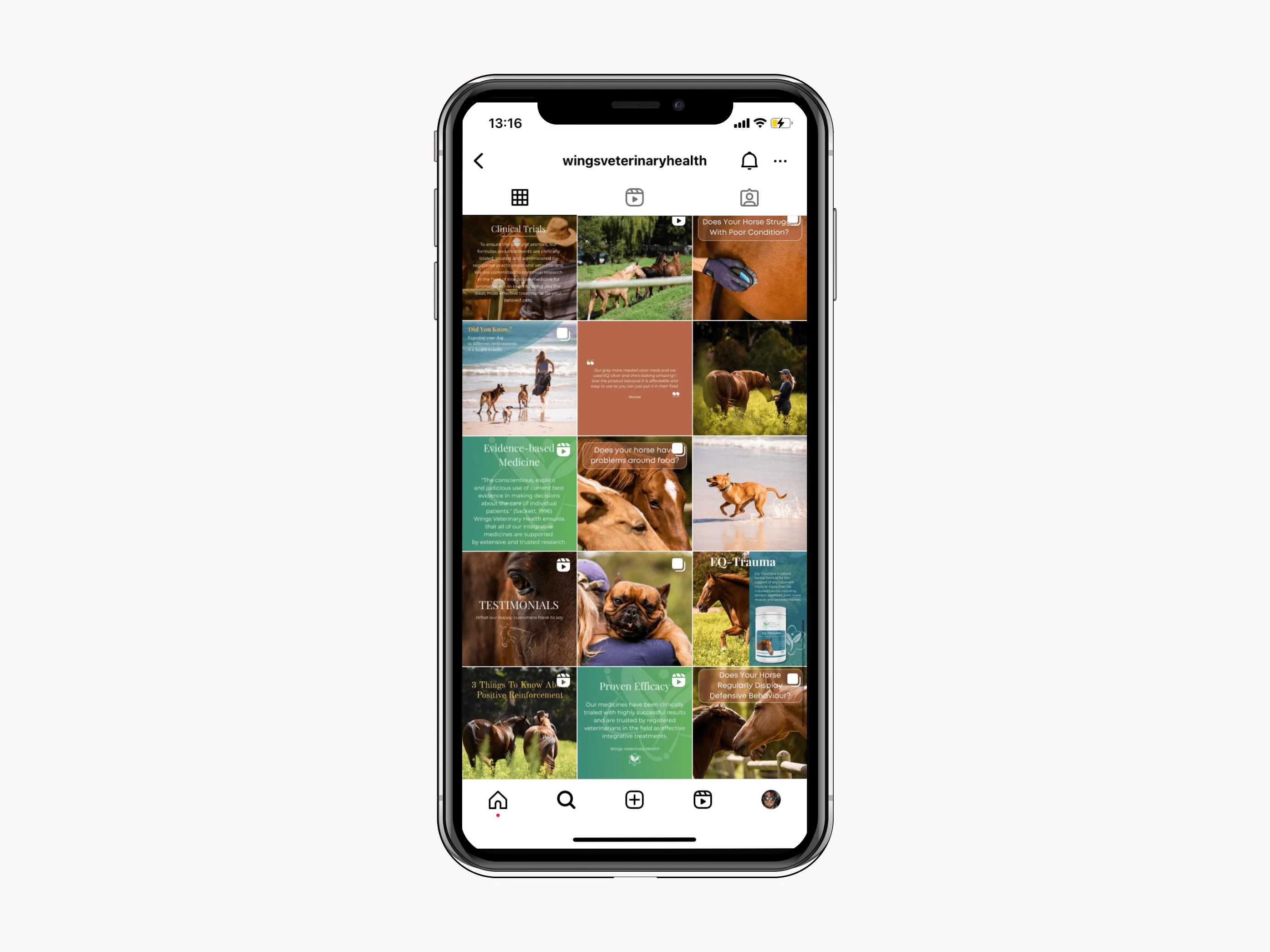
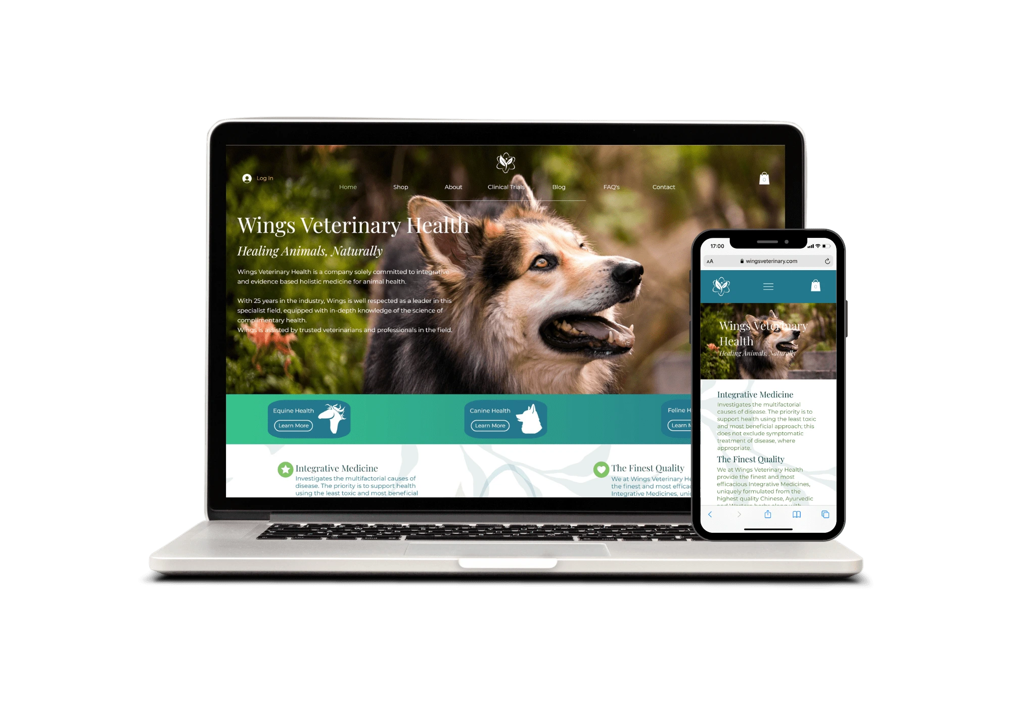
Since the animal health industry is starkly categorised based on the type of animal, we decided to differ the equine formulas from the canine/feline formulas based on colour. The blue speaks to the classic and elegant spirit associated with that of the equine community, while the green is more friendly and happy, sympathising with the qualities of dog and cat owners. This specification is showcased throughout the website, socials, and packaging - producing a cohesive and comprehensible vision.
Wings Veterinary Health is a business run by a family who loves animals.
Therefore, our objective was to bring out the heart of the company, with a personalised touch, making the brand relatable and memorable through highlighting its foundation of love and care for animal health.
To bring these elements to the forefront, we used photography of the Wing family’s animals in their homes, presenting a friendly, compassionate vision. Compassion is a strong pillar of the business, which is emphasised in the about section of the website. Showcasing the ethos, values, and heart of Wings Veterinary Health.
Like this project
Posted Jan 24, 2024
This project for an integrative veterinary company entailed creation of an entire brand, and website to showcase and implement that brand.
Likes
0
Views
2

