
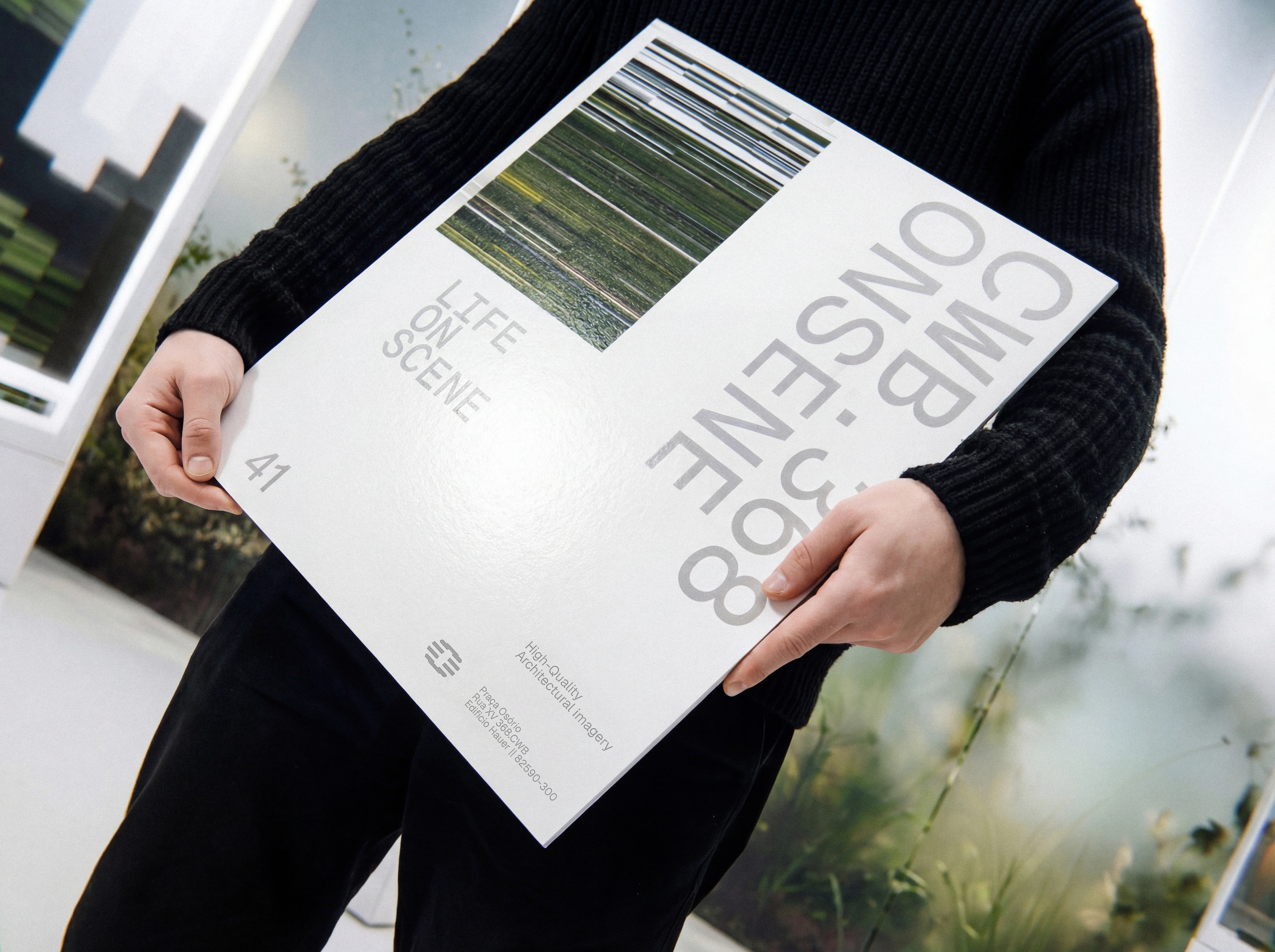
Onsene is a boutique architectural visualization studio built on authorship, curation, and atmosphere. The work puts life at the center of the frame, translating space into scenes that feel inhabited, credible, and unforgettable. “Life on scene” is the brand’s point of view: every image is directed with intention, shaping light, shadow, texture, and composition to surface what’s already there in potential and bring it into presence. For architects, developers, and investors, this becomes a clear visual narrative that elevates perceived value and supports confident decisions.
SENSORY AND ORGANIC. CINEMATIC. BREATH AND CONTEMPLATION.
Onsene starts from a simple concept: sensory and organic, cinematic in language, shaped by flow, haze, negative space, and quiet contemplation. The scene guides the eye. The detail holds the whole. The atmosphere carries the memory.
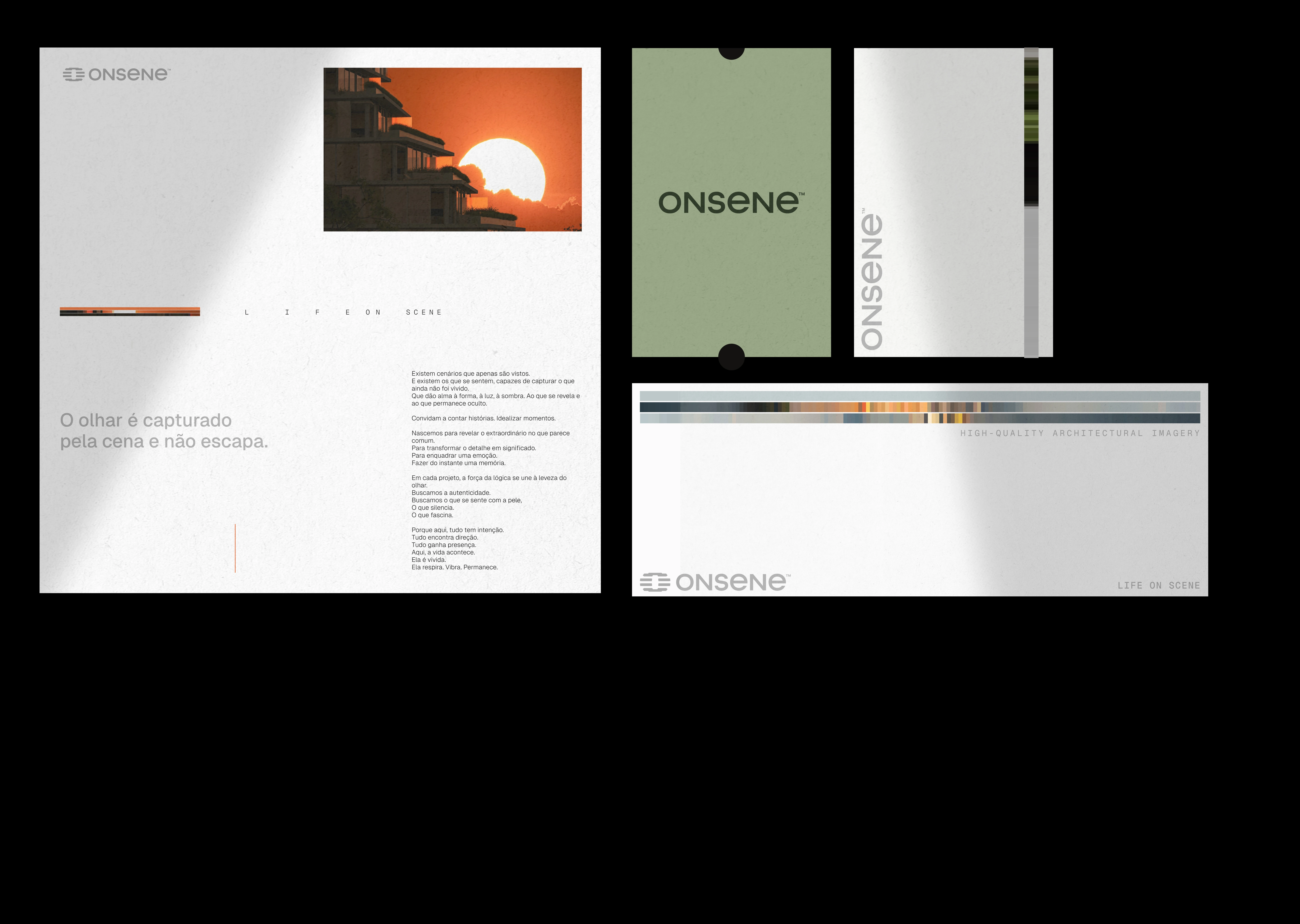
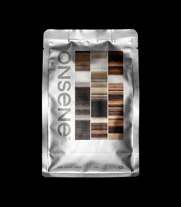
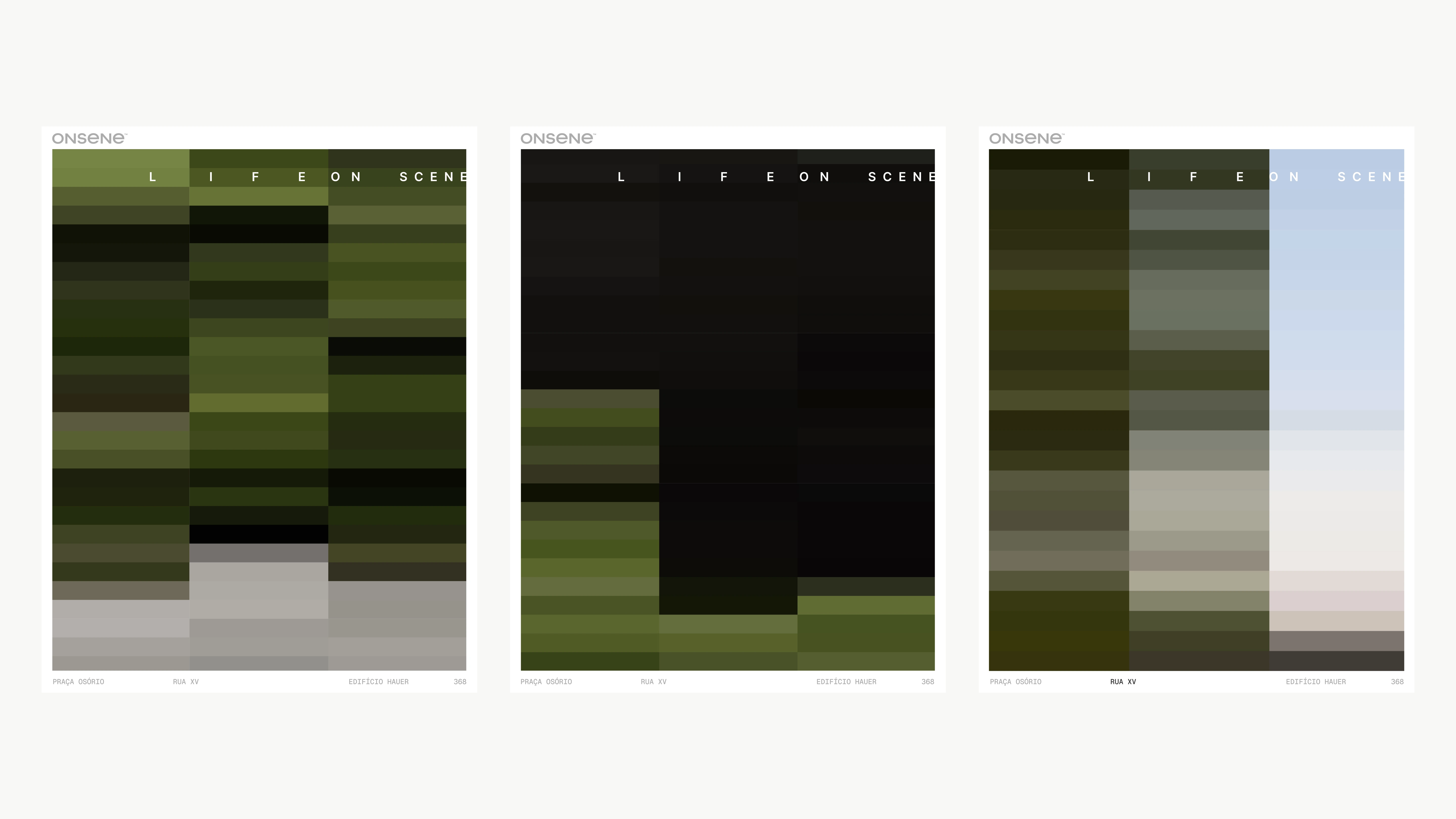
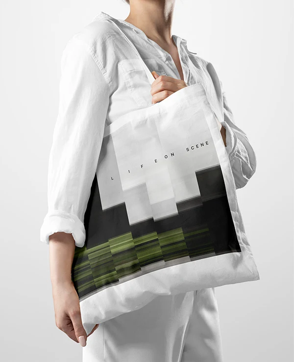
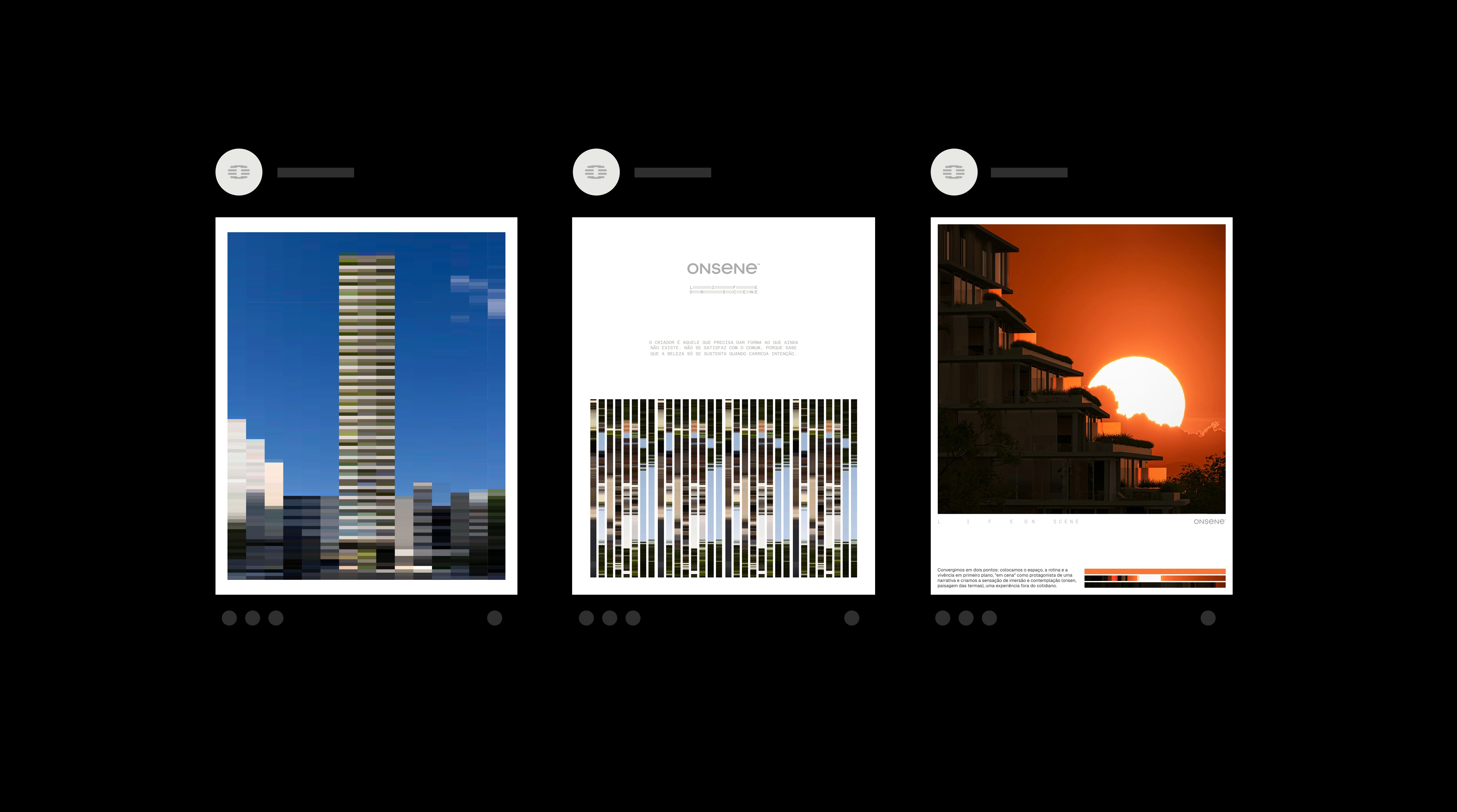
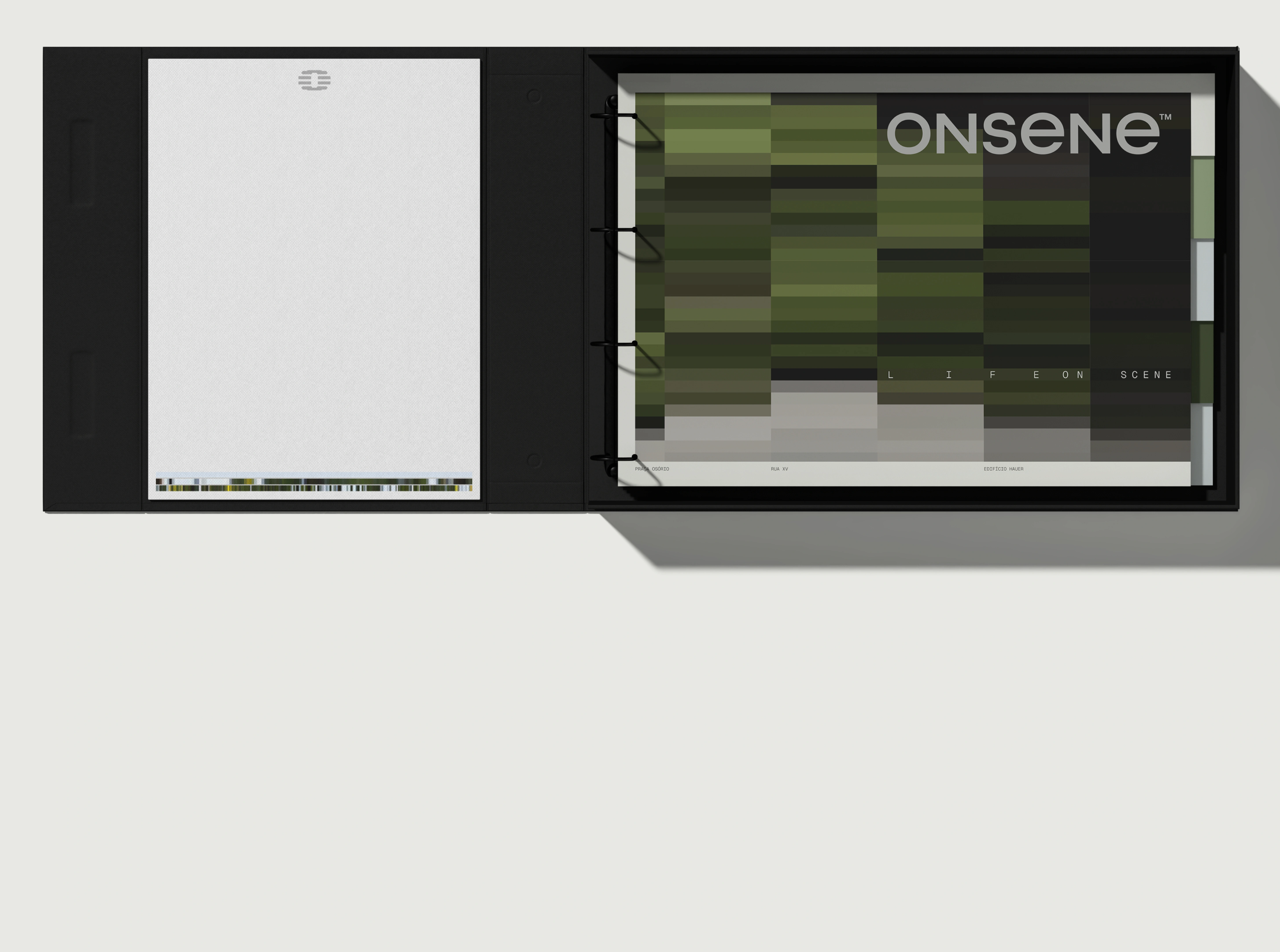
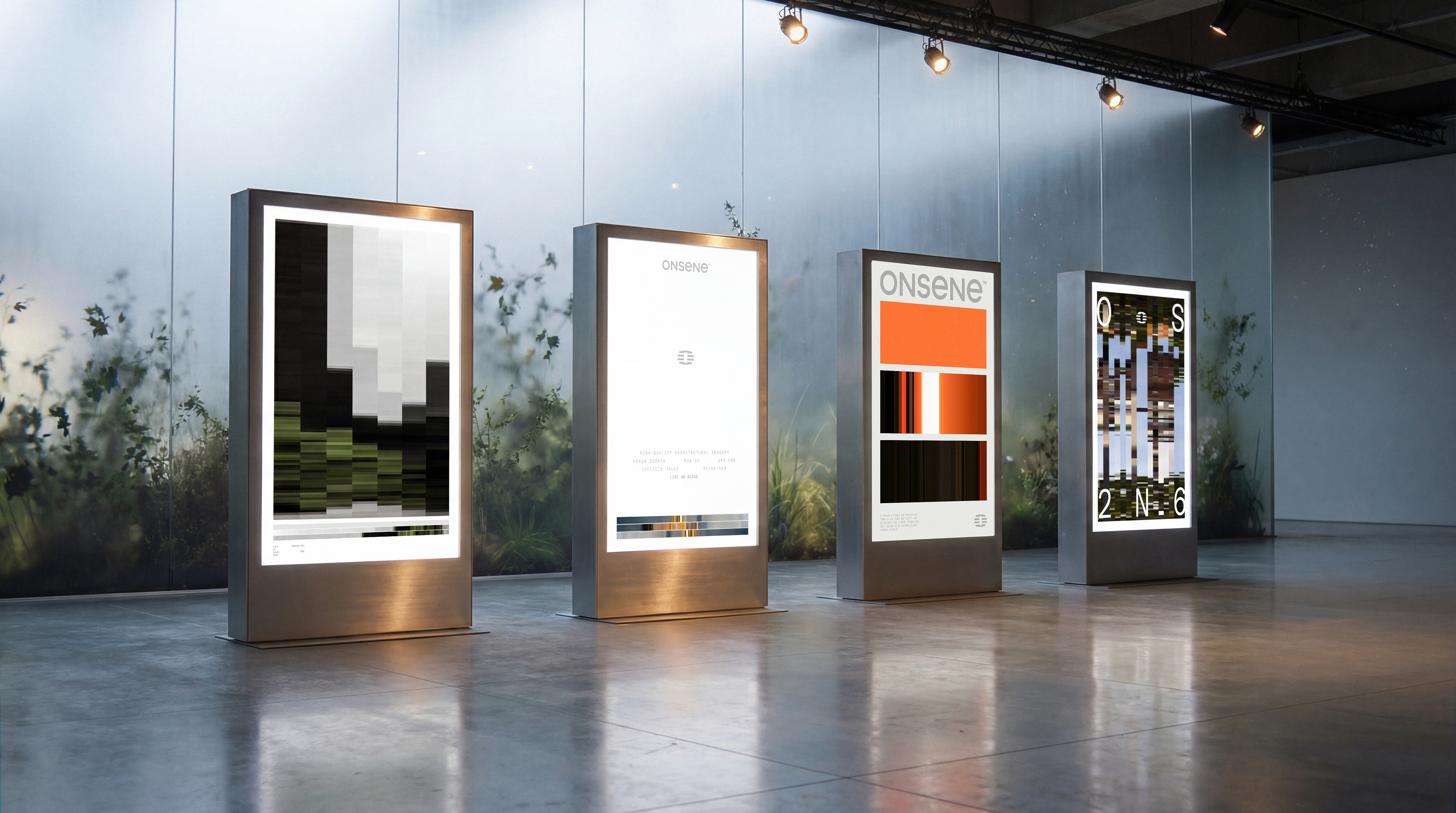
In digital environments, that idea becomes a system. Precise compositions, considered negative space, and a clear hierarchy hold attention where it matters. Light and shadow operate as language, creating depth and presence. Color serves the scene and comes from the image itself, organized in bands of dark, mid, and light values to keep balance and contrast.
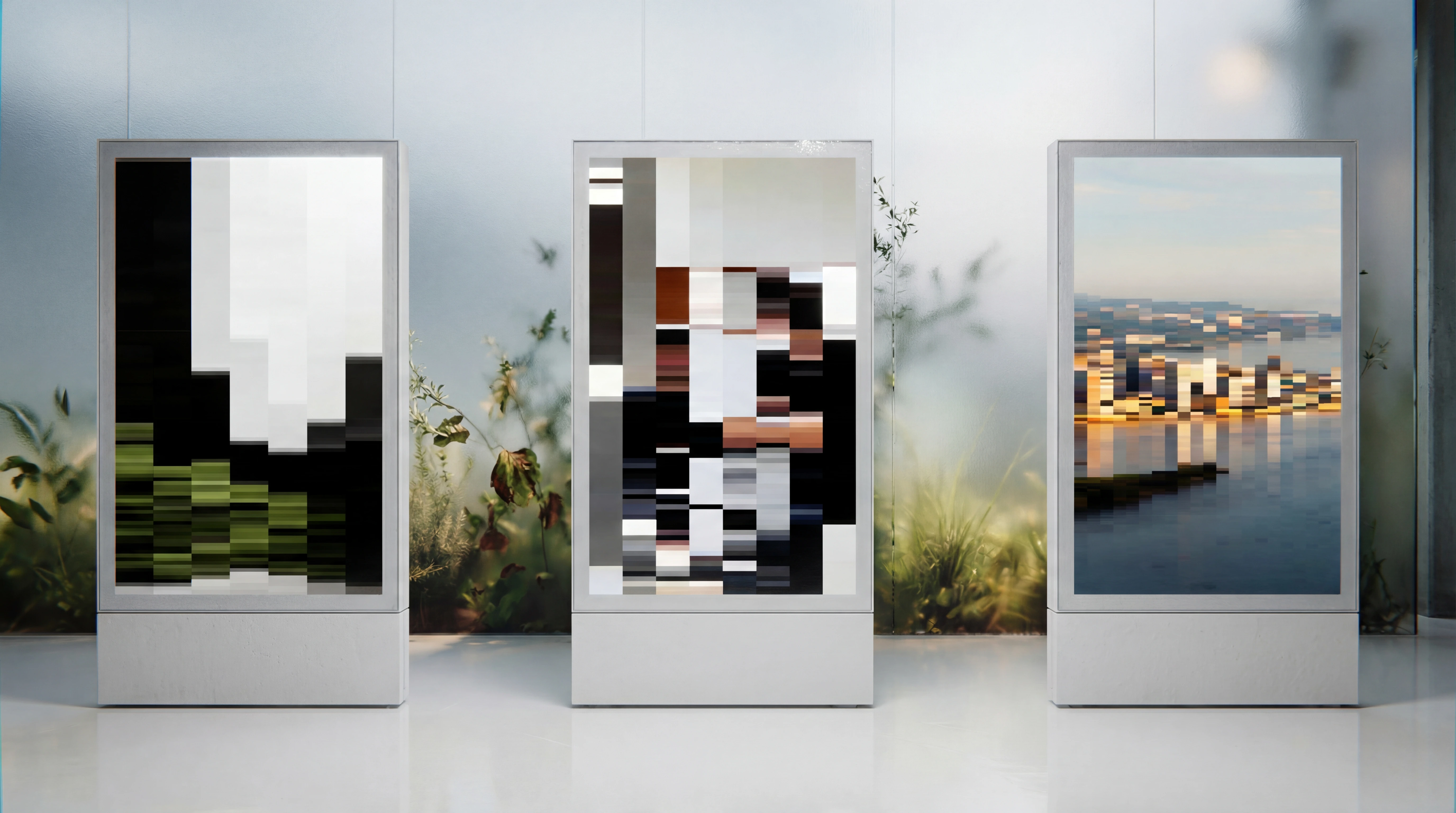
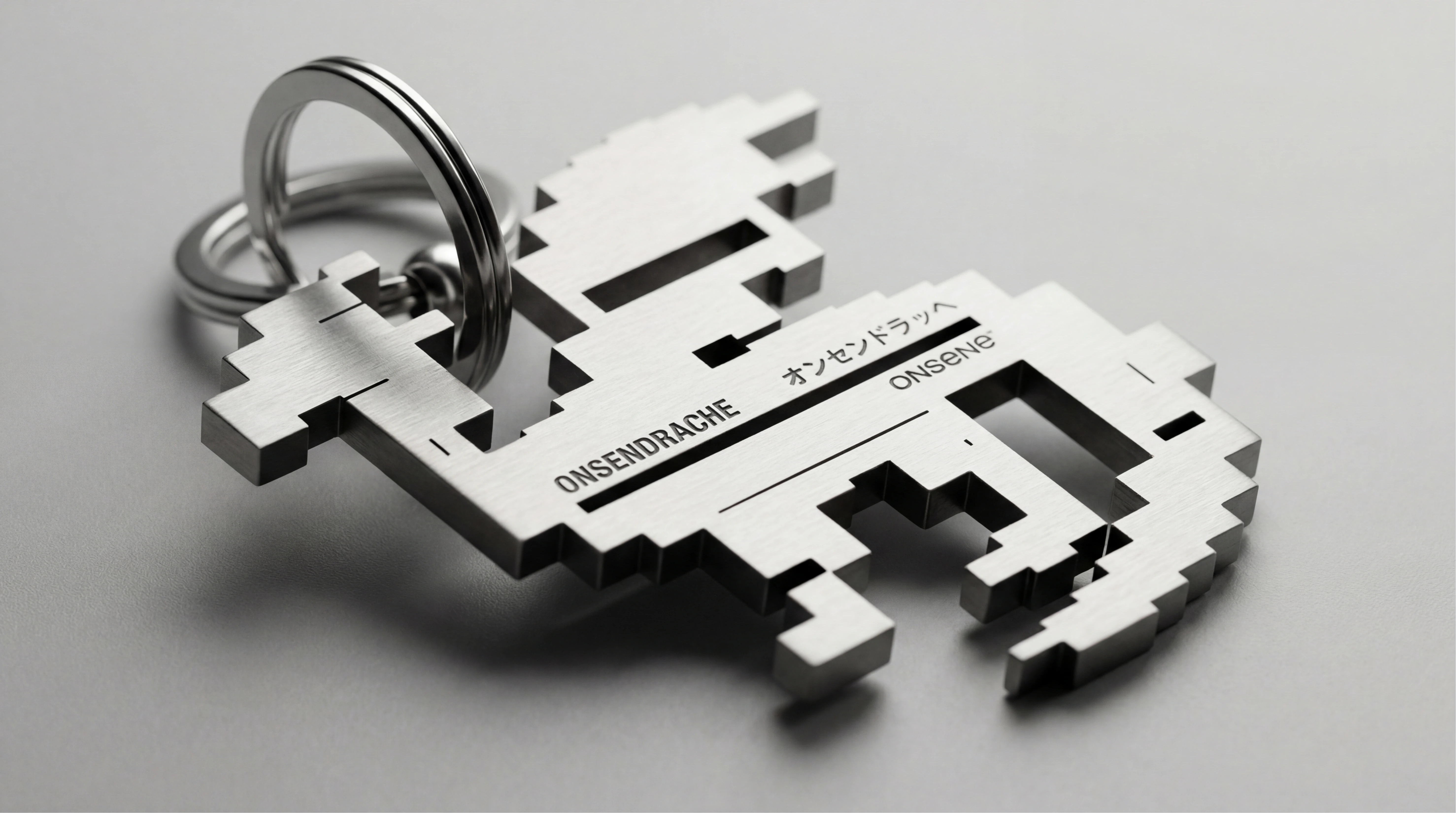
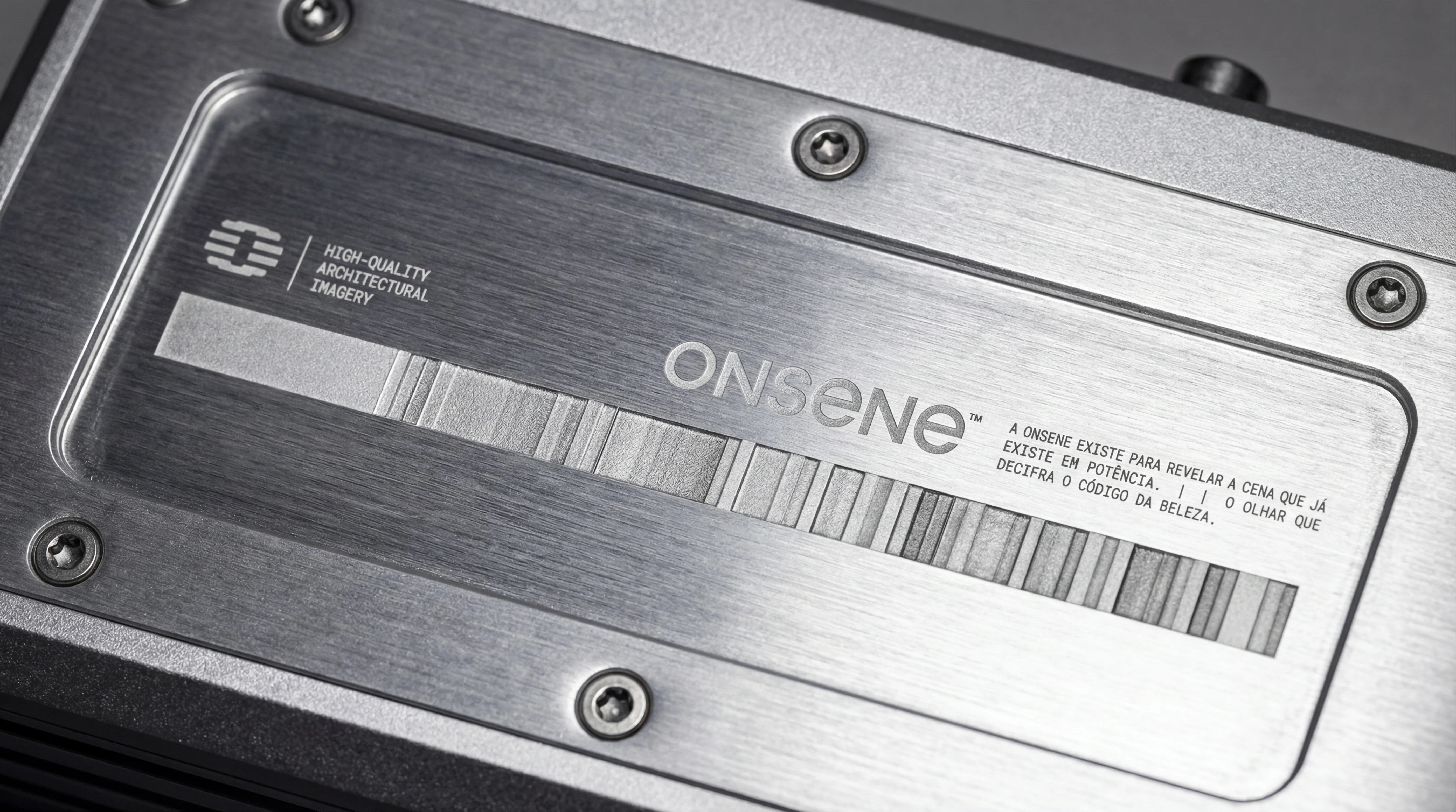
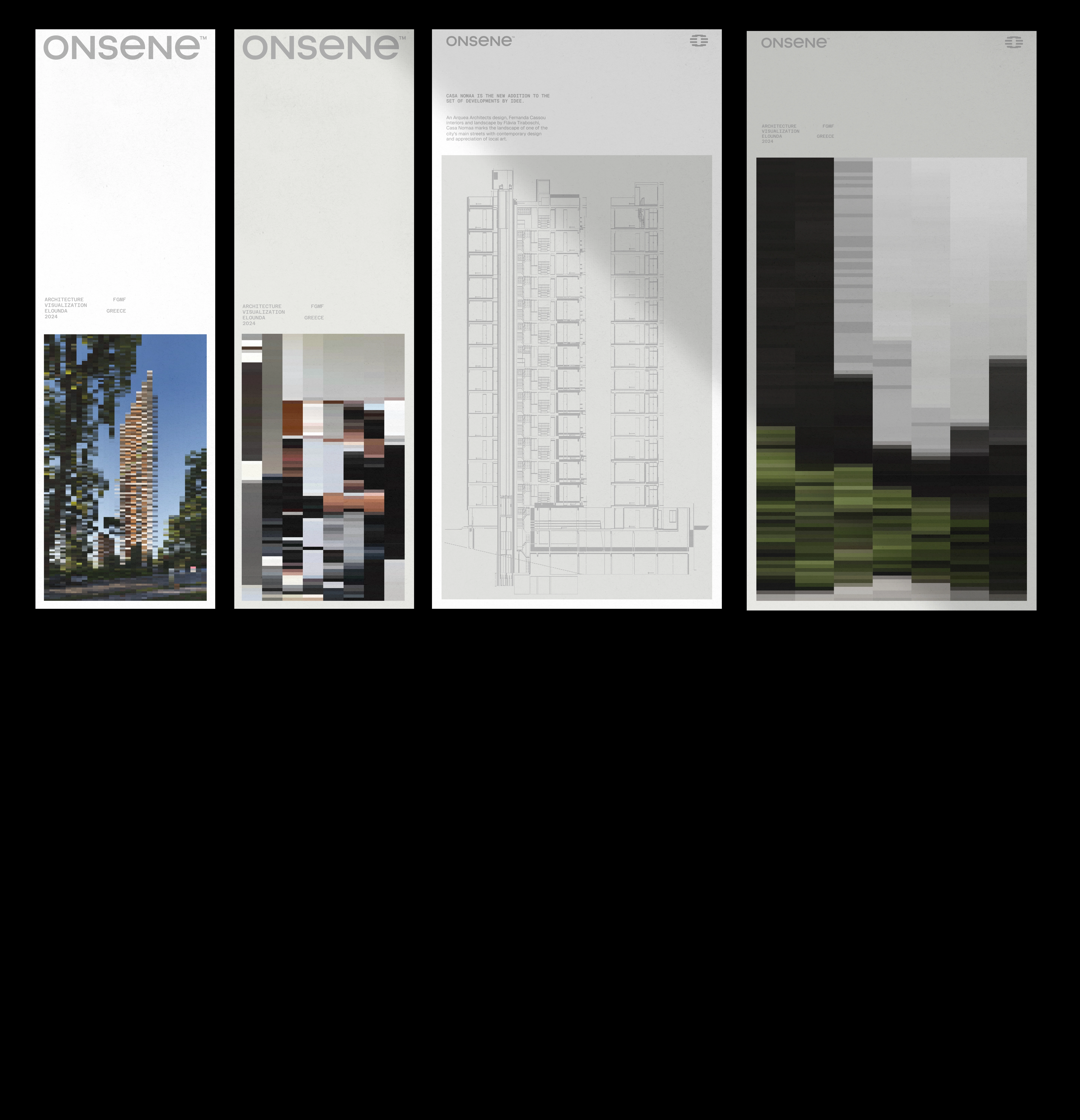
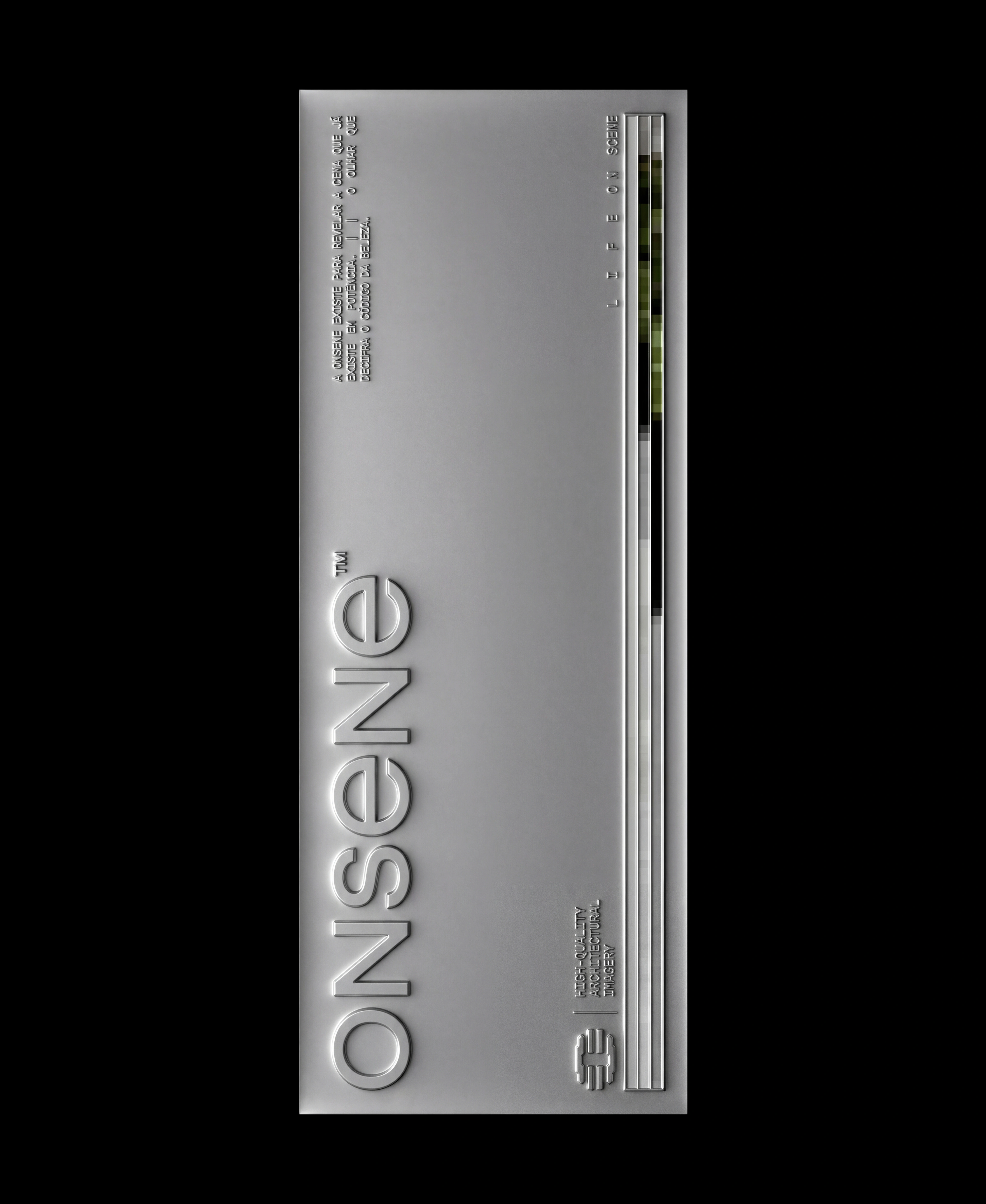
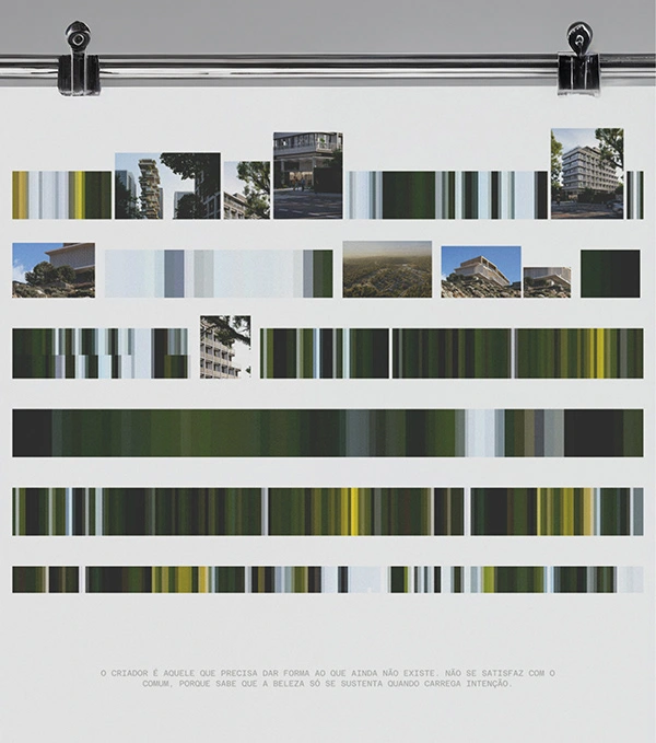
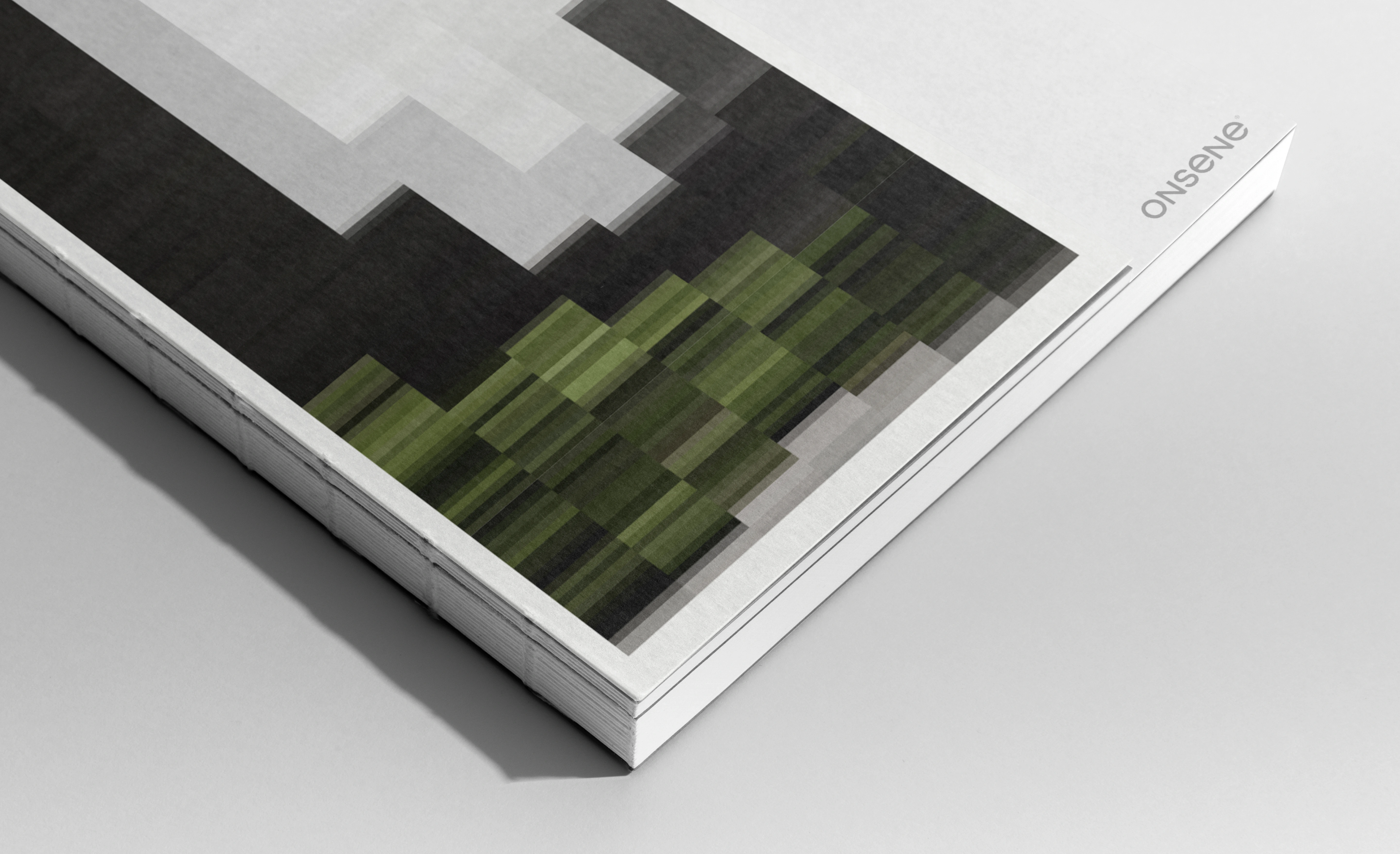
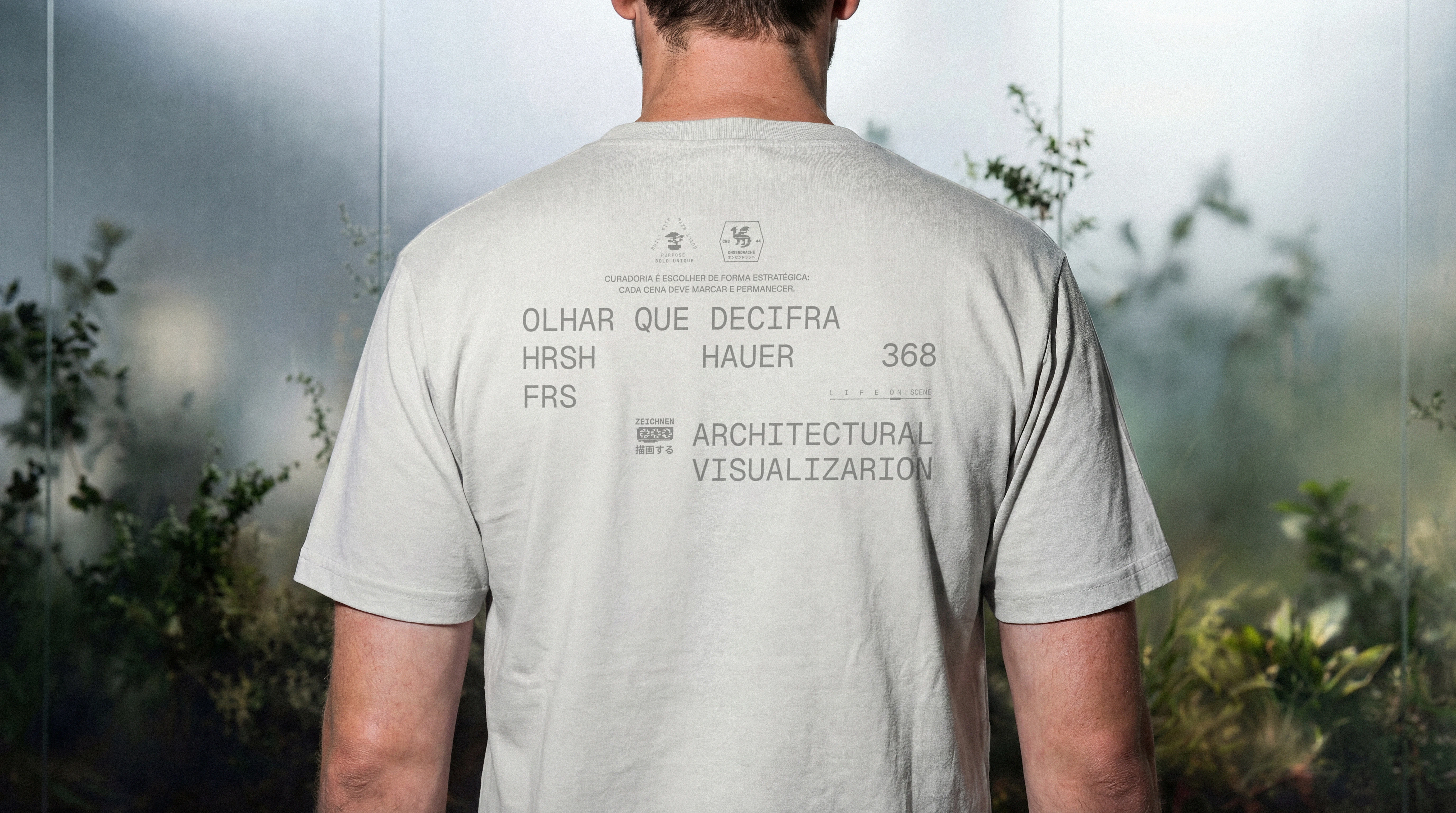
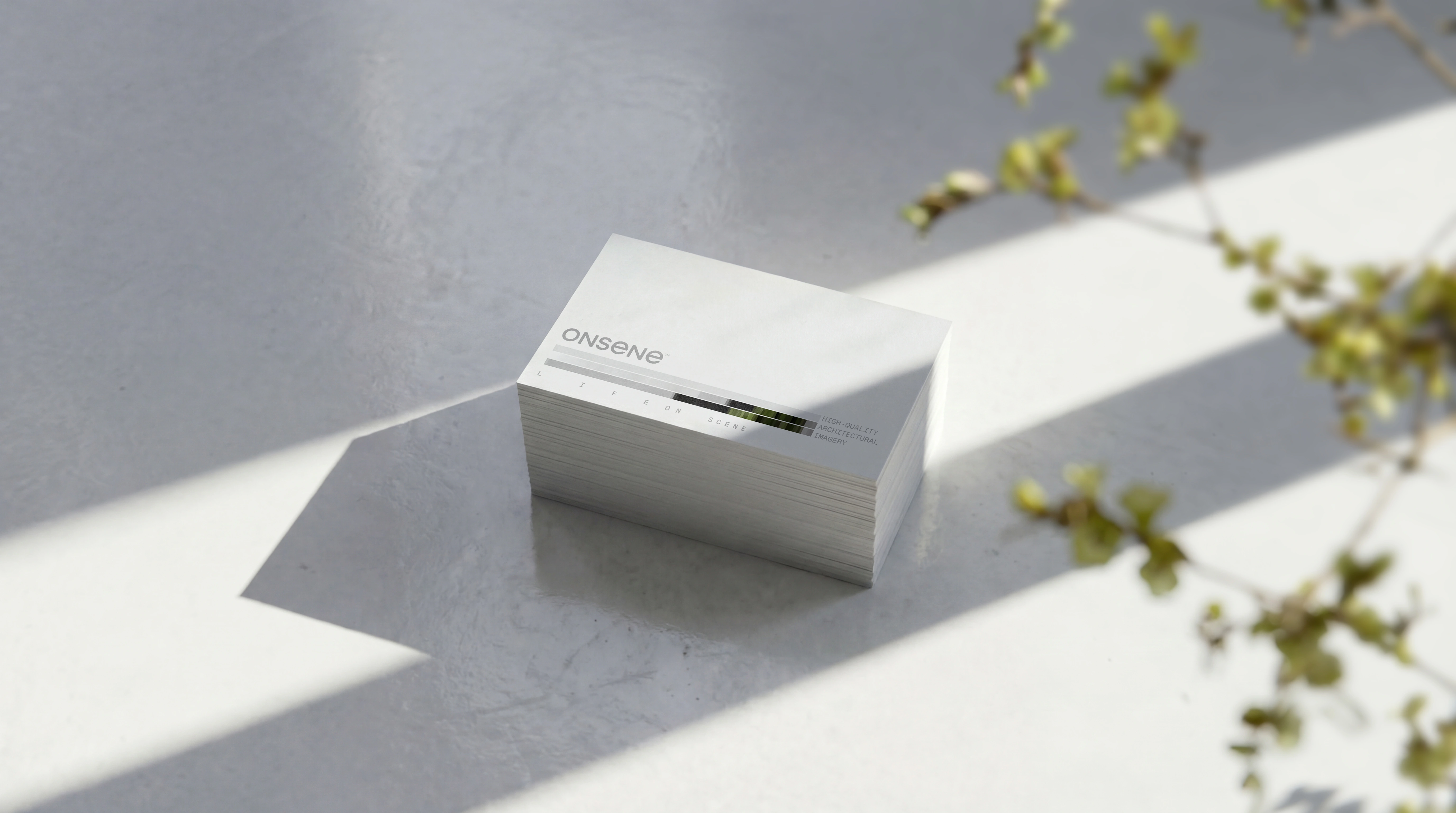
The mosaic is both signature and method. It extracts the chromatic DNA of each scene and turns it into applied identity, variable by project and consistent as a system. The symbol works as seal and avatar, keeping recognition across digital applications.
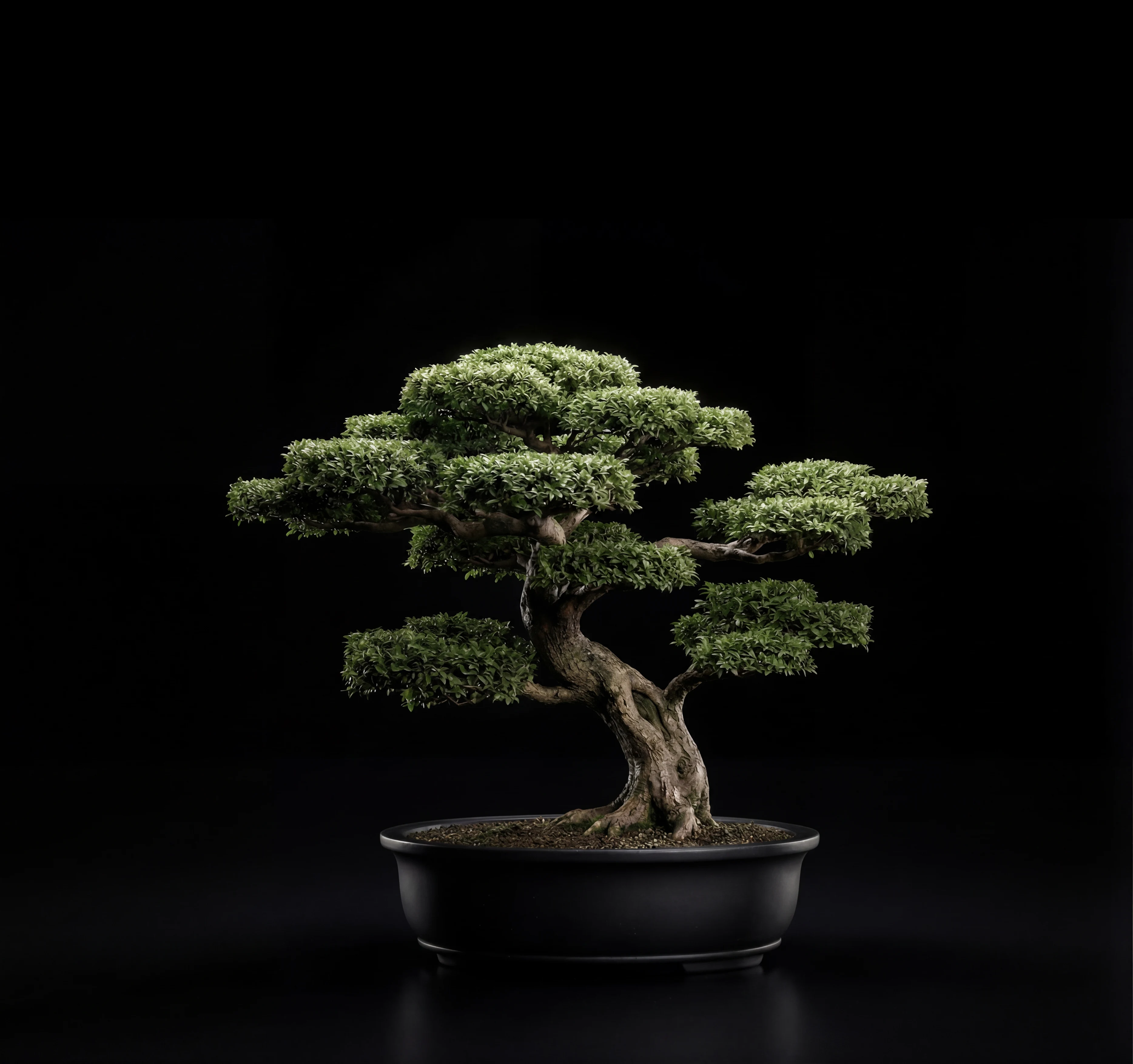
Axis-O” Symbol (Three-Dimensional Life)
Motion and layered depth, while preserving the letter “O” as Onsene’s formal signature.
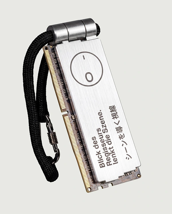
The symbol proposal is designed to convey movement and depth through an abstraction that evokes the sense of technology and avant-garde embedded in the brand’s creative production, expressed through a three-dimensional reading. The composition explores a duality between unity and circular motion—sensations that become especially apparent upon closer observation. Another essential aspect lies in preserving the structure of the letter “O,” reinforcing Onsene’s identity and visual singularity.
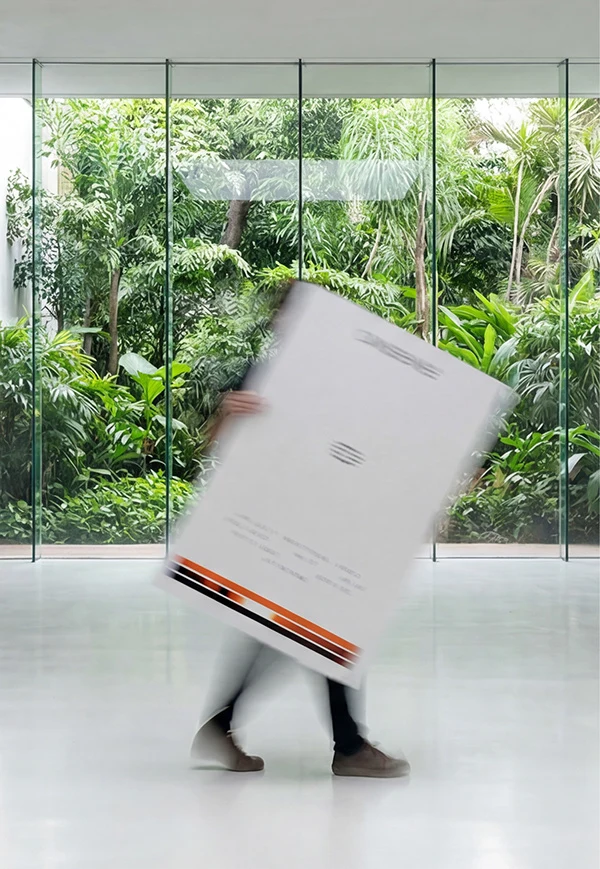
The signature expands across the mosaic as an extraction of each scene’s chromatic DNA. It translates the soul of the project and creates a proprietary identity for every piece of work, while maintaining consistent recognition.
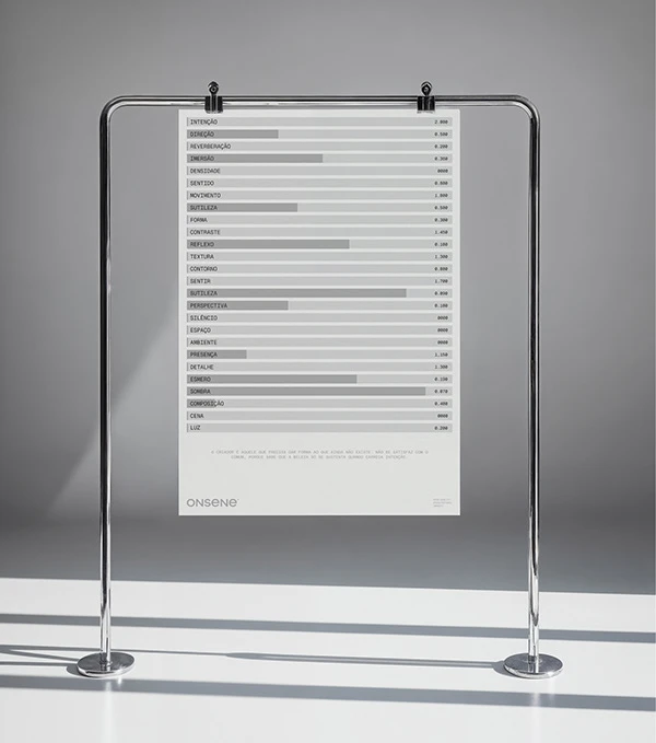
Onsene also operates with a proprietary tool that decodes any image into its essential elements, with a focus on light, form, and chromatic DNA.
Naming & Visual Identity - by LOTIPA
-
Credits:
Direction & Lead Visual Design — Antoniel Felainne
Graphic Design — Antoniel Felainne, Lucas Oliveira, Alex Monteiro & Ax Leandro
Motion Design — Ax Leandro
Website Design — Antoniel Felainne & Alex Monteiro
Brand Copywriting — Aldenis Rodrigues
Creative Coding (Brand App) — Antoniel Felainne
Back-End Development — Marcos Cuel
Architectural Images — Onsene Studio
Follow me → Instagram
Website → lotipa.com
© 2026 by LOTIPA
_______
Share your feedback about this project. All comments are welcome!
0 likes · 3 views · Nov 10, 2026
Brand identity for Onsene, a boutique architectural visualization studio. Cinematic, sensory and quiet. Best of Behance.

