
APPY
Appy is a London product studio founded by Michael Le and Jacob van Leeuwen, after years at Microsoft, Skype and EA on one side and WeWork, Philips and F1 on the other. It began as a spark: take that big-tech experience and put it into products that create real social impact. The first name was Appy Camper, a nod to “happy camper” and to the founders’ weekends in a tent around a fire. For them, being a happy camper means moving tech away from clicks and attention, towards connection, well-being and products that actually make people ‘appy. The rebrand shortens the name and keeps the camp.
CAMPFIRE AND CODE.
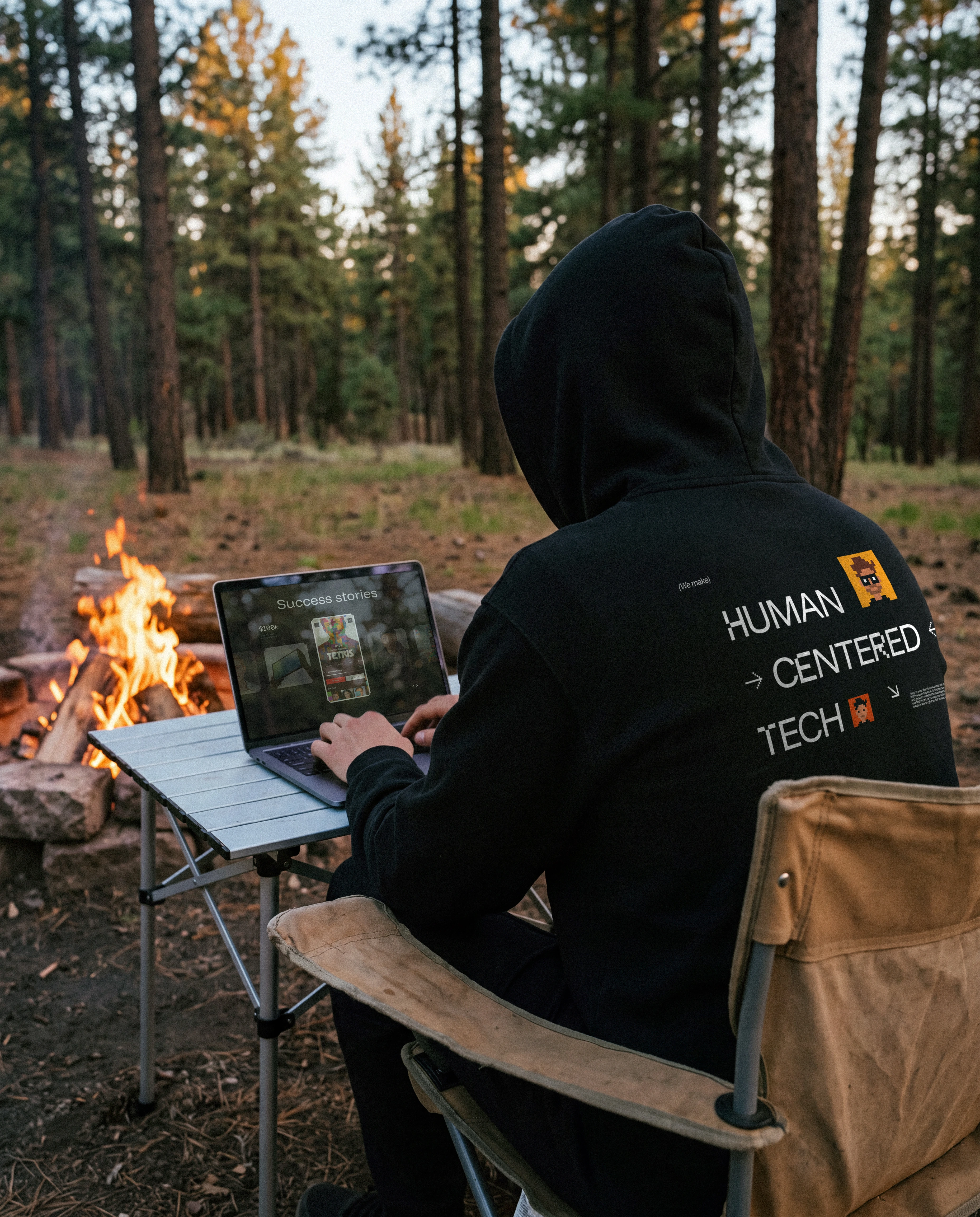
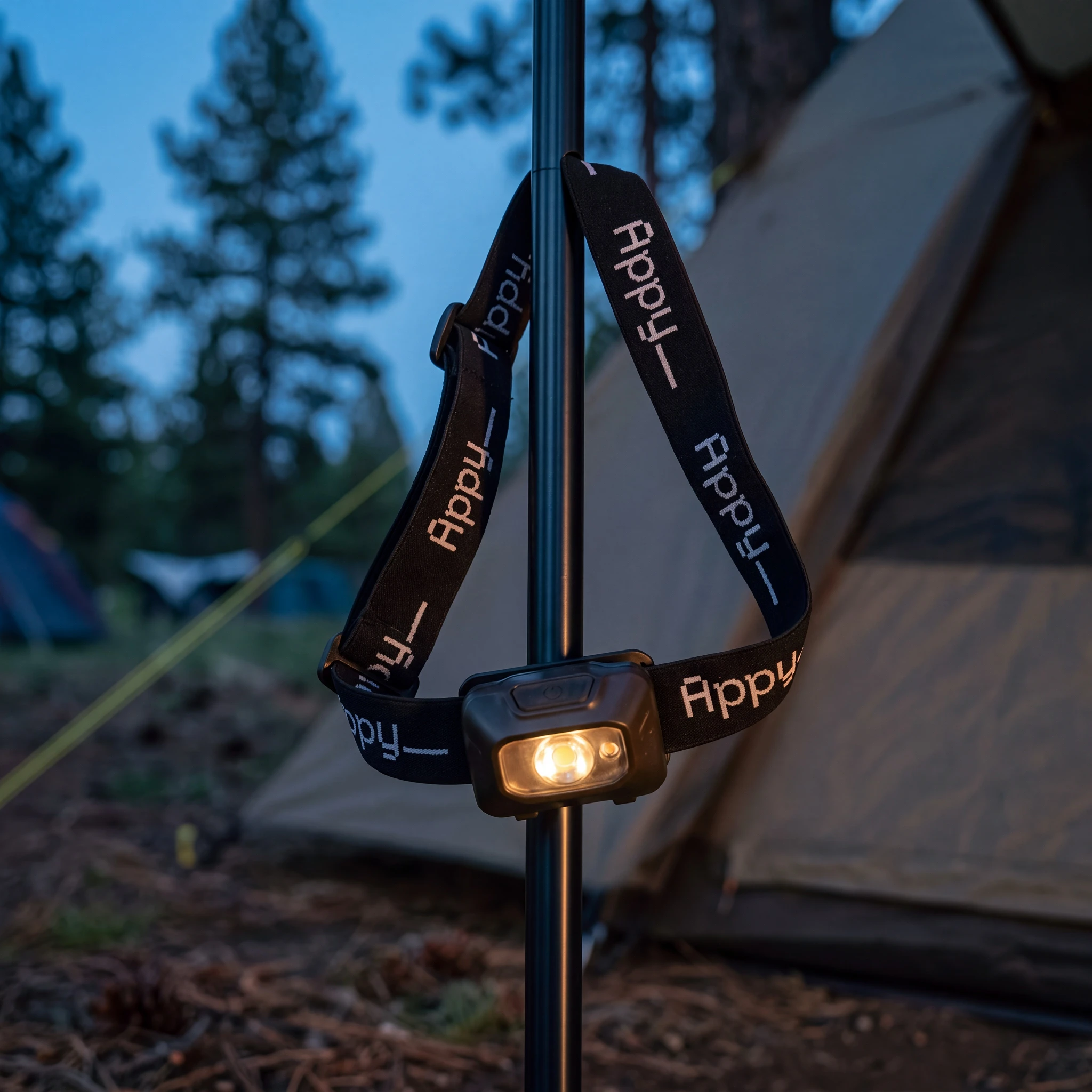
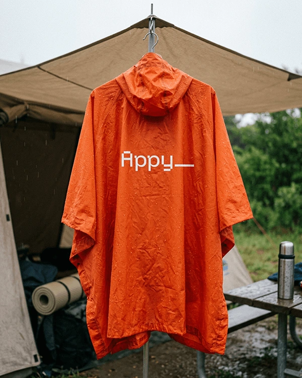
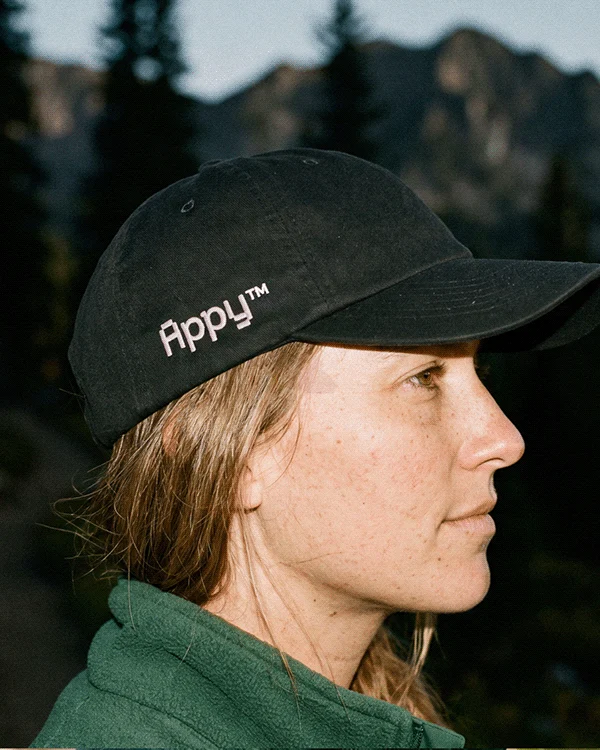
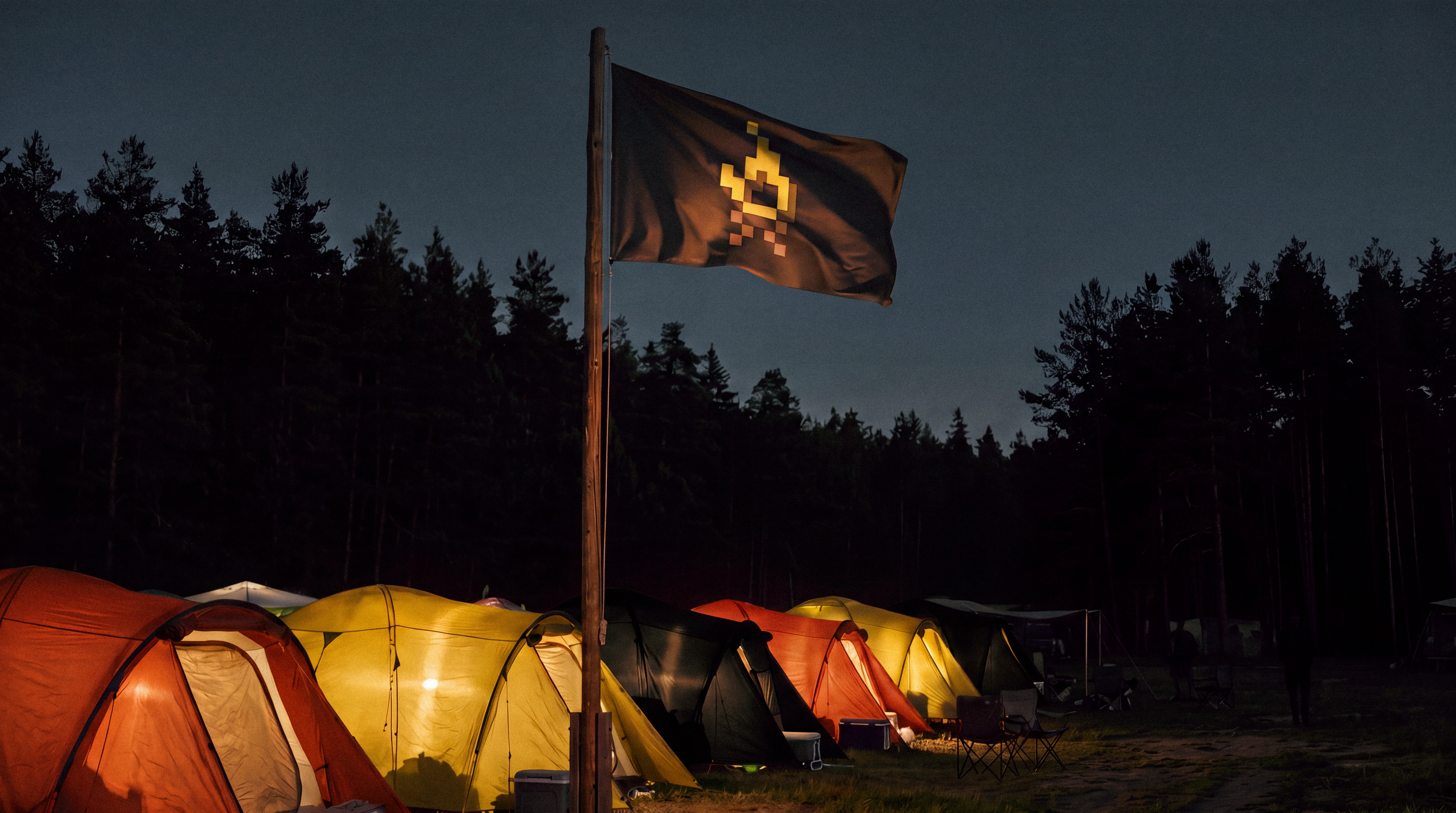
A campsite is where a small group slows down and makes things work with what they carried in. The fire sits in the middle, everyone has a job, and nobody is scrolling. It is the opposite of the attention economy Appy wants to leave behind, so the camp became the setting of the brand. The photography goes outdoors, to the tents and the late fire, where laptops and phones show up as tools people use and then put away.
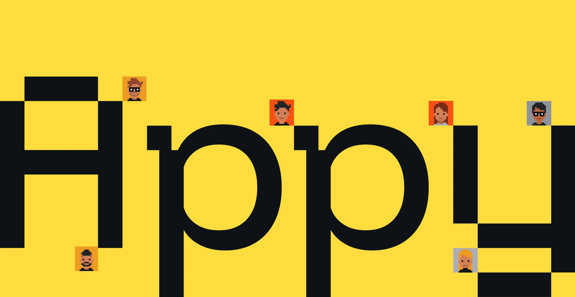
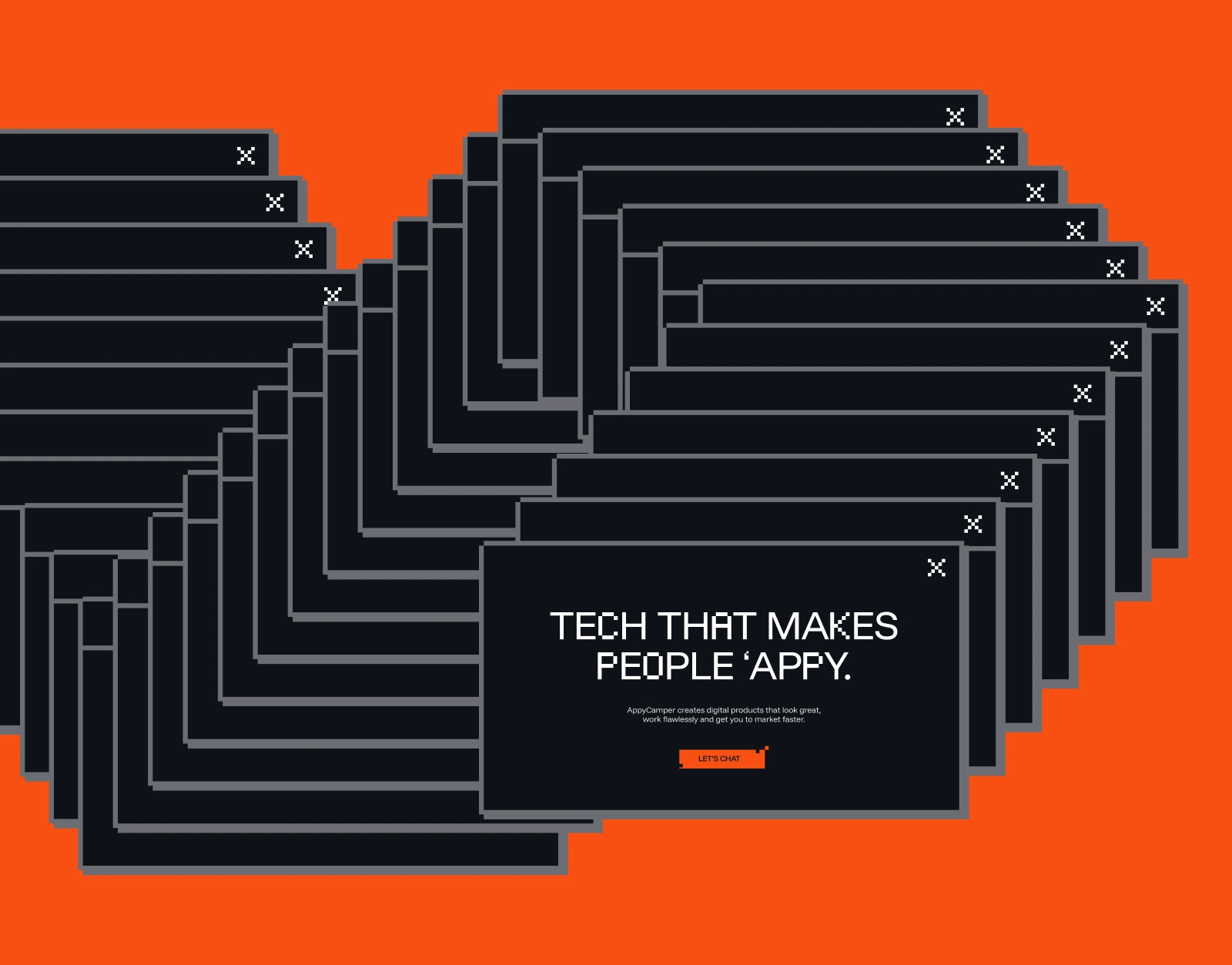
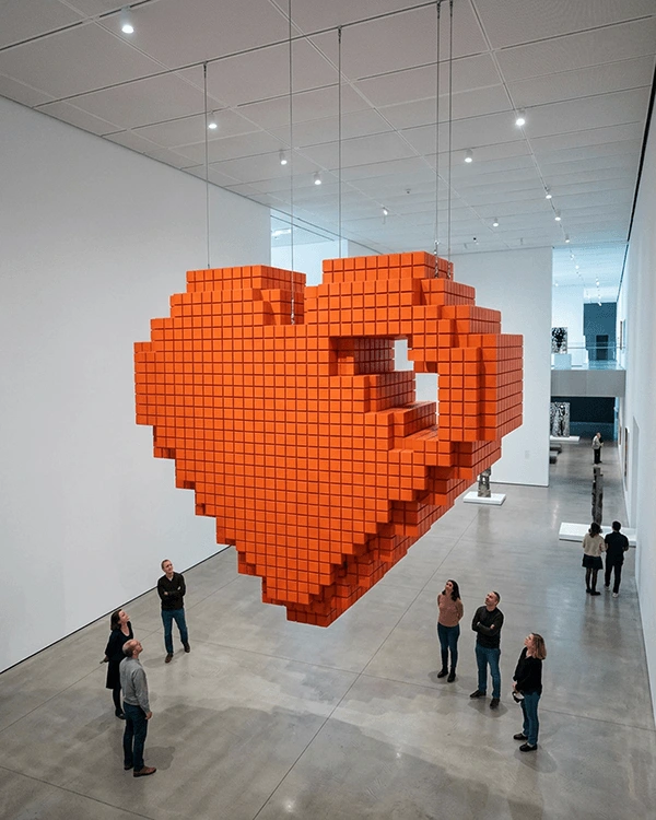
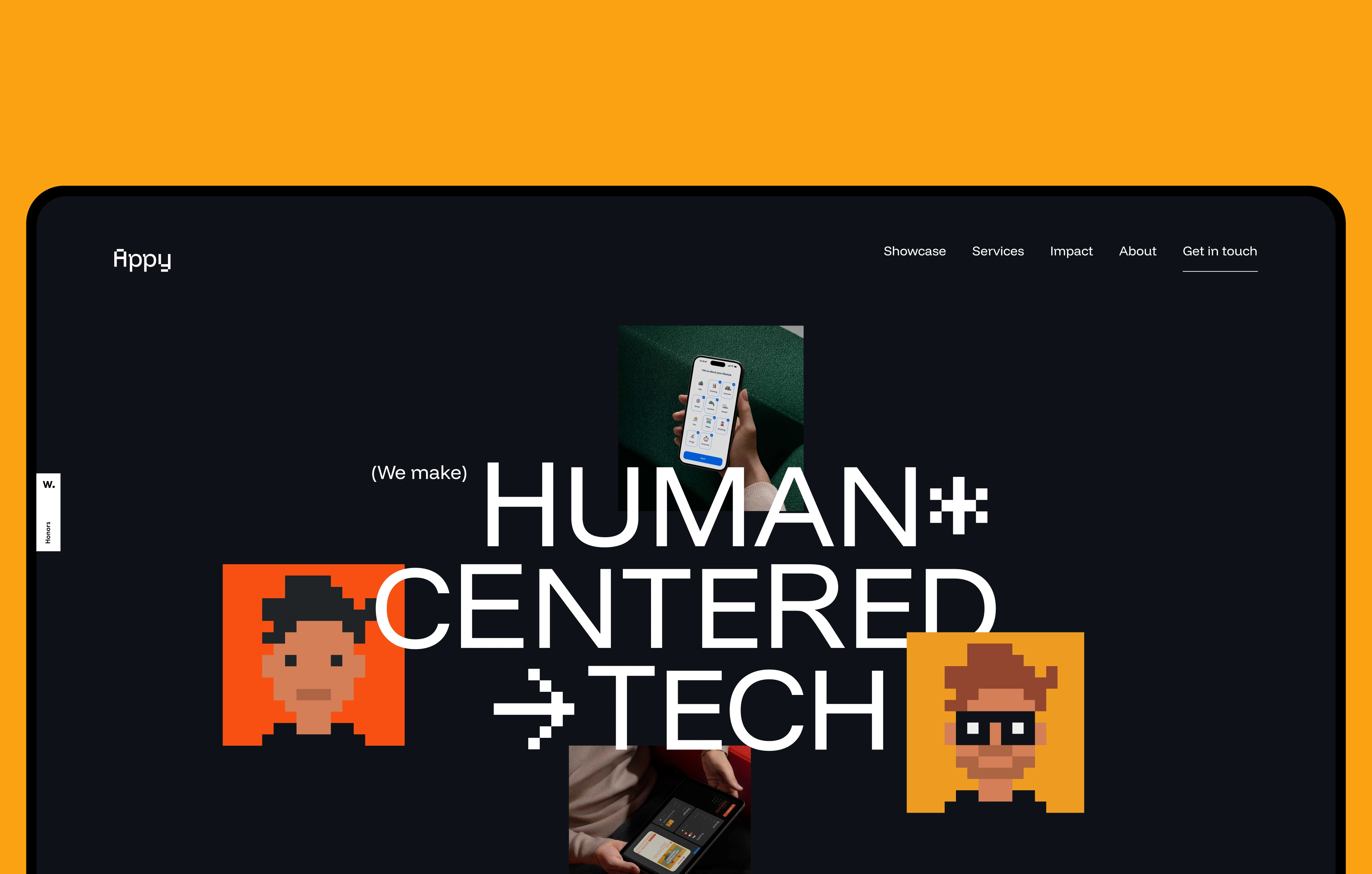
The second source is the founders’ other obsession: pixel art, arcade cabinets and early 3D console games, with their blocky geometry left in plain sight. Pixels are what a screen is made of, and showing them is a way of showing the work. Together, the camp and the pixels describe the team the way its clients know it: easy to work with, and obsessive about detail. The symbol is the spark grown into a campfire, drawn on a pixel grid, small enough to read as an icon and solid enough to become an object.
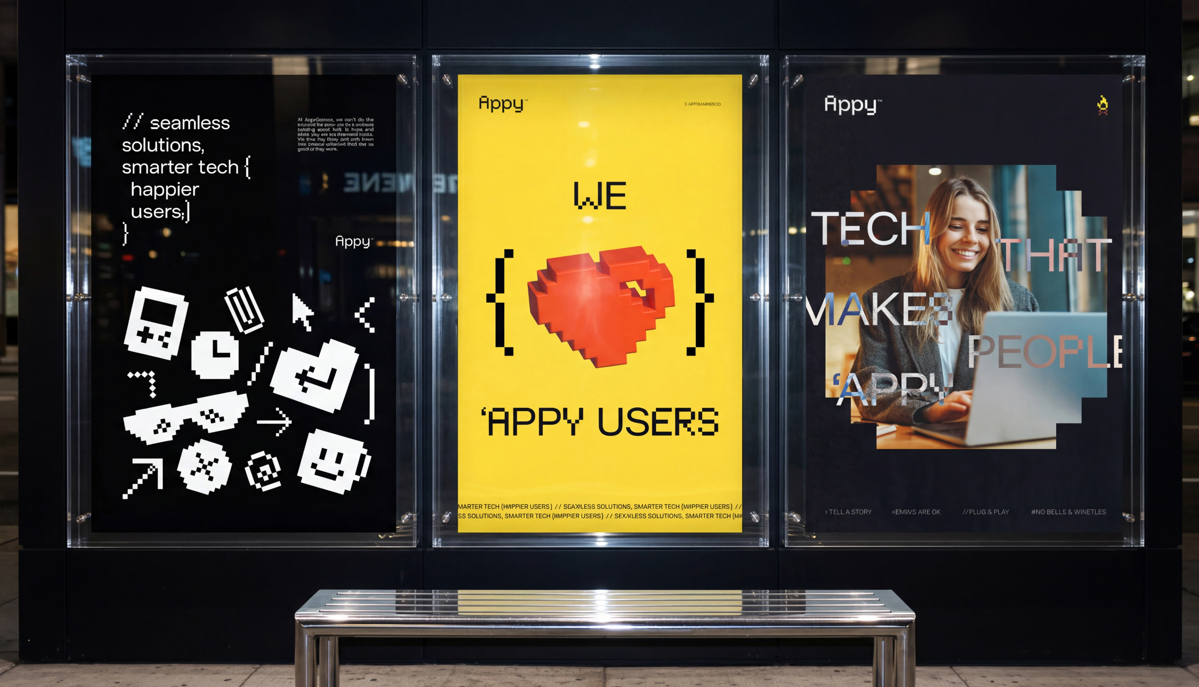
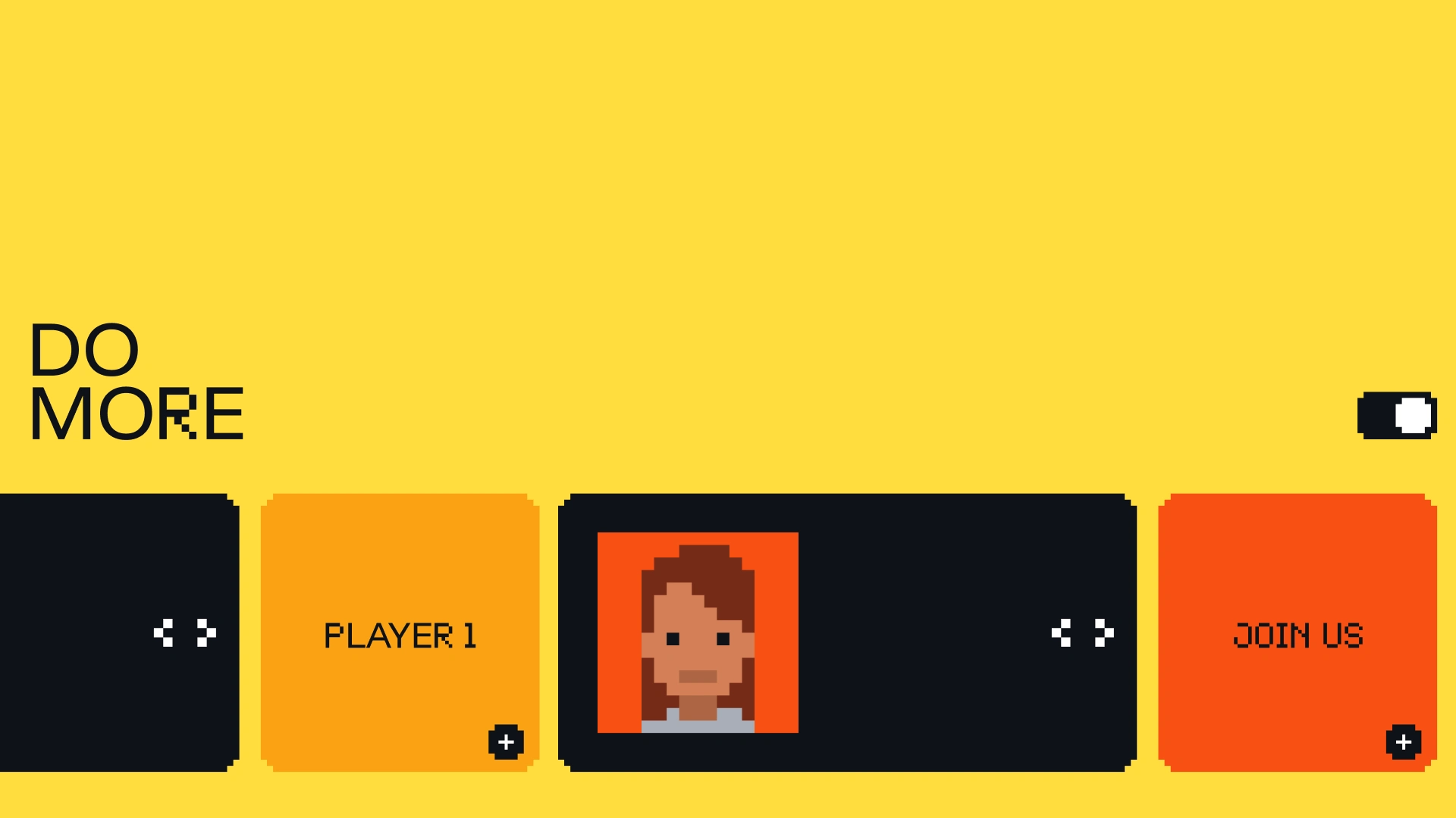
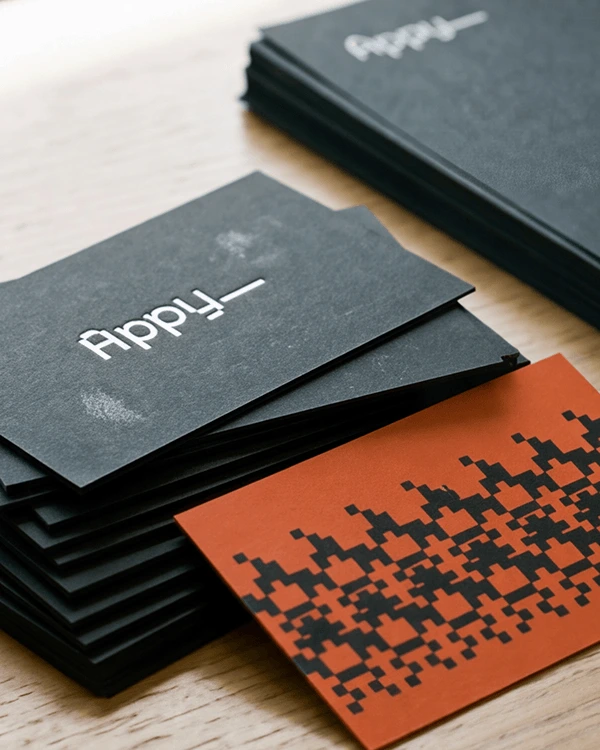
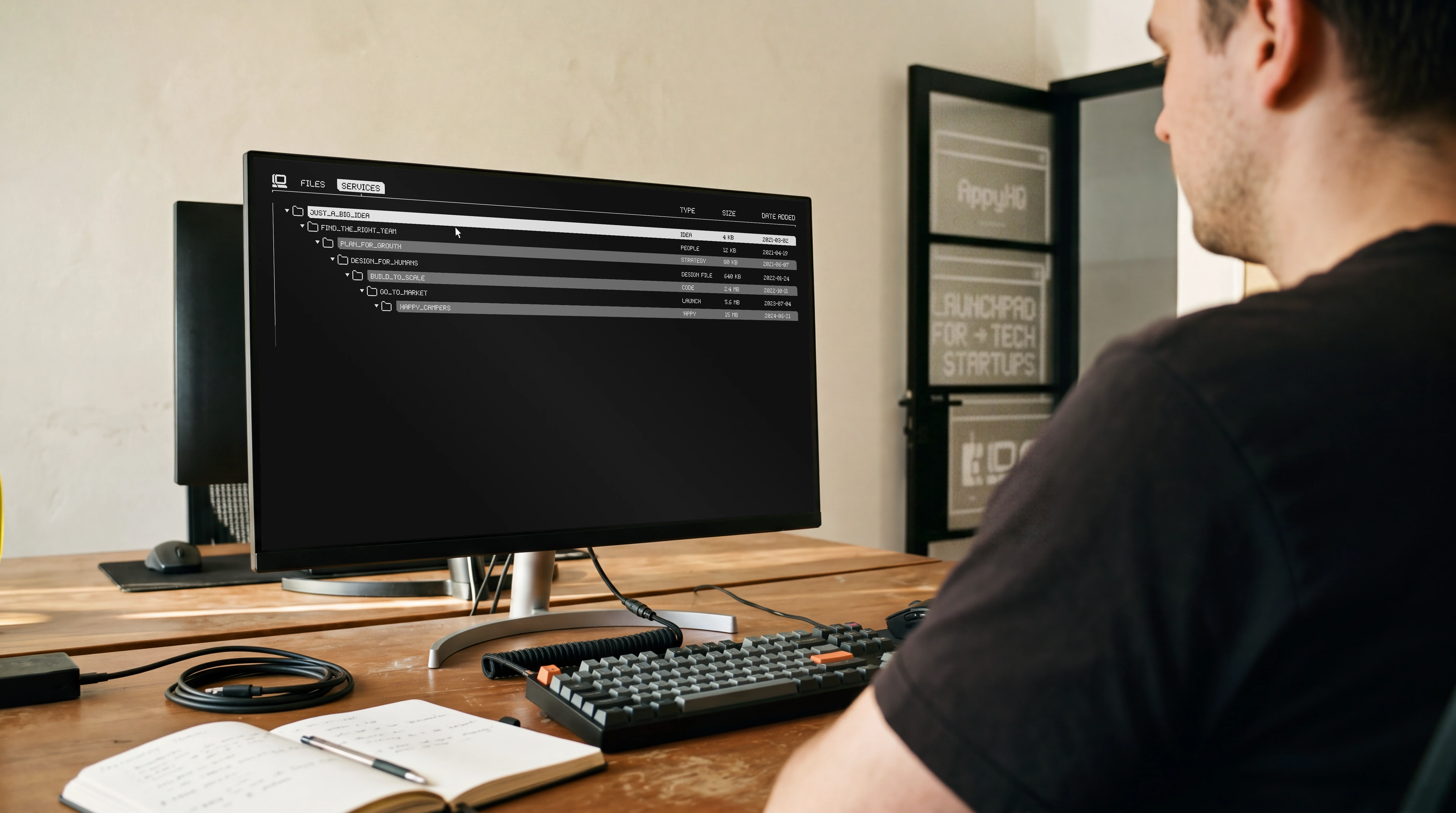
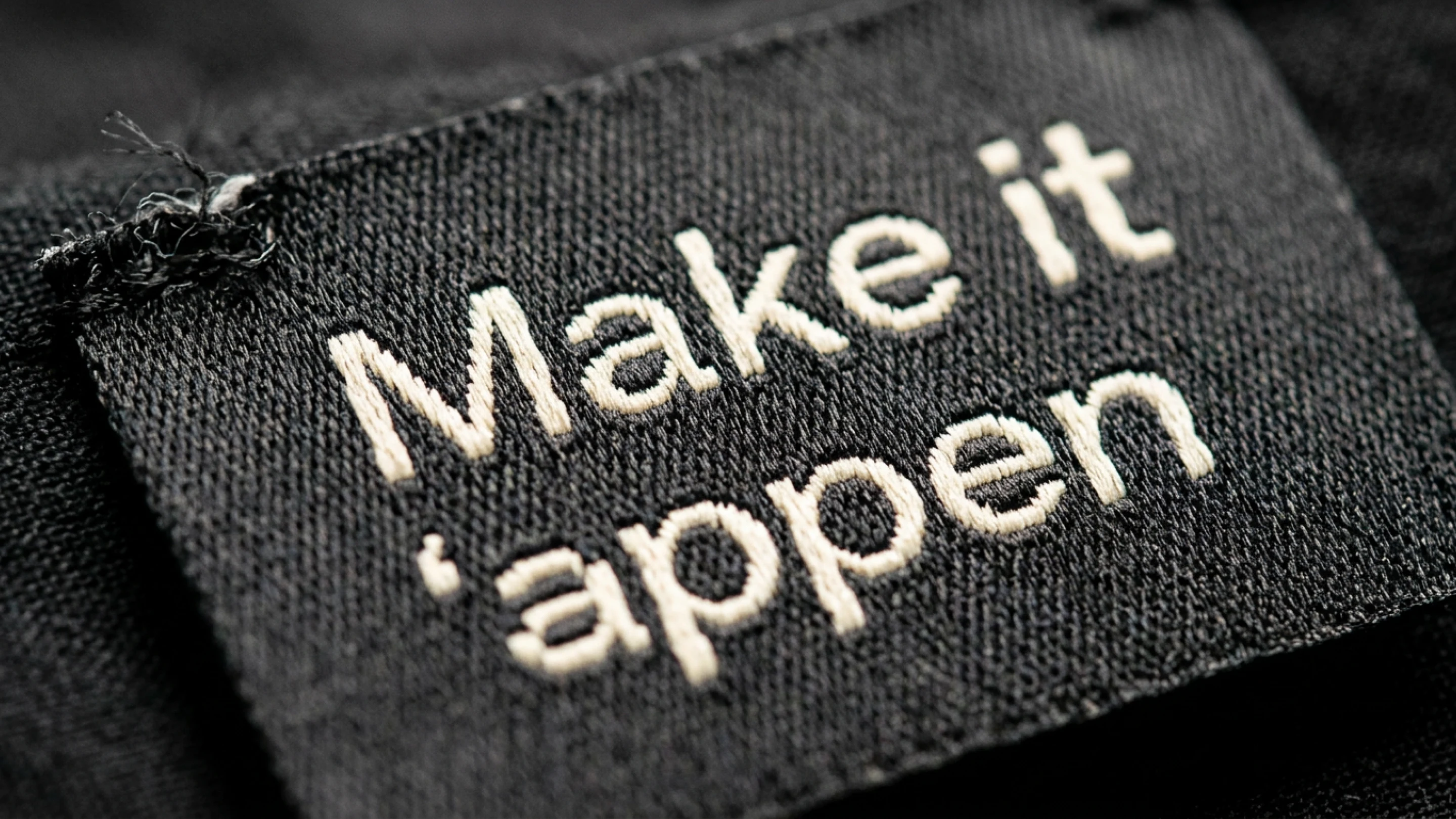
The system runs on a few rules. A near-black base with yellow and orange taken from firelight. Funnel Display for the voice, paired with Appy Pixel, a custom typeface drawn by Lotipa. Interfaces that borrow from game menus, with stat bars and player cards. Most pieces close on the studio’s own line: make it ‘appen.

TYPOGRAPHY
Funnel Display carries the words. Appy Pixel carries the screen.
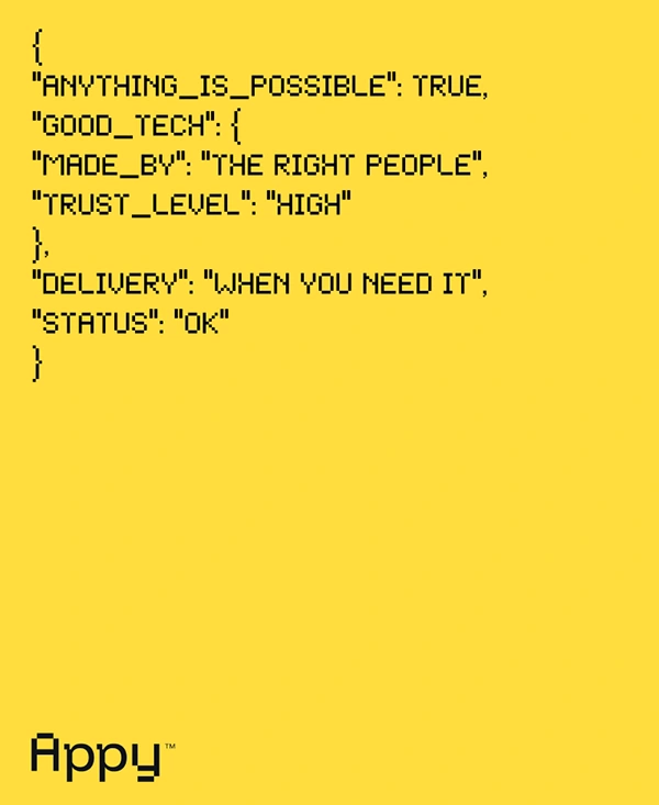
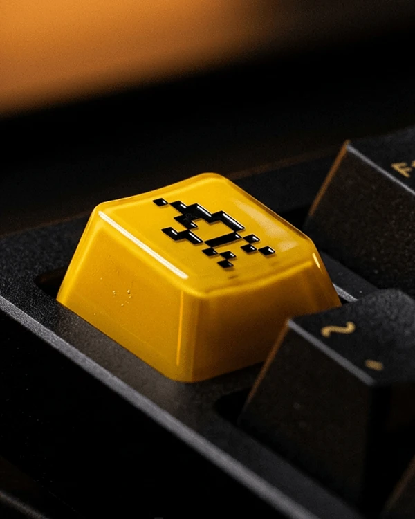
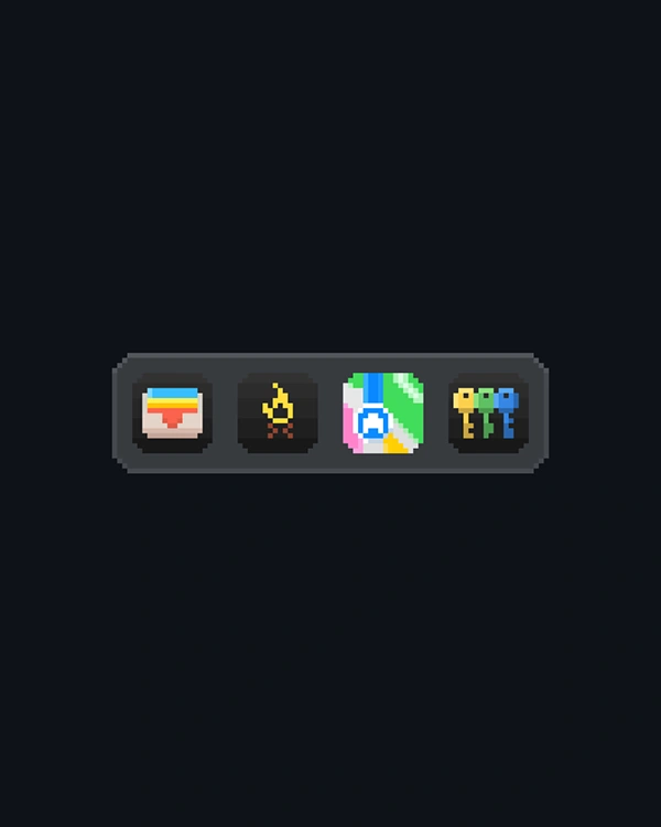
Appy Pixel was drawn by Lotipa to sit next to Funnel Display. It keeps the proportions of a sans display face and rebuilds each letter on a pixel grid, so a headline can move from print to screen without changing its voice. The brand icons are glyphs inside the font, so the whole set types out like text.
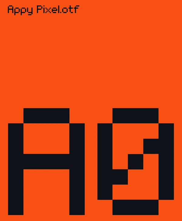
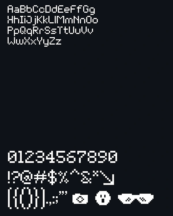
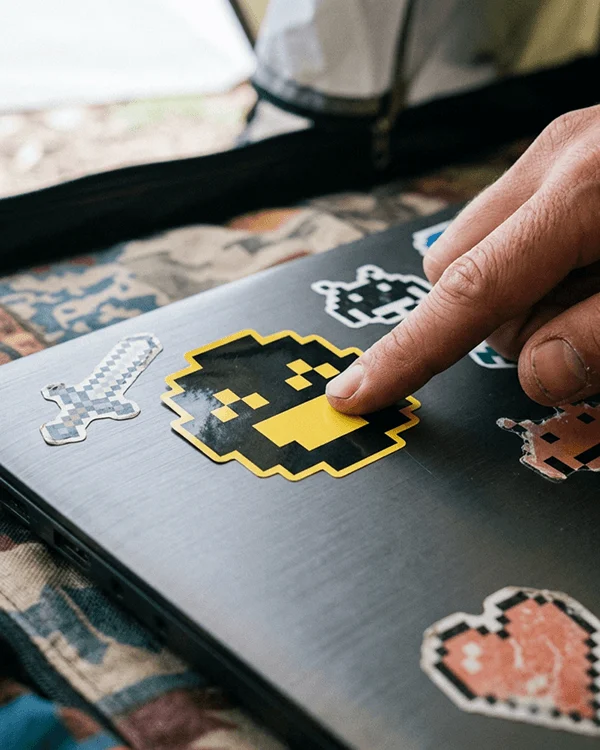
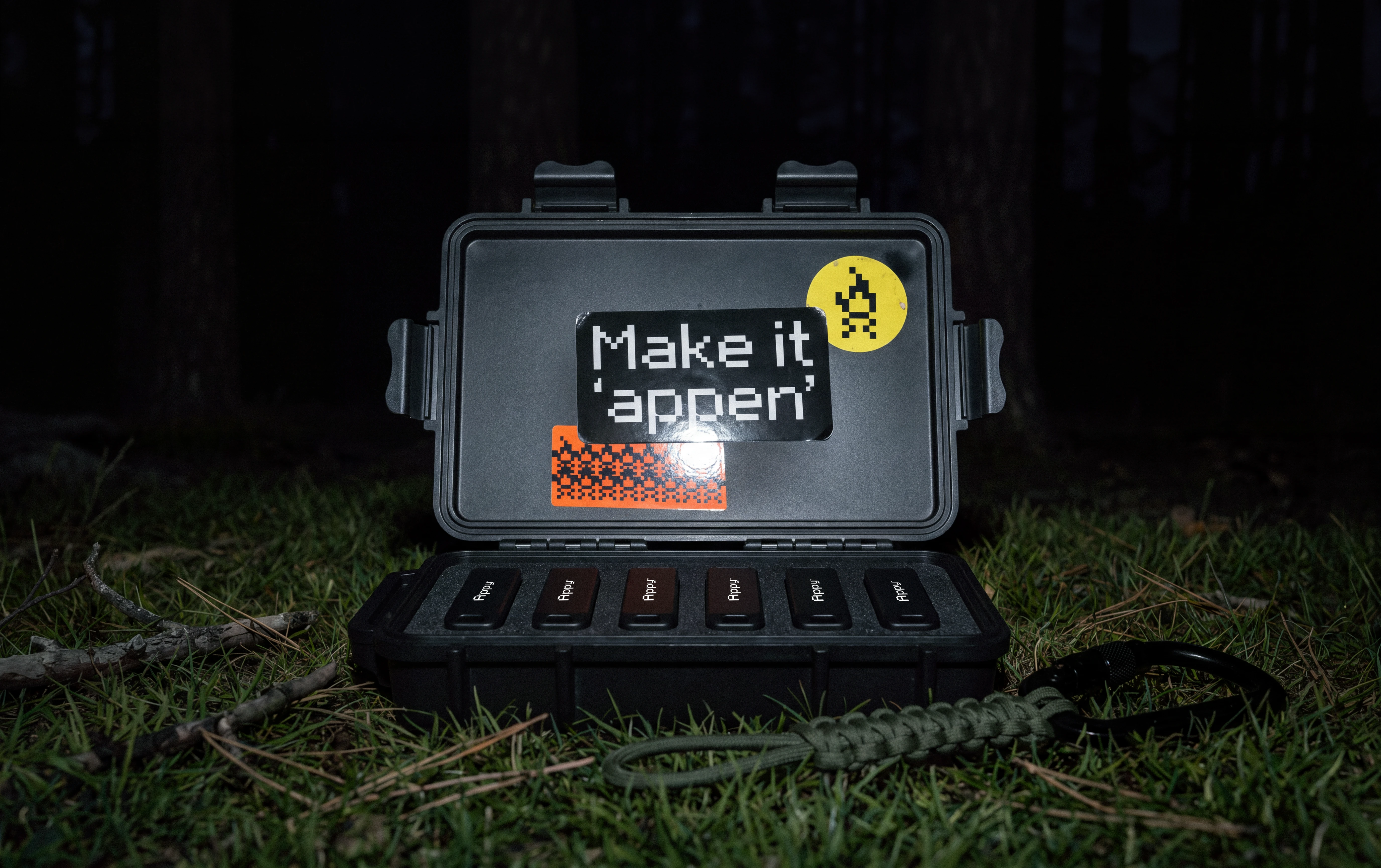
The icons are Appy Pixel glyphs. They work flat in interfaces and as raw 3D objects, blocky on purpose, the way early console games looked. The same glyph goes from a toolbar to a keycap to a keychain.
OUT IN THE WORLD
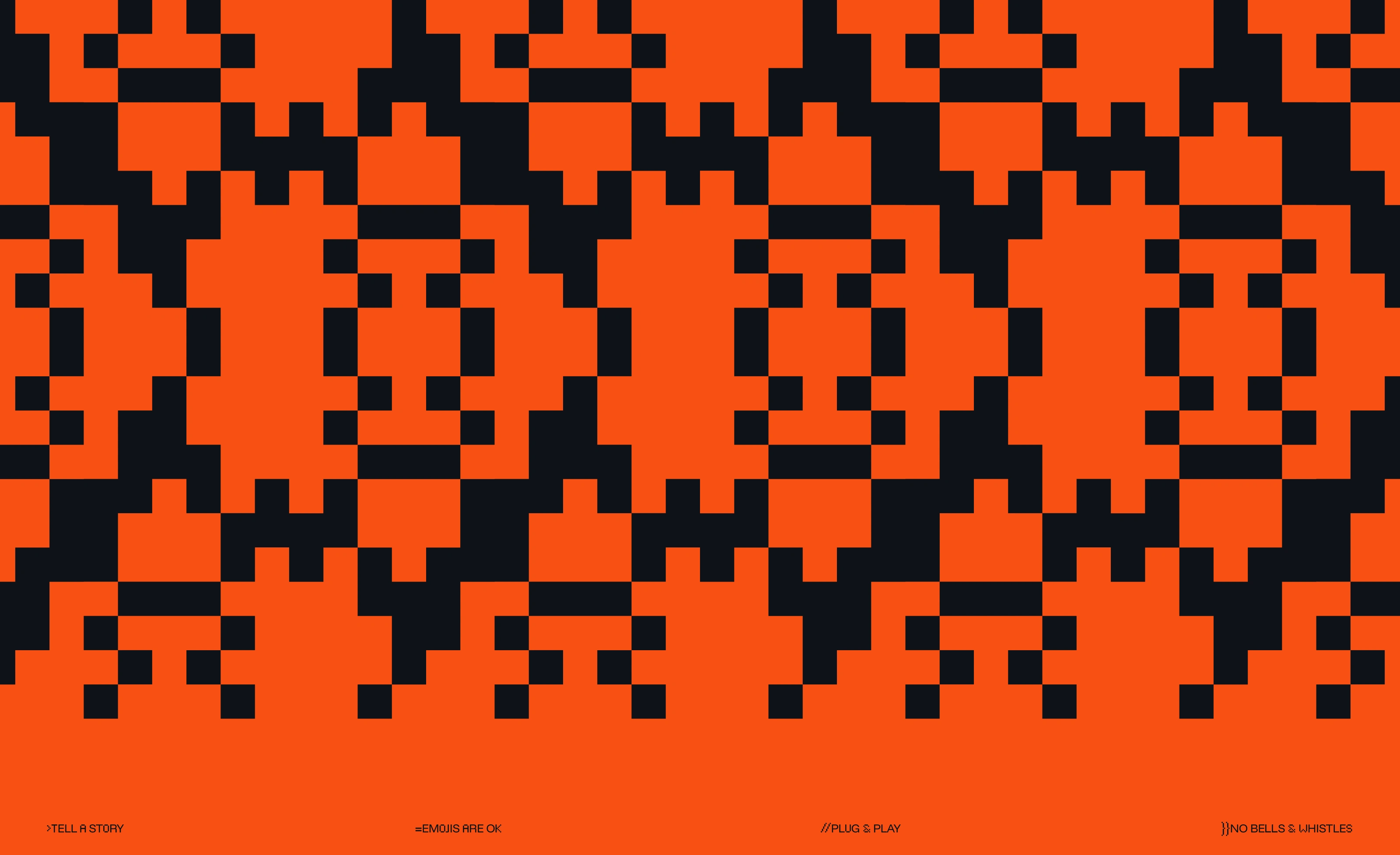
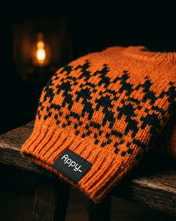
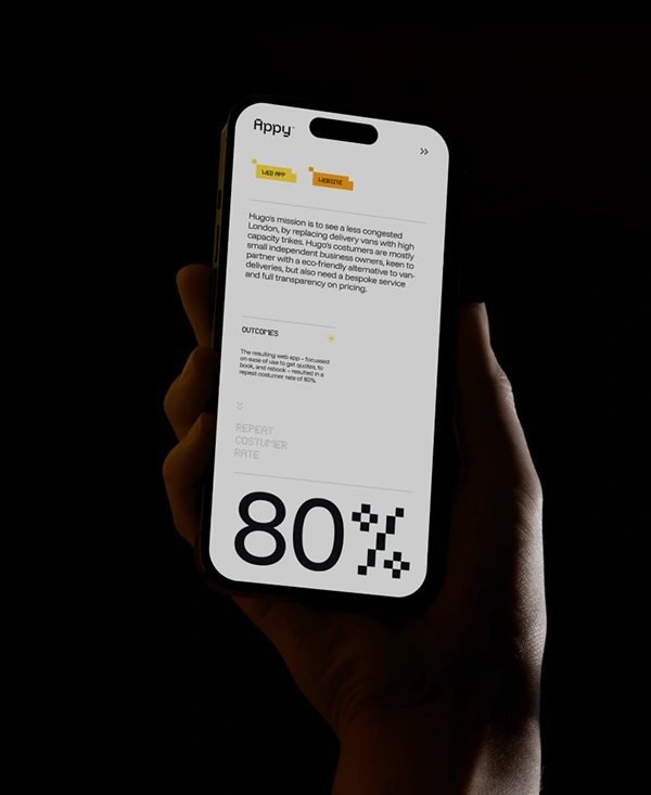
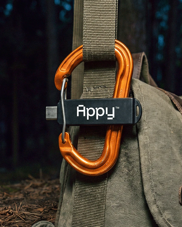
On screen, the app opens on a pixel campsite and the cards read like a game menu. Off screen, the pattern is knitted into a beanie and the tagline woven into labels. The campfire travels furthest, from a carabiner keychain to the camp itself. Each piece carries one part of the system, so the brand doesn’t need the logo on everything to be recognized.

Visual Identity & Typeface - by LOTIPA
-
Credits:
Graphic Design — Antoniel Felainne & Alex Monteiro
Motion Design — Ax Leandro & Lukas Martins
Brand strategist — Kim Dale
Production Artist — Marco di Teles
Design Intern — Leo Kitagawa
Web — Appy Team (Michael Le & Jacob van Leeuwen)
Follow me → Instagram
Website → lotipa.com
© 2026 by LOTIPA
_______
Share your feedback about this project. All comments are welcome!
0 likes · 1 view · Nov 10, 2026
Rebrand of Appy, a London product studio for impact-driven startups, with its own typeface, Appy Pixel. ODA Winner and Gold.

