Scoob - A Pet Sitting App
Overview 🔎
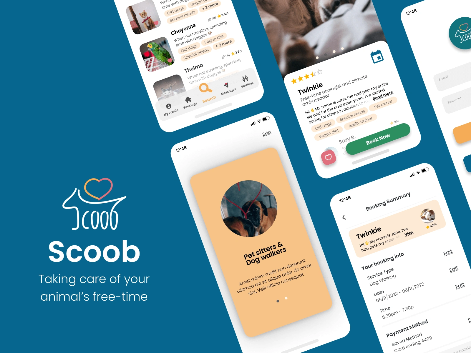
Scoob is a dog walking and pet sitting app taking care of your and your animal's free time. If there's a need, there is always a person, that can step into your full schedule, and give the best service to your barking, meowing, or chirping friend.
This project was created as part of Dribbble's Product Design course. We were building the app through various product design steps, including user interviews, persona building, user flows, wireframes, designing, prototyping, and testing.
Problem & Solution 🤝
Based on user research, we identified the potential challenge pretty quickly for a local market. People in the researched area do not have a previous experience with similar apps unless they lived abroad in a country where Rover or similar apps are being used on a day-to-day basis. In the researched area, people are used to organizing their free time around their pets, and if necessary, they ask their relatives to take care of pets. So how do we build similar trust, so that the person will use the service guilt-free and perceive it trust-worthy?
Goals/Requirements:
• Trustworthy look
• Pet owners and Pet sitters covering
Process 🛣
User Flow
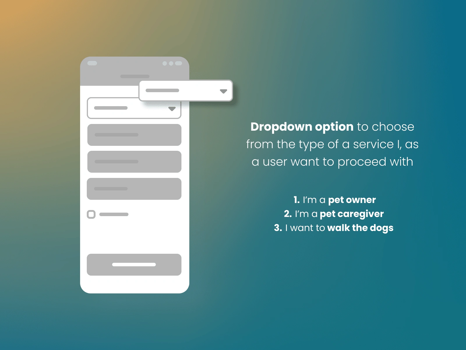
We aimed to be transparent. We realized through the research, that it's not only pet owners who should be considered our endgame but caregivers too. To reflect a two-sided customer experience, we had to create a distinguished approach from the very beginning, that's why the flow was initially divided into three different types of customers in the early stages of user flow.
Low Fidelity Wireframes
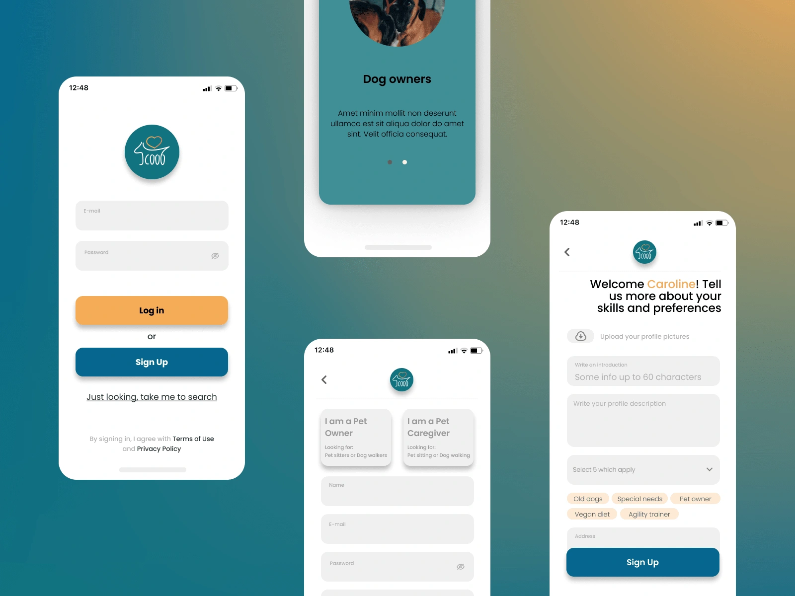
It started to be more obvious, that the user needs to fit within a specific type of customer from the very beginning. This being one of the main objectives, we incorporated a category selection early on, starting with the registration itself.
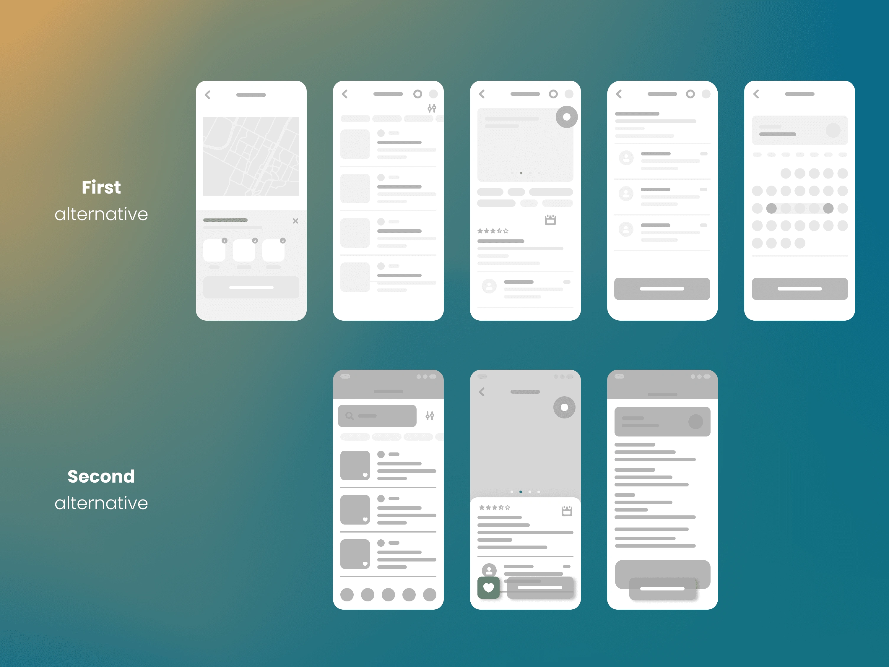
As mentioned earlier, the target audience would have been skeptical towards a similar app, mainly because of lacking experience with alternative services. So we had to solve the level of trustworthiness through the user flow. We realized, that people trust in others' opinions, their reviews, and reliability score, as well as a personal connection. So we created two alternatives - one with emphasis on localization (finding only users within the radius), the other on reviews and scoring.
In the process of user interviews afterward, we realized, that if we immediately choose the default radius by user's address since the registration (with the ability to change it in the profile), we can easily avoid additional screens. Therefore the user goes right to the search after registering.
Results 🎁
Visual Design
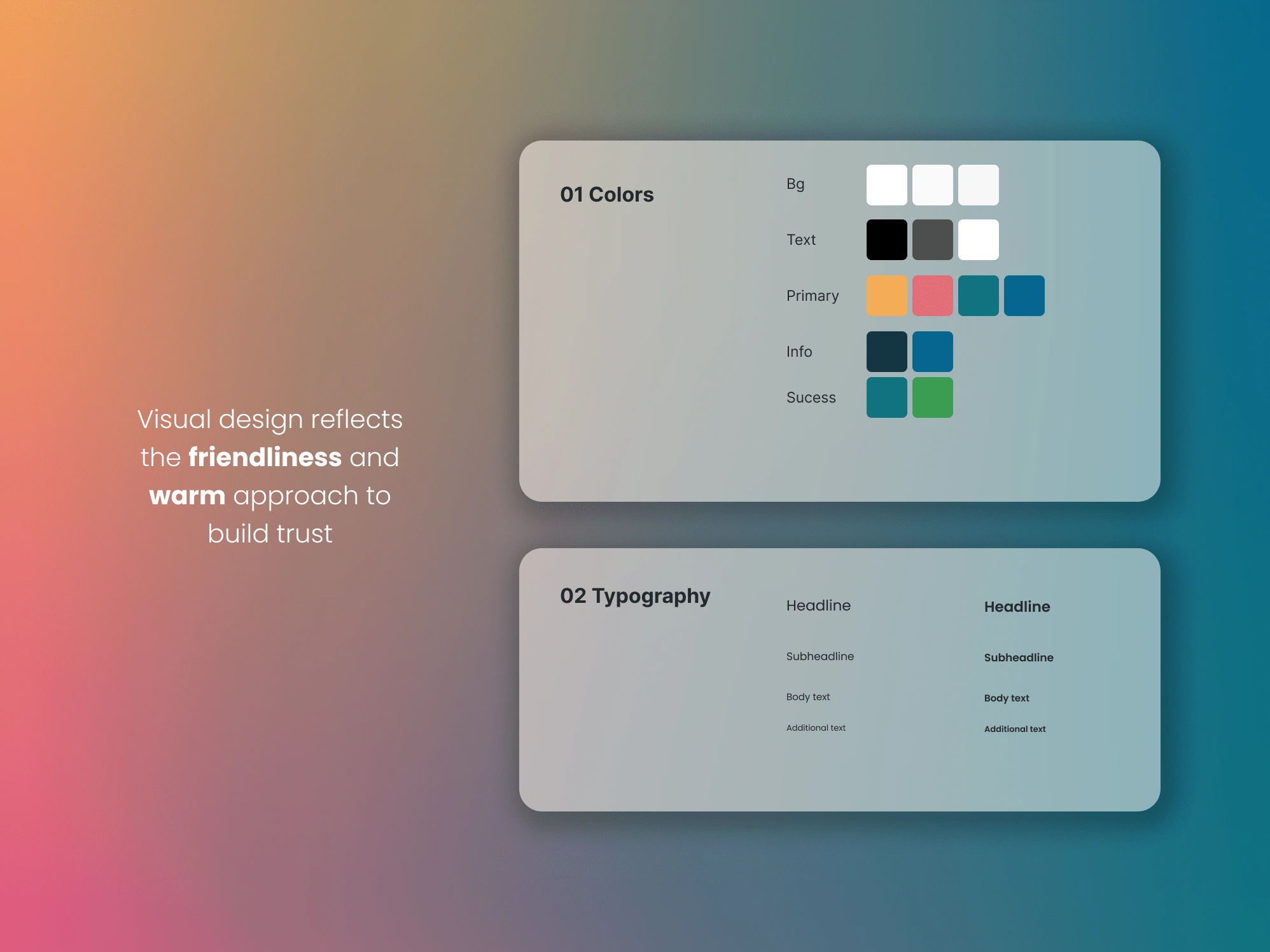
The design of the app uses warmer colors and a clean look so it provides the professionalism this matter and theme deserves. User interviews showcased, that potential users need to build a relationship and trust the person as well as the platform to take good care of their animal friends, similar to they would with their own close friends and relatives.
High Fidelity Wireframes & Prototype
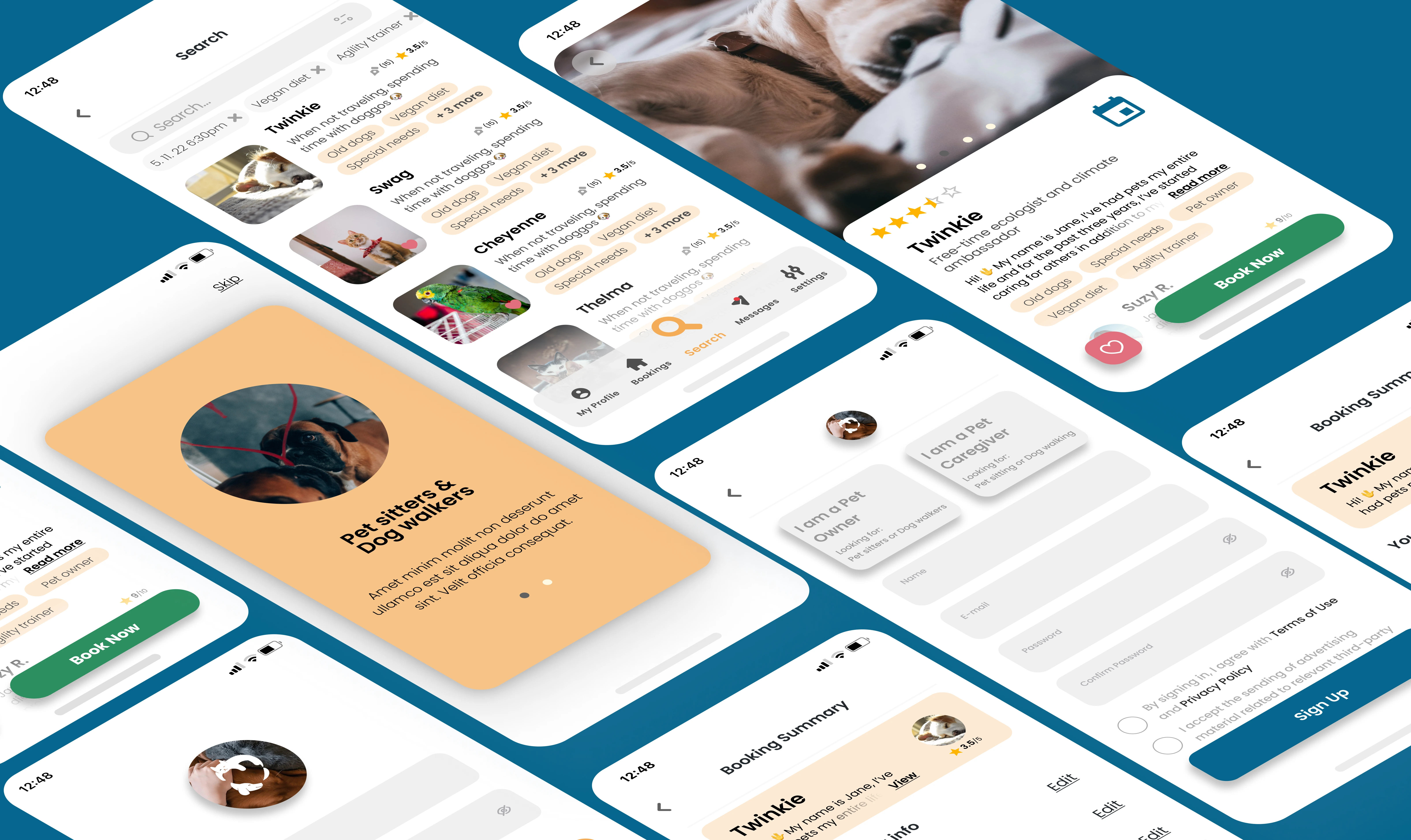
Through the testing period of our final high fidelity wireframes, several feedbacks referred to unclear service selection, so we changed the approach towards a more definitive selection of customer types - either a caregiver or a pet owner, with further service selection in the later booking stage.
My Role
UX Designer
Takeaways 📣
Some markets are still new to quite some services, that exist in leading consumer markets. You have to work a lot with trust within the designing process. During interviews, better ask more about the current way of solving the issues with the interviewee, they will give you some ideas which you can incorporate within the design. Working with trust in new untapped markets is the main attribute we should take into consideration.
Like this project
Posted Jul 22, 2022
Scoob - A Pet Sitting App designed by Miriam Kölešová. Connect with them on Dribbble; the global community for designers and creative professionals.
Likes
0
Views
11

