Travel Agency Website Design
Compass Crew - Improving user experience for an adventure focused startup
Let’s explore how I created a seamless digital product for Compass Crew, thrillophilia for backpackers!
✨About Compass Crew
Adventure-focused startup for solo travelers and backpackers in India.
📙Design process and challenges
The company being an adventure focused startup, creating visual heavy platform was necessary. Keeping up to date with the trends and incorporating the vision of the team was a challenging target to achieve.
To design the product, I did an extensive research in the domain and on the competitors (thrillophilia) and created a basic understanding of the design approach. To steer my design decisions into the right direction, I took inspiration from visual heavy platforms which showcased their brand’s value in an impeccable way. To stay track throughout the process, I created a moodboard which incorporates everything.
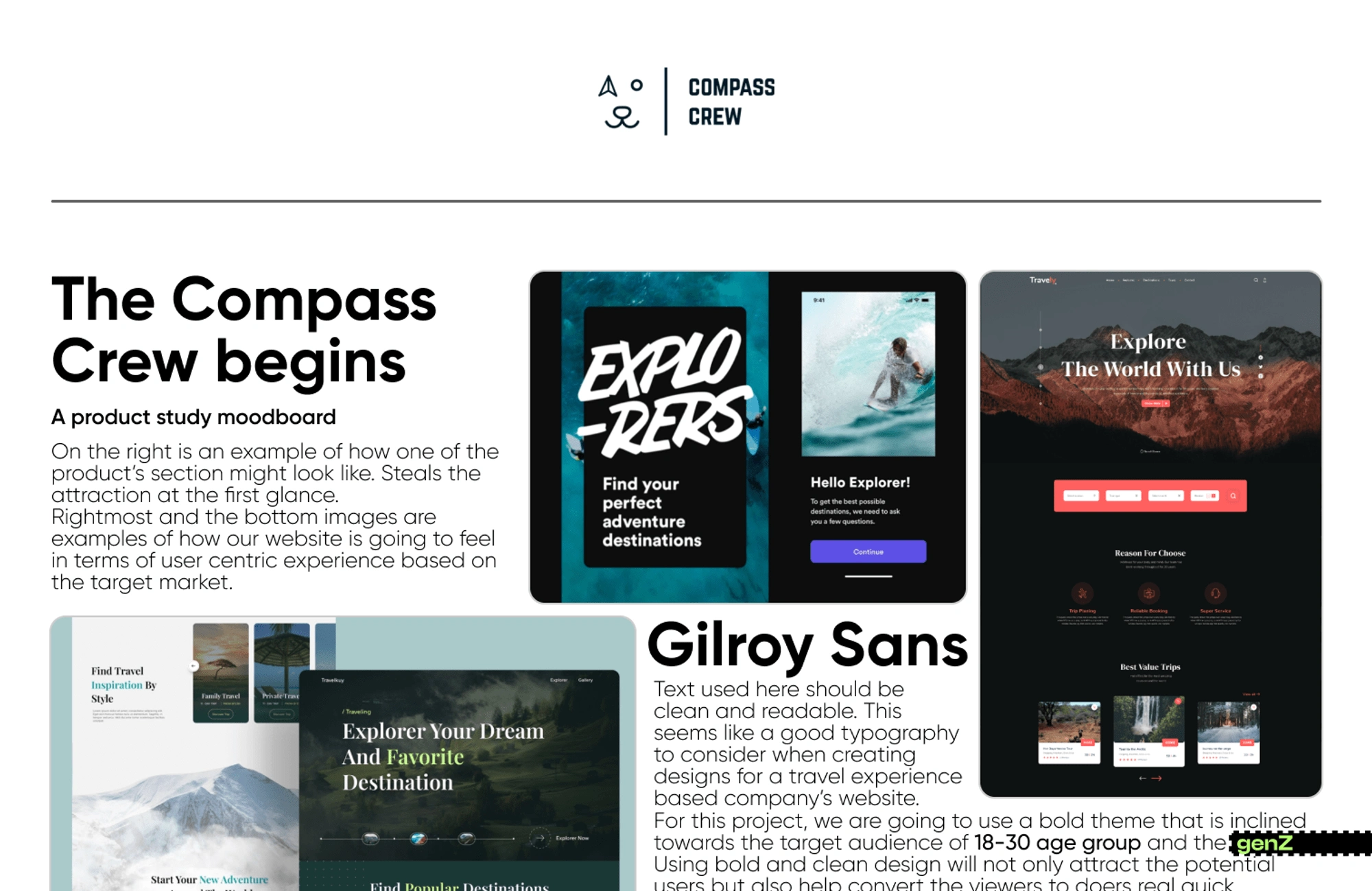
Moodboard - Compass Crew
There were various iterations, upon which the final design is built that brings together the true explorative nature of the Crew.

Design Iterations
1. Website Functionality
To help users explore the website easily, design changes were made accordingly.
a. Experiential hero section
Expectations of an explorer would be to feel the thrill right before booking an experience. In the previous design, the page directly jumps to the activities that they offer as a service which does not help in retaining the user on the website for a longer period.
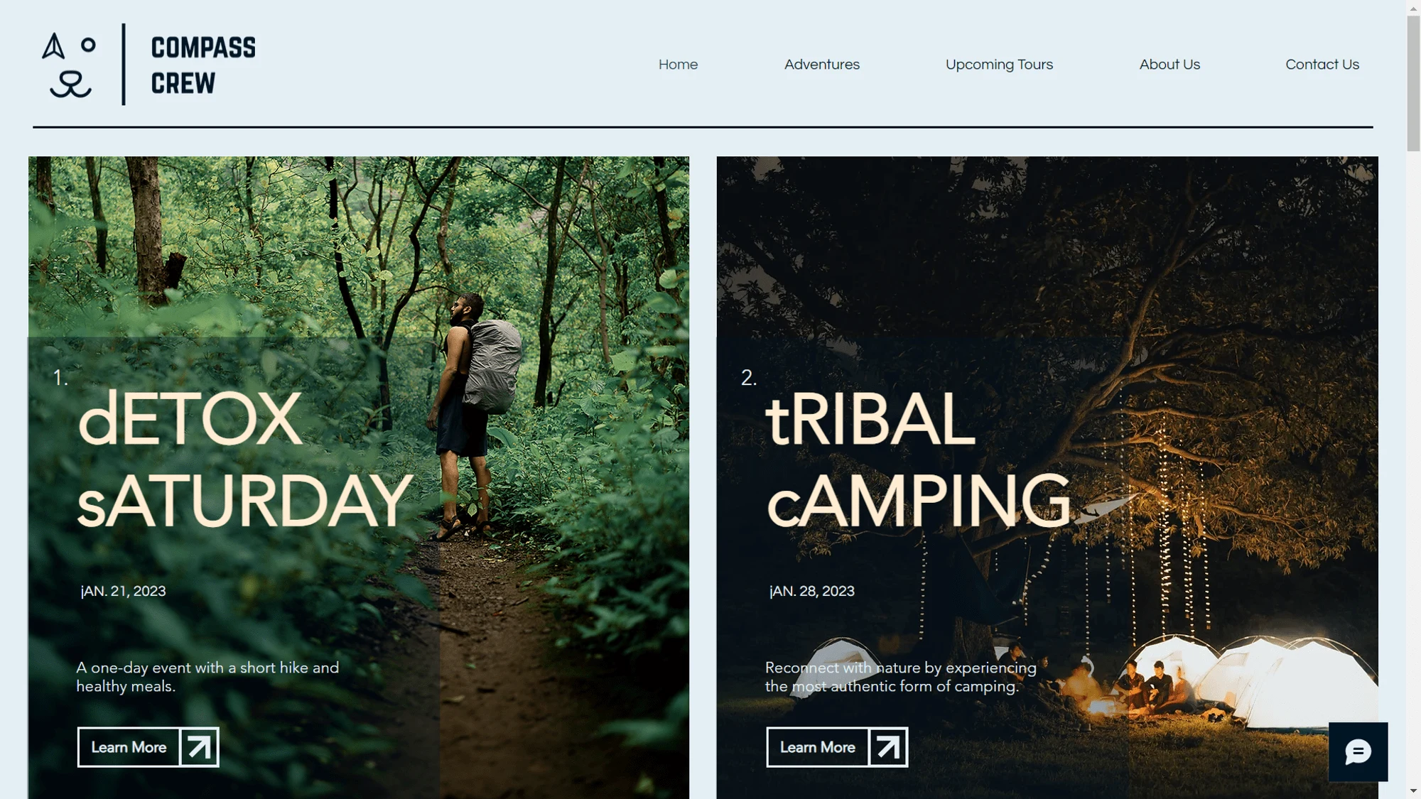
Old design: Limited experiential value
To overcome this problem, we worked on imagining and bringing the perspective of a user to the real life. When we showed some of the inspirations to the interviewees, we noticed a higher percentage of people choosing an immersive landing hero section rather than just content and other stuff. Incorporating the same idea in our landing section, we started creating an exploratory vibe from the landing section itself. This includes a sticky menu bar with an interactive search bar.
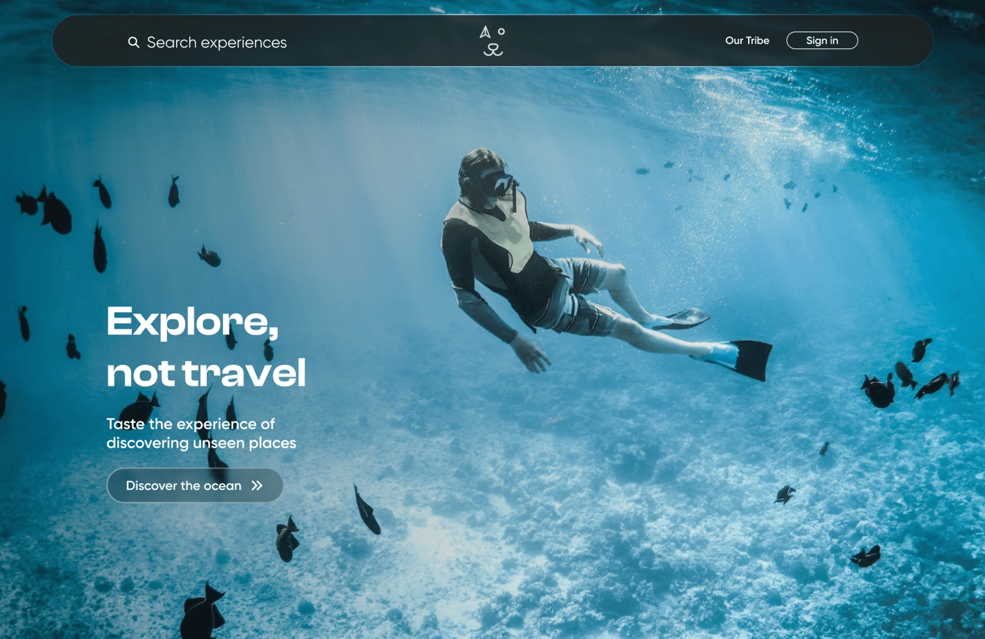
Landing Hero redesign - Visually appealing experience
b. Trending/Upcoming activities
The platform did serve two different purposes.
B2B adventure servicing.
Personalised CC adventure trips.
Our goal was to keep both of the purposes intact on the website and equally visible on the landing page. To bring in more leads for the CC exclusive exploration trips, a unique section was introduced right after the hero section to showcase the upcoming events and trending content.
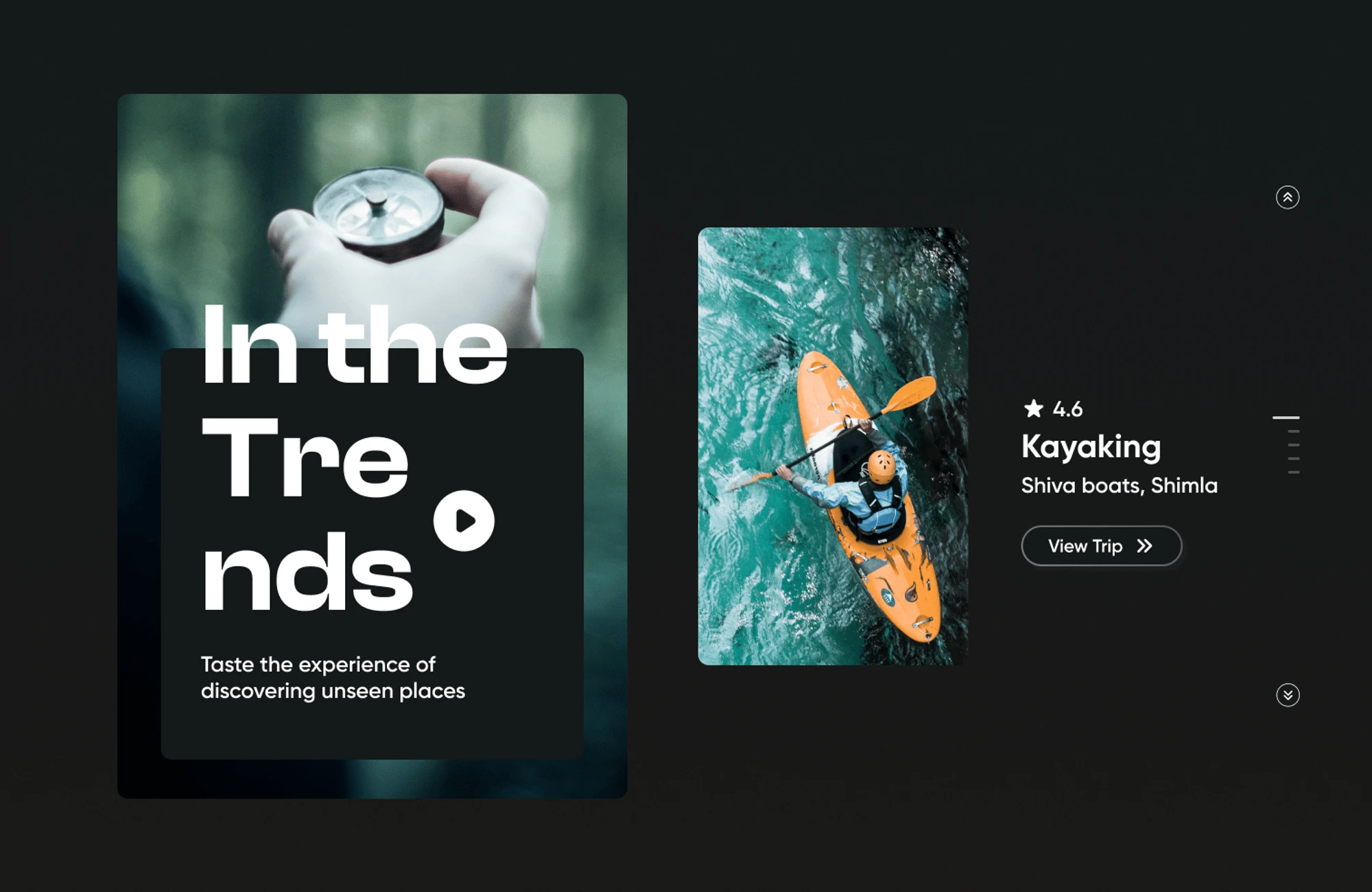
Upcoming events section - Making the user interact right away
c. Search events page
Previous platform lacked the search functionality. We incorporated a new search experience which enables the user to explore the adventures that they can venture upon. Incorporating the funcionality with the aesthetic design was a bit overwhelming but bringing it to the real life was really good.
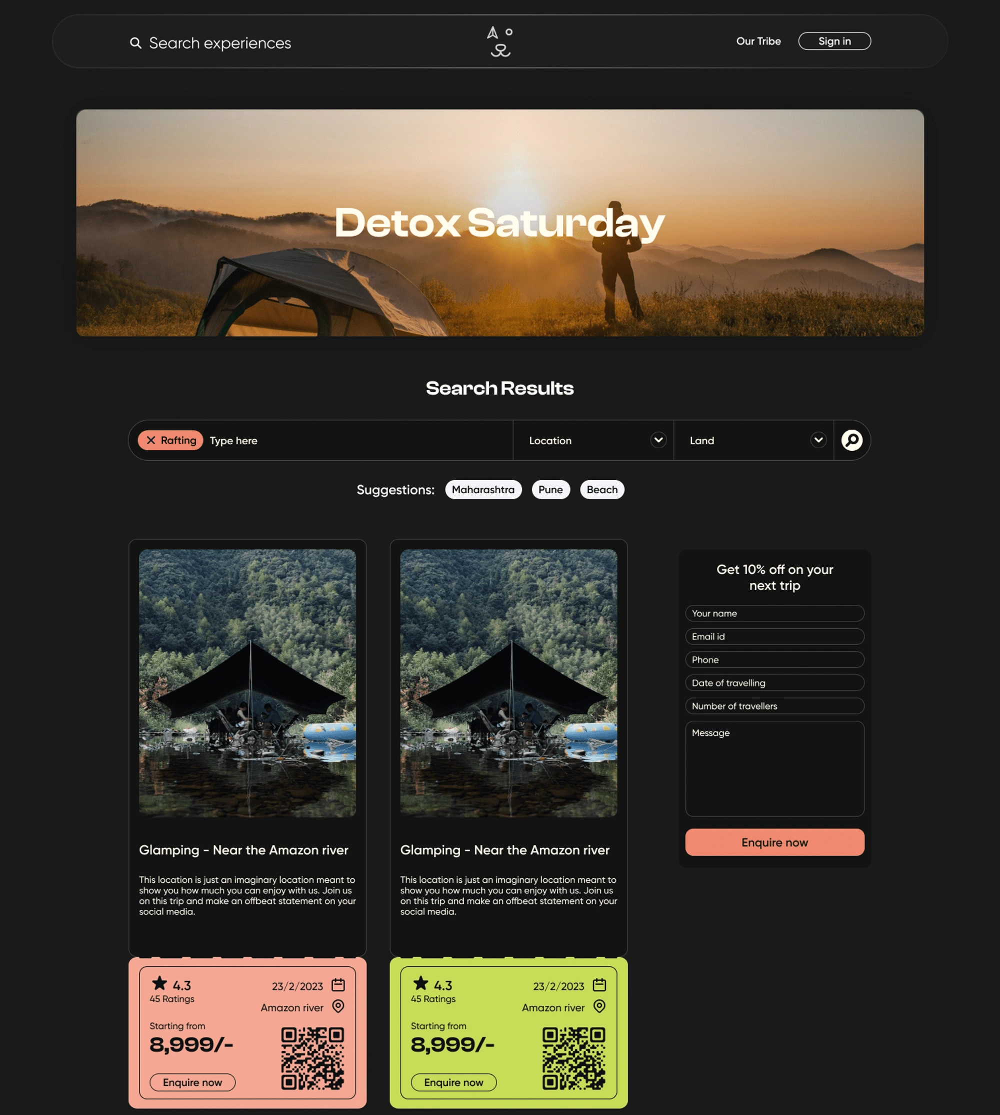
Search page - User’s delight
Recreating the event cards to match the vibe such that it includes all the necessary information and yet look exotic, was bit of a task. Ticket style cards was what I was looking for and this is what I came up with. Users and the stakeholders liked this creative approach.
2. Brand representation
Compass Crew’s business needed to showcase an adventure brand such that the users feel the community vibe created around the exploration sphere. To bring those aesthetics to real life, we created a collage styled section to make the user feel an explorer’s journal.
a. Our tribe
Creating a section exclusively to showcase our community and how we like the exploration, this was the best page we intended to bring to life.
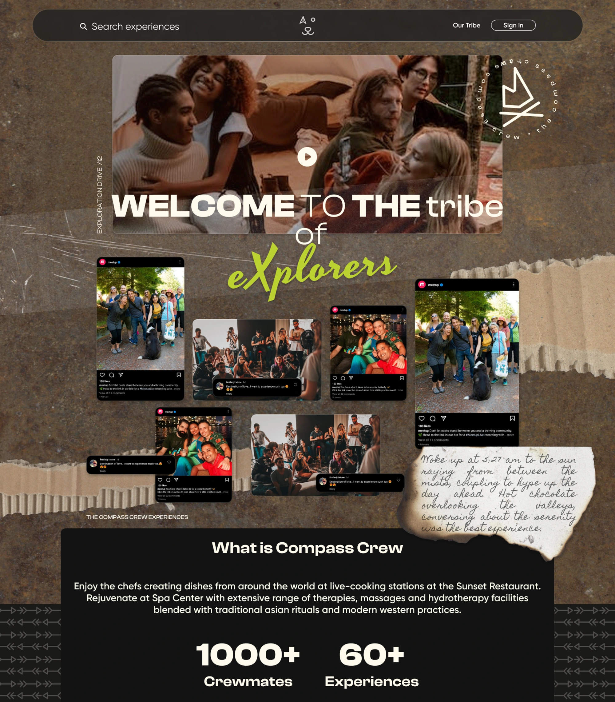
Our Tribe page - The CC community
The section included media content related to previous user experiences - pictures, social media interaction, real-time status and some random journals. Having this section as a community section, CC felt respected and in line with their visions.
b. Individual event page
In the previous website, the content inside of an individual event was just pricing of the package. It was definite that we needed more spice to that content to increase the conversion rate.
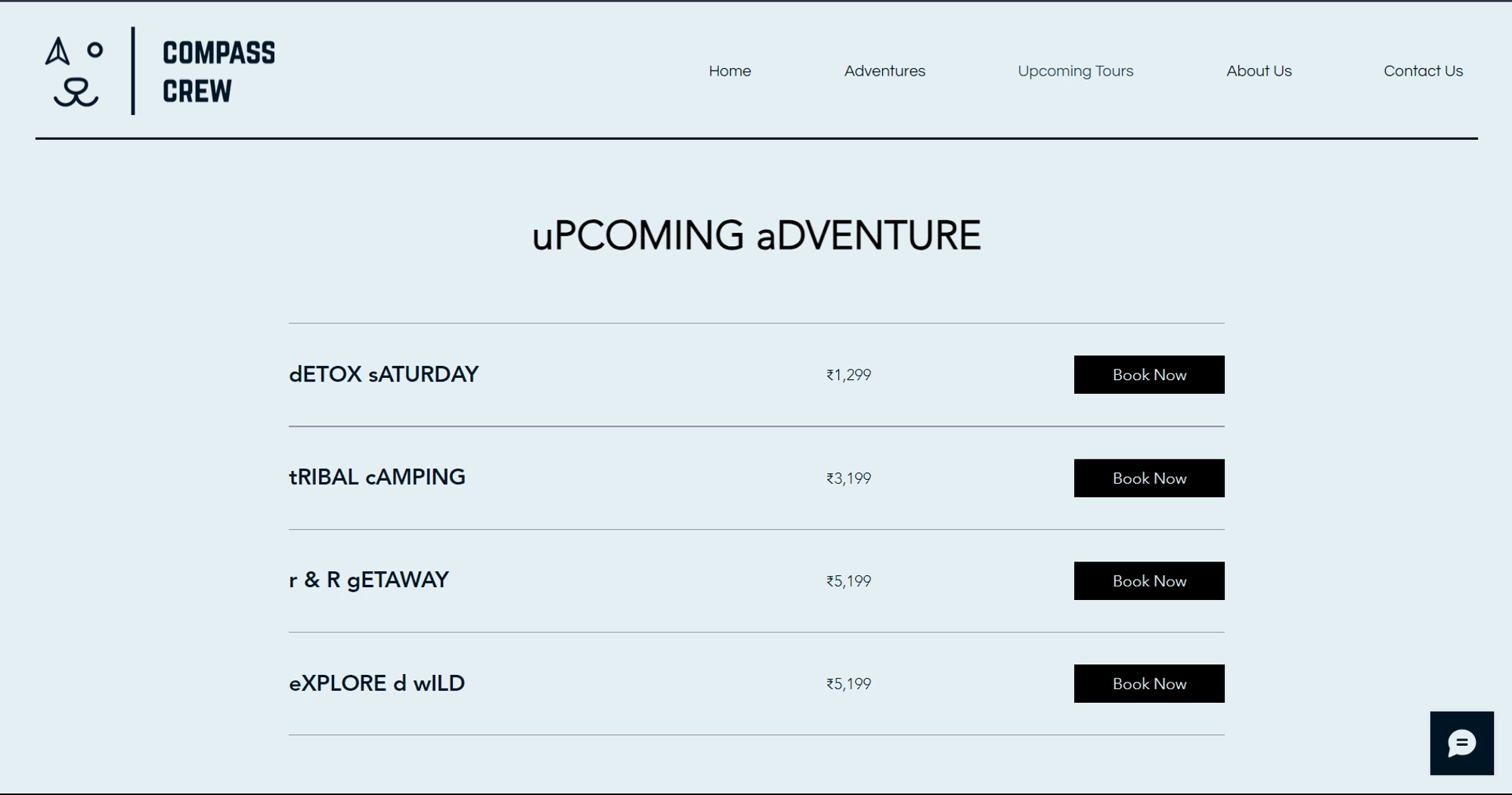
Old individual event page design
Redesigning the events page experience, I figured there were some specific elements that needed to be put in higher visibility than others. The gallery was to be a collection of images that is surrounded around the location in a pleasantly immersive way. The event host to be show in a different section which would lead to a specific page for the host. And finally, the events form should cater the best exploration experience to the users.
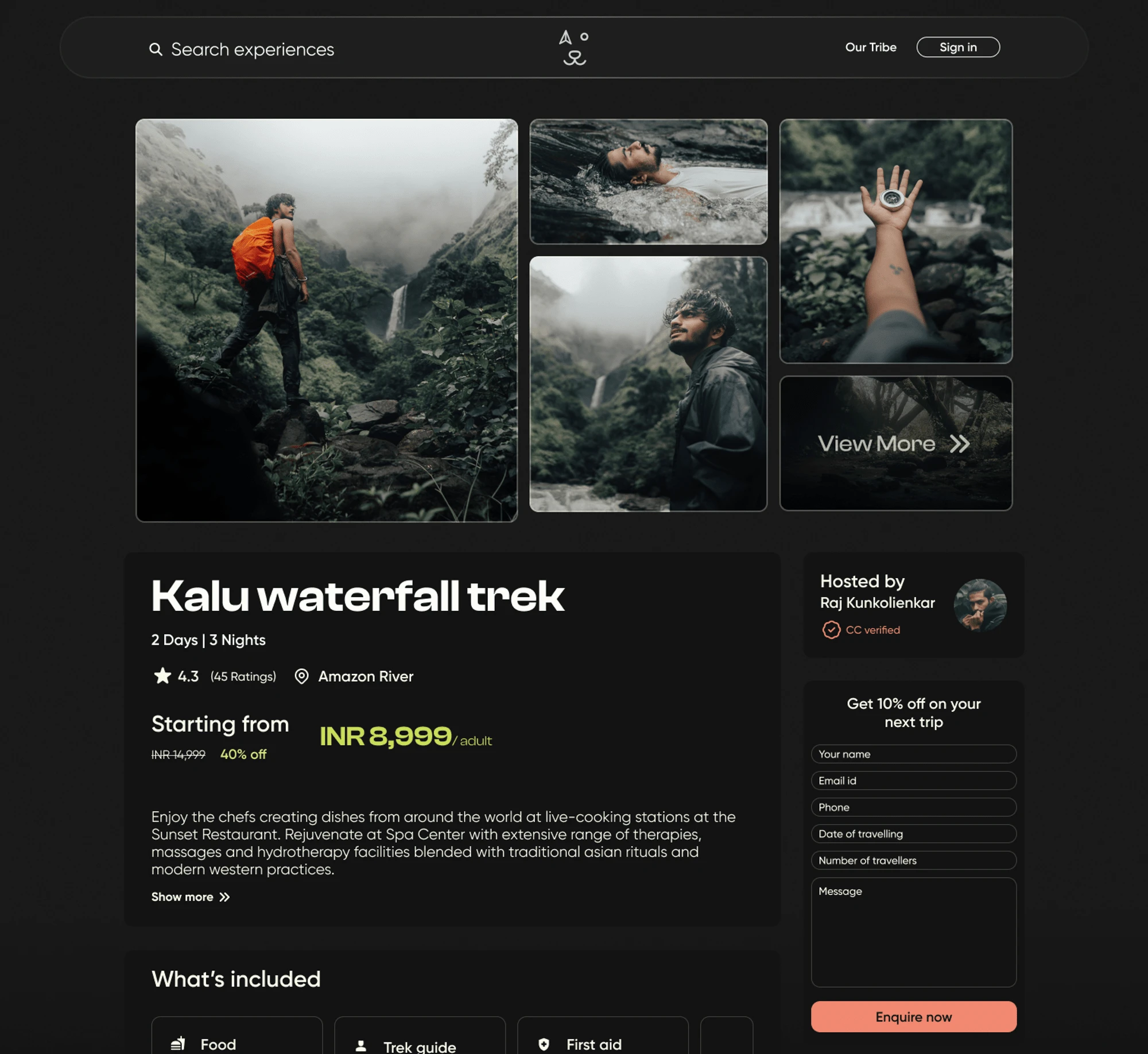
Individual Events page - redesign
Including all of the important content, we thought of giving it a vibe similar to what is shown on the whole platform. The colors, typography and other components needed to be in the similar manner that it is on the whole platform. Incorporating the design style with proper functionality, it was a delight to view the platform such that it was always envisioned by the team CC.
👉 Final words
Project Compass Crew has been a really exciting design project for me which lead me to unseen exploration in the world of design. Throughout the journey, at times I was clueless, directionless and inspiration-less but the whole team, my friends and mentors were really a lifesaver. This helped me equip real great knowledge of including the design content with the branding.
~kunaaal
Like this project
Posted Mar 23, 2024
Redesigning a travel agency website to match the company's brand values and the GenZ vibe!
Likes
0
Views
9


