
Two directions. One brand. Two completely different moods.
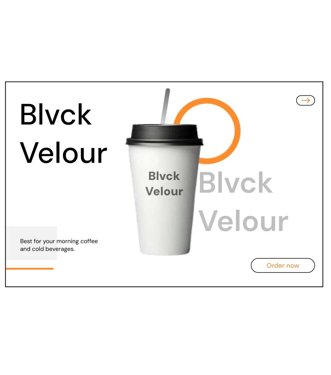
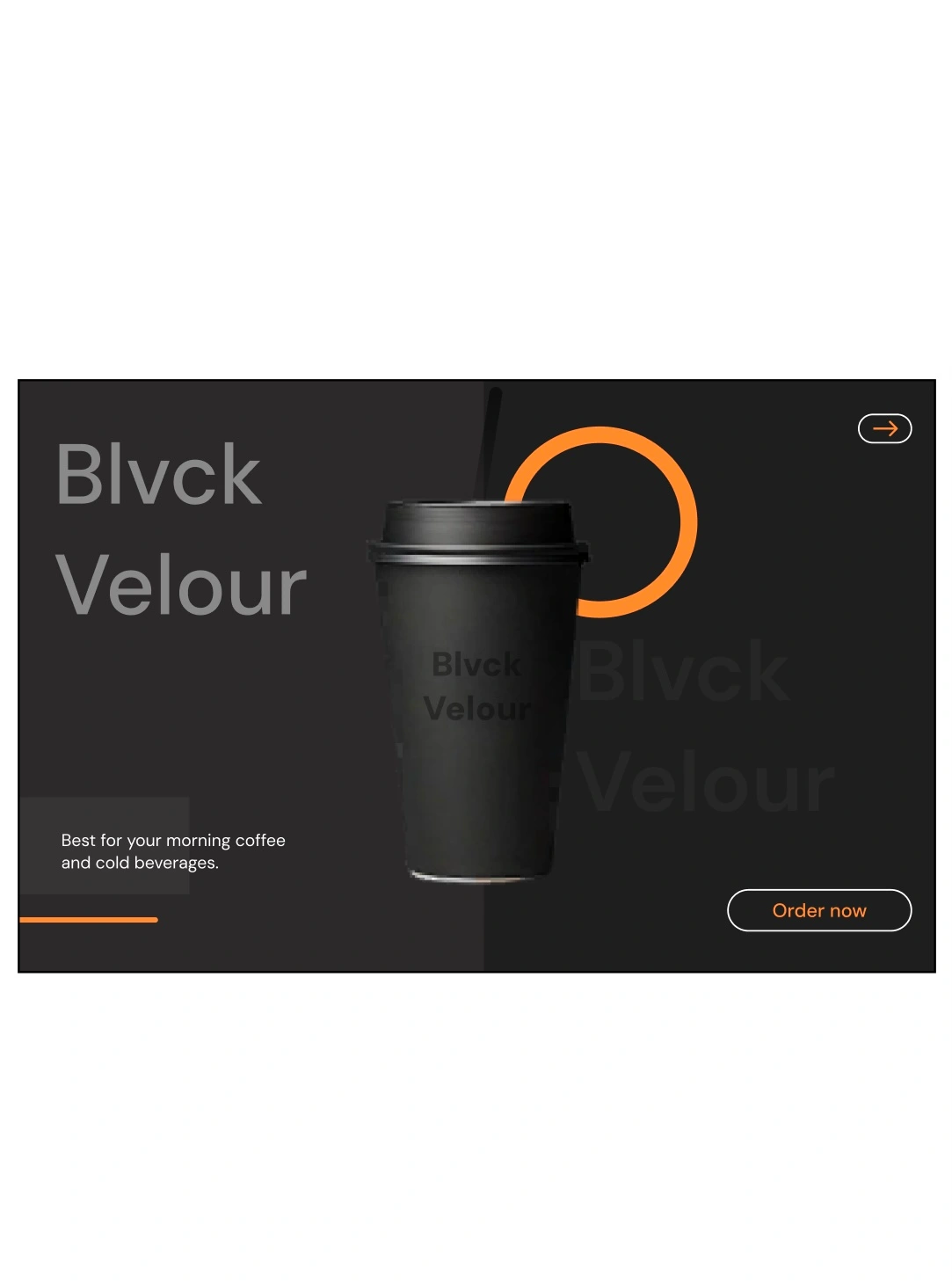
I explored two visual directions for the same coffee packaging concept ; a light/clean version and a dark/bold version.
Both communicate the same brand, but they create completely different moods.
Option A — Light: clean, minimal, fresh
Option B — Dark: bold, premium, more dramatic
If you were the client, which one would you choose?
And more importantly, what makes you choose it?
I’m curious to hear how other designers and creatives approach this kind of visual decision.
Do let me know in the comments.
0 likes · 0 views · Aug 13, 2026
Two directions. One brand. Two completely different moods. I explored two visual directions for the same coffee packaging concept ; a light/clean version an...
