Octrino.com - Redesign
Ali benabbes
About the project
Octrino is a web marketing tool that manages the writing, analytics, net-linking and creation of websites.
My role in this project
As principal designer, I was responsible for taking product features from conception to implementation; producing high-quality deliverables such as UI screens, user flows, and prototypes at various levels of fidelity.
Part of my responsibilities also included collaborating with the product owners and tech lead to define high-level requirements and strategy.
Background
In 2021, after operating octrino.comfor a year the Octrino Team decided to re-haul the product from the ground up with a new design, more features, improved UX, and a new Strategy.
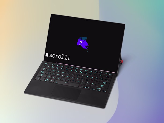
Older version of octrino.com
As the app encompasses various features targeted at various users which range from customers, analysts, writers and project managers; The design team conducted an in-depth analysis of the product, making use of various UX research techniques such as user interviews, usability testing, heat map analysis, and more.
How it works
Customers can useas a web marketing tool to acquire better analytics which can help them get better ranks on search engines for their website ; with the help of the octrino writers, developers, and good strategists, Customer can request big Scale Net-linking campaigns with ease.
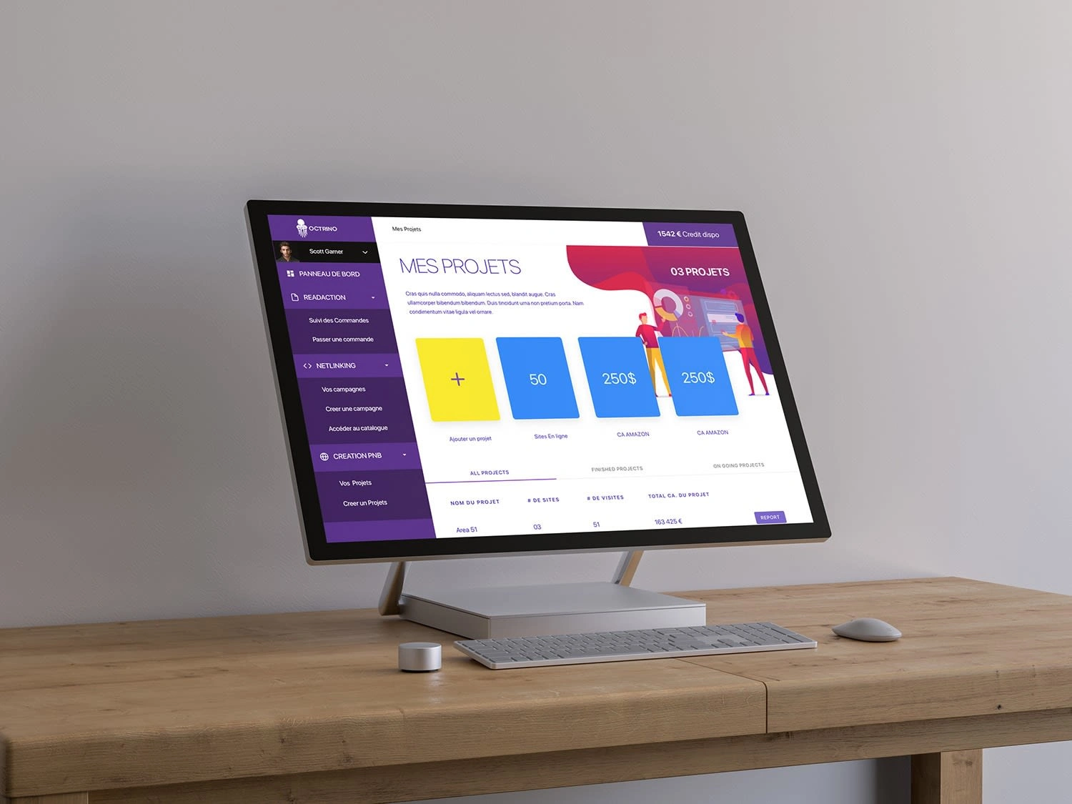
Analytics - Project management
Octrino Target audience
Octrino.com has a “multi sided” audience which means it acts as bridge between two major type of users : Customers (Website owners) and Blog post Writers. But also acts as a platform for freelancers that encompasses : Project managers, Content Managers, Writers , Reviewers, and Web developers.
Client DashBoard UI
More over we identified two types of customers : Individual site owners and Major Brands.
Project goals
Establish a new Scalable, Coherent, and Modular Design system.
Reorganise Octrino platform by User roles, where each user has a specific role accompanied with specific set of tools and user-interface.
Cut Reliance on external tools like google docs, Jira & trello for a coherent in-house solution to improve collaboration, cut operation costs and avoid data loss.
Increase productivity and efficiency by designing simplified project management tools, introducing new analytics metrics plus dashboard and, revamp the content creation & validation process.
Increase customer satisfaction by offering advanced project tracking tools, design new feedback channels and simplify the payment process.
Results ⭐️
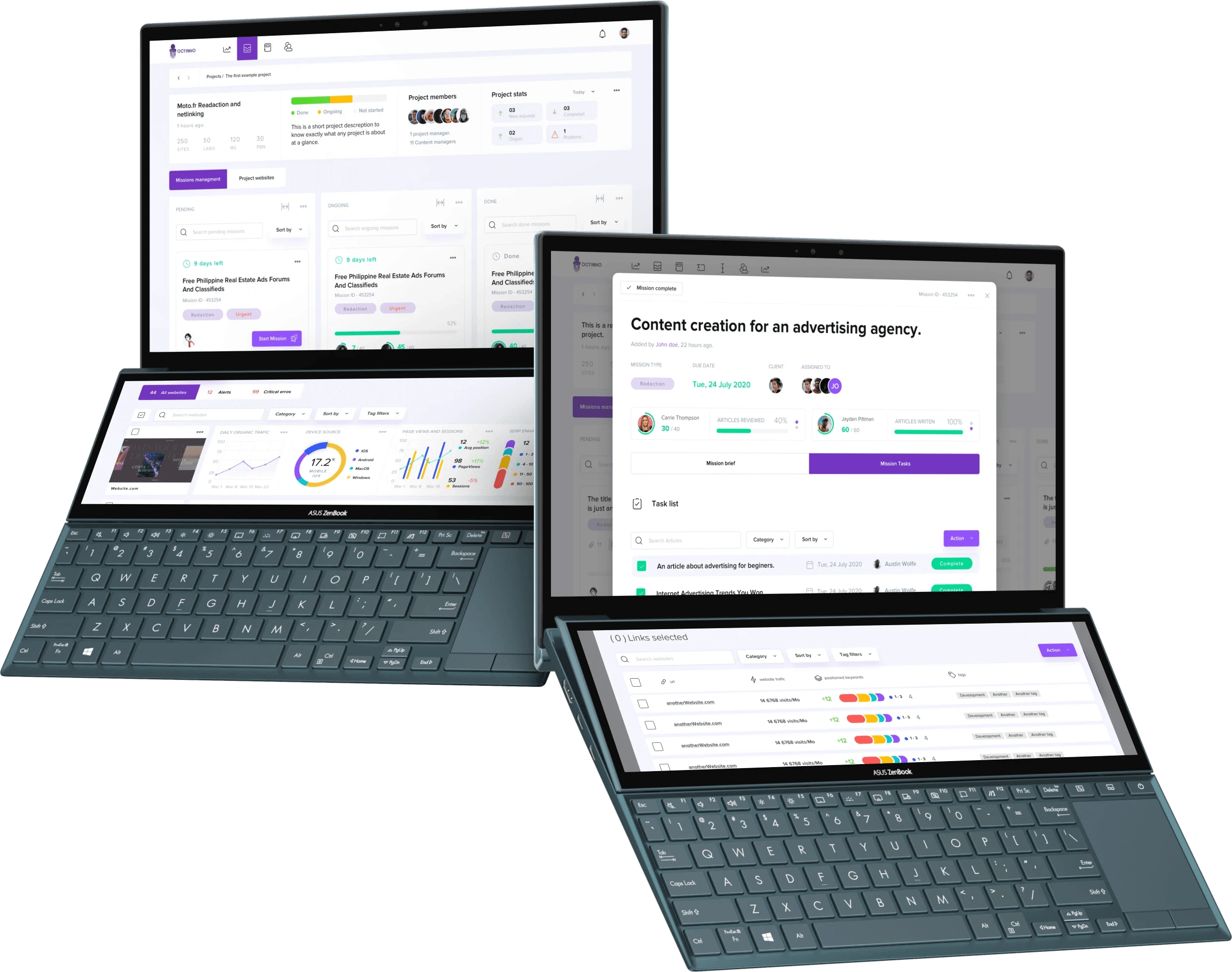
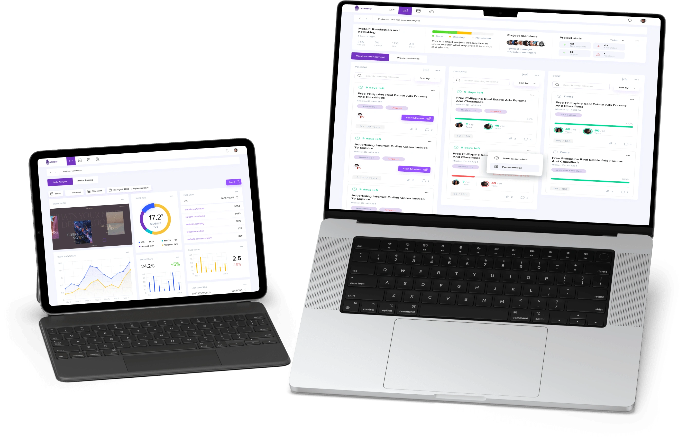
Octrino v2 multi-screen workflow ( web marketing tool )
Redefined structure
We clearly defined users roles based on assigned tasks and workflows which in turn helped us restructure the existing hierarchy to establish better flows. The result was a multi interface solution that answers to different needs based on users roles.
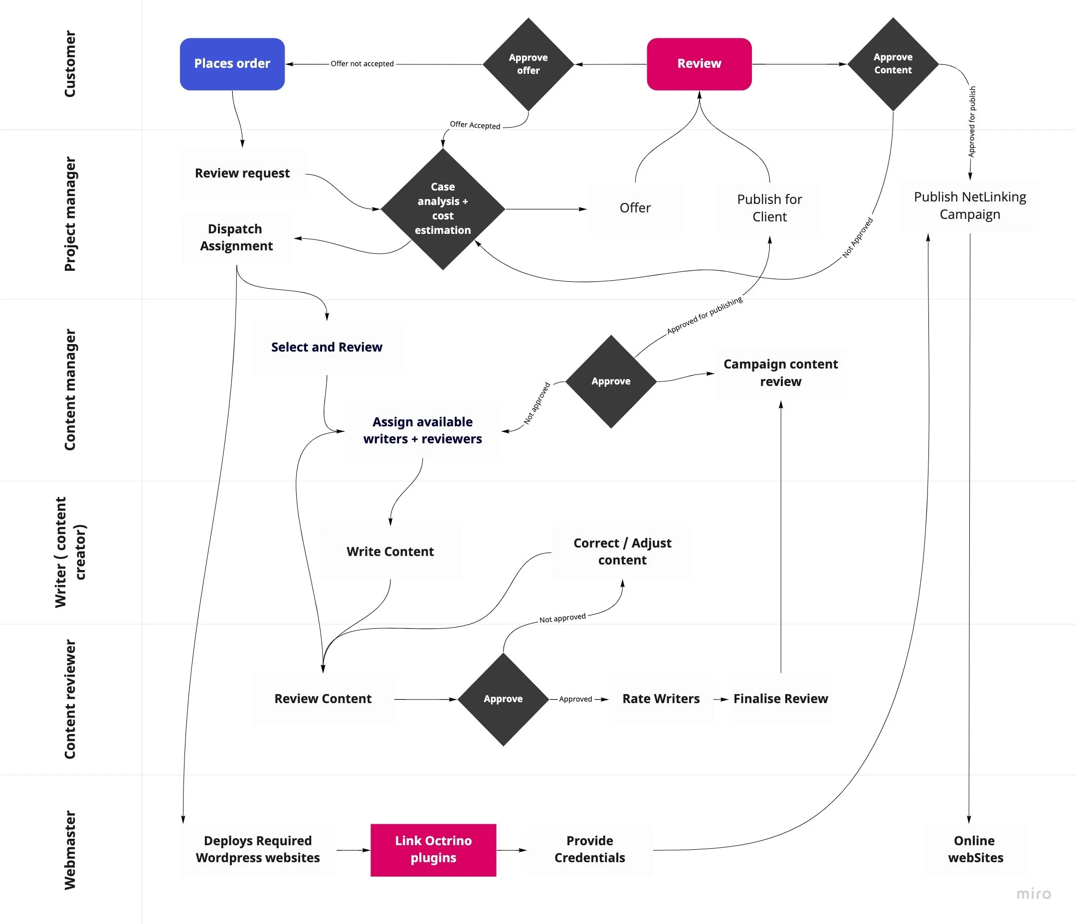
Swimlane Diagram
Scalable Design System
We organised related information into cards that can be reused in many different contexts, in this case cards where used interchangeably in various dashboards assigned to various user roles. That enables us to put together a scalable homogeneous design system and, to determine the most natural way to present information to the user and make it skimmable at a glance.
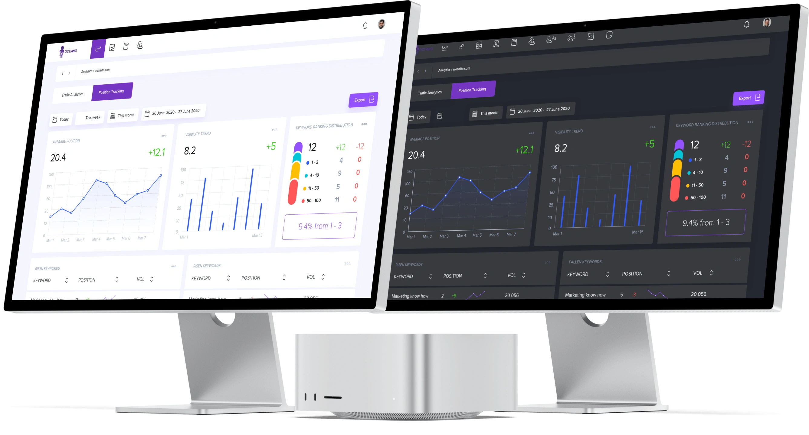
Light mode - Dark mode
Streamlined flows
We took flows that were originally separated into many steps and consolidated them into one or two steps. We also clearly marked optional fields, and added tooltips and hints to provide more context.
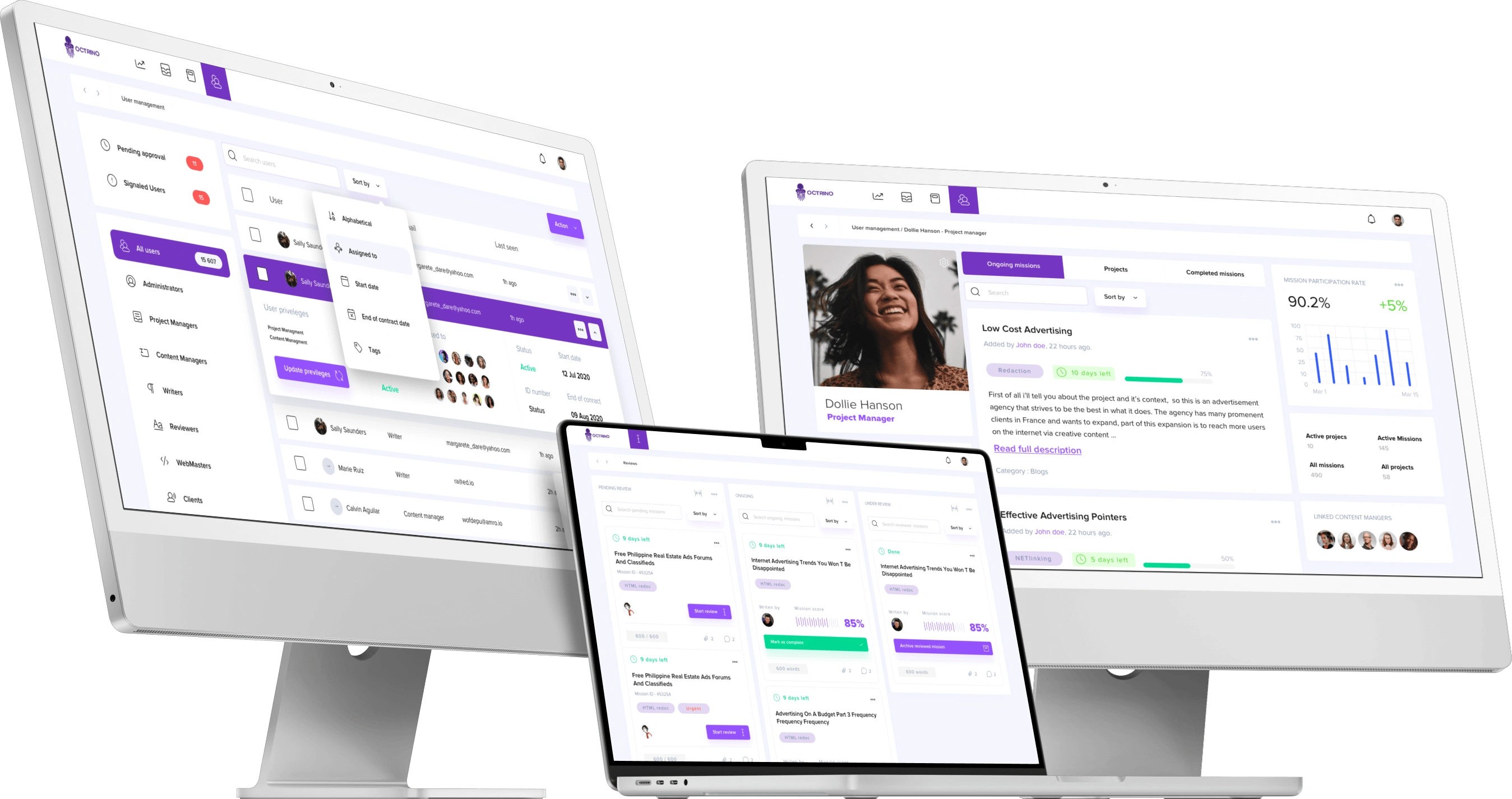
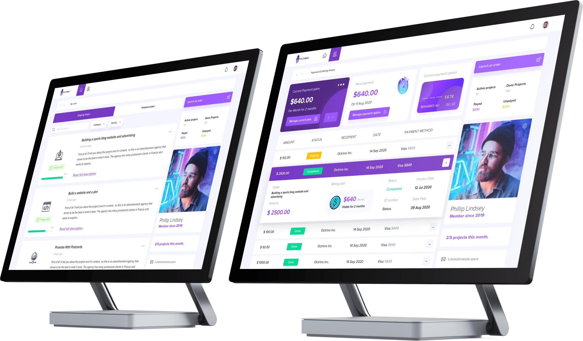
User Project assignment - Writers Dashboard - User profile page
Takeaways 📣
Doing a second take on an existing product was a very challenging but ultimately rewarding experience.
Using the guidance we got from user interviews proved to be invaluable in making decisions about what should be prioritised.
Personally, I found it infinitely entertaining to discuss the minutia of flows, spending hours with the team talking through edge cases and finding the flaws in our logic
Like this project
Posted Aug 15, 2022
Octrino is a webmarketing tool that manages the writing, net-linking and creation of websites.
Likes
1
Views
21