GetMyCourse Blended Learning Landing Page Design
Abhinav Sharma
GetMyCourse - A High-Converting Landing Page
Client: GetMyCourse Australia (500+ 5-Star Reviews on Trustpilot)
Industry: Education / Career Upskilling
Project Type: Conversion-Optimized Landing Page (Design + Development)
Landing Page: https://getmycourse.com.au/blended
Project Overview
GetMyCourse is a well-established education provider in Australia, trusted by thousands of students and backed by 500+ 5-star reviews on Trustpilot. When they introduced a new Blended Learning Program, they needed a dedicated landing page that could clearly communicate the course’s value, empathize with the audience’s struggles, and convert visitors into consultation calls.
I was approached through LinkedIn to design and develop this landing page. The challenge was unique: unlike typical course pages, this one required heavy copy, emotional storytelling, and a structure optimized for conversion — since paid ads would be driving the majority of traffic.
The final page not only matched their existing brand language but presented complex information in a clear, persuasive, and conversion-focused way.
Goals
The objectives of this project were to:
Communicate the value of blended learning in a simple, compelling manner
Present copy-heavy content in a digestible and emotionally engaging format
Build instant trust using strong social proof and high-credibility elements
Increase conversions through strategic CTA placement and hierarchy
Create a seamless booking process for free consultations
Ensure the design stays consistent with the main website’s brand system
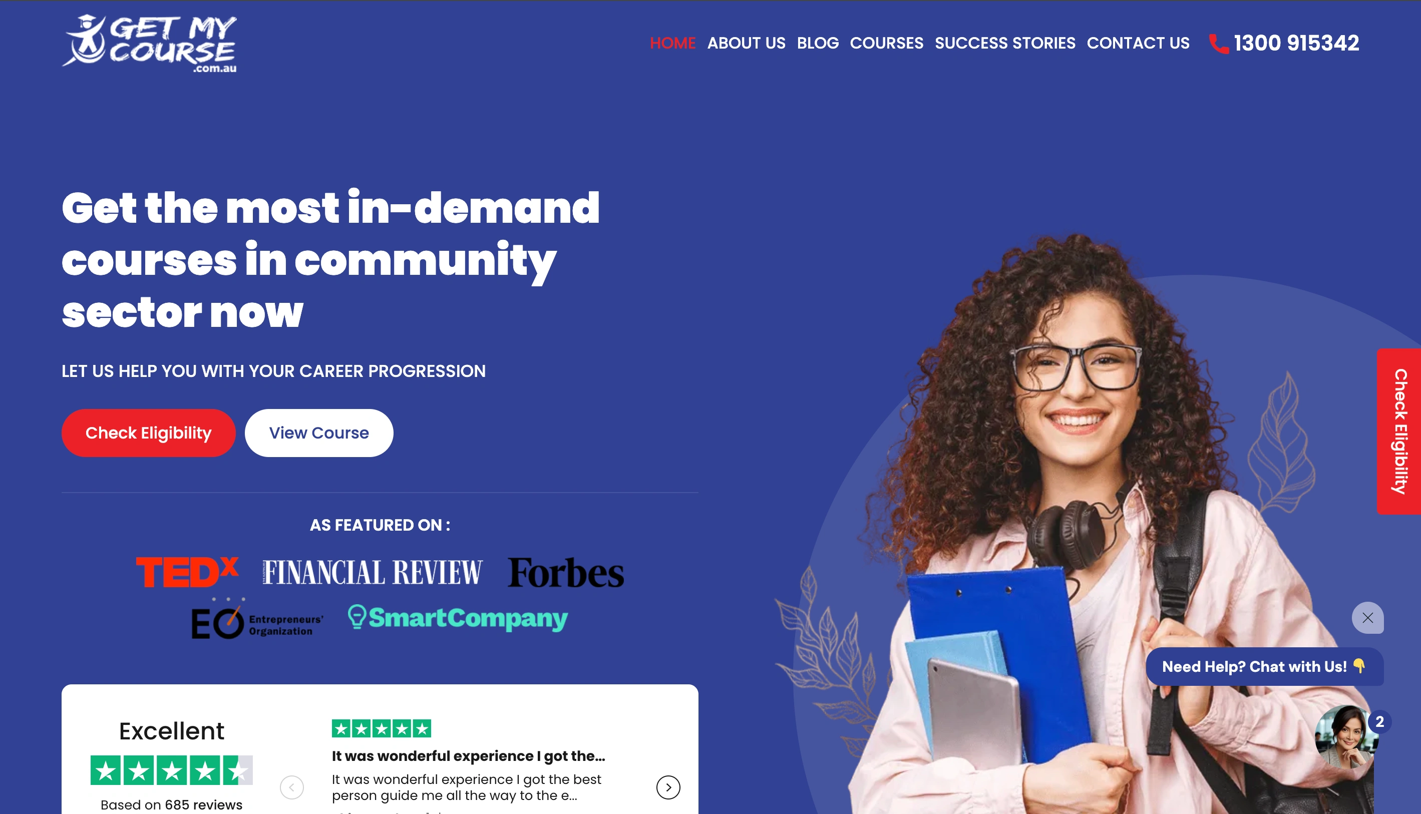
Get My Course main home page
Our Design Approach
Because this page would receive targeted ad traffic, the design had to be laser-focused on reducing friction and guiding users toward booking a consultation.
I followed a conversion-optimized approach:
Strong hero framing + social proof
Emotional storytelling
Pain → Relief structure
Clear program benefits
Reassurance through testimonials
Multiple strategically placed CTAs
Visual anchors supporting heavy copy
Every section serves a purpose — to build trust, break doubt, and help visitors see how blended learning can advance their career.
Key Design Highlights
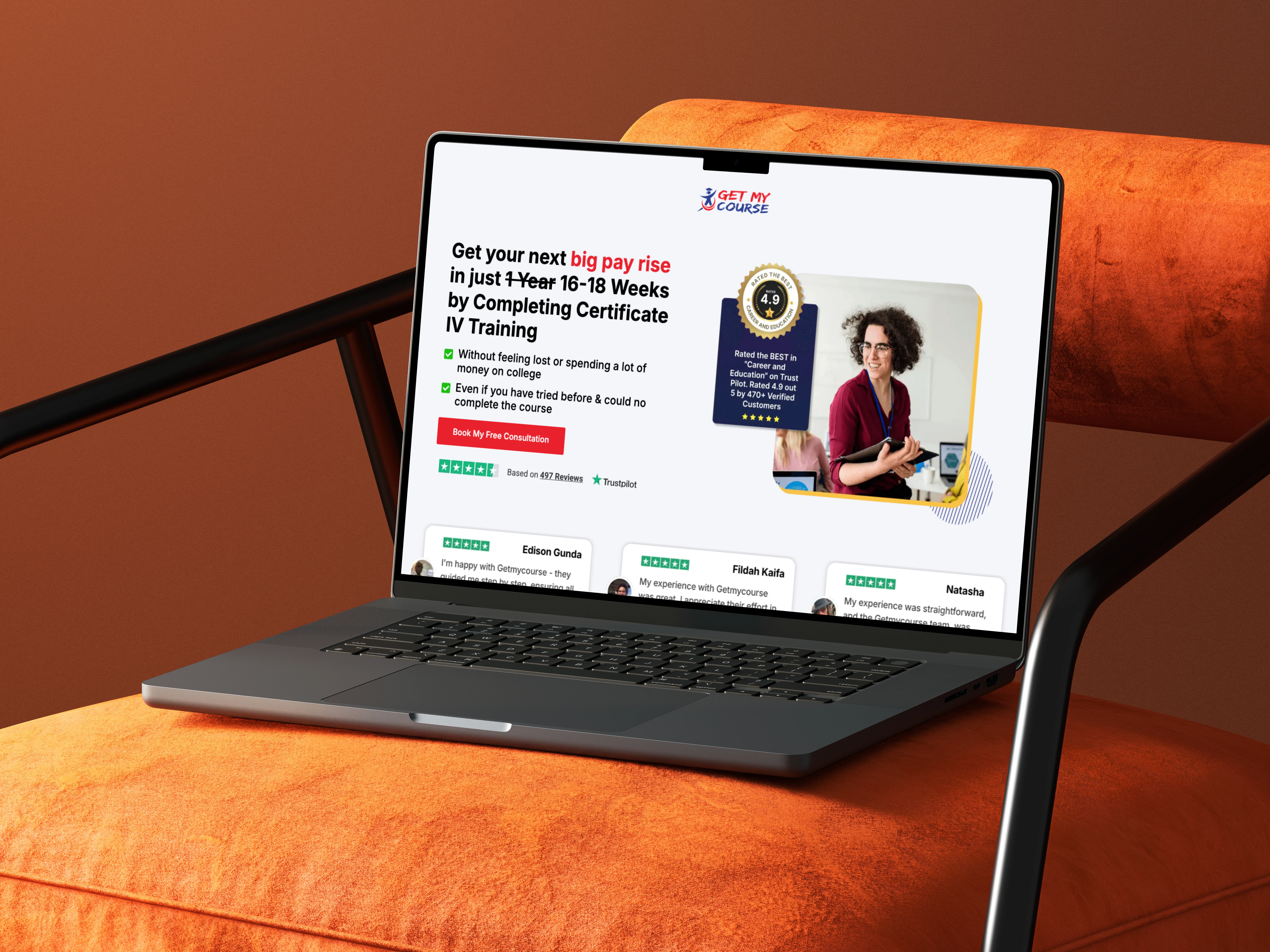
1) Hero Section with High-Impact Social Proof:
The hero combines a clean layout with powerful trust signals:
"Best in Career & Education" badge shown prominently in hero illustration.
Trustpilot 4.9 rating near the CTA.
Actionable “Book My Free Consultation” button
This establishes legitimacy instantly and reduces action anxiety.
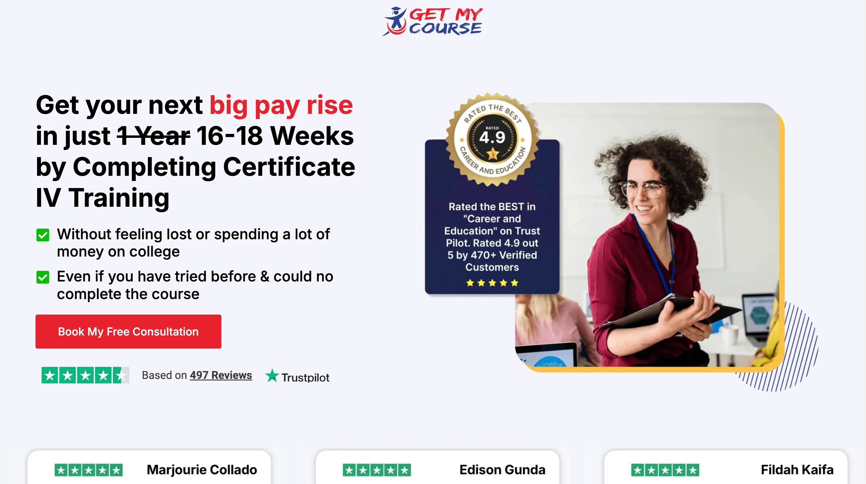
Social Proof Heavy Hero Section
To keep users on the intended path, the navigation bar was intentionally removed — displaying only the GetMyCourse logo (non-clickable) to prevent visitors from leaving the landing flow.
2) Authentic Review Ticker Below Hero:
A horizontal moving ticker features real Trustpilot reviews, subtly peeking into the hero section, drawing users downward and keeping the momentum of trust.
3) Custom Visuals for Complex Concepts:
I designed a career growth graph illustrating the difference between traditional learning (slow, linear) and blended learning (fast, exponential). This visual analogy made the benefit instantly clear.
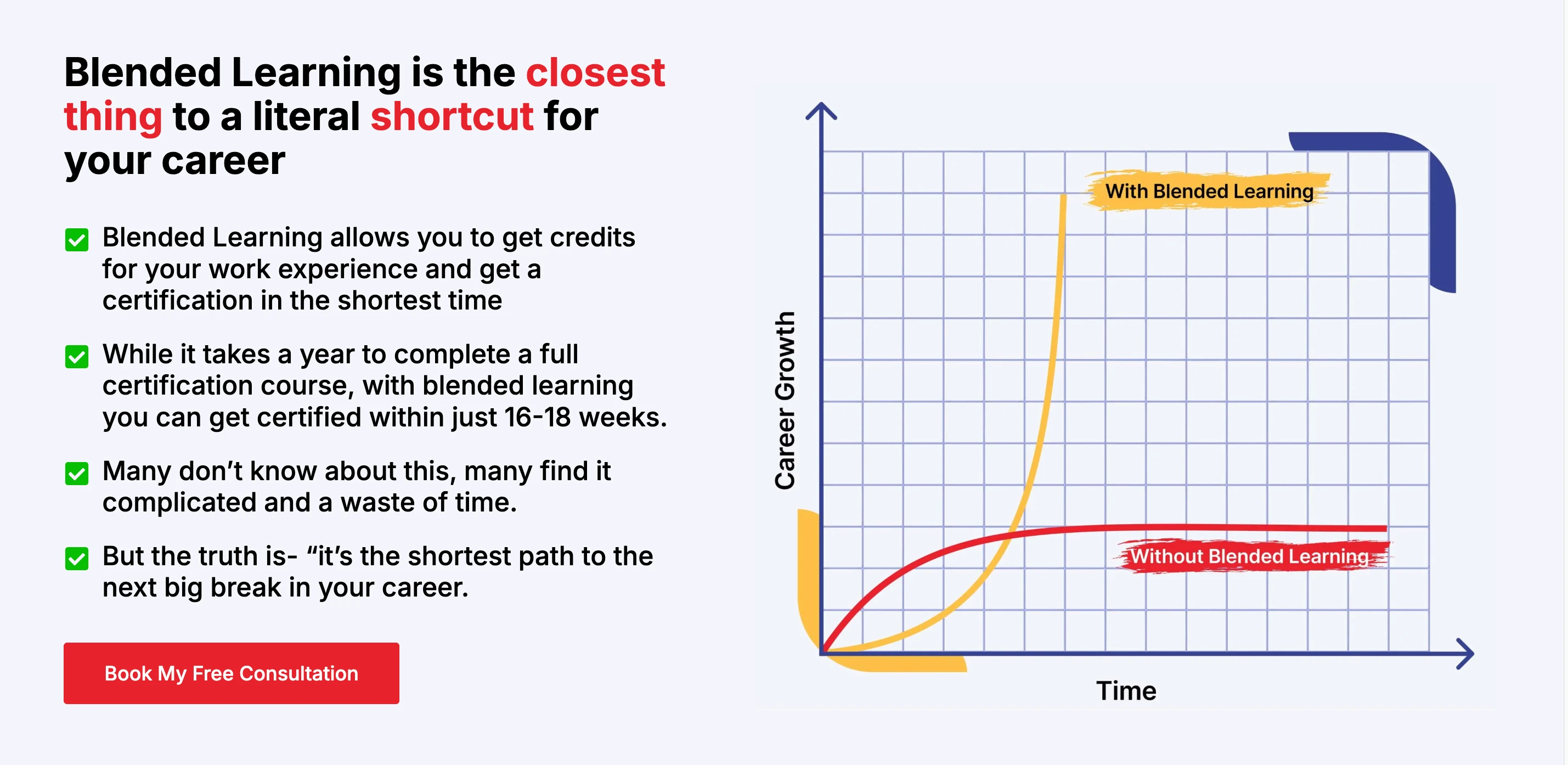
Custom Illustrations
4) Contrast-Driven Emotional Section (Pain → Relief):
To balance empathy with reassurance, I designed a two-column section where the left side highlights visitor struggles in a muted blue background, while the right side uses a brighter palette and geometric accents to signify clarity and progress
A subtle arrow-shaped divider guides the eye from “problem” to “solution,” reinforcing the narrative flow.
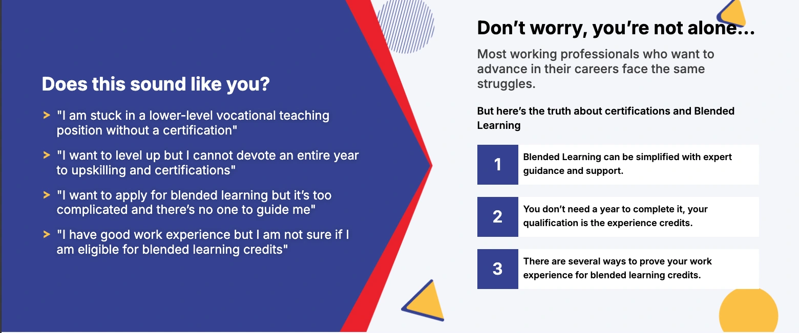
Contrast Driven Section
5) Accreditations & Benefits Section:
To reinforce trust further, and position GetMyCourse as a credible established educator I added:
Awards and recognitions
Core benefits (“Save your time, Save your efforts, Save your money”)
A moving marquee featuring Forbes, Financial Review, Smart Company, etc.
6) Lead Magnet Bonus Section
As an additional conversion lever, I introduced a “Goals Mastery Workbook” giveaway for users who book a consultation increasing the incentive and perceived value.
7) The Decision Section (Conversion Psychology)
A two-card decision-making section helps visitors make the final leap:
Left card: “Accept where you are…” (with a red underline)
Right card: “Take a step toward a simple 15-minute call.” (with a blue underline)
This creates a visual “cost vs. benefit” comparison, encouraging action.
Conversion Psychology
Development & Integration
I handled the full build and implementation, including:
Responsive development in Wordpress, in their existing website
Asset optimisation
Interaction setup
Zoho CRM integration, with form submissions distributed using a round-robin assignment
Automated lead routing for the sales team
(I learned Zoho CRM from scratch for this integration — adaptability is one of my strengths, could you tell 😉)
Final Result
Complete Landing Page Design
Business Impact
The landing page is built on proven conversion principles and provides GetMyCourse with:
A clear, compelling narrative for their blended learning program
A trust-rich structure tailored for paid traffic
Multiple engagement levers (video testimonials, benefits, social proof, FAQ)
A seamless path to booking consultations
Automated lead distribution to streamline their internal workflow
A strong foundation for consistent, high-intent conversions.
Looking For A Custom Website?
Book a free 15-minute call or shoot me a message to see whether my approach is the right fit for your project.
Like this project
Posted Dec 7, 2025
A high-converting, copy-driven landing page for GetMyCourse—designed to build trust, clarify blended learning, and drive more consultation bookings.
Likes
2
Views
26