Electric Midnight — A 1920s Visual Development Study

Carman Chung

Electric Midnight — A 1920s Visual Development Study
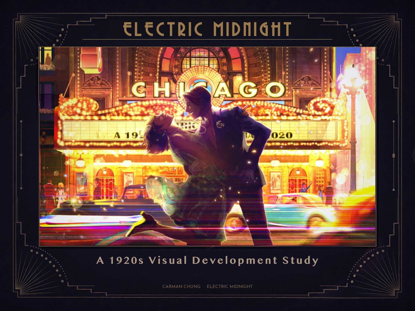
THE IDEA
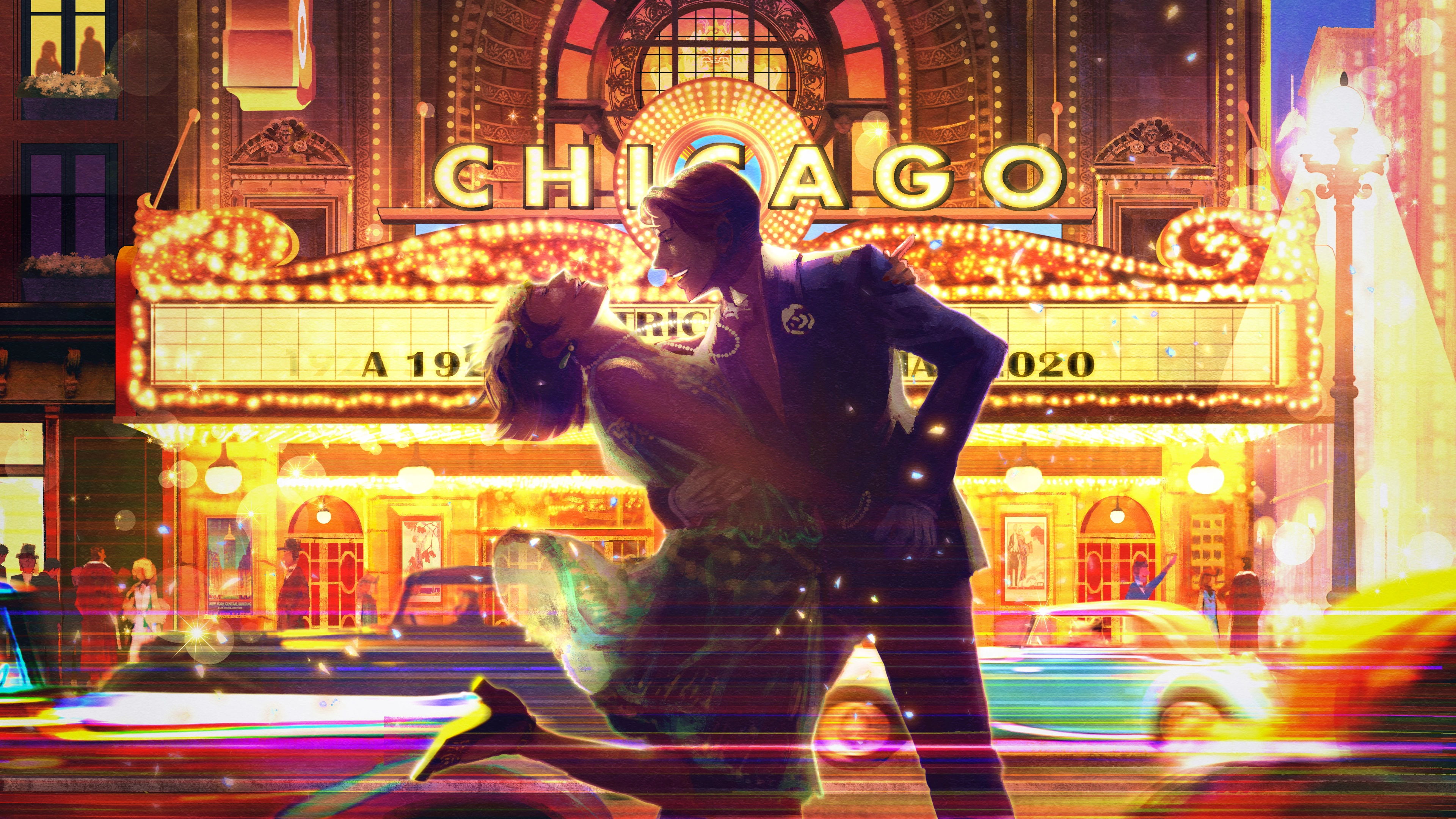
Electric Midnight is a self-directed visual development study in which I translated historical research into a heightened narrative image. I wanted the Roaring Twenties to feel like a firework: dazzling at full bloom, modern and restless, yet already carrying the sense that its brilliance could not last.
My aim was not literal reconstruction. I used period photographs, footage, costume references and dance research to build a coherent visual language for an imagined night outside the Chicago Theatre.
RESEARCHING THE SETTING
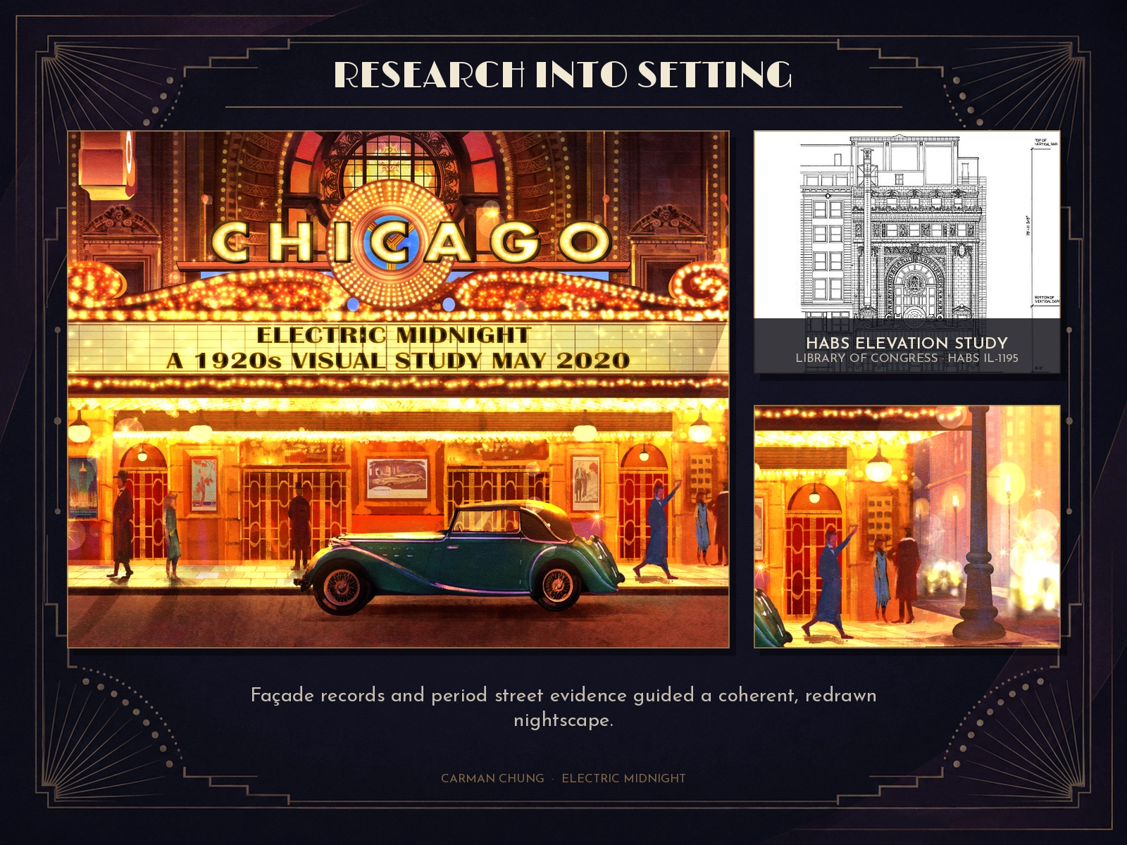
I compared modern and period views of the theatre with the Historic American Buildings Survey record to distinguish later alterations from earlier features. The façade was redrawn as a historically informed reinterpretation, then populated with period dress, street lighting and traffic.
In the final composition, the cars became bands of motion rather than display objects. This helped the street feel crowded, fast and electrically alive while keeping the dancers at the centre of the scene.
DESIGNING THE CHARACTERS
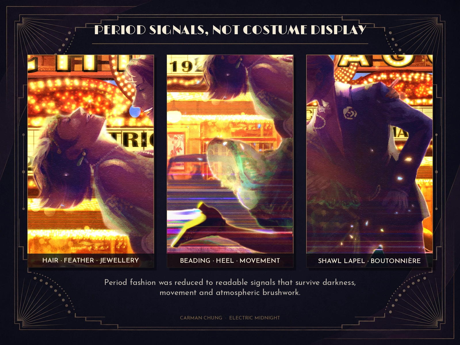
Mid-1920s fashion research shaped the silhouettes without turning the illustration into a costume chart. The woman combines a lightweight, beaded two-piece evening dress with a bobbed silhouette, a restrained feathered headband, long necklaces and curved mid-height heels. Her partner's dinner jacket uses a shawl lapel and white boutonnière, giving the darker silhouette a few clear period signals.
I simplified these details selectively so they would remain readable through low light, movement and loose atmospheric brushwork.
CHOREOGRAPHING THE POSE
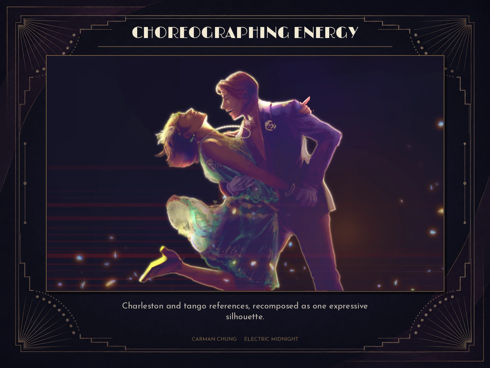
I studied period dance footage and stills, particularly Charleston, tango and foxtrot. Instead of reproducing one formal step, I combined the lift and kick of Charleston with a tango-like dip, then exaggerated the line until the pair felt spontaneous, flirtatious and slightly unruly.
The reference study was used only to solve the anatomy and movement. The final characters were fully redrawn.
*If you would like more historical information about 1920s dances, please check this link:**<https://vintagedancer.com/1920s/1920s-dances/>***
If you would like more historical information about 1920s dances, please check this link:https://vintagedancer.com/1920s/1920s-dances/
DEVELOPING COLOUR AND LIGHT
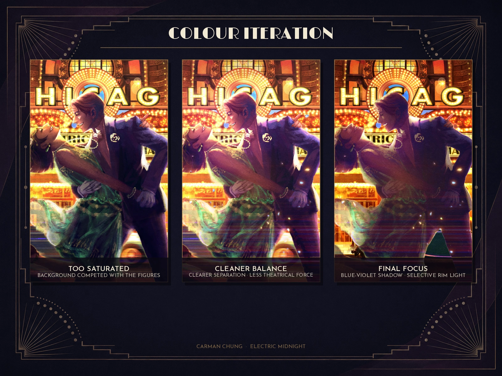
The first near-final pass pushed saturation too far: the illuminated marquee overwhelmed the figures and parts of the palette became muddy. I reduced the overall intensity, shifted the shadows towards blue-violet and introduced a clearer rim light around the dancers.
The image then became cleaner but lost some of its theatrical force. For the final pass, I deepened the figures again and allowed selected details to disappear into shadow, creating a stronger sense of a spotlight cutting through the city glow.
I also tested a separate stage-based setting. It clarified the spotlight metaphor, but weakened the sense of time and place, so the final returned to the theatre street.
RESOLVING ACCURACY AND VISUAL HIERARCHY
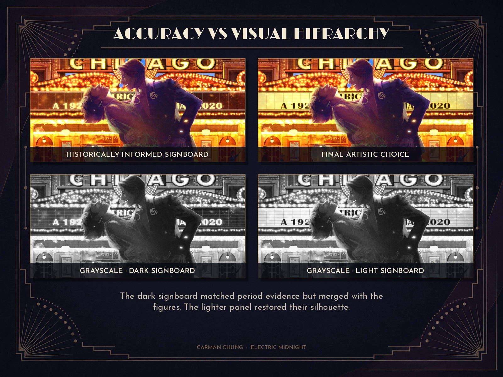
A 1927 Kaufmann & Fabry view of the Chicago Theatre pointed to a darker marquee signboard with pale lettering designed to read as illuminated at night. I tested that treatment because it was more historically convincing. Once the dancers were added, however, the dark central panel merged with their deliberately shadowed silhouettes.
To remove hue from the judgement, I compared both versions in grayscale. The lighter signboard created a clearer boundary around the figures and restored the dancers as the focal point. I therefore kept the less historically exact light panel in the final artwork. It was a deliberate hierarchy decision: period research informed the image, but did not override the narrative focus.
OUTCOME
The finished image balances two kinds of evidence. Architecture, costume and dance make the period legible; motion blur, exaggerated light and selective detail make it feel remembered rather than reconstructed.
This project reflects how I approach narrative illustration: research first, then selective exaggeration to make the visual idea emotionally precise.
Concept, research, character design, visual development, digital painting and compositing: Carman Chung
Tool: Clip Studio Paint · Date: May 2020
Self-directed portfolio study. The Chicago Theatre is used as a historical location reference; no affiliation or endorsement is implied. Final illustration and character designs © Carman Chung.
Research sources displayed or cited: Historic American Buildings Survey, Chicago Theater, HABS IL-1195, Sheet 2 of 5, Library of Congress; Kaufmann & Fabry, Chicago Theater, 175 North State Street, 1927, Chicago History Museum (cited for research; image not reproduced).
Looking for a narrative or atmospheric illustration built from research, character and place? Message me on Contra to discuss the scope, intended use and visual direction.
HABS IL-1195, Sheet 2 of 5:
https://www.loc.gov/pictures/item/il0807.sheet.00002a/Kaufmann & Fabry, 1927:
https://images.chicagohistory.org/asset/11723/Like this project
Posted Aug 6, 2026
Historical research, character staging and colour development for a self-directed 1920s Chicago illustration.
Likes
0
Views
8
Timeline
May 1, 2020 - May 10, 2020