Mourning Glory — Rebuilding an Arthurian Farewell Through Colour

Carman Chung

Mourning Glory — Rebuilding an Arthurian Farewell Through Colour
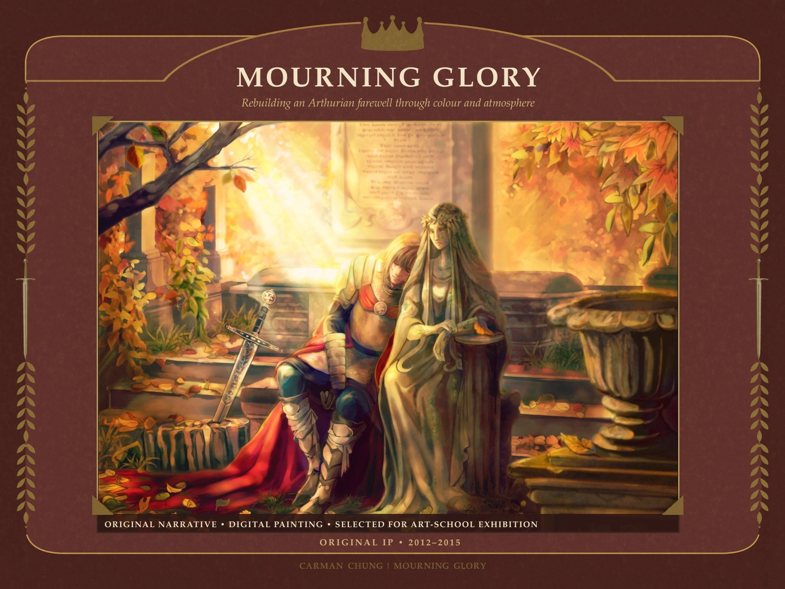
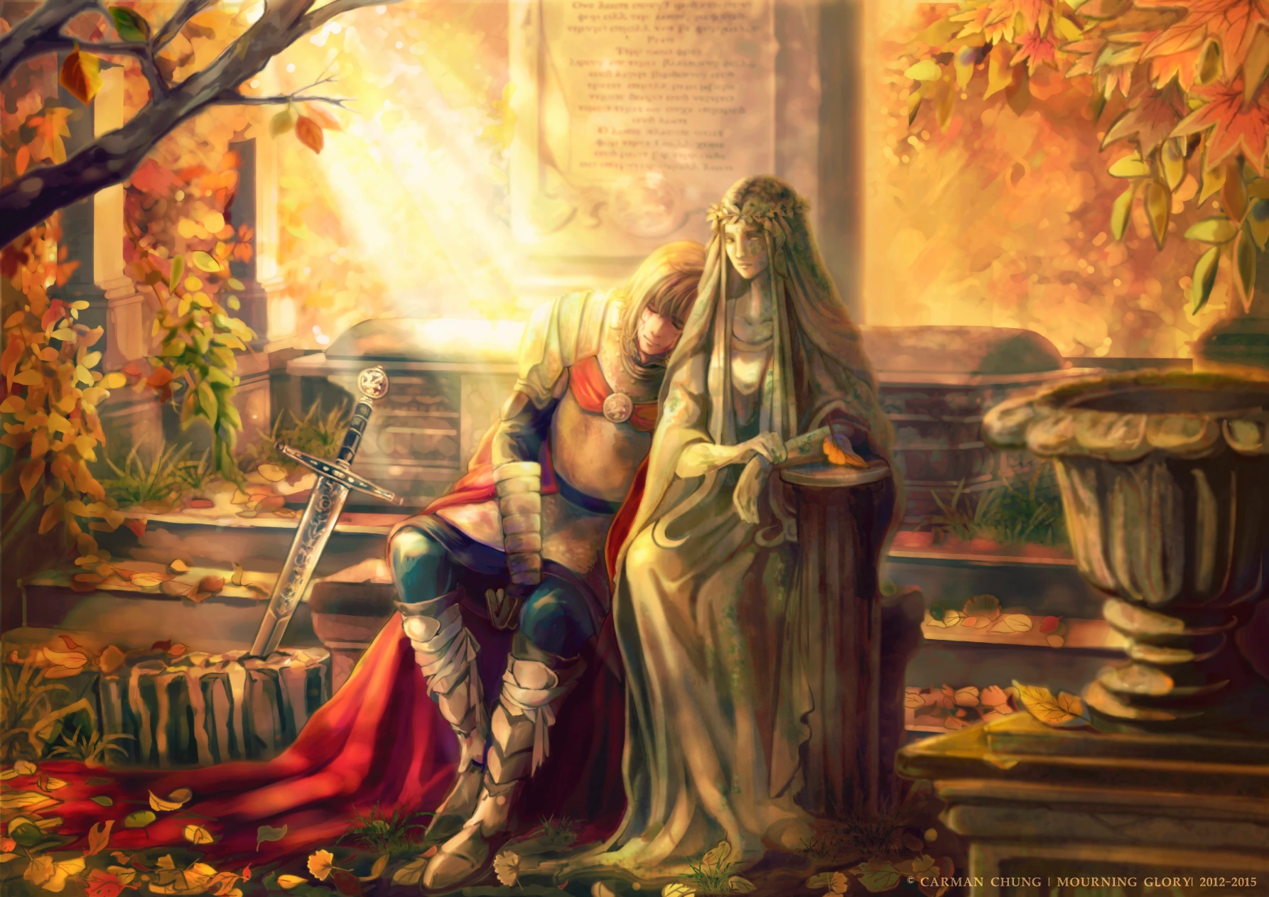
Mourning Glory case study cover featuring Arthur resting against the stone Lady of the Lake in an autumn cemetery.
THE PROJECT
Mourning Glory is an original Arthurian-inspired illustration about Arthur’s final return to the Lady of the Lake. It began as a line drawing in 2012. In January 2015, I rebuilt it as a complete digital painting while moving from a flatter, line-led style towards a more painterly approach to colour, light and surface.
The finished work was selected for an art-school exhibition. My role covered the original narrative, character interpretation, environment design and final illustration.
A RETURN, NOT A DEFEAT
The earliest line drawing already held the emotional centre of the scene: Arthur rests his head against the Lady’s stone figure. His lowered arm implies death, while the slight smile makes the moment feel closer to homecoming than defeat.
In this original interpretation, the Lady of the Lake carries the emotional roles of both guide and beloved. She dies in service of Arthur’s future reign; after completing his own duty as king, he returns to her resting place.
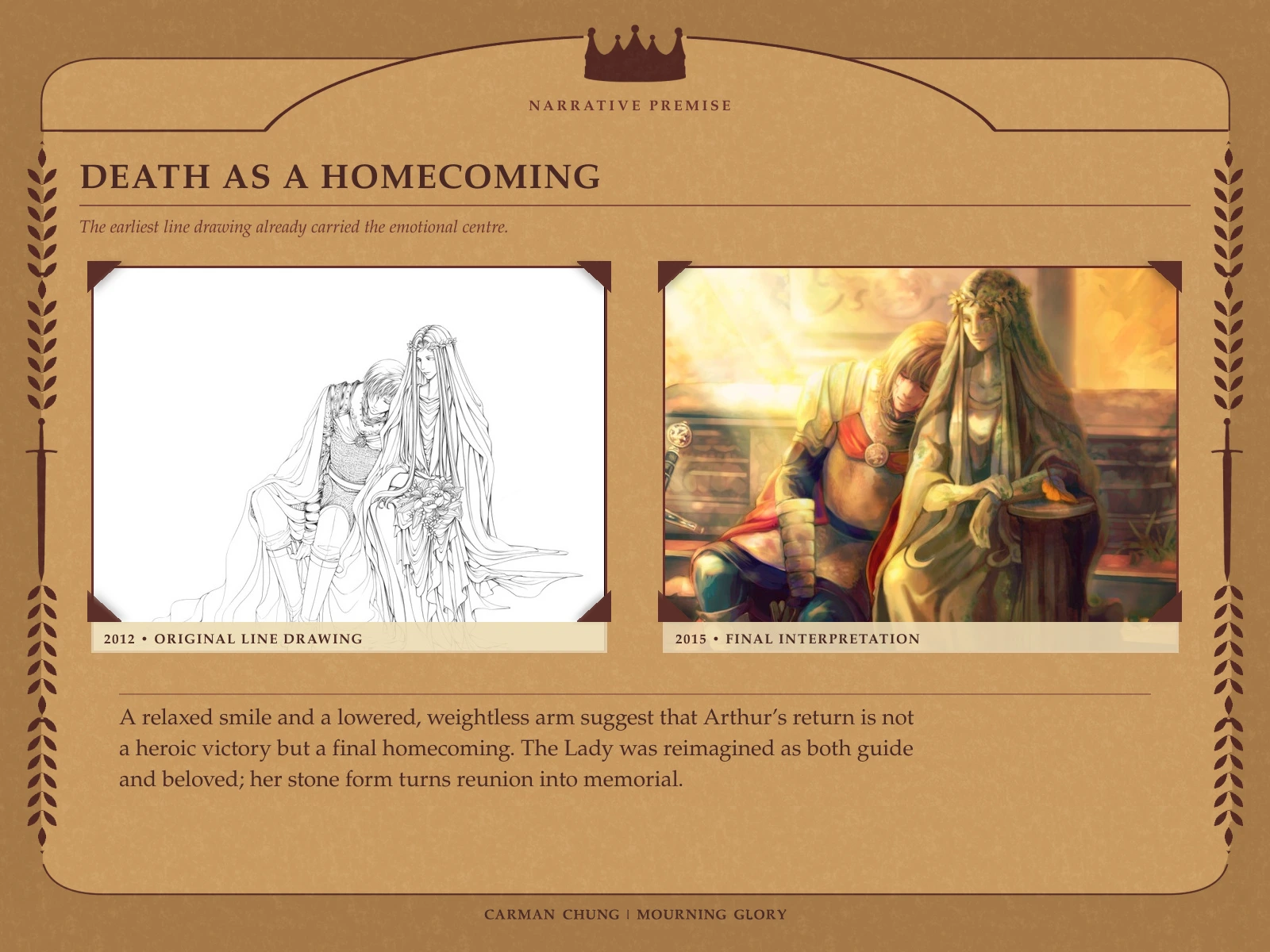
Comparison between the 2012 line drawing and the 2015 final interpretation, showing death reframed as homecoming.
BUILDING THE RESTING PLACE
The 2012 drawing contained only the two figures. To turn it into a self-contained narrative image, I added a cemetery, sarcophagus, memorial inscription, fallen leaves and a late-afternoon setting.
The golden sunset frames the end of Arthur’s legend as a grand closing rather than a bleak collapse. His red cloak becomes the principal colour accent within the gold, while the Lady’s stone form establishes the stillness of the grave.
The aim was for viewers to feel farewell, rest and reunion through atmosphere even if they did not immediately recognise the Arthurian source.
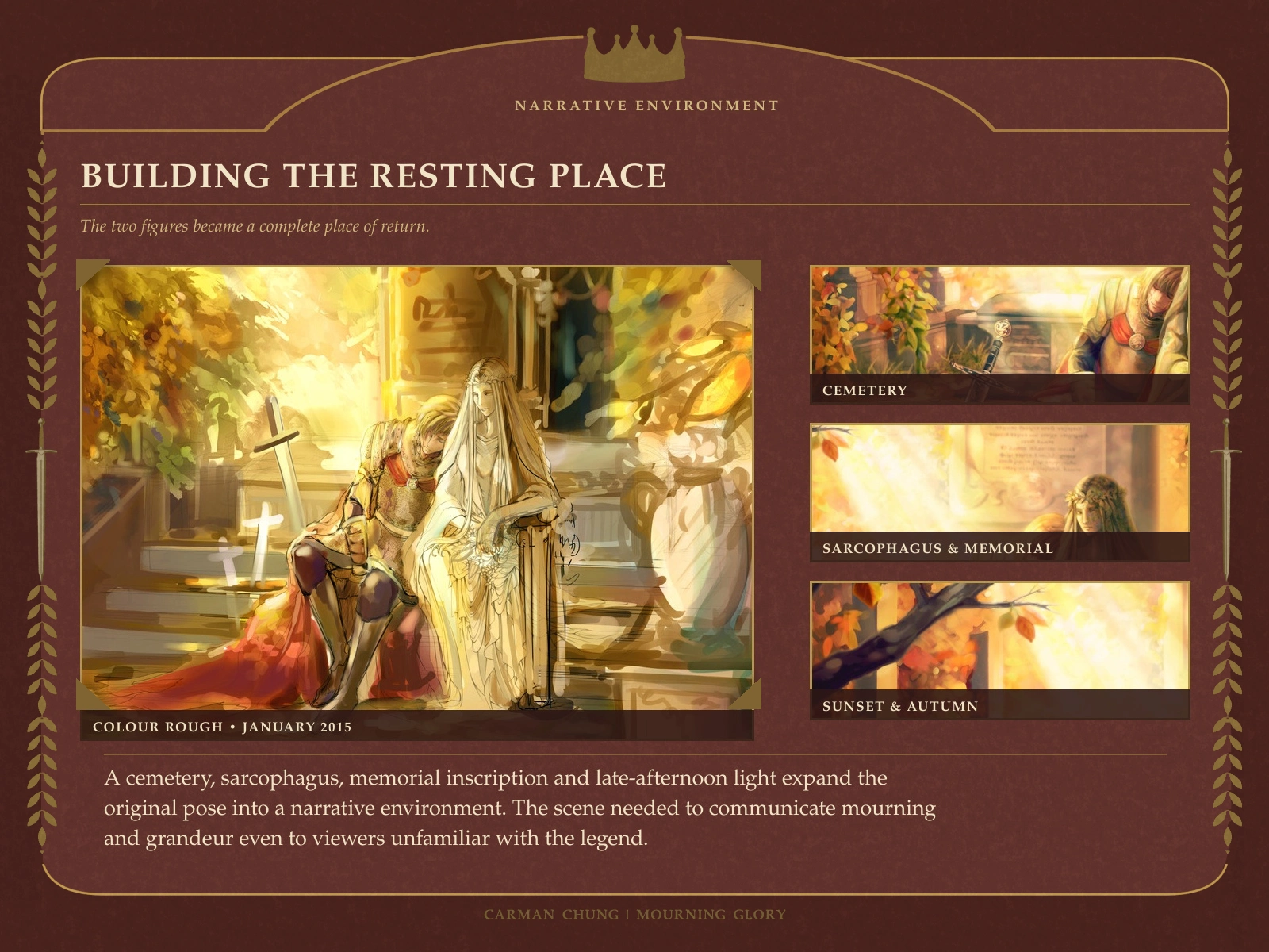
Colour rough and final environment details showing the cemetery, sarcophagus, memorial and autumn sunset.
EXCALIBUR AS A NARRATIVE ANCHOR
The colour rough contained several sword shapes. As the scene developed, they competed with one another and weakened the focal structure, so I reduced them to a single sword set into stone.
That one prop combines two familiar Arthurian motifs: the sword in the stone and Excalibur’s return to the Lady of the Lake. In this retelling, returning the sword also becomes Arthur’s return to the Lady’s resting place.
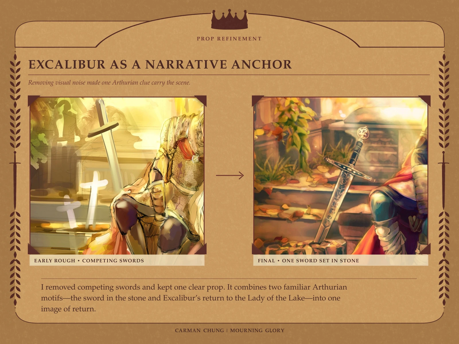
Process comparison showing several rough sword shapes reduced to one sword set into stone.
MATERIALS CARRY THE STORY
Material contrast separates Arthur’s human body from the Lady’s carved form. Warm skin, reflective armour, cloth and bandages remain tactile and mortal even though the pose implies death. The Lady is cooler, quieter and weathered like a funerary effigy.
Small details carry additional evidence: blood on Arthur’s face suggests the battle that preceded his return; metal war boots and bandages replace the earlier leather footwear; and a dragon clasp on his red cloak quietly refers to the Pendragon name.
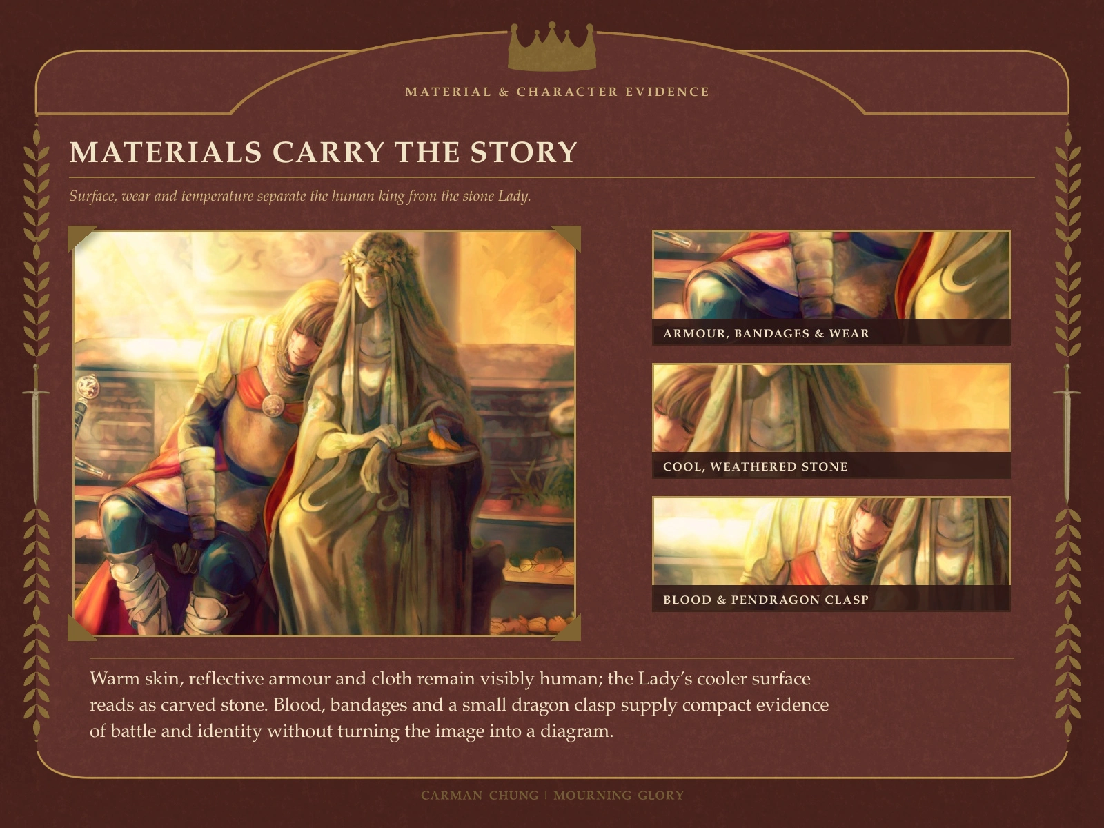
Detail study of armour, bandages, stone texture, battle traces and the Pendragon-inspired dragon clasp.
COLOUR AS THE FINAL ACT
The colour rough established the main idea early: a golden sunset, bright autumn foliage and Arthur’s red cloak as the visual anchor. Later passes strengthened the environment, light and material rendering, but the near-final version became too uniformly red and yellow.
During the final colour correction, I introduced violet and blue into the armour, shadow and stone. Those cooler notes separate the figures from the surrounding gold and give the warm light somewhere to glow against.
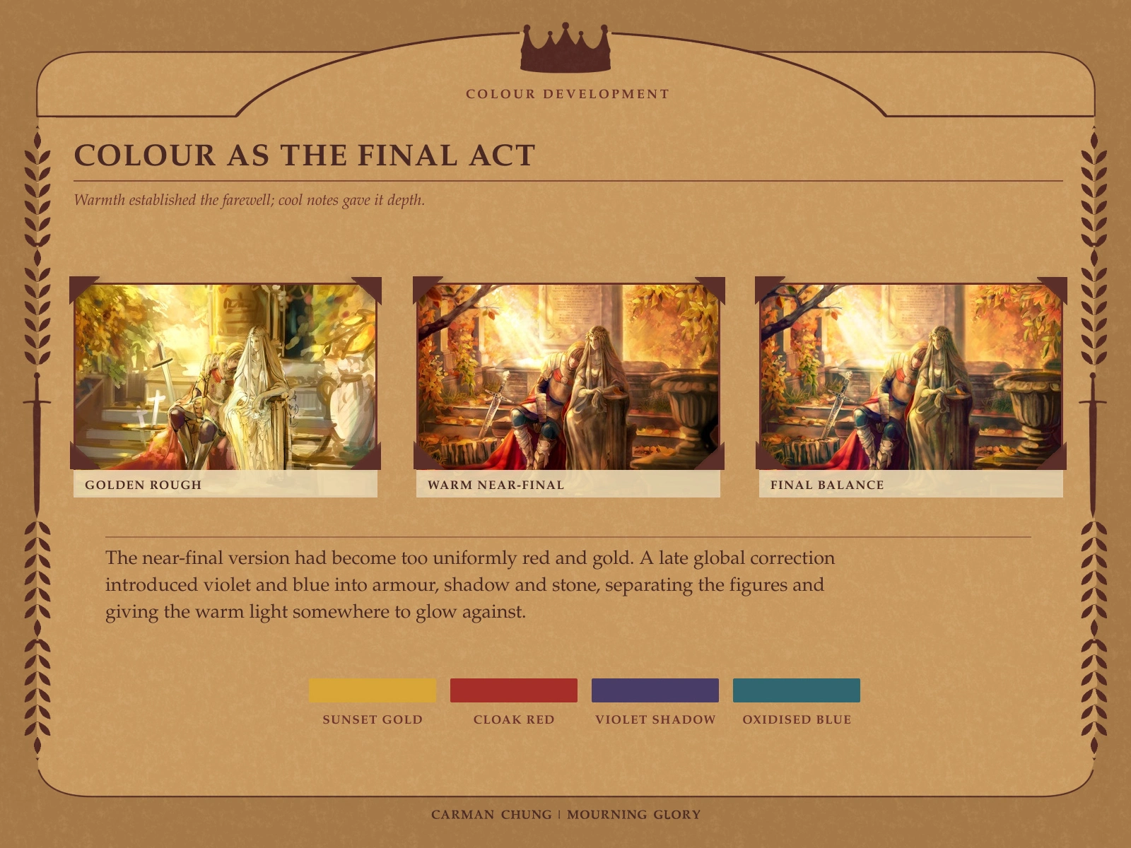
Three-stage colour comparison from golden rough to warm near-final pass and cooler final balance.
OUTCOME AND REFLECTION
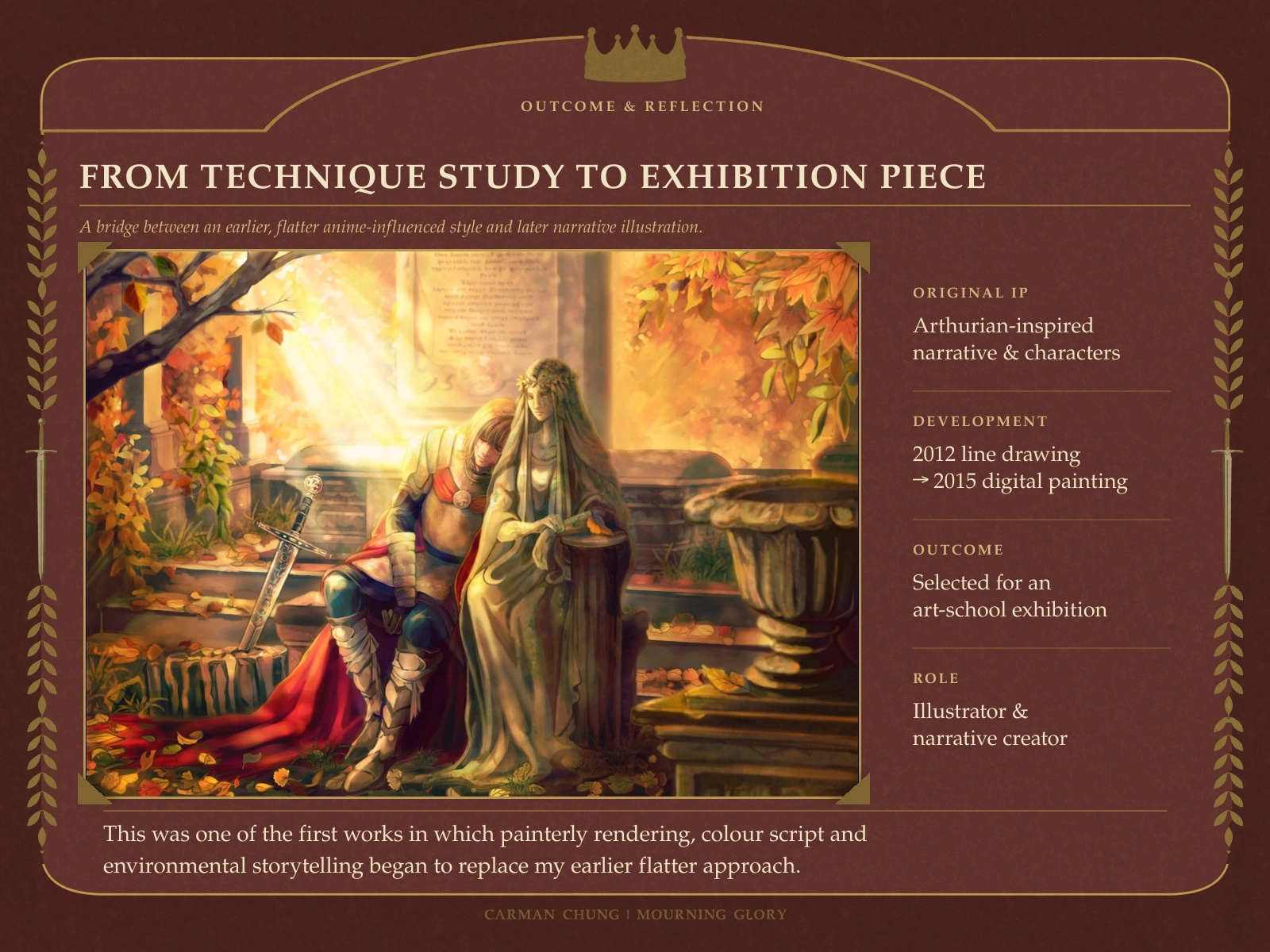
Final Mourning Glory illustration with project outcome, role and 2012-to-2015 development summary.
Mourning Glory became one of the first works in which painterly rendering, colour scripting and environmental storytelling began to replace my earlier flatter, anime-influenced approach. The project’s value lies not in dense historical reconstruction, but in making a farewell legible through pose, prop hierarchy, material contrast and atmosphere.
The final piece was selected for an art-school exhibition and became an important bridge towards my later narrative and symbolic illustration work.
CREDITS
Original narrative, character interpretation, visual development and illustration: Carman Chung
Project context: Art-school exhibition piece
Original interpretation inspired by Arthurian legend. No client or third-party franchise is involved.
Looking for a fantasy, romance, gothic or horror cover or key-art illustration shaped by atmosphere, symbolism and classical visual language? See my Narrative Cover & Key Art Illustration service or message me on Contra to discuss the story, intended use and visual direction.
Like this project
Posted Aug 22, 2026
A 2012 line drawing rebuilt in 2015 into an exhibition piece through narrative environment, material contrast and colour development.
Likes
0
Views
10
Timeline
Jan 1, 2012 - Feb 28, 2015