Vow to Thee, My King — A Two-Perspective Narrative Series

Carman Chung


Vow to Thee, My King: A Two-Perspective Narrative Series
Royalty reappears only as part of comparisons that serve a different explanatory purpose.
THE PROJECT
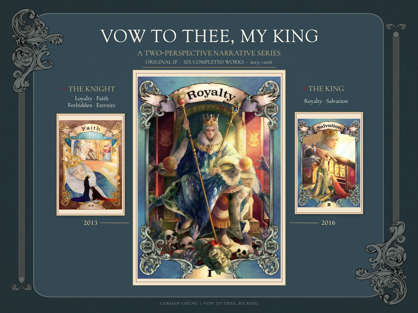
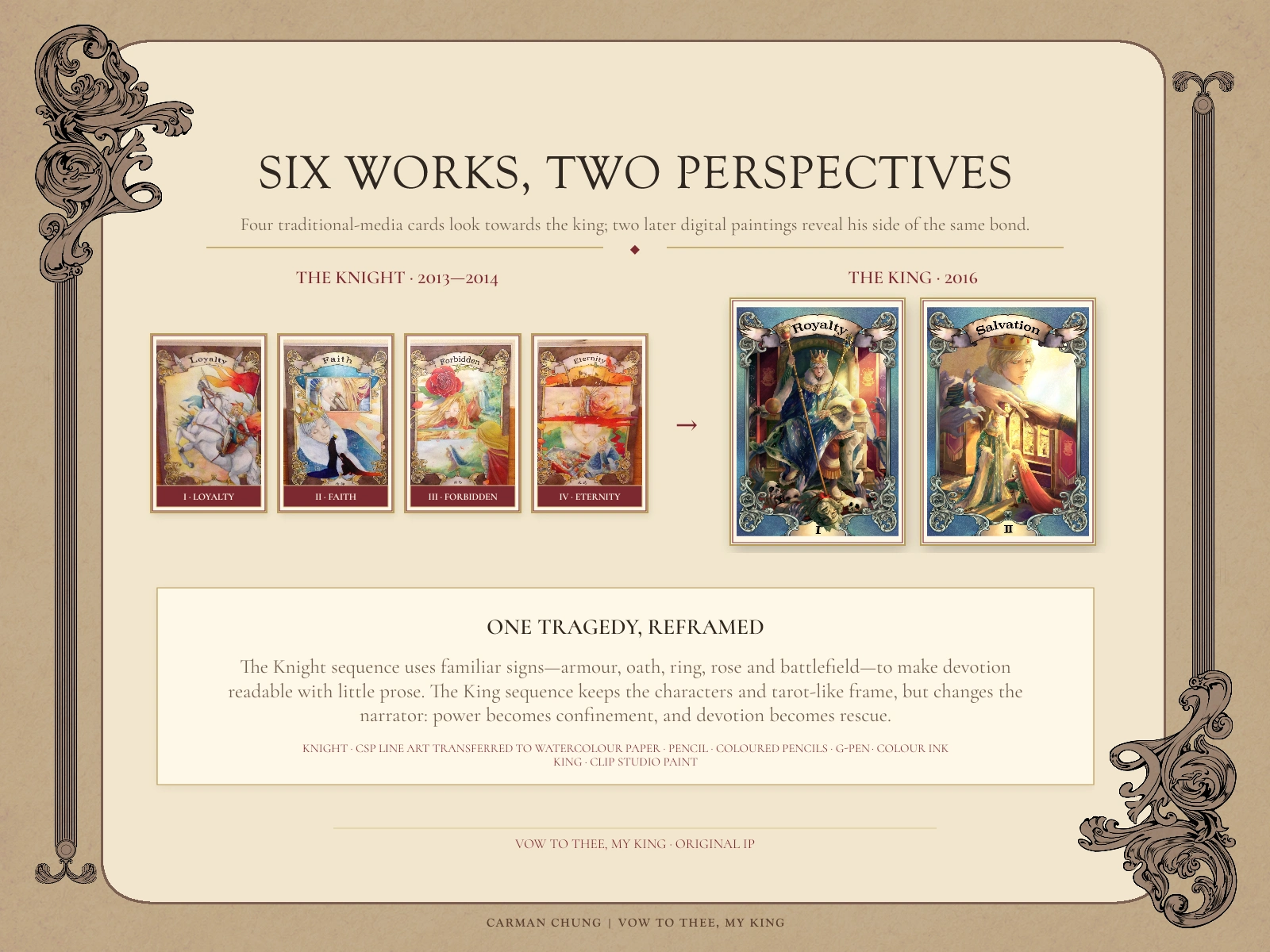
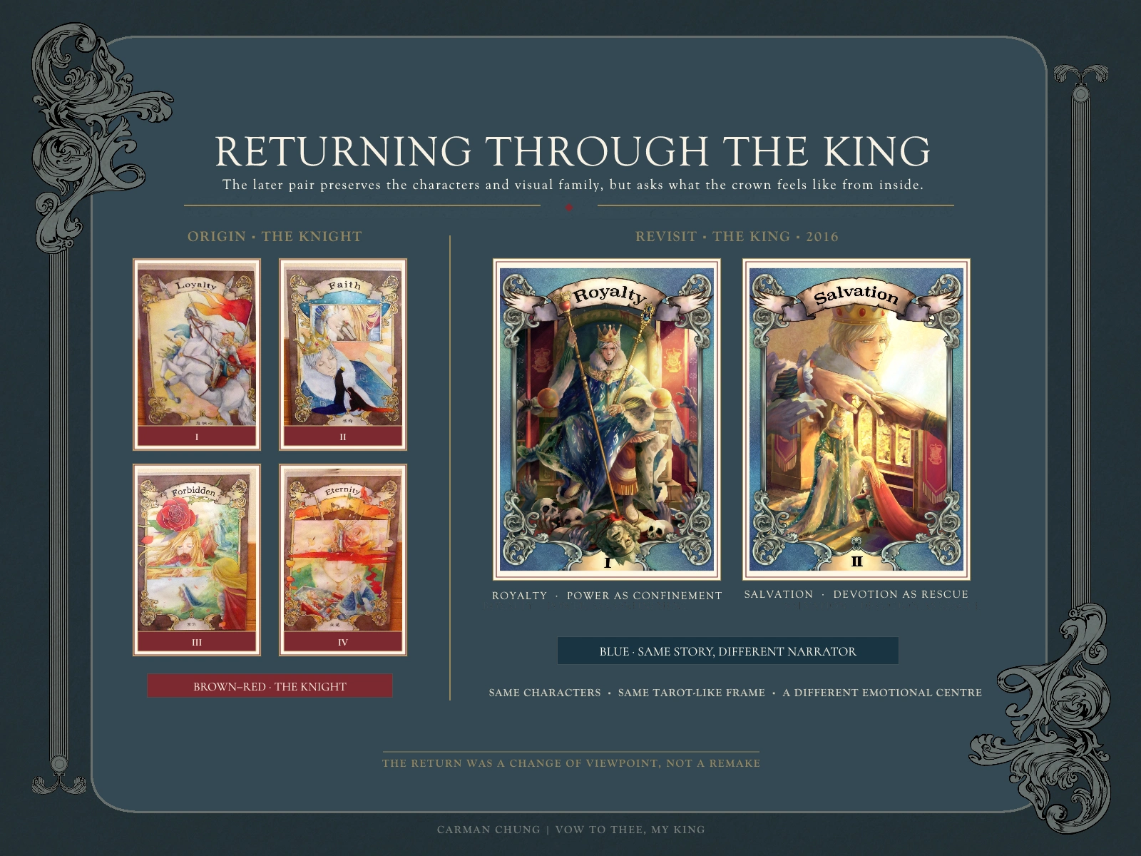
Vow to Thee, My King is an original medieval-fantasy illustration series developed across two art-school projects. The first four tarot-inspired works follow a female knight; in 2016, Royalty and Salvation revisit the same tragedy from her king’s perspective.
Because the story carried little prose, recurring gestures, colour, emblems and framing had to establish the characters, their social positions and the emotional direction of the story.
THE KNIGHT’S PERSPECTIVE
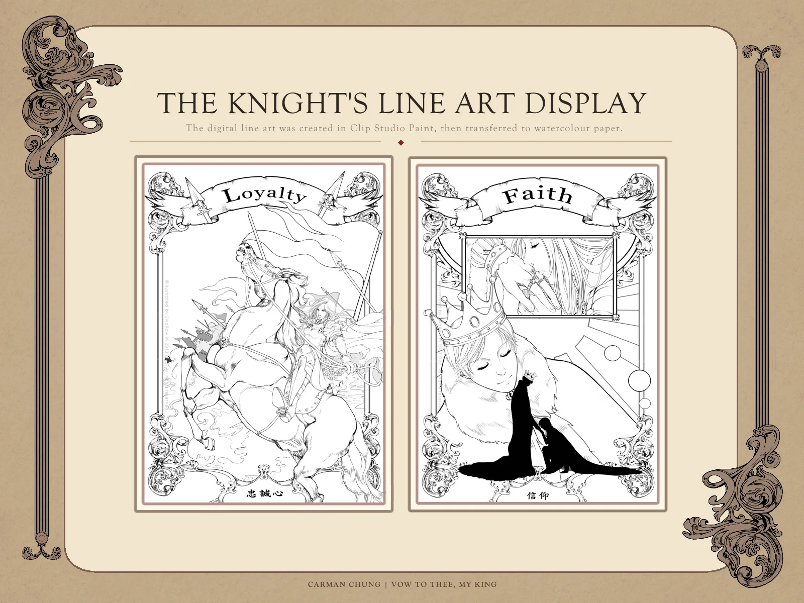
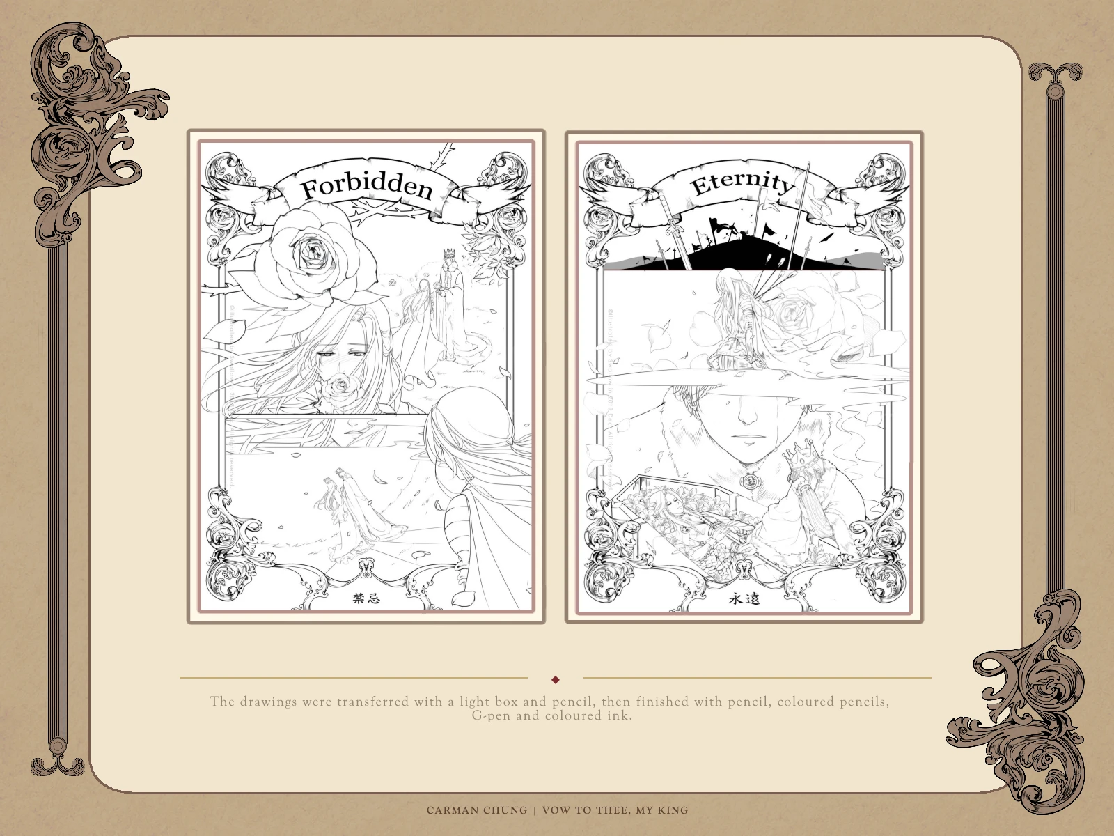
The early four-work sequence moves from public duty to private sacrifice. Loyalty establishes the knight’s role through horse, armour and battlefield motion. Faith turns loyalty into devotion through kneeling and the kiss of a ring. Forbidden introduces the thorned rose and the distant royal couple. Eternity closes the arc with battlefield remains, lilies and a coffin.
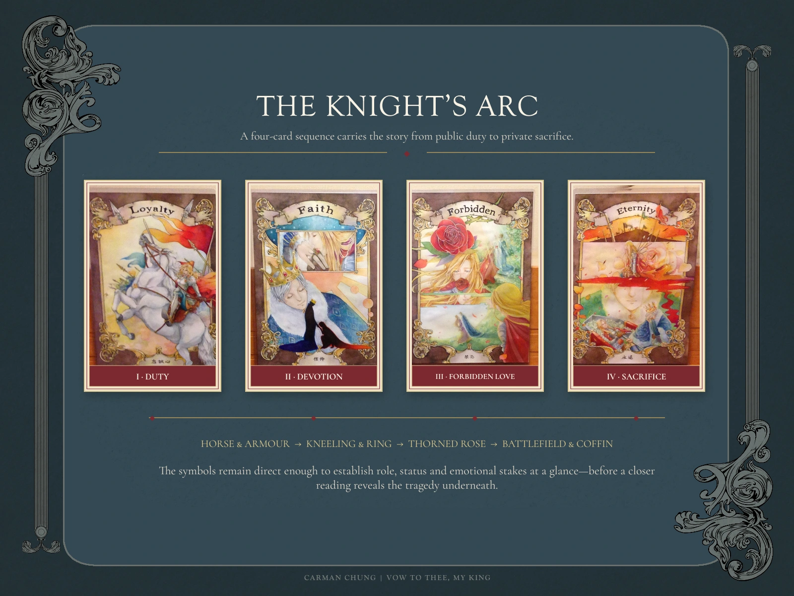
I drew the line art in Clip Studio Paint, transferred it to watercolour paper with a light box and pencil, then completed the four works with pencil, coloured pencils, G-pen and colour ink.
WHY RETELL THE SAME STORY?
When I returned to Vow, I did not want simply to repaint the first series at a higher technical level. The more useful question was: what would change if the king—previously seen mainly as the object of the knight’s devotion—became the narrator?
Keeping the character designs and tarot-like frame created continuity. Moving from the Knight series’ brown-red ground to blue separated the new point of view without breaking the visual family.
HISTORICAL REFERENCE AS NARRATIVE EVIDENCE
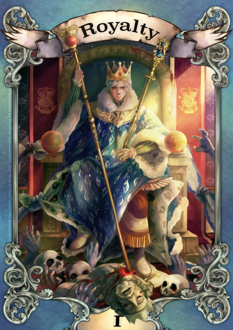
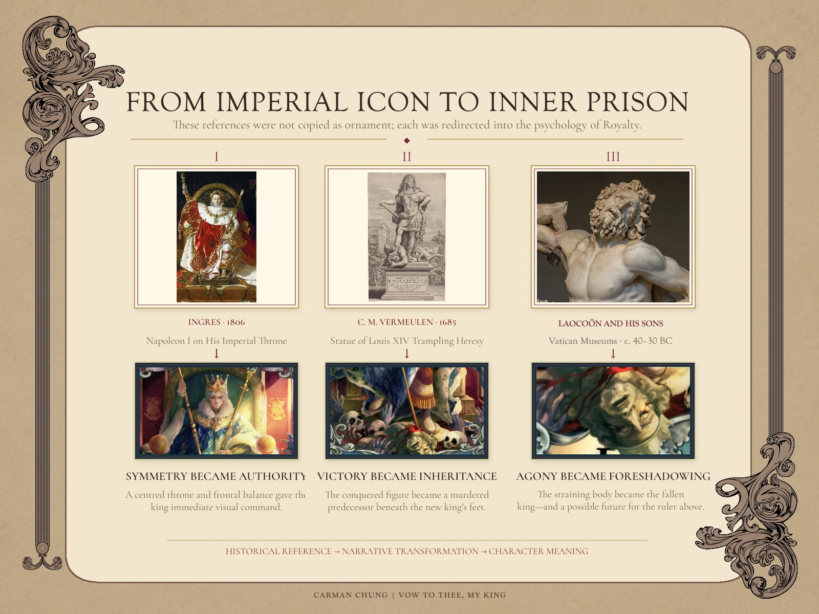
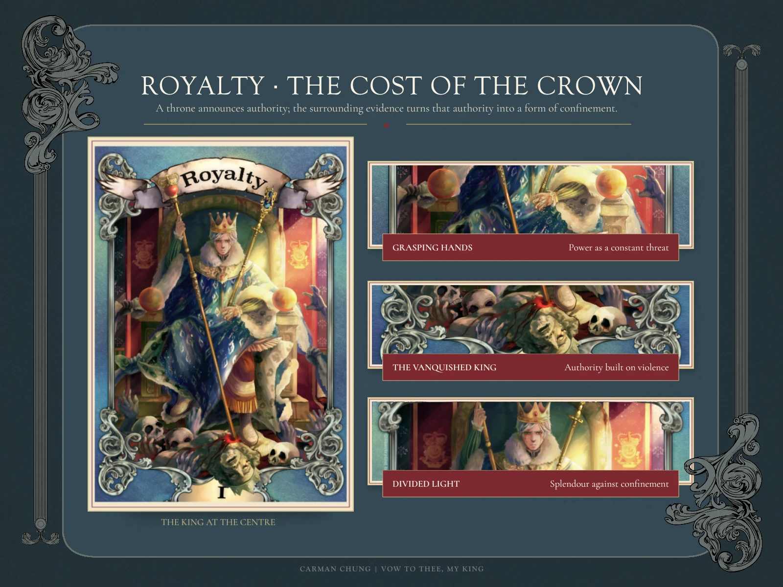
Royalty was built from specific visual references rather than generic medieval styling. Ingres’s Napoleon I on His Imperial Throne informed the centred throne and frontal authority. Cornelis Martinus Vermeulen’s Statue of Louis XIV Trampling Heresy suggested how victory could be reframed as inheritance: the conquered figure became a murdered predecessor beneath the new king’s feet. The straining agony of Laocoön and His Sons shaped that fallen ruler and quietly foreshadowed a possible future for the king above.
Each reference was redirected into this character’s psychology rather than copied as decoration.
ROYALTY — THE COST OF THE CROWN
Royalty asks what it means to become the king. A central throne composition declares status, but the rest of the image resists triumph: bodies and skulls collect below, the sceptre extends into the fallen predecessor as a murder weapon, black-purple hands grasp at the robes, and a hard diagonal light splits the scene.
The king’s expression remains deliberately blank. Power is presented as both possession and confinement—the crown inherited together with the violence that produced it.
REFINING WEIGHT, LIGHT AND MATERIAL
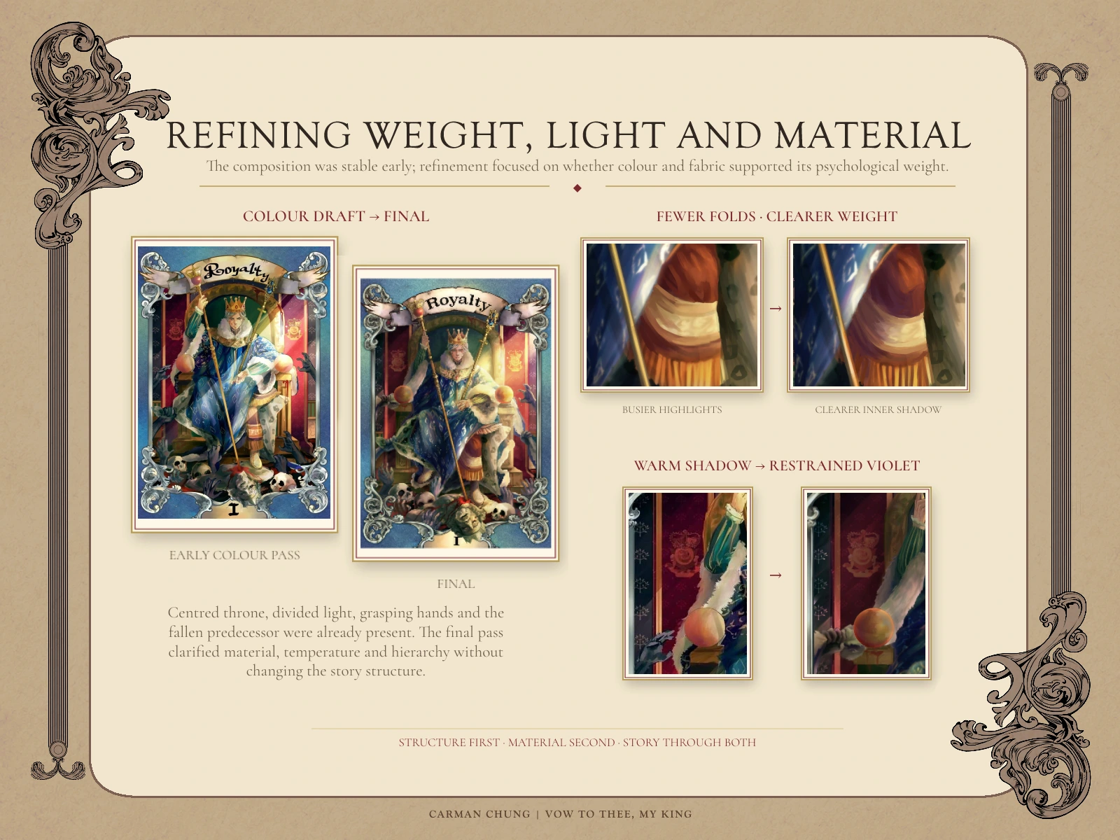
The colour draft fixed the core structure early: centred throne, vanquished predecessor, grasping hands and divided light. Refinement focused on whether material and colour supported that idea.
On the raised knee, I replaced busy highlights with fewer folds and a clearer inner shadow so the cloth read as fabric stretched over a bent leg. On the darker side of the throne, a restrained violet cooled the flags and added depth against the warm light.
SALVATION — THE SAME GESTURE, REVERSED
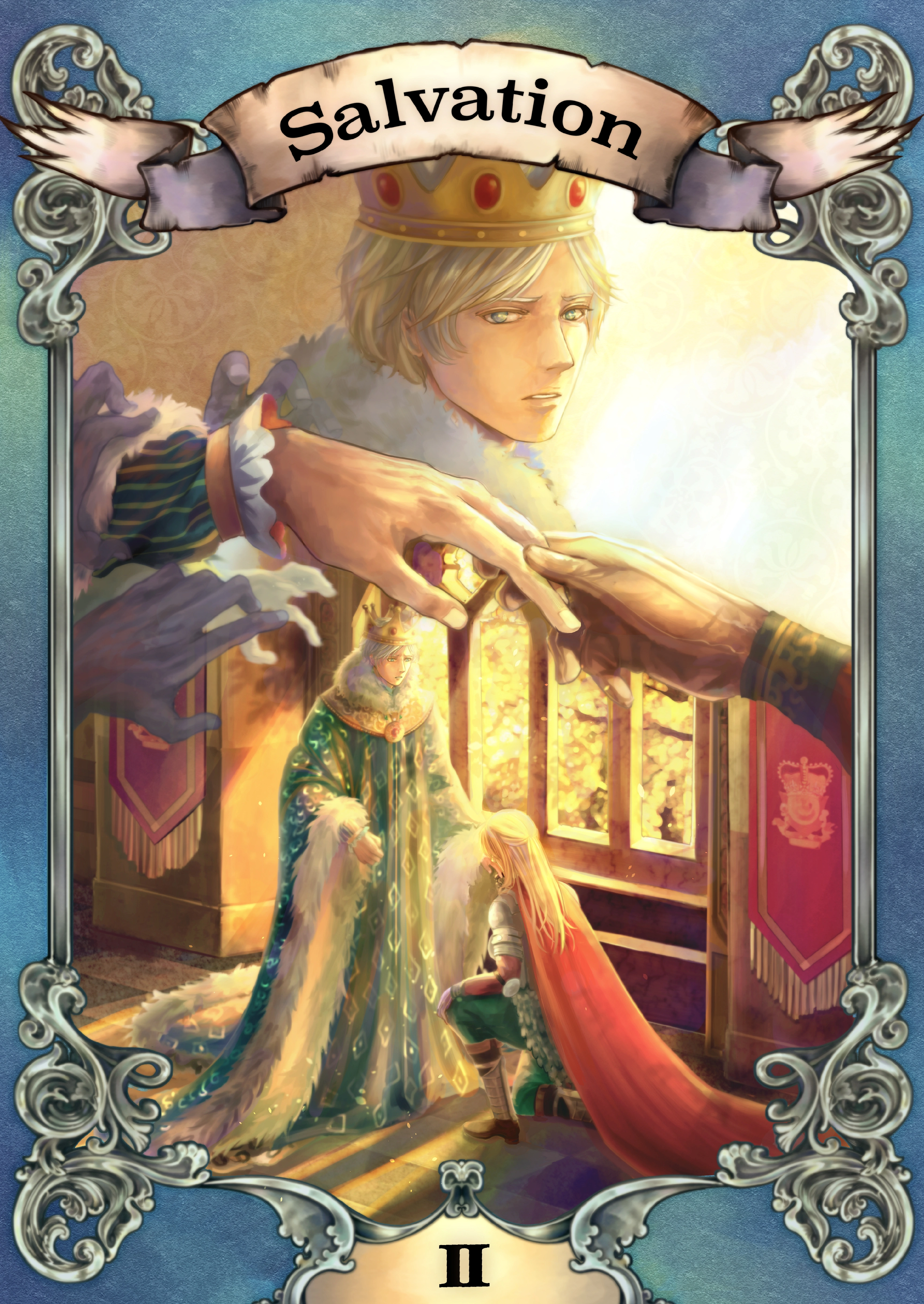
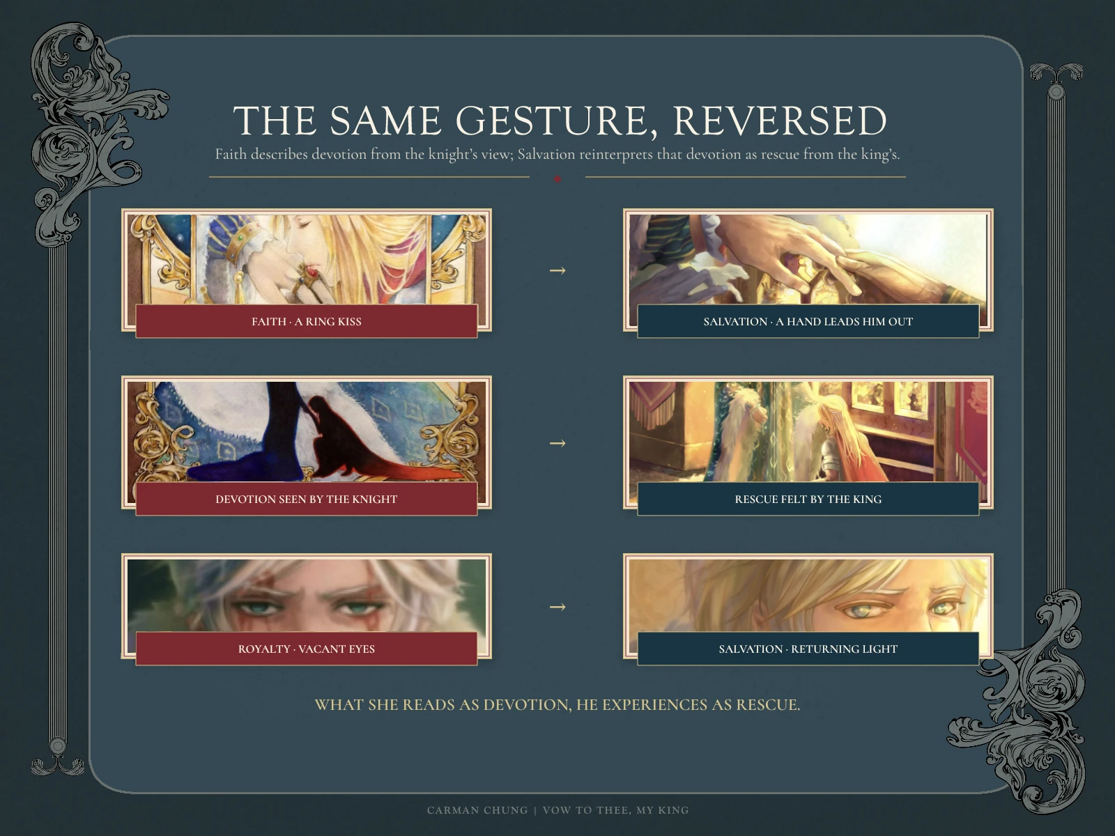
Faith had shown the knight kneeling and kissing the king’s ring—devotion seen from below. Salvation repeats the hands and kneeling pose but changes their emotional direction. The knight’s hand reaches through the surrounding threat and leads the king towards light.
The king’s eyes, vacant in Royalty, regain a visible catchlight. What the knight understands as faith is recontextualised as rescue: she serves the king, but she is also the person who still sees the man beneath the crown.
OUTCOME AND REFLECTION
The six completed works form two linked but unequal sequences: four early traditional-media illustrations from the knight’s perspective, followed by two digital paintings from the king’s. Two further King-perspective ideas were never completed and are intentionally excluded from the deliverables.
This project taught me to treat symbols in layers: silhouette and familiar gesture should communicate first; historical and symbolic detail can reward a closer reading. That principle continued to shape my later narrative and symbolic illustration work.
CREDITS
Original story, narrative concept, visual development and illustration: Carman Chung
Project context: Art-school illustration series
Original characters and original IP. No client or third-party franchise is involved.
Looking for a character-led cover, key art or narrative illustration shaped by symbolism, atmosphere and historical visual language? Message me on Contra to discuss the scope, intended use and visual direction.
Like this project
Posted Aug 21, 2026
An original medieval-fantasy series retelling one tragic bond through a knight’s devotion and a king’s hidden dependence.
Likes
0
Views
14
Timeline
Jan 1, 2012 - Feb 1, 2016