Chase the Stars: A Paid Narrative Wraparound Book Cover

Carman Chung

The brief
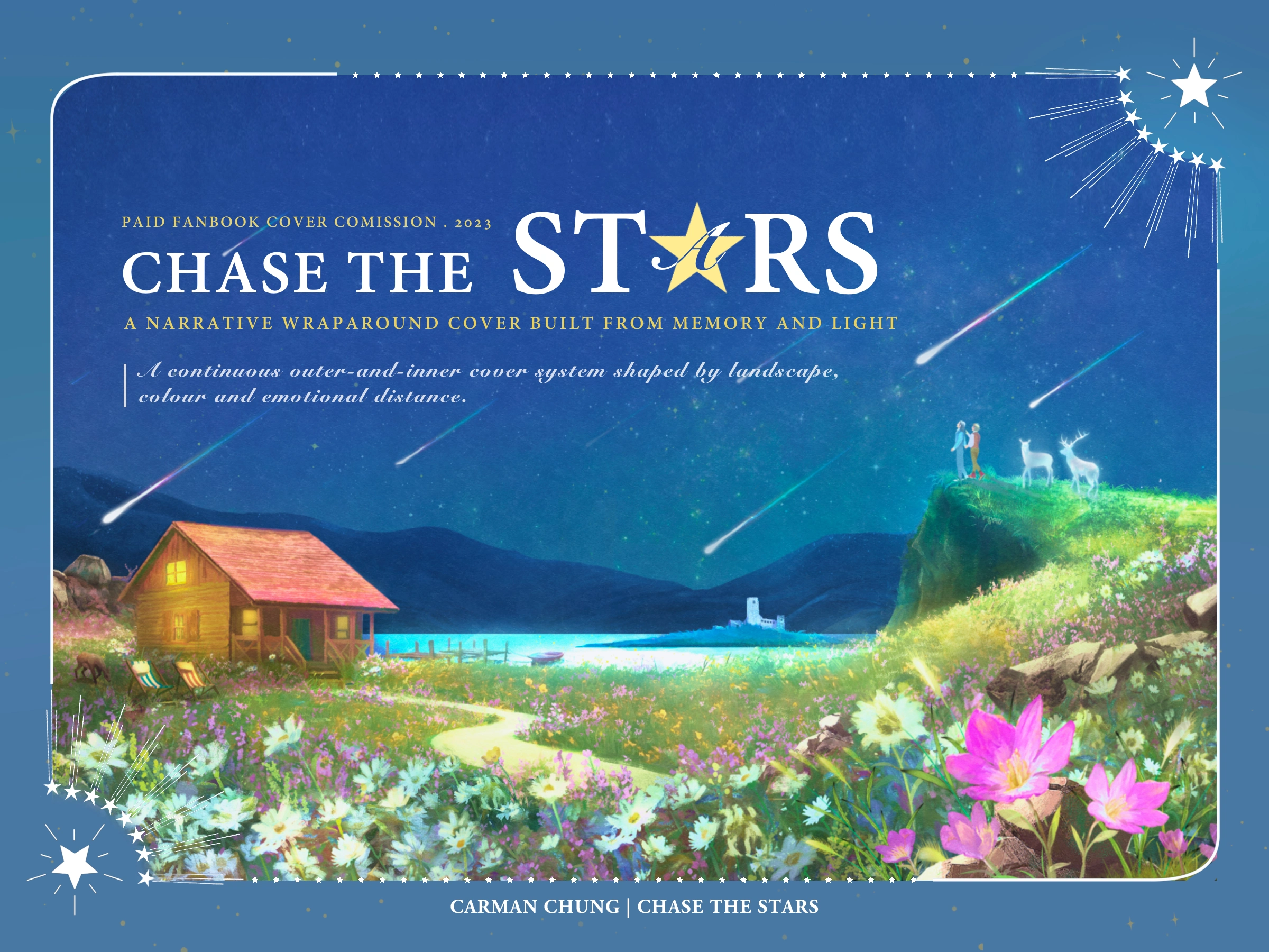
This commission called for more than a front-cover illustration. The client needed an A5, right-bound fanbook with one continuous outer wrap across the left flap, back cover, spine, front cover and right flap, plus an inner cover that belonged to the same world without simply repeating it. Scotland was central to the story. Its emotional centre was a separated couple, a cottage where they had once been happy, and the hope that one of them might eventually return.
Researching a Scotland of memory
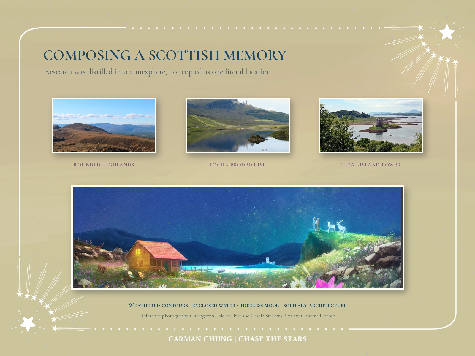
I read the story before drawing and studied recurring features of the Scottish landscape: rounded Highland contours, enclosed lochs, abrupt eroded rises, treeless moorland, weathered rock, red deer and tower houses isolated beside water. I did not reproduce one identifiable location. Instead, I combined those observations into a fictional place that could feel recognisably Scottish while remaining shaped by the story.
The terrain also solved a compositional problem. The client wanted the two figures to remain part of a much larger environment but still read as the front-cover focus. Placing them on the upper edge of a small cliff kept their scale modest while giving them the highest visual position. Across the remaining wrap, the warm cottage anchors the back, the lake and distant tower carry the eye through the centre, and the flowered slope leads towards the figures and title.
Letting flowers carry the emotional structure
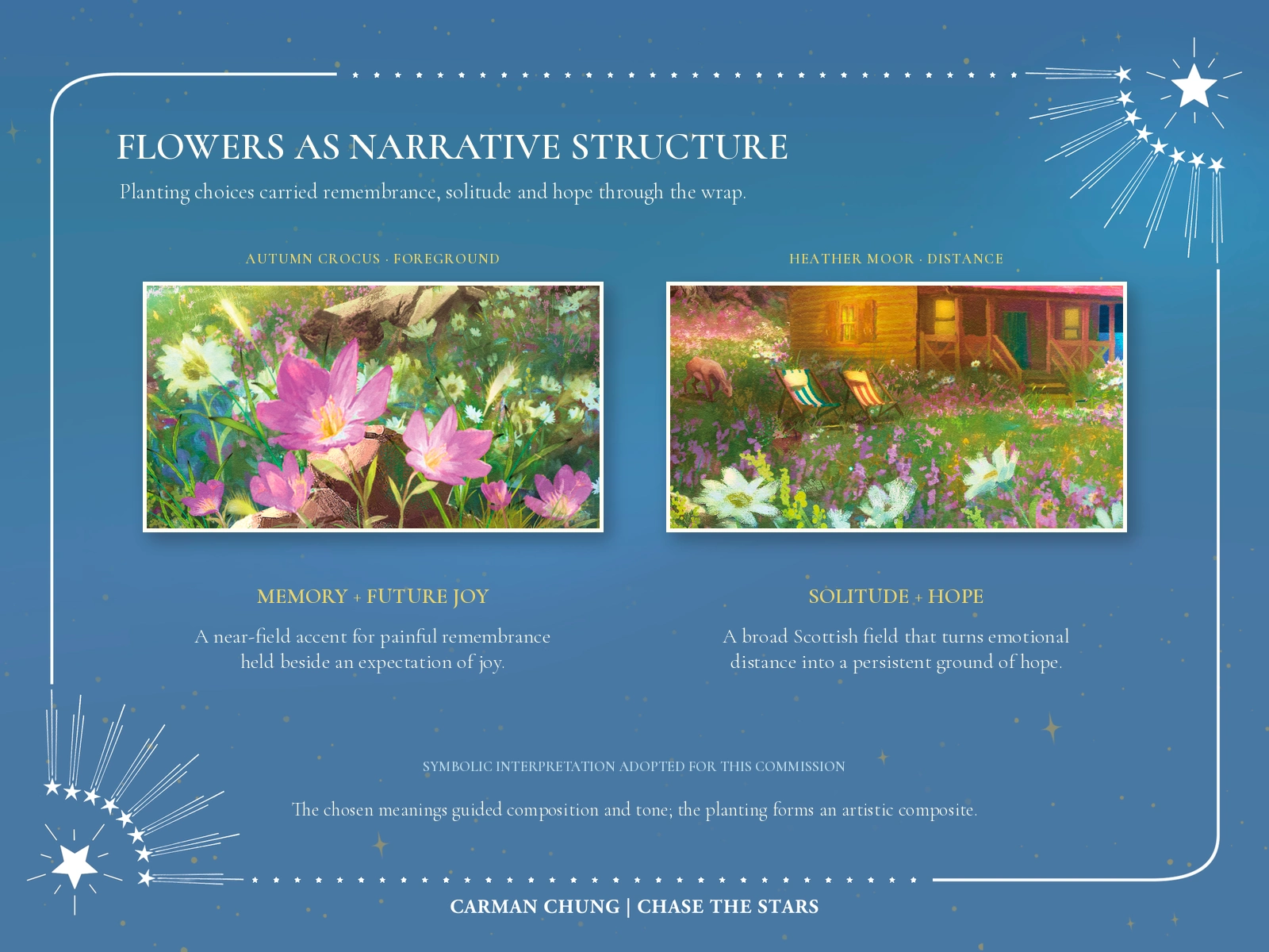
The planting was not generic decoration. Drawing on flower-language interpretations selected for this commission, I used autumn crocus in the near foreground to connect painful remembrance with an expectation of future joy. Heather spreads across the more distant ground, carrying an association with solitude and hope while reinforcing the Scottish moorland setting.
The field is intentionally an artistic composite. The species would not necessarily appear at this density, in one exact place or during one single seasonal moment. Their arrangement was designed around narrative meaning, colour contrast and depth: large pink crocuses pull the viewer into the foreground, heather binds the wider hillside together, and the warm cottage sits inside that field as a sign of home, memory and continued waiting.
Designing across the approved production layout
The cover was composed as a five-zone book object rather than a panoramic painting later placed on a template. The approved production file defines two unequal flaps, the back cover, a narrow spine and the front cover.
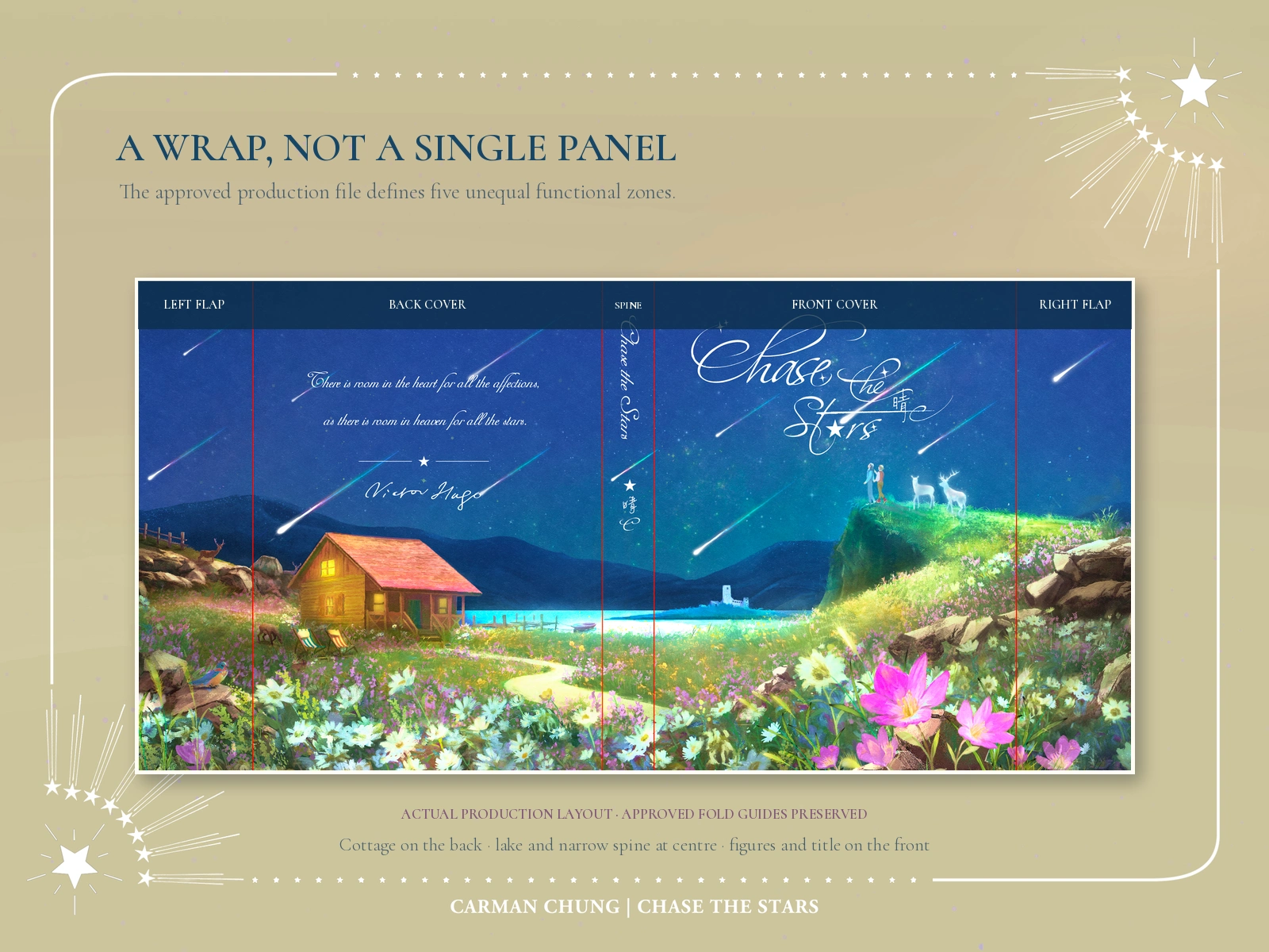
The cottage and client-supplied epigraph anchor the back; the lake, jetty and distant tower bridge the centre; the figures, luminous deer, title and foreground crocuses concentrate the front. Important focal details were kept clear of fold and trim risk while the continuous landscape still had to read as one world.
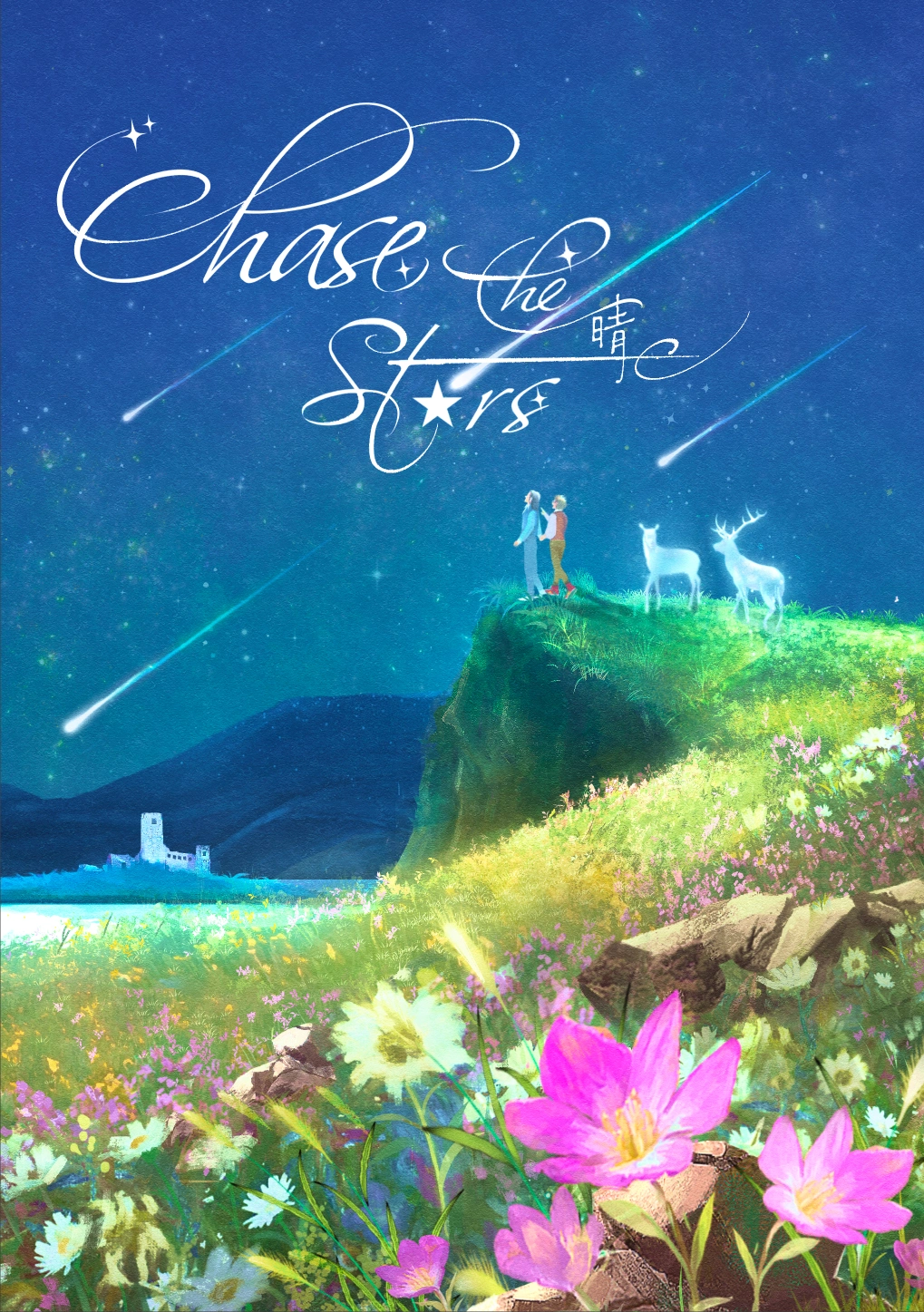
The Front Cover
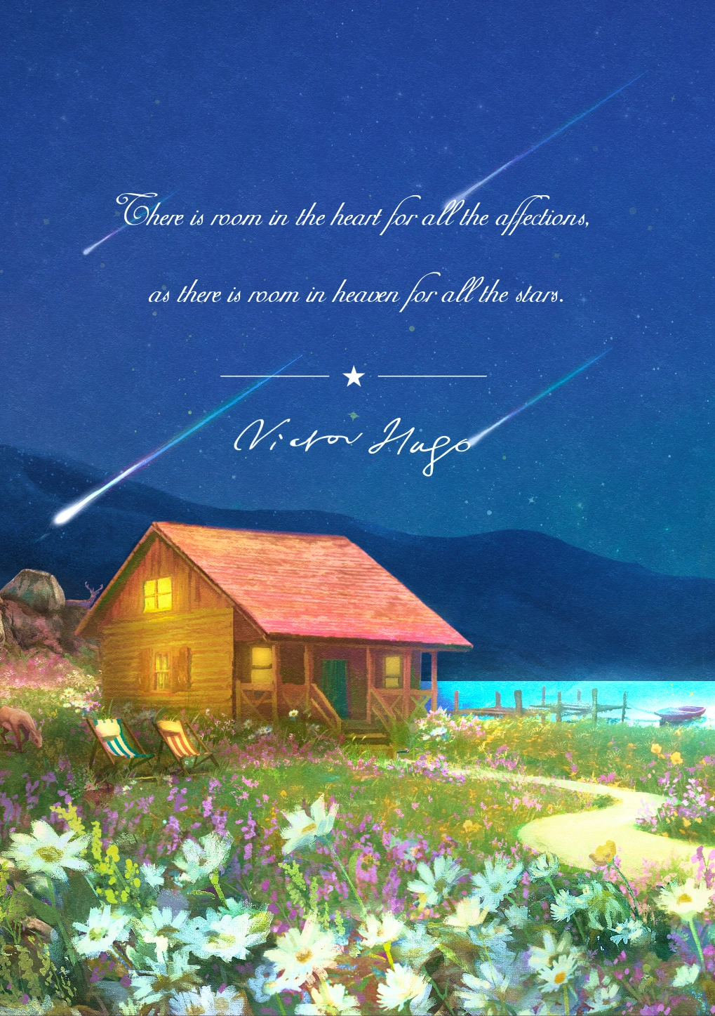
The Back Cover
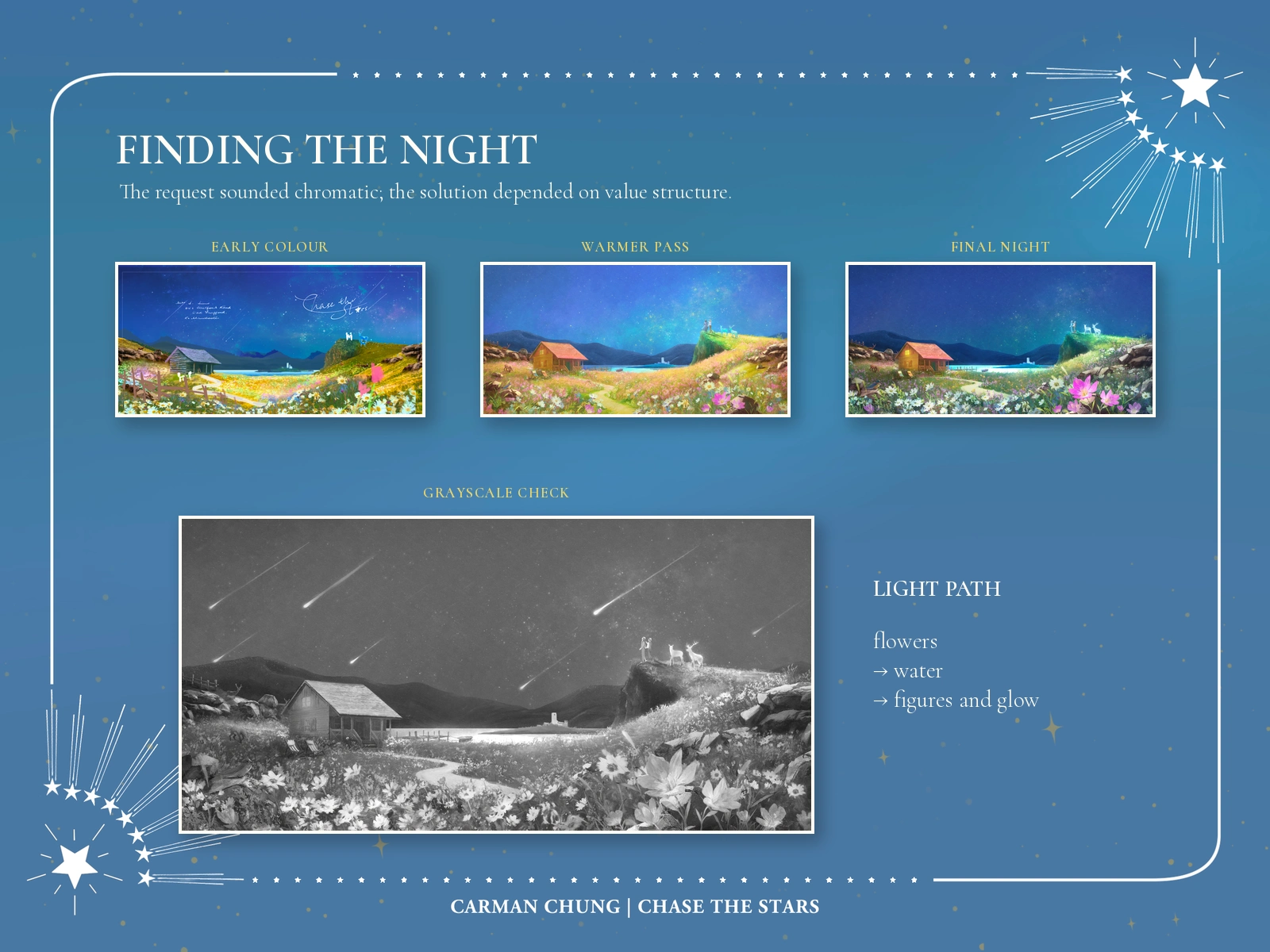
Finding a night that still held colour
The early colour sketch was luminous, but its brightness was too evenly distributed. When the client requested a darker night and stronger contrast, the problem was structural rather than a simple blue colour grade: pushing every area darker would bury the figures and flowers. I deepened the sky and mountain layers, retained the flowers and water as a path of light, warmed the cottage windows and checked the spread in grayscale. The final hierarchy preserves the requested vivid colour while making the front-cover silhouettes and glow more legible.
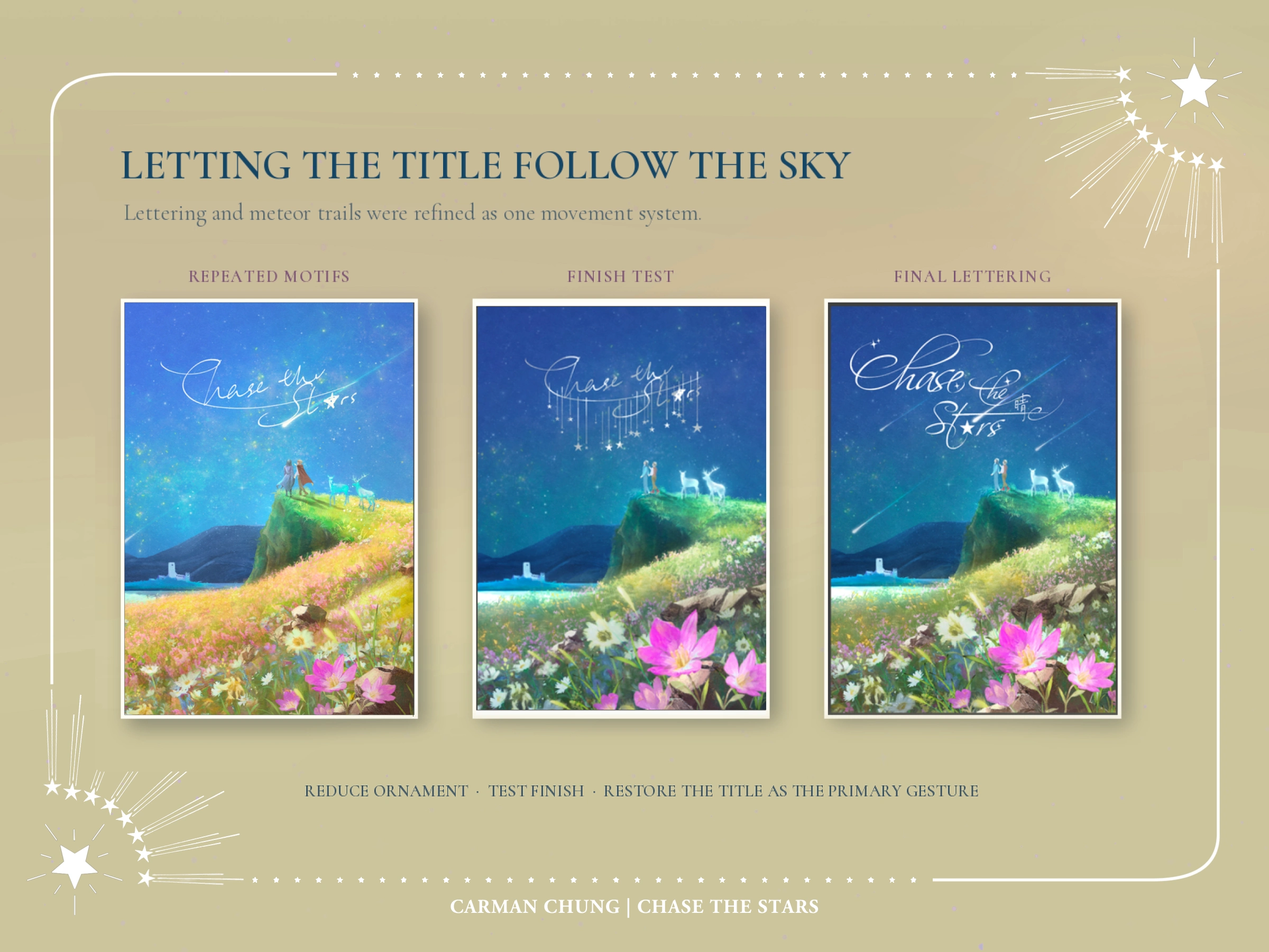
Letting the lettering move with the sky
Early title tests repeated hanging stars and additional decorative motifs. Against an already active meteor field, they competed with the image. I simplified the lettering, refined the number and placement of the trails, and used the title's long strokes to follow the same diagonal movement as the sky. Selected title and star elements were kept separable so the client could discuss foil or spot-finish options with the printer.
One setting, two emotional states
For the inner cover, I avoided repainting the same full-colour scene. The outer wrap is expansive and shared; the inner cover narrows into solitude. I reduced the world to blue, then retained yellow and pink in the path, window light, flowers and title. The same geography therefore becomes a memory-state rather than a duplicate illustration.
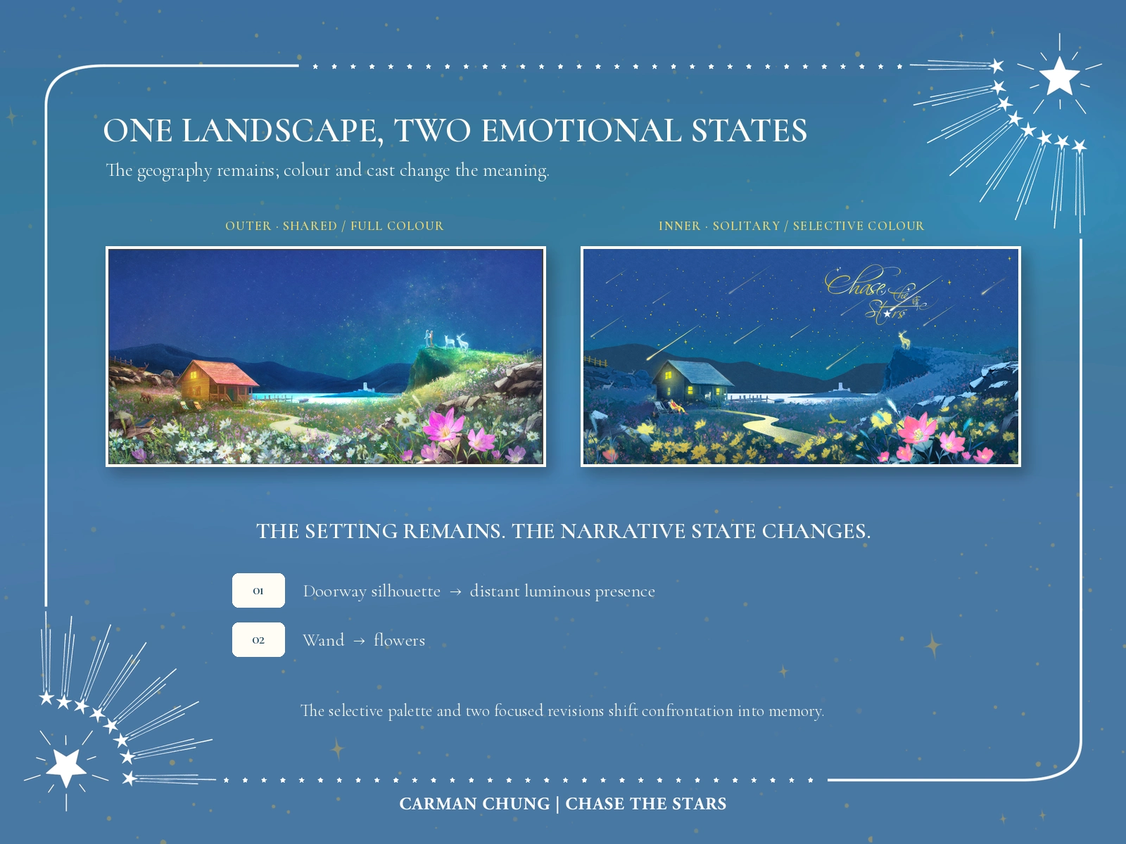
Two focused revisions completed that shift. A second silhouette in the cottage doorway made the idea too literal, so I replaced it with a more distant luminous presence. A wand read as confrontation, so I changed it to flowers. The approved inner cover keeps the emotional connection while allowing absence to remain part of the story.
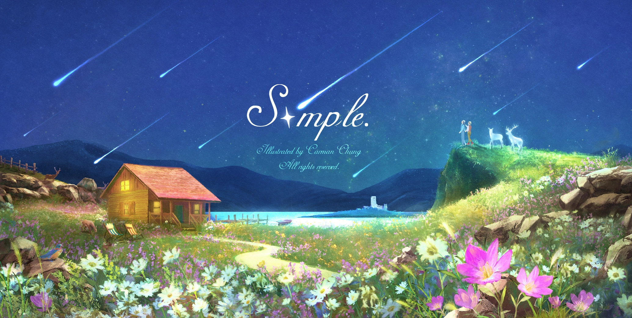
The Outer Wrap
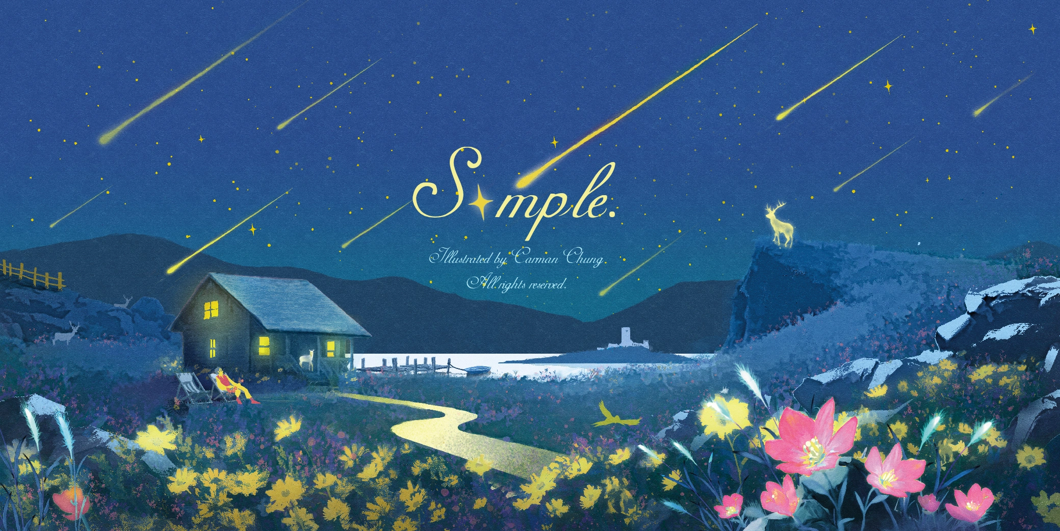
The Inner Cover
Outcome
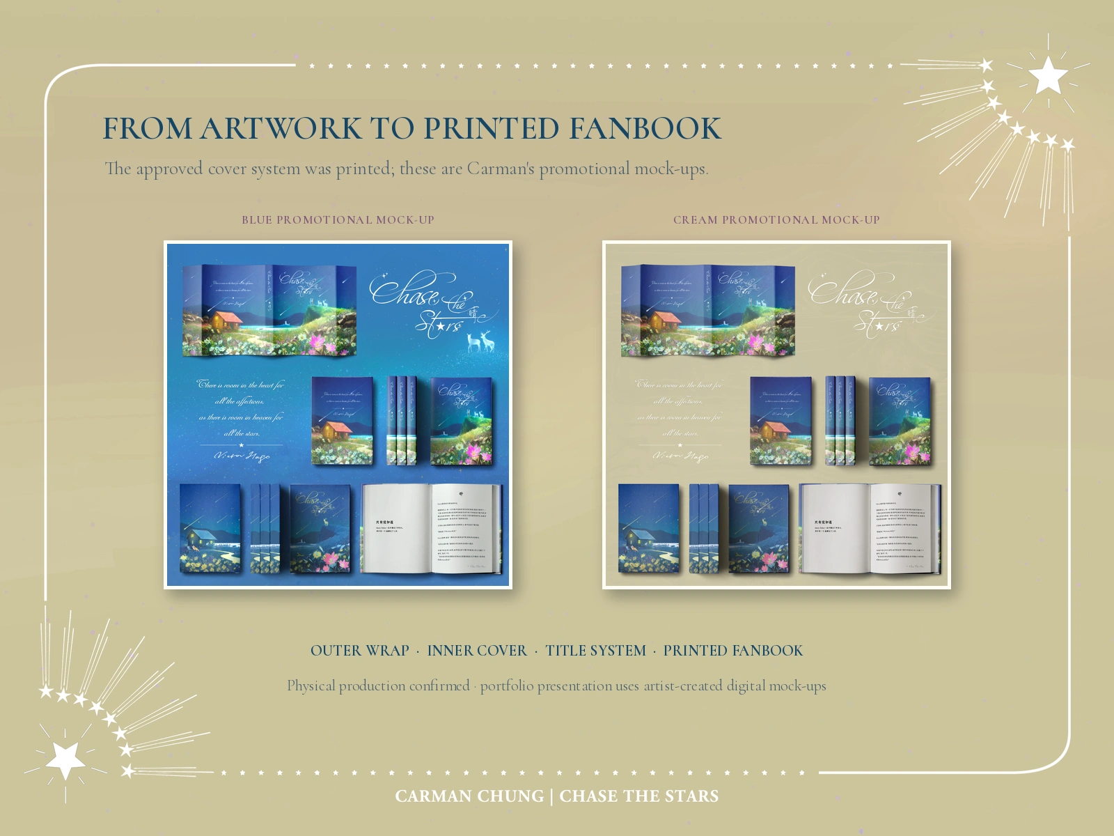
The final system included the continuous outer wrap, a contrasting inner wrap, a refined title treatment, separable elements for possible special finishes and two digital promotional mock-ups. The outer and inner covers were produced for the printed fanbook. For this portfolio presentation, I use the promotional mock-ups I designed during the project rather than third-party product photography.
The client approved the final artwork and explicitly permitted its use in my portfolio.
I create narrative covers and key art for fantasy, romance and character-led stories—especially projects that need atmosphere, symbolism and a strong sense of place. If you need an illustration that can carry meaning across a complete cover system, let's discuss your project.
Credits and rights note
Artwork, environment research, lettering and cover design by Carman Chung. (The work was originally credited under the artist name Swallow and is presented here under Carman Chung.)
Independent paid fanbook commission set in the Harry Potter universe; not affiliated with or endorsed by the original rights holders. Artwork is shown as a portfolio sample with the commissioning client's permission. All underlying third-party rights remain with their respective owners. Private messages and unpublished source text are not reproduced. Back-cover text was supplied by the client.
The explanatory landscape graphic includes reference photographs of the Cairngorms, the Isle of Skye and Castle Stalker, archived with the project under the Pixabay Content License.
Like this project
Posted Aug 27, 2026
A paid fanbook commission turning separation, memory and hope into a printed outer-and-inner cover shaped by Scottish landscape and flower symbolism.
Likes
0
Views
10
Timeline
Aug 1, 2023 - Aug 27, 2023