Goodwill Dallas Website Design
Website redesign for one of the world largest NGOs
The Problem
Expanding Organization without True Digital Presence:
Goodwill Dallas is a massive organization but at the time had no digital front to express its expanse. People didn't know much about what they did. They wanted a website that truly reflects who they are.
Lack of Visuals:
In their initial websites, there was not much use of visuals to convey the message. That needed to be changed big time.
Old Design

The old design, even though was very functional, did not convey what GoodwillDallas stood for.
The old design, even though was very functional, did not convey what GoodwillDallas stood for.
The client wanted to express the organization's true magnitude in a clear and needfully detailed manner with fun and vibrant visuals.
Wireframes
First was the understanding for me to gain, ‘What is GoodwillDallas?’
I would have many sessions, full of questions and once I would gain clarity, I'd start sketching out ideas and potential flows of various journeys.
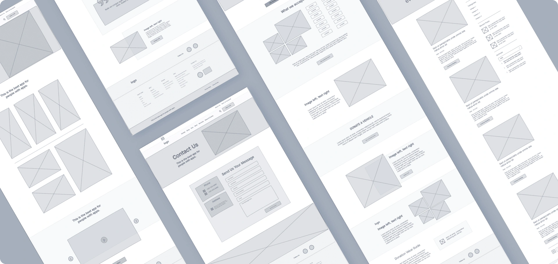
Wireframes for various webpages
The Moodboard
Once the core structure was final, I moved to visual direction exploration.
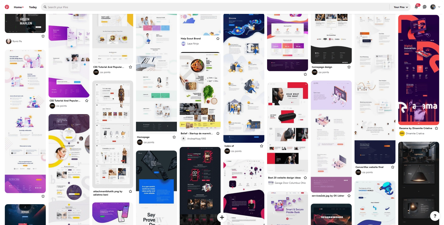
I used Pinterest to compile all the potential visual directions
Design: The Early Iterations
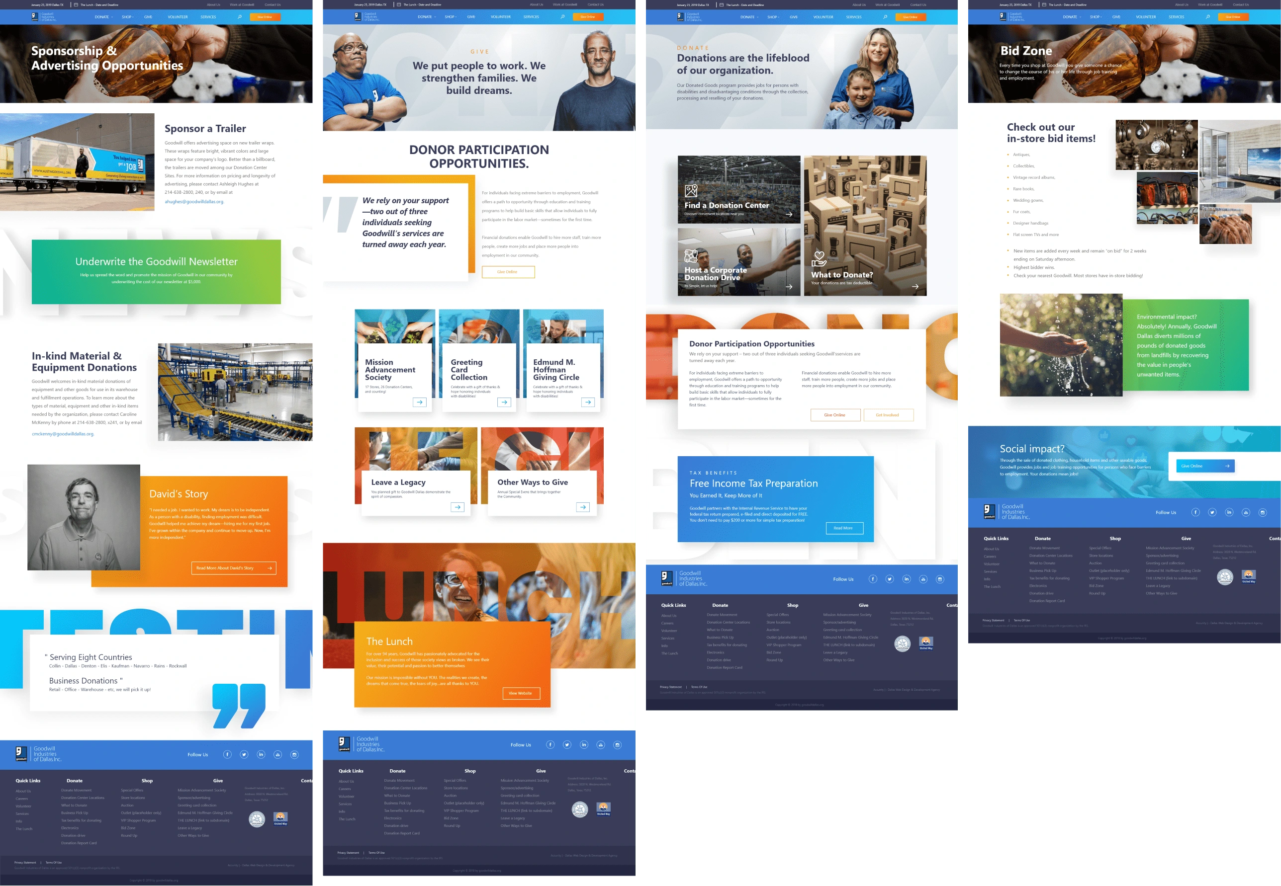
A collage of early iterations
While designing the first version, I overshot the idea of vibrancy a bit. Introducing 2 new gradients.
While the client necessarily did not dislike it, the concern arose that we may be a little too far off from the original brand.
This could be a bigger change that the users might not welcome.
Toning Down
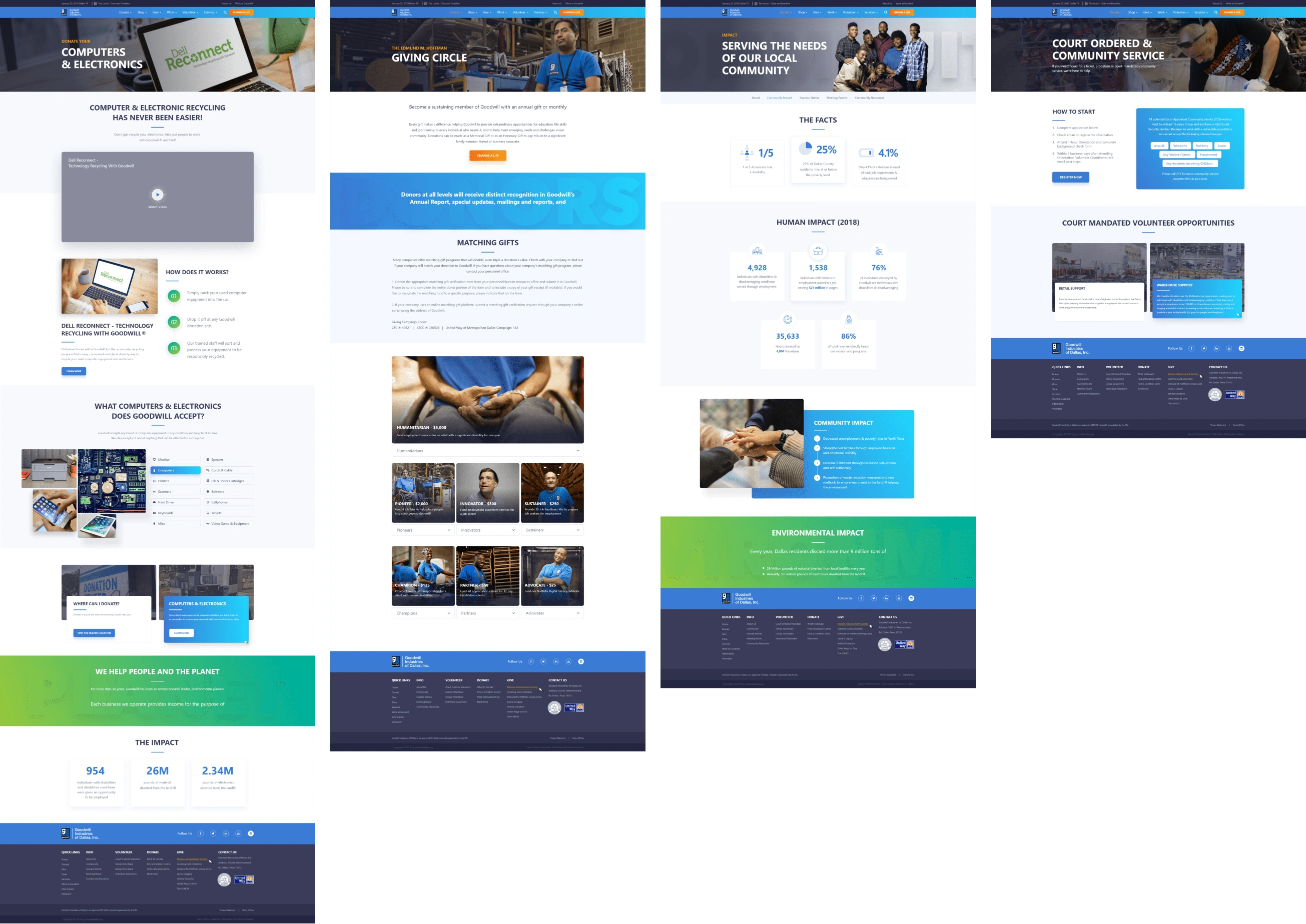
A couple of iterations later, we found the perfect mix of visuals, colors, and layout.
Images
I pushed back to use real images as they tell the real story. The client was kind enough to have a shoot done for the project, capturing people and action all around the organization
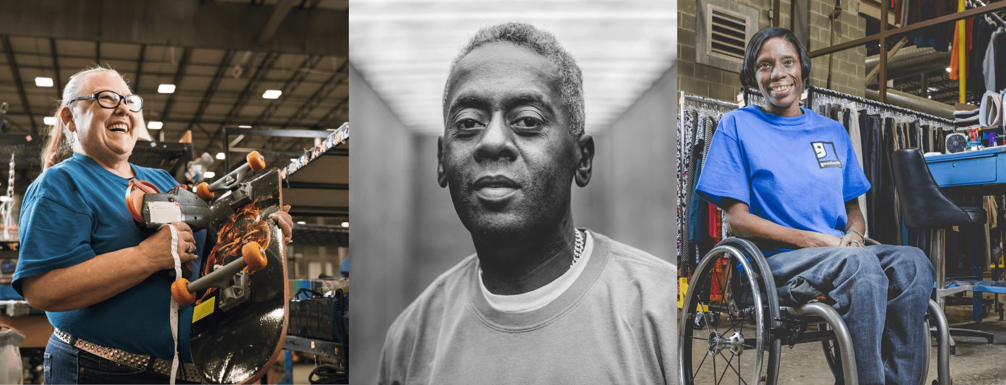
Real images by Goodwill.
Design Language: Big, Bold & Impactful
I used classic and proven techniques of storytelling to make the content be more impactful.
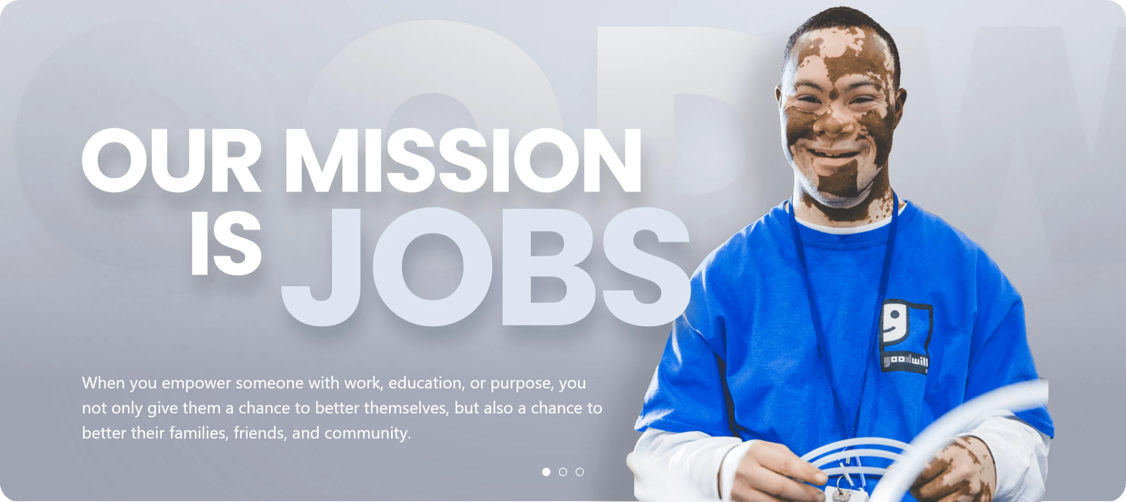
One of the main web banners
The Homepage
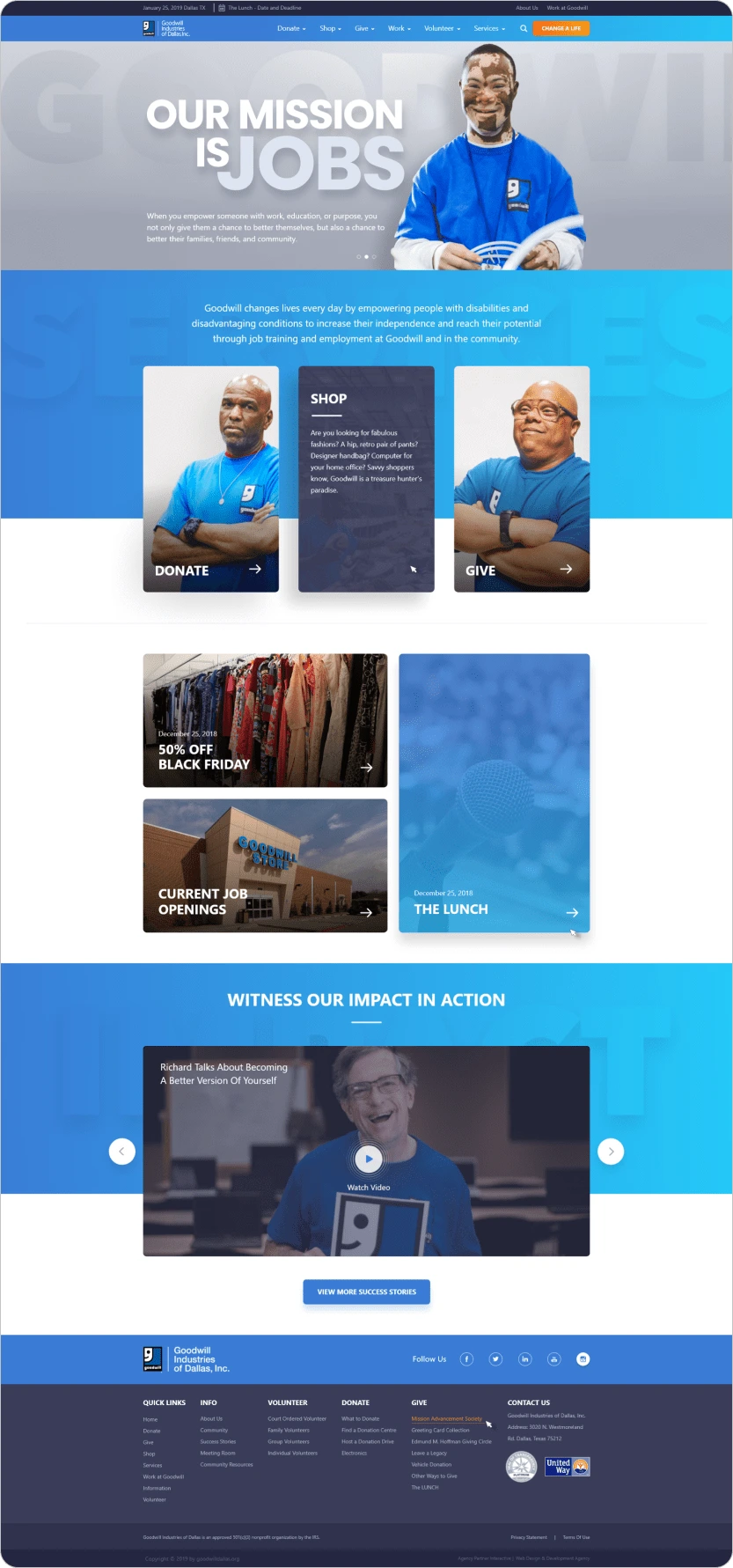
Live Homepage
Unique Website Sections
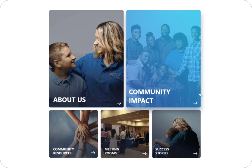
Big bold tiles with real images

Vibrant sections to pull focus
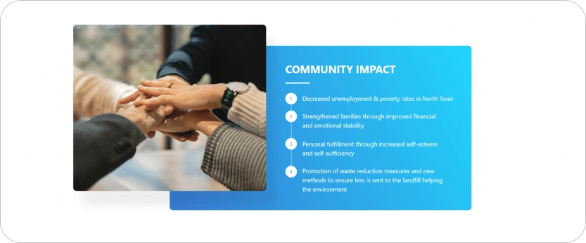
Clean, clear and concise
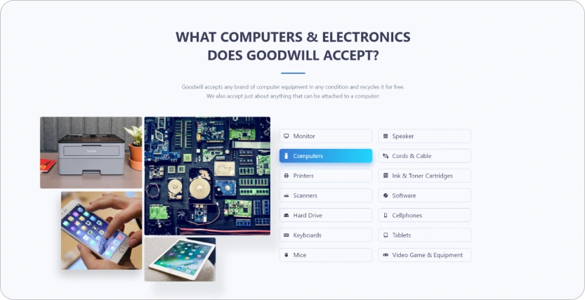
Defined interactions
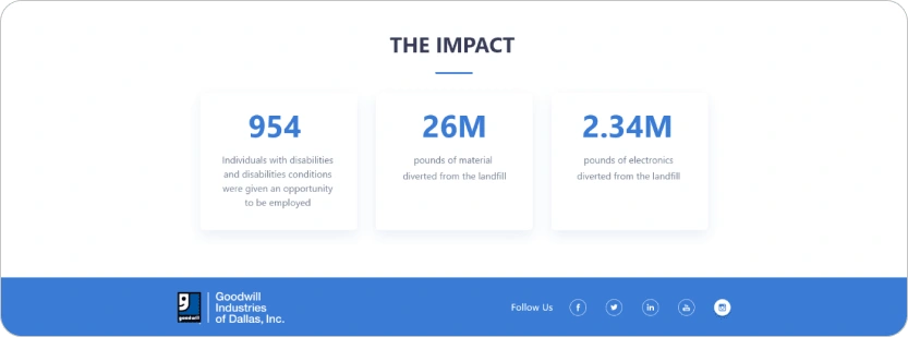
Big numbers
Key Challenges & Learnings
Designing for Content:
The amount of content was huge.
It was difficult to go through it all and understand and then design for it.
We were very open about the questions we had while designing and the client responded in kind.
I believe honest due diligence pays off well.
Designing for Content:
We cannot go too far when designing for an established brand.
We need to be very mindful of what changes we make and how they may affect the users and business
Having invested a decent amount of time in iteration opens up potential ways we can steer the project.
Designing for Content:
Even though as a designer, there is only so much I did, the impact of this work goes a long way.
Hopefully, people will be using the site to donate to goodwill and in return, they will help out millions of people. I feel happy to be a part of that!
Like this project
Posted Mar 25, 2023
Complete website redesign from scratch while keeping the original brand values intact. Improved functionality through detailed UX studies.
Likes
0
Views
20
Clients

Goodwill Industries International

