PreCheck Dashboard Design
A web application design for HR teams to help them better conduct background checks.
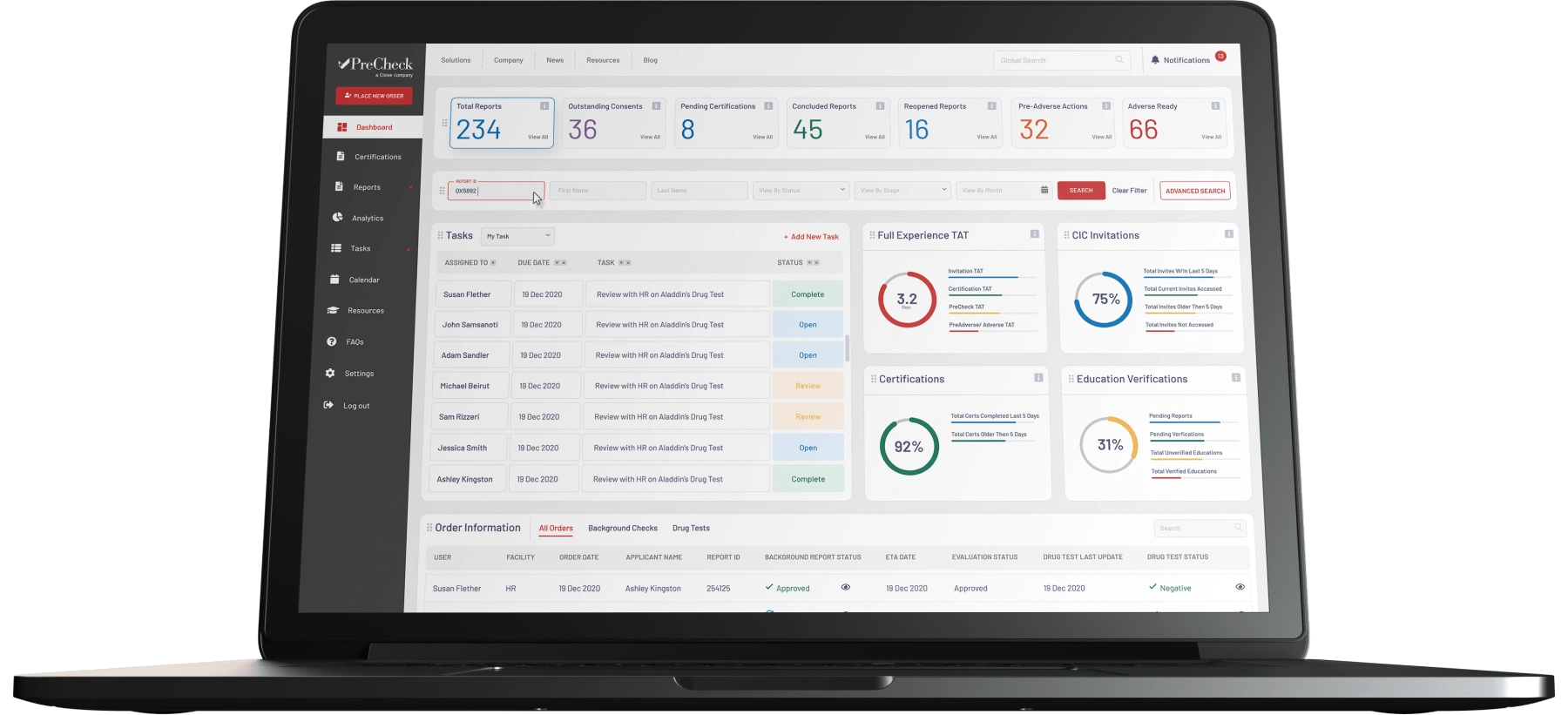
The Final Dashboard Design
The Process
The Old App
The app in use was rather dated. That in itself comes with various challenges.
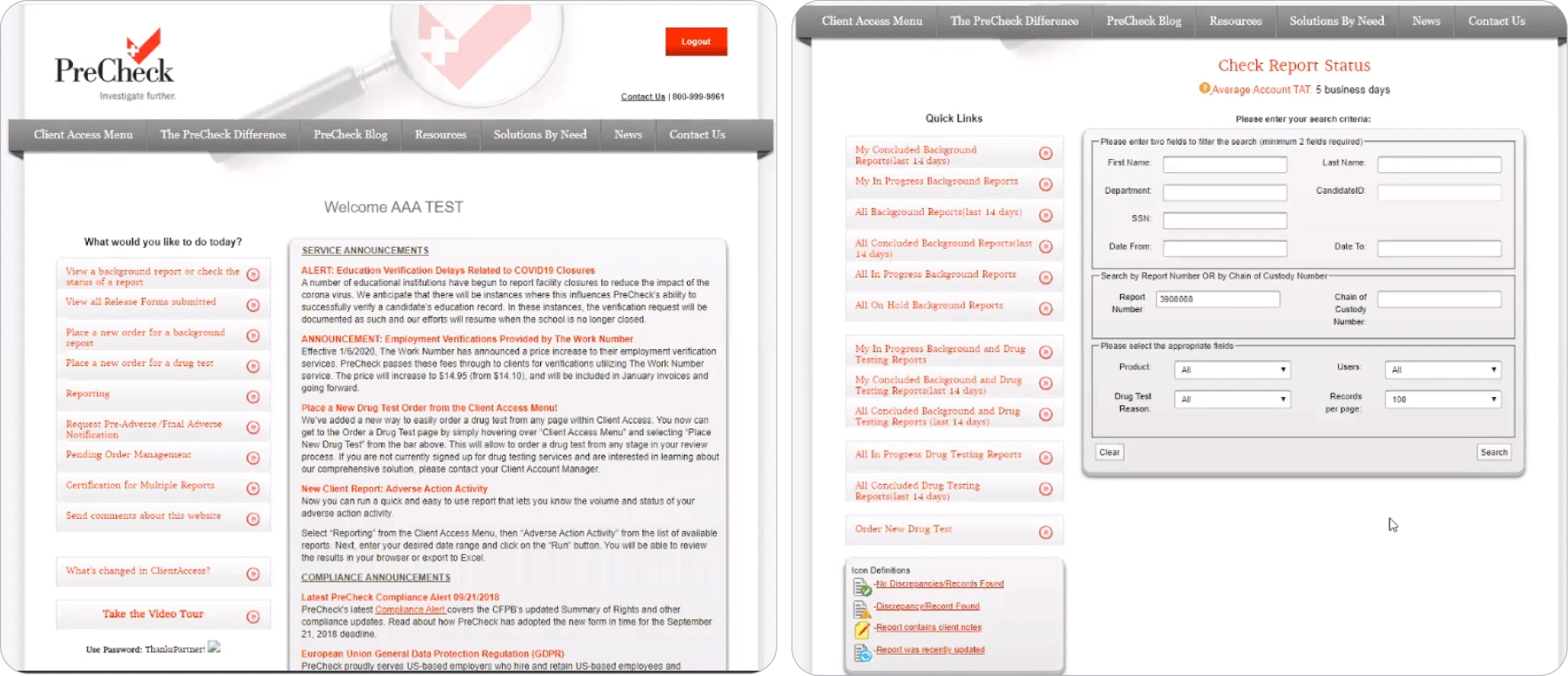
The Old UI
The problems that were tackled
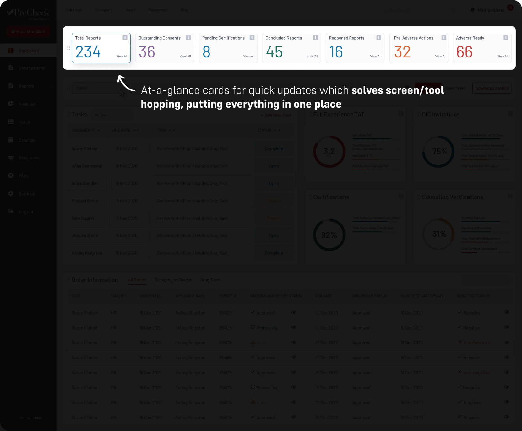
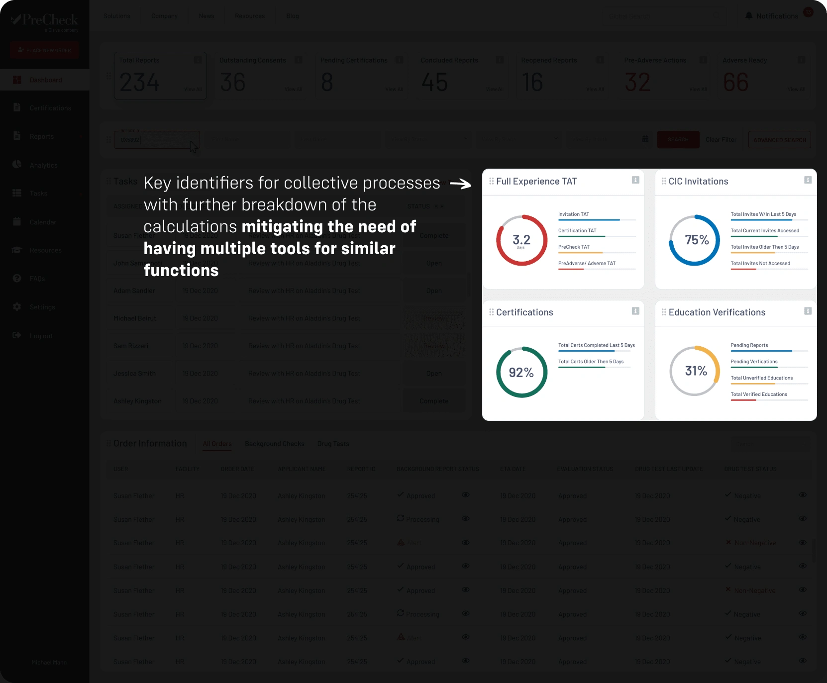
Many Tools for One Role: HR Managers rely on different types of software for similar features.
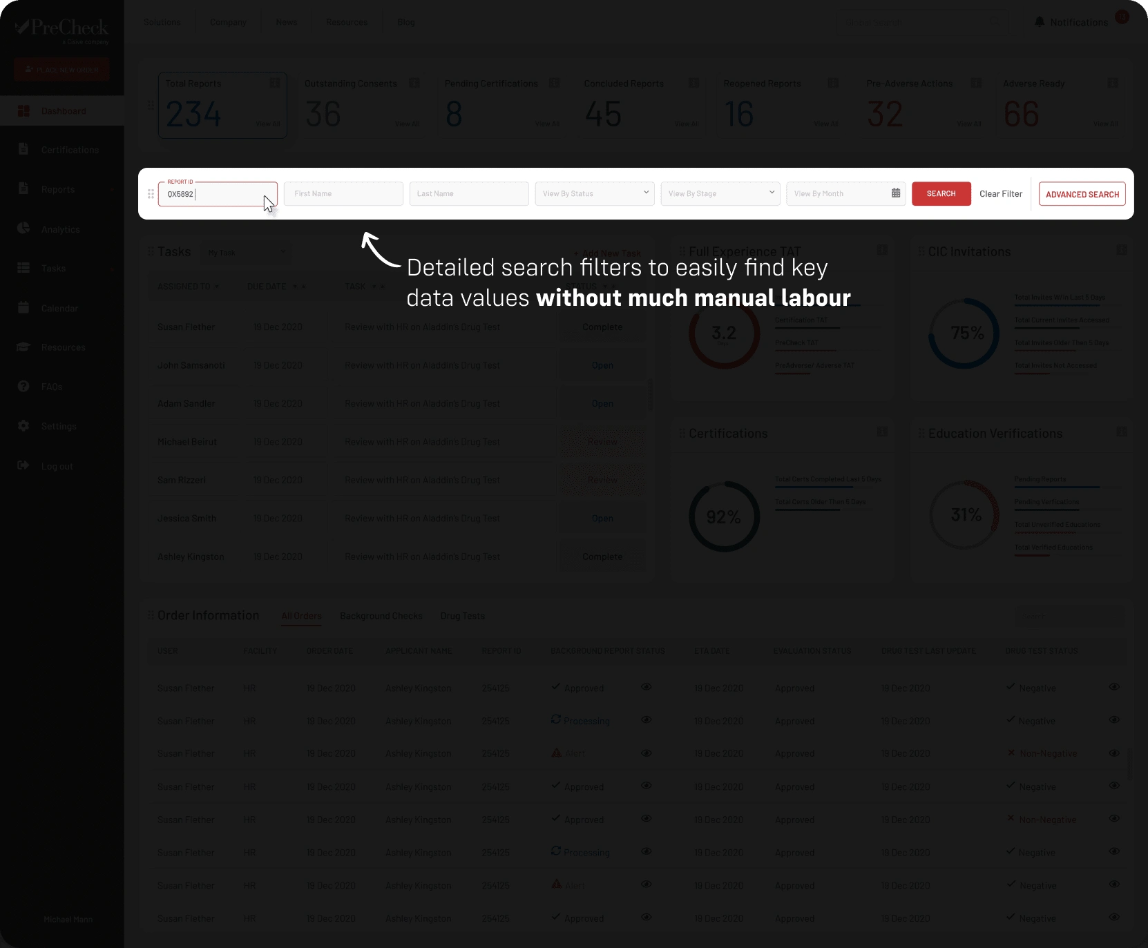
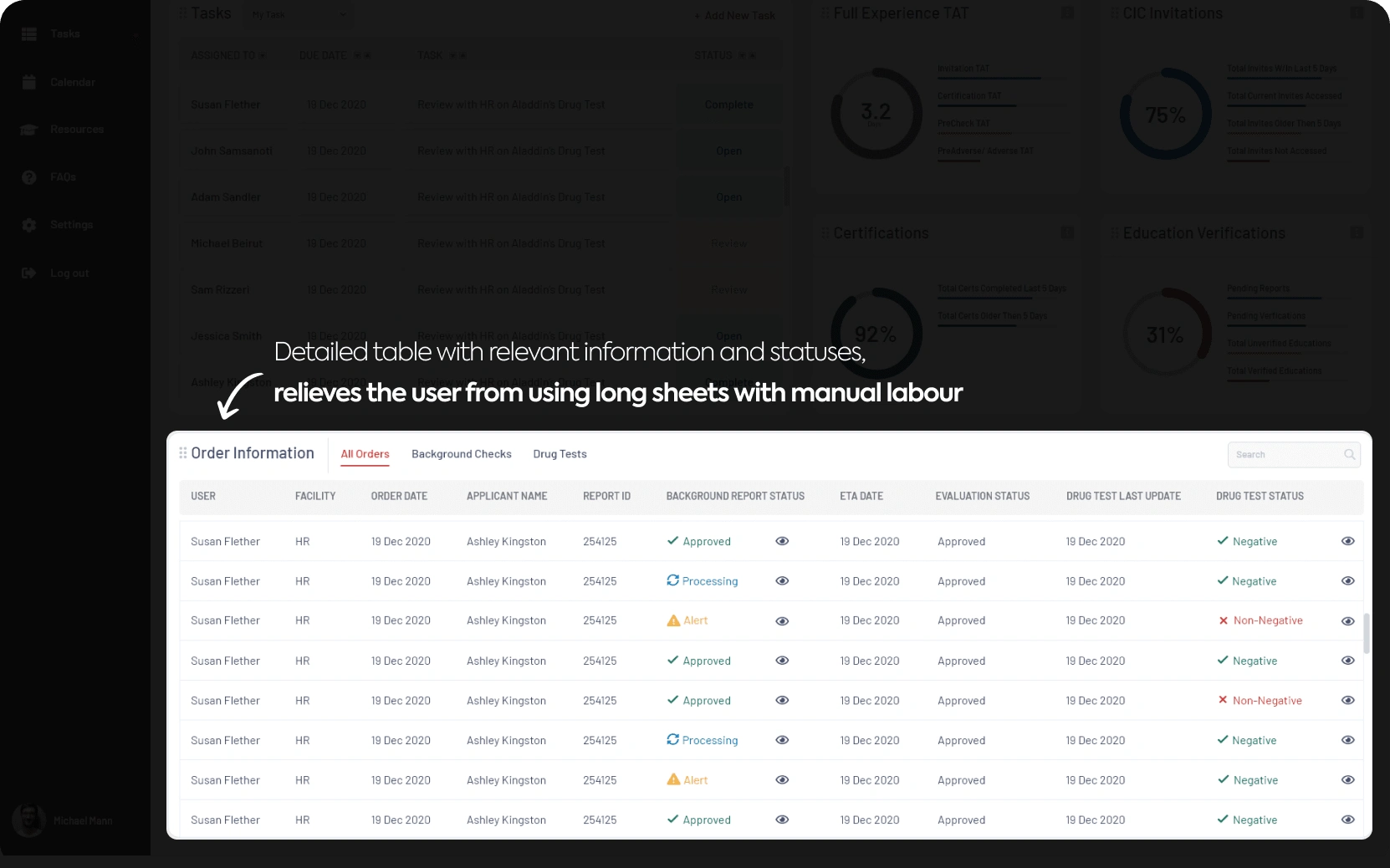
Extensive Manual Labour: Use of spreadsheets to manually manage long strings of data.
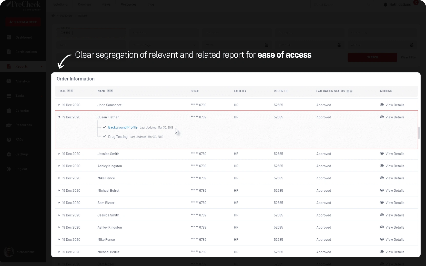
Many Moving Parts: Handling multiple parts of different types of job openings simultaneously.
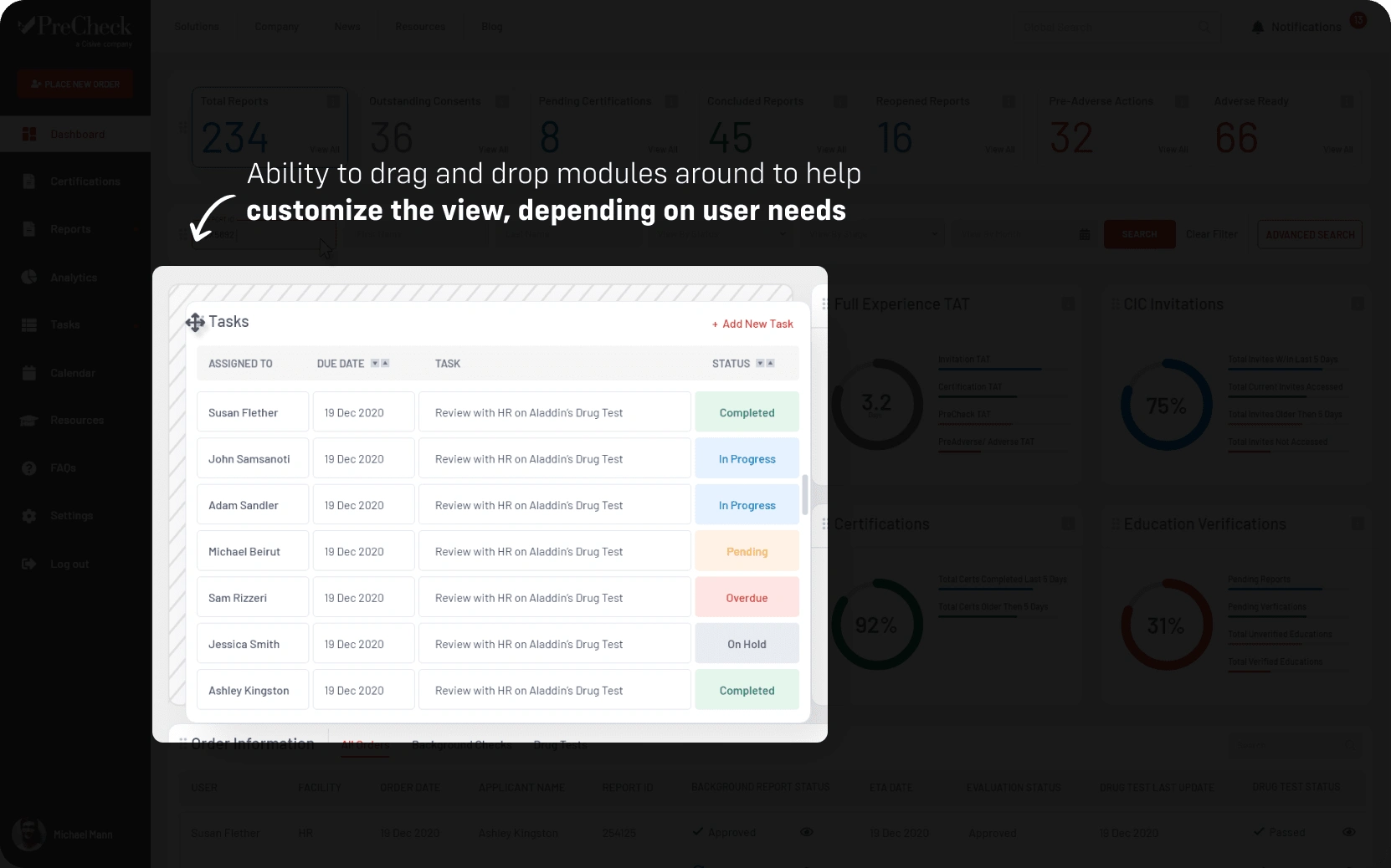
No Customization: Different job openings may have a completely different hiring process.
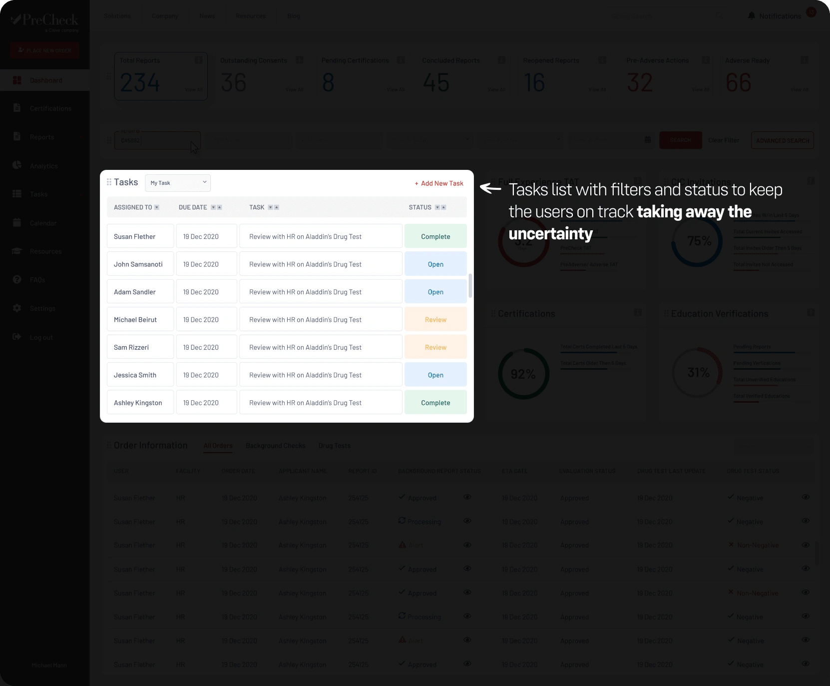
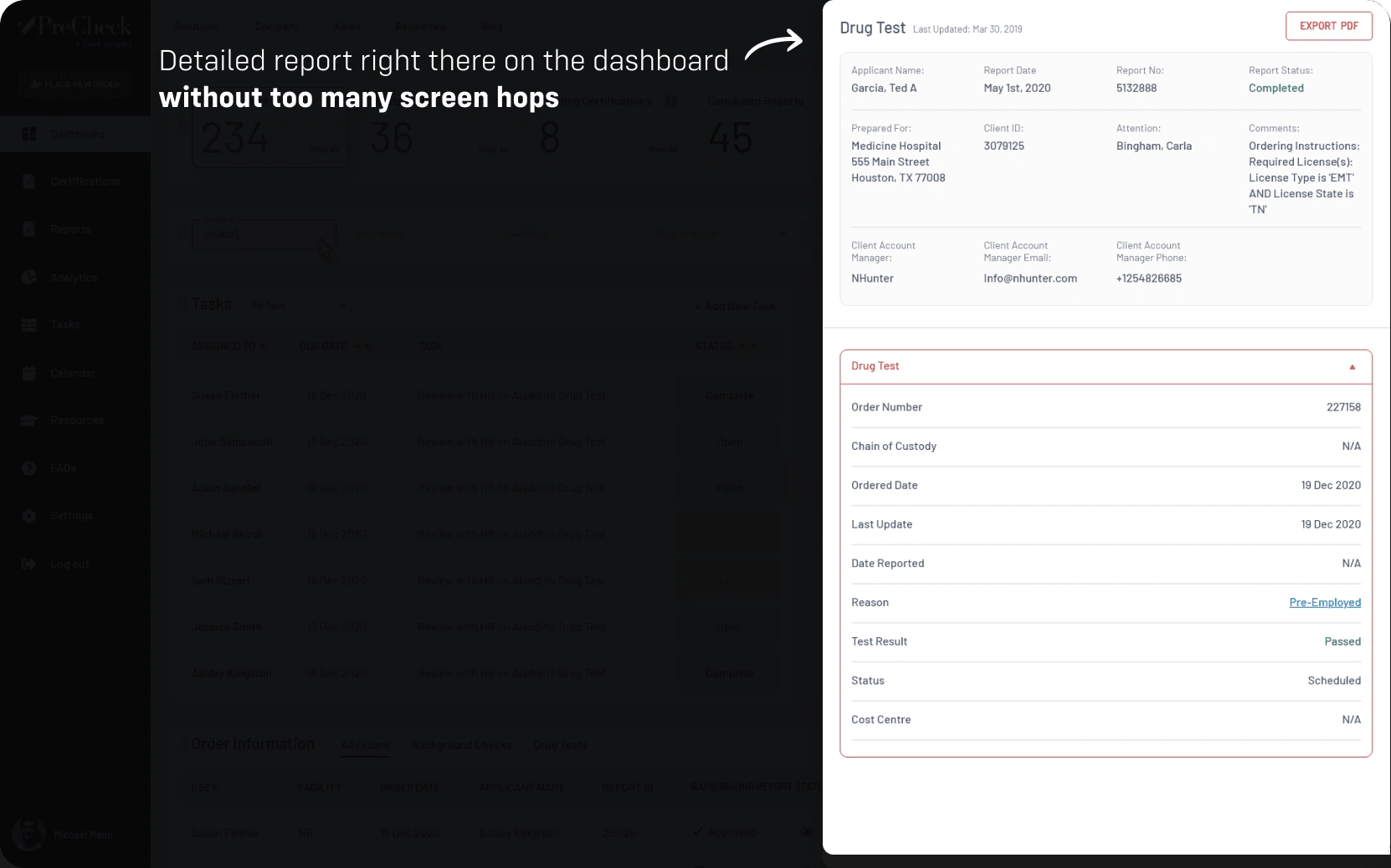
Uncertainty: The hiring process can get complicated and users have difficulty figuring out the next steps in the process.
Competitive Landscape
Goodhire: Delivers fast, accurate & reliable results. Simple workflow.
Vitay: Designed to give detailed insights into candidates' performance
Crimcheck: Specializes in providing pre-employment screening & certified background checks.
Checkr: Provides scalable background checks
Design Strategy
The idea was to cherry-pick all the best features prominent in the industry that also resonated well with the business, and merge them into one super platform.
Batch Processing of orders
Status Tracking
Self Service Portal
Candidate Scoring
Reminders and Notifications
Reporting/Analysis
Completion Alerts
Screening Services Integrations
Smart Search
Modules Customisation
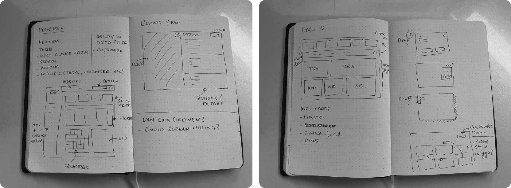
Wireframes
The next step was to dive in deep and work on some wireframes. Starting with low fidelity and then moving to high fidelity.
The Design
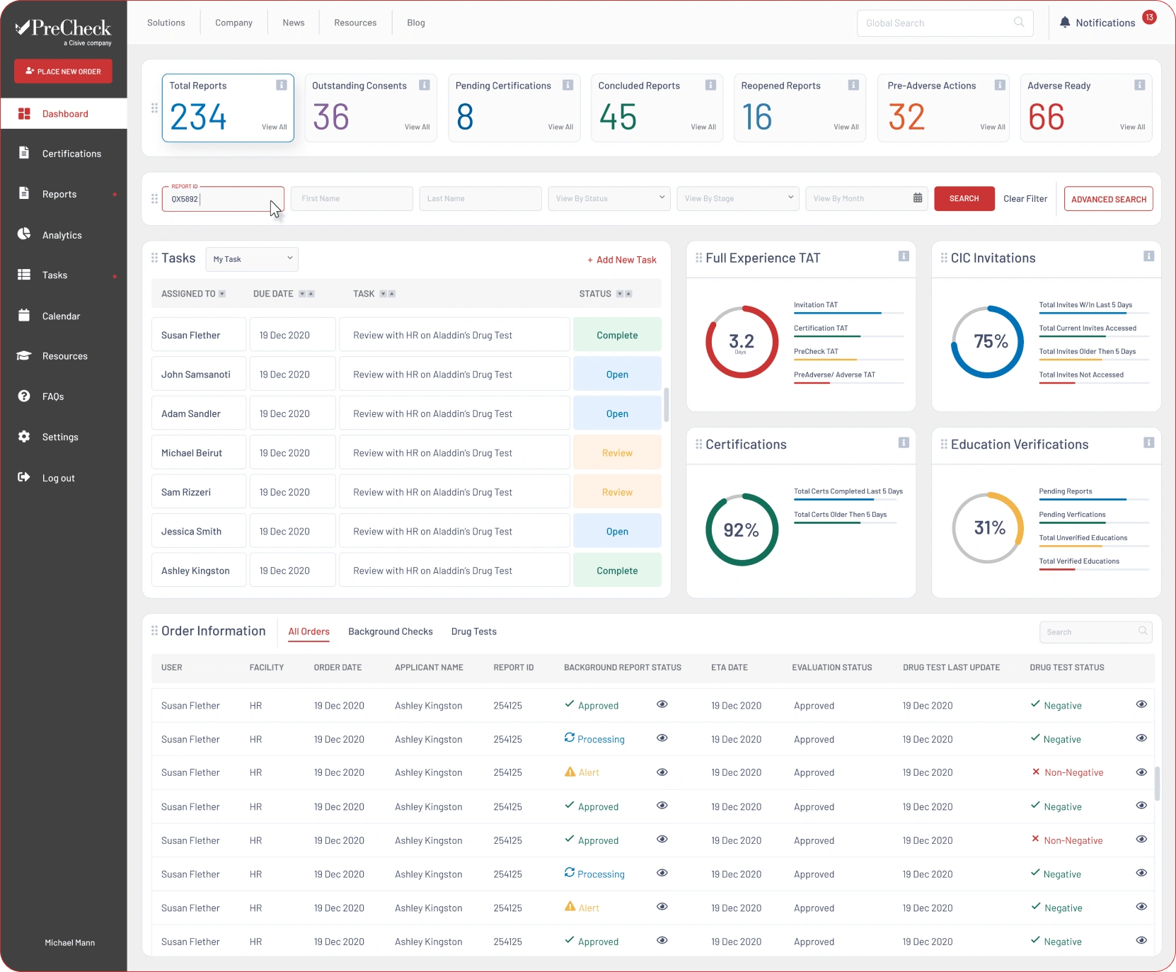
The main dashboard
Design Breakdown
The dashboard may seem overwhelming but it is well tested and after many iterations, every element in there solves a specific issue.
Key Challenges & Learnings
The Color Paradigm
The client insisted on using ‘Red’ as a primary color.
It was difficult to design an error state that pulls focus with ‘Red’ as a primary color.
We tried various ways, stronger type weight, icon pairing, decluttering the vicinity of the red state.
Building in Tiers
Building a product with a grand vision is helpful, but without breaking it down into features/functions it can be very challenging to focus.
The client requested to start on everything at once, we took a step back in explaining why that would be a bad idea.
Showing examples of past projects and discussing issues openly really helped.
Like this project
Posted Mar 23, 2022
A web application design for HR teams to help them better conduct background checks.

