aroma Perfume House — Visual

View completed workwww.behance.net
aroma Perfume House — Visual Identity & Packaging
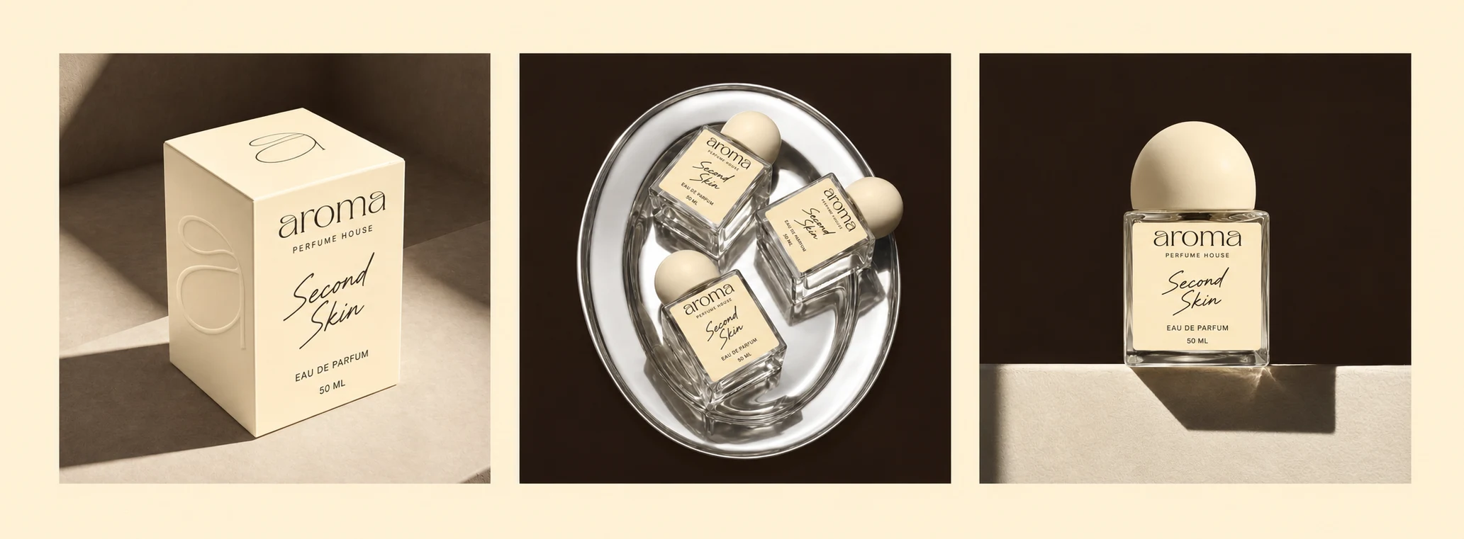
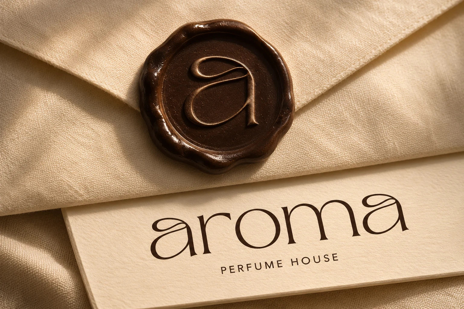
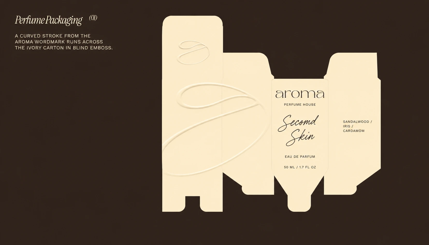
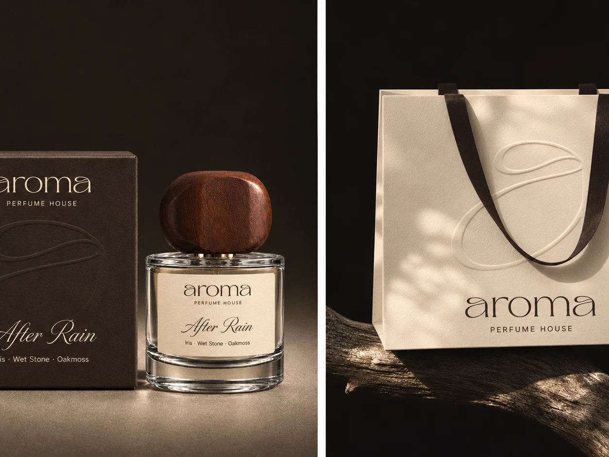
For aroma, I wanted to give shape to the trace a fragrance leaves on skin. I started with the lowercase a that opens and closes the wordmark. Its fine loop became the signature of the identity, from the curve of a paper scent strip to a raised line that runs across three fragrance boxes when they sit side by side.
Espresso brown and warm ivory carry through the packaging, campaign imagery, and digital storefront. On the cartons, the curve catches the light before you feel it under your fingertips. A peel-away label becomes a scent strip and reveals the words Close to skin. Opening the box becomes the first part of trying the fragrance.
0 likes · 0 views · Nov 4, 2026
aroma Perfume House — Visual Identity & Packaging For aroma, I wanted to give shape to the trace a fragrance leaves on skin. I started with the lowercase a t...