Jedi Dashboard for LMS Efficiency
shiva ram
Jedi Dashboard for an LMS to improve Program Managers' efficiency. Led UX research with 20+ stakeholders, identifying workflow gaps in ticket resolution, session planning, and learner communication. Designed a scalable system with activity tracking, email sync, and 1-click automation. Used Figma & MUI for rapid prototyping and dev handoff. Result: 50% increase in learner capacity per PM and reduced operational overhead.
Skills and deliverables
UX Research, Interaction Design, UX & UI Design, Usability Testing, Wireframe
At Great Learning, I led the UX design of the Jedi Dashboard, a core component of the Ninja Olympus LMS. The goal was to enhance the efficiency and bandwidth of Program Managers (PMs) by designing a scalable internal product that could support more learners without increasing operational overhead.
Problem
PMs handle key responsibilities across learner engagement, support tickets, session planning, and progress tracking. However, several issues affected their efficiency:
Communication was scattered across email, WhatsApp, and phone
No centralised view of learner progress or history
Session planning was time-consuming and prone to errors
Tasks lacked automation, affecting turnaround times
Teams struggled to track performance or forecast workloads
These issues restricted each PM to managing 100–120 learners, limiting scalability and productivity.
Research
To understand pain points, I conducted research with over 20 Program Managers, 5 BU heads, and Senior PMs. We also sent out surveys for quantitative validation.
Key findings included:
Follow-up history and learner context were fragmented
Ticket logs were incomplete or outdated
Content import was a manual, repetitive task
Session planning was stressful due to a lack of visibility
No automation existed for managing “at-risk” learners
These insights guided the design strategy toward visibility, automation, and simplified workflows.
Design Approach
We categorised the tasks into communication-related and non-communication-related to structure the solution. Major features included:
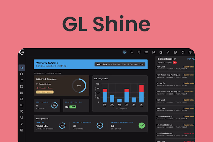
360° Learner View: Centralised profile with history, tickets, communications, and progress
Activity Tracking: Logged emails, calls, and WhatsApp messages per learner
One-click Automation: Bulk follow-ups and segmentation of learners (e.g., inactive, at-risk)
Session Planning Interface: Streamlined scheduling and tracking
Performance Filters: Views to track engagement, collections, reactivations, and more
We used Figma for UX/UI design and Material UI (MUI) components for faster development handoff with React.
Testing and Iteration
Usability testing revealed areas to refine, such as dense tables preferred by PMs to view more data, and simplifying advanced filters. We adjusted UI density, improved filter logic, and optimized layout based on real workflows.
Outcomes
After launch, we worked with experimental teams to measure adoption and impact.
Results within 3 months:
50% increase in learner capacity per PM (from 120 to 200 learners)
70% reduction in ticket resolution time (from 48 hours to under 10 minutes)
Logged communications and activity history for better visibility
Improved planning and progress tracking
Reduced stress on PMs with automation and real-time insights
Conclusion
The Jedi Dashboard transformed a fragmented workflow into a seamless experience. By combining deep user research, system thinking, and scalable UX design, we empowered PMs to focus on learner success instead of administrative overhead.
Like this project
Posted Jul 24, 2025
Jedi LMS Dashboard: Boosted PM efficiency via UX research, scalable design, and automation—50% more learner capacity, less overhead. Built in Figma & MUI.
Likes
0
Views
6