Presentation Design for Logistic Company

Moew Studio


Like this project
Posted Jul 7, 2025
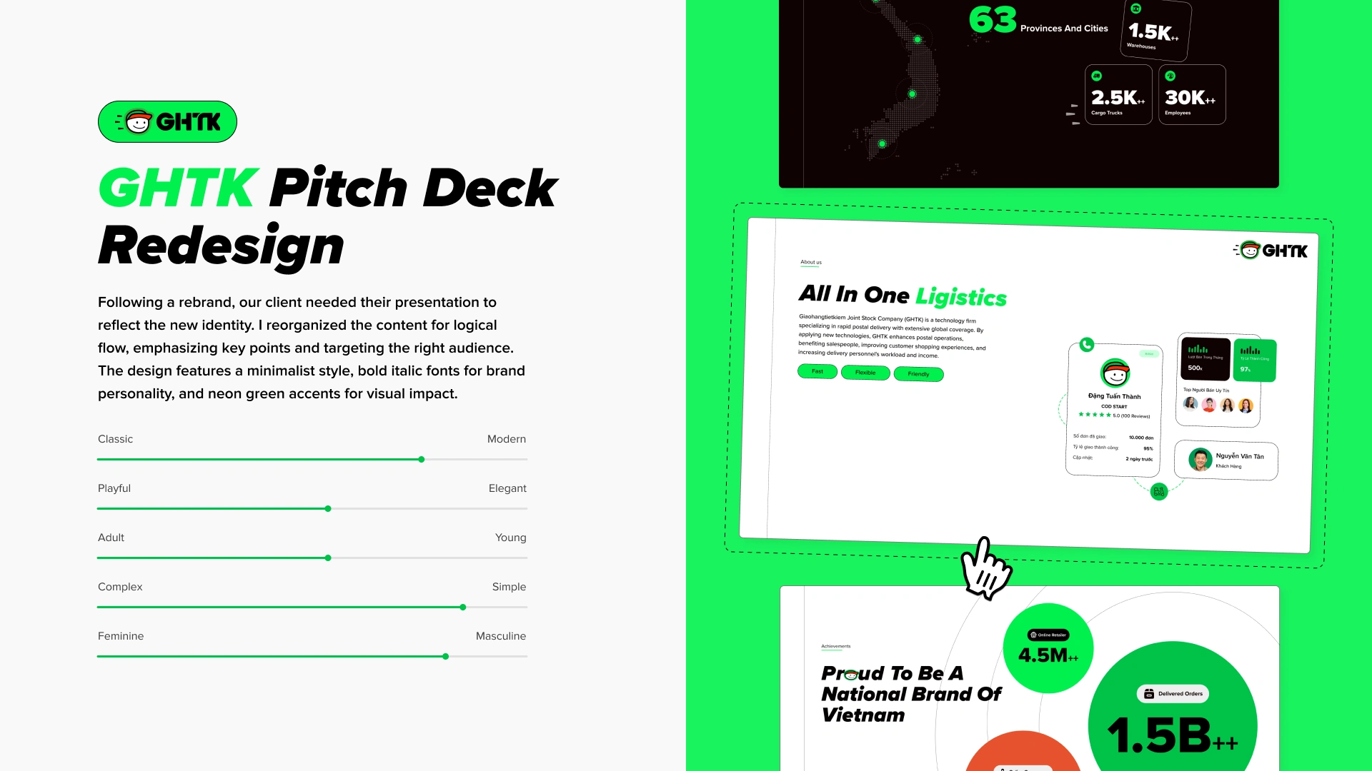
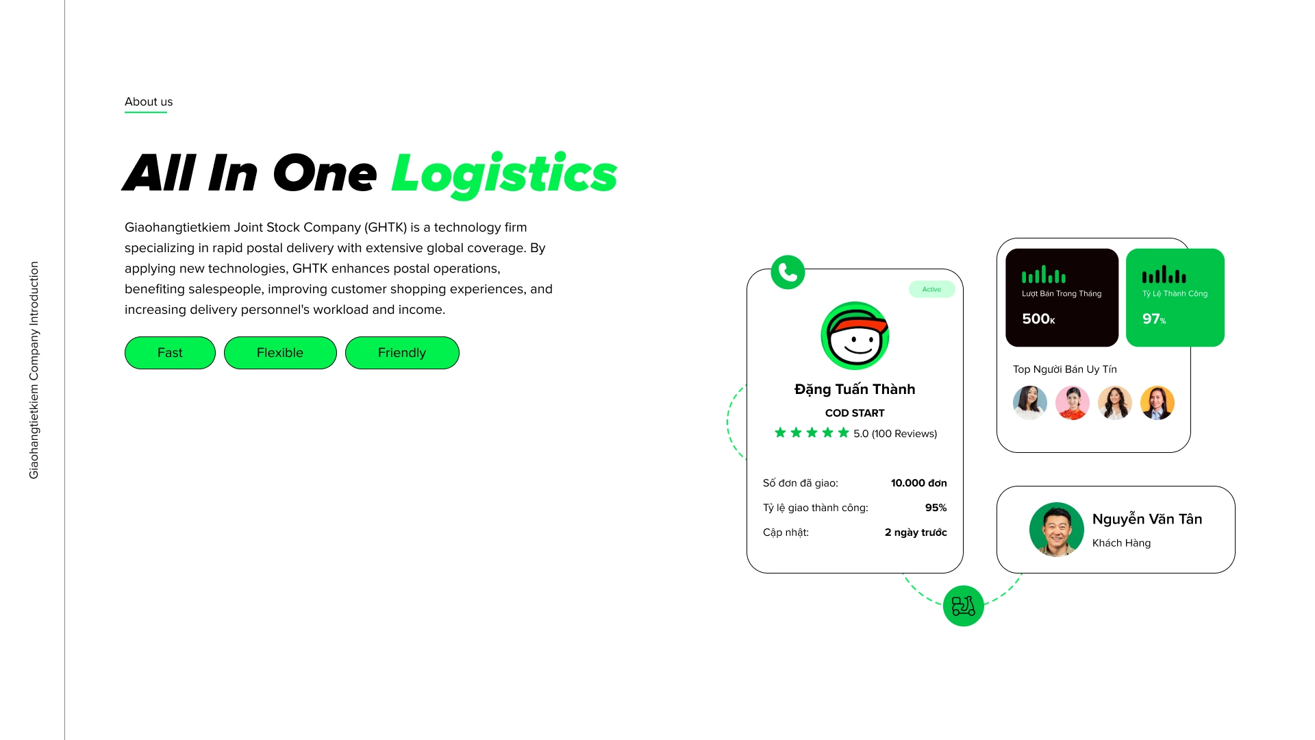
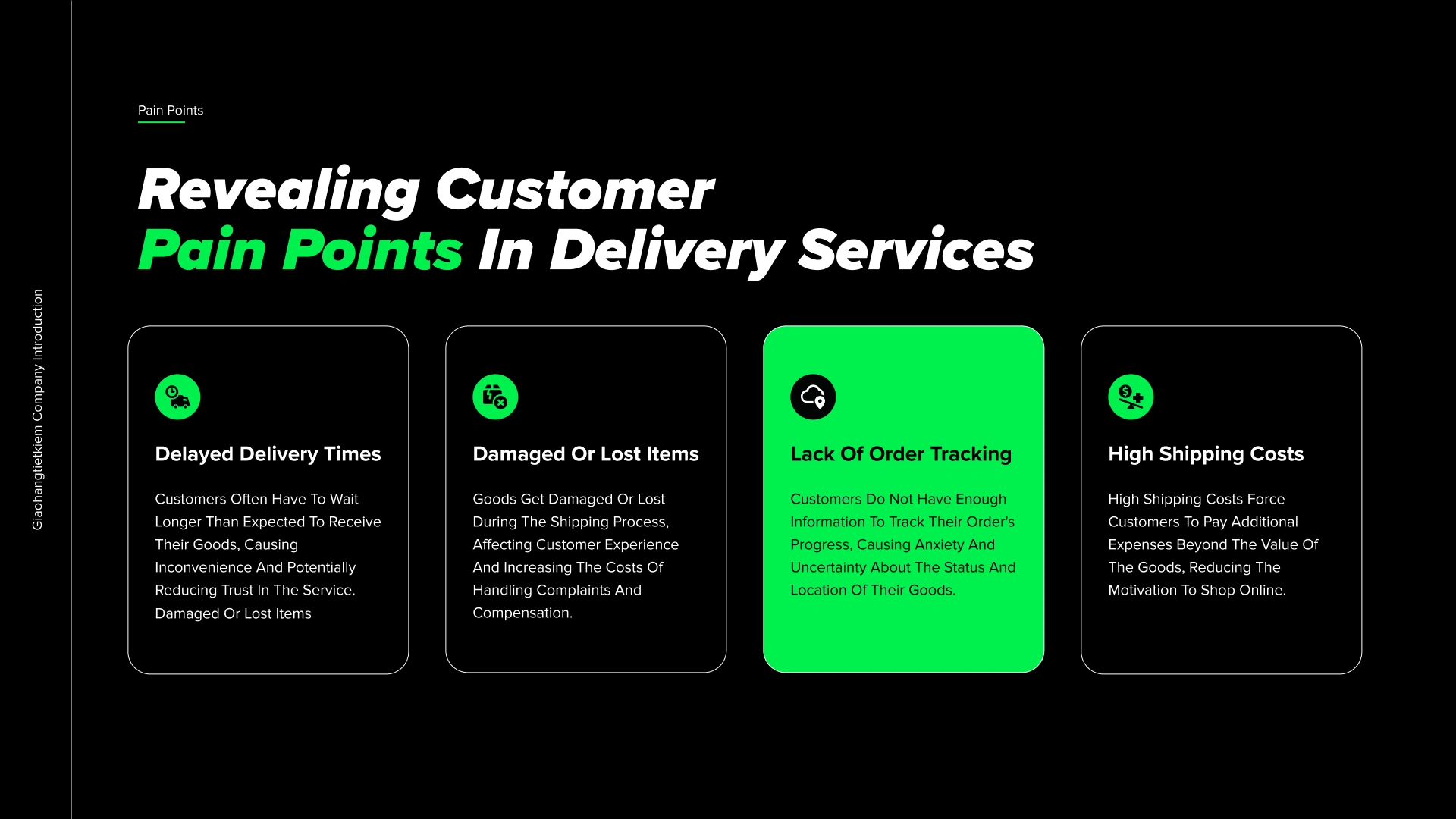
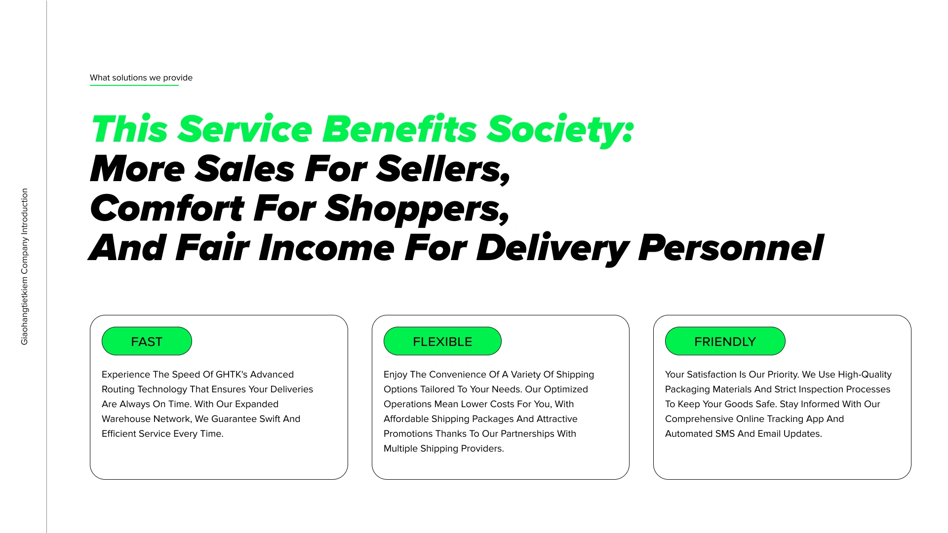
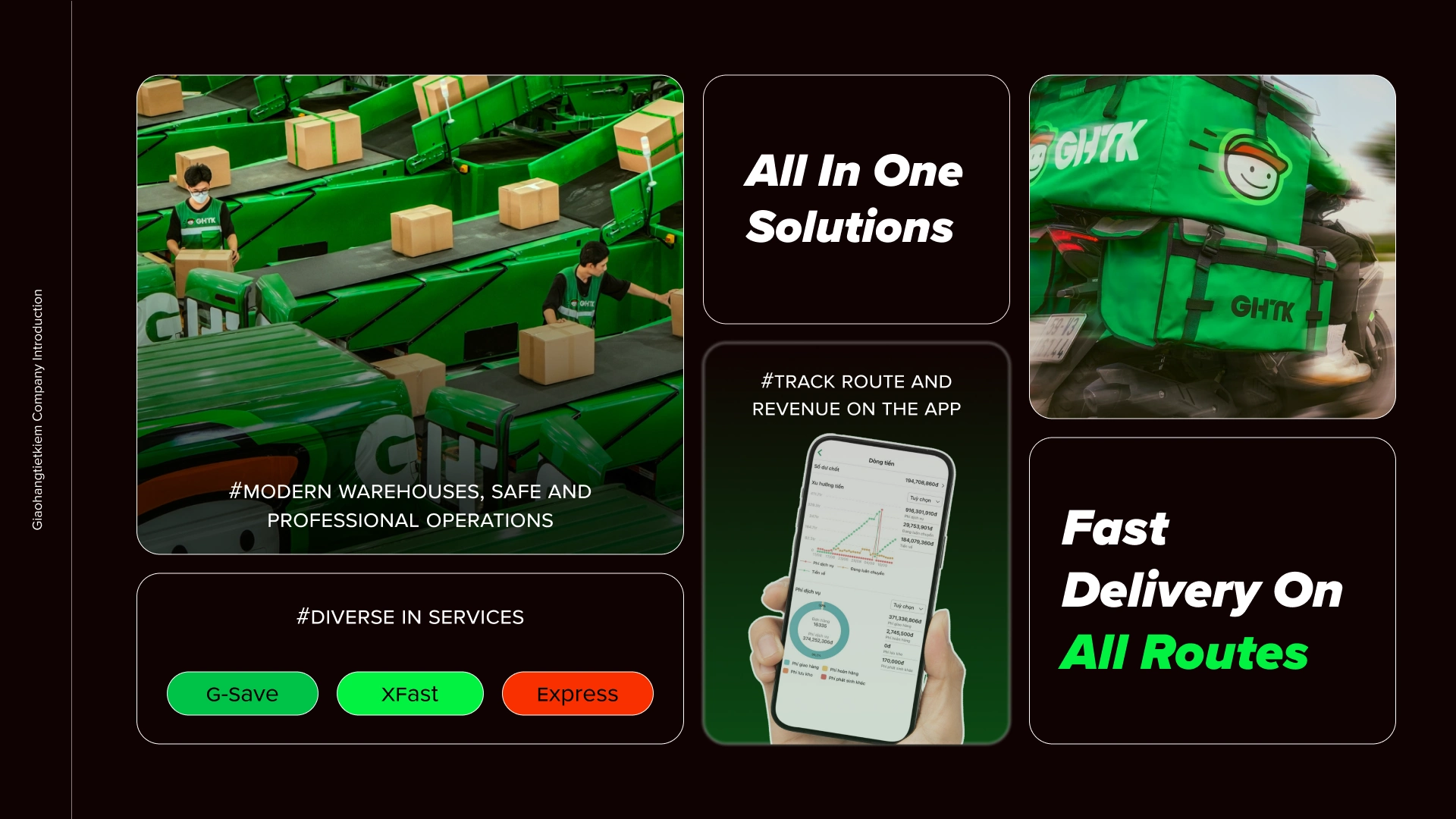
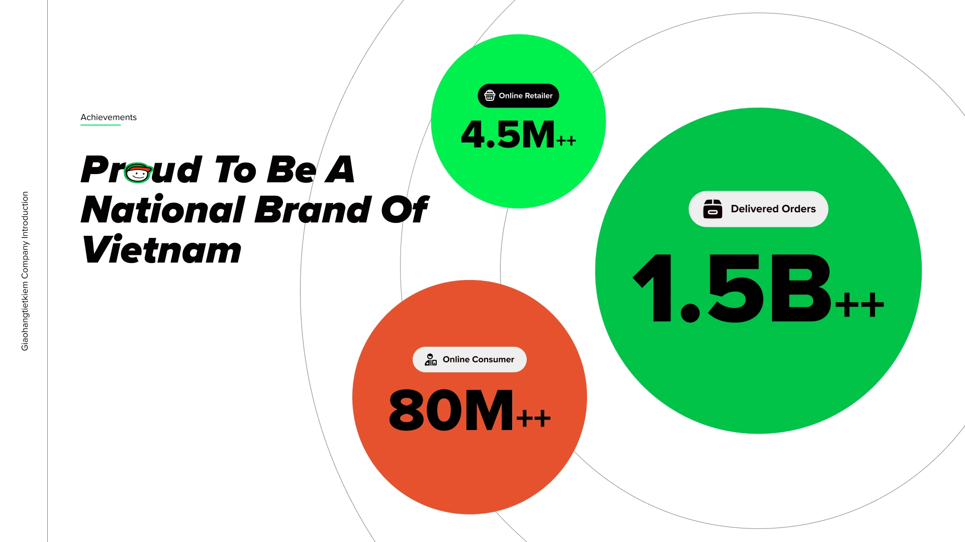
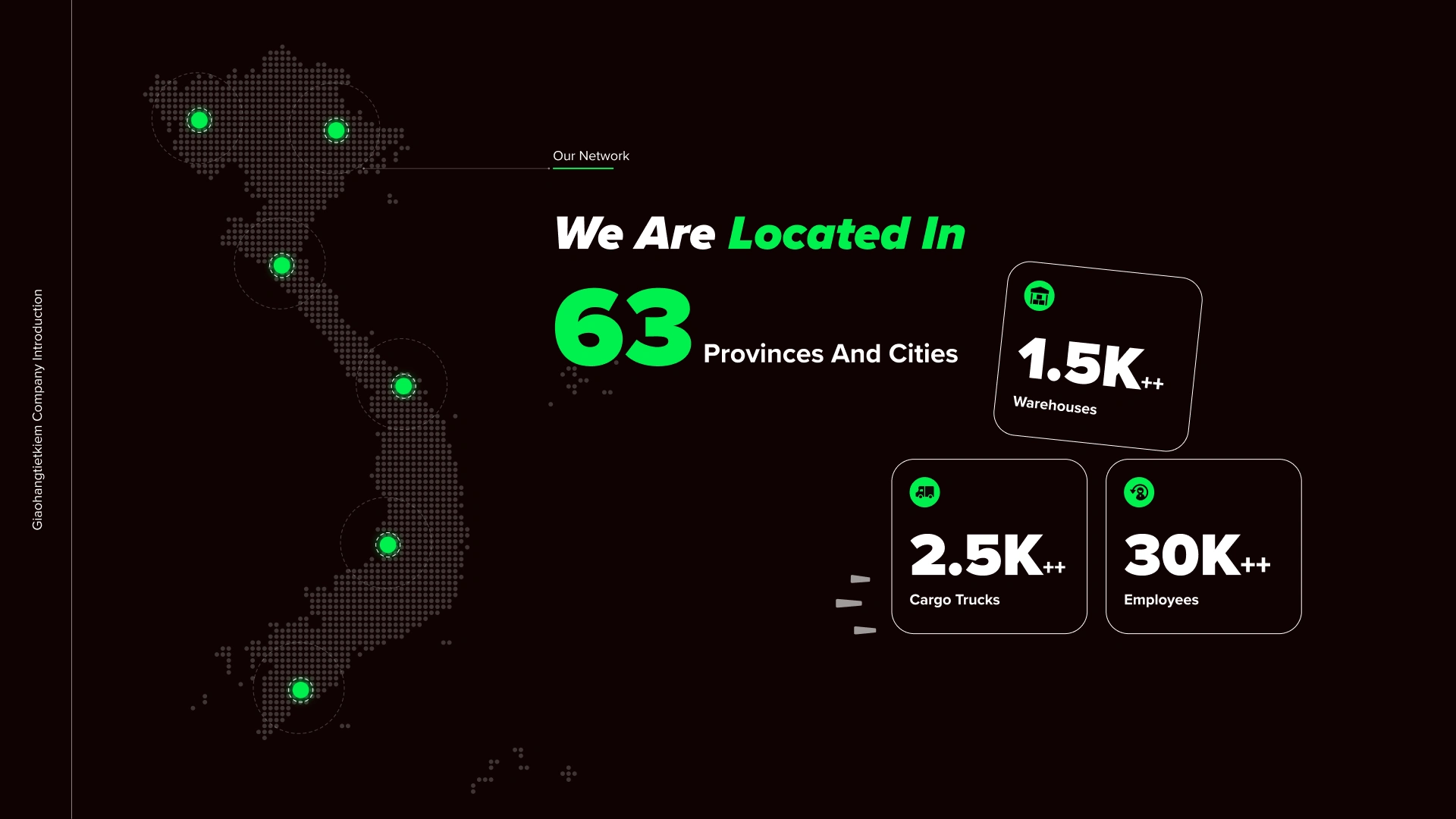
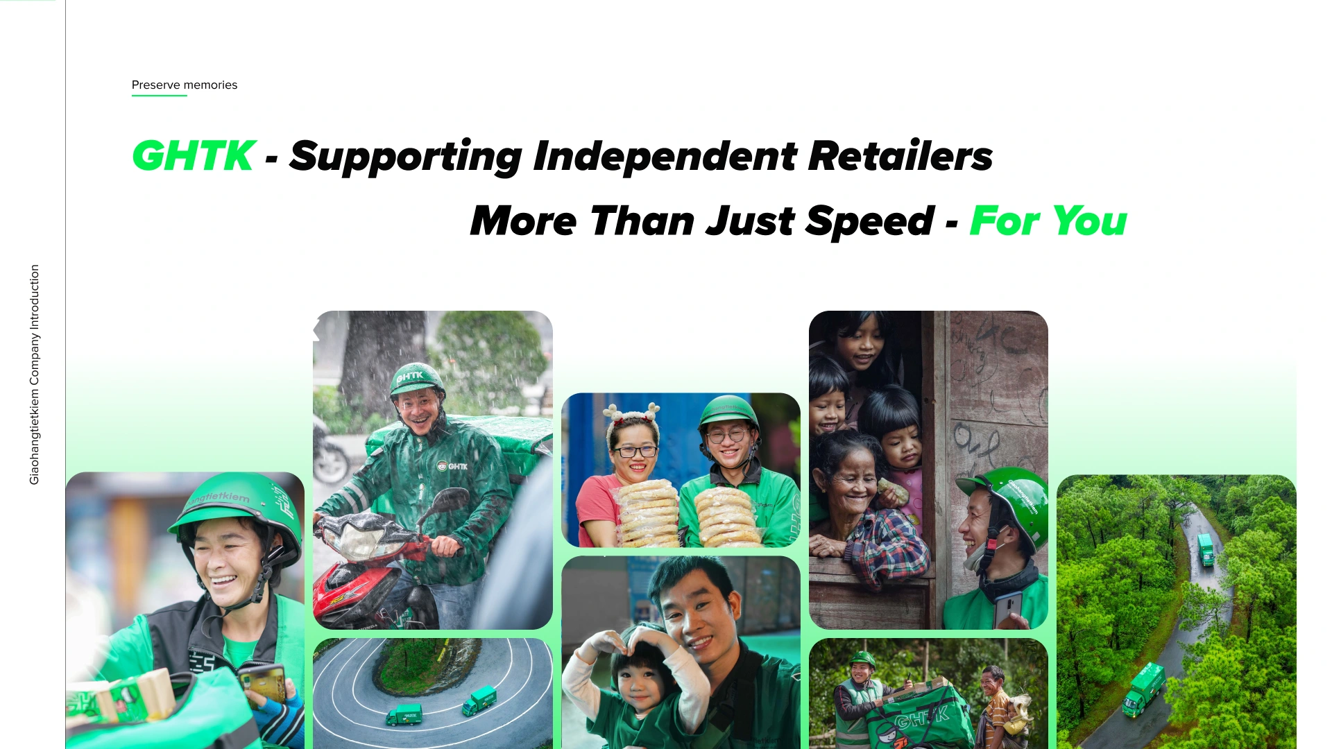
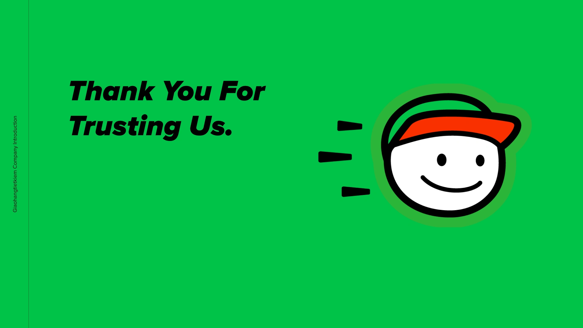
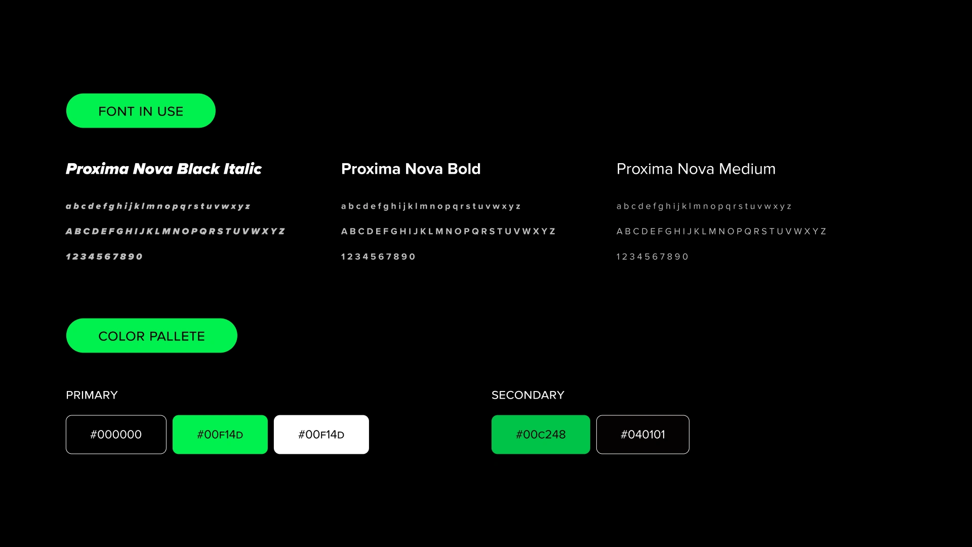
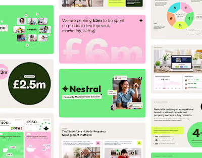
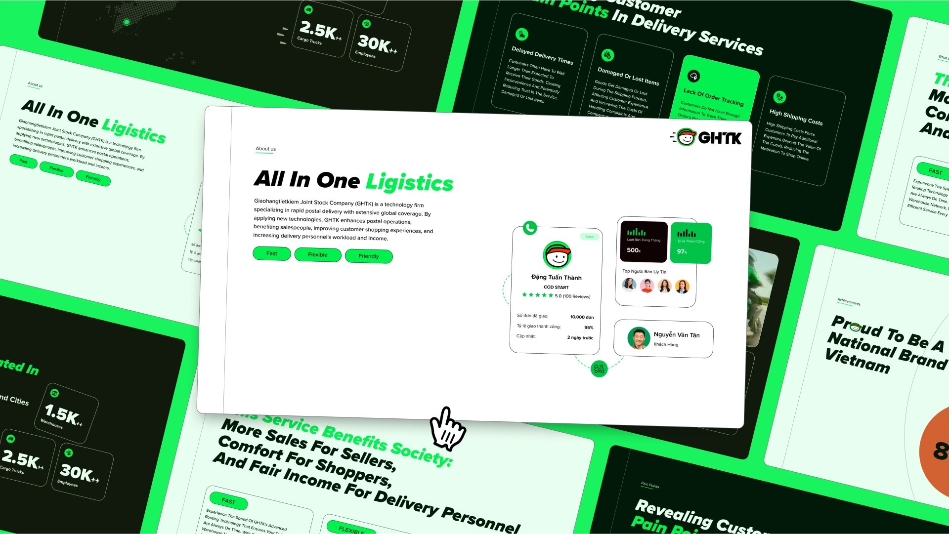
The design features a minimalist style, bold italic fonts for brand personality, and neon green accents for visual impact.
Likes
0
Views
5
Timeline
Mar 11, 2024 - Apr 1, 2024


Context & Challenge
Following a rebrand, our client needed their presentation to embody the refreshed brand identity. The challenge was that the existing deck felt fragmented: the content lacked logical flow, the hierarchy of information wasn’t clear, and the visuals did not reflect the new personality. This created a risk of misalignment and reduced impact when presenting to their target audience.
Approach & Solution
To solve this, I reorganized the material into a clear narrative structure, ensuring a logical progression of ideas and highlighting key messages. The content was streamlined and reframed to speak directly to the audience’s priorities, making the presentation both persuasive and easy to follow.
Design Execution
Visually, I applied a minimalist style to maintain clarity and sophistication. Bold italic fonts introduced a sense of brand personality, while neon green accents served as strong visual highlights to draw attention and reinforce the identity. This balance of restraint and energy created a polished yet impactful design.
Outcome
The final presentation delivered coherence, clarity, and confidence. It authentically reflected the new identity, resonated with the intended audience, and elevated the overall professionalism of the client’s communications.