Creating an accessible, usable and compelling Injection Site ...
Introduction 🔎
At its core, MyTherapy is a medication reminder application, this means that daily users are getting reminders on their devices about medications that they need to take.
Some of these can be Injectables, and with that comes several other complexities, like for example rotating your injection sites.
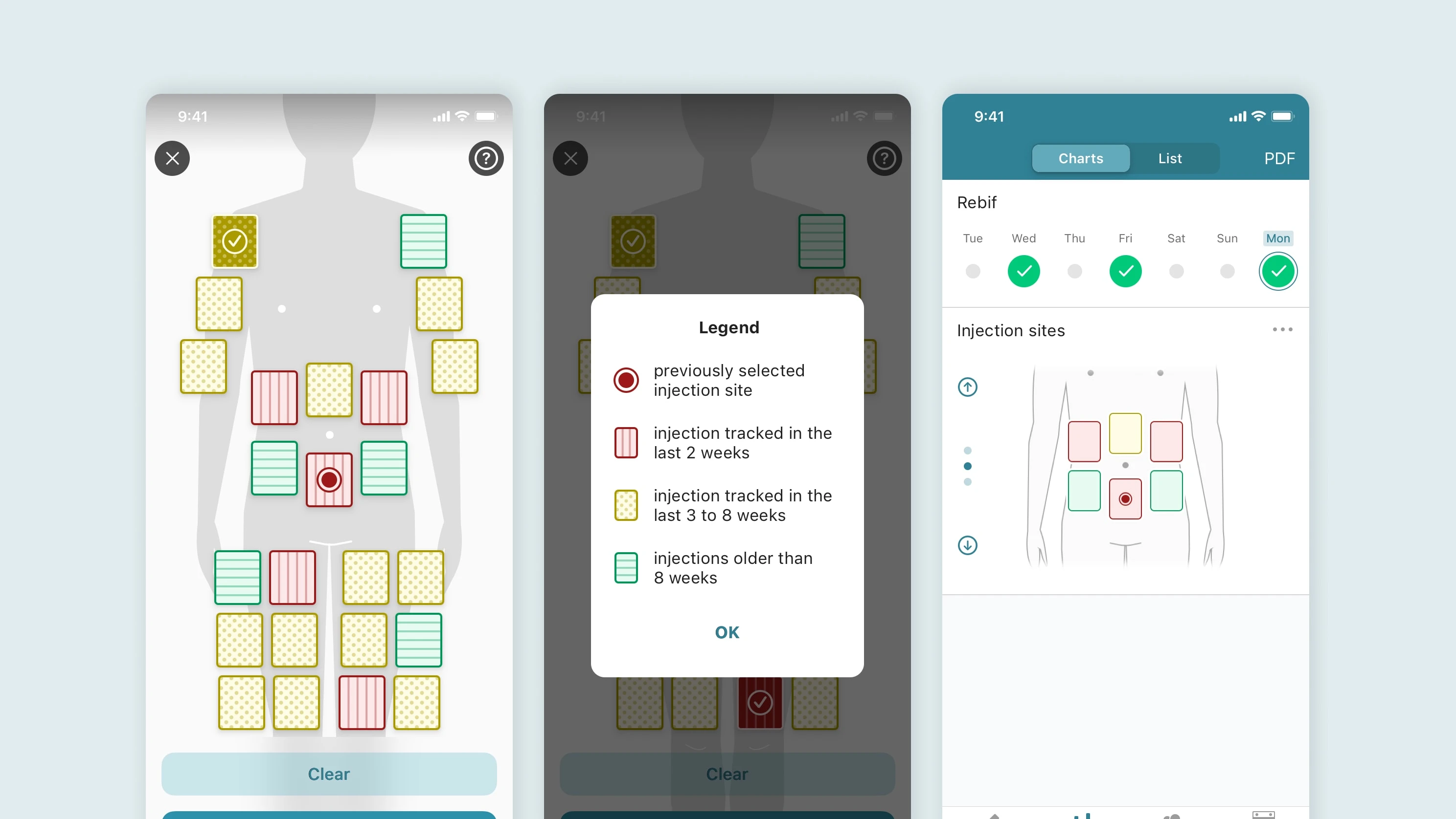
Injection site tracking feature on iOS
About the Project 🤝
Recent studies have shown that injectable medications account for more than 50% of all of the drugs taken.
Due to more people taking injectables, there was a strong desire to add some kind of injection site tracking features for the users.
This feature could potentially help users to ensure proper rotation, and stop a potential fatty lump (lipohypertrophy) from forming.
The initial plan was to only focus on the front side of the body, with planned improvements coming later that included the back side and maybe more sites as well.
Goals/Requirements:
• Feature to work on both platforms (iOS and Android)
• Feature must work across devices sizes, from large phones like iPhone Max versions and Samsung + models
• Accessibility was a priority for this feature, since
Project Execution 🛣
While working on the feature we realised we wanted to also ensure full accessibility compliance. During the design phase, I realised early on that traffic light colours that would be used, could easily cause issues for those with red/green colour blindness.
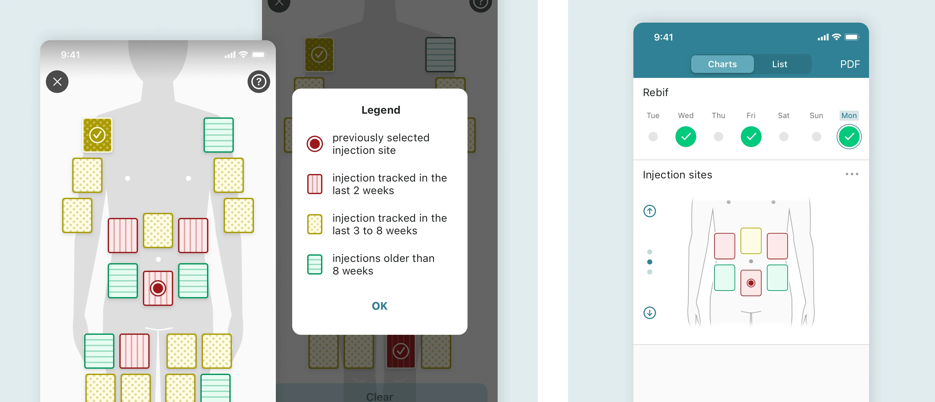
To resolve this, we added the patterns that can be seen in the designs. These patterns were based on common patterns for these same colours across other websites, as well as using some heraldry symbols.
You can read more about how colours and patterns were used in Heraldry here.
The next most important feature in terms of accessibility was how we could ensure voiceover still worked and worked well on a feature like this.
The complexity lay in how this screen was structured, the selection areas are essentially floating and at different x and y values to get them laid out over the correct area on the body.
This meant that we needed to create a focus order that selected the correct area, and also announced a phrase that made sense to those using voice over.
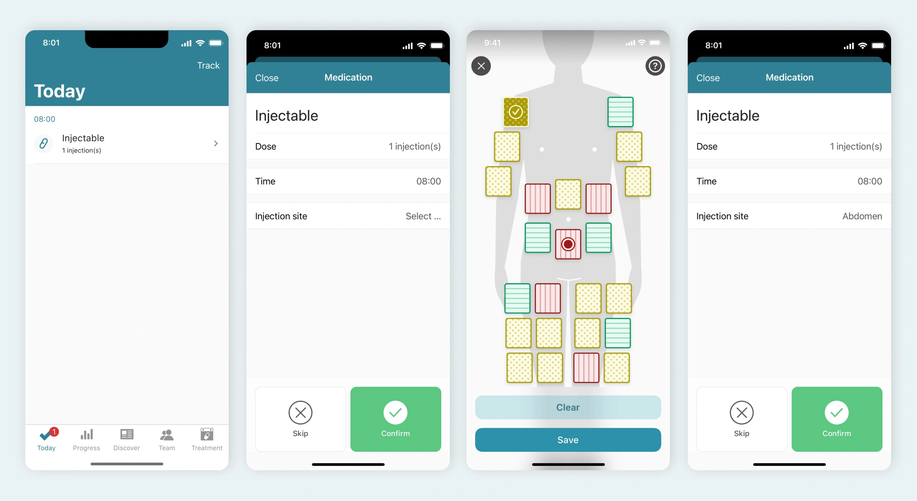
Process of adding an injection site to a medication reminder
Takeaways 📣
We were really happy with what we were able to produce in the team. The feature was switched on for all users with the injection unit on their medication. This saw feature usage go up, along with a lot of positive user feedback.
If we had the chance to go back and work on this feature again, I would have suggested we work on the back side of the body as well. In the original feature we worked on, we only included the front side of the body due to time constraints.
Like this project
Posted Dec 2, 2022
Users are taking their medications as injectables, this is how we added site tracking
Likes
0
Views
13
Clients

smartpatient


