End-to-End E-commerce User Journey Design for Essenza
Lawrencia Benedicta
Essenza , End - to -End E-commerce Design
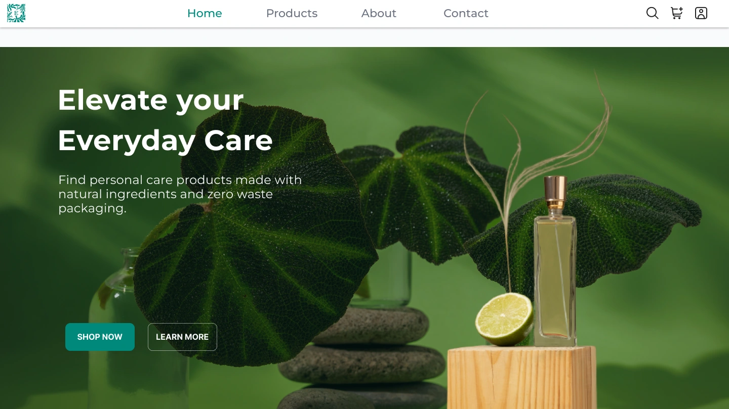
Hero section
Overview
Most personal care brands focus heavily on aestheticsb ut fall apart when it comes to the actual buying experience.
For Essenza, I didn’t just design a landing page
I designed a complete user journey:
Landing page (light & dark mode)
Onboarding flow
Input and form experience
Home/product browsing
Product detail page
Checkout flow
Order tracking
The goal was simple:
Create an experience that feels calm, clear, and easy to move through from discovery to delivery.
Why section
The Problem
While looking at similar e-commerce experiences, I noticed a pattern:
Users land on beautiful pages but don’t know where to go next
Onboarding feels unnecessary or confusing
Product pages lack clarity or trust
Checkout feels long and stressful
After payment, users are left in the dark
So the real problem became:
How do we design an experience that doesn’t just attract users but actually guides them all the way through?
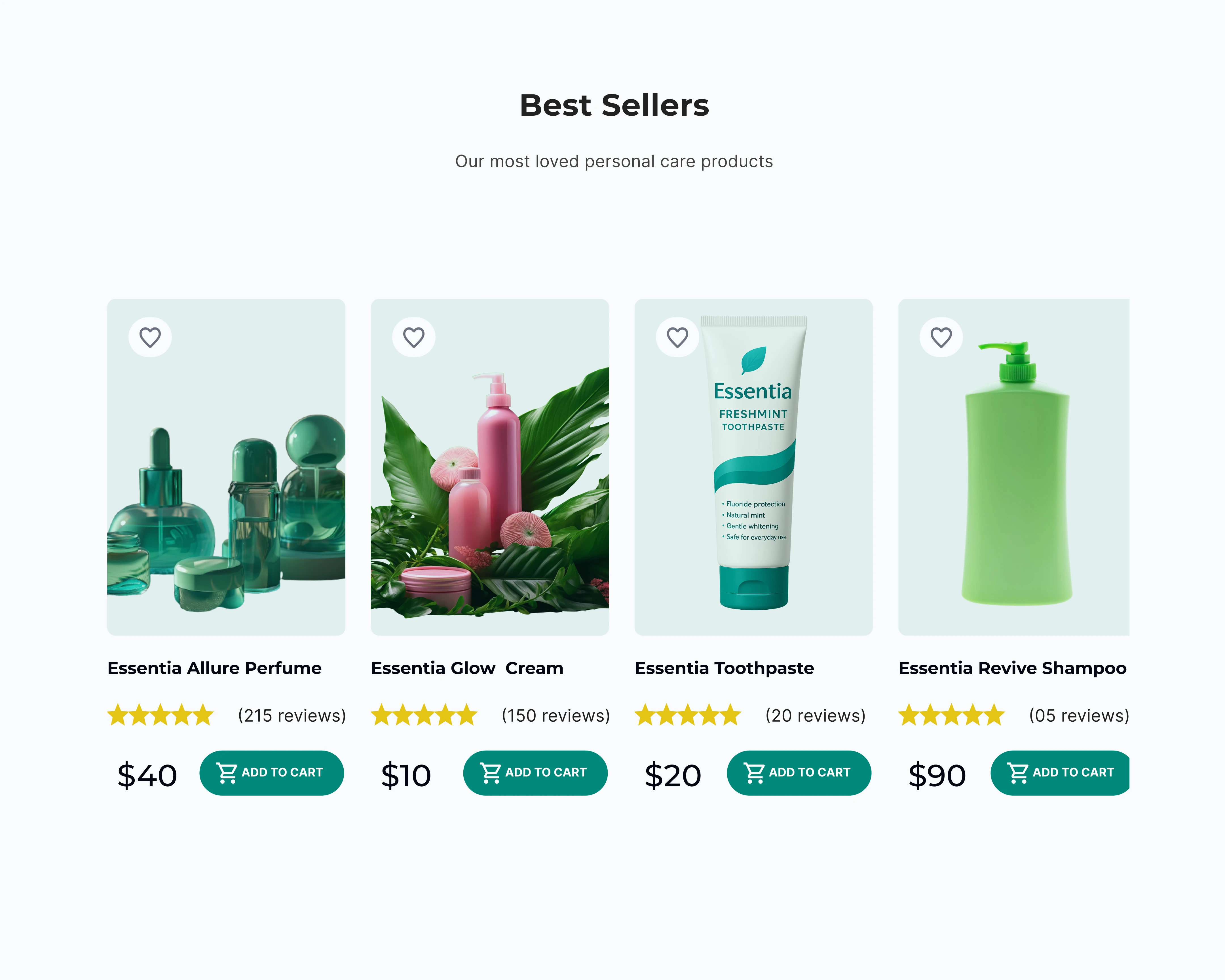
Best seller
The Goal
This project focused on:
Designing a frictionless shopping journey
Making every step feel intentional and connected
Reducing confusion across key flows
Building trust at every stage
Supporting both visual appeal and usability
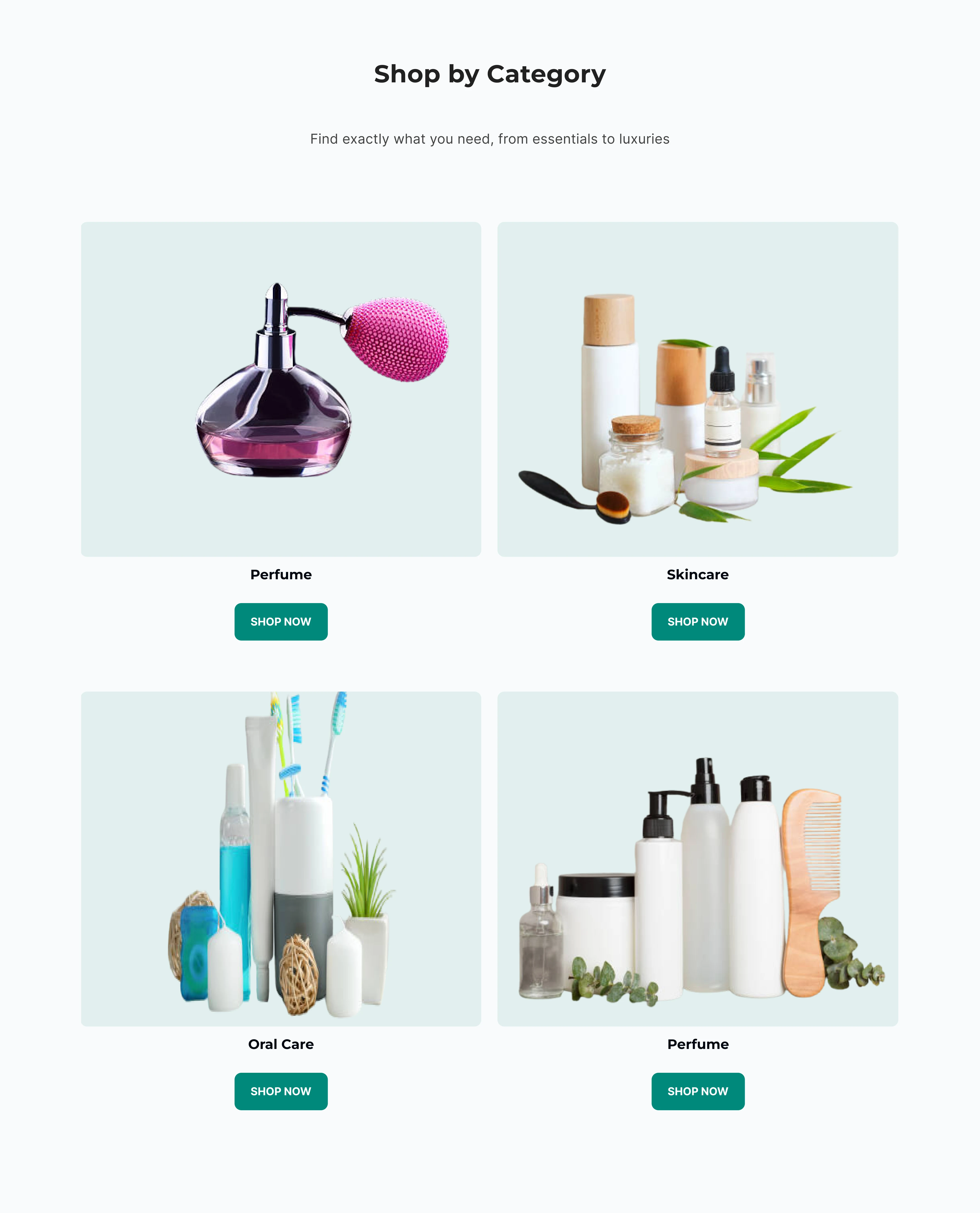
category section
My Approach
Instead of treating each screen separately, I approached this like a system.
Every screen answers a question:
Landing page → Why should I care?
Onboarding → Is this for me?
Home → What can I explore?
Product page → Can I trust this?
Checkout → Is this easy and safe?
Tracking → What’s happening with my order?
This helped me design with flow, not just visuals
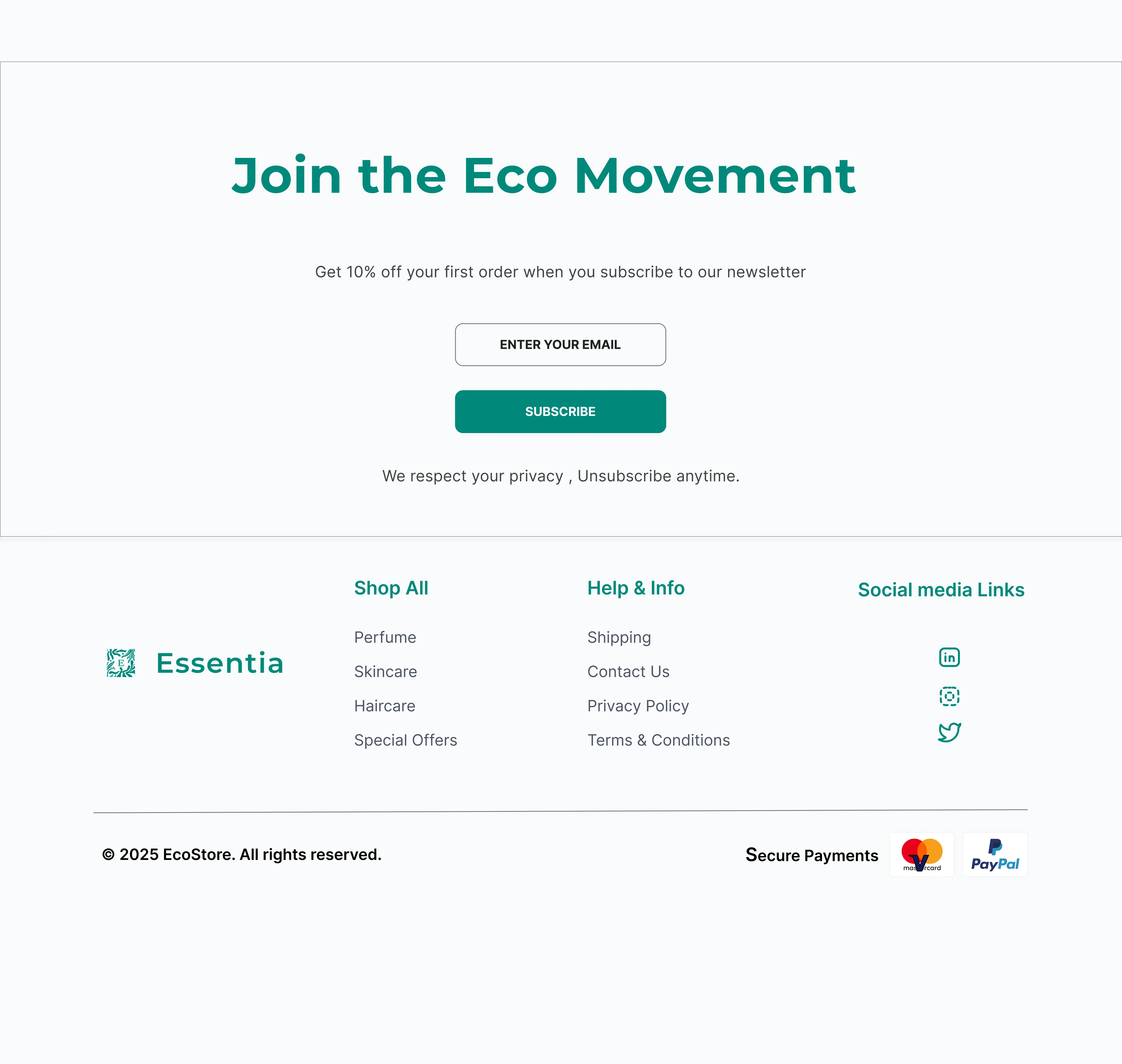
Footer section
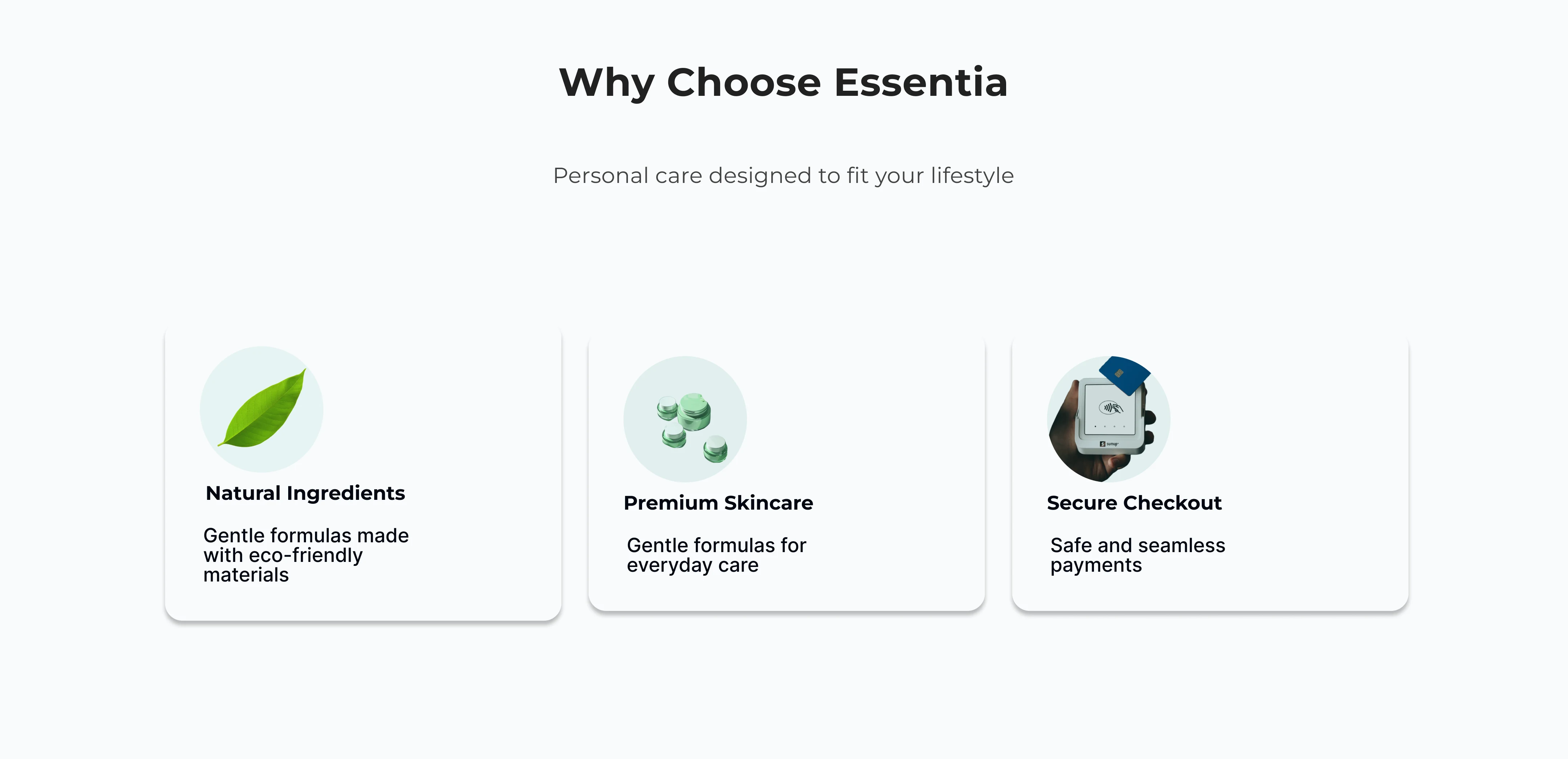
Visual Language
Soft greens → natural and organic feel
Clean typography → readability first
Generous spacing → reduces overwhelm
Subtle shadows → depth without distraction
The goal was:
Calm interface + confident structure
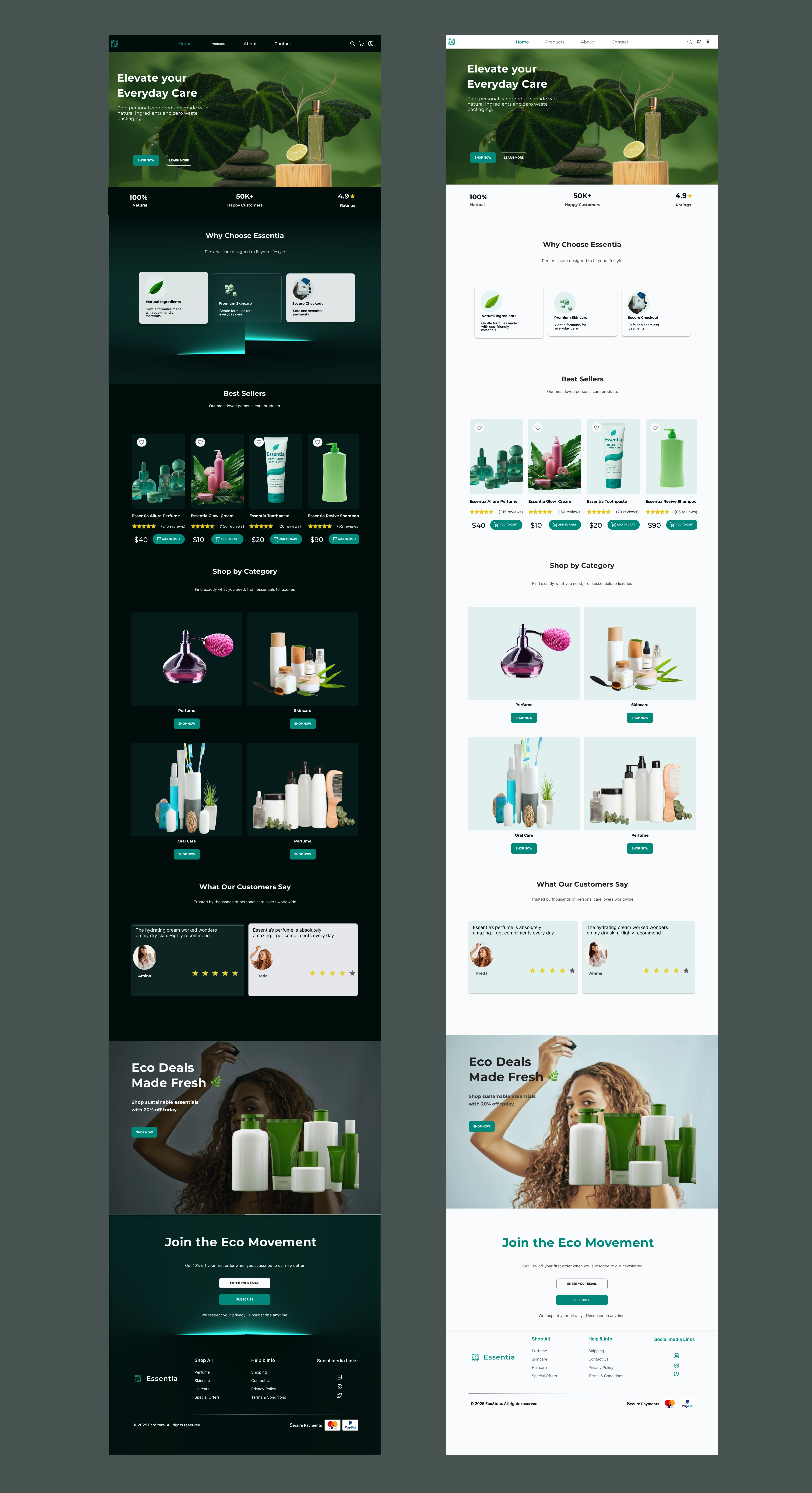
landing page in light and dark mode
Light & Dark Mode
I designed both modes intentionally — not just as a visual switch, but as a usability choice.
Light mode → clean, airy, product-focused
Dark mode → more immersive, modern, reduced eye strain
This gives users flexibility depending on context and preference.

Key Flows & Solutions
1. Landing Page — Clear First Impression
Problem: Users land but don’t immediately understand the value.
Solution:
Strong hero section with clear messaging
Immediate CTA
Supporting trust indicators (ratings, benefits)
Designed to answer in seconds:
“What is this and why should I stay?”
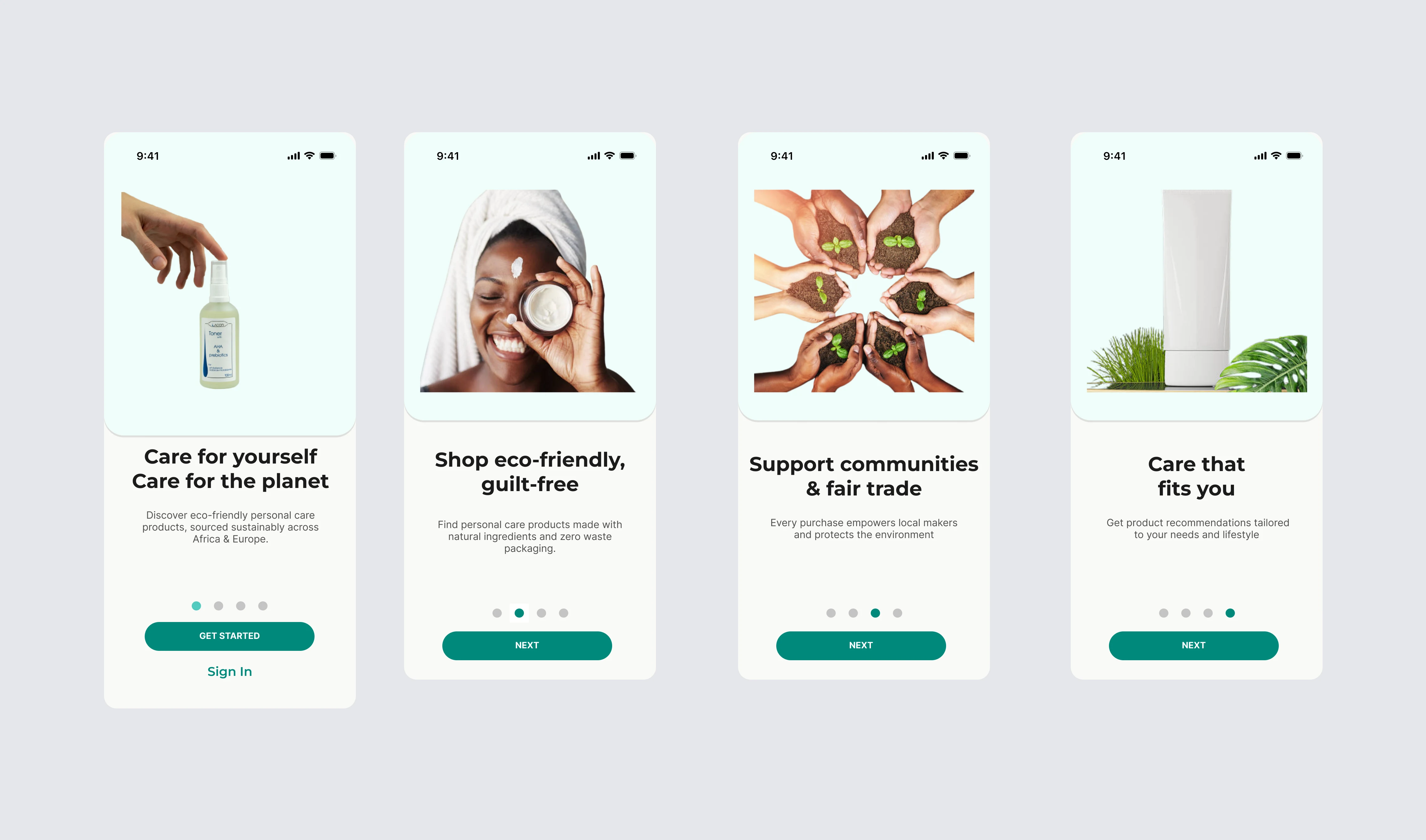
Onboarding screen
2. Onboarding Flow — Guided Start
Problem: Most onboarding flows feel unnecessary.
Solution:
Kept it short and purposeful
Focused on user intent (preferences, needs)
Designed it to feel like guidance, not friction
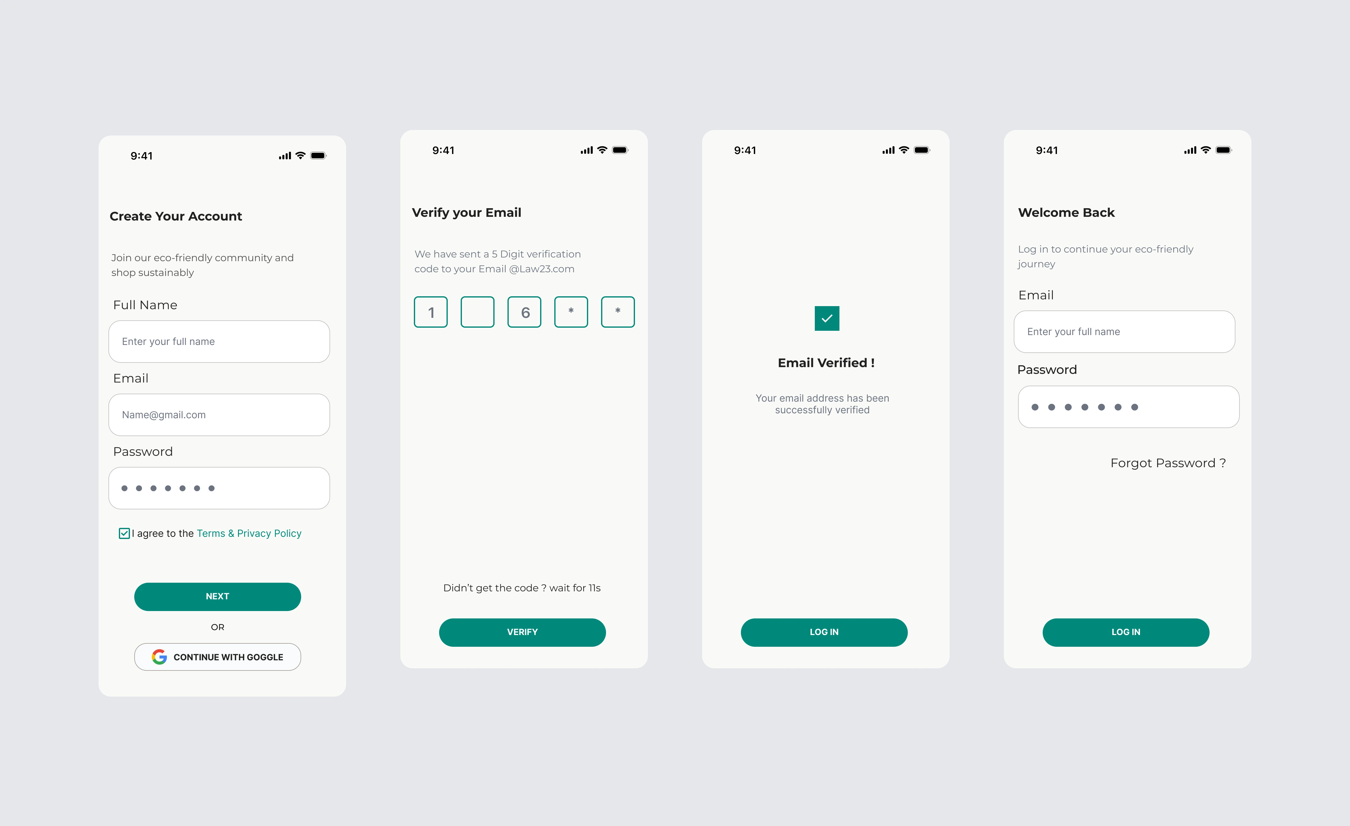
inpur form field
3. Input & Form Fields — Reducing Friction
Problem: Forms are where users drop off.
Solution:
Clean, minimal input fields
Clear labels and spacing
Reduced cognitive load
The goal:
Make filling forms feel effortless
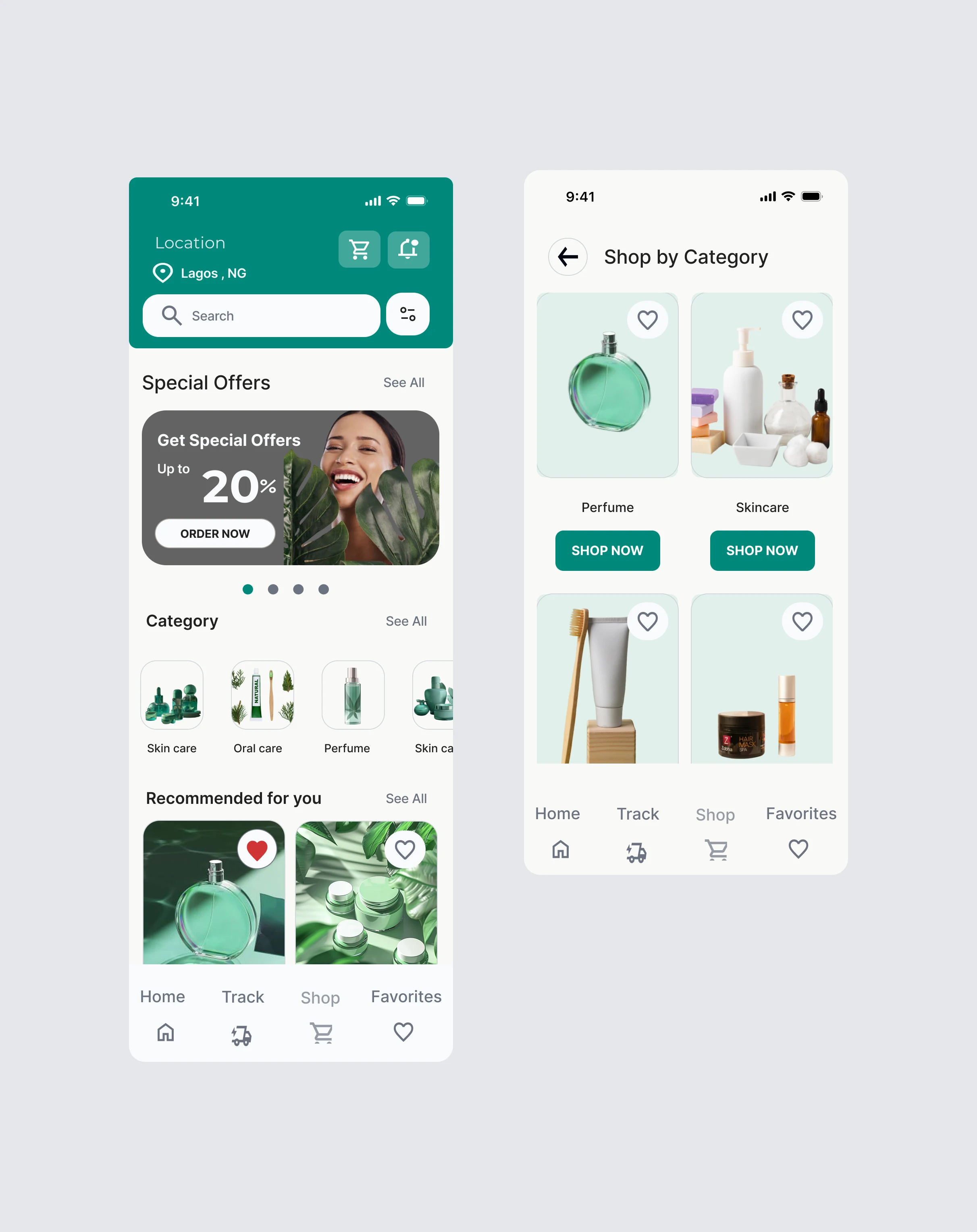
Home page
4. Home Screen — Structured Exploration
Problem: Too many options overwhelm users.
Solution:
Organized product categories
Clean layout for scanning
Focus on best sellers and highlights
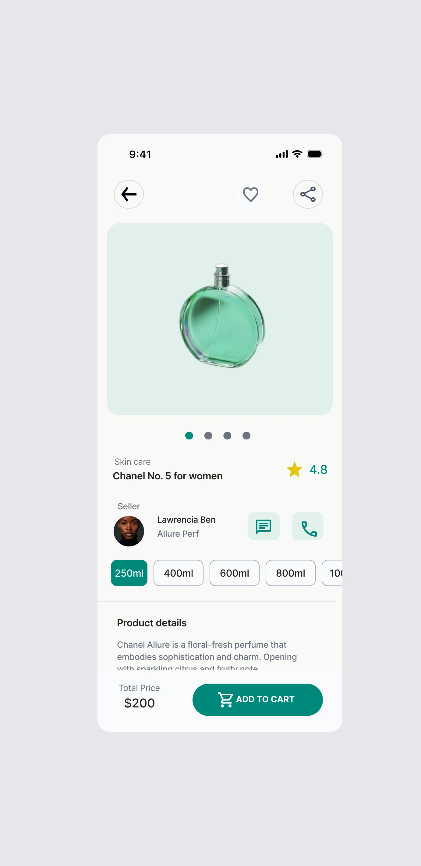
5. Product Detail Page — Building Trust
Problem: Users hesitate before buying.
Solution:
Clear product visuals
Pricing + ratings upfront
Simple, readable information
Designed to answer:
“Is this worth buying?”
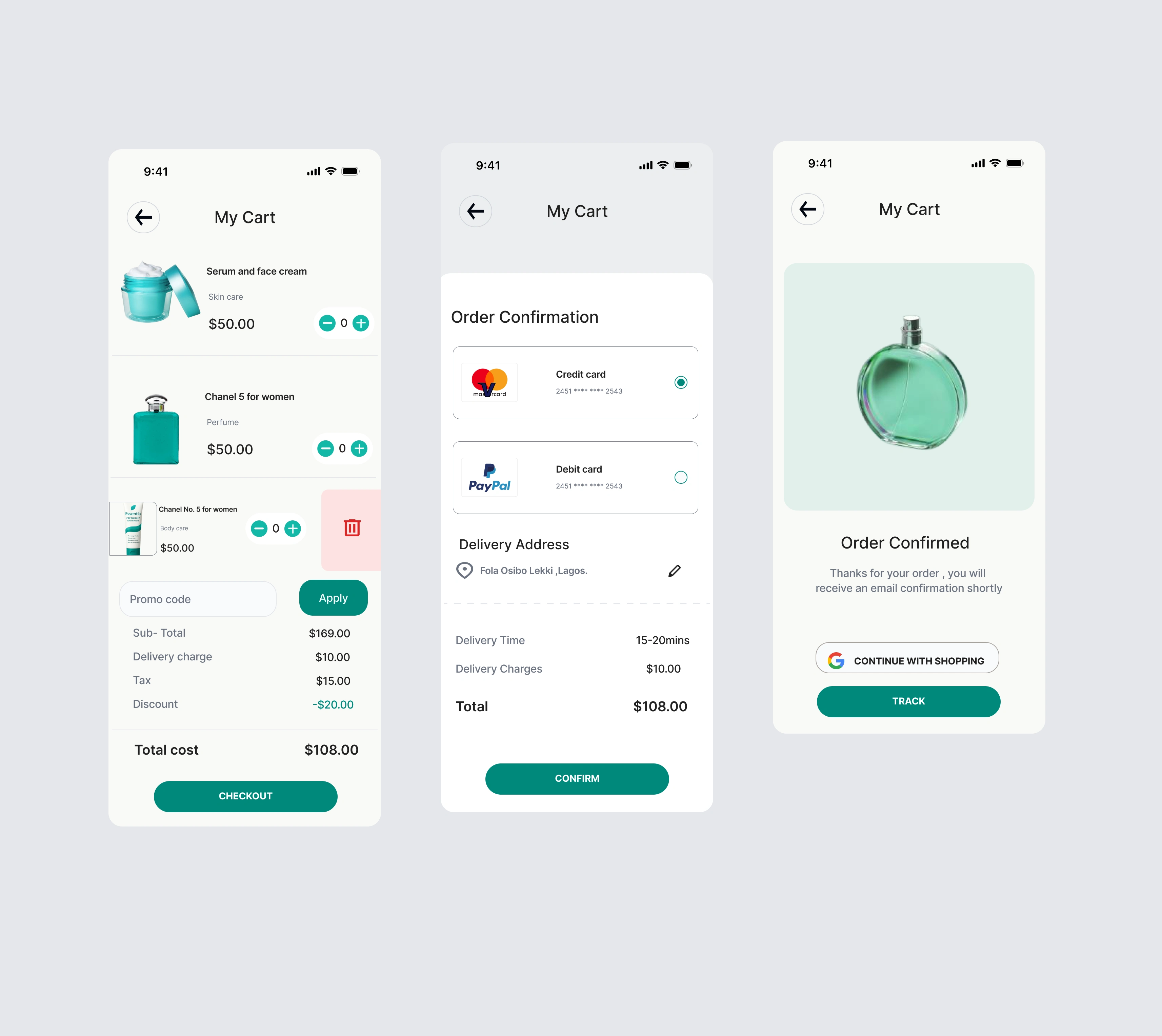
6. Checkout Flow — Removing Stress
Problem: Checkout is often long and confusing.
Solution:
Simplified steps
Clear progression
Minimal distractions
Focus:
Speed + clarity = conversion
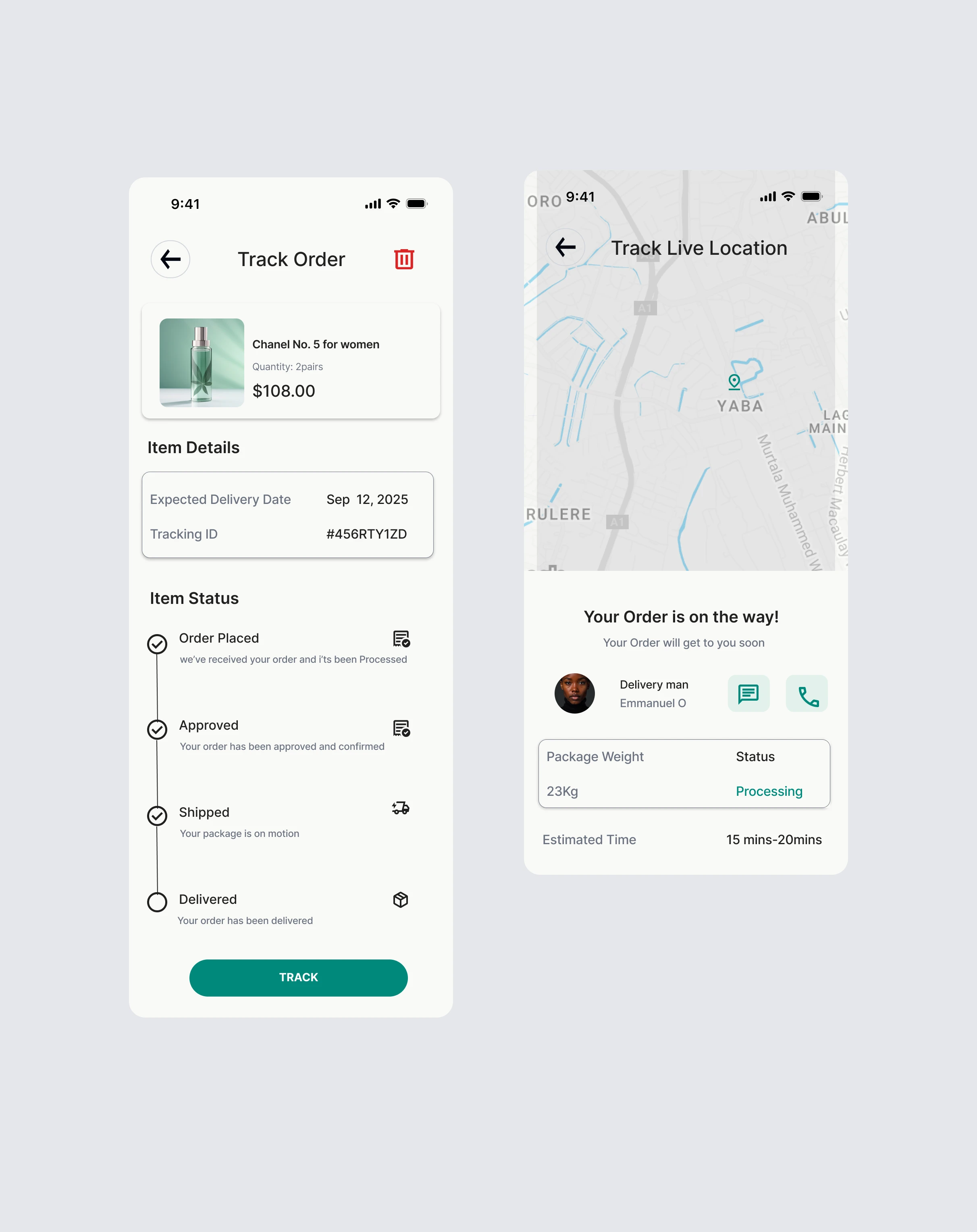
7. Order Tracking — Post-Purchase Experience
Problem: Users feel disconnected after payment.
Solution:
Transparent tracking system
Clear order status
Reassurance after purchase
This builds long-term trust.
Prototype video
What Makes This Different
This project isn’t just about UI screens.
It’s about:
Designing connections between screens
Thinking about user movement, not just layout
Solving real drop-off points in e-commerce
Challenges
1. Keeping everything consistent
Designing multiple flows meant ensuring:
Visual consistency
UX consistency
Interaction clarity
2. Balancing simplicity with functionality
Too simple → lacks depth
Too complex → overwhelms users
So every screen had to feel:
Simple but complete
Outcome
The final result is a complete e-commerce experience that:
Guides users from entry to purchase
Reduces friction across key touchpoints
Feels calm, modern, and trustworthy
Supports real-world usability
Let’s Work
If you’re building:
An e-commerce product
A digital shopping experience
Or a product that needs clear user flows
I design experiences that don’t just look good
they guide users, reduce friction, and convert.
Like this project
Posted Apr 16, 2026
Designed an end-to-end e-commerce user journey for Essenza, enhancing user experience and trust.
Likes
1
Views
5
Timeline
Jan 16, 2026 - Jan 30, 2026
Clients
Essenza