Duolingo App Dark Mode Redesign
Lawrencia Benedicta
Duolingo Redesign
Starting Experience & Subscription Flow ,Dark Mode Concept
A dark mode redesign concept for Duolingo focused on improving the app’s starting experience and premium subscription flow through cleaner visuals, stronger hierarchy, and a more immersive interface.
This redesign explores how Duolingo’s onboarding and premium experience could feel more immersive and visually refined through a dark mode-focused interface.
Rather than redesigning the full product, the project focuses on two high-impact areas that shape user perception immediately:
The starting experience
The subscription flow
The goal was creating a cleaner and more engaging experience while preserving the playful personality that makes Duolingo recognizable.
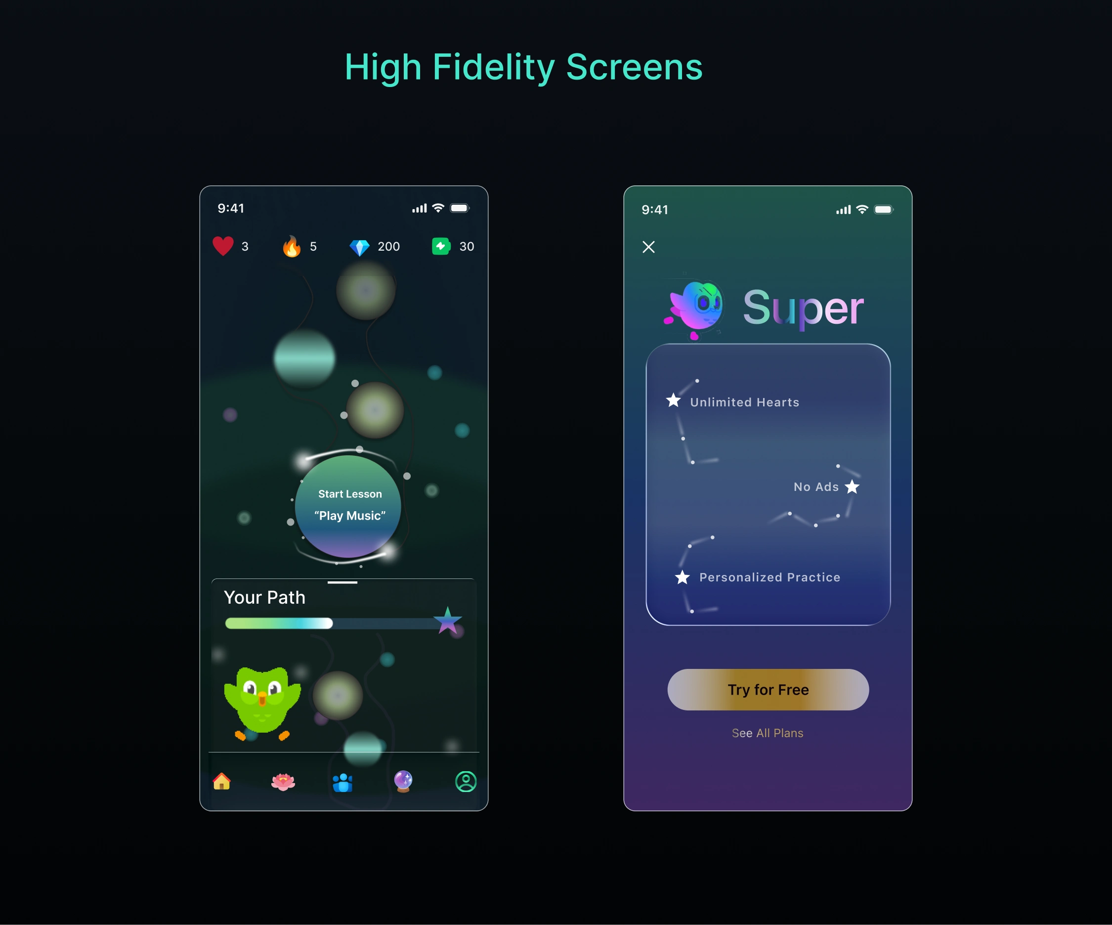
Both screens in dark mode
Project Overview
Duolingo’s playful learning experience has made language education more accessible and enjoyable for millions of users.
However, after reviewing the starting experience and Subscription Flow , there were opportunities to improve:
Visual hierarchy
Information clarity
Emotional engagement
Premium feature presentation
Overall UI consistency
This redesign reimagines those experiences through a modern dark mode interface designed to feel more immersive and visually balanced.
The concept focuses on improving first impressions while making the premium experience feel more valuable and engaging.
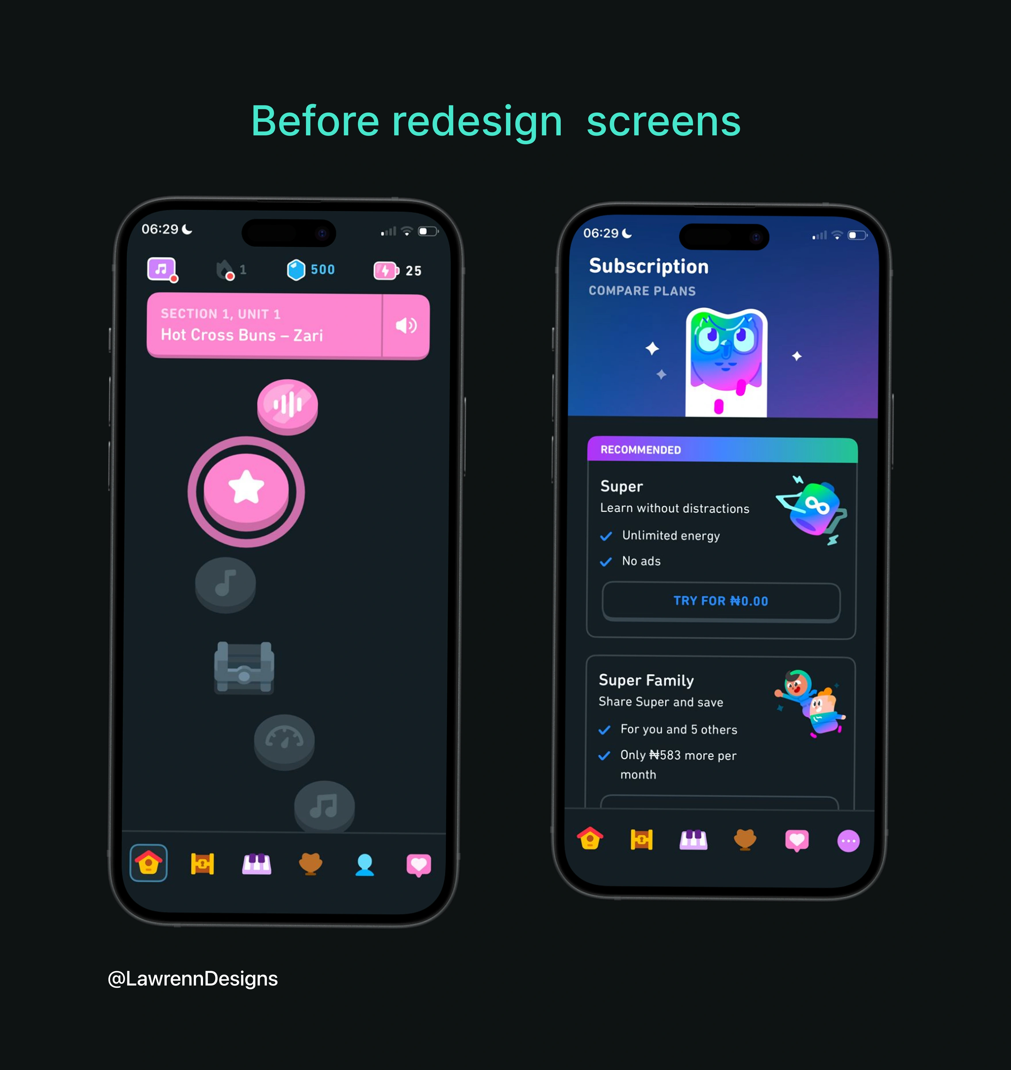
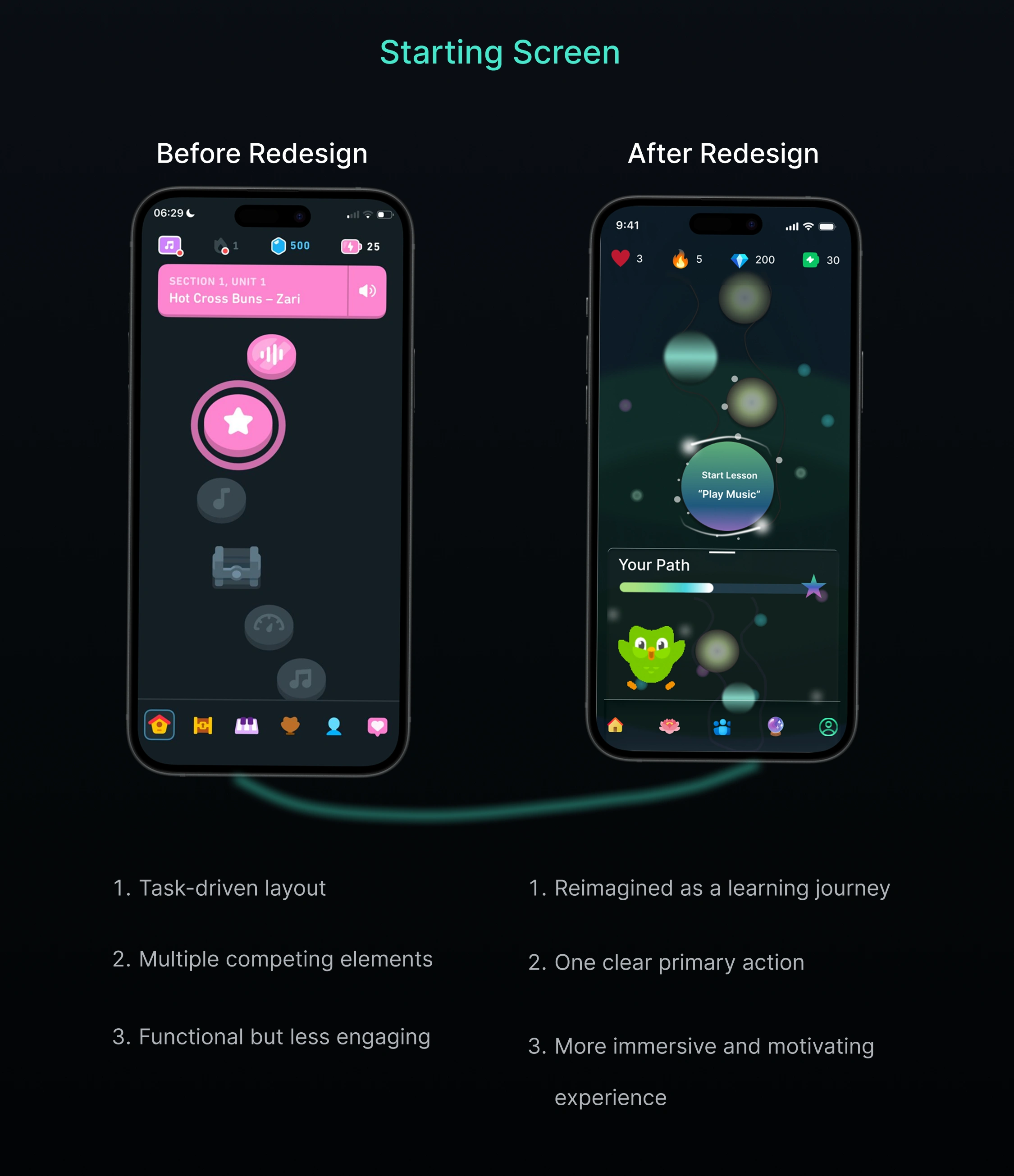
Before redesign screens
The Problem
The original starting and subscription experience felt functional , but visually there was room for a more immersive and premium presentation.
Some key issues identified included:
Busy layouts
Weak visual focus
Limited premium emphasis
Inconsistent spacing
Lack of stronger emotional engagement
The challenge was redesigning these experiences in a way that feels cleaner and more modern without removing the playful energy users associate with Duolingo.
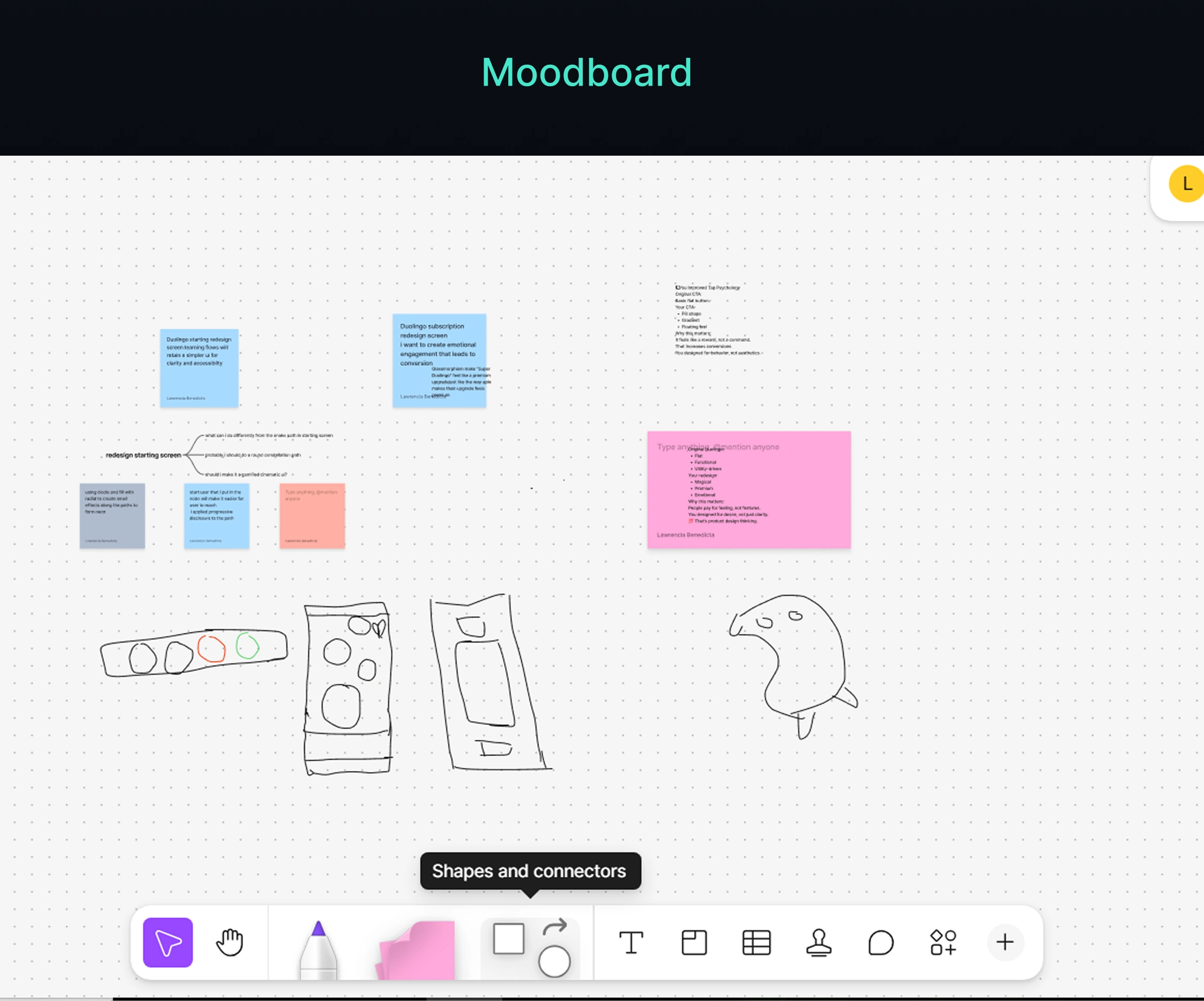
Research & Discovery
The research phase focused on understanding how modern educational and subscription-based apps create engaging first impressions.
One major insight was that dark interfaces can create a stronger sense of immersion when paired with:
Clear visual hierarchy
Controlled color contrast
Focused layouts
Strong typography
Simplified content presentation
The redesign direction focused on balancing Duolingo’s energetic branding with a cleaner and more premium interface structure.
Design Direction
The visual direction combines Duolingo’s playful identity with a darker and more refined interface system.
The redesign focused on creating an experience that feels:
Immersive
Modern
Visually clean
Energetic
Premium
The dark interface helps create stronger contrast for:
CTA buttons
Illustrations
Premium highlights
Typography
Interactive elements
Spacing and layout hierarchy were also refined to reduce visual clutter and improve focus across the experience
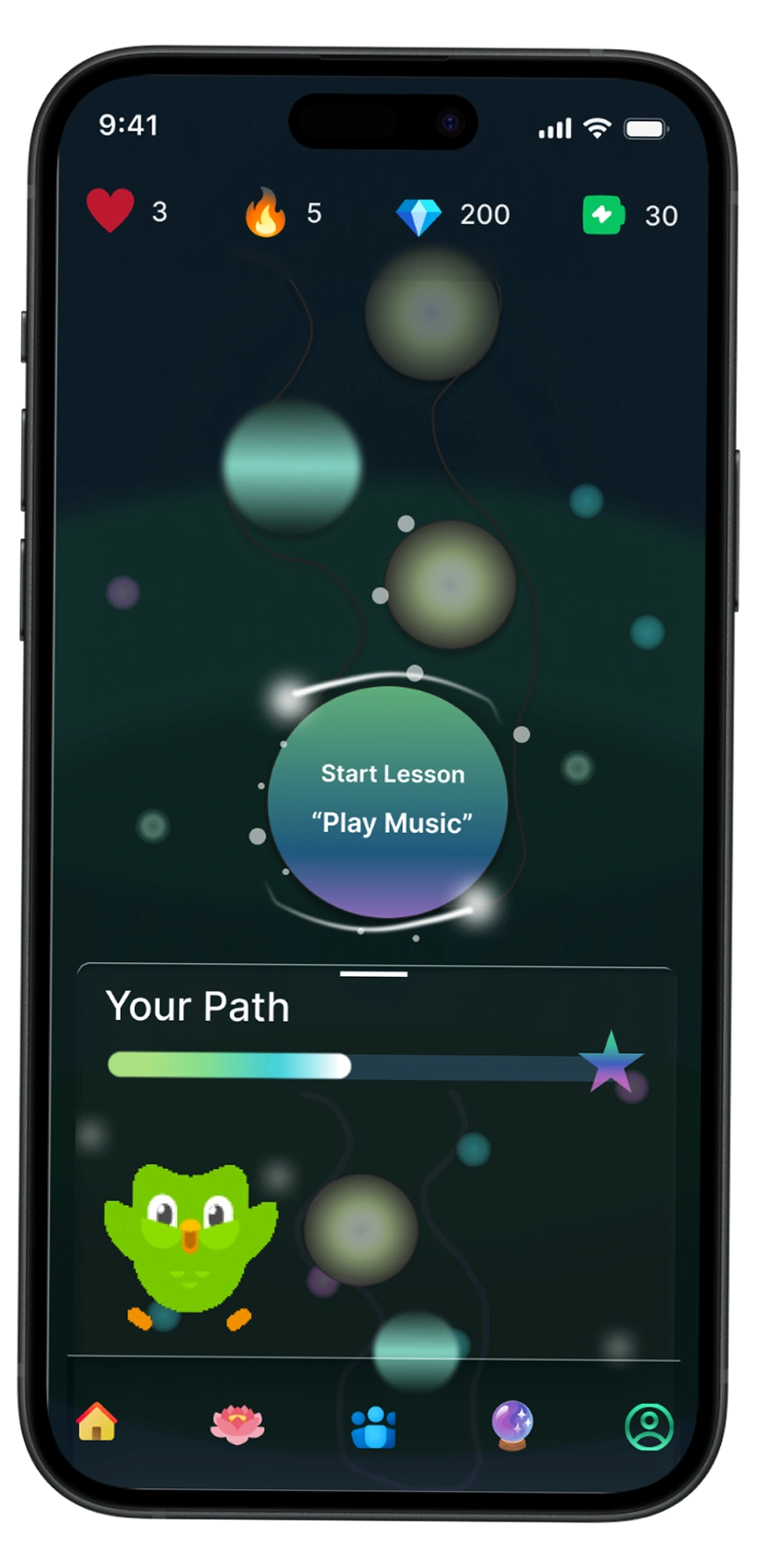
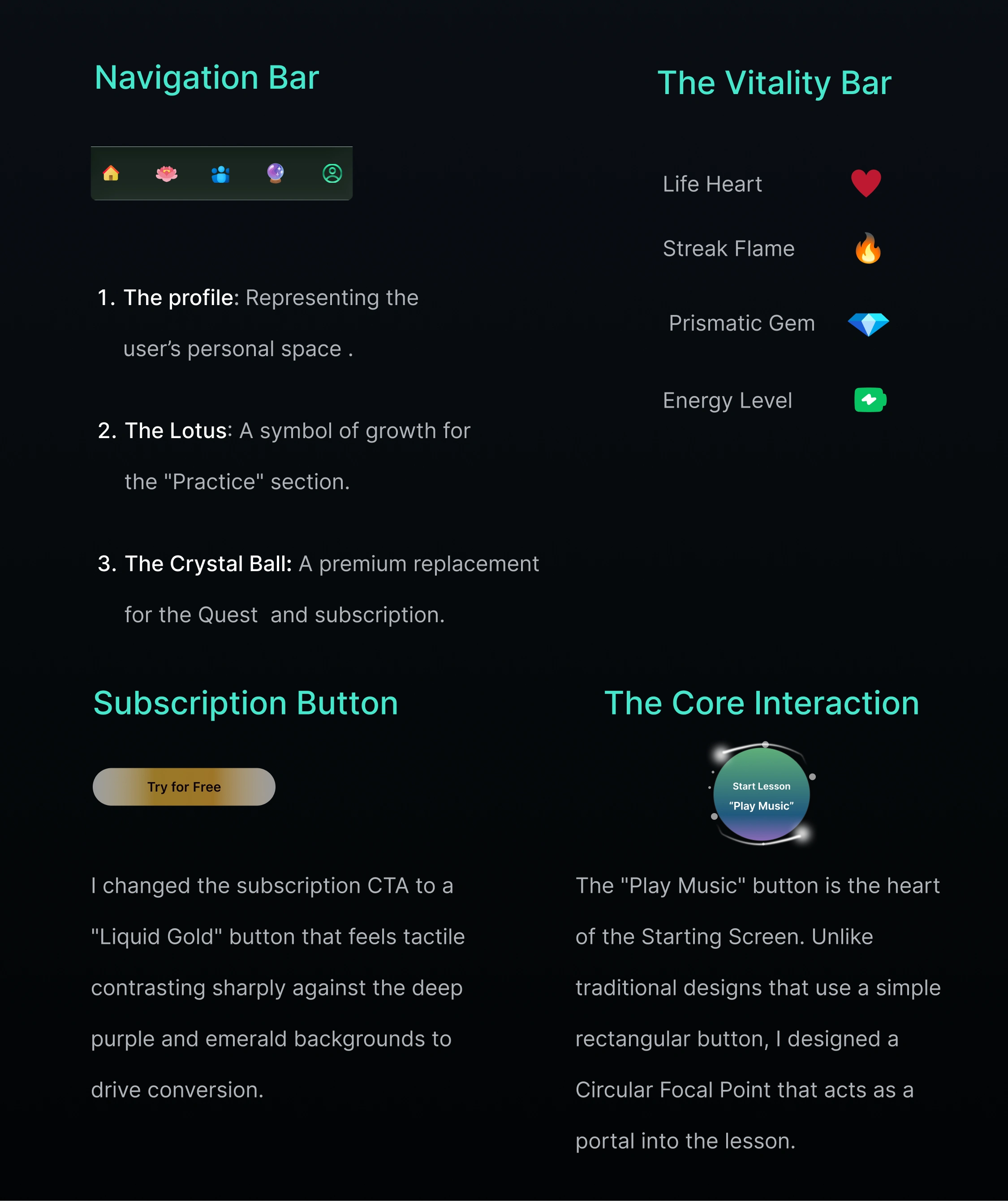
Starting screen
Starting Screen Redesign
The starting experience was redesigned to create a stronger emotional connection from the very first interaction.
The interface was simplified to improve focus while maintaining the fun and welcoming energy of the brand.
Key improvements included:
Cleaner typography hierarchy
Better spacing balance
Stronger CTA visibility
Improved illustration placement
The darker interface also helps key elements stand out more clearly creating a stronger visual impact during onboarding.
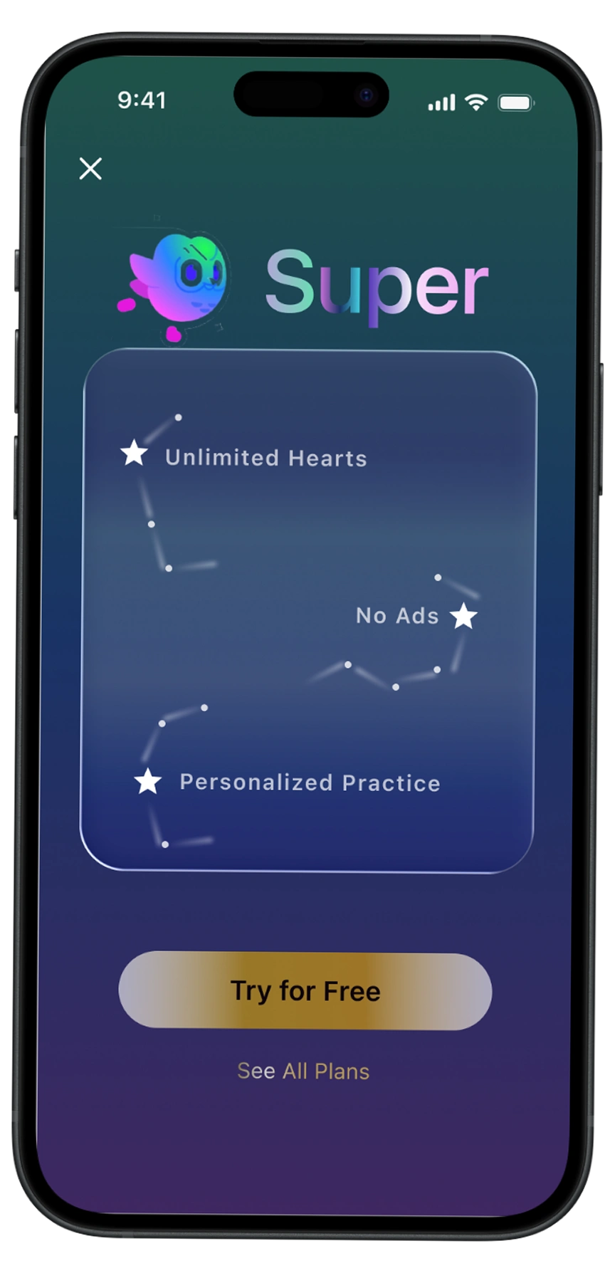
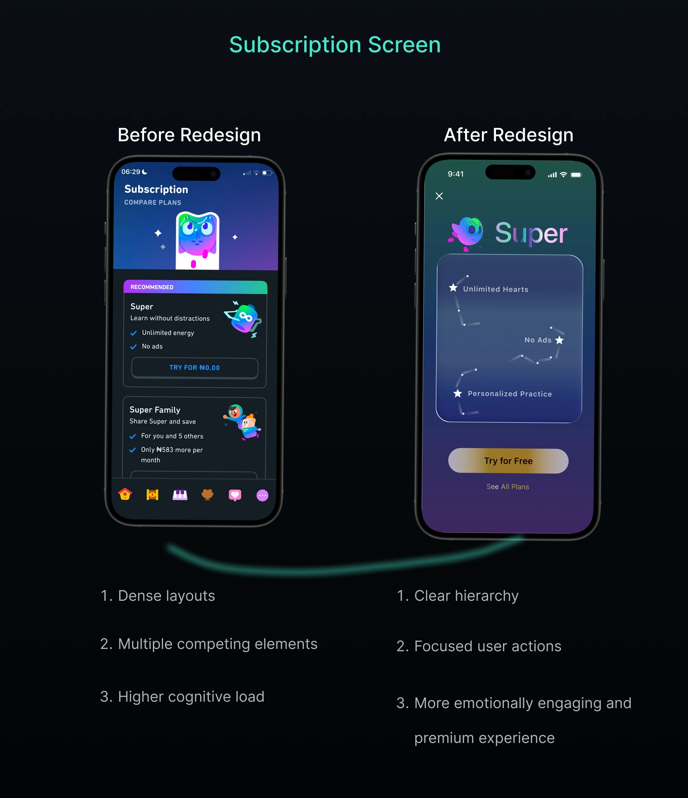
Subscription Screen Redesign
The subscription experience was redesigned to better communicate the value of Duolingo’s premium offering.
The goal was creating a premium flow that feels visually engaging without becoming overwhelming or overly aggressive.
The redesign focuses on:
Cleaner feature presentation
Stronger content hierarchy
Better visual emphasis
Improved CTA placement
Progressive disclosure
The dark mode interface especially helped create a more premium atmosphere while improving focus on upgrade-related actions.
Bright accent colors were used strategically to guide attention toward important actions and feature highlights.
Challenges
One of the biggest challenges was balancing Duolingo’s playful identity with a more refined and immersive dark mode interface.
Another challenge was ensuring the premium flow felt visually elevated without becoming too sales-focused.
A lot of time went into refining:
Layout balance
Visual hierarchy
CTA visibility
Contrast management
Information density
The redesign needed to feel modern while still remaining instantly recognizable as Duolingo.
Final Outcome
The final redesign delivers a cleaner and more immersive dark mode experience for Duolingo’s onboarding and subscription flow.
By improving hierarchy, spacing, and premium presentation, the redesign creates a more engaging and visually polished user experience while preserving the product’s playful personality.
The result balances:
Simplicity
Energy
Premium presentation
Clarity
Brand familiarity
Final Reflection
This project was an exploration of how thoughtful visual refinements can improve first impressions and user engagement in educational products.
Like this project
Posted May 27, 2026
A dark mode redesign for Duolingo, enhancing starting experience and premium flow.
Likes
0
Views
10
Clients
Duolingo