Agrikola – Brand Identity
Quick overview
This project started back in March 2022. The task was to rebuild the client's company image completely from the ground up, including the name.
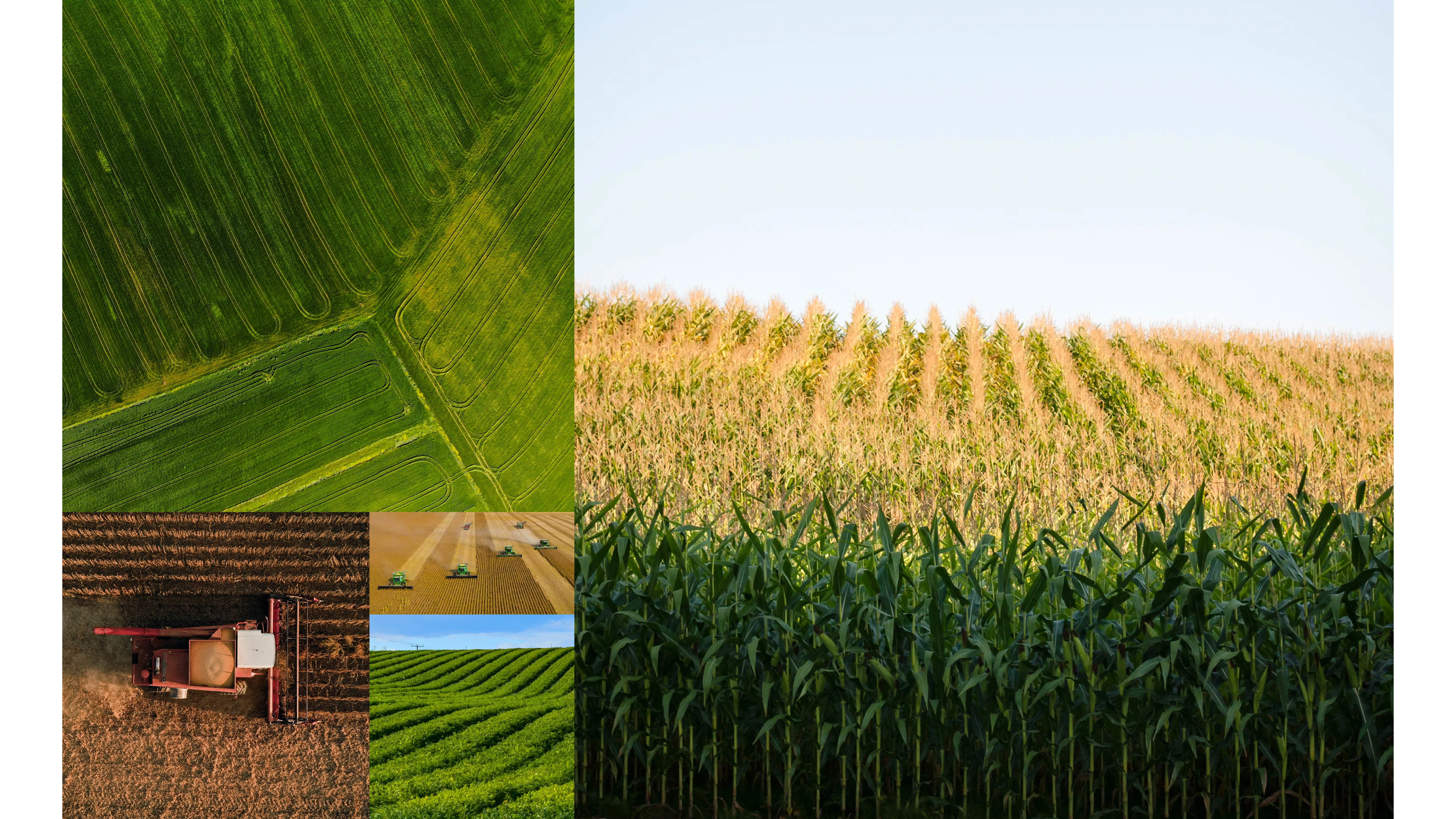
Moodboard that inspired the Brand's logo design.
The client's Vision
One of the main client's requests was to incorporate his love and passion for his craft in the logo mark, to find balance between traditional and modern iconography.
Goals:
• The Brand's field of operations should be easily recognisable at first glance;
• Balance between traditional and modern iconography;
• An easy to remember name with a fresh twist.
Process
After the initial briefing with the client I started working on the project by gathering as much information as possible, mostly from books. I immediately found myself exploring with the Golden Ratio and the result was quite interesting.
Final logo
In the final logo design we can find different elements merged together by the Golden Ratio: the sun, the fields, harvest plants, agricultural machinery's tires.
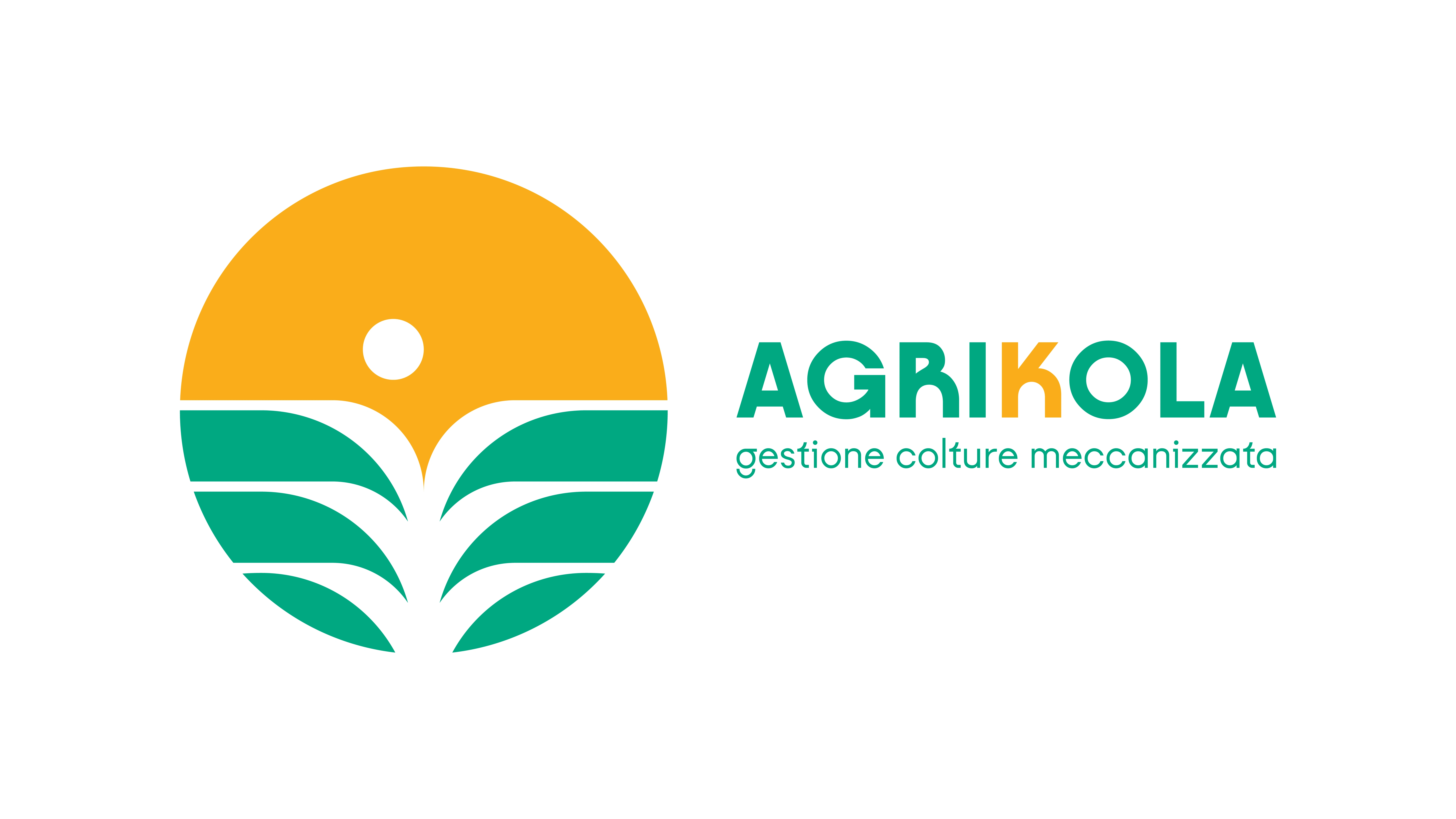
Final Logo Design + Naming
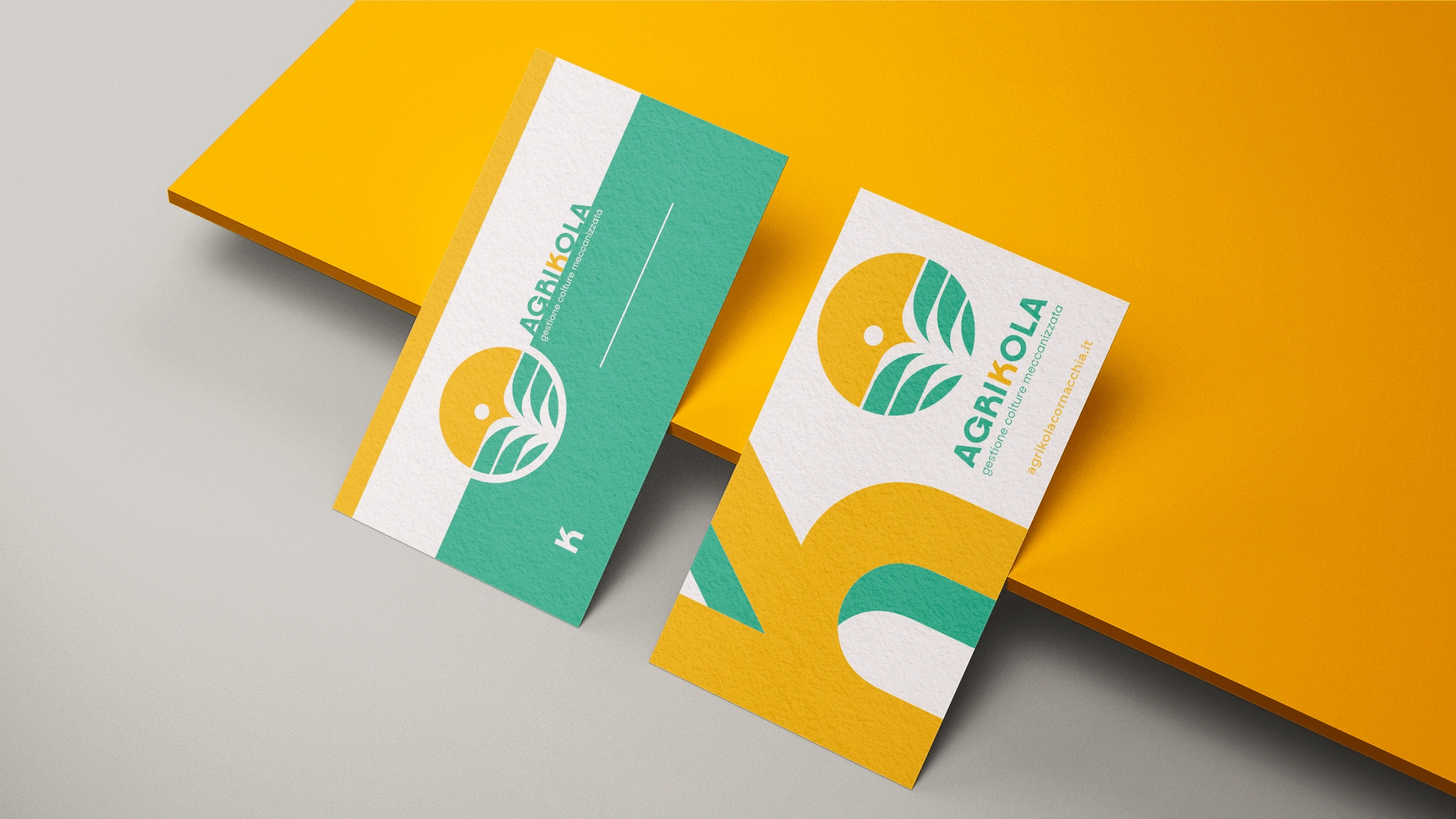
Mock-up
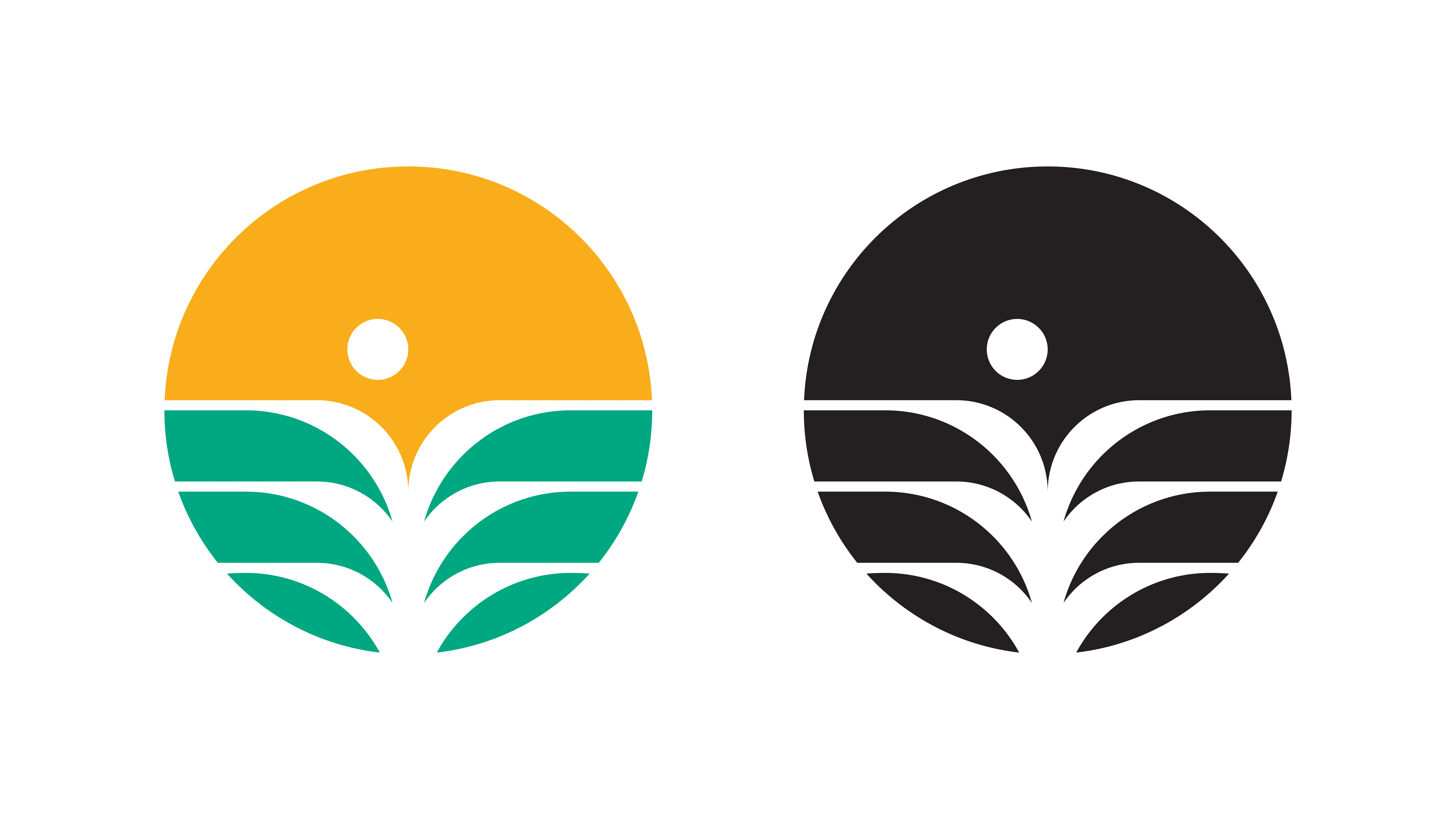
Final Logo Design
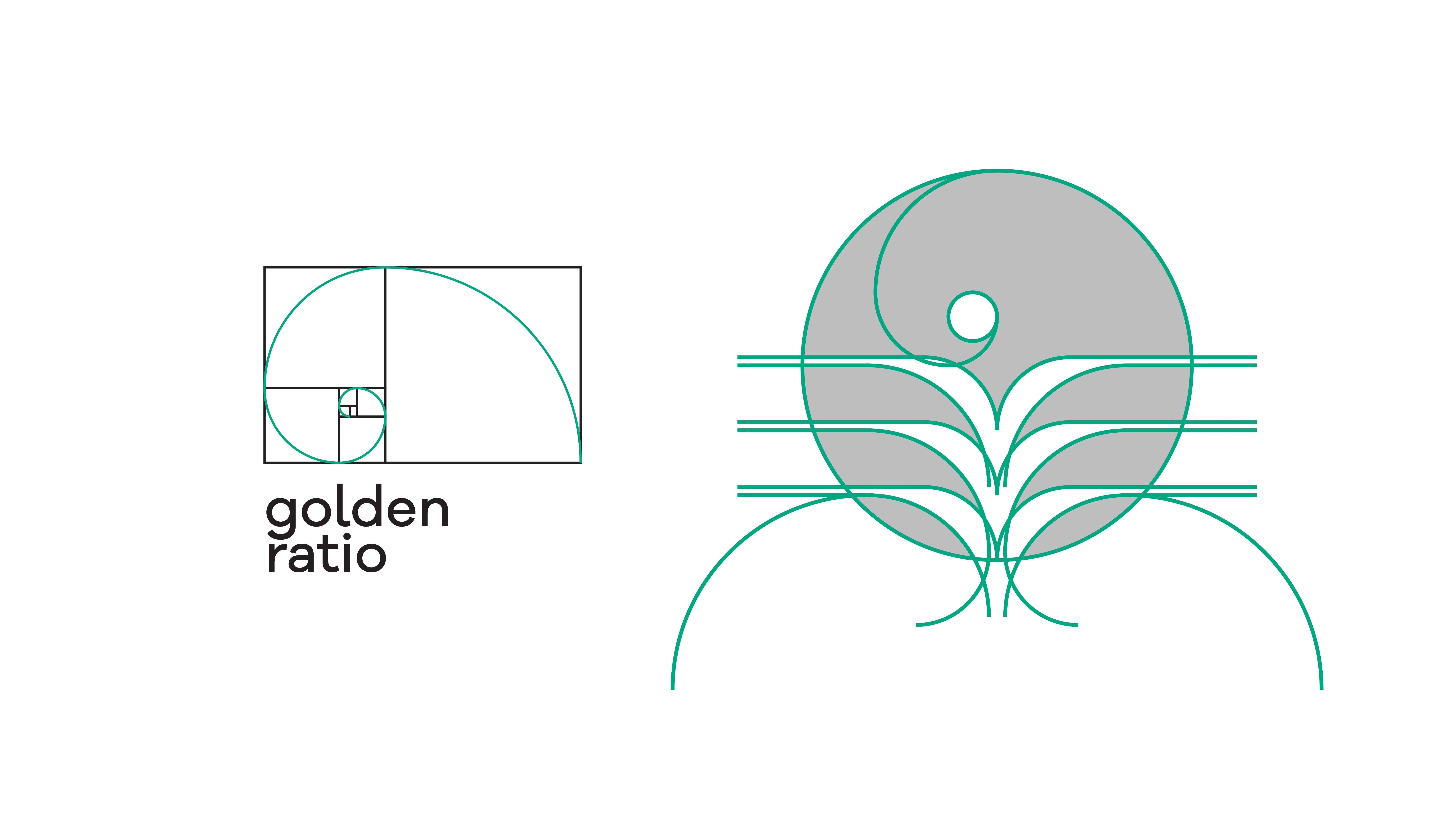
On the left: golden ratio; on the right: final logo design.
Results
The client ended up loving this and other concepts that were presented to them but ended up settling for the version you see above as it best embodied traditional and modern at the same time.
Thank you for viewing my work. If this work inspired you, I would love to hear your thoughts and, who knows, maybe start working together for your next venture!
You can follow me on Instagram for more info!
Like this project
Posted Nov 22, 2022
Agrikola: branding for a modern take on traditional farming.
