
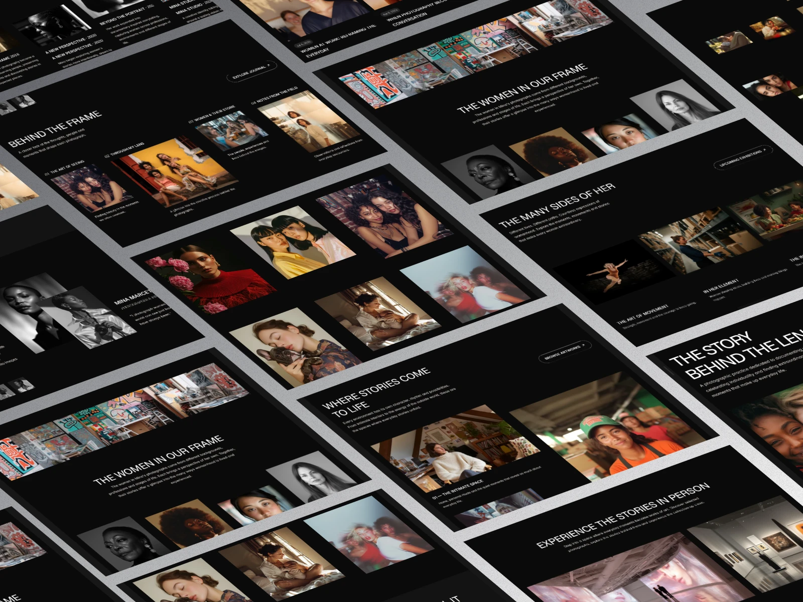
MINA STUDIO
Celebrating women through the art of everyday photography.
Project Overview
Mina Studio is a conceptual photography brand built around a simple but meaningful idea: women deserve to be seen in the fullness of their everyday lives.
The fictional photographer, Mina, documents women in their natural environments, capturing moments of work, movement, creativity, care and personal expression. Her photography finds beauty in familiar experiences and gives artistic attention to stories that might otherwise go unnoticed.
The goal was to develop a visual identity and digital experience that communicates this philosophy while presenting Mina's work as an established fine-art photography practice.
The Challenge
Photography portfolios often rely heavily on conventional portraits, carefully styled images and familiar gallery layouts.
For Mina, I wanted to explore a different approach.
How could a photography website communicate the idea that ordinary women and their everyday experiences deserve the same artistic attention often reserved for fashion, celebrities and fine-art subjects?
The website needed to achieve three things:
1. Communicate Mina's philosophy and artistic perspective.
2. Present a diverse collection of photographs in an engaging, editorial format.
3. Give visitors a reason to explore the stories behind the images and connect with the photographer.
The challenge was to create an experience that felt artistic and visually distinctive without allowing the design to overshadow the photography.
Brand Positioning
I developed Mina Studio around the idea of celebrating women beyond conventional representations of beauty and success.
The brand's central message became:
"I photograph women as they are, so the world can see just how extraordinary they have always been."
This statement informed the direction of the entire project.
Mina's work needed to feel intimate, expressive and thoughtful. Her subjects would include women across different ages, professions, backgrounds and lifestyles.
A woman preparing a meal, a surgeon attending to a patient, an athlete in training or an older woman enjoying a quiet afternoon could all become compelling photographic subjects.
The intention was to represent womanhood in its many dimensions without reducing it to a single image or expectation.
Visual Direction
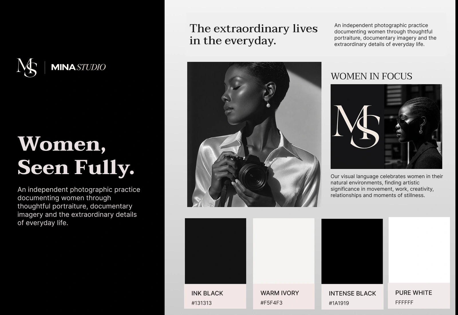
I chose a dark, editorial visual direction inspired by contemporary art exhibitions and fine-art photography portfolios.
The dark background creates a neutral environment where photographs become the primary visual focus. It also establishes a sense of depth and sophistication throughout the website.
- Visual characteristics:
- Deep charcoal backgrounds.
- Warm ivory typography.
- Elegant serif accents paired with clean sans-serif headings.
- Asymmetrical image arrangements.
- Generous negative space.
- Minimal interface elements.
The wordmark, MINA STUDIO, follows the same direction. Bold uppercase typography is paired with an elegant italic serif treatment to create a simple editorial identity.
Rather than introducing decorative elements, I allowed typography, composition and photography to establish the brand's personality.
Image Selection & Visual Storytelling
Photography was central to this project, so image selection played an important role in shaping the website experience.
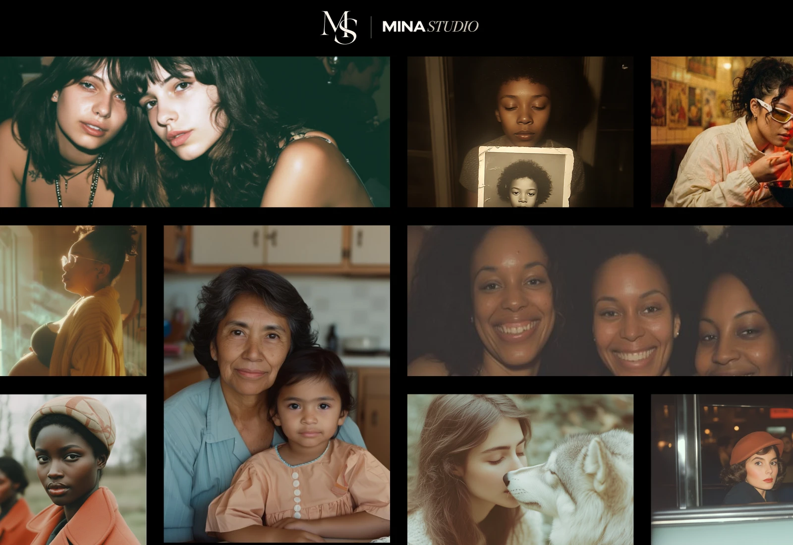
I deliberately moved away from using exclusively polished studio portraits. The collection needed to reflect the different environments and experiences that make up women's everyday lives.
I explored several photographic themes:
1. The Art of Movement: Women jogging, dancing, training and engaging in physical activities.
2. Purpose in Practice: Women working across different professions, including healthcare, education, business and creative industries.
3. The Poetry of Ordinary Life: Cooking, cleaning, caring, personal rituals and quiet everyday experiences.
I also considered how different photographic compositions could work together. Close-up portraits, environmental photographs, wide compositions and candid moments create visual variation while maintaining a consistent editorial direction.
The intention was to make the gallery feel like a curated photographic exhibition rather than a conventional collection of portfolio images.
Content Strategy & Website Structure
The website needed to communicate more than Mina's photography services. It needed to introduce her perspective, give context to her work and create opportunities for visitors to engage with the brand.
I structured the experience around the following pages:
Home
Introduces Mina's photography philosophy through an editorial hero, featured collections, selected projects, exhibitions and collaboration opportunities.
About
Explores Mina's story, artistic philosophy, creative approach and the women represented in her photographs.
Gallery
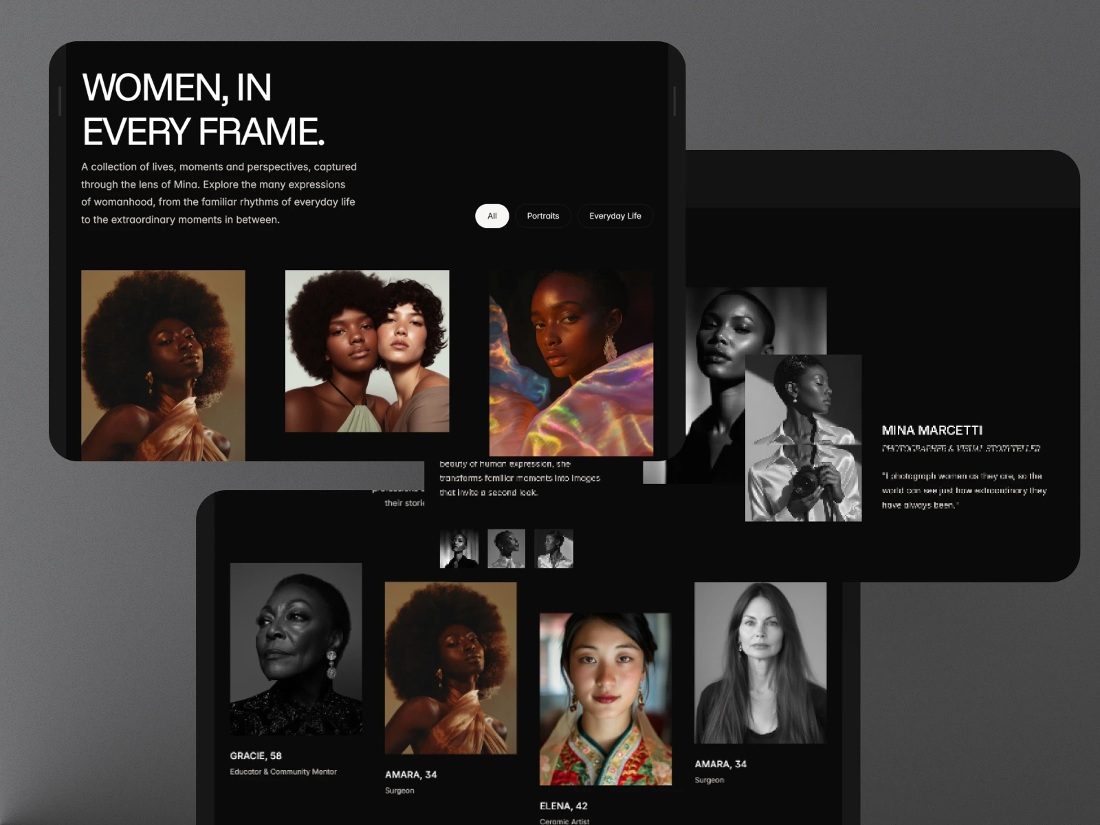
Presents the photographic collection through curated categories, allowing visitors to explore different expressions of everyday womanhood.
Journal
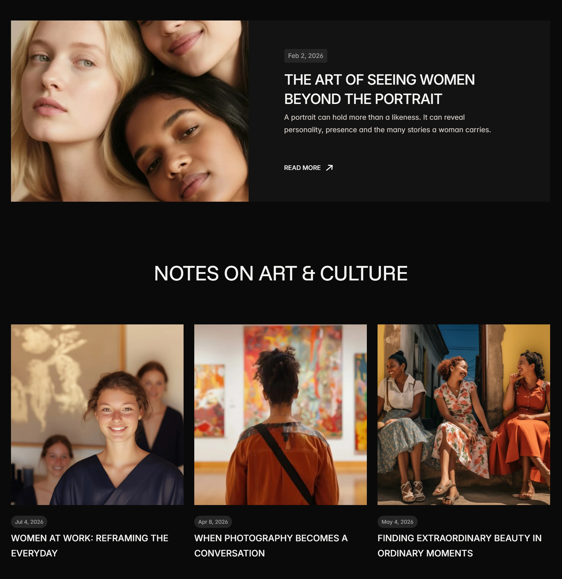
Provides editorial content around photography, women's representation, creative processes and the stories behind the images.
Exhibitions & Events
Introduces photography exhibitions, artist conversations and creative collaborations.
Contact & Booking
Creates clear pathways for personal portrait enquiries, editorial commissions, collaborations and event reservations.
Each page serves a distinct purpose while contributing to the same brand narrative.
CMS & Content Management
Because Mina's work is expected to grow over time, I incorporated CMS-driven content into the website.
The blog collection supports editorial articles covering topics such as:
- The Art of Seeing Women Beyond the Portrait.
- Women at Work: Reframing the Everyday.
- Finding Extraordinary Beauty in Ordinary Moments.
- Who Gets to Be Seen? Rethinking Women's Representation.
I also developed an events collection for exhibitions, artist talks and creative collaborations.
This structure makes it possible to expand the website with new stories and events without manually designing a new page for every entry.
Website Design
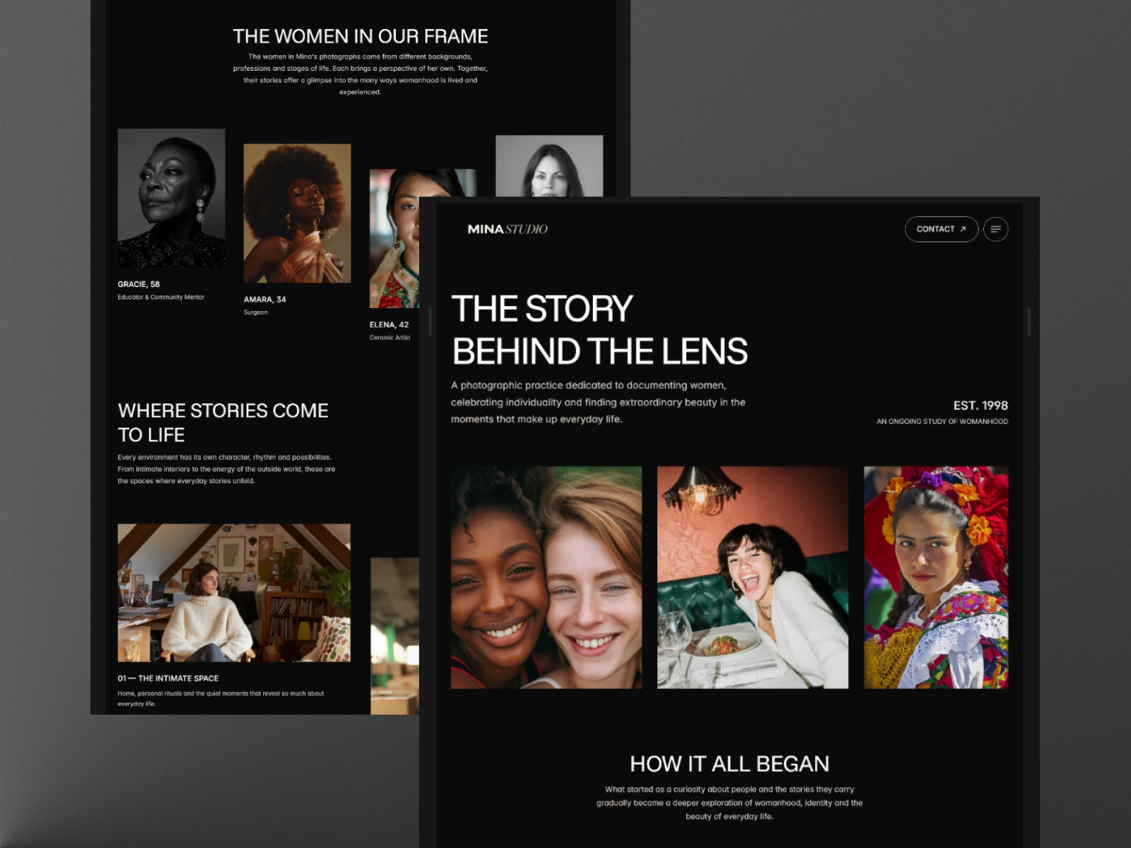
The final website brings the brand's visual identity and content strategy together through a consistent editorial experience.
Across the different pages, I focused on maintaining a clear visual hierarchy, giving photographs room to breathe and keeping navigation straightforward.
The homepage introduces the brand through visual storytelling, while the Gallery places the photography at the centre of the experience.
The About page provides context, the Journal expands the brand's perspective, and the contact and booking pages support visitor engagement.
The result is a cohesive website designed around the relationship between photography, storytelling and representation.
The Outcome
Mina Studio became a complete conceptual photography brand with a defined artistic direction and a multi-page website experience.
Beyond showcasing photographs, the project explores how a creative portfolio can communicate a point of view and establish a meaningful connection between the photographer, her subjects and the audience.
One of the most important decisions was to keep the women and their stories at the centre of the experience.
Key Takeaway
A website can do more than display creative work. It can communicate the thinking behind it, give context to the stories being told and shape how people experience the work.
With Mina Studio, I explored how thoughtful design and visual storytelling could help celebrate the extraordinary in everyday life.
Explore the Live Website Here: https://minastudio.framer.website/
0 likes · 3 views · Nov 4, 2026
MINA STUDIO is a self-initiated brand and website concept for a fictional photographer documenting women in their everyday lives

