PapitoTrades, A Trading Alerts Site That Shows the Losers

Supreme Dream


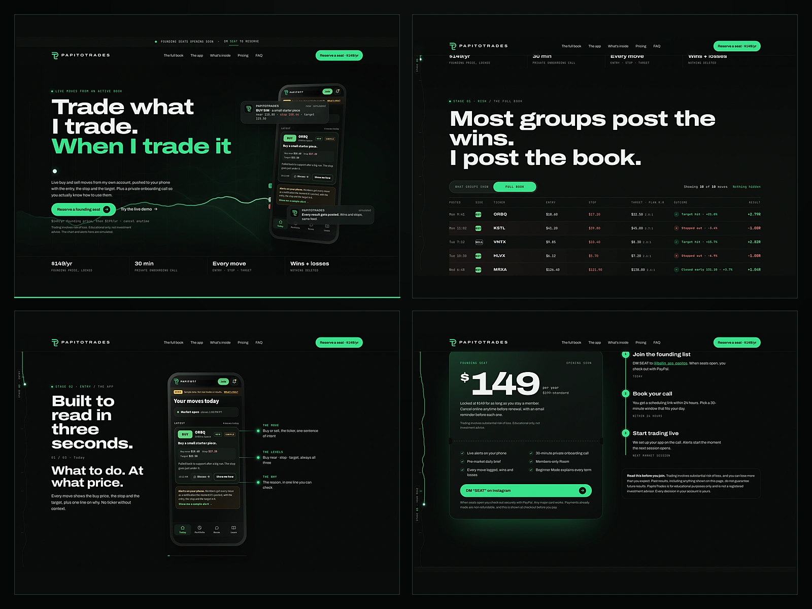
Trading alert services all show you the winners. PapitoTrades already promises members the full book, wins and losses, but the old site only said it. So we built a redesign where the stopped-out trades stay on the page, as a working demo you can open and click through right now.
This is a redesign we built for the client to review. It is not launched on papitotrades.com. Every ticker, price and result in it is invented sample data, and no results, signups or testimonials are claimed anywhere.
The problem with the category
The product is live buy and sell alerts for stocks, options and crypto, a private onboarding call, a pre-market brief and a members' room. The trust test in that product is simple. If you only ever see the hits, nothing you read means anything. The old site made the claim in words. Words are the cheapest thing on the page.
So we moved the claim into the layout itself.
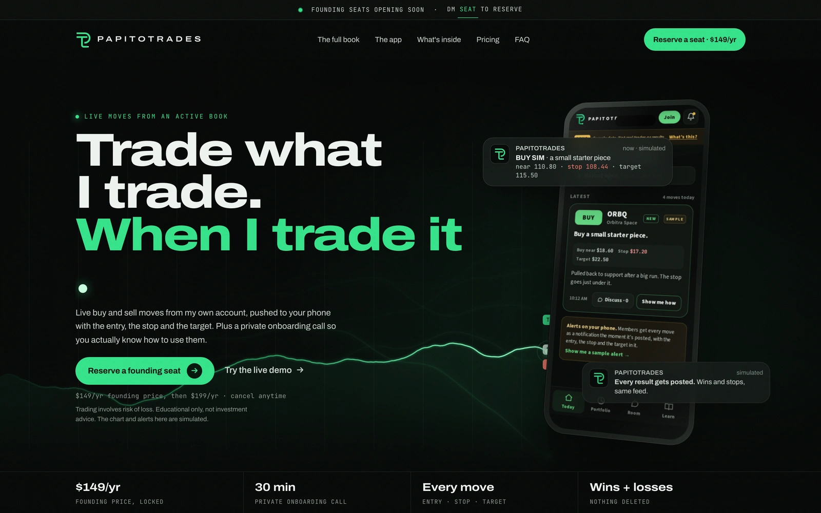
Desktop hero: live moves from an active book, with a simulated price path playing across the grid and a phone mockup showing the app
The hero plays instead of promising
The opening section runs a simulated price path on a canvas grid. Trades fire in real time with the entry, the stop and the target printed on the card. Some reach the target. Some get stopped out. The chart is labelled as simulated in the same weight as the numbers, so a first-time visitor understands what they are looking at before they read a word of copy.
The full book is the whole argument
Below the hero the page pins a ledger of ten sample moves. Each row prints the posted time, the side, the ticker, the entry, the stop, the target, the planned reward to risk, the outcome and the result as a multiple of risk. Four hit target, four got stopped, two closed early. A toggle switches the ledger between the highlight reel and the full book so the difference is something you drag yourself rather than read about.
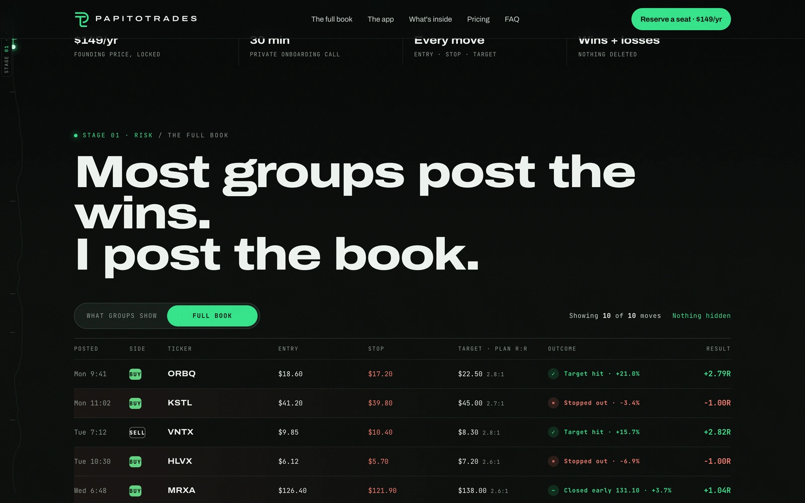
The full book pinned as a ledger: ten sample moves with entry, stop, target, outcome and result columns, and a count reading nothing hidden
The app walkthrough
The product lives in an app, so the site shows the three real screens as a pinned phone with callouts pointing at the move, the levels and the reason. The screens are the client's own, already labelled demo data.
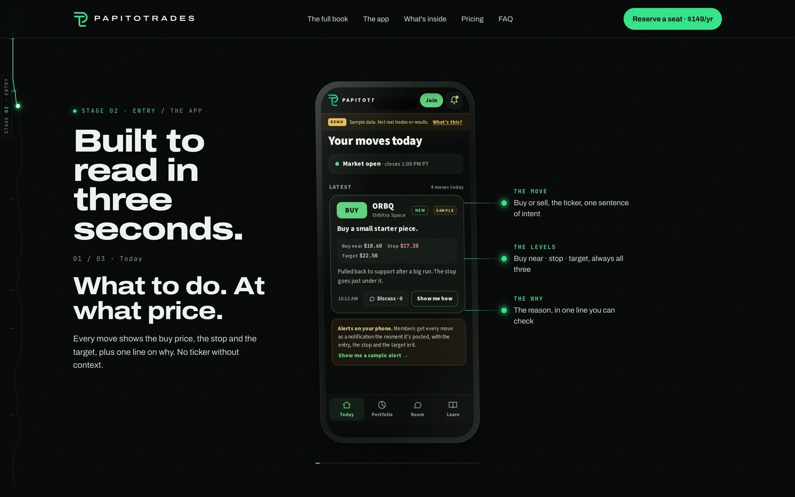
The app section: a phone pinned in the centre with callouts for the move, the levels and the why, beside the section headline
Four tools, not four features
What a member gets is broken into four cards that stack and hand off as you scroll: the alert feed, the private onboarding call, the pre-market brief and Beginner Mode. Each card carries a live micro visualisation of what it produces, so the page shows the format before it describes it.
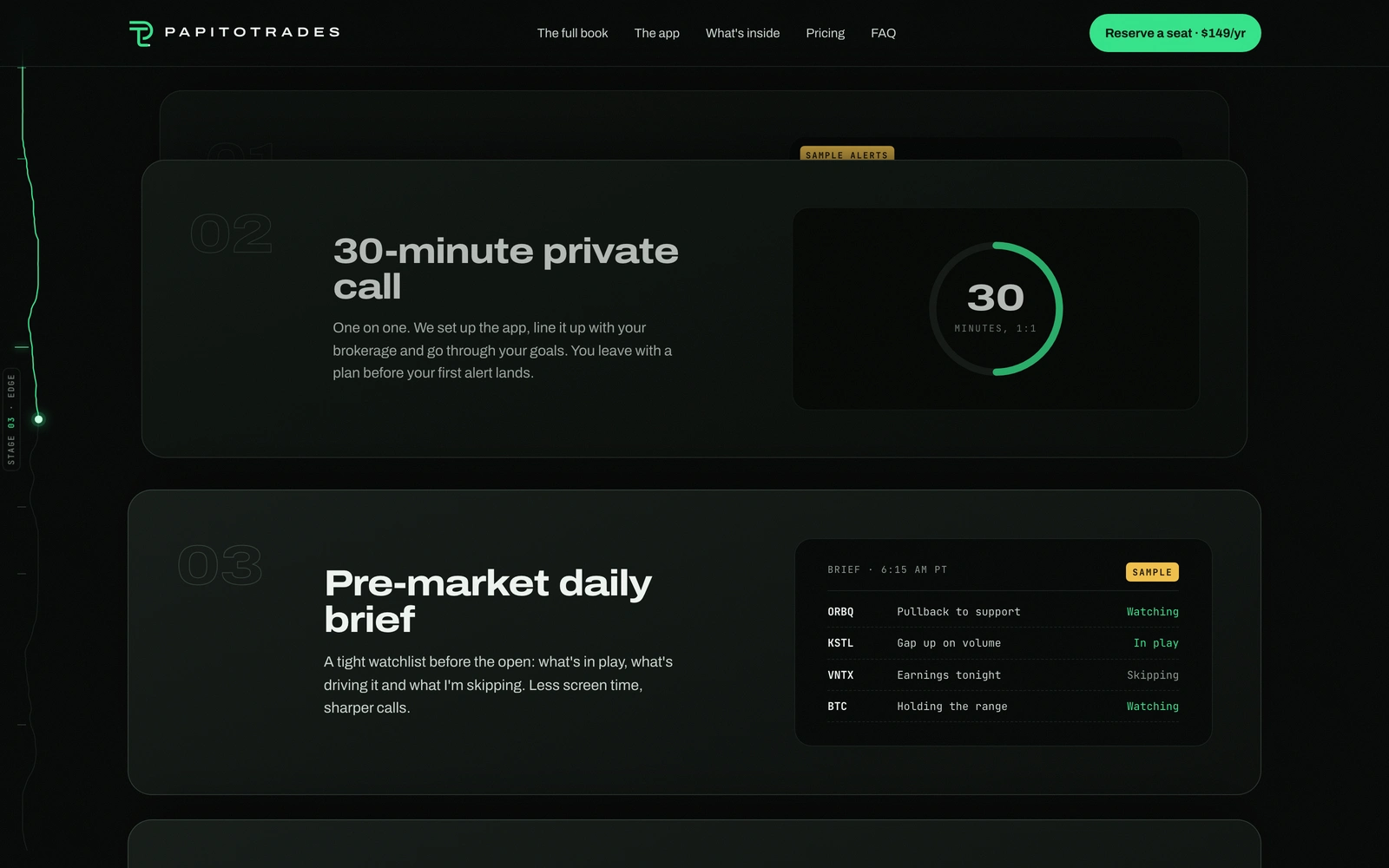
The tools section: stacked cards for the 30-minute private call and the pre-market daily brief, each with a sample panel of its real output
Pricing with the risk box attached
The pricing section is a seat card with the founding price, the standard price and a three-step timeline from joining the list to the first alert. The risk disclosure sits next to the buy button, not buried in a footer, because that is where a membership like this gets sold and it should be the first thing a buyer reads.
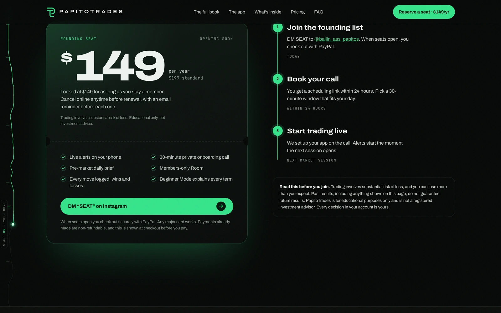
The pricing section with the founding seat card, the three-step join timeline and the risk disclosure box beside it
Built to hold up
The whole site is static HTML, CSS and JavaScript with GSAP and ScrollTrigger for the pinned sections and Lenis for scroll feel. Fonts are self-hosted so there is no third-party request in the critical path. It was checked at 320, 375, 390, 414, 768, 1024, 1280 and 1920 with no horizontal overflow and no console errors, and reduced motion leaves every section readable with no pins and no canvas loop.
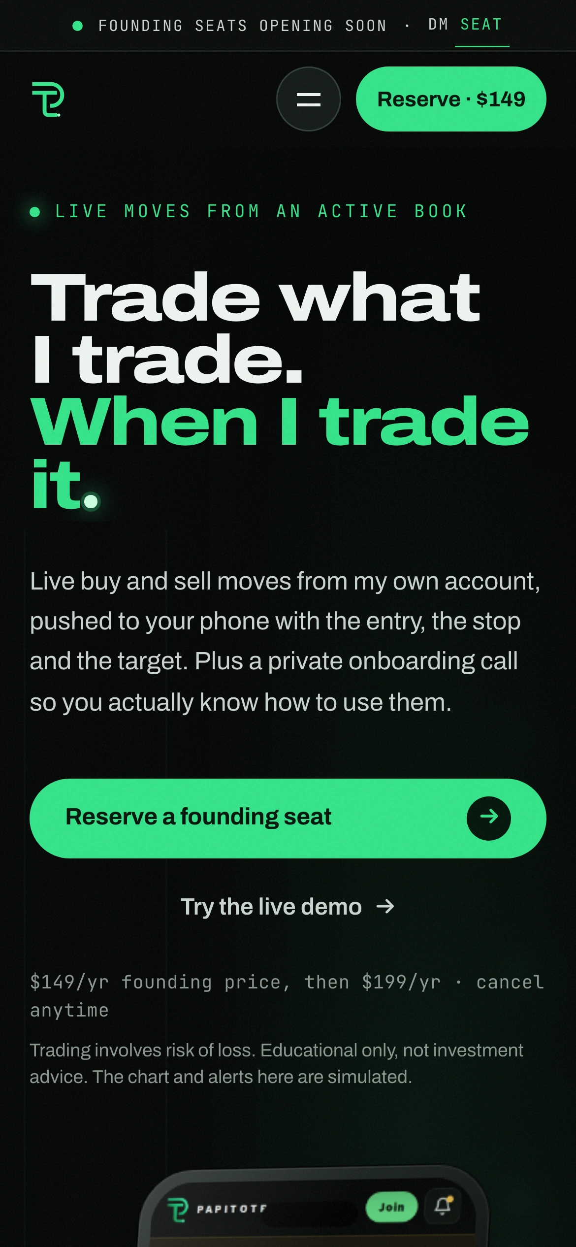
The same hero at phone width, with the headline, the CTA, the price line and the risk note all intact
See it live: givemeprompts.com/demos/papitotrades
If you are running an alerts service and your hardest problem is trust, tell us what you need to prove and we will build the page that proves it.
More work: givemeprompts.com/work
Like this project
Posted Oct 4, 2026
A redesign demo for a trading-alerts membership: the full book, the app, four tools and honest pricing. Sample data throughout.