The Mariner’s Club – Luxury Brand Identity

Nuria Studio


Like this project
Posted Nov 26, 2025
A refined visual identity inspired by maritime heritage and modern quiet luxury. This branding project blends Old Money aesthetics & elegant typographic design.


THE MARINER’S CLUB
Visual Identity • Art Direction • Brand System
The Brief
The Mariner’s Club is a modern, heritage-inspired yacht club offering refined waterfront hospitality, curated nautical goods, and an elevated quiet-luxury coastal experience. Rooted in classical maritime tradition yet designed for today’s understated elite, the brand needed a visual identity that could embody:
the timeless codes of Old Money yacht culture
a sense of calm, privacy, and exclusivity
the sophistication of a premium coastal destination
the balance between classic heritage and modern restraint
The objective was to craft a visual universe capable of living seamlessly across stationery, hospitality touchpoints, nautical merchandise, and lifestyle communications — all while reflecting the serenity and prestige of life by the water.
The Challenge
The Mariner’s Club required an identity that would honor maritime heritage without falling into clichés, and capture modern luxury without appearing cold or overly minimal.
The challenge centered around three design constraints:
1. Translating heritage into modernity
How to integrate traditional yacht club elements — anchors, rope motifs, navy blue palettes — and elevate them into a clean, contemporary, quiet-luxury aesthetic?
2. Designing a system that feels exclusive yet effortless
The identity needed to evoke private club intimacy and discreet refinement, while remaining approachable and serene.
3. Crafting a multisensory experience through visuals alone
Since The Mariner’s Club extends beyond a simple location, the visual identity had to carry the essence of hospitality: warmth, precision, and a curated rhythm that mirrors life on the water.
The brand required a design system that could shift from formal prestige (letterheads, membership documents) to coastal leisure (striped motifs, soft-toned lifestyle photography) without losing coherence.
The Outcome
The final identity for The Mariner’s Club is a refined blend of heritage, serenity, and contemporary coastal elegance, built around a cohesive visual system.
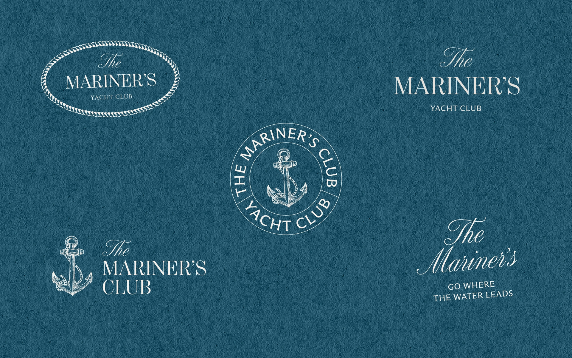
A Timeless Core Identity
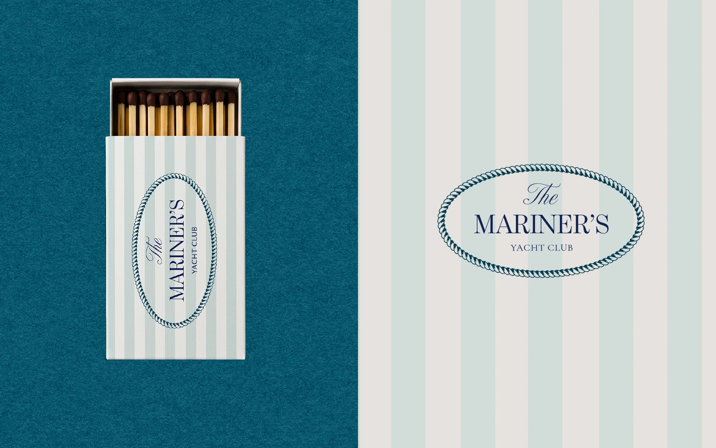
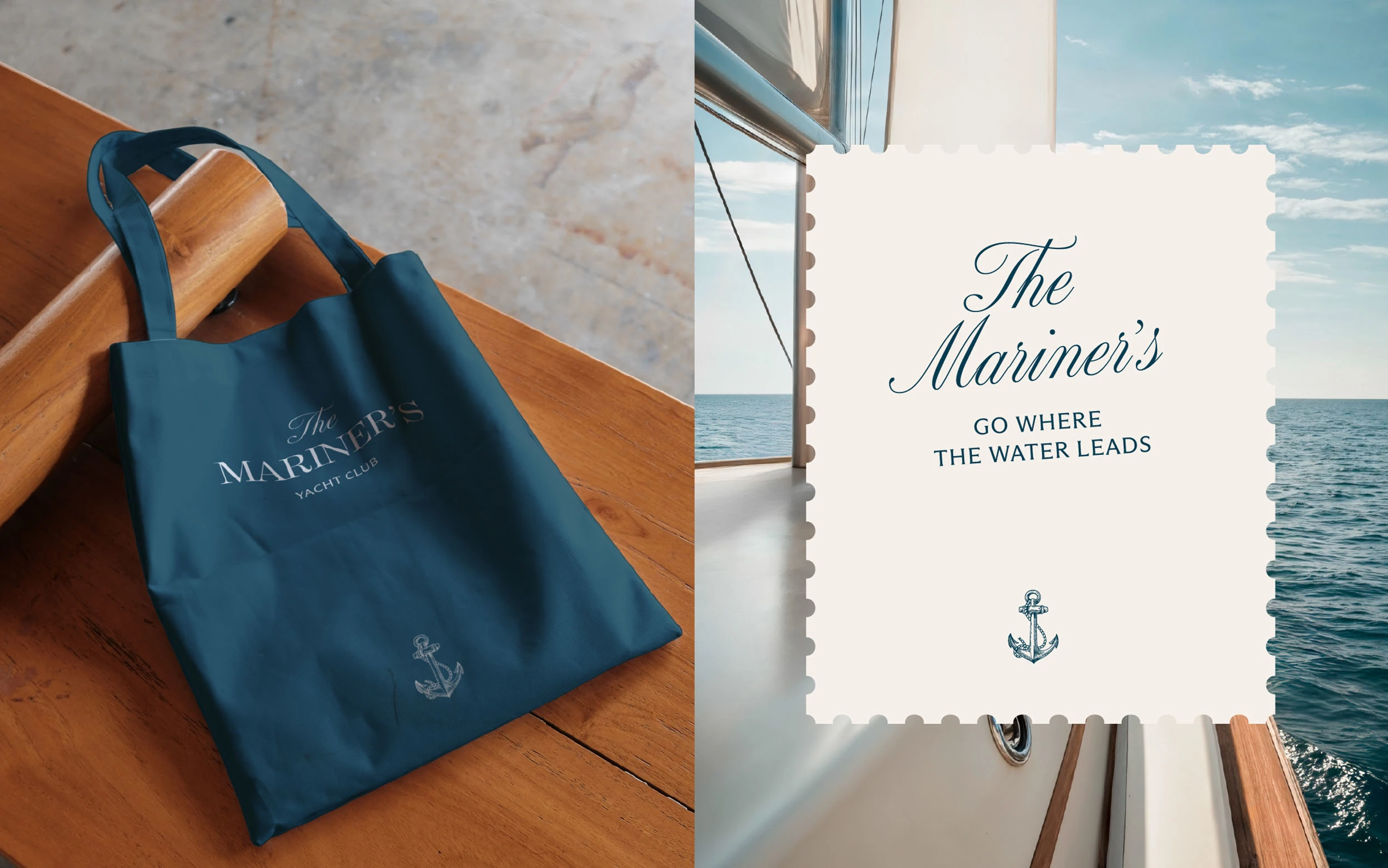
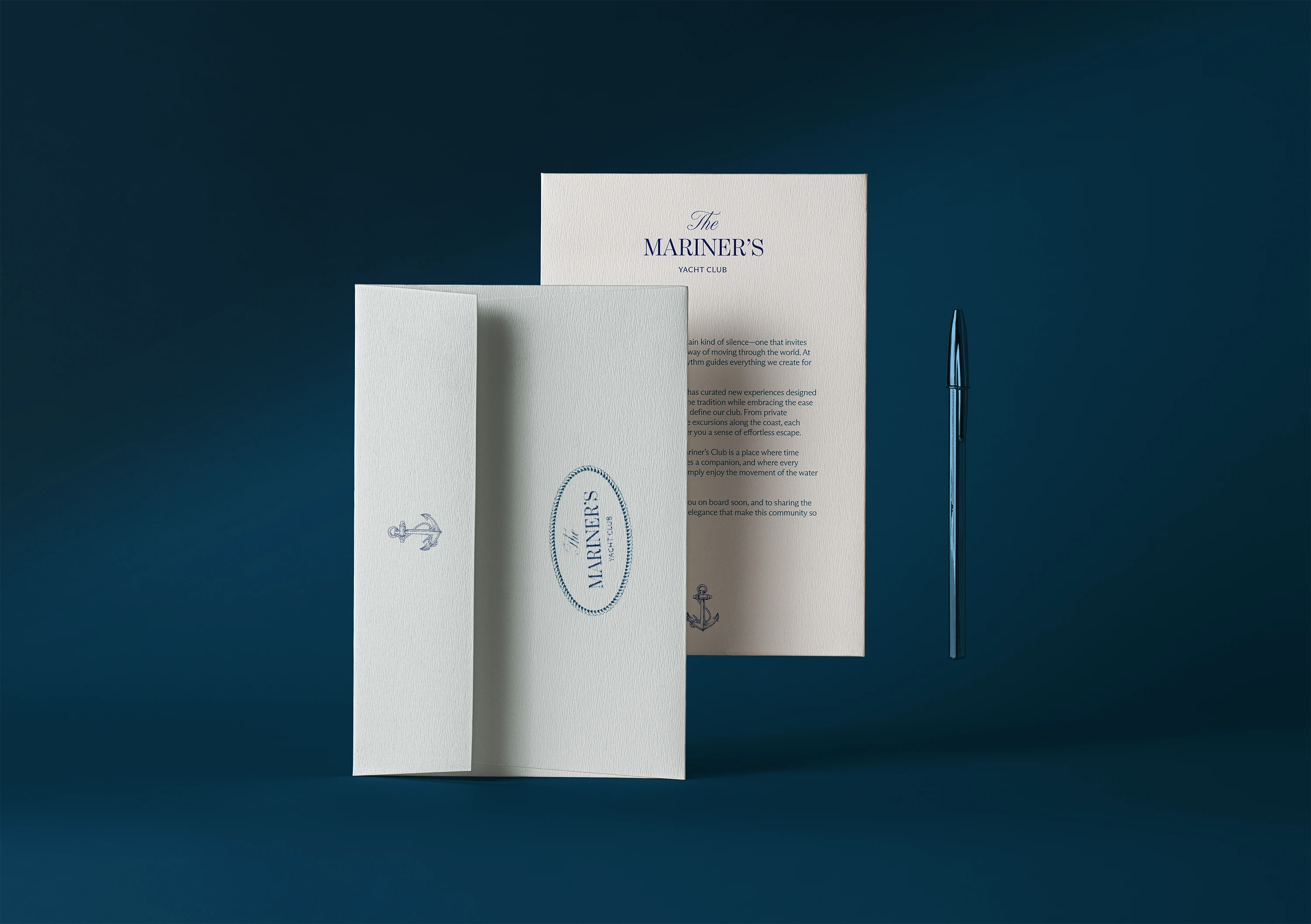
A hand-drawn anchor emblem, reinterpreting maritime insignia with subtle detailing.
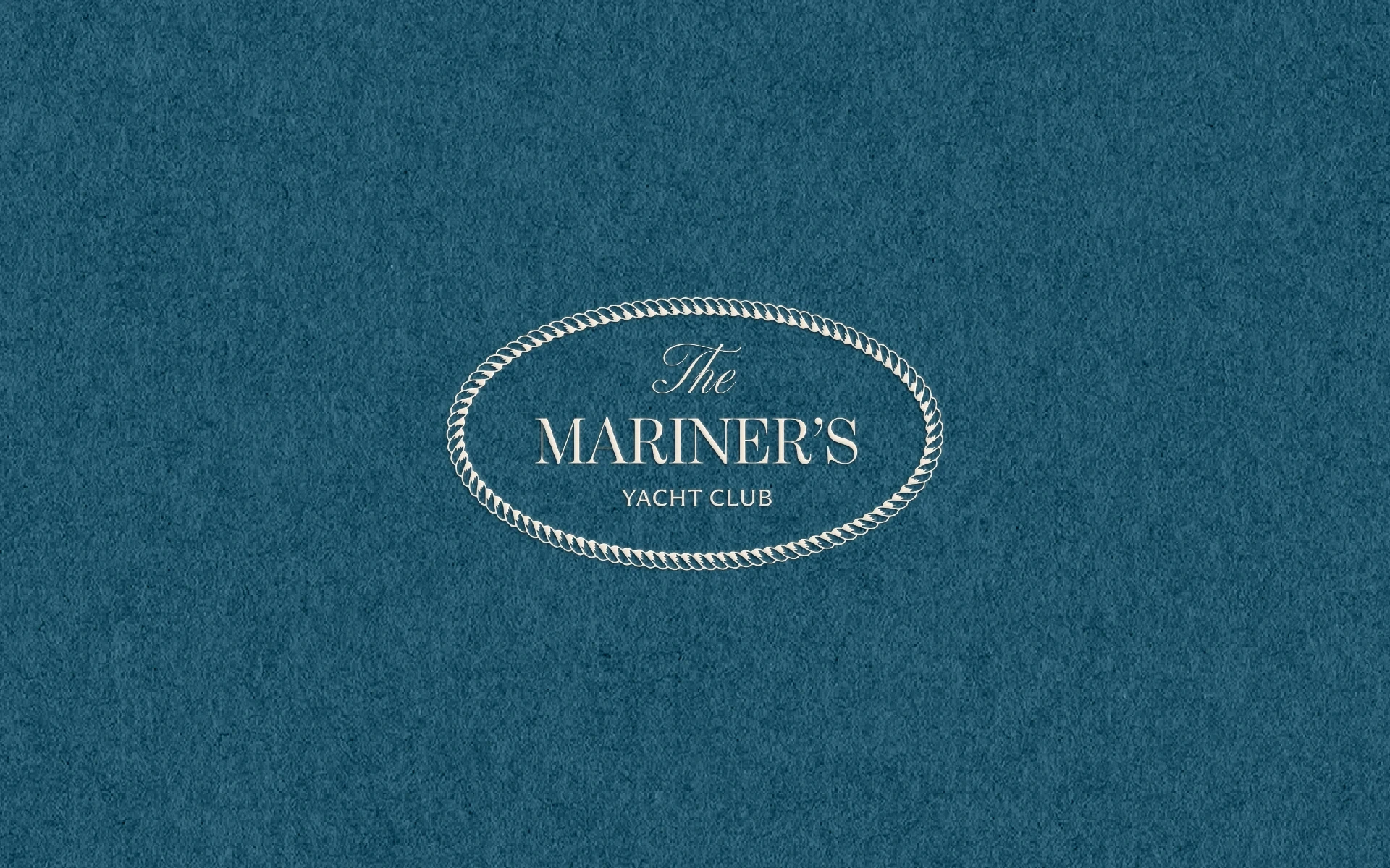
A signature oval seal inspired by rope braiding, creating an immediate sense of tradition and exclusivity.
A custom typographic pairing: elegant serif + understated modern serif for a balanced quiet-luxury tone.
A Quiet-Luxury Palette & Materiality
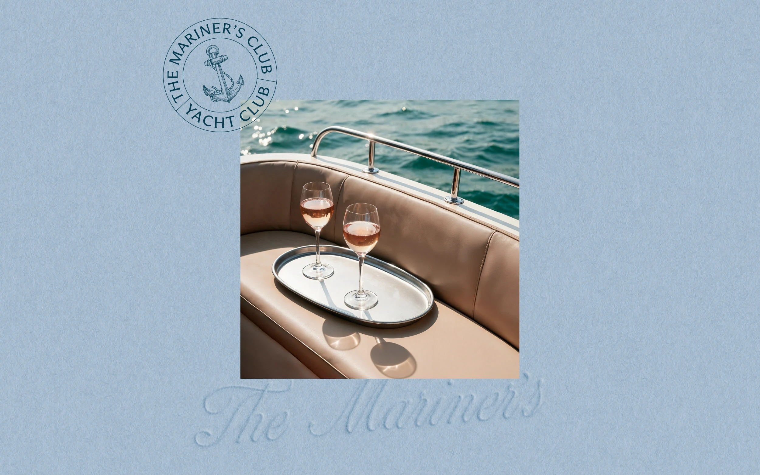
Deep maritime blues inspired by open-water horizons.
Ivory whites and muted seafoam stripes recalling classic coastal clubs.
Textured paper simulations and embossed effects reinforcing the tactile refinement of private membership stationery.
A Modular System for Many Touchpoints
Stationery suite: membership letters, envelopes, cards, seals.
Hospitality elements: matchboxes, striped goods, tote bags, nautical accessories.
Brand compositions combining photography with signature frames for a timeless editorial feel.
The result is a brand world that feels calm, exclusive, and rooted in tradition, while speaking to a new generation attracted to quiet luxury and elevated coastal experiences.