Marketing by Amber - Visual Identity Project

Stacey Troutman
Brand Designer
Graphic Designer
Logo Designer
Adobe Illustrator


Canva

Notion

⭐️ About Marketing by Amber
Amber is a marketing powerhouse of a woman. She is the ultimate boss woman that does it all! Amber provides courses, coaching, and consultation services to teacher business owners. Her signature course is called Teacher Marketing Academy. She's currently shifting to consolidating her offers she shares to develop Teacher Marketing Academy so it can be more of a robust offering for her audience.
On the other hand, Amber also serves as fractional Head of Marketing for EdTech companies and is helping up and coming startup companies get off the ground while also supporting social media strategy with a bigger EdTech company.
👉🏽 The Brief
Design tone:
renewed
fresh
passionate
radiant
glowing
professional
social/outgoing
🎨 Visual Inspiration
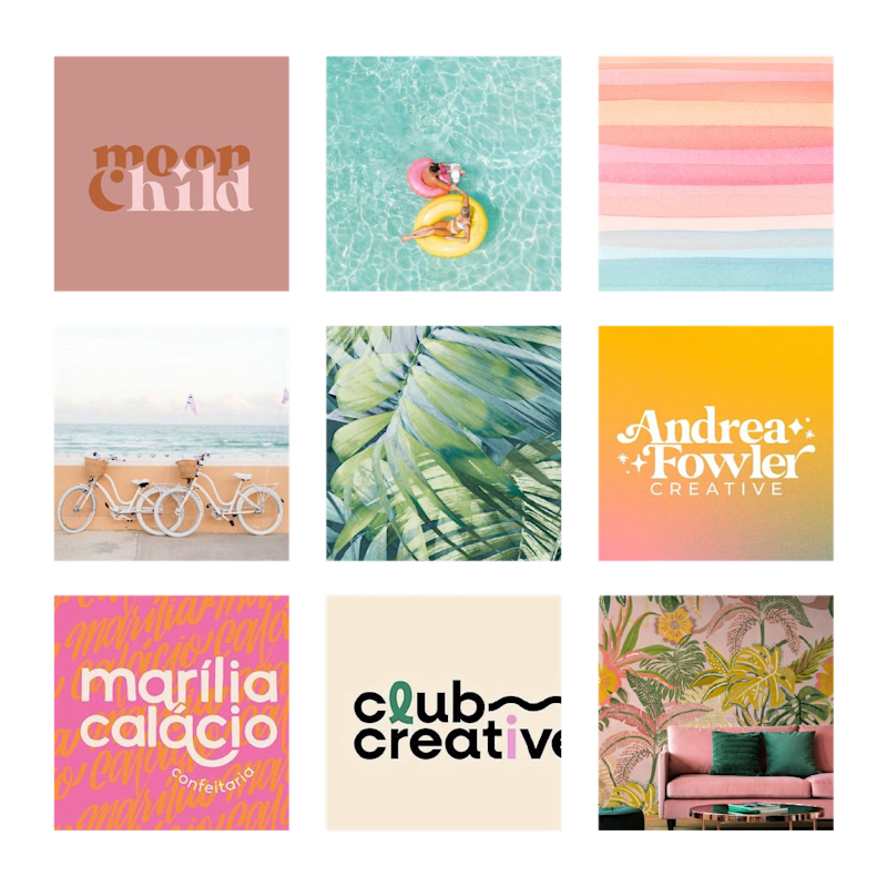
Visual inspiration mood board for Marketing by Amber's design project
☝🏽 First Step
Once Amber and I met a couple of times and discussed the design brief, I went off to create a mood board presentation (seen above) in which she approved. With this presentation, I also include a proposed color palette.
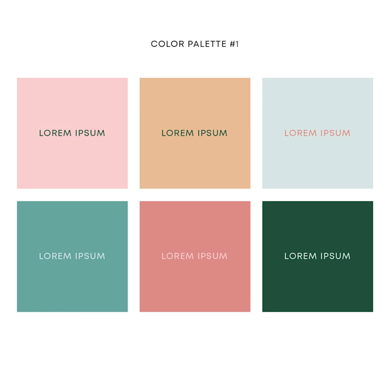
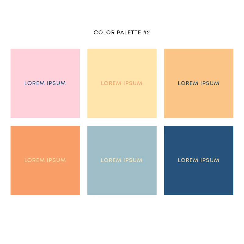
There were two ways I envisioned this project to go, which is why I presented Amber with two proposed color palettes. While she loved both of them and a mixture of both proposals, something didn't seem to quite click with us yet.
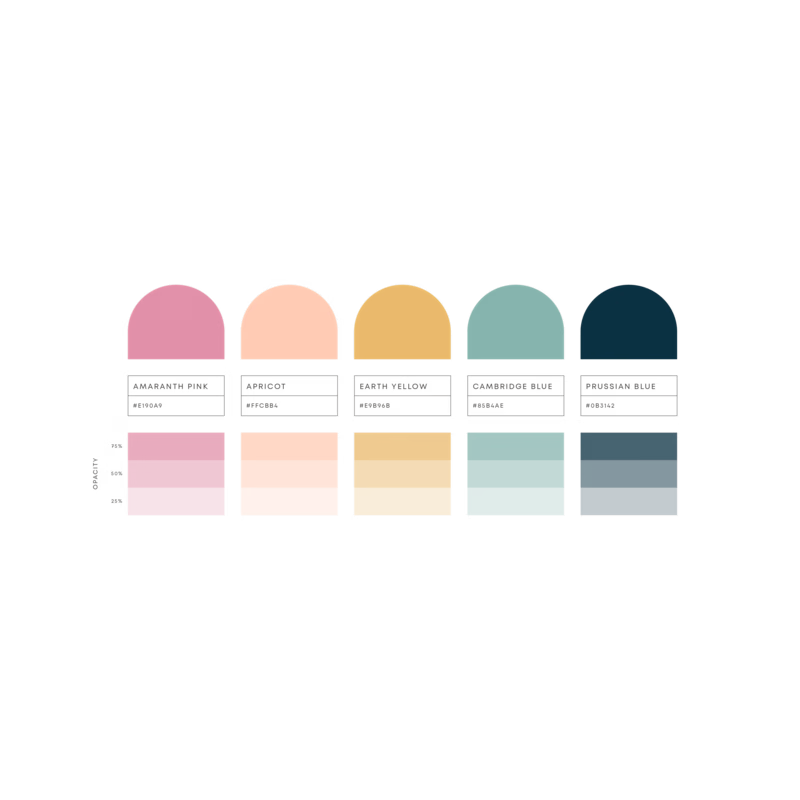
Final color palette for Marketing by Amber
After many discussions and "let's sleep on it" comments, we've decided with a final color palette that Amber and I fell in love with !
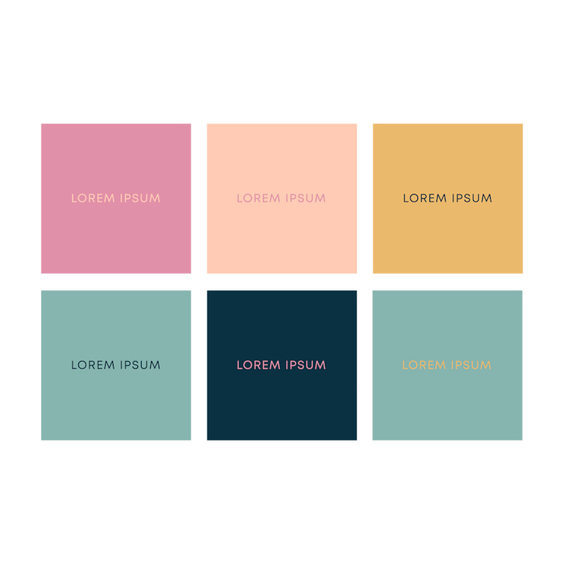
Final color palette shown with color functionality
I had to make sure all the colors worked well with one another, and they had great contrast for text and background colors.
✍🏽 Iterations
On to the design stage, where the magic happens!
I don't always start sketching on a notebook and paper, sometimes I use my iPad Pro and Apple Pencil to kind of speed things up for me.
With Amber's design, my mind was everywhere - and not in a negative way!
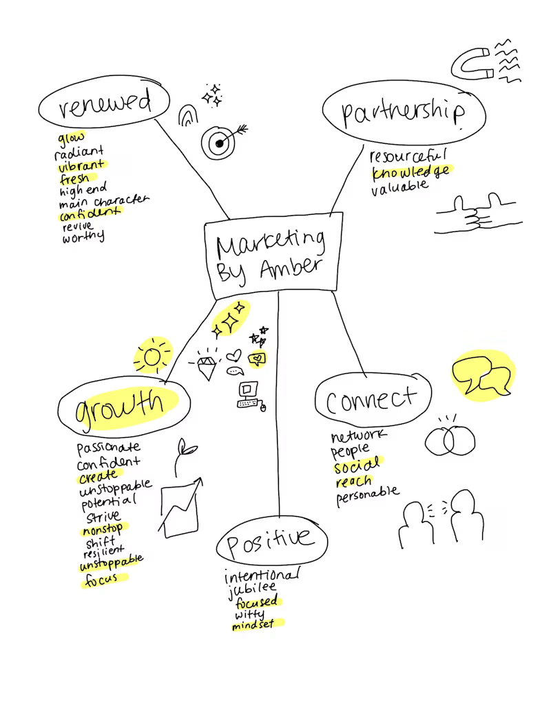
Word map of my brain dump for Marketing by Amber
I'm implementing a new strategy with my brain dump for designs. In the past, I would just brain dump any adjectives and nouns on a sheet of paper and write everything I could that aligns with the design brief.
For Amber's, I approached it in a more organized way. I chose five words that she and I agreed that represents her brand, and from there I created a list of more words that is in alignment of that root word. Lastly, I would highlight the words that mean the most or were more important than others.
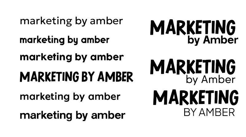
From selecting a typeface...
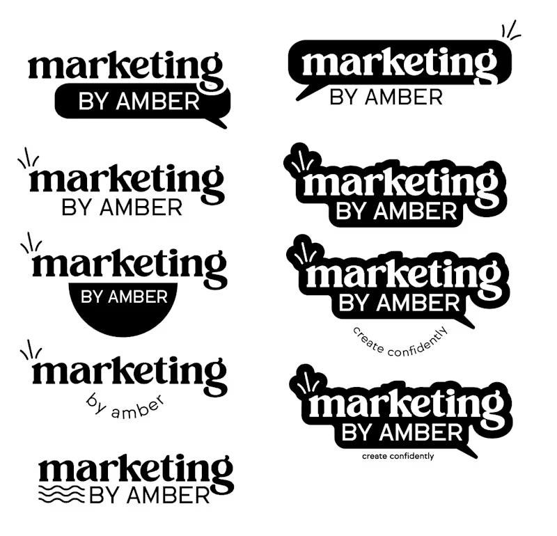
First concept for Marketing by Amber
To figuring out designs that flow with the message of her branding...
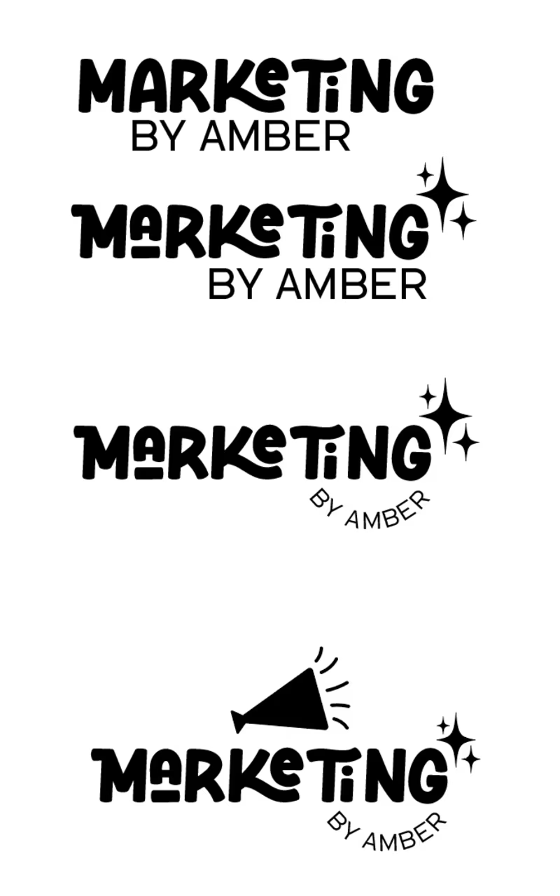
Second concept for Marketing by Amber
This process can take days and sometimes even up to 20 days for me to get something to spark. With that said, I always make sure to stay in communication with my clients when things take longer than expected.
Amber and I went back and forth a few times discussing which designs she felt connected to the most. I presented her two, however, she wasn't fully satisfied with either one.
In the end, we returned to the first concept I showed her and I got curious with one specifically. So, I began to play around with it more and added her colors!
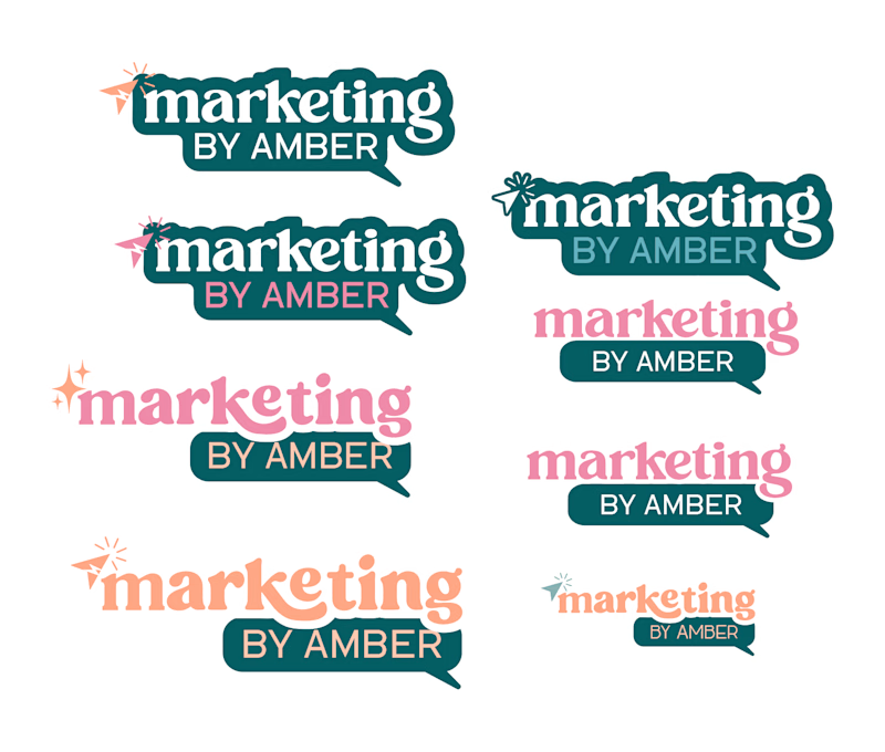
Adding colors into designs
Again, Amber and I met up back and forth discussing the designs to the point where we thought maybe we were overthinking it. So, I suggested we simplified and returned to the designs.
✨Final Designs
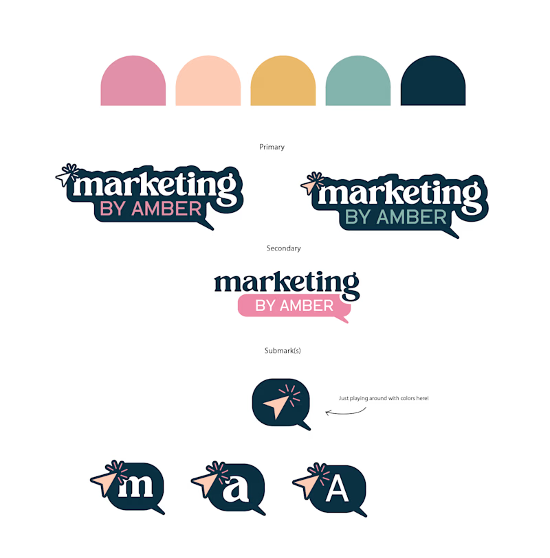
Marketing by Amber's final designs
In the end, we did end up going with one of the initial designs I've presented to her and the more she looked at it, the more she fell in love with it - especially when the colors came into play!
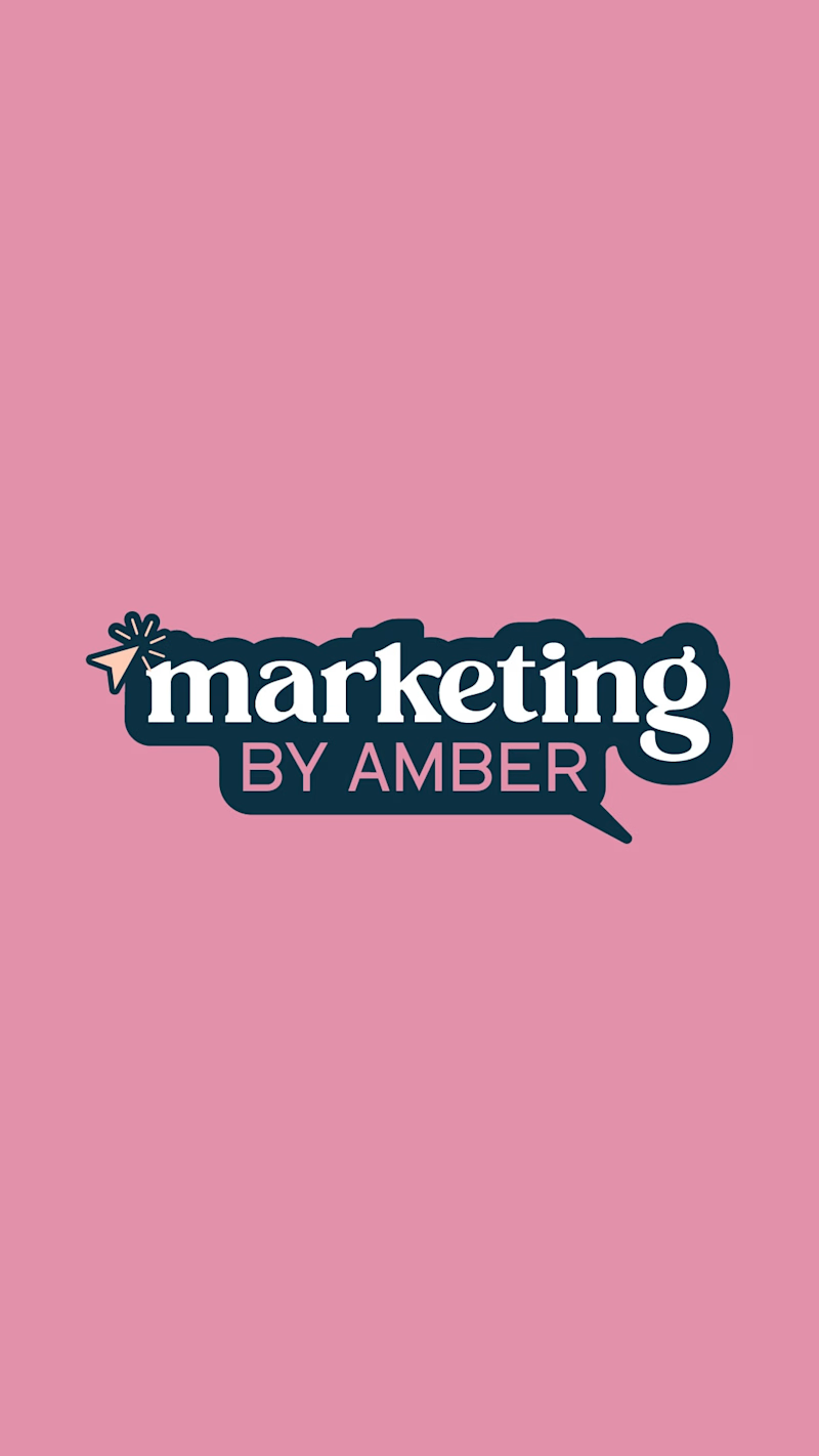
Final Primary Logo for Marketing by Amber
To see more of Amber in action, check her website here!