Senior Brand & IA Designer — RV 2.0 Launch
Introduction
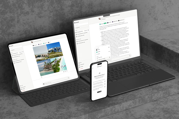
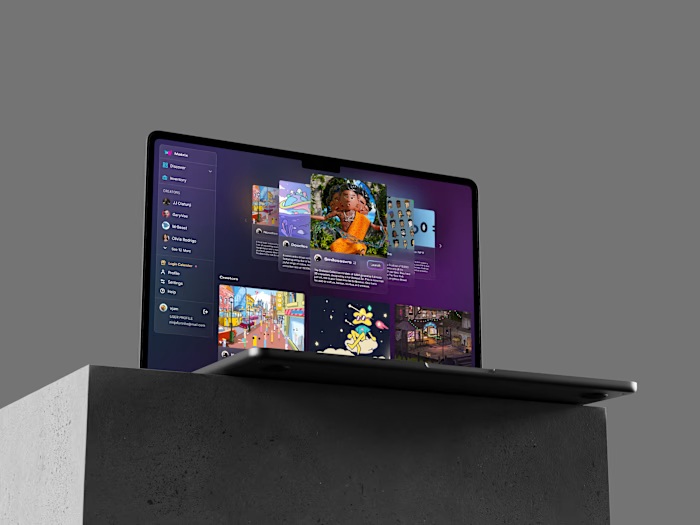
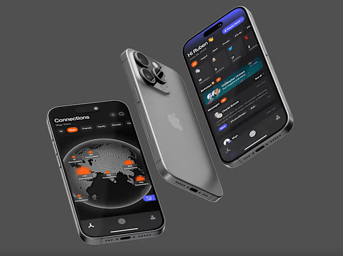
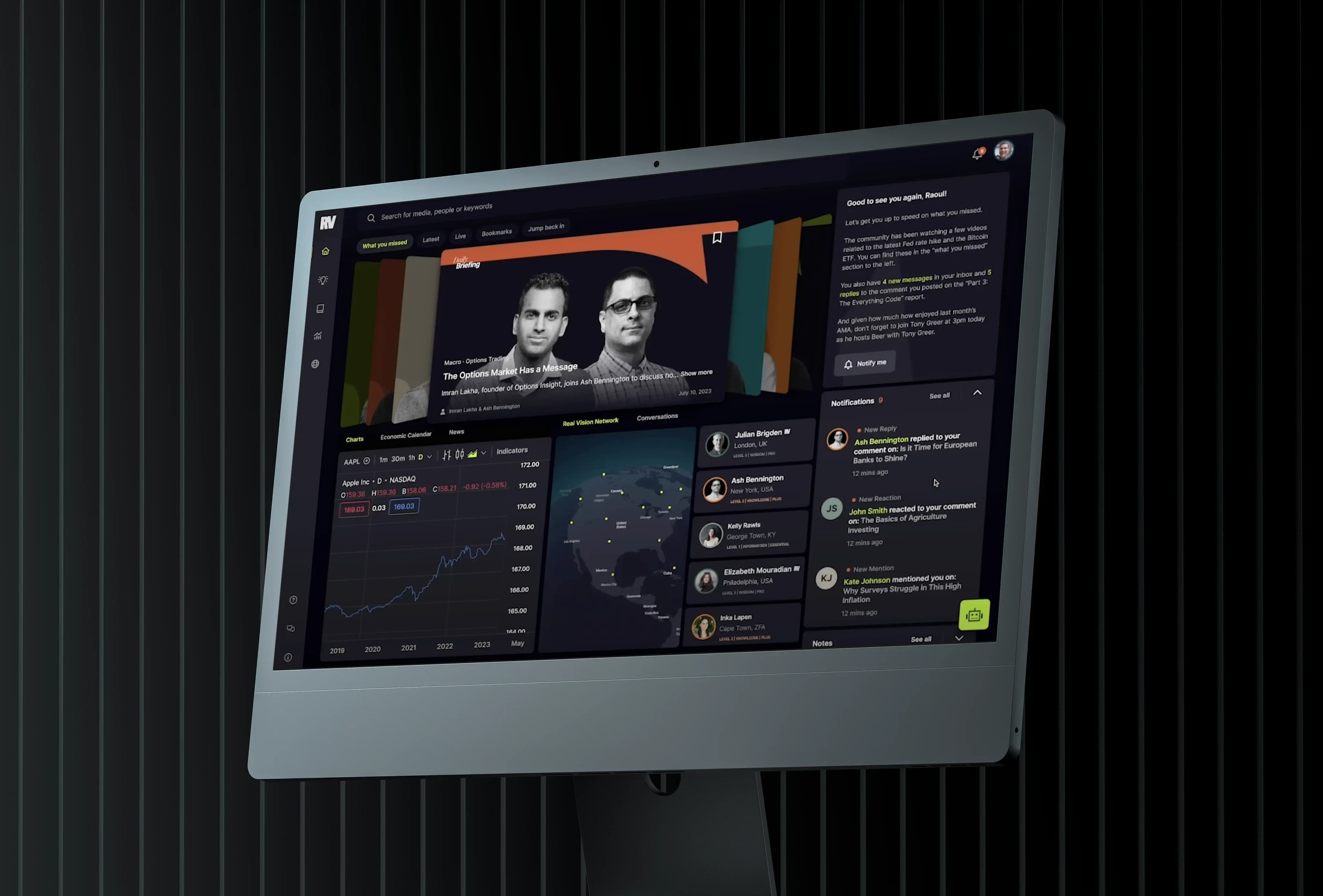
As a Product Designer, my work at Real Vision involved being part of a big change. We were upgrading Real Vision to a better version, Real Vision 2.0, aiming to make it even better for users. In this case study, I'll share my role in the team and how I helped improve Real Vision 2.0.
Background
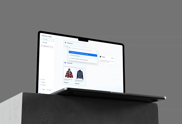
Real Vision is like a 'Netflix for investing,' offering all sorts of financial shows and educational stuff. We wanted to make it easier for users to learn and take notes. So, we planned to add a smart feature called Second Brain, which would help users take notes easily. Also I worked on the branding as well as higher level IA (blockframing using Bloom's taxonomy)
The Collaborative Team
In our team, we had some important people, like the Director of Product Design and the Chief Experience Officer. Each of us had a key role in making Real Vision 2.0 great, with a focus on making it easy and enjoyable for users.
Responsibilities of the Product Designer
My main job was to focus on three things:
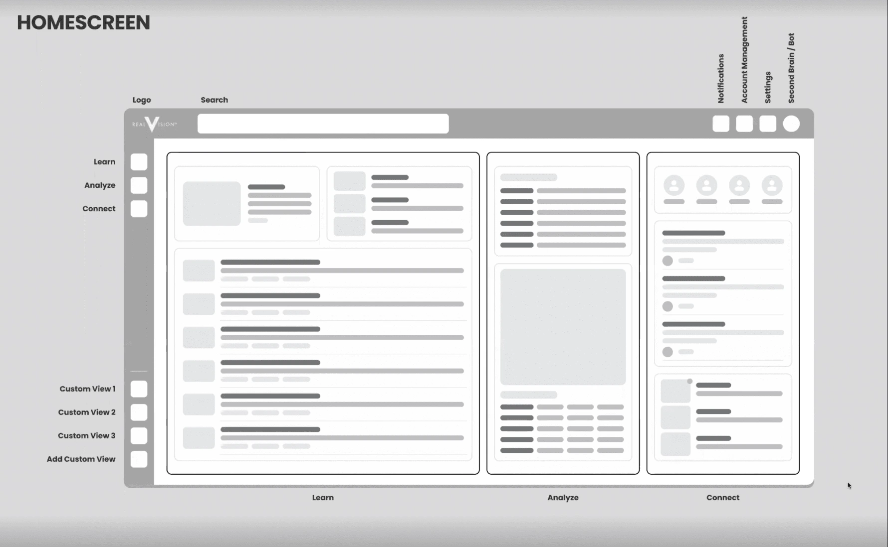
Information Architecture and Competitive Usability Studies: I had to organize all the information on Real Vision so that users could find things easily. I also checked out other apps to see how their note-taking features worked. This helped us make Second Brain better than the similar features in other apps.
Shaping Interaction/Interactive Patterns: I also had to make sure that everything on the platform was easy to use. I used a special way of organizing stuff called Bloom's Taxonomy. This made it easy for users to find what they needed. I also used block framing techniques, which made it quicker to design things that users could easily understand and use.
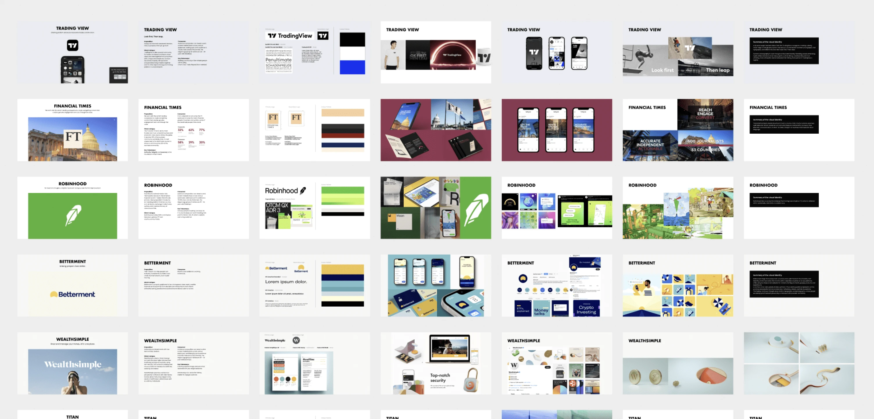
Branding and Secondary Research: I was also responsible for working on our brand image and conducting research on our competitors. I looked at what they were doing and found inspiration for our own approach. I focused on figuring out how we could make ourselves different from them and really shine, all while staying true to our main message.
Outcomes
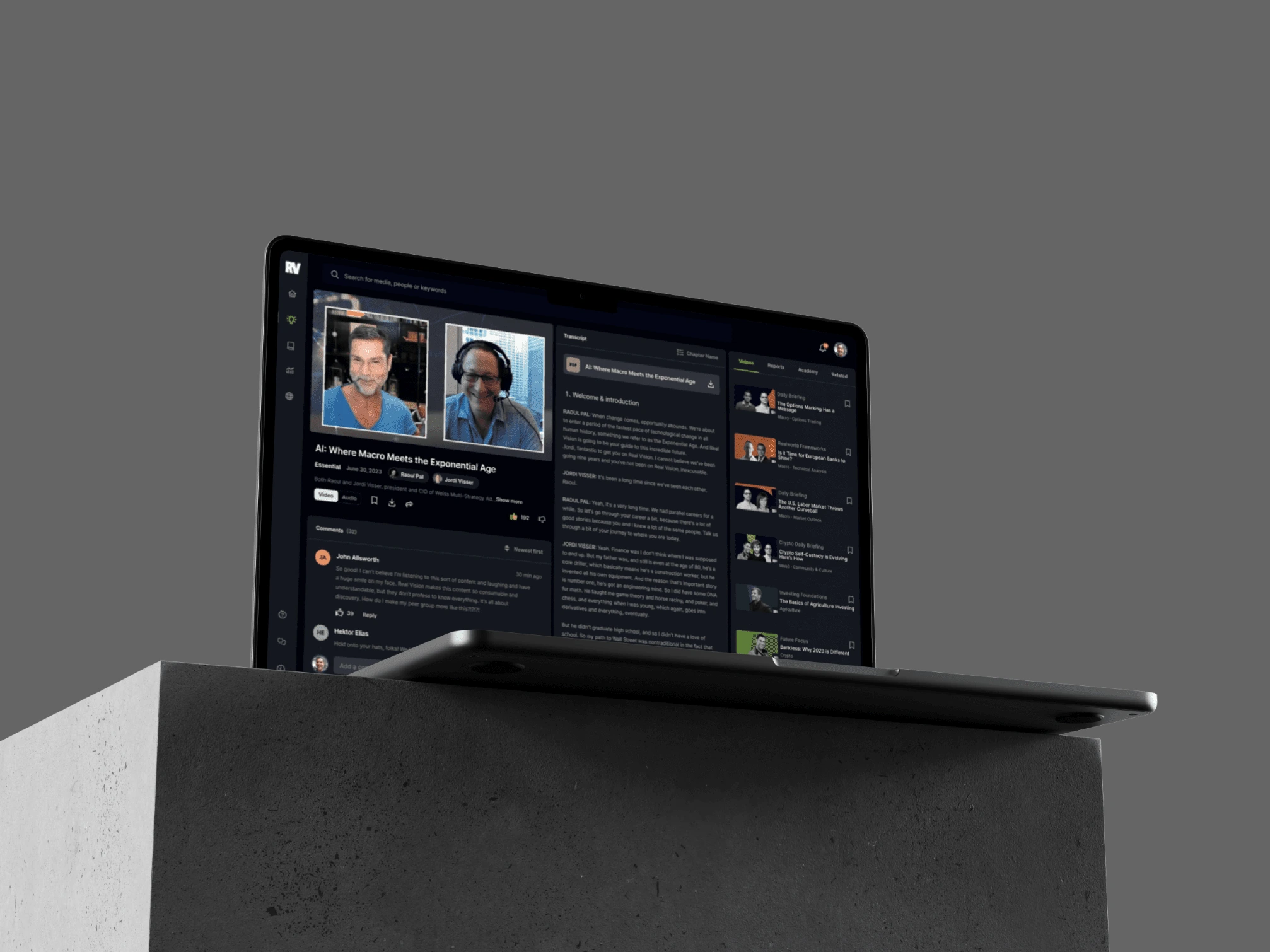
Because of the work I did, Real Vision 2.0 became much better. People found it easier to use and were able to find what they needed quickly. The changes we made to Second Brain made it better than the note-taking features in other apps.
By using Bloom's Taxonomy and block framing techniques, we made the platform easier for users to navigate and learn from. Real Vision 2.0 became a top choice for people who wanted to learn about investing and finance.
Conclusion
My role in improving the way information was organized and making things easier for users was really important. Because of the work our team did, Real Vision 2.0 became a great platform for people to learn about investing and finance, helping Real Vision stay ahead in the world of financial education.
Like this project
Posted Oct 31, 2023
Created a comprehensive brand strategy and design system for a tech startup, resulting in increased brand recognition and user engagement.

