Brand Identity for Pointa Community Center
Kseniia Shliakhtina

The community center Pointa
Brand identity
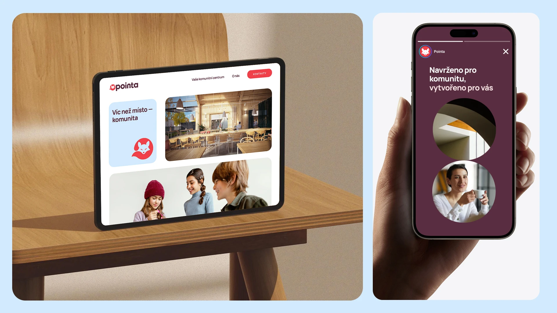
Pointa is a new community space designed to become both a meeting point and a local landmark in the growing district of Pardubice, Czech Republic. The architecture is cozy and light, blending Scandinavian aesthetics with natural materials and soft wooden textures.

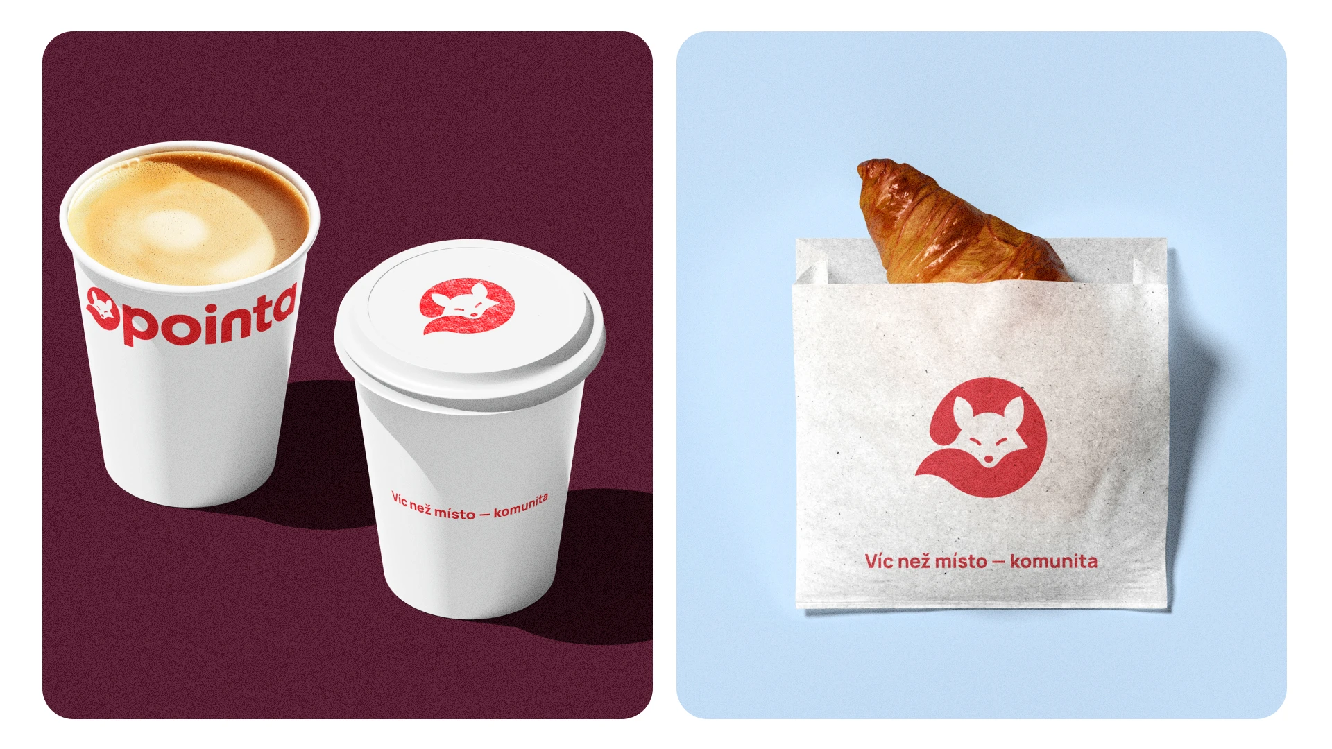
My task was to create a visual identity that captures the warm, inviting spirit of the space. The client envisioned a fox as the central symbol – curious, clever, and full of character. Its soft, rounded form adds a sense of movement and friendliness, making it perfect for various formats.

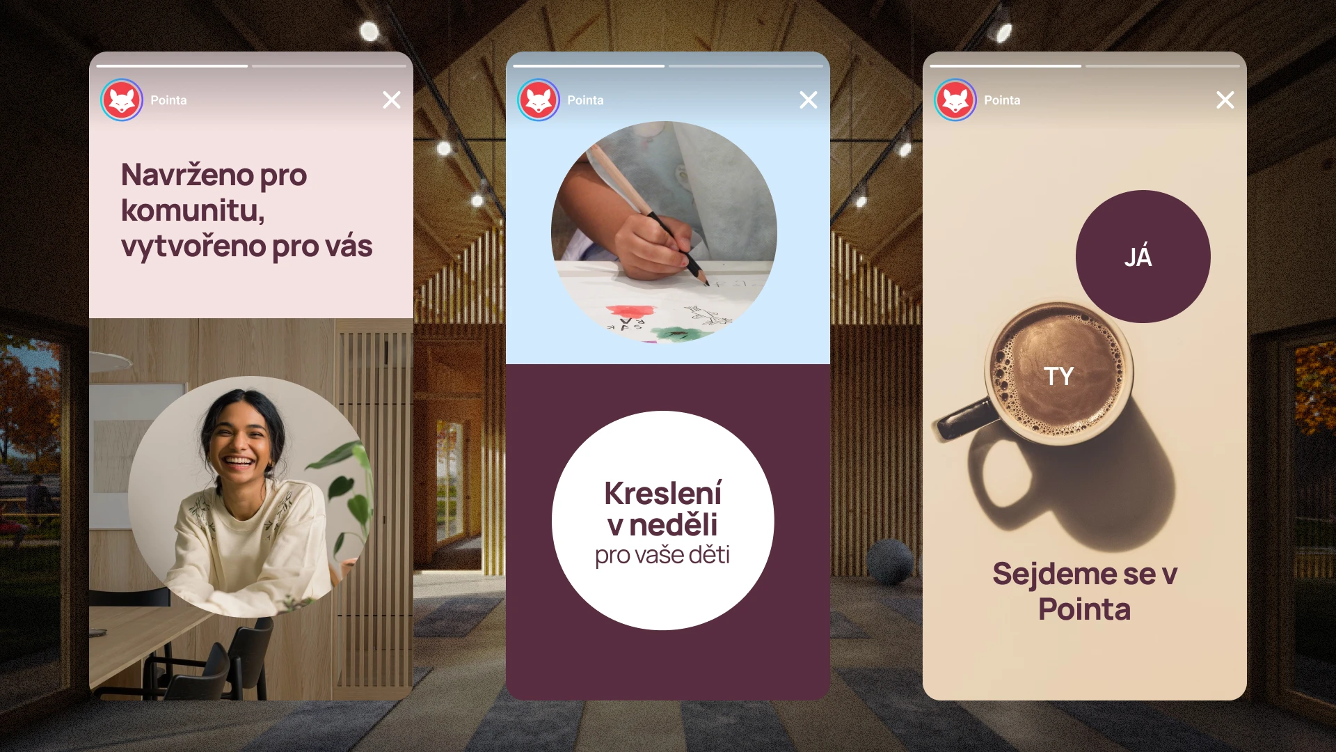
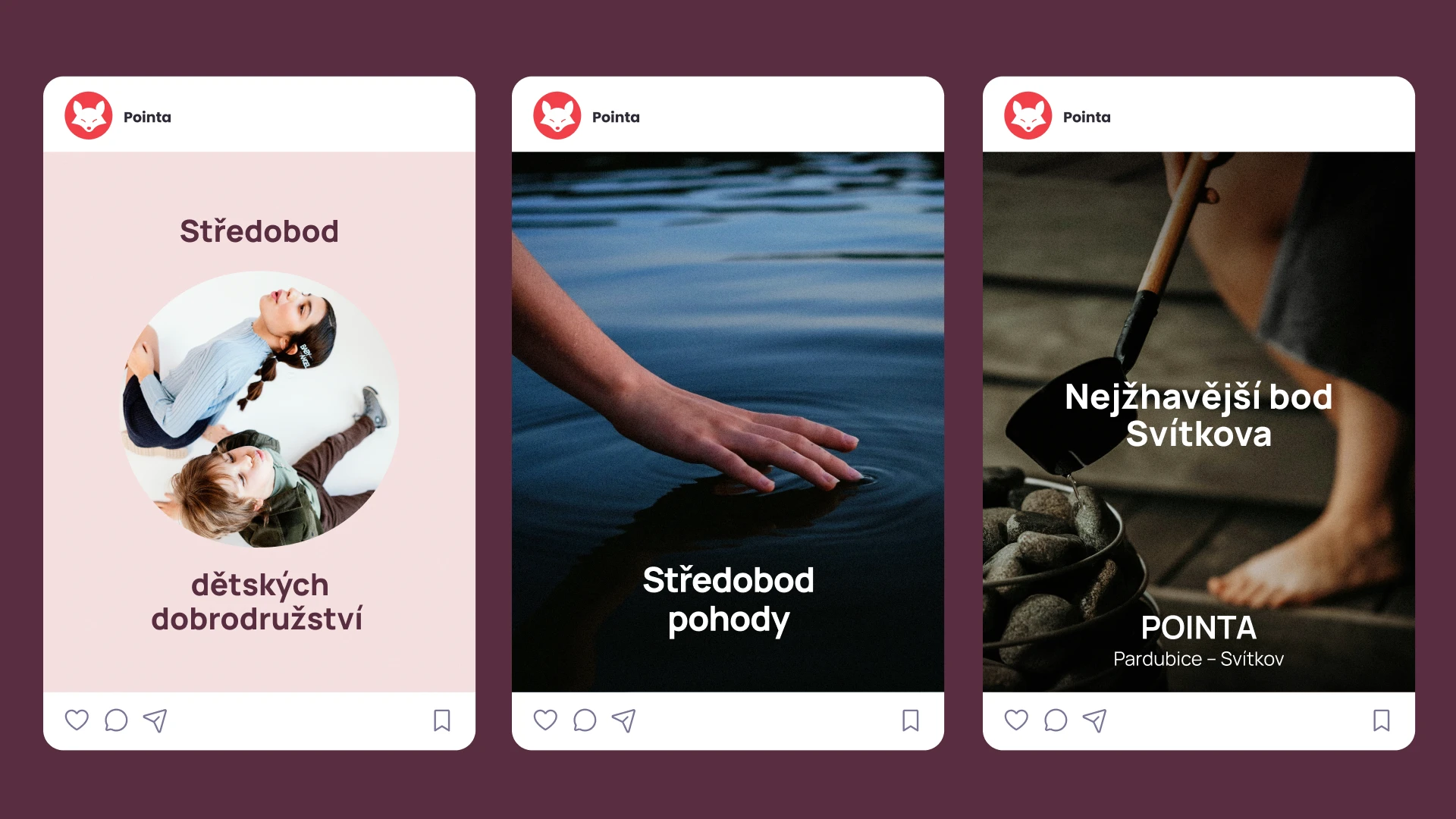
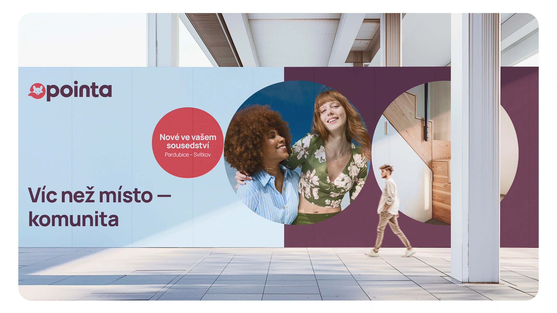
The circle became the heart of the branding, representing connection, community, and flow. It works as a flexible graphic element: framing content, blending visuals, and showcasing both the space and its diverse activities. The result is a layered, playful identity that reflects the center’s role as a vibrant and welcoming hub.
Like this project
Posted Jul 15, 2025
Brand identity for Pointa, a community space in Pardubice, Czech Republic