Enhancing Q-Tickets: User-Friendly Ticketing Experience
Q-Tickets specializes in facilitating the sale of tickets, offering a streamlined and convenient process for fans to secure their desired seats or entry passes.
I was given the crucial job of making the Q-Tickets website and app better and easier to use. This was a great chance to bring in new ideas to improve how people use Q-Tickets.
This involved creating intuitive interfaces, streamlined navigation, and efficient checkout processes, ensuring a seamless and convenient ticket buying experience for users across different devices.
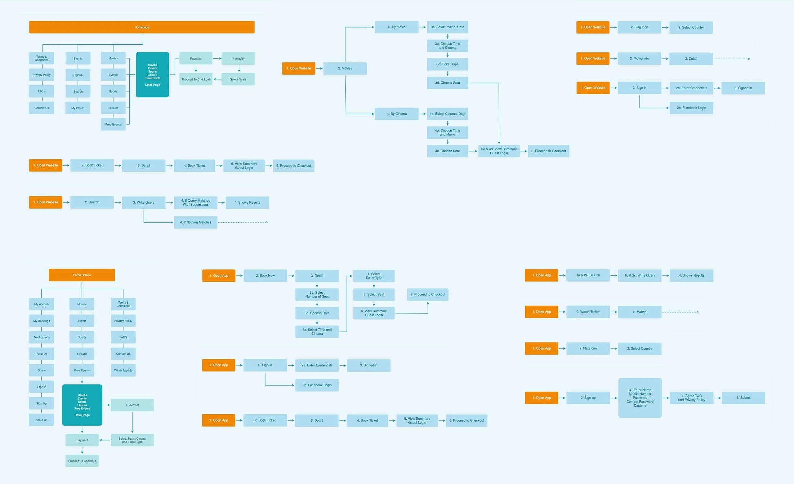
User flows for website and mobile app
By analyzing the user experience on both web and mobile platforms, I created a user journey that optimizes the flow for purchasing tickets online.
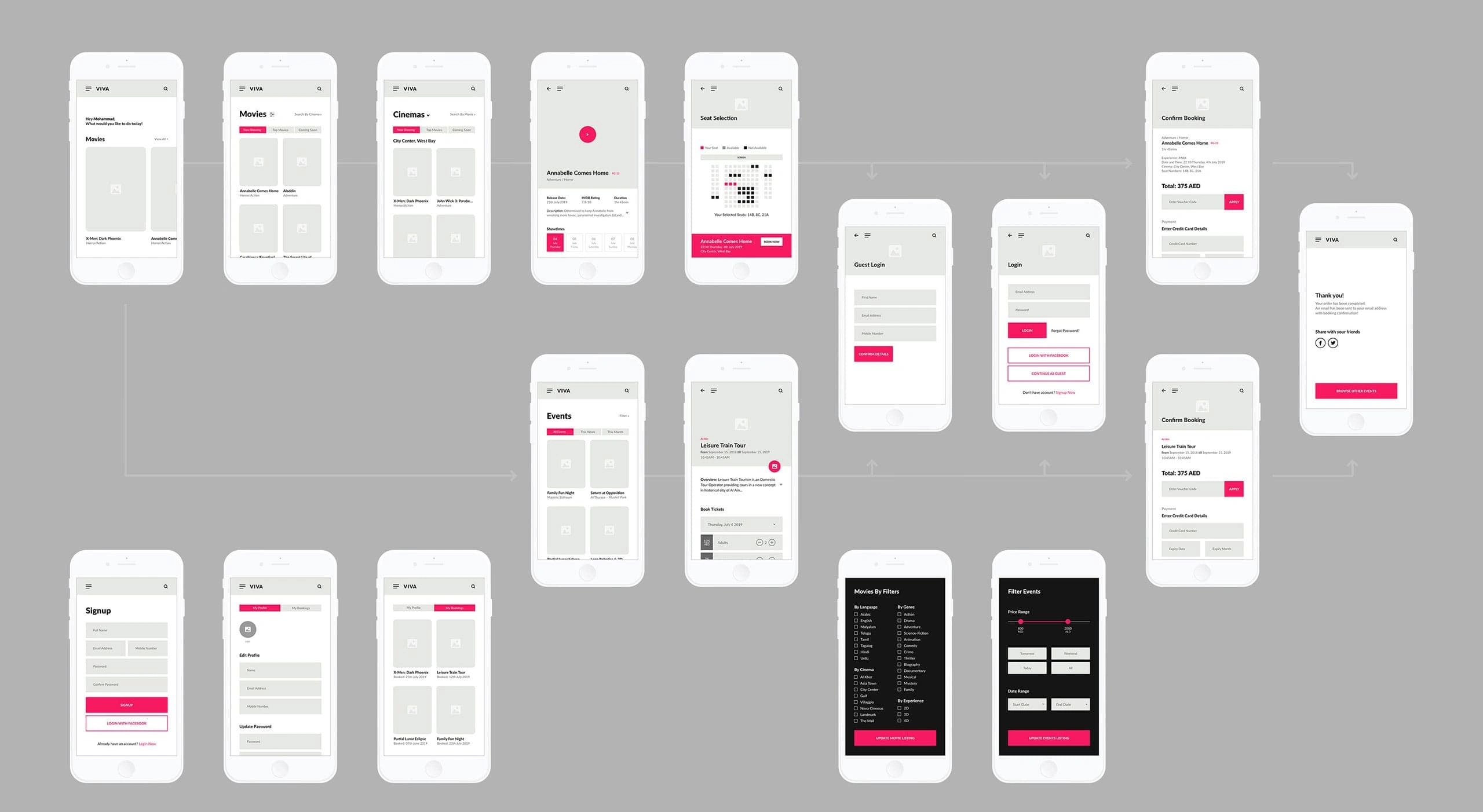
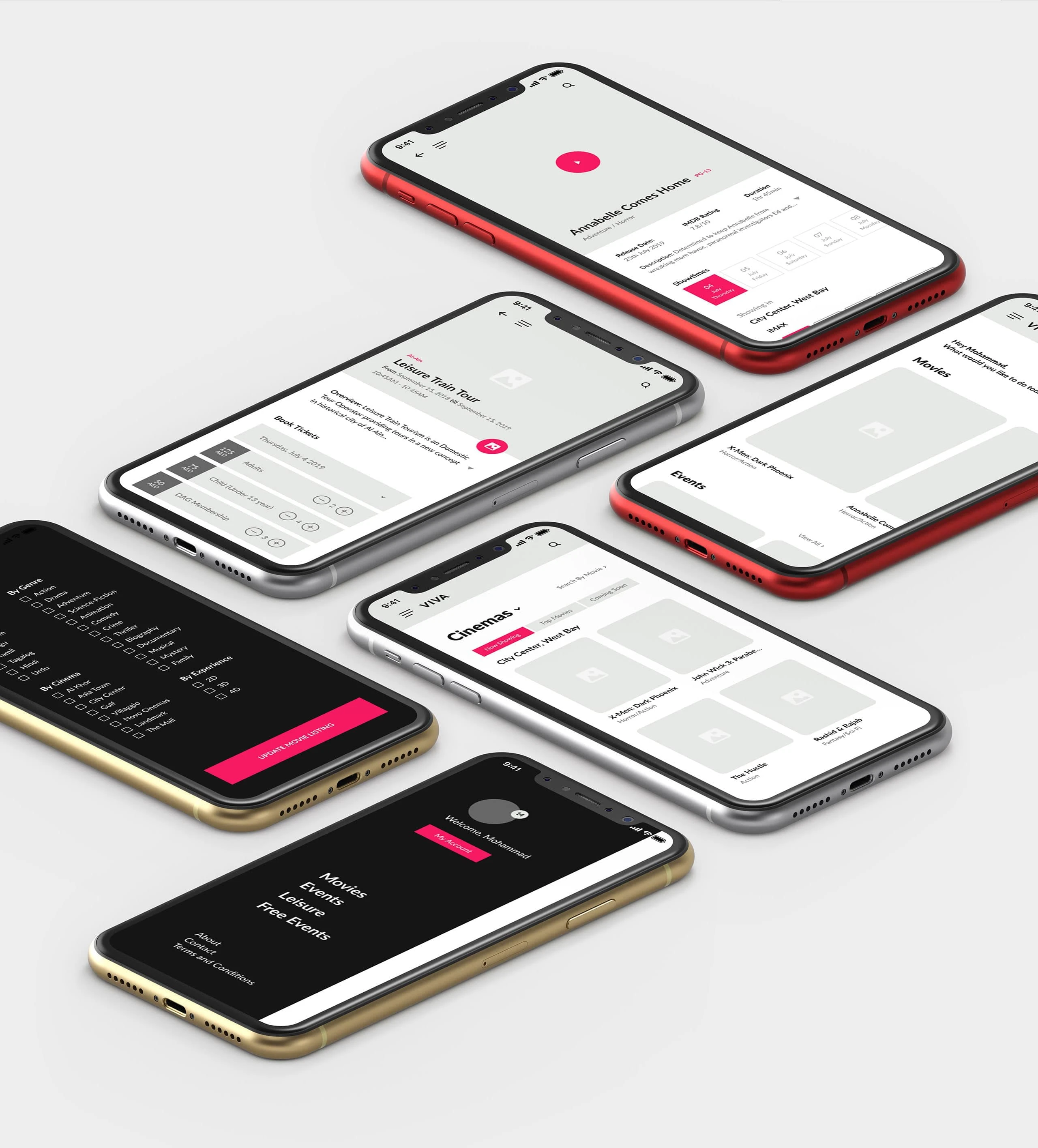
Mobile wireframes
To map the overall user journey of the mobile app, I developed high fidelity wireframes that visually depicted the interface and interactions at each stage.
These wireframes included detailed representations of screens, navigation paths, and user interactions, providing a comprehensive blueprint for the development of the mobile app and ensuring a cohesive and user-friendly experience for purchasing tickets online.
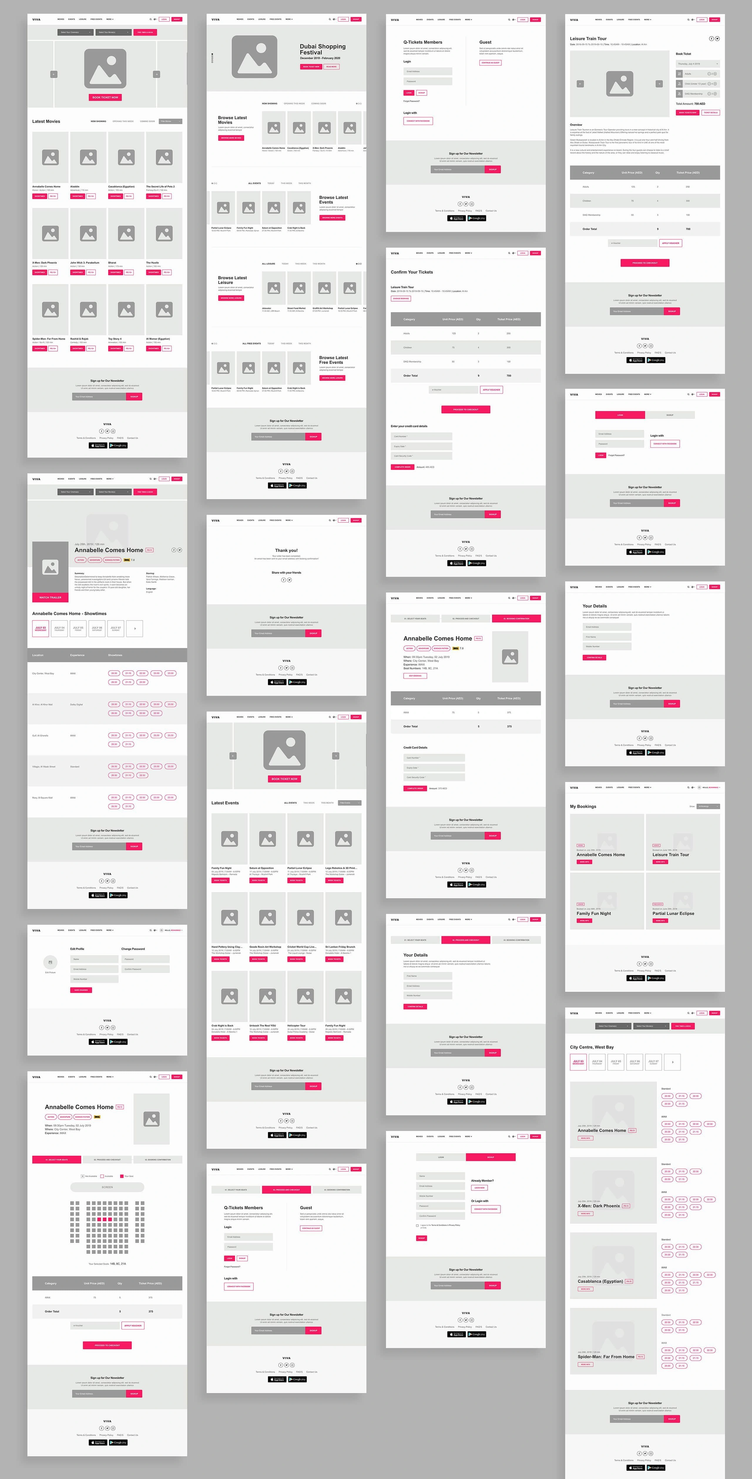
Website wireframes
I also developed high fidelity wireframes that provided a comprehensive blueprint for the website's development, illustrating the interface and interactions at each step.
This ensured a seamless and user-friendly experience for online ticket purchasers.
Want to make your digital presence stand out?
Connect with me at farhanrao.com
Or drop a message at emailme@farhanrao.com
Like this project
Posted Nov 12, 2024
I was given the crucial job of making the Q-Tickets website and app better and easier to use.
Likes
0
Views
7


