Redesigning an e-commerce Homepage to boost conversions
Guilherme Piluski
Date
May–June 2025
Team
1 front-end engineer and myself as the Product Designer
Key Results
+38.7% more mobile users used search as their main navigation path
This was the clearest signal from the new homepage. It became more intuitive, easier to use on mobile, and helped reduce friction.
Also, the bounce rate of the mobile homepage dropped by 23%. Our homepage is now helping many more users find the parts they want to buy.
🧭 Context
KarHub is a Brazilian auto parts e-commerce. The homepage is a major entry point for users, but in May 2025, it still had an outdated layout and a clunky search experience, especially on mobile.
We analyzed two primary navigation paths starting from the homepage:
Category navigation
Search
Here’s what we discovered:
Search outperformed categorie navigation, so we should prioritize it
Search usage on mobile was low, but had a lot of potential
The category section had low engagement and used real product images that were inconsistent and low quality
🔧 Process
1. Funnel Analysis
We compared how users from the homepage moved through the funnel:
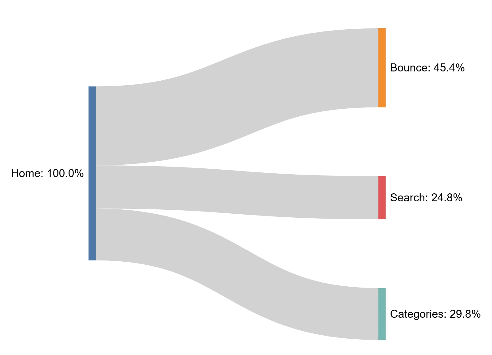
Mobile Conversions - May
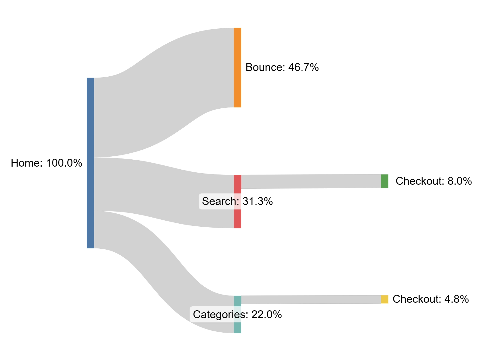
Desktop conversions - May
➡️ Search was clearly the most efficient path to conversion, especially on desktop.
2. Homepage Redesign
🔍 A Better Search Experience
We redesigned the search component on the homepage to match the UX used throughout the site.
Changes included:
Removing the old two-button setup
Merging filters and search fields into one streamlined layout
Focusing on clarity and mobile usability
[image placeholder: old vs. new search layout (desktop + mobile)]
🗂️ Revamped Category Section
We replaced the old, inconsistent product photos with over 300 high-quality AI-generated images that visually represented each category.
The result was a more appealing and consistent experience for users browsing by category.
[image placeholder: old category grid vs. new AI-generated visuals]
[video placeholder: scrolling through redesigned category section on mobile]
📈 Results
📱 Mobile
Users navigating via search increased from 24.8% to 34.4%
→ +38.7% increase
Search conversion rate on mobile grew from 2.4% to 3.8%
Homepage bounce rate dropped from 45.5% to 34.8%
💻 Desktop
Users navigating via categories increased from 22% to 27.1%
→ +5.1 percentage points
📊 Interpretation
The new homepage made search a priority, especially on mobile. This helped reduce friction and guide users toward finding the right parts faster.
The updated category section also attracted more attention from both mobile and desktop users, thanks to the visual overhaul.
[chart placeholder: before/after comparison of navigation behavior and conversion rates]
[image placeholder: KPI summary card with icons for traffic, CTR, conversion]
💡 Reflections
Unifying the search UX simplified the experience and gave users more confidence in the process, especially on mobile.
Using AI-generated images turned out to be a low-cost, high-impact way to solve a long-standing problem with poor product visuals — a huge win in a space where product imagery is often overlooked.
Like this project
Posted Oct 30, 2024
How I turned a funnel analysis into actionable insights to help Brazil’s top auto parts retailer boost conversions.
Likes
0
Views
10