Agro Rebranding
Dario⚡️ Ferrando
Verified
The Brief, aka the challenge
The Agro (Now Renalta) team came in hot with a rebranding request. The to do list, quite clear. A refresh of their branding, including new typography set, new colors and new illustrations styles. A new landing page, a new UI for their iOS app.
The challenge? Everything had to be delivered in two weeks. (Spoilers, in the end everything was delivered in one week). In a matter of days, the Agro brand had a new digital presence, matching with their vision and creating a strong visual baseline for their next steps.
Note: a week after launch the team decided to rename to Renalta. This obviously means the mockups I have still show the older logo, but the live version is updated to the renaming!
The Rebrand
The rebrand had a focus on creating a more mature and modern look and feel for Renalta. With the imminent launch of the new iOS app, the company needed a cleaner and minimal look to attract a wider userbase, while looking top tier and most importantly trustworthy and reliable.
We explored a couple options based on a modern take on Guilloches, the decorative minimal patterns that are most commonly used on certificates and banknotes.
Some Early Explorations
Early Explorations
In the end, we decided to go for something that would still use the heavily decorative style of the guilloches, but in a cleaner and more geometrical manner, so that the brand would not end up being overly complicated or loud. We shifted away from rotated patterns, and focused more on grids and concentrical repetitions that you can see consistently applied on both website and app.
Everything was obviously complied in a Figma Styleguide that was delivered both as a figma file and as a figma slides document.
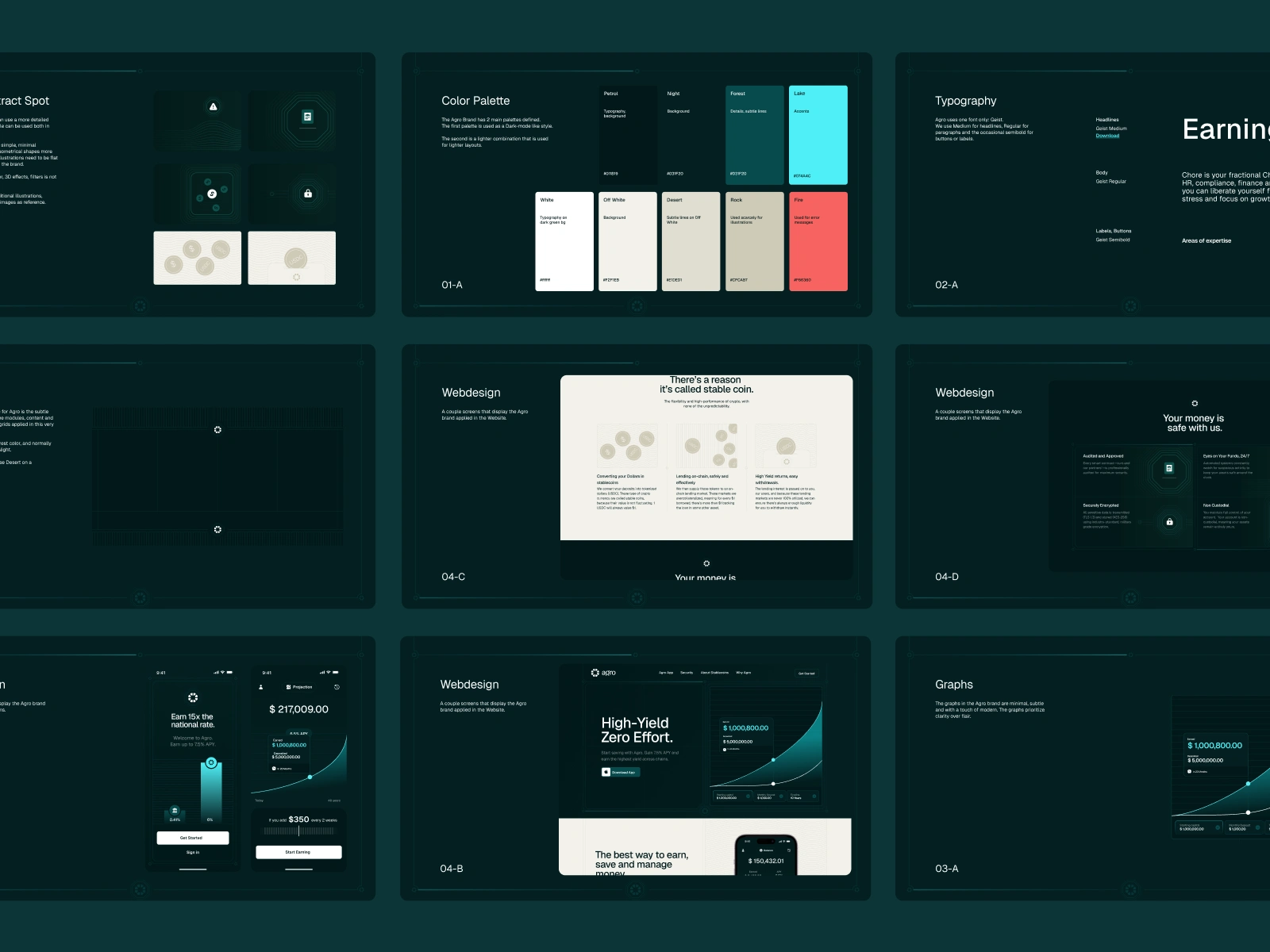
The Agro Brand Guidelines
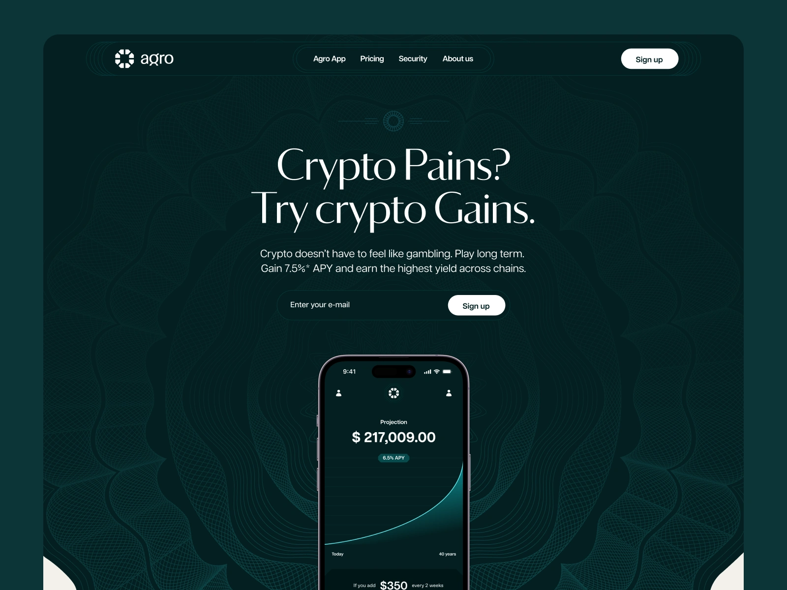
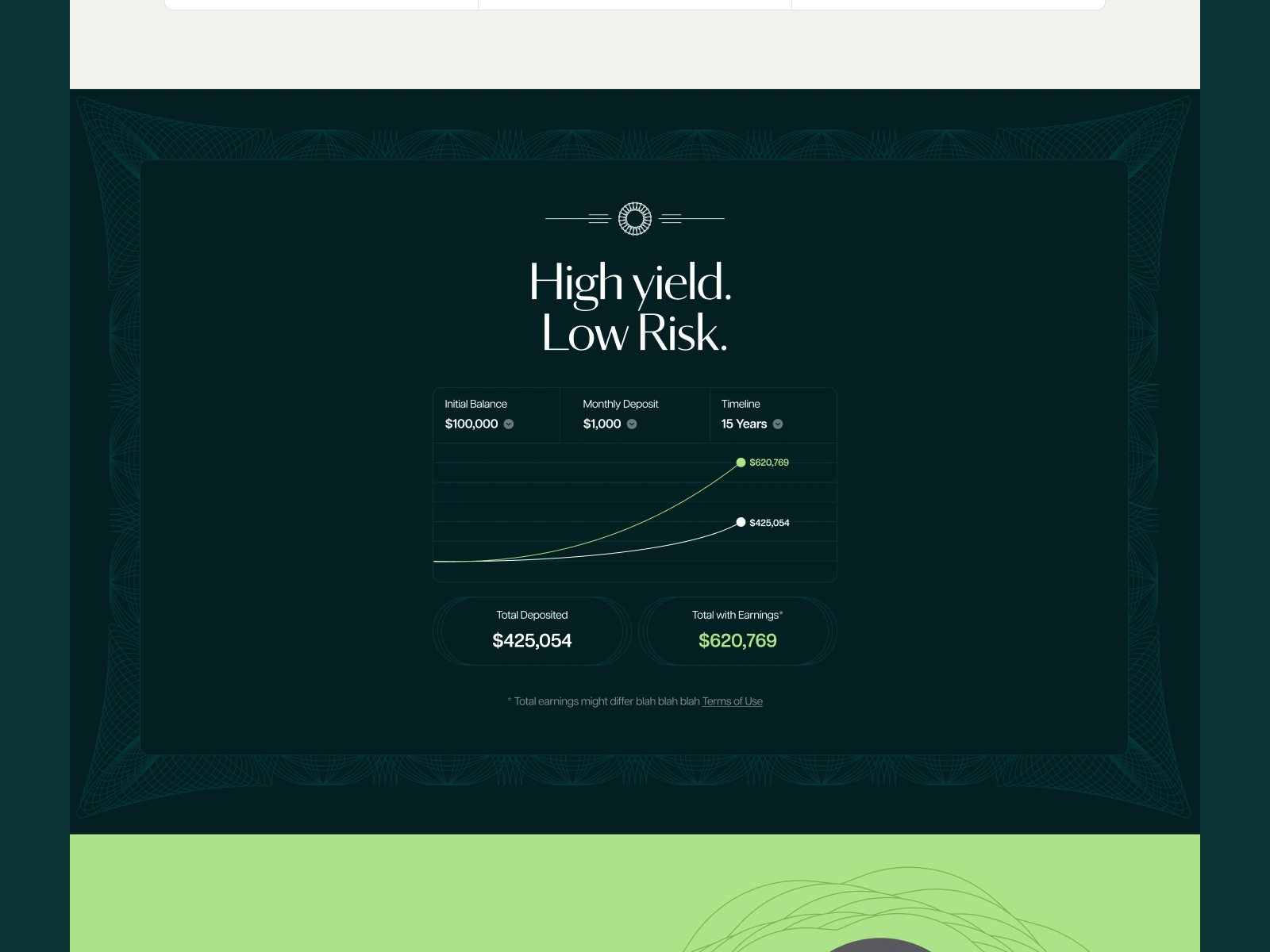
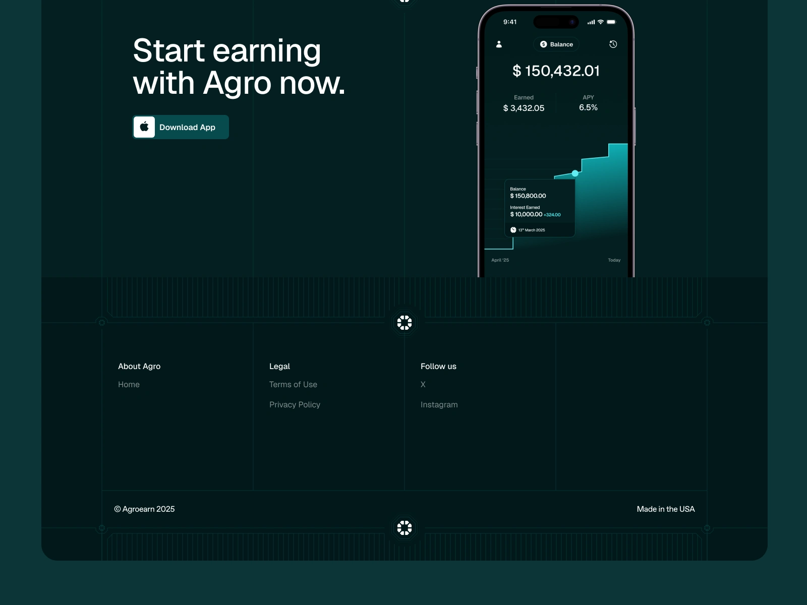
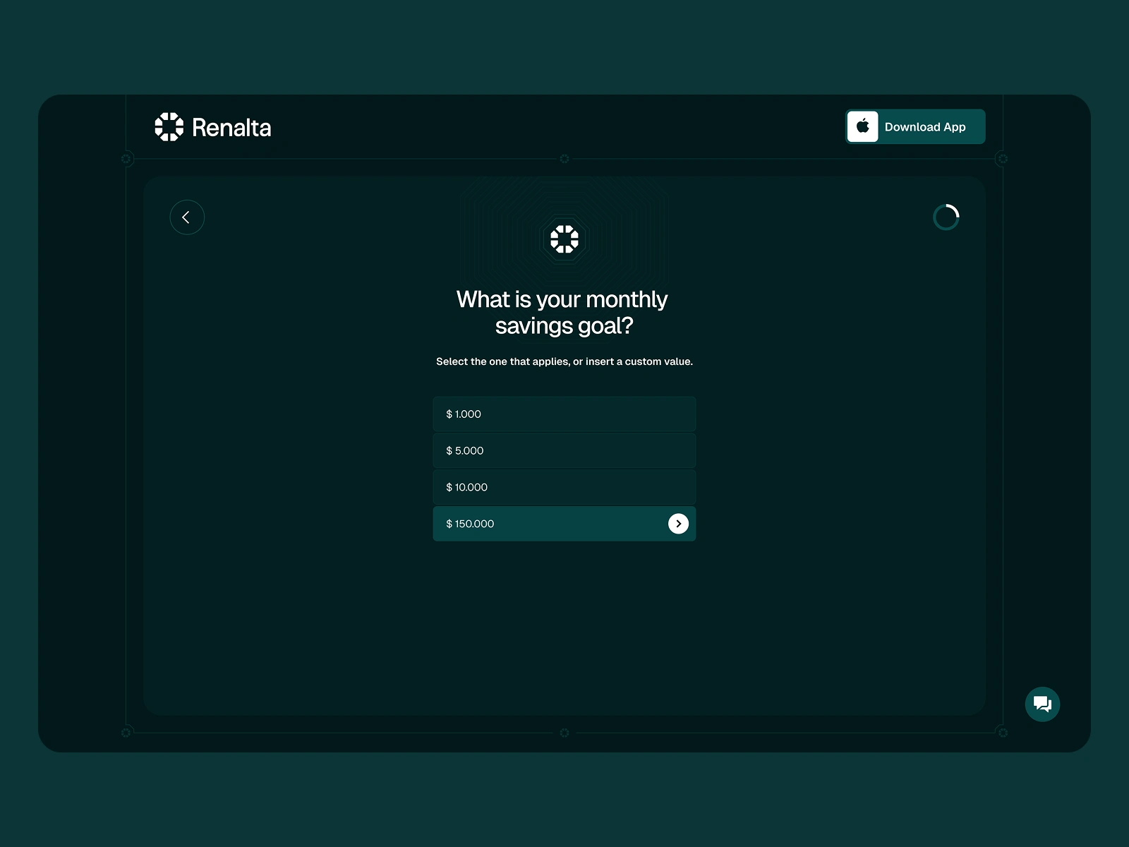
Landing Page
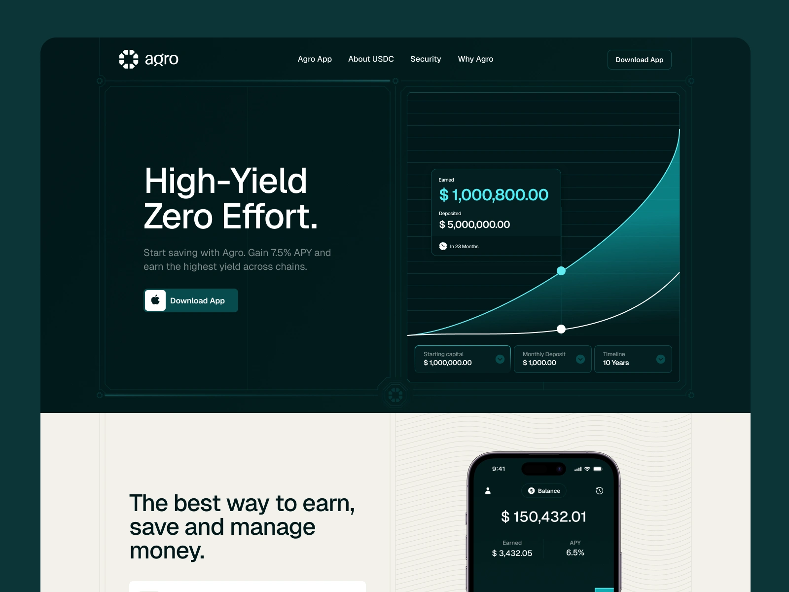
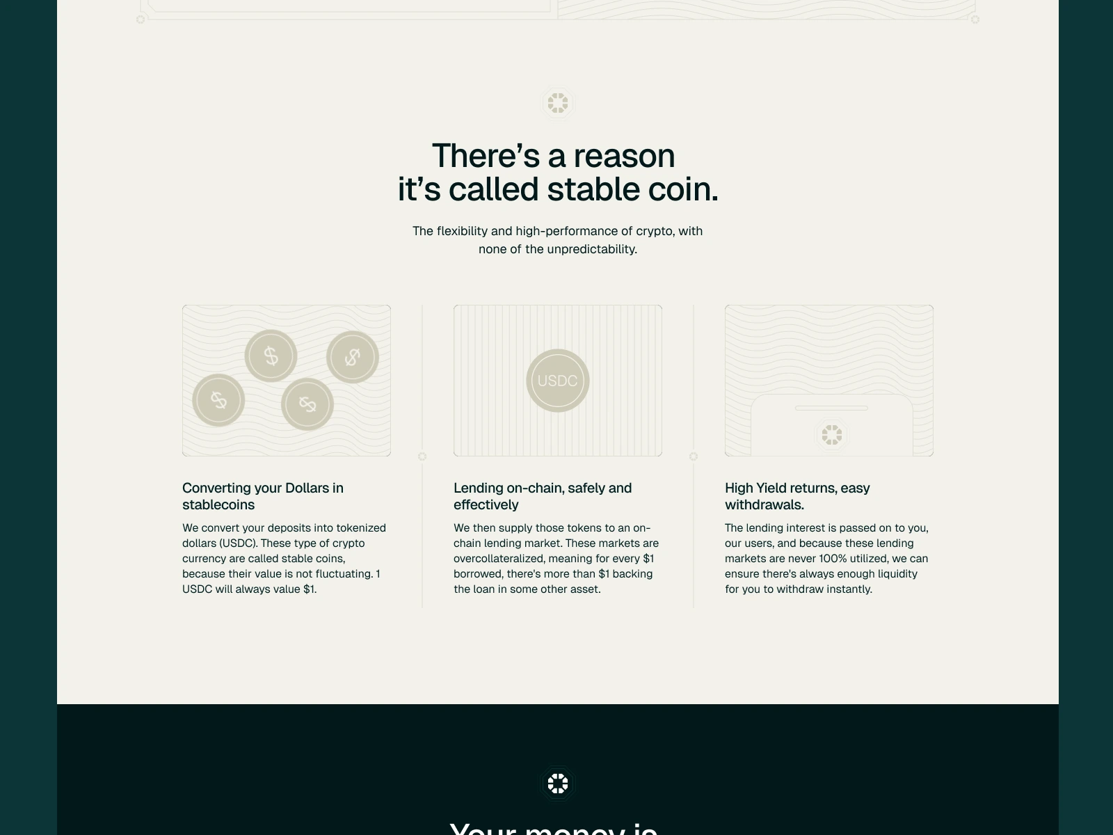
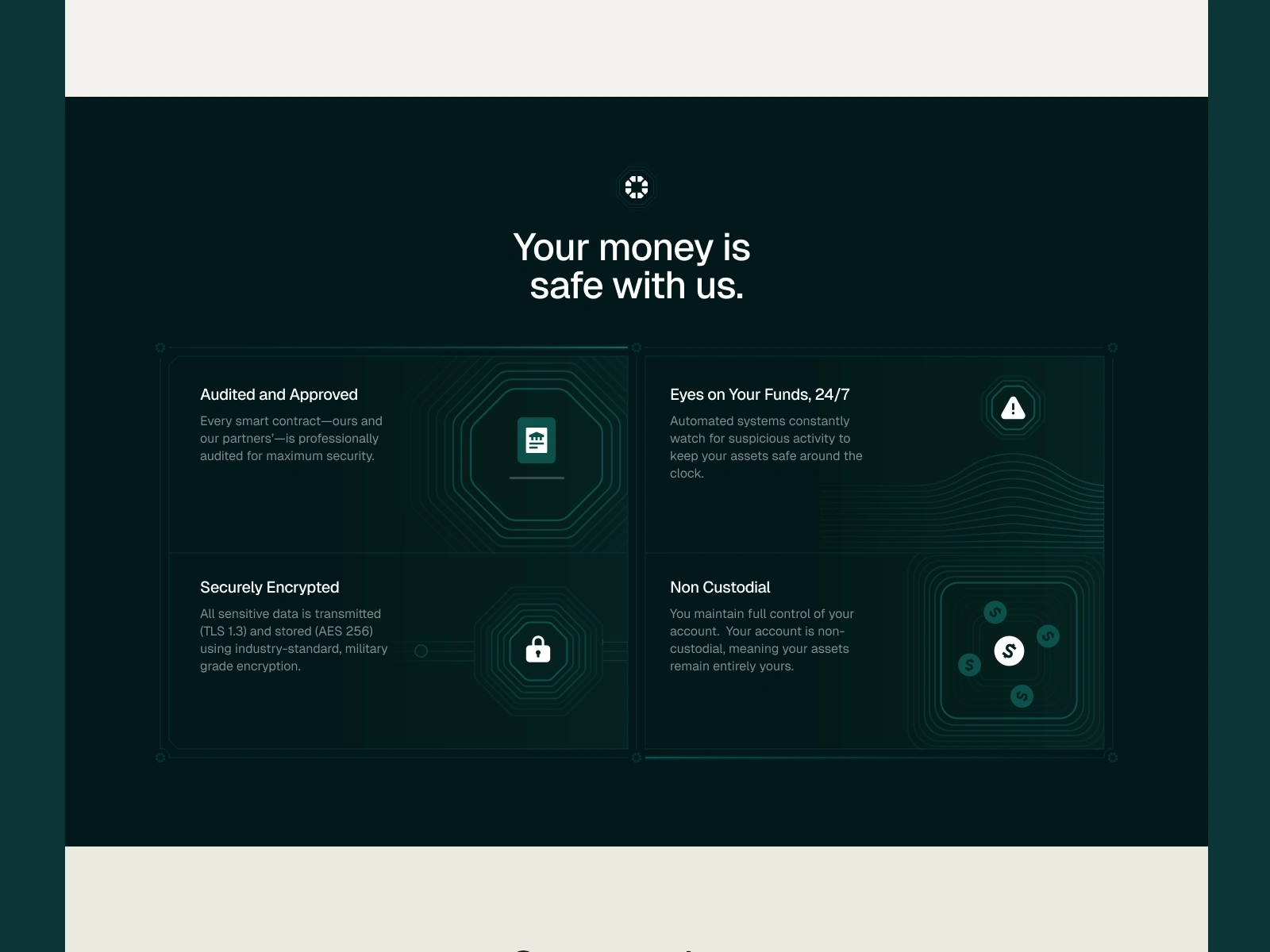
I supported the team with the full redesign of the page. I started from simple wireframes and suggested the structure, content and final design of the website. I took care of everything including illustrations and copywriting.
The website was designed pixel perfect both for desktop and mobile, with the addition of tablet designs for both horizontal and vertical layouts.
For some of the page animations, I teamed up with Arsen Airyan to create custom minimal animations that would enrich the website experience, without overloading the page with too much.
A look at the landing page including the animations
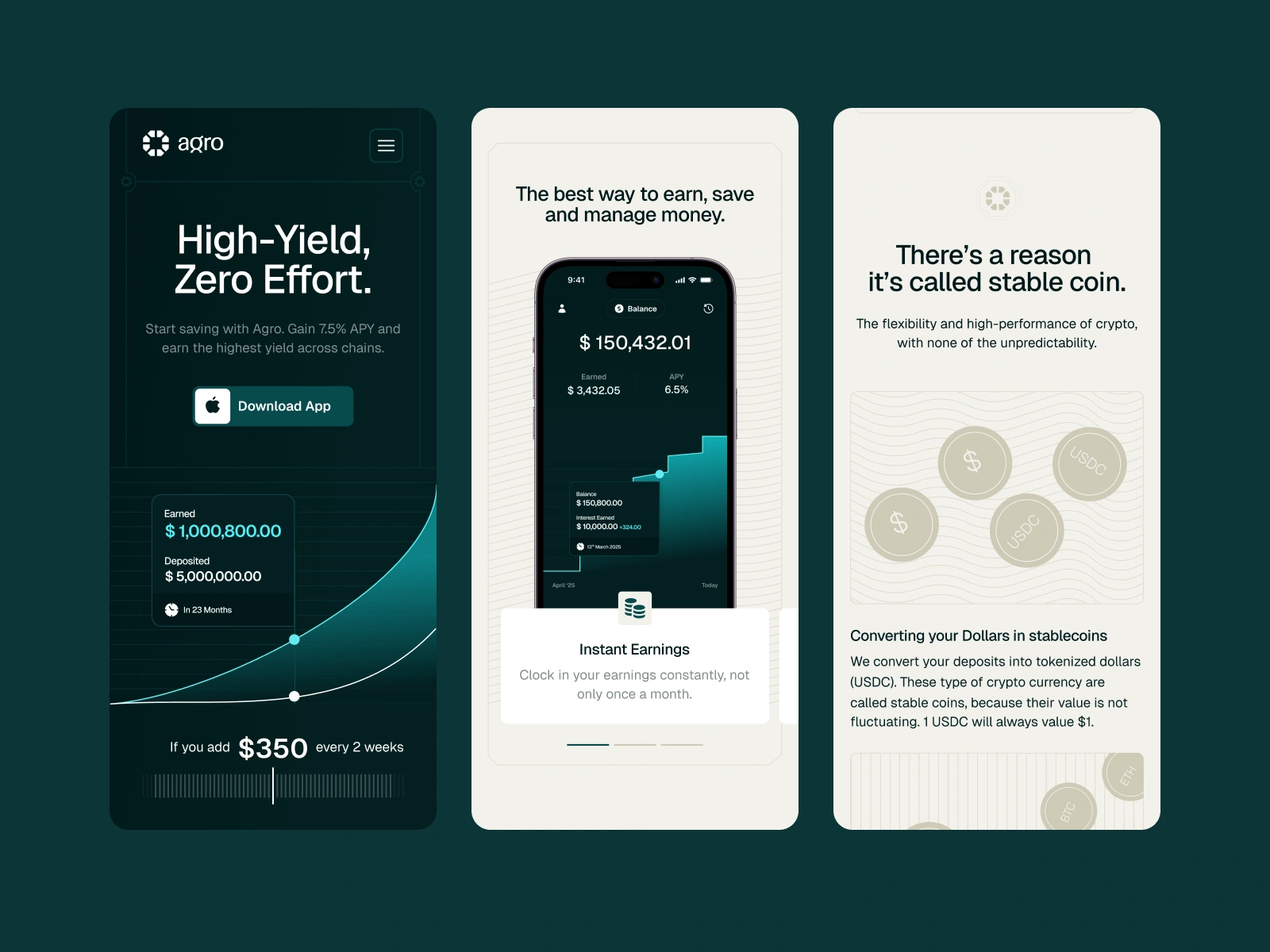
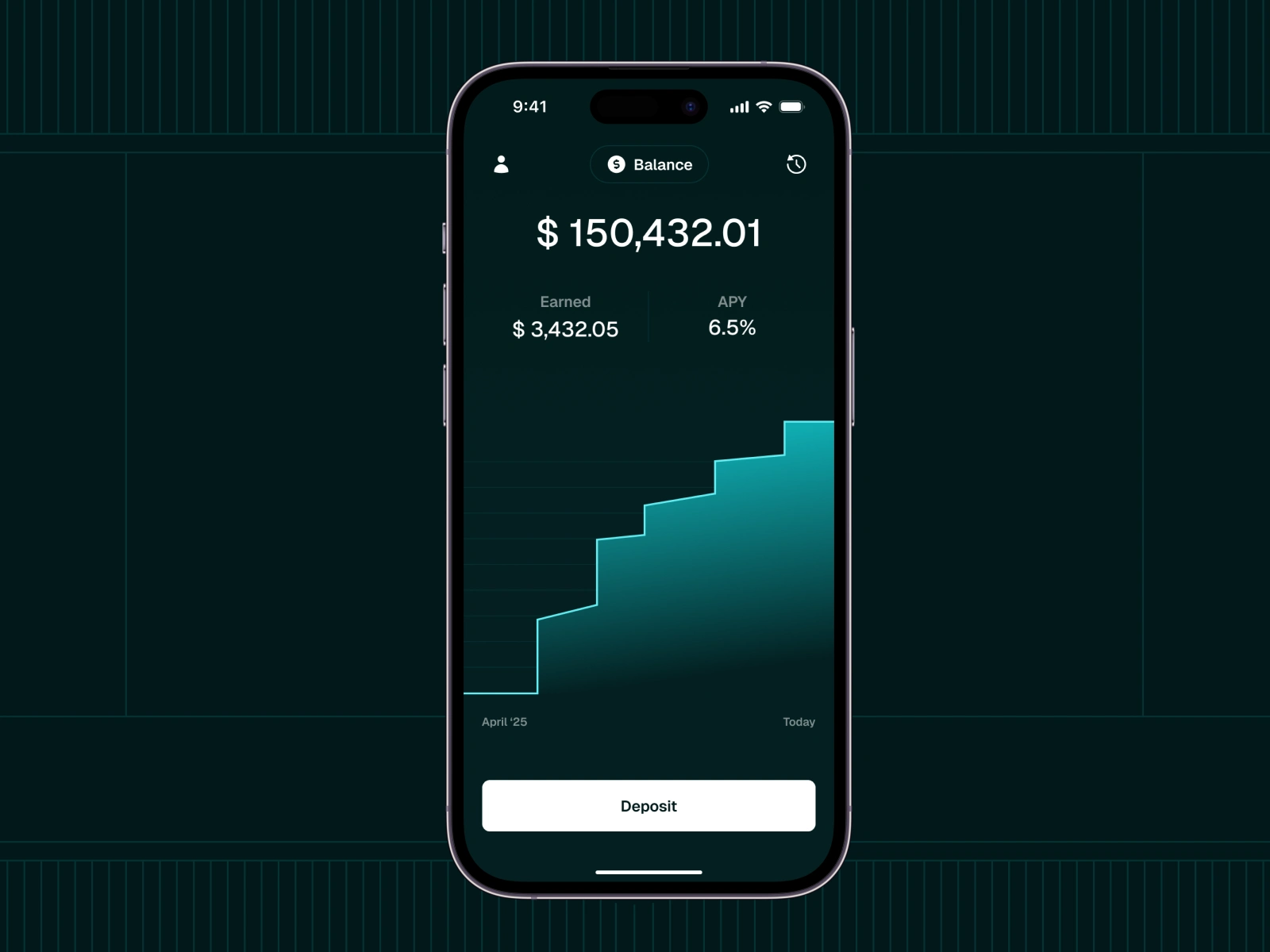
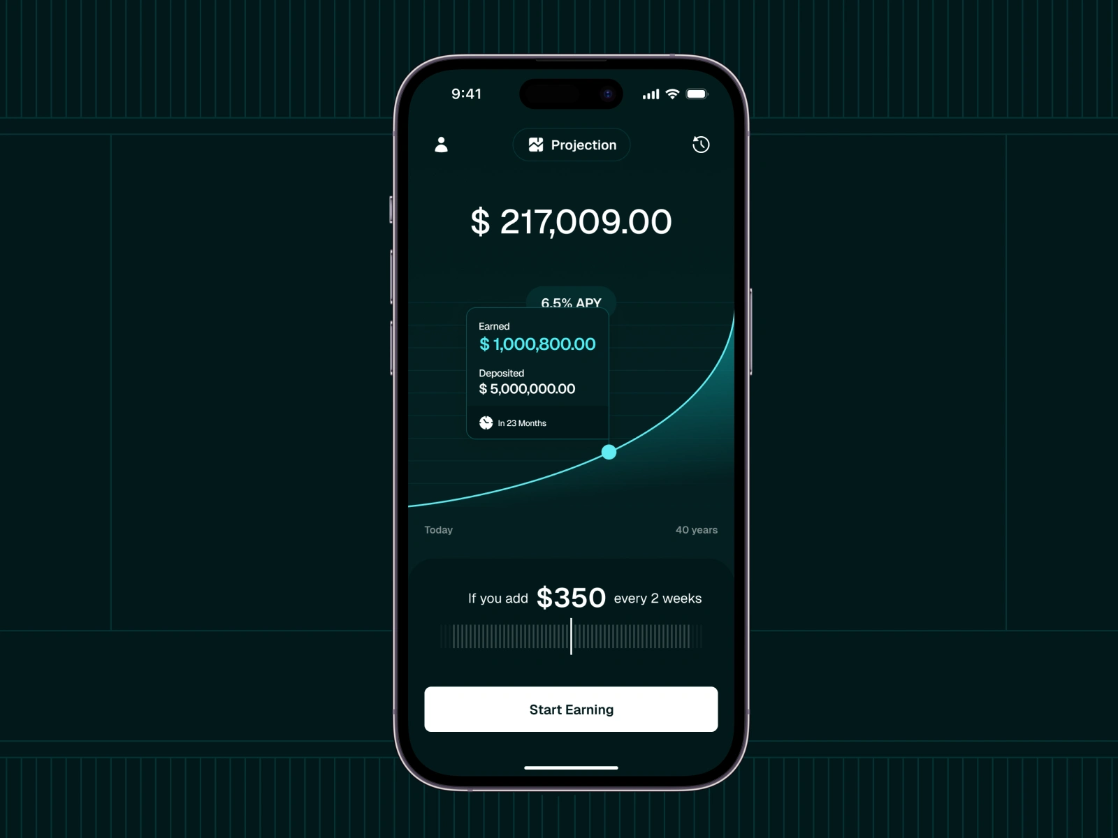
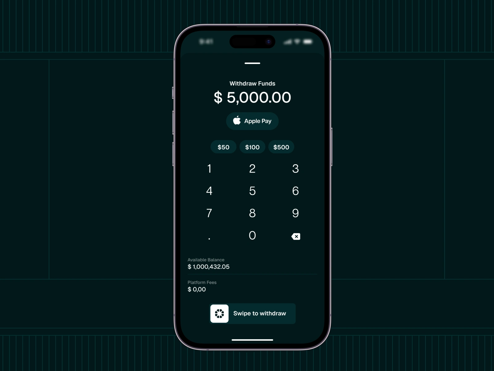
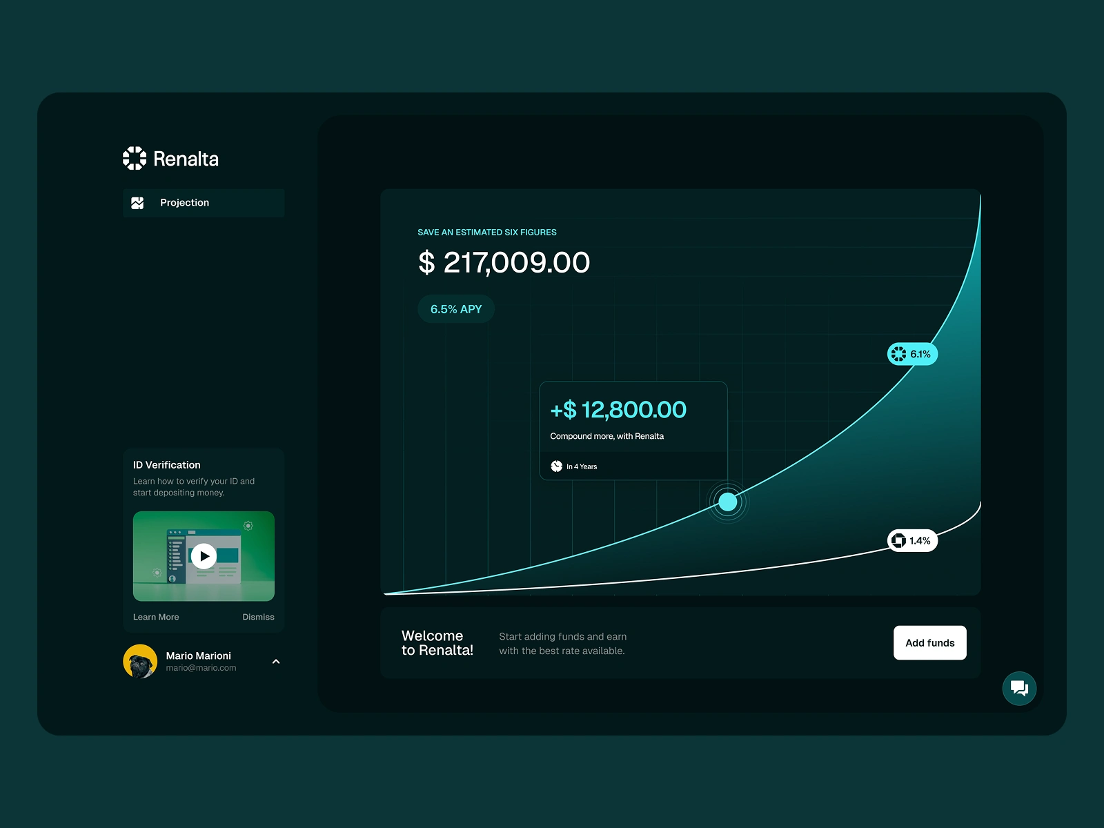
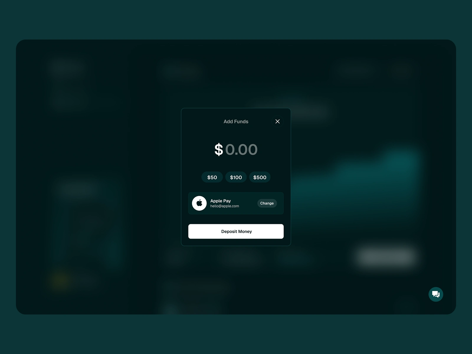
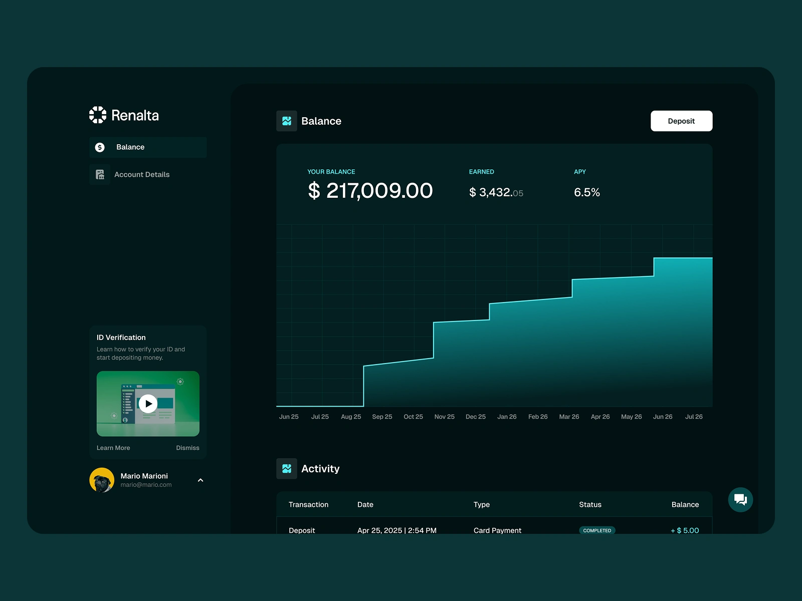
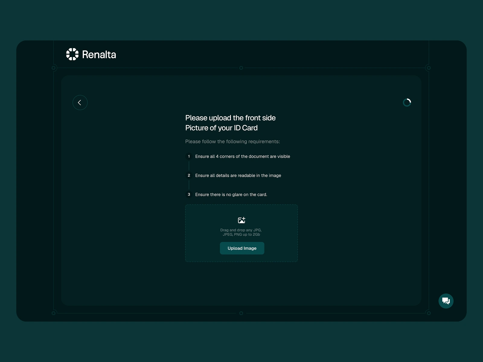
iOS App
Next up, we had to take care of the UI of the existing iOS app Prototype. While we will soon focus on a UX overhaul of the platform, the focus for the moment was to take what was available, and do a complete refresh of its look so that it looked ready to launch. The app will be available on the appstore on the coming weeks.
As usual, I did not only support on the UI design (alongside the creation of a small design system), but I took care of the Appstore listing materials including app icon and store screenshots.
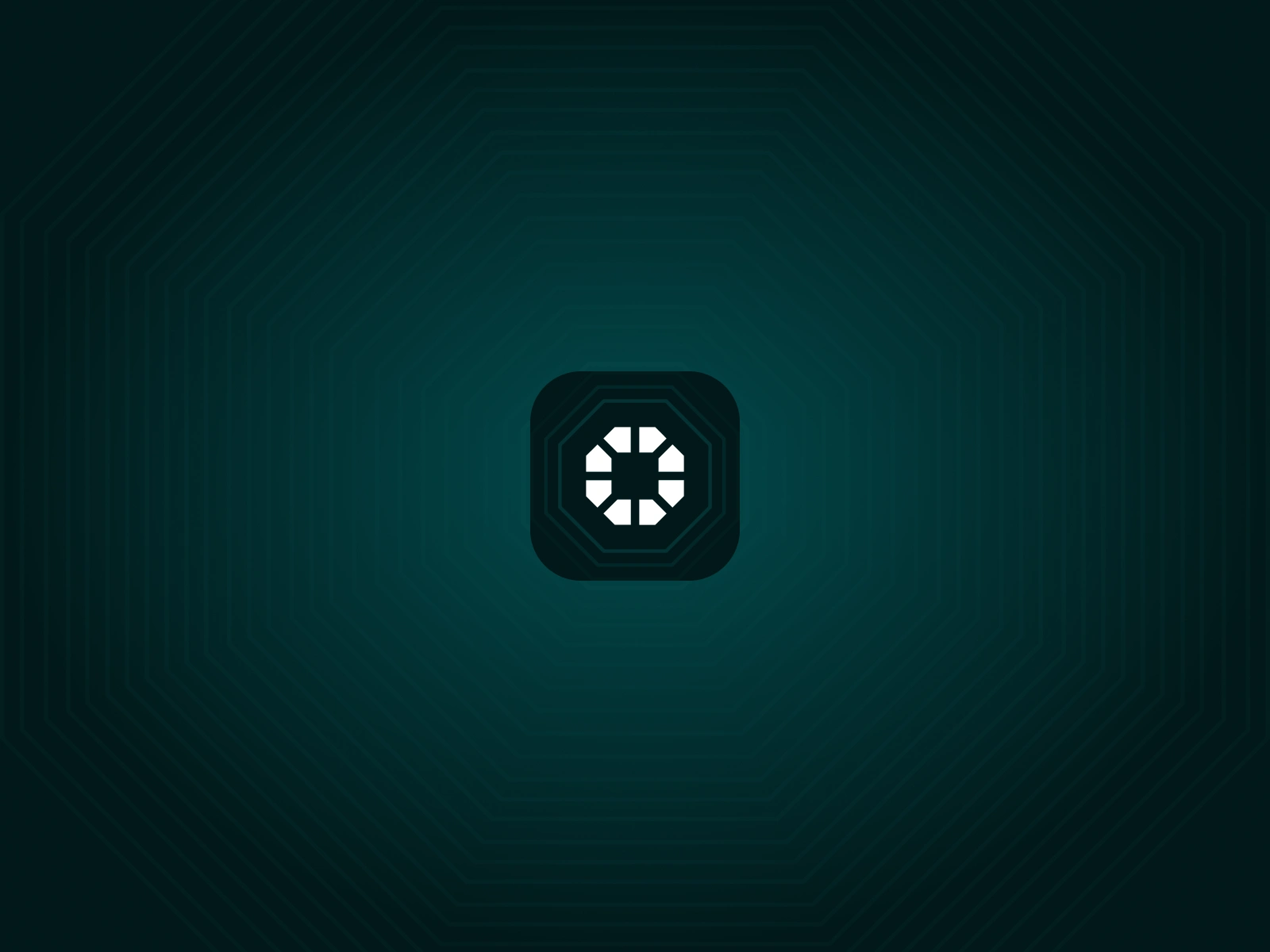
App Icon
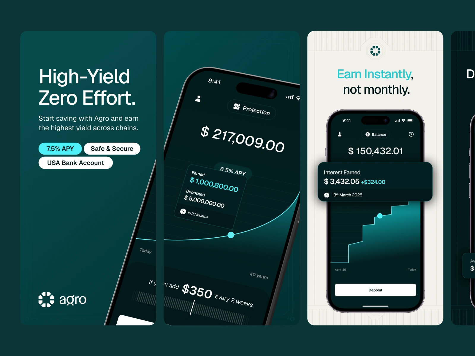
Appstore Screenshots
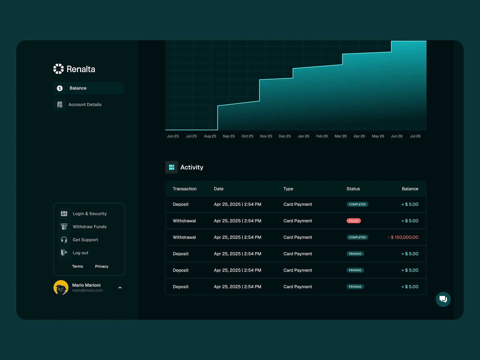
Desktop App
Shortly after delivering the brand and iOS app, the team rehired me to add the Desktop app experience for Agro. I kept the same serious and professional vibe across the entire desktop app and designed everything with feature parity in mind.
Like this project
What the client had to say
Dario is a phenomenal designer. He is quick, responsive, extremely creative, and incredibly thoughtful. I highly recommend working with him. He is a rare talent and pleasure to collaborate with.
Natalia Murillo
May 13, 2025, Client
Posted May 21, 2025
Rebranded Renalta's digital presence with new branding, landing page, and iOS app UI. Desktop app and more soon to come!
Likes
60
Views
857
Timeline
May 6, 2025 - May 11, 2025
Clients
Agro