Built with Jitter
Popcorn Website
Popcorn Website
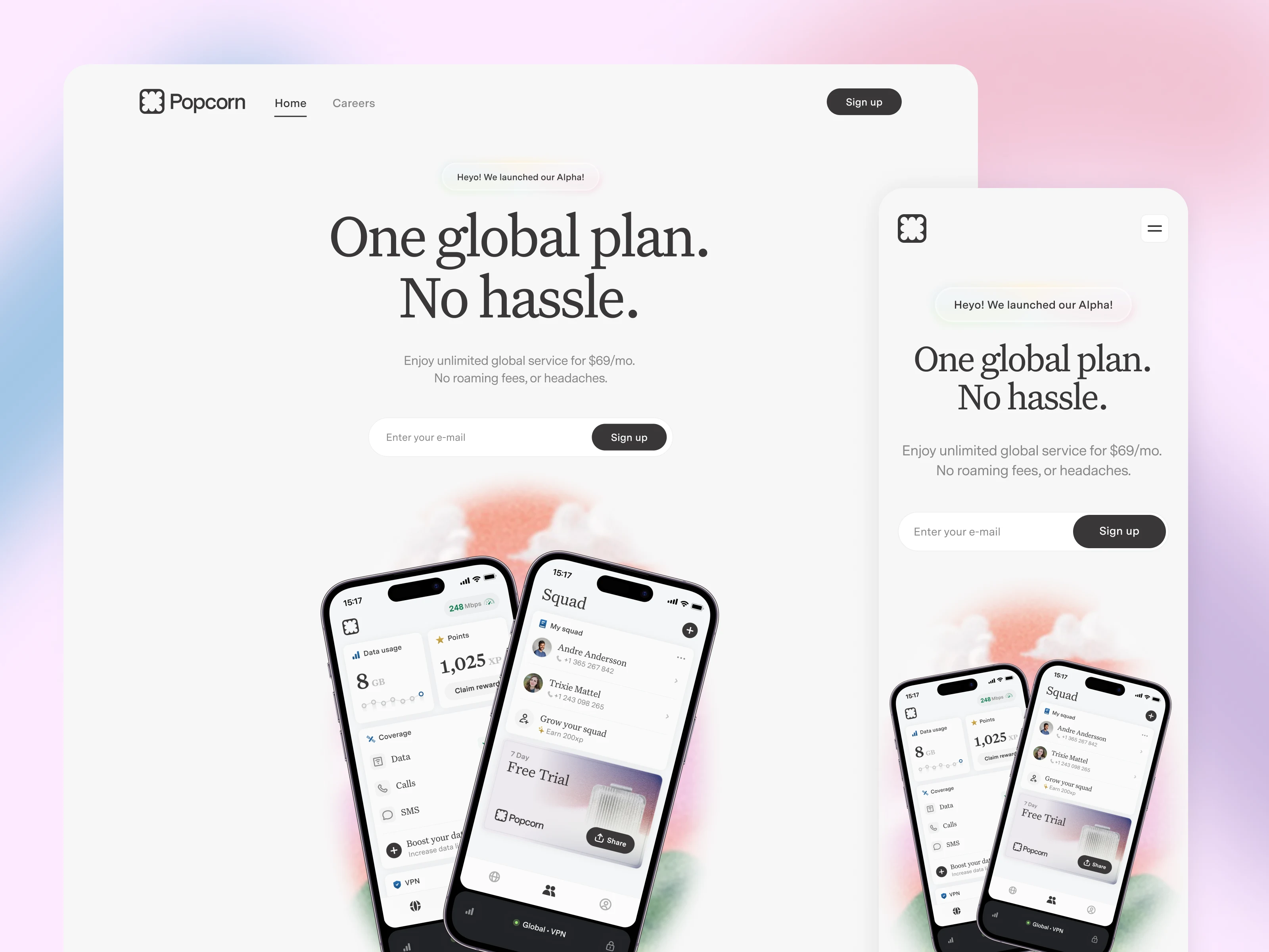
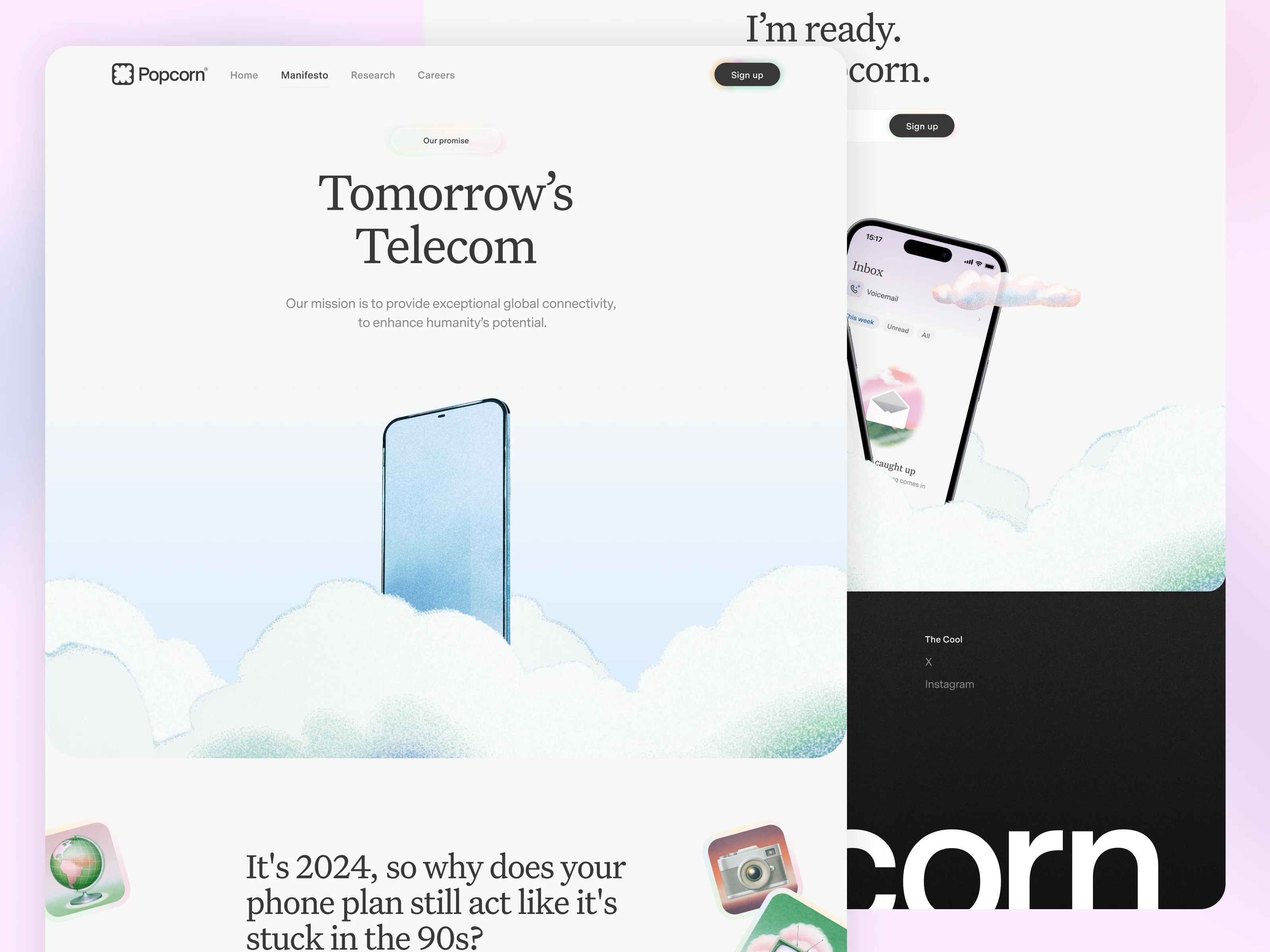
I designed the entire digital presence for Popcorn.
An ethereal, light website with a unique, dreamy vibe.
Check out the launch video I made with Jitter for a preview, or dive in and learn more about the process.
The Challenge
I would say the biggest challenge for this project was the need to create a distinct and unique look and feel, while having little to no illustration assets to use. The Popcorn brand, done by Open Purpose, is amazing, but for whatever reason very little illustration material was delivered at the end of the project. That left me with very little to use, and very much to deliver.
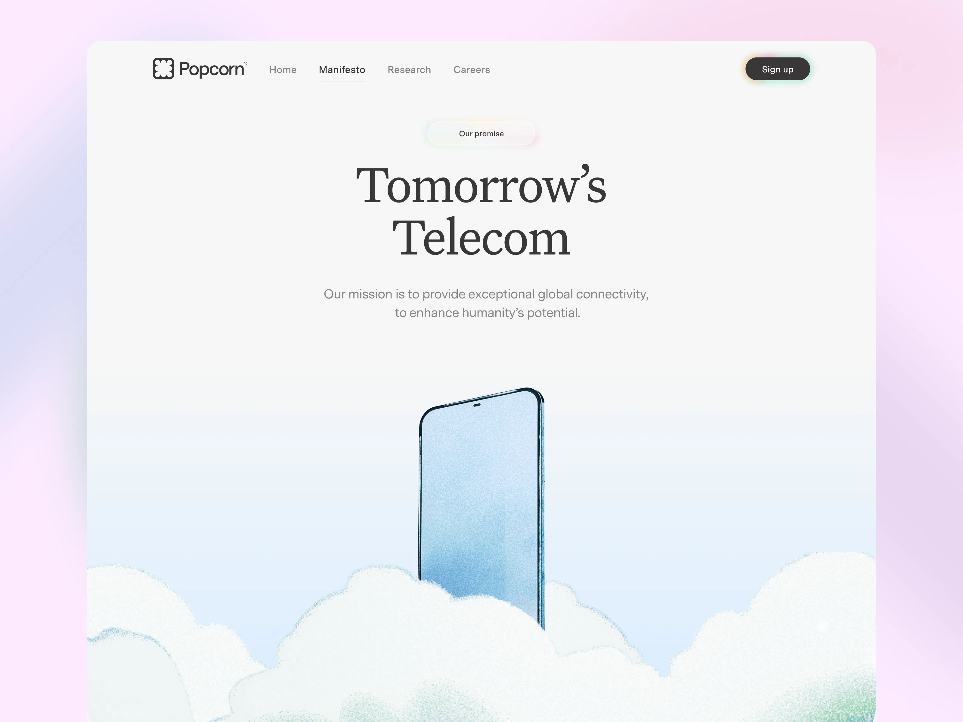
Instead of turning to GenAi tools, I decided to embrace the challenge. Some illustrations (like the globe on the Research page) I directly made myself, trying to stick to the provided branding, while for other pages such as the manifesto, I tried to make a smart use of the few clouds we were delivered as pngs.
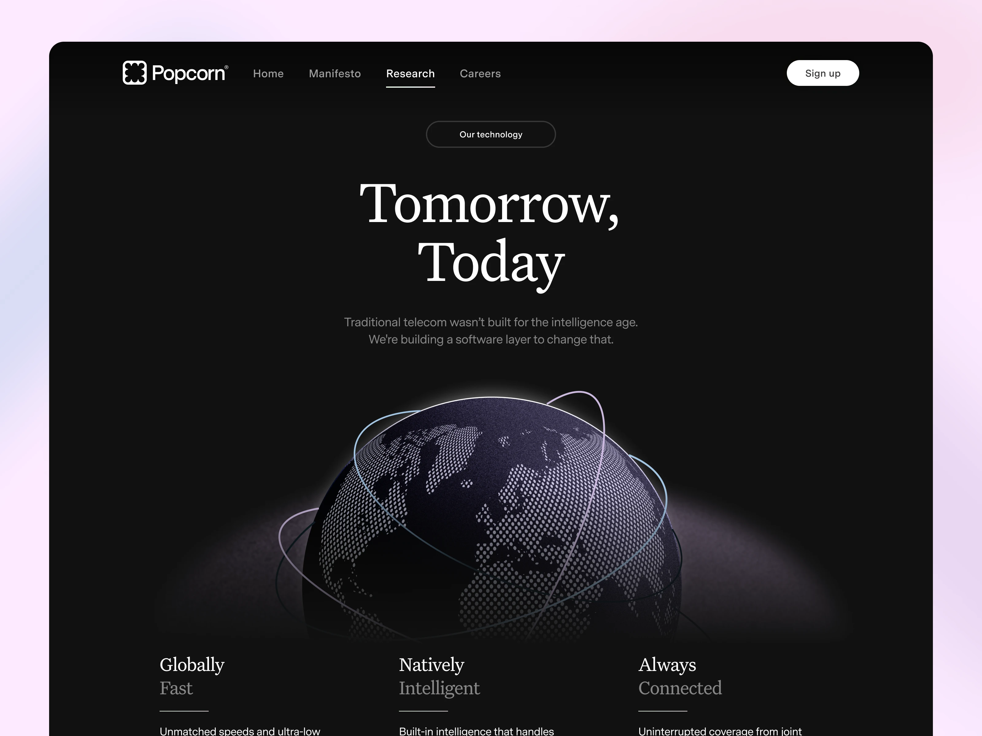
Some illustrations I had to create myself - such as the globe
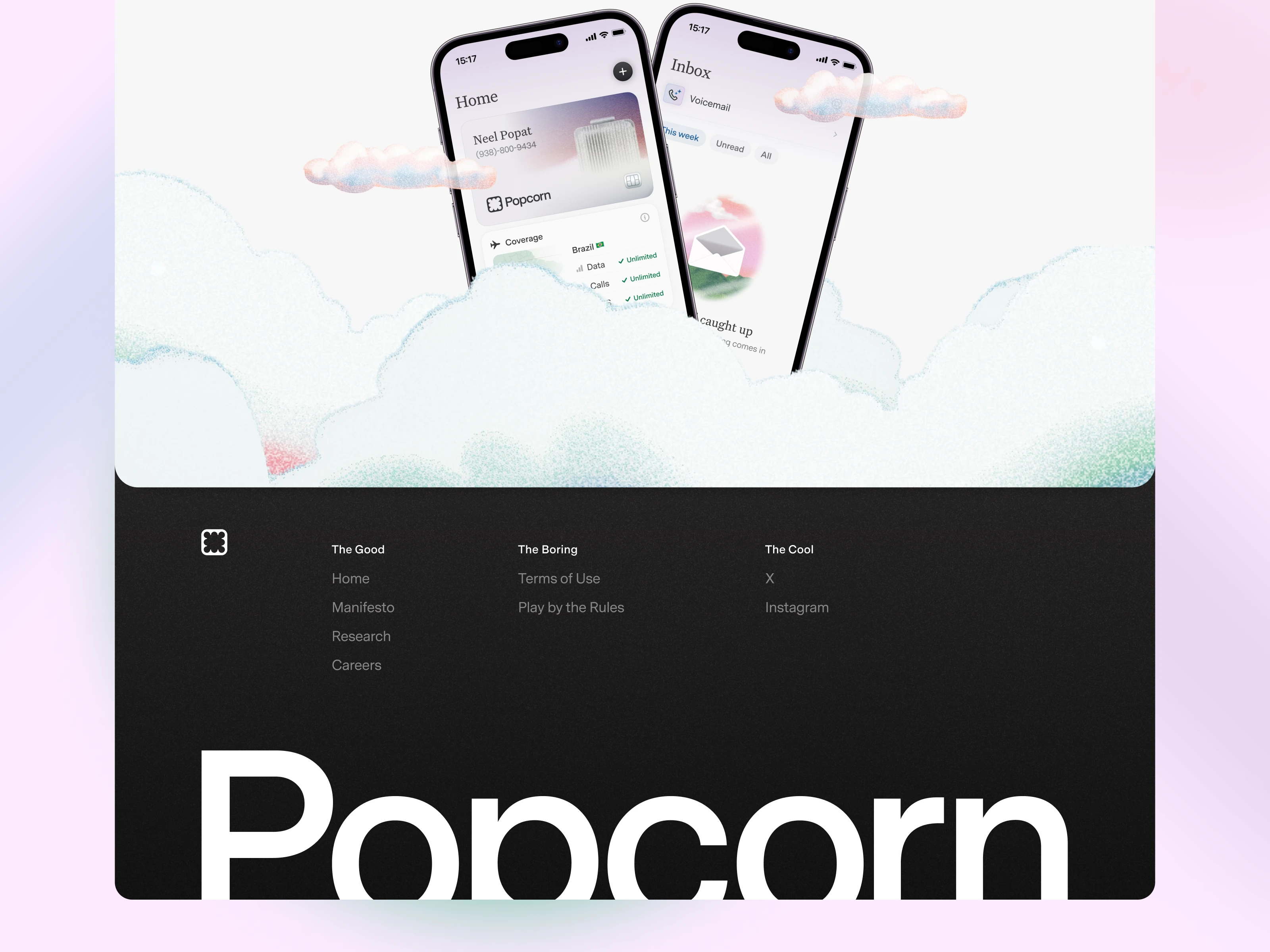
In other instances, I tried to use the very few assets provided in a smart way. Such as these overlapping clouds
A Deconstructed Minimalism
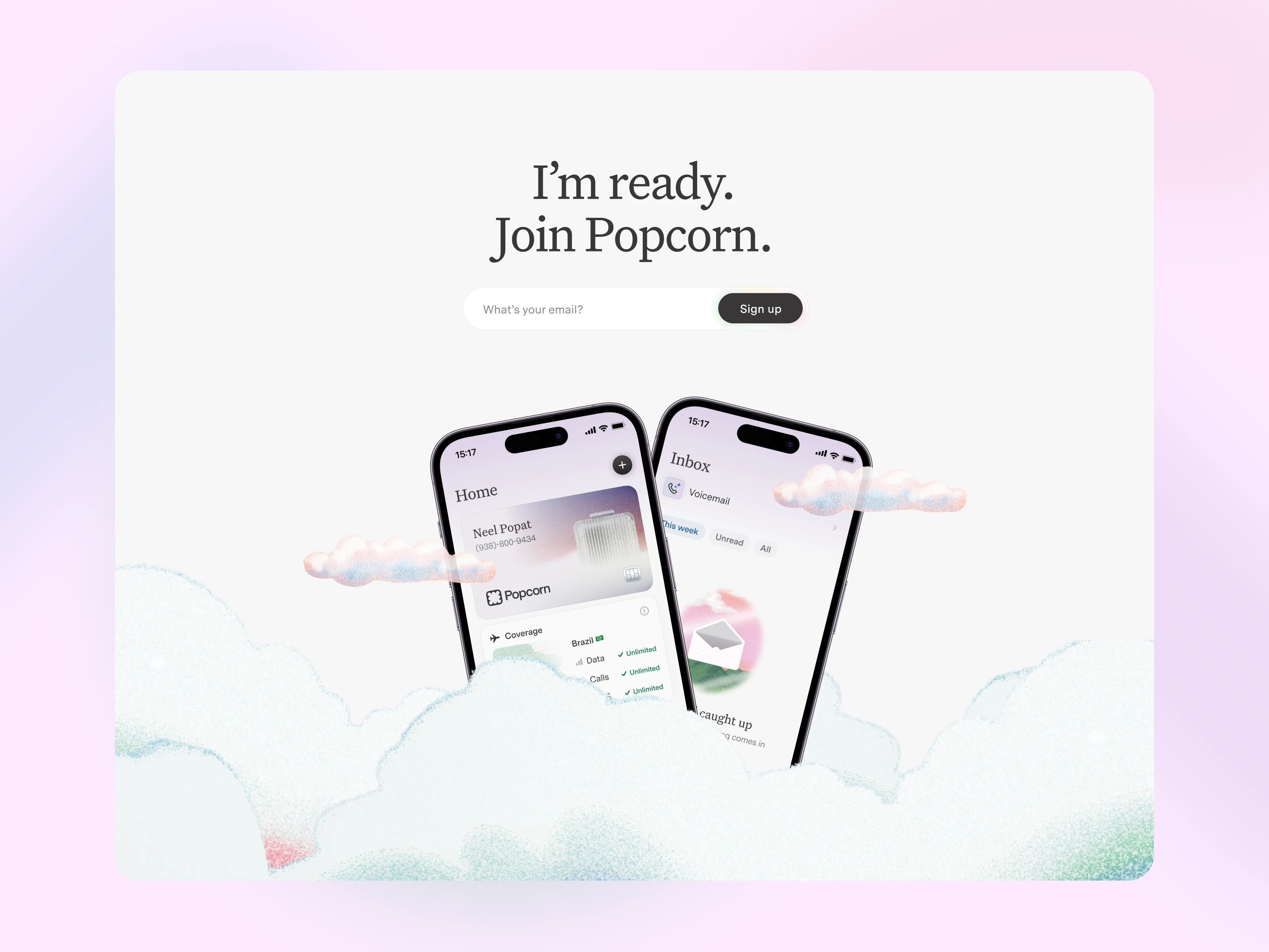
Another complexity came from the fact that the website was set up to be very minimal in terms of content, meaning I had to make a good use of whitespace and proportions. I decided to go for some deconstructed modules that resulted in a very unique look, while really using just a couple elements. The vibrance of the compositions comes from the unsual way to assemble the modules.
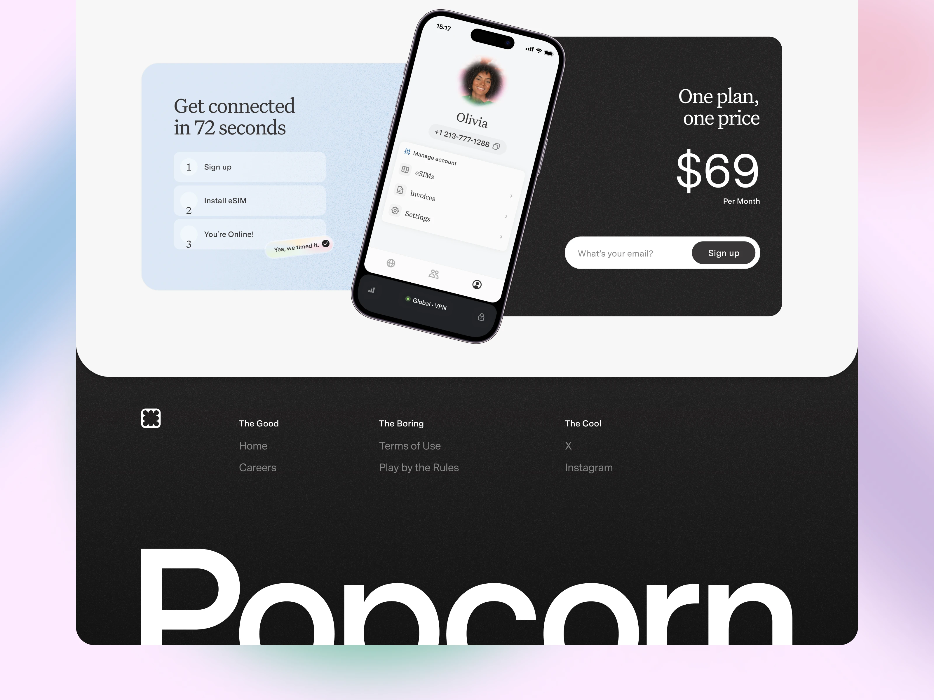
A look at the deconstructed Endpage CTA
A dreamy, minimal website
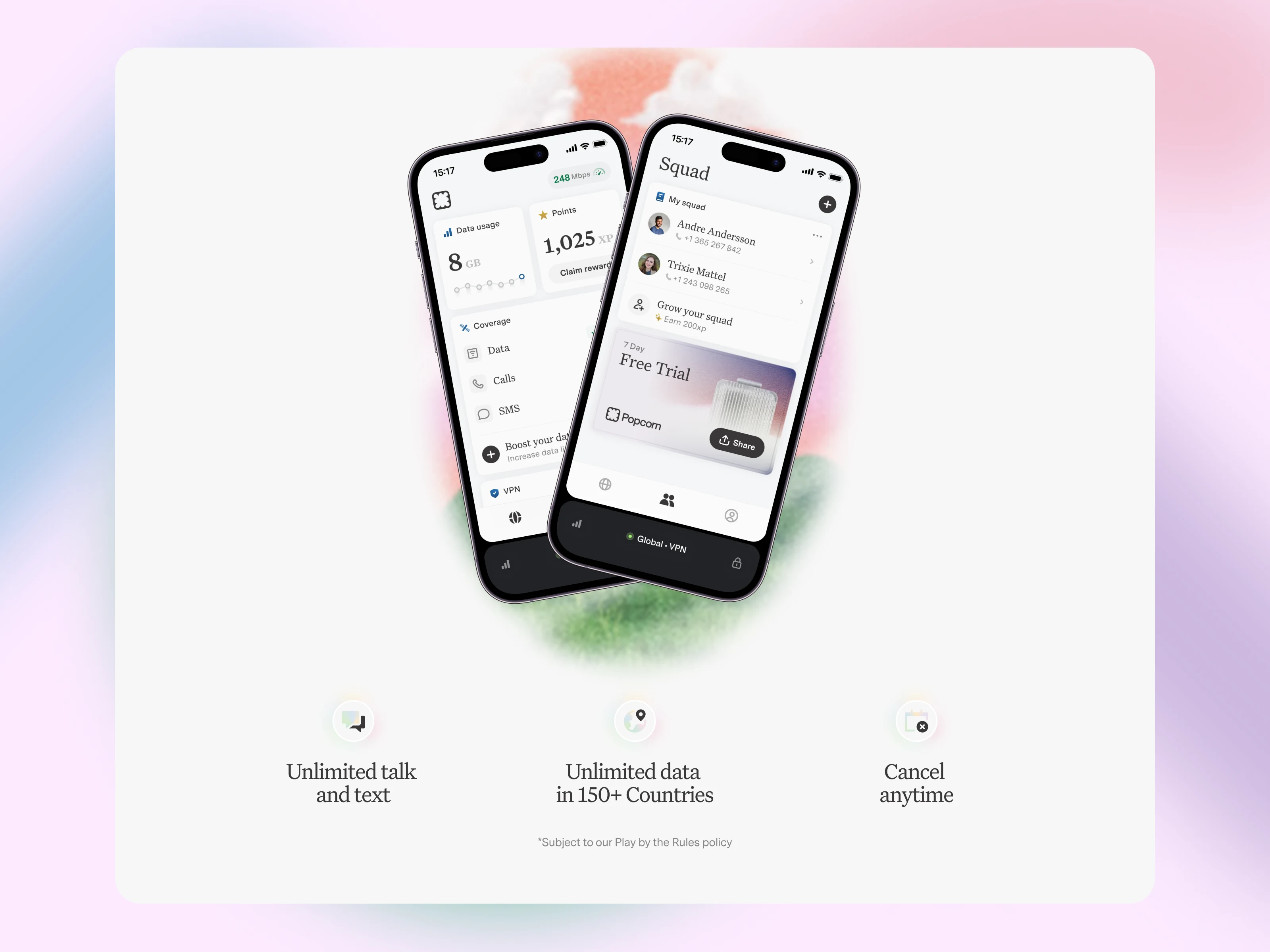
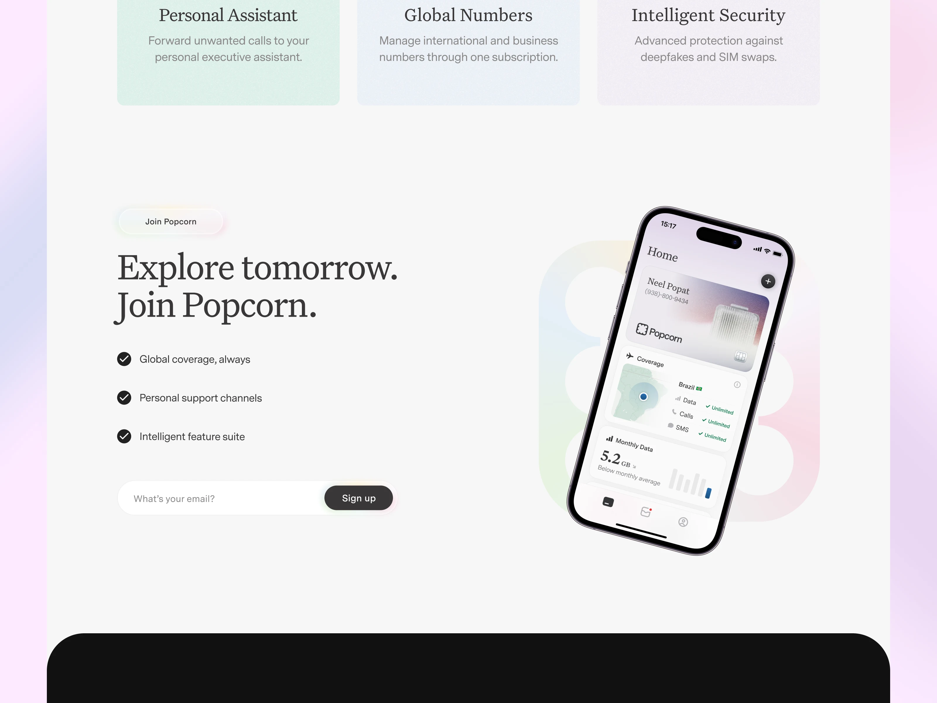
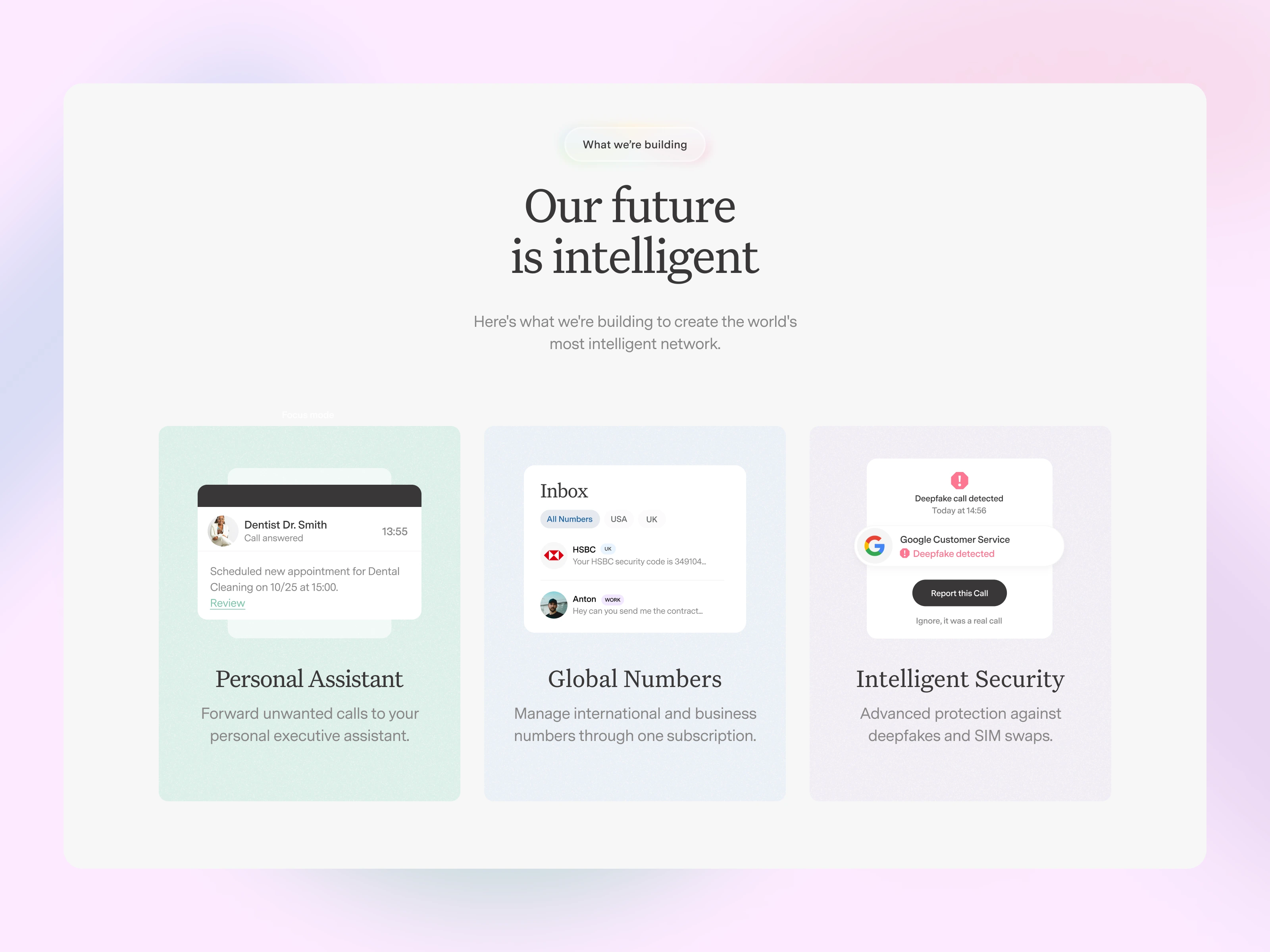
As for the rest of the website, I tried to stick to a very minimal, spacey and dreamlike design. Very little use of color, airy modules, lots of whitespace and soft gradients whenever necessary. Feel free to check it live in action on www.popcorn.space
A pagescroll of the Homepage
Obviously, Fully Responsive
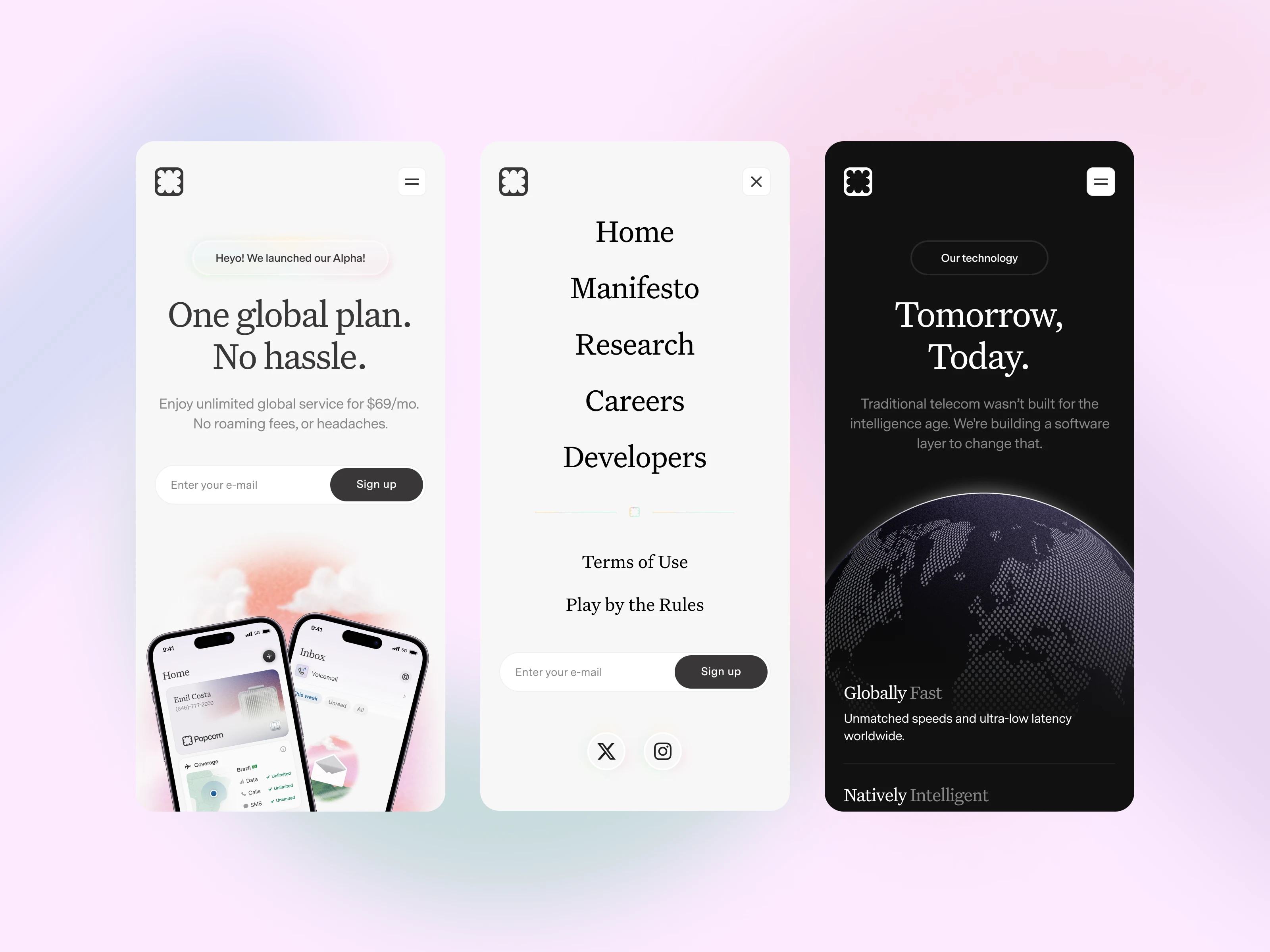
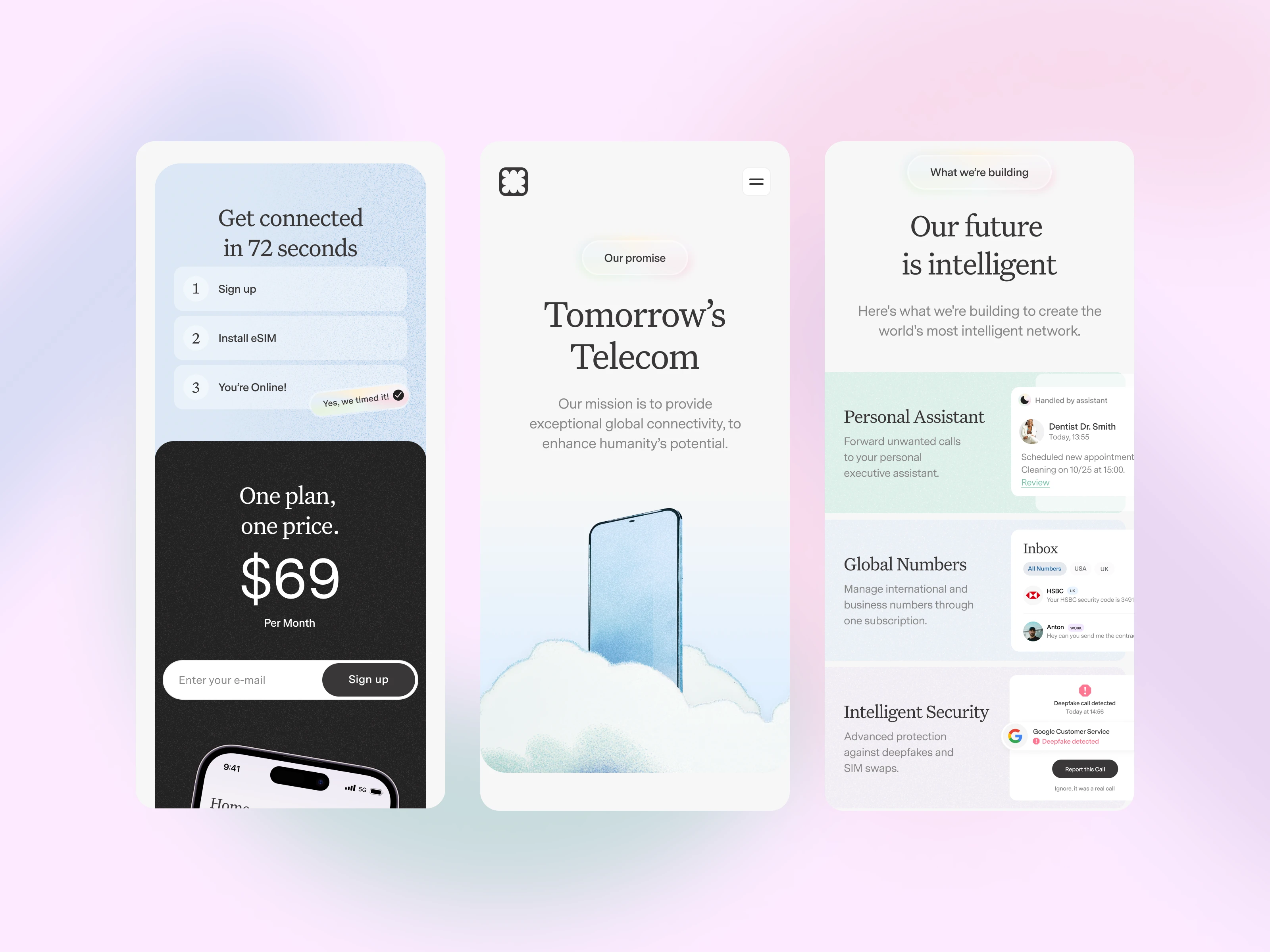
In 2025 it goes without saying but the whole website is responsive and was designed pixel perfect for Tablet Vertical, Landscape and Mobile.
Tablet and Mobile Pagescroll
Like this project
Posted Apr 1, 2025
Full website design done for Popcorn. I managed to create a unique, dreamy look and feel for the digital presence of the company.
Likes
47
Views
452
Clients
Popcorn
Collaborators
