Ideando Website Refresh
Martin Studio
Ideando Website Refresh
Overview
Ideando is an innovation and product development firm focused on helping companies validate ideas, accelerate product delivery, and create meaningful digital experiences. As the company evolved, its website no longer reflected its sharpened positioning or the clarity of its new messaging. This project was a full refresh aimed at elevating the brand, improving usability, and making the company’s value unmistakably clear from the moment a visitor lands on the site.
The Challenge
The previous version of the Ideando website had strong foundational elements but lacked cohesion and clarity. Several issues surfaced during the audit:
The core message was diluted and visually overshadowed.
Portfolio work—one of the most important credibility signals—was buried several clicks deep.
Navigation patterns were unintuitive, making it harder for prospects to explore the company’s capabilities.
Visual inconsistencies across typography, color, spacing, and interactions weakened the brand’s overall presence.
The goal was simple: create a bold, direct, and intuitive experience that communicates Ideando’s value instantly.
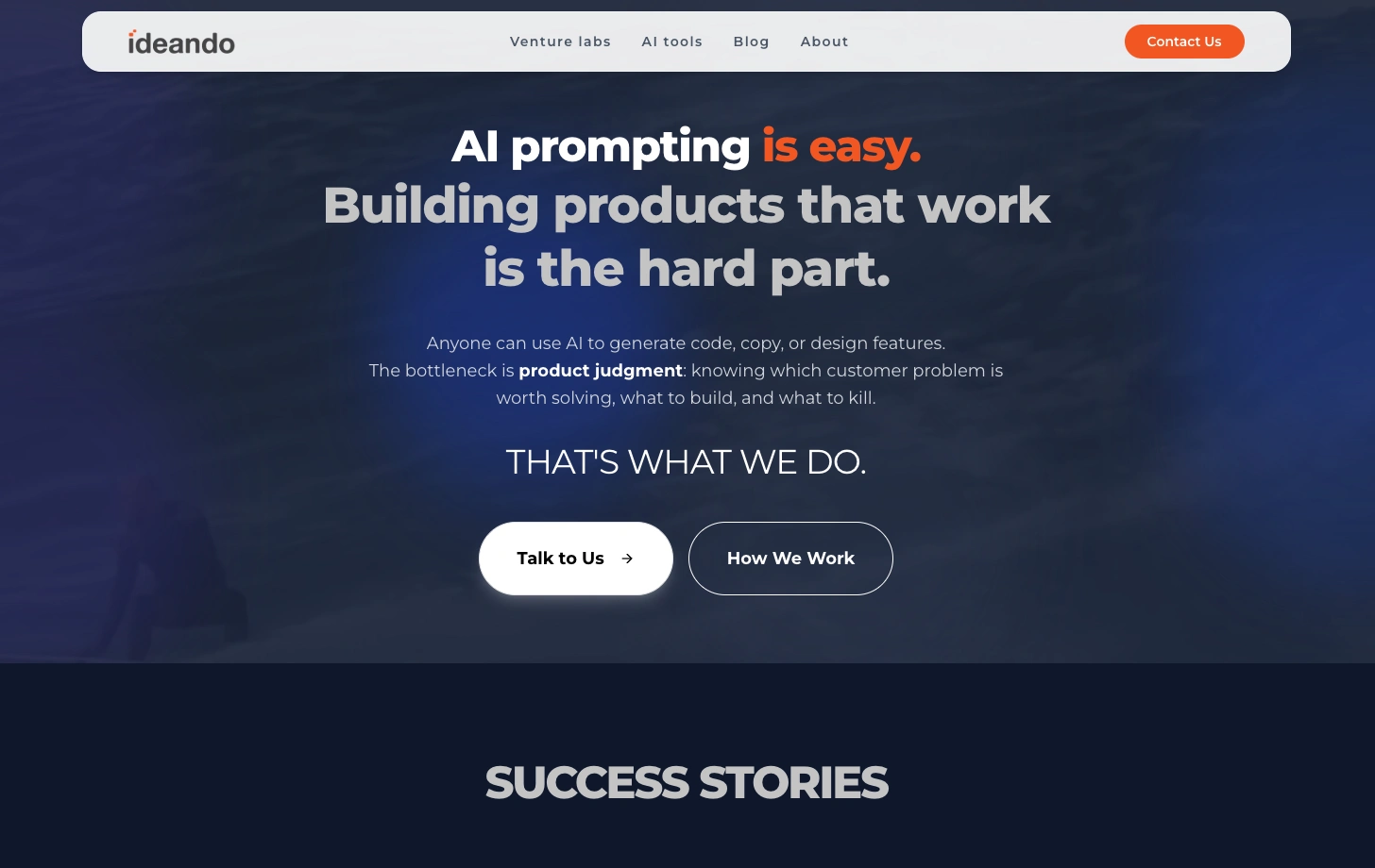
Hero Section & Navigation Redesign
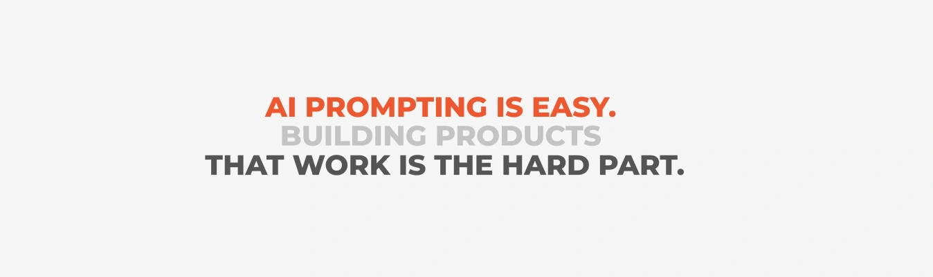
The hero section is the first impression—and previously, it wasn’t doing the brand justice. The copy was left‑aligned, visually unbalanced, and lacked the punch needed for a company that leads with innovation.
What Changed
Centered the core message to give it prominence and balance.
Introduced a dark, minimal background to remove distractions and increase contrast.
Added subtle sparks of Ideando’s primary orange to inject energy and brand recognition.
Used Montserrat Extra Bold to reinforce confidence and clarity.
Simplified the main navigation to make key sections easier to access.
The result is a hero that feels intentional, modern, and unmistakably aligned with the company’s voice.
A Bold Choice: The Surf Video
Although Ideando is a tech‑driven company, the brand is also about creativity, disruption, and momentum. The surf video became a metaphor for that spirit—dynamic, fluid, and bold.
It signals to visitors that Ideando isn’t just another consultancy. It’s a partner that brings energy, originality, and a fresh perspective to every engagement.
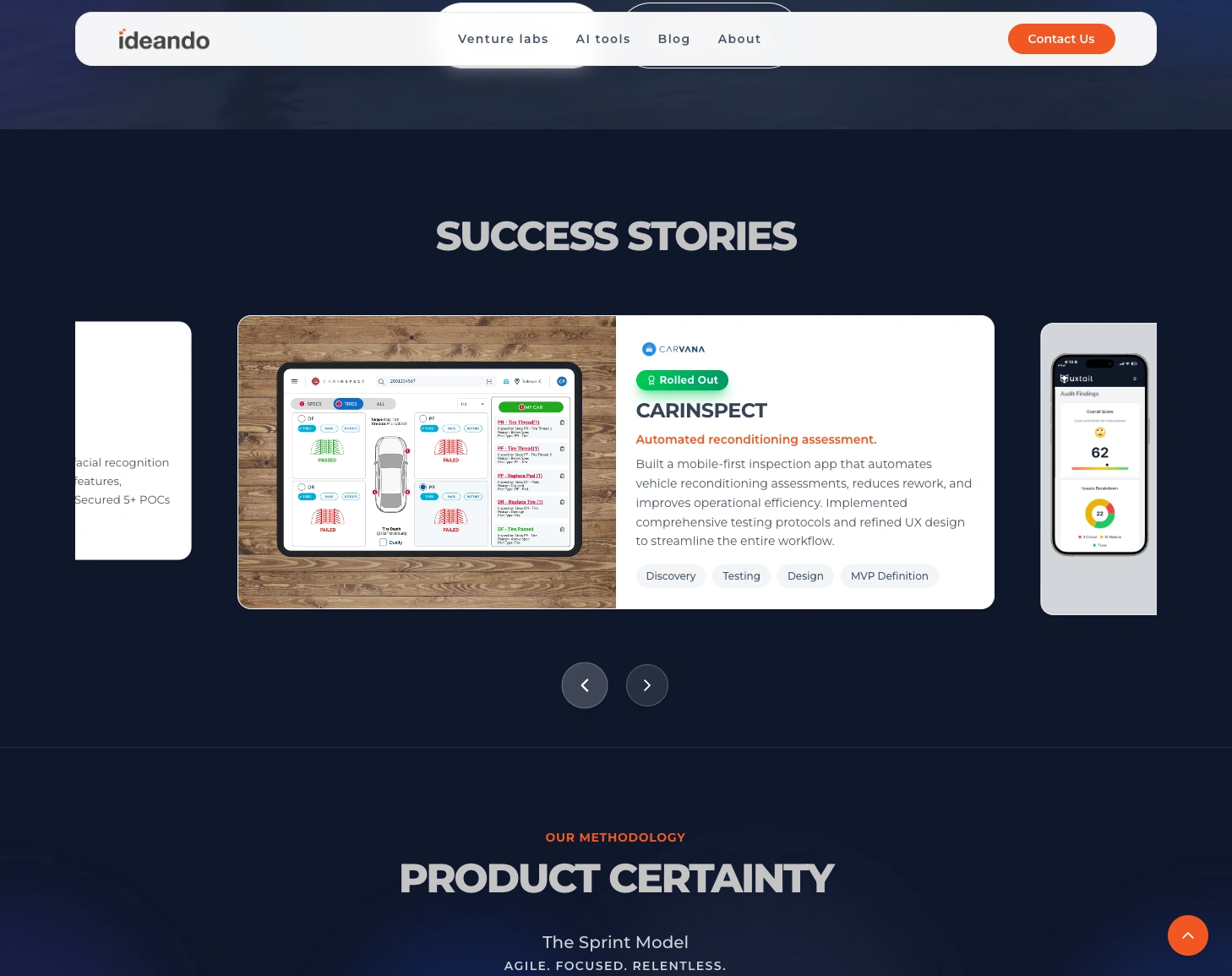
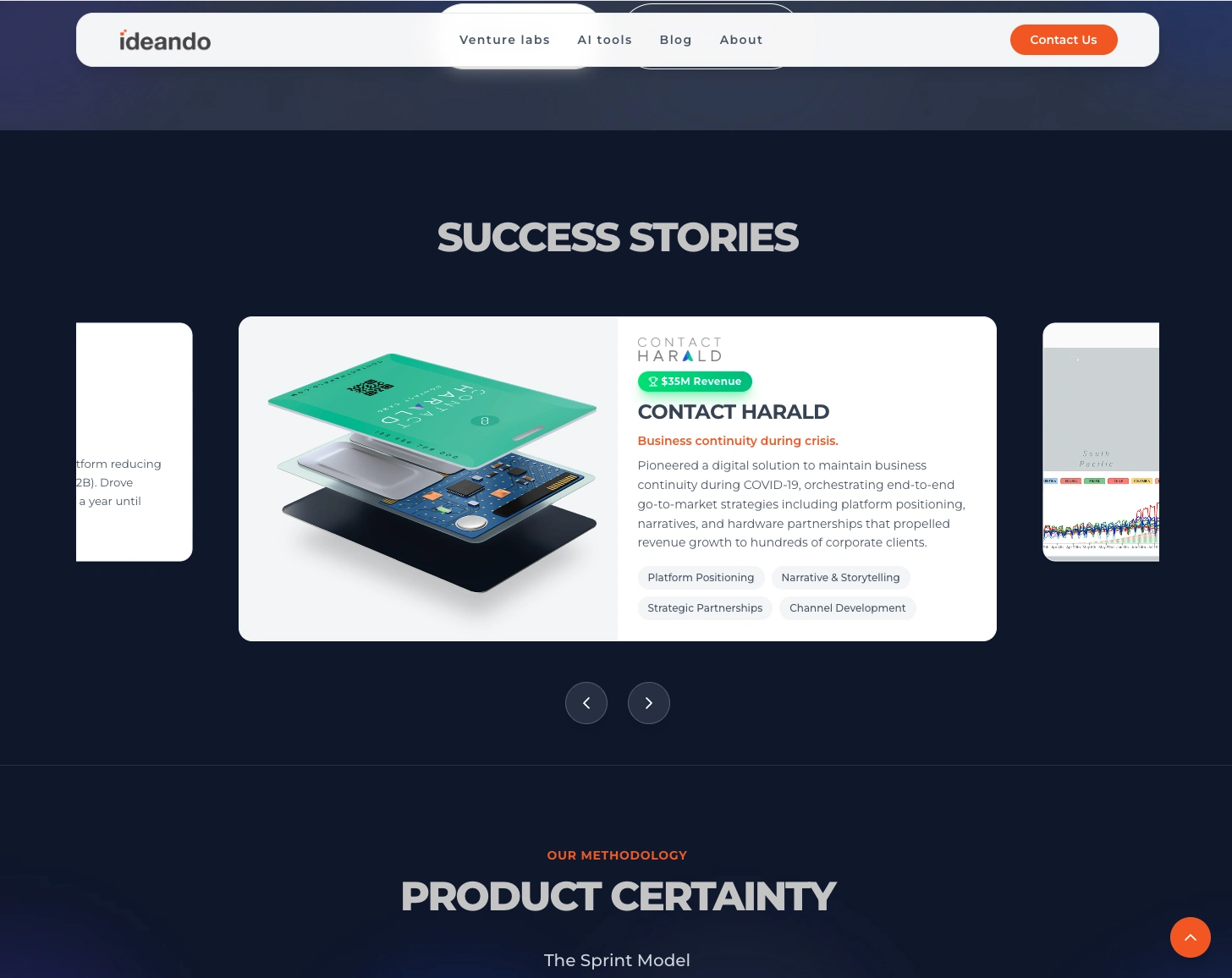
Elevating the Portfolio
One of the biggest usability gaps was the placement of the portfolio. It was hidden deep within the site structure, making it easy for potential clients to miss entirely.
What Changed
Moved the portfolio carousel directly below the hero section.
Made work samples one of the first things visitors see.
Reduced friction by eliminating unnecessary clicks.
Created a more intuitive path for prospects who want to quickly validate expertise.
This shift dramatically improves discoverability and aligns with how decision‑makers evaluate partners.
Visual Cohesion & Accessibility
While the site was simple, it suffered from inconsistencies that affected both usability and brand perception:
Heading styles varied across pages.
Font sizes and treatments were mismatched.
Section spacing and layout patterns lacked structure.
Interactions were inconsistent or missing.
Outcome
The new Ideando website delivers a sharper, more intuitive, and more compelling experience. It communicates the company’s value with clarity, showcases work upfront, and reflects the bold, innovative spirit behind the brand.
This refresh not only modernizes the visual identity but also strengthens Ideando’s credibility and positions the firm for stronger client engagement.
Like this project
Posted Mar 12, 2026
Revamped Ideando’s site with stronger messaging, clearer navigation, and a front‑and‑center portfolio for a more cohesive, intuitive user experience.