BIBIM - MMMMMM!
Ariha A
Bibim
BIBIM is a small takeaway restaurant offering best Korean mixed noodles in town
This visual identity consists of brand's logo, pattern, packaging design, and different branding usages. The logo is a wordmark that tells the brand story effectively together with carefully selected brand colors and typography.
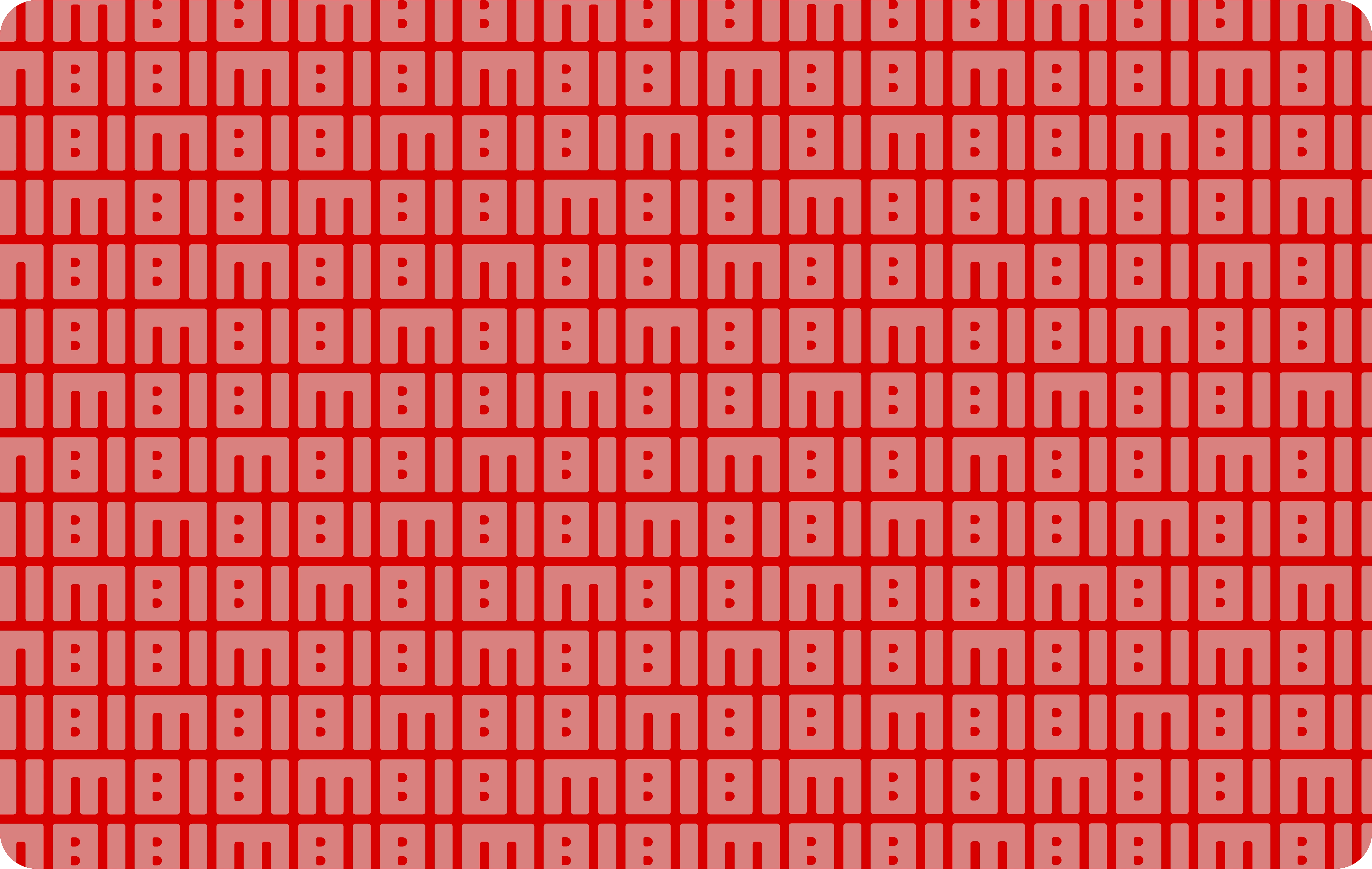
Brand Pattern
The logo is designed in a way that it is read the same both horizontally and vertically and forms a brand pattern when combined and repeated.
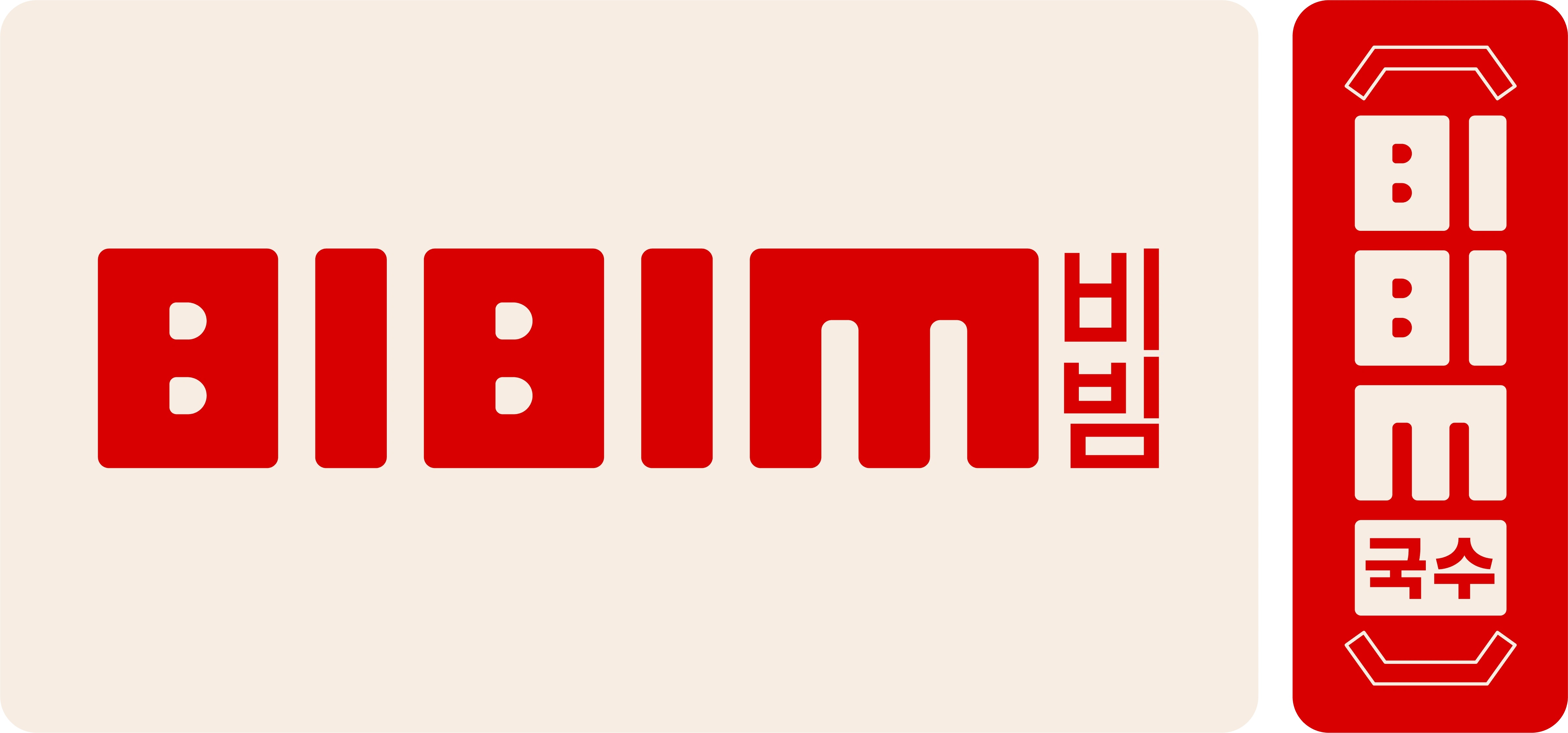
Logo
The bright red and beige color with the logo compliments the Korean food and language at the same time
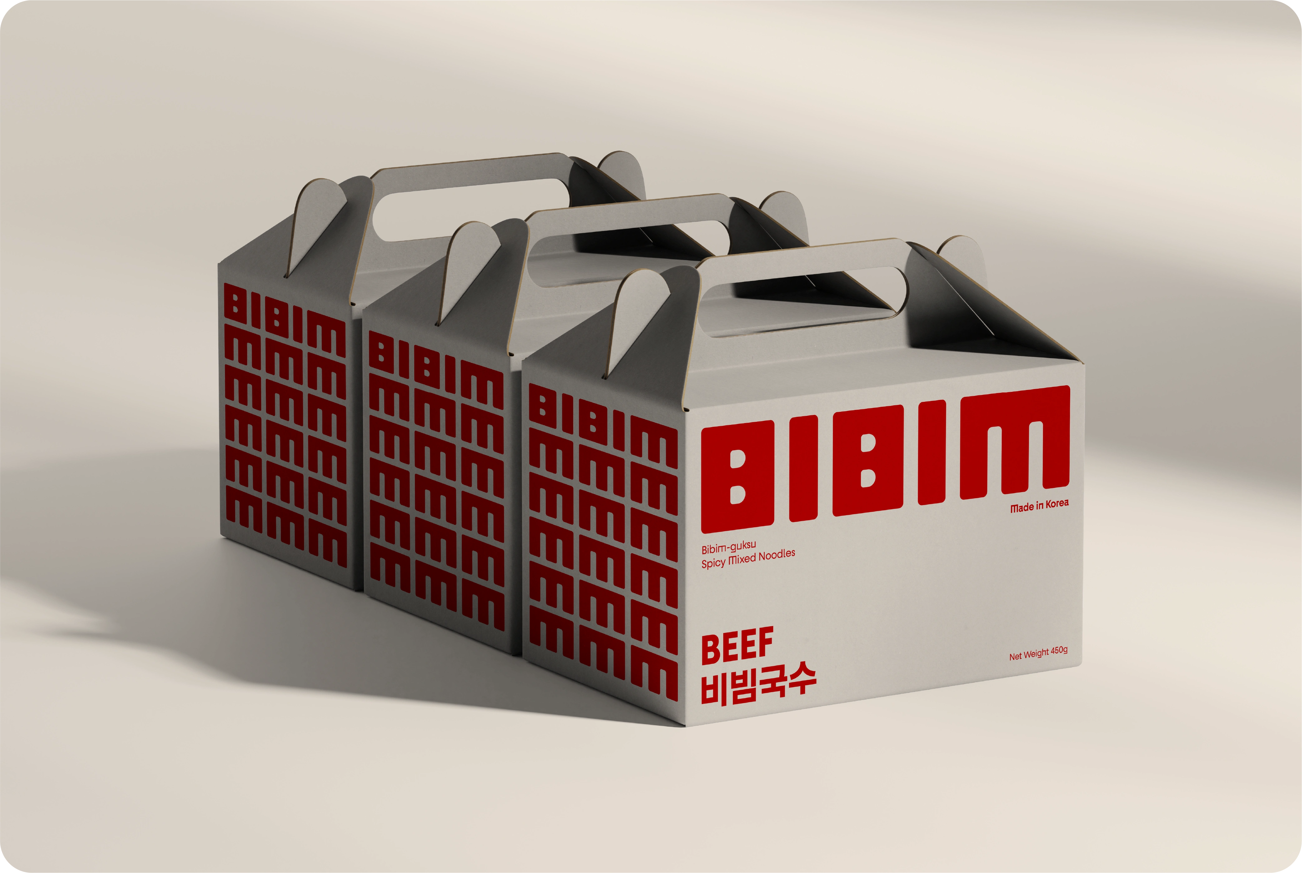
Packaging - Takeaway Box
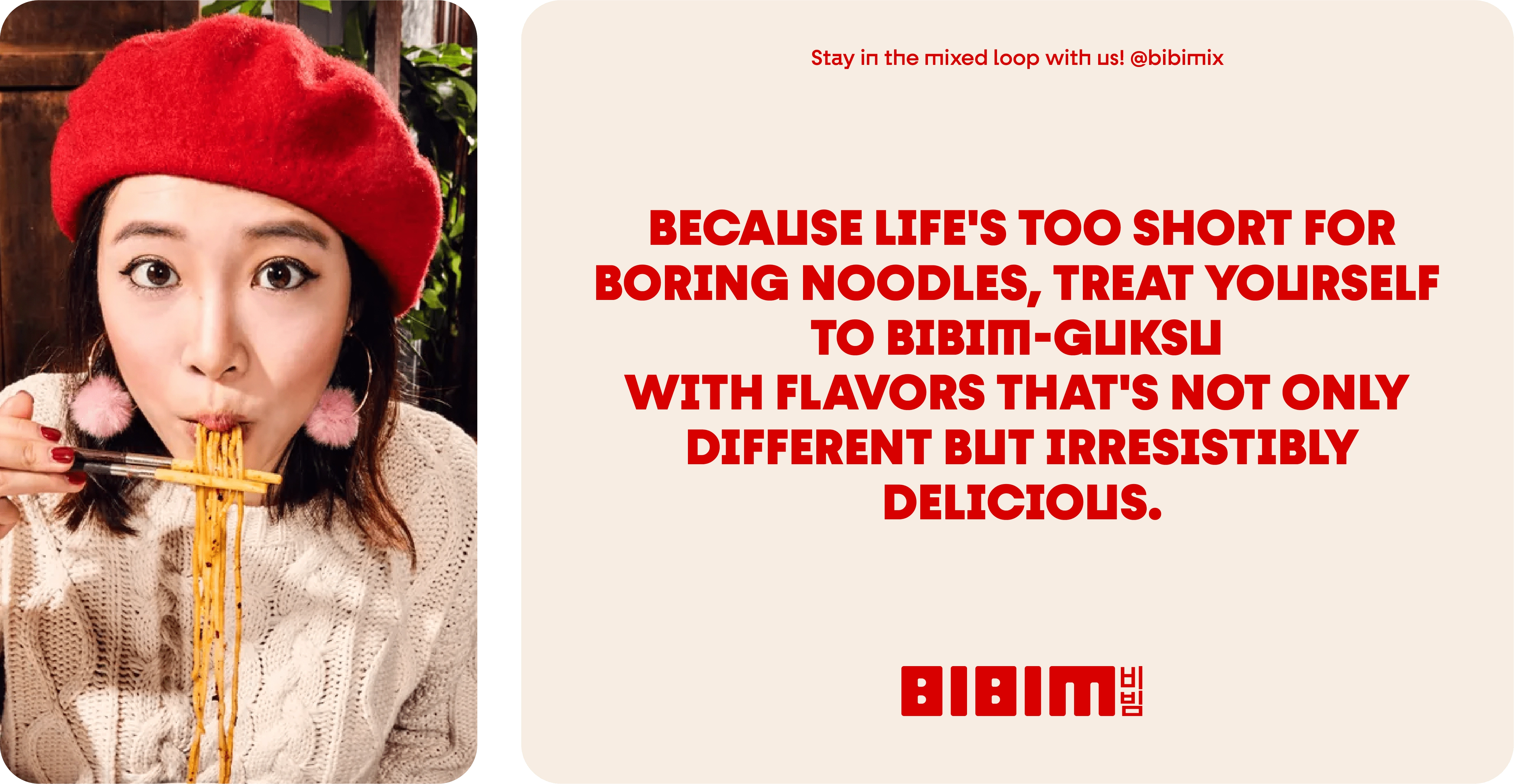
Photography & Brand Text
The letter M in BIBIM can be extended and used as a mmm!! expression.
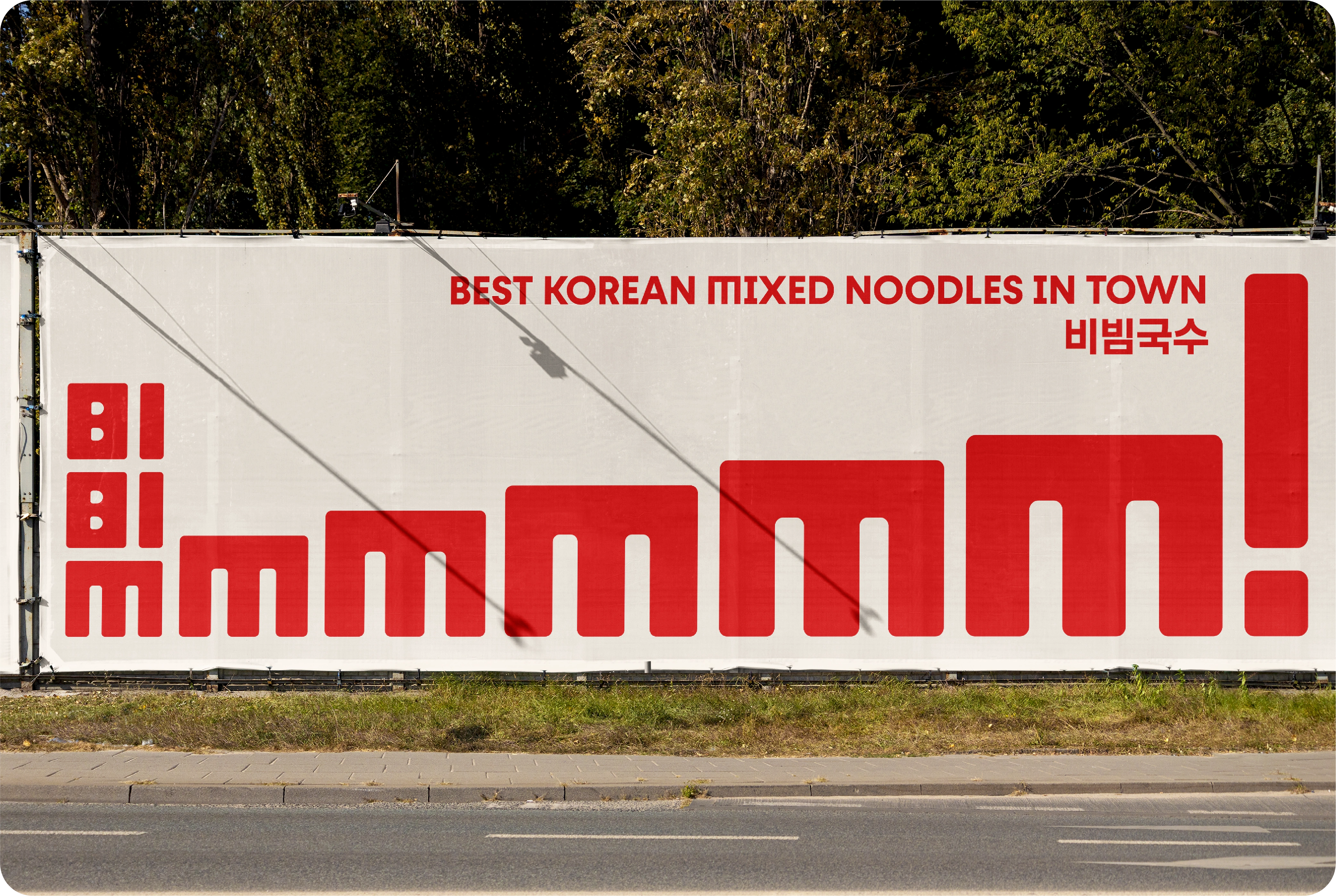
Banner
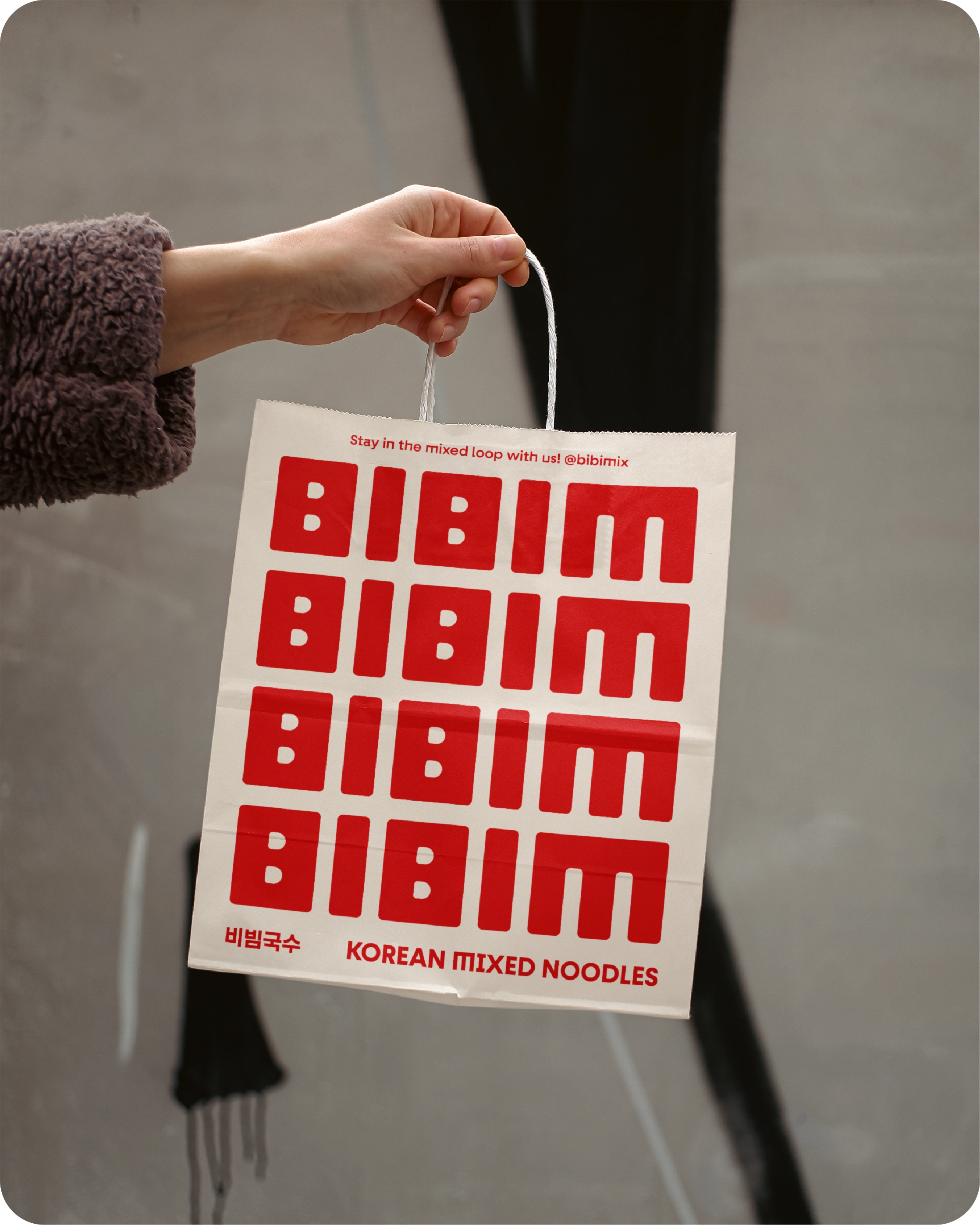
Paper Bag Mockup
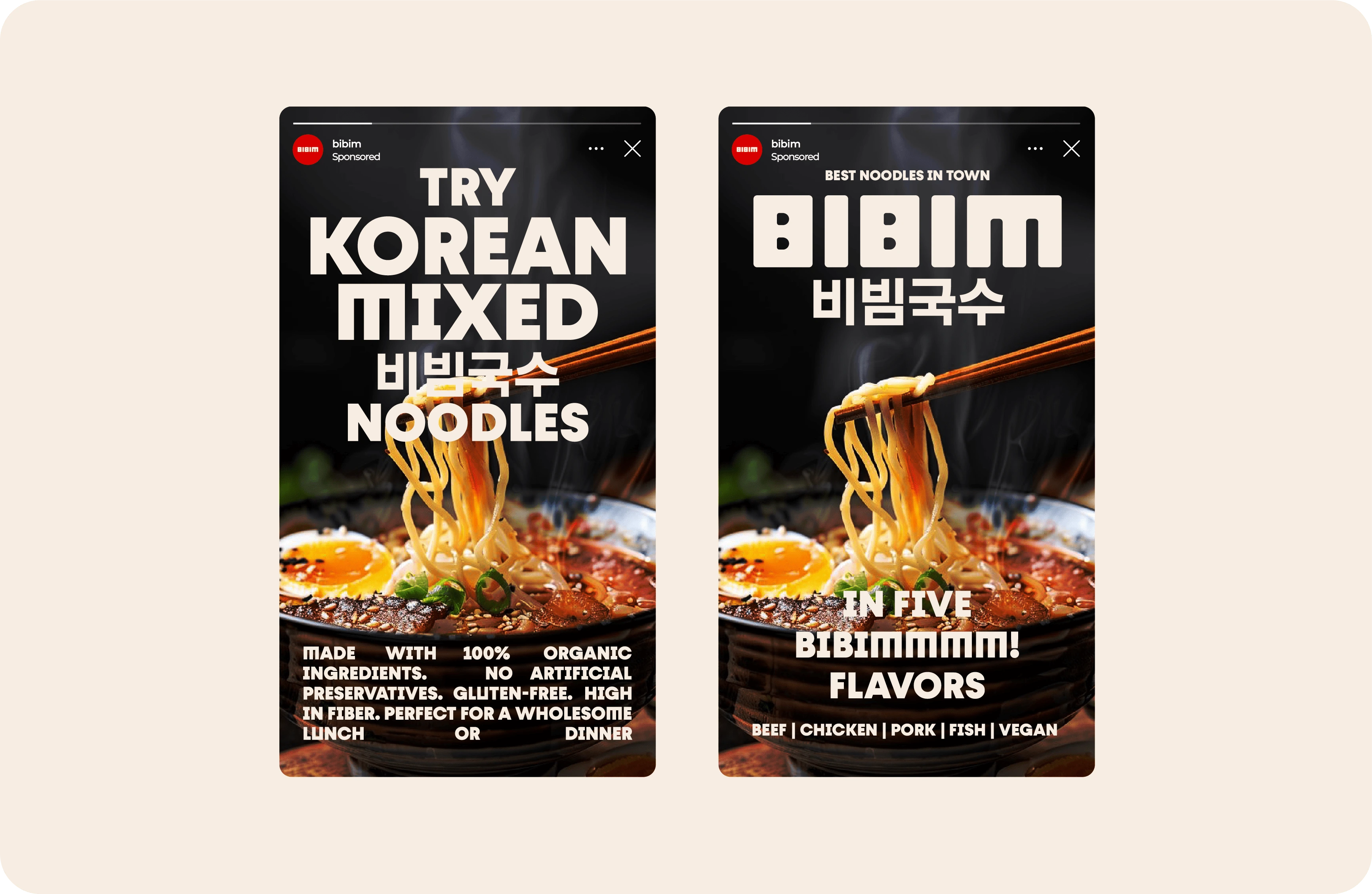
Instagram Stories
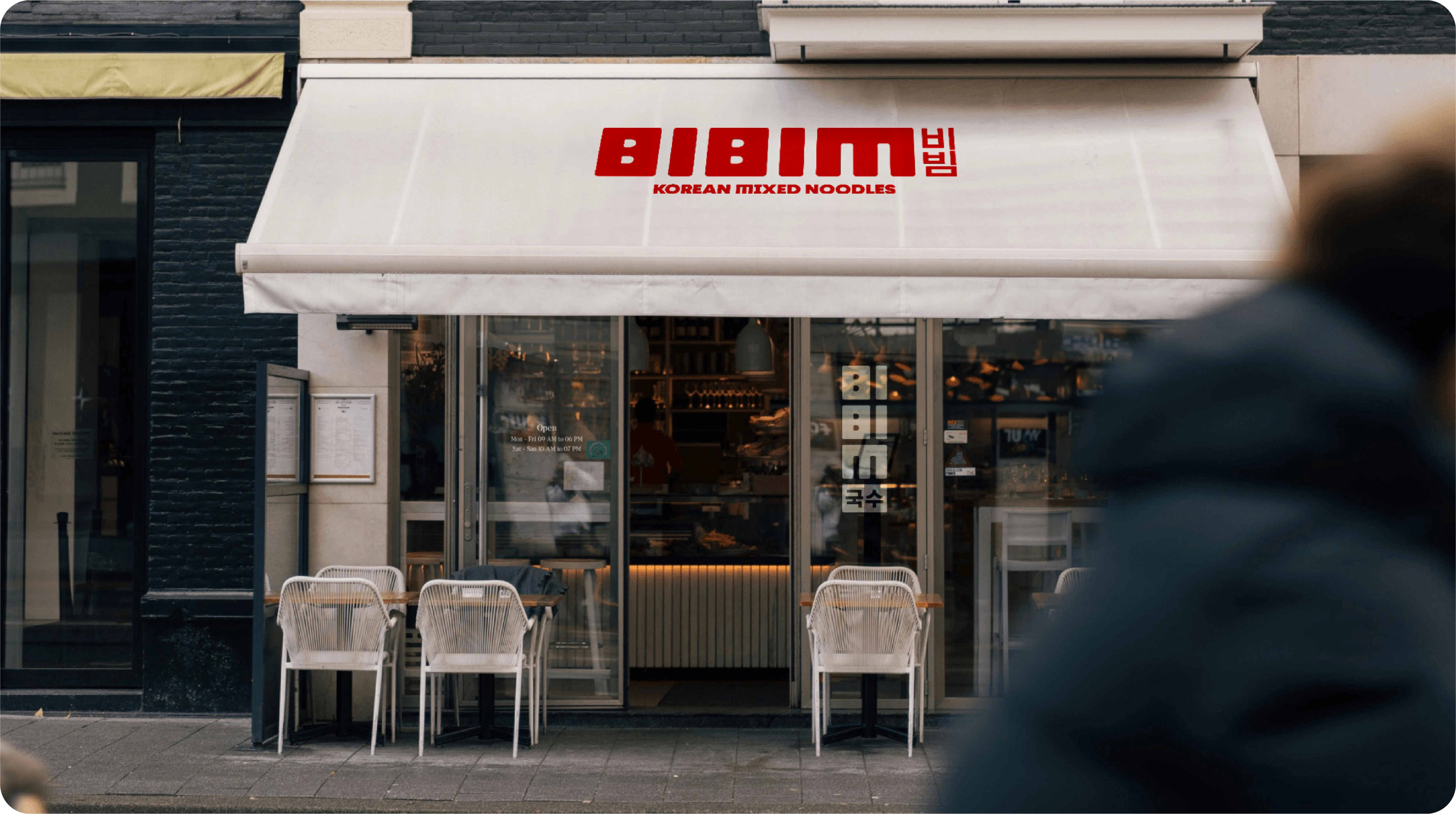
Store Front
'
'
Like this project
Posted Nov 12, 2024
A visual identity for a small Korean noodles takeaway restaurant. Modern and youthful branding that makes you go MMMMM!!